Have you ever read and re-read something over and over and still didn’t understand it? Unless it was a book on advanced nanoengineering, it probably wasn’t your fault. Much of the writing you will read in your life will be unnecessarily complex or vague. Surprisingly, however, it’s easy to write effectively. Master the following eight writing tips, and you’ll be able to craft clear, engaging case studies that even the busiest hiring managers will stop to read in full.
Many of us write “good communicator” or “strong communication skills” in our UX design portfolios and resumes. But where’s the proof? How you write your case studies will not only help hiring managers understand your story but also prove that you are indeed a good communicator. Writing excellence is just eight practical tips away:
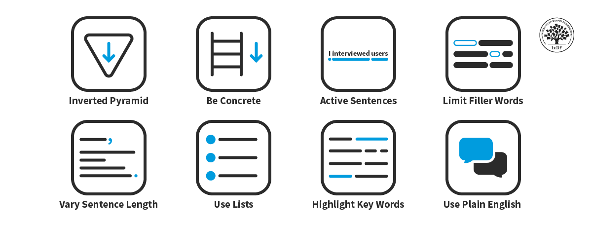
Use the inverted pyramid to state your most important points first.
Be concrete and climb the ladder of abstraction.
Write active sentences for an easier read.
Kill your filler words.
Mix short and long sentences for variety.
Use bullet points and numbered lists to help readers skim.
Highlight key words.
Use plain English.
Writing tips are just one piece of the portfolio puzzle. Another is the way you structure your case studies. A well-organized case study not only showcases your design skills but also tells a compelling story that engages hiring managers. Find out from Morgane Peng, Managing Director and Head of Design at Societe Generale CIB, how to set yourself up for success when you write your case studies:
Table of contents
- 1. The Inverted Pyramid: Give the Reader What They Want
- 2. Be Concrete and Climb the Ladder of Abstraction
- 3. Use Your Active Voice and Leave the Passive Behind
- 4. All Killer, No Filler
- 5. Combine Short and Long Sentences for an Enjoyable Read
- 6. Let Your Readers Skim with Bullets and Numbering
- 7. Make Your Message Heard and Highlight Key Words
- 8. Be Understood with Plain English
- The Take Away
- References and Where to Learn More
1. The Inverted Pyramid: Give the Reader What They Want
Let’s get straight to the point—the inverted pyramid is a writing style where you provide the most important information first. Journalists use this style to deliver the essential parts of a story first (the who, when, what, where, and why) before they provide further detail.
It is called the inverted pyramid because the key information—the outcome of the story—is at the top. The details then get finer and finer as the piece moves toward the end.
The inverted pyramid is the opposite of the standard pyramid. Academics often use this method to build an argument:
They present the problem statement first.
Next, they list their details and observations.
Finally, they give a conclusion with the important information at the end.
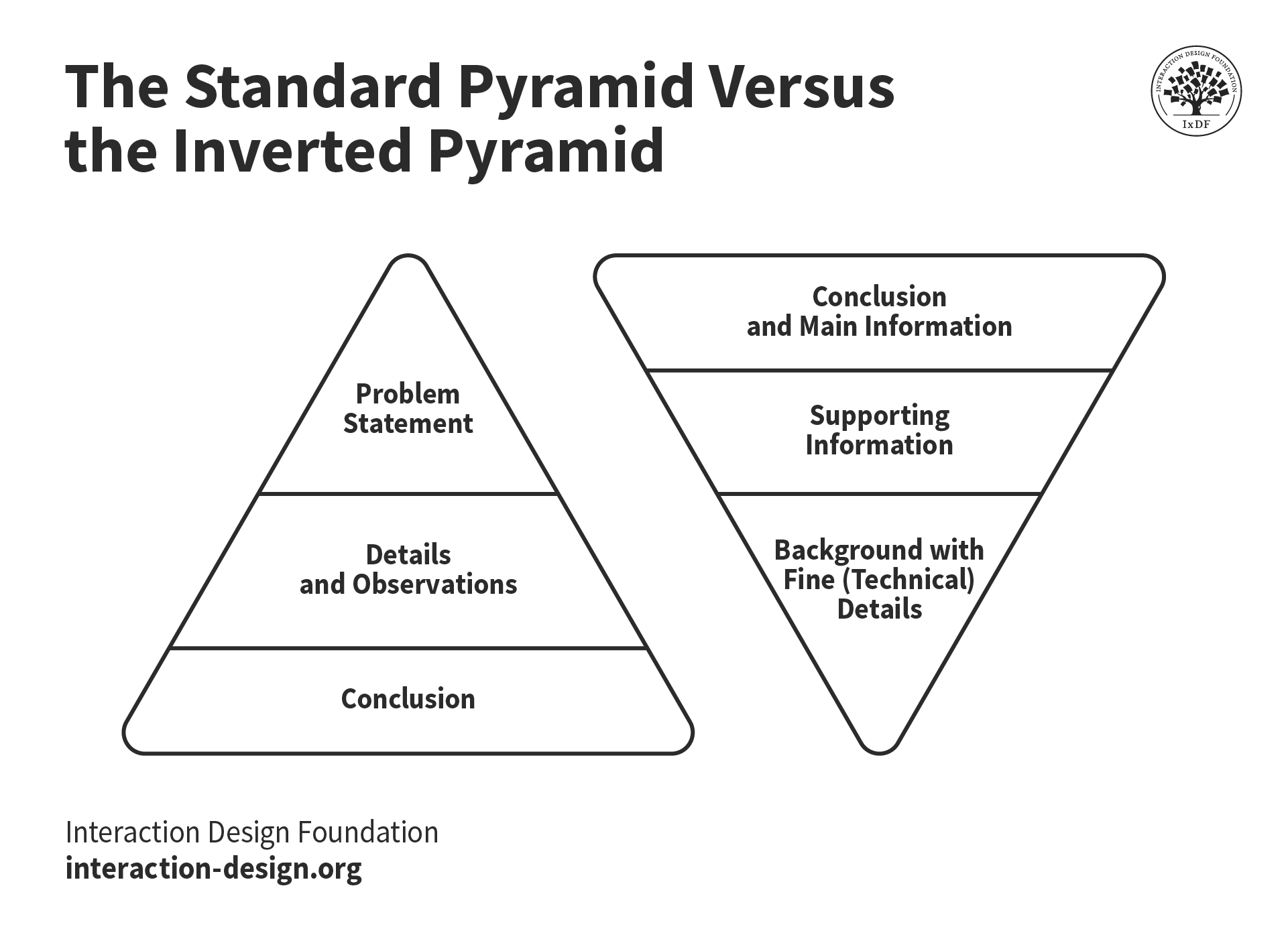
The standard pyramid makes you wait until the end to find out what you want to know. So why not make it easier for hiring managers and present the important information first? The inverted pyramid does just this. If the reader wants to, they can continue reading for more detail. If not, they can leave with what they came for.
© Interaction Design Foundation, CC BY-SA 4.0
Here are two examples from a case study of the same paragraph. The first uses the standard pyramid style, while the second uses the inverted pyramid. Can you tell the difference?
Standard pyramid:
“We wanted to discover if users responded differently to our newsletter button redesign. We set up two homepages—one with the new design and one with the old design—and ran an A/B test. The A/B test lasted for 30 days, and at that time, we had around 10,000 homepage visitors, who we split equally between the two designs. At the end of the test, we used a chi-square calculator to confirm the results were statistically significant, which they were. The results of the test indicated that the new button design resulted in 3% more signups to our newsletter.”
Inverted pyramid:
“We discovered that the redesigned newsletter button achieved 3% more signups than the previous design. To reach this conclusion, we ran an A/B test in which we presented the new design to half our homepage visitors and the old design to the other half. The test ran for 30 days, and during that time, we had around 10,000 visitors. To validate the test, we used a chi-square calculator, which confirmed that our results were statistically significant.”
The standard version is almost frustrating to read. What if the hiring manager already knows how an A/B test works? What if they don’t care about the method you used, just the results? They will have to read through information irrelevant to them to find what they need to know. In the inverted version, the reader gets the important information right away. They can then skim the rest or read it in full if they want to learn more.
Why Should You Use the Inverted Pyramid Writing Style?
You’ll help recruiters understand better and faster: Readers will understand the key take away of the topic right from the start. This way, they’ll absorb your supporting information and background much better.
You’ll reduce the time required to read and interact: Hiring managers can understand what you mean without having to read the entire content. Even if they stop reading midway, they will still grasp the main idea. This means you’ll also support skimming, which most readers do online.
You’ll encourage reading: When you draw readers in with your main points, they’ll naturally continue if they’re interested in the topic.
How to Apply the Inverted Pyramid Style
Find out what you really want to communicate and why you want to communicate it. What is the conclusion—the key fact you want to tell readers? You should be able to sum up the key take away in a heading or sentence. If you define your key take away before you write:
The writing process will be easy.
Your readers will instantly understand what you want to tell them.
It’s as simple as that.
So, how do you find out what you really want to communicate and why you want to communicate it? You simply use this sentence and insert your main take-home point:
I want to communicate that... [main take-home point/conclusion],
because… [why this is essential to your dear reader/user].
Here is an example:
“I want to communicate that my design approach is grounded in understanding user needs and solving real problems, because this shows hiring managers that I can create impactful, user-centered solutions that meet business goals effectively.”
Once you’ve written your main point and conclusion, move on to the next most important details and supporting information. Finally, write your background information with fine technical details, discussions, and perspectives. This final part is only for those who want to go deeper.
Aim to write in the inverted pyramid style within each paragraph, too. Start your paragraphs with the most important sentence first. In fact, start your sentences with key words as much as you can.
2. Be Concrete and Climb the Ladder of Abstraction
Abstract sentences are broad and vague—for instance:
“An analysis was conducted to explore the link between the interface's aesthetics and user engagement.”
Abstract sentences require effort and time to process, and they don’t reveal who does what. Try to imagine how you might draw an illustration of the sentence above. It’s not easy, right? This is how difficult it is for our brains to comprehend and make sense of abstract sentences.
Concrete sentences, on the other hand, instantly reveal what they mean. They help us understand who does what and are much easier to understand and visualize. For example:
“Our team of four researchers conducted a study in our usability lab with 50 participants. We measured how the visual design of our new app influenced user satisfaction and time on task.”
When you write concrete sentences, hiring managers don’t have to search the article for supporting information. In the abstract sentence, the hiring manager needs to find additional information to know:
Where you did the test.
How many people were on your team.
How many users participated in the test.
For this reason, concrete sentences are easier to understand and faster to read.
The Ladder of Abstraction
The ladder of abstraction is a useful writing concept that helps you balance concrete and abstract language. Created by S.I. Hayakawa, a Semanticist and US Senator, the ladder starts with concrete at the bottom and climbs to abstract at the top.
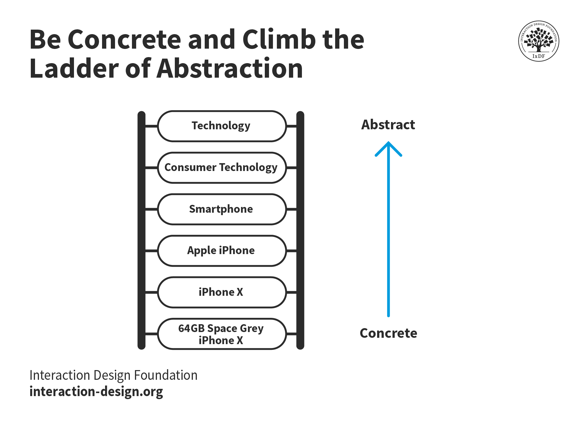
The ladder of abstraction is like a scale that goes from very specific to very broad. A particular model of a smartphone is concrete and specific. Technology as a whole is abstract and broad.
© Interaction Design Foundation, CC BY-SA 4.0
This is an example of the ladder in action:
In this project, we:
Abstract: Improved user experience.
Less abstract: Simplified the process of completing common tasks on the website.
More specific: Enhanced website navigation.
Even more specific: Made the website's menu easier to use.
Concrete: Implemented a more intuitive menu structure to reduce clicks for key actions.
The concrete example is the most direct and informative. A hiring manager will understand more about the project right away than if the case study used a more abstract option. This doesn’t mean you should never use abstract sentences. It is called a ladder for a reason—you move up and down it.
A good approach to the ladder is to start at the bottom and climb up. If you begin with the concrete facts, it grounds the reader in reality before taking them on a journey into the abstract:
“In this project, we implemented a more intuitive menu structure to reduce clicks for key actions. This change was part of a broader project to enhance the website navigation and our ongoing mission to improve the user experience.”
Why Should You Write Concrete Sentences?
We understand concrete statements faster. Abstract sentences force readers to skim up and down the page to understand what the sentence is trying to communicate. In extreme cases, abstract writing forces readers to guess what it means. That said, abstract language still has its place if you complement it with concrete statements.
How to Write Concretely
Provide examples to illustrate your point: If you are writing about design challenges you faced in a project, list two to three specific challenges you encountered.
Show and tell: When you explain a solution you created, include sketches, mockups, and prototypes of the design.
Be specific: Avoid general statements; instead, be specific. Don’t say, “We had an outdated design”; say, “We had an outdated design with text that was too small for mobile devices.”
Climb the ladder of abstraction: Begin with concrete sentences and progress to more abstract language. Feel free to move up and down the ladder as you see fit. However, particularly in UX/UI design case studies, concrete sentences are a must to aid readability and comprehension.
3. Use Your Active Voice and Leave the Passive Behind
Active sentences specify what action is performed and by whom. Or, to make that sentence even more active: “Active sentences specify what happened and who did it.” Active writing helps you construct clear, concrete sentences. It is the verb that makes the major difference. You write active sentences with active verbs instead of passive verbs.
A simple example is this:
“We [actor/subject] created [action/active verb] paper prototypes [what’s being done/object].”
The active verb helps the reader easily identify the who and what of the sentence.
On the other hand, in passive sentences, the subject doesn’t perform an action but has something done to it. Therefore, passive sentences often “hide” the actor. For instance:
“Paper prototypes [what’s being done/subject] were created [action/passive verb].”
Notice how the sentence doesn’t reveal who created the prototypes?
Why Should You Write Active Sentences?
“If you can’t explain it simply, you don’t understand it well enough.”
– Albert Einstein
Active writing is easier to understand:
Active sentences are direct and, therefore, clear in their meaning.
Passive sentences are indirect. The reader will often not know who did what to whom. Hiring managers will have to use mental effort and time to skim for the missing details.
As an author, you should take on the mental burden of understanding who does what to whom. In fact, when you connect the dots yourself, you’ll likely understand the content you’re communicating much better.
Active sentences also show that you communicate clearly and make you sound more confident. For example, when you say, “I conducted user interviews,” you clearly show your part in the design process. If you say, “User interviews were conducted,” it’s unclear whether you or another actor conducted the interviews. Similarly, if you say, “You should use active sentences,” it sounds more confident and direct than “Active sentences should be used.”
Finally, you’ll reduce your word count. Active sentences are typically shorter than passive ones. For example, “The development team implemented my designs” (6 words, 43 characters) is shorter than “My designs were implemented by the development team” (8 words, 51 characters). The difference might be small, but it quickly adds up the longer your case study is.
How to Write Active Sentences
Where possible, place the actor first in a sentence. For example:
“I conducted a user interview” instead of “User interviews were conducted.”
“We ideated on the original design” instead of “The original design was ideated on.”
Next, avoid gerunds. A gerund is when you use an action as a noun, and it can hide who the actor is. For example, “Conducting usability tests improved the prototype” uses the verb “conduct” as a noun. To convert this sentence to the active voice, you must identify the subject: “We conducted usability tests to improve the prototype.” Outside of your UX portfolio, you can also use commands or instructions in the active voice: “Conduct usability tests to improve prototypes.”
An easy way to spot gerunds is to look for words ending in -ing. However, take note that not all -ing forms are gerunds. The continuous tenses use -ing forms and are in the active voice. “We were interviewing the user when we made a huge discovery” or “I am still improving this feature based on the latest analytics” are examples of non-gerund -ing forms.
Finally, you should also avoid nominalizations. Like a gerund, a nominalization is also a verb that you convert into a noun. “Discussion,” “exploration,” and “ideation” are examples of nominalizations. When you use a nominalization, it doesn’t always mean you’re writing in the passive voice. However, they have a similar effect to gerunds—they make your writing wordier and less direct. For example, “We had a discussion about possible ideas” is less clear than “We discussed possible ideas.”
Now, what if you combine a nominalization with a gerund? Your writing becomes even less clear as if a fog descended over it. For example, the sentence “Improving communication required a discussion” sounds distant, as if you didn’t want to be involved in the discussion. However, the active version, “We discussed how to improve communication,” is confident and clear.
4. All Killer, No Filler
Filler words are actually quite redundant. They really just add unnecessary length but do not actually contribute any real meaning. You should try to remove them in order to improve the overall quality of your work.
The sentence above is full of filler words. Try to read the sentence without the bolded words. It still conveys the meaning of the sentence but is significantly more direct and concise:
“Filler words are redundant. They add length but not meaning. Remove them to improve the quality of your work.”
Of course, if you always write with the absolute minimum required words, you will sound like a robot. For your UX/UI design case studies, you’ll want to use conversational writing to showcase your personality. However, there is a difference between writing in a conversational style and using many filler words as if you were conversing with a friend:
Conversational writing:
“These are the steps I took to improve our website’s usability. First, I gathered feedback from real users. Then, I prioritized changes based on their needs.”
Conversation with a friend:
“So, it was literally really simple to make the website easier to use. I just started by getting some feedback from people who were actually using it, and then I focused on fixing the stuff they found frustrating. Now, it’s much more user-friendly.”
Why Should You Limit Filler Words?
Less is always more when it comes to writing. Excessive filler words are like noise—they are meaningless and distract the reader from the meaning of the text. When you remove filler words, you make your message clearer and easier to absorb.
How to Limit Filler Words
Review your text for these filler words and remove them if they add nothing, or rewrite your sentences to be more direct. There are many more filler words than the ones below, and some words that are filler sometimes are not filler at other times. However, this list is a great starting point:
Just: “If you just follow these steps, you’ll improve the design.”
So: “So, we started by gathering user feedback.”
A bit: “The interface might be a bit confusing at first.”
Literally: “The new feature literally saved users hours each week.”
Quite: “The changes were quite effective and reduced errors.”
Rather: “It’s rather difficult to navigate without a clear menu.”
Such: “It was such a useful tool for our team.”
Actually: “Actually, there’s an easier way to complete this task.”
Remove words that reference the here and now: Examples include “here,” “now,” and “currently.” For instance, “This is how we did it” is more direct than “Here’s how we did it,” and the reader already knows that the explanation will be in the text (i.e., “here”). Also, you can shorten phrases like “The website is currently down” to “The website is down.” It is clear that the website is down now because the sentence is in the present tense.
Be more specific: Instead of saying, “We had a very good time,” be specific and say, “We had a great time.” Instead of “The team was very pleased with the result,” say, “The team was delighted with the result.” Rather than say, “The website was very slow,” describe how slow and say, “The website took 50 seconds to load.” Your sentences will become more informative, powerful, and interesting.
5. Combine Short and Long Sentences for an Enjoyable Read
Mix long and short sentences to create a more interesting reading experience. Use short sentences as much as you can. See, isn’t this nice? Use longer sentences more sparingly. Your best paragraphs will have a healthy blend where short and longer sentences complement each other to optimize flow. Your writing will pour your message into hiring managers’ minds naturally and effortlessly.
Why Should You Mix Short and Long Sentences?
Variety makes your content interesting: Consistently short sentences feel choppy and sound repetitive when placed together. On the other hand, consistently lengthy sentences require mental effort to understand. A mix of both improves readability.
You’ll get to the point: It’s likely you’ll have more long sentences than short ones. Given this, you’ll need to break up and shorten your long sentences. By doing so, you’ll make your sentences more succinct. Now, that’s a nice side effect.
How to Mix Short and Long Sentences
Break up long sentences: Find long sentences and break them up. In general, you should only use lengthy sentences when they make your text easier to read than shorter ones.
Use short sentences for dramatic effect: Short sentences not only give readers an easier time, but they also add dramatic effect. This technique is the equivalent of a dramatic pause when a speaker pauses to emphasize a point. Use them well.
Read your writing aloud: You’ll discover how well your words can flow into your reader’s mind when you read them aloud. If you find yourself out of breath, it’s probably because of a sentence that is too long. Likewise, you’ll feel the uncomfortable stop-and-start of too many short sentences. You’ll notice how well the sentences complement each other and play off one another’s strong points in each paragraph.
6. Let Your Readers Skim with Bullets and Numbering
Nothing is more scannable than a list. Bulleted lists and numbered lists are your friends when you want to make text readable.
As with all the tips on this list, bullet points and numbering help you explain your work simply. Your solutions and ideas may be complex, but if you can explain them simply, you will succeed beyond those with better ideas but worse communication.
In this video, Don Norman, Founding Director of the Design Lab at the University of California, and Co-Founder of the Nielsen Norman Group, teaches his simple method for explaining complex subjects:
Video copyright info
University Hall, Northwestern University by Madcoverboy (talk) (CC BY-SA 3.0)
https://commons.wikimedia.org/wiki/File:University_Hall_Northwestern.jpg?uselang=ru

Hammer created by Kenneth Apiah from Noun Project.
https://thenounproject.com/term/hammer/8708/

Stone created by zidney from Noun Project.
https://thenounproject.com/term/stone/2127177/
Why Should You Use Bulleted and Numbered Lists?
You’ll help hiring managers skim and understand better. See what we mean? When you use lists, you group content, which makes your content faster to process.
You’ll show you care: Bullets and numbering show you care enough to structure your content well, and readers will appreciate that.
How to Use Bullet Points and Numbered Lists
Structure your content well: Know the key points you want to say.
Use bulleted lists when the order doesn’t matter: For instance, use bullets for the key factors you considered when you designed a prototype. In this case, all factors were equally important, so their order doesn’t matter.
Use numbered lists when the order matters: For example, when you want to list the three steps to create an account. When items have a clear hierarchy or sequence, use a numbered list.
Use numbered lists when the number of items matters: When you mention ten usability heuristics for mobile devices, you should put them in a numbered list. Even though all ten heuristics are equally important, the total number of items is a key characteristic of your list.
7. Make Your Message Heard and Highlight Key Words
Many readers won’t read your content word for word. In fact, you’re probably not reading this word for word. That’s why it’s essential to highlight key words to help your readers scan.
Why Should You Highlight Key Words?
You’ll help recruiters scan your content: Readers can get a solid grasp of your message faster.
You’ll emphasize your main points: Highlight words to signal to readers what your main points are. This way, you tell your story better and help readers absorb those points faster.
How to Highlight Your Key Words
Identify key words.
Bold key words (or use other visual styles): You can choose to bold your key phrases or italicize them. You can even use custom styles (such as a highlight), but stick to one style consistently.
Don’t use an underline: We often use underlines to mark links on a webpage. If you use underlines to emphasize your points, your readers might think they are links.
8. Be Understood with Plain English
Plain English is simple—it’s friendly, professional, and reads like a conversation. Plain English creates a pleasant reading experience:
Plain English:
“We redesigned the checkout process to help customers complete their purchases faster.”
In contrast, “bureaucratic” English is lengthy, dull, and difficult to understand. You’ve probably encountered bureaucratic English in legal documents and academic papers:
Bureaucratic English:
“A redesign of the checkout process was undertaken with the objective of facilitating an expedited transaction completion for customers.”
Big words and confusing sentences do not make you sound more intelligent. In fact, if you use plain English to explain yourself well, you will come across as an expert communicator. As Leonardo da Vinci said, “Simplicity is the ultimate sophistication.”
Why Should You Use Plain English?
You’ll communicate clearly and concisely: Plain English is easy to understand, so your readers will easily get what you mean.
You’ll widen your audience: The recruiter who reads your UX case study might not be a UX expert, so help them understand. You will engage more people with your portfolio if you communicate clearly.
How to Write in Plain English
Limit jargon: Jargon is words that only people from a certain group understand. Designers love jargon. Examples of design jargon include “usability,” “ideation,” and “A/B testing.” Often, recruiters are not designers. However, design case studies should use design terms. Given this, you can explain what the terms mean. For example, “We tested the prototype’s usability to see how easy it was to use.”
Use simple words over complex ones: Big words don’t help your readers, many of whom might be non-native English speakers. Don’t say “additional,” “correspondence,” or “modify.” Say “more,” “email,” and “edit” or “change.” Be simple, but also don’t oversimplify what you say. English has a huge vocabulary, where four, five, or more words can describe the same thing. Take the time to pick the most appropriate simple word for each context. When readers must stop to think about a strange-looking word, you will start to lose them.
Read what you’ve written aloud: Read your draft aloud to see if it sounds like how you’d normally speak. Use your phone to record yourself if it helps. If you find yourself sounding unnatural, tweak what you’ve written. You’ll also find words you are too fond of. For example, if you keep writing “increase,” swap it out for “rise” here and there. It’s amazing what the ear can pick up that the eye is blind to.
Read aloud, and you’ll notice flow, word choice, and mistakes that your spell-checker may miss (for instance, “Now you’re leaning!”). Remember, typos and grammar mistakes will show hiring managers that you lack attention to detail. This is one of seven mistakes that Morgane Peng will help you avoid in this video:
The Take Away
Clear and confident writing will enhance your UX/UI design portfolio. Hiring managers will enjoy your case studies and find them easy to understand. Incorporate these eight tips to boost your writing skills:
Use the inverted pyramid to state your most important points first.
Be concrete and climb the ladder of abstraction.
Write active sentences for an easier read.
Kill your filler words.
Mix short and long sentences for variety.
Use bullet points and numbered lists to help readers skim.
Highlight key words.
Use plain English.
References and Where to Learn More
Want to create a portfolio that gets you hired? Take our course, Build a Standout UX/UI Portfolio: Land Your Dream Job, and learn how to showcase your skills, tell compelling project stories, and impress employers.
Learn more about the inverted pyramid in Nielsen Norman Group’s article, Inverted Pyramid: Writing for Comprehension.
Find out how to make your portfolio writing stand out in our article, Grab Hiring Managers’ Attention with Your Design Portfolio Right From the Start.
The Plain English Campaign has a helpful PDF guide on how to write in plain English.
Get more tips from Don Norman in our course, Design for the 21st Century with Don Norman.
Mary Dash, Chief of the Congressional Correspondence and Quality Review Branch of the Internal Revenue Service in the USA, gives some excellent tips on writing in plain language.
American linguist S. I. Hayakawa created the concept of “the ladder of abstraction” in his 1939 book Language in Thought and Action.
