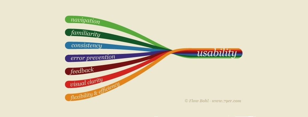
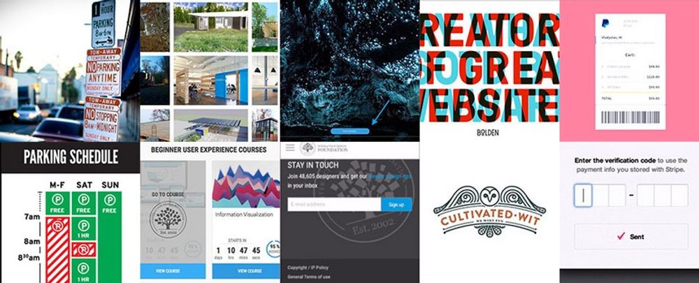
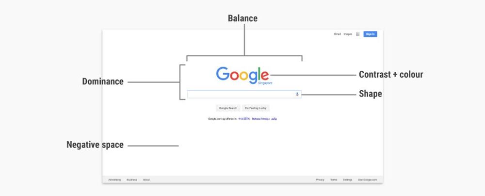
Usability and user experience (UX) are not the same thing: the usability of a product is a crucial part that shapes its UX, and hence falls under the umbrella of UX. While many might think that usability is solely about the “ease of use” of a product, it actually involves a great deal more than that. So, let’s find out more about usability here and be absolutely certain about the nature of this fundamental building block of our craft!
The ISO 9241-11 standard on usability describes it as:
“The extent to which a product can be used by specified users to achieve specified goals, with effectiveness, efficiency and satisfaction in a specified context of use.”
– ISO 9241 Ergonomics of Human System Interaction
Usability is hence more than just about whether users can perform tasks easily (ease-of-use). It also deals with user satisfaction—for a website to be usable, it has to be engaging and aesthetically pleasing, too.
Why Does Usability Matter?
Before we delve deeper into what usability entails, it’s vital to address the importance of usability. Usability matters because if users cannot achieve their goals efficiently, effectively and in a satisfactory manner, they are likely to seek an alternative solution to reach their goals. And for websites and apps, alternative solutions are abundant. Quite simply: if your product is not usable, its UX will be bad, and users will leave you for your competitors. Given that, designers looking to develop products with longevity need to ensure that those products are usable or risk losing users to their competitors.
In fact, a 2015 joint research by Huff Industrial Marketing, KoMarketing and BuyerZone (see the link at the end of this piece) on B2B web users showed that 46% of users leave a website because they can’t tell what the company does (i.e., a lack of effective messaging), 44% of users leave due to lack of contact information, and 37% of users leave due to poor design or navigation. This goes to show the potential harm bad usability can bring to your website.
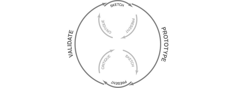
Usability is the outcome of a user-centered design process. That is a process which examines how and why a user will adopt a product and seeks to evaluate that use. That process is an iterative one and seeks to continuously improve following each evaluation cycle.
“Usability, fundamentally, is a matter of bringing a bit of human rights into the world of computer-human interaction. It's a way to let our ideals shine through in our software, no matter how mundane the software is. You may think that you're stuck in a boring, drab IT department making mind-numbing inventory software that only five lonely people will ever use. But you have daily opportunities to show respect for humanity even with the most mundane software.”
― Joel Spolsky, software engineer, writer and creator of project management software Trello
The 5 Characteristics of Usable Products
In 2001, Whitney Quesenbery, the UX and Usability Expert and former President of the Usability Professionals’ Association (UXPA), offered five criteria that a product must meet to be usable:
Effectiveness
Efficiency
Engagingness
Error Tolerance
Ease of Learning
1. Effectiveness
Effectiveness is about whether users can complete their goals with a high degree of accuracy. Much of the effectiveness of a product comes from the support provided to users when they work with the product; for example, fixing a credit card field so that it only accepts a valid credit card number entry can reduce data entry errors and help users perform their tasks correctly. There are many different ways to provide support—the key is to be as informative as possible in a meaningful way to the user.
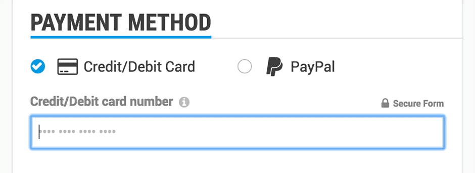
In the IxDF payment form, we restrict the number of digits you can enter into the credit card number field to reduce data entry errors.
You might also want to examine the language used in your product—the clearer and simpler that language is (ideally 6th-grade level), the more likely that your information will have the right impact on the user. Using the right level of technicality—for example, reducing the number of technical coding terms for a design-focused website—also helps make your messages clearer and meaningful to users.
Redundancy in navigation can sometimes be beneficial; if users have multiple paths to their objective, they are more likely to get there. This may reduce the overall efficiency of the process, however, so a balance has to be struck.
2. Efficiency
Effectiveness and efficiency have come to be blurred in the mind. They are, however, quite different from a usability perspective. Efficiency is all about speed. How fast can the user get the job done?
You’ll want to examine the number of steps (or indeed clicks/keystrokes) to achieving the objective; can they be reduced? This will help develop efficient processes. Clearly labeled navigation buttons with obvious uses will also help, as will the development of meaningful shortcuts (think about the number of hours you’ve saved using Ctrl+C and Ctrl+V to copy and paste text).
So as to maximize efficiency, you need to examine how your users prefer to work—are they interacting via a smartphone or a desktop computer with a large keyboard and mouse? The two require very different approaches to navigation.
3. Engagement
Engagement refers to the level of engagement a system offers. Indeed, engagement has become something of a buzzword, but if you cut through the fluff, you’ll find that engagement occurs when the user finds the product pleasant and gratifying to use. Aesthetics matter here, and it’s why many companies invest a small fortune in graphic design elements—but they’re not the only factors involved in how engaging a design is.
Engagement is not only about looking nice; it’s also about looking right. Proper layouts, readable typography and ease of navigation all come together to deliver the right interaction for the user and make it engaging. Looking nice isn’t everything, as Wikipedia (famous for its ultra-basic design) proves.
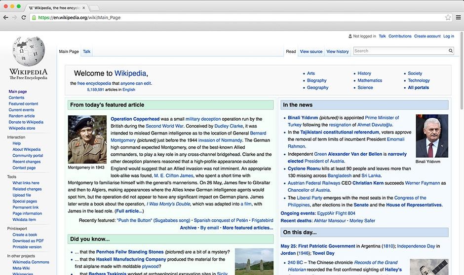
Wikipedia has an ultra-basic layout, but this didn’t prevent its success! The value it offers to people worldwide is so immense that aesthetics are a secondary concern. The focus here is on the ability to find information and the structure of the presentation of the information to facilitate reading. Thus, curious readers can discover facts and access related pages quickly (or efficiently!).
4. Error Tolerance
It seems unlikely that—for any degree of complexity—you can completely eliminate errors in products; in particular, digital products may be error-prone because of the ecosystem in which they dwell – an ecosystem which is beyond the designer’s control.
However, the next best thing is to minimize errors from occurring and to ensure that a user can easily recover from an error and get back to what he or she was doing. This is error tolerance.
Promoting error tolerance, according to Whitney Quesenbery, requires:
Restricting opportunities to do the wrong thing. Make links/buttons clear and distinct, keep language clear and simple, don’t use jargon unless absolutely necessary and keep dependencies in forms or actions together. Limit options to correct choices if you can and give examples and support when asking people to provide data.
Offering the opportunity to “redo”. Give users a way to reset what they’ve just done and go back and start again.
Assume everyone is going to do things you don’t expect them to do. Then, either facilitate that or offer advice/support to get back on the right path.
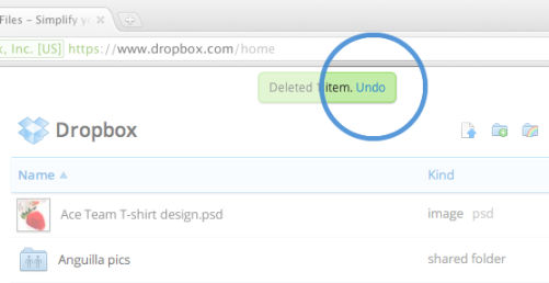
Dropbox has an undo function, in case users accidentally delete items in their folders.
5. Ease of Learning
If you want a product to be used regularly, then you want the users to be able to learn the product easily so that when they use it again, it comes as second nature.
You also need to accommodate ease of learning when releasing new functionality and features; otherwise, a familiar and happy user may quickly become frustrated with your latest release. This is something that tends to happen a lot on social networks; whenever a new set of features is released, they tend to be greeted with howls of outrage from comfortable users, even if they’re better than the old features. And this is true even when the new features are also easy to learn. Facebook’s switch to the ‘Timeline’ format in 2012 (after giving users months to shift from the previous format) offered a prime example of this curious reaction from some users.
The best way to support ease of learning is to design systems that match a user’s existing mental models. A mental model is simply a representation of something in the real world and how it is done from the user’s perspective. It’s why virtual buttons look a lot like real buttons – we know that we push buttons. The form elicits the appropriate action in the user, hence making it easy to learn.
Utility + Usability = Usefulness
When you’re designing for usability, it’s important to think about utility, too. While usability is concerned with making functions easy and pleasant to use, utility is about providing functions that users need in the first place.
Only when usability is combined with utility do products become useful to their users. A mobile payment app could provide the most usable feature of adding the people around you on Facebook, but because most users of that app wouldn’t need that feature, it’s going to be useless to them. All your effort towards building the most user-friendly feature could go to waste if that feature isn’t needed.
The Take Away
Usability is more than just ease of use. You need to ensure designs are efficient, effective, engaging, easy to learn and error tolerant if you want them to succeed. Of course, there are limitations on the value of usability, and sometimes trade-offs have to be made to ensure economic viability, for example. However, when there is no such conflict, usability should be the priority.
References & Where to Learn More
Course: The Practical Guide to Usability
Cockton, G. (2013). Usability Evaluation. In Soegaard, M. & Friis-Dam, R. (eds). The encyclopedia of Human-Computer Interaction (2nd Edition)
Five Simple Usability Tips (2016)
When Should I Conduct Usability Testing for a Product? (2016)
ISO 9241 Ergonomics of Human System Interaction
B2B Web Usability Research Report
Quesenbery, W. (2001). What does Usability mean? Looking Beyond “Ease of Use”. In Annual conference-society for technical communication (Vol. 48, pp. 432-436)
Hero Image: Copyright holder: Flow Bohl. Copyright terms and license: All rights reserved.
