Your constantly-updated definition of Usability Evaluation and
collection of videos and articles. Be a conversation starter: Share this page and inspire others!
288shares
What is Usability Evaluation?
Usability evaluation assesses how easy and enjoyable it is for users to achieve their goals while using a product. Designers use qualitative and quantitative research methods to identify User Experience (UX) issues.
"If a User is having a problem, it's our problem." – Steve Jobs
Usability evaluation is important in design and essential for user satisafaction, but it's not enough by itself. In this quick video, you'll find out why usability evaluation is only one part of the whole picture. When you use it along with other tools designers have, you can come up with better and more useful solutions.
ShowHide
video transcript
Transcript loading…
To fully understand usability evaluation, it’s necessary to grasp the concept of usability first. The International Organization for Standardization (ISO) defines usability as:
“The extent to which a product can be used by specified users to achieve specified goals with effectiveness, efficiency, and satisfaction in a specified context of use.”
– ISO 9241-11, Ergonomics of human-system interaction—Part 11, Guidance on usability
Usability Evaluation measures (or in some cases, predicts) this effectiveness, efficiency and satisfaction. You can use usability evaluation methods at any stage of design or development.
Effectiveness checks how accurately users achieve goals in specific situations.
Efficiency looks at the resources used to accomplish goals.
Satisfaction examines how comfortable and pleasant the system is to users.
Let's take an online fitness tracker app as an example. You've downloaded the app to log your daily workouts. Effectiveness measures how accurately the app records the type and duration of your exercises. If it consistently gets this right, that's effective tracking.
Efficiency looks at how the app uses your phone's resources. Is it draining your battery too quickly while you log your workouts?
Satisfaction refers to how users feel about the entire experience. For example, how easy is it to set your fitness goals and track your progress?
In this example, user evaluation helps designers create a fitness app that is easy to use and meets the users' needs.
When to Use Usability Evaluation
Designers who learn how to use usability evaluation throughout the design process will find themselves at an advantage.
Evaluate early on in your design process: An architect will always check that a building's foundation is solid before construction begins. Similarly, usability evaluation can be a powerful foundational step in the early design and prototyping stages.
For example, a design team might use usability tests on an early prototype of a smartphone to catch potential issues like unclear navigation. You can save time and resources when issues like this are found and fixed early.
William Hudson, UX strategist and educator, explains why tree testing and first-click testing can be useful early in your design process.
ShowHide
video transcript
Transcript loading…
Evaluate throughout your design process: Continuous user feedback keeps a product on the right track throughout the design process. Designers who get user feedback throughout product development can rest assured that their product meets user needs and expectations.
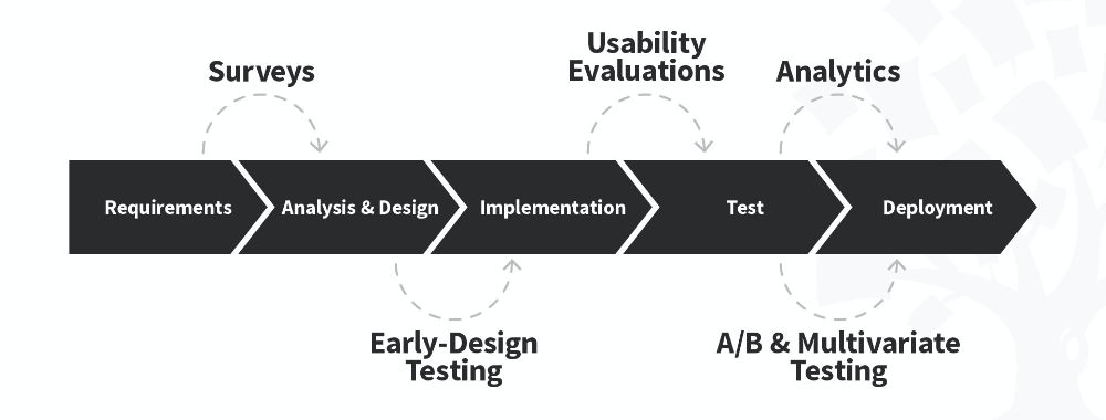
Usability evaluation happens at every step of a project, including during the requirements, analysis and design, implementation, testing and deployment stages.
Evaluate before you launch a new product or relaunch an existing product: Always conduct usability evaluation when you're getting ready to make big changes or launch a new product. You can think of it like taste-testing a new recipe before you decide to use it for a special occassion.
For example, if you’ve been hired to redesign an online store, usability evaluation will help you ensure the site is user-friendly.
You’d use remote usability testing to make sure the process of buying products is smooth and error-free and it’ll be easy for more people to make purchases.
Why Usability Evaluation is Important in User Experience (UX) Design
Usability evaluation acts as a sense checker and keeps User Experience (UX) designers user-focused. Usability, a subset of UX design, makes sure that products are simple to use, work well, and meet users’ expectations.
User Experience (UX) encompasses the overall emotional and psychological response a user has when using a product.
Let’s look at why usability evaluation is important in UX design:
User-centered design: Usability evaluation keeps the design focused on the people who will use the product. It ensures the user’s needs drive design decisions. This leads to a more effective and user-friendly interface.
Problem identification: Usability evaluation methods help find potential problems within the user experience. Feedback from real users gives the design team useful insights that help them identify opportunities.
Iterative improvement: Regular usability testing helps designers make continuous improvements. They test, improve, and test designs again, which leads to small but valuable improvements and a better user experience.
Reduced costs: Design teams can use early-stage usability checks to save time and resources. It's a cost-friendly way to prevent expensive changes after the product is released.
Competitive advantage: Products that go through usability testing often do better than their competition. It can result in users sticking aroundmore and help the brand build a solid reputation.
Alan Dix, professor and bestselling author, walks through three non-negotiable usability guidelines.
ShowHide
video transcript
Transcript loading…
Usability Testing vs Usability Evaluation - What’s the difference?
Usability testing involves observing the behavior of real users and is the most used usability evaluation method.
Take a group of people trying out a new mobile app for example. UX researchers will observe to see if any issues come up. These observations could include issues like a menu that’s difficult to find and a confusing signin process.
Usability evaluation includes usability testing, asking users for feedback (also known as inquiry) and examining the product's design (also known as inspection).
The Three Main Types of Usability Evaluation
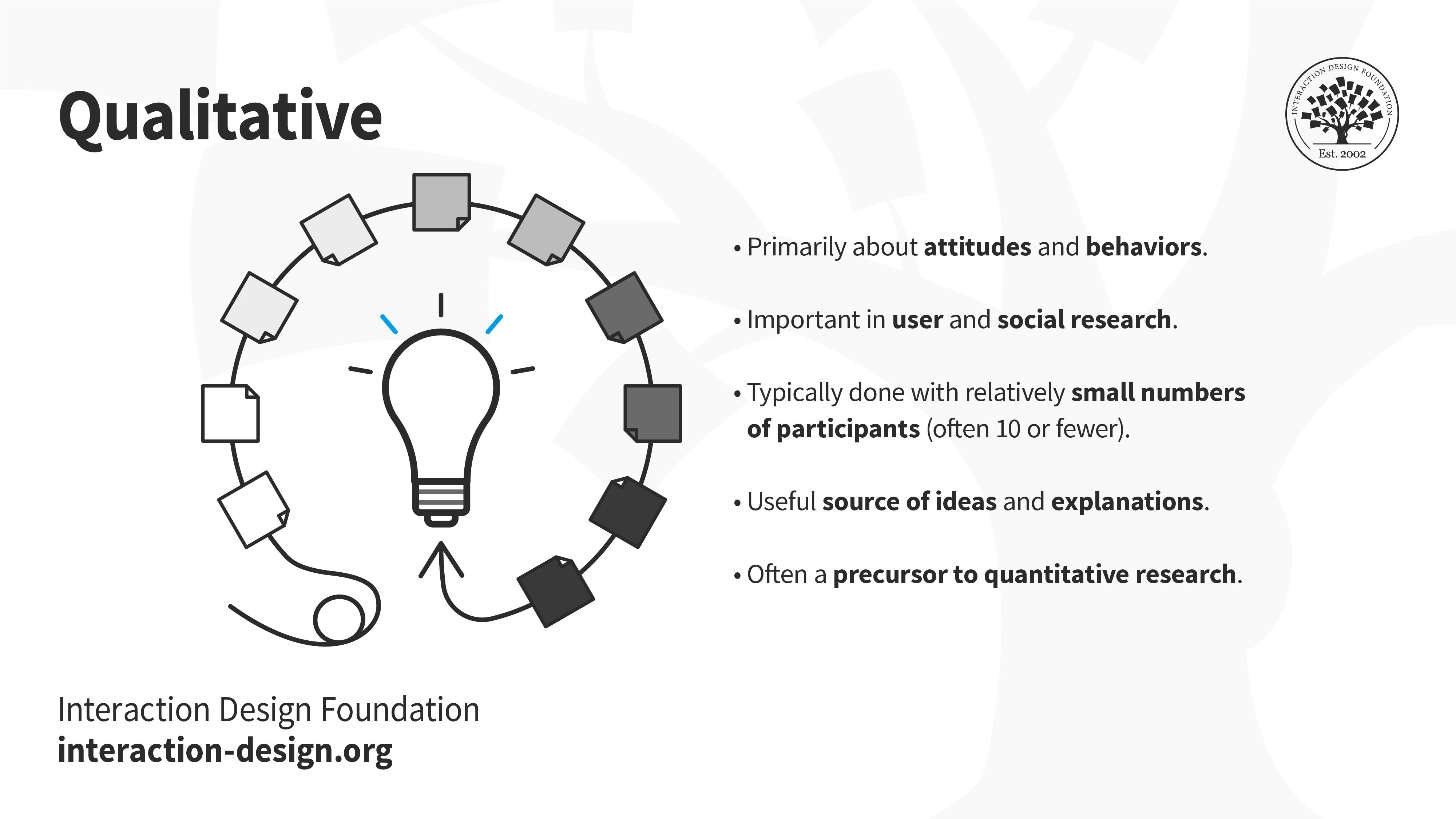
The three main types of usability evaluation are usability testing, usability inquiry, and usability inspection. Together, these methods provide rich qualitativeuser insights. Researchers use these insights to gain a better understanding of user interactions, preferences, and challenges.
Often conducted before quantitative research, the qualitative research methods used in usability evaluation provide insight into user attitudes and behaviors. Qualitative research methods are typically done with 10 participants or less. Researchers use interviews and focus groups in combination with usability testing to obtain these qualitative user insights.
Like watching people trying to cook a new recipe, usability testing involves observing real users. In the same way a chef in the kitchen can see if an ingredient is hard to find, UX designers can spot issues by watching how users behave. This qualitative hands-on approach provides actionable insights that ultimately help make the product easier to use.
2. Usability Inquiry
Usability inquiry involves talking to users to find out what they expect and what they need. It's important to get information from users to make designs people like and help them achieve their goals. Two common ways to do this are focus groups and interviews.
In focus groups, participants come together to discuss their experiences. For example, you can organize a focus group to learn how a group of gamers feels about a new mobile game’s interface.
Interviews involve one-on-one conversations. An example of this would be when a designer talks directly to a smartphone user to find out what they like and what their challenges are.
Both focus groups and interviews can help UX designers understand what users want and need.
3. Usability Inspection
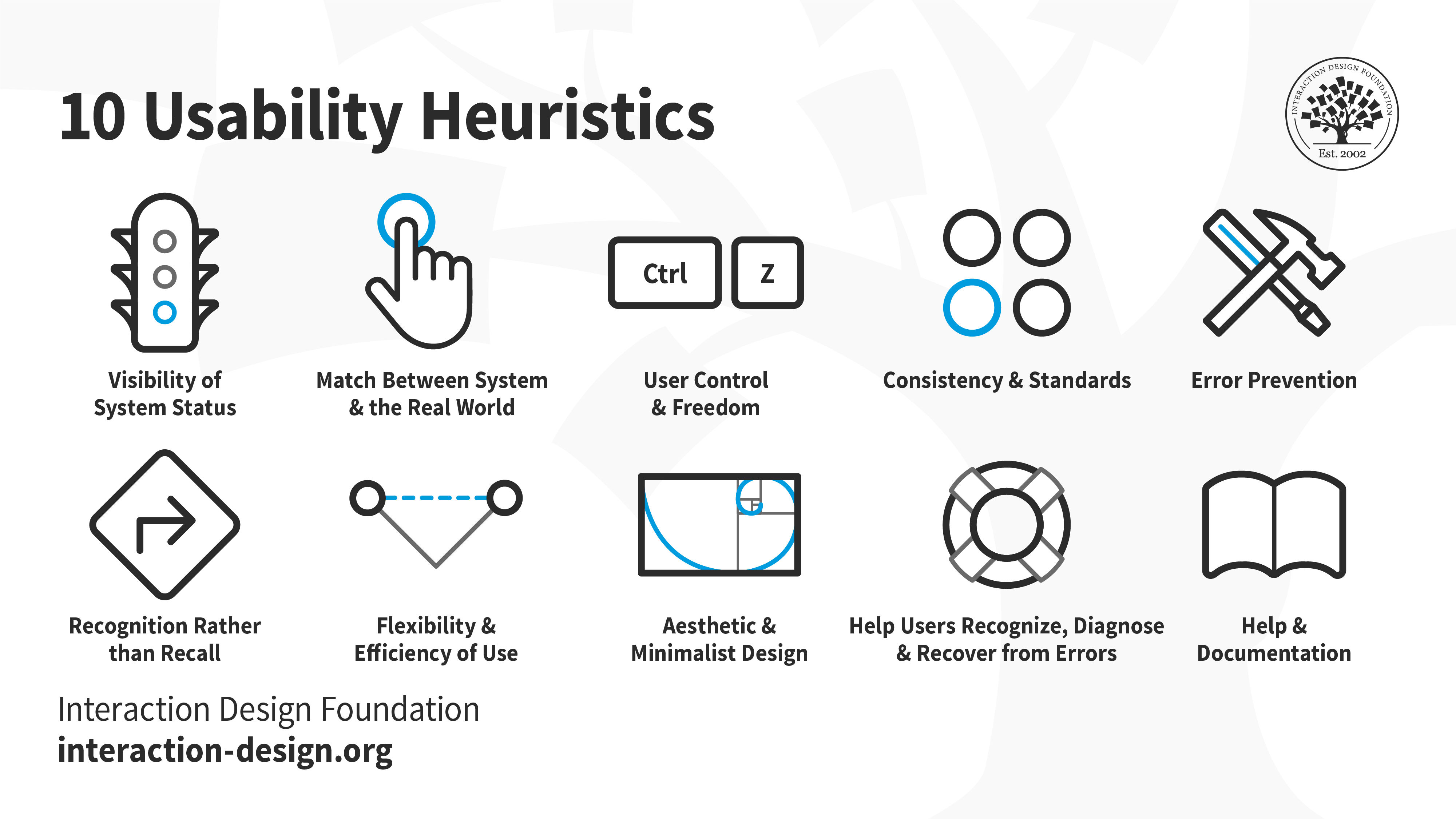
Usability inspection involves expert assessments to find usability problems. Heuristic evaluations and cognitive and pluralistic walkthroughs are methods used to test how easy a product is to use.
Heuristic evaluations use predefined principles. For example, think about testing a mobile app. You'd have a list of guidelines or rules for making a good app, like "clear navigation" and "simple registration." If you had trouble using the menu, you'd use these rules to recommend changes to the app.
The ten Nielsen-Molich usability heuristics are visibility of system status, system match to the real world, user control and freedom, consistency and standards, error prevention, recognition instead of recall, flexibility and efficiency of use, aesthetic and minimalist design, help users recognize, diagnose and recover from errors and help and documentation. These usability heuristics help UX designers measure how user-friendly a digital product is.
Cognitive walkthroughs are when experts pretend to be users. They go through the interface one step at a time to find any problems with how user-friendly it is.
An example of a cognitive walkthrough is when a team of UX specialists, engineers, and experts evaluate a new mobile app:
They plan which specific user activities they want to check. This includes tasks like signing in, finding a product, and completing a purchase.
They perform each step while putting themselves in the mindset of a first-time user of the app.
The goal of this exercise is to identify any problems with how easy the mobile app is to use.
Pluralistic walkthroughs are similar to cognitive walkthroughs. A group of experts, users, and other stakeholders work together to share their perspectives.
For example, a user might say, "I can't figure out how to buy that Nike shoe in size 38." The product manager might interpret that as, "This design doesn't yet match our project goals. It doesn’t give the user the feedback that this particular size is out of stock." This gives a broader view of what needs fixing.
These techniques provide a structured approach to evaluating usability. They also provide useful ideas for improving the design.
Quick Comparison Table: The Three Usability Evaluation Methods
Usability
Evaluation Method
Pros
Cons
Examples
Helpful Tools
Usability Testing
- Real user interactions
- Identifies actual user issues
- Provides direct user feedback
- Requires user recruitment and coordination
- Can be resource-intensive
- Limited to the skills and insights of the test users
UX researchers observe users completing a list of tasks on their new food-ordering app. They make notes of potential usability issues.
You’ll gain useful, valuable insights into the usability of your product if you take a well-thought-out approach to recruitment for usability evaluation.
Recruitment Planning Guidelines
Understand Your Users: Before you start recruiting, figure out who your ideal users are. Take the time you need to get clear about details like their age, what they like, and why they might use your product. This will help you find the right people for the usability evaluation.
Look for people who are genuinely interested in what your product is about. Think about this as if you’re starting a sci-fi book club. Would you invite sci-fi enthusiasts or romance readers? Sci-fi readers who already enjoy the genre are a better fit. You can expect them to engage and provide relevant feedback during book club meetings. In the same way, feedback from users who are likely to use your product in their real lives will provide the valuable insights you’re after.
Refine Your Recruitment Messages: First impressions matter. Your recruitment message is the first point of contact with potential participants. When writing your message, tell users why you're doing this usability evaluation and what's in it for them. Make it easy for users to express interest, learn more and sign up to participate.
Offer Incentives: Incentives can be a powerful tool in user recruitment. Experiment with rewards you offer participants, such as gift cards and discounts. Incentives show your appreciation for their time.
Prioritize Diversity: You’ll gain a better understanding of what real users may think of your product if your recruitment efforts are inclusive. Inclusive recruitment results in a healthy mix of backgrounds and experiences and contributes to more in-depth usability insights.
Instructor William Hudson talks about user research recruitment and how to identify participants who aren’t a good fit.
ShowHide
video transcript
Transcript loading…
Where to Find Usability Evaluation Participants
Existing Users: Your existing user base is a goldmine for usability feedback. It's best to avoid assuming they'll join in. Invite your users to join through emails, website pop-ups, social media groups, or even have sales and customer service teams reach out.
Online Platforms: You can tap into the large pool of potential participants available online via social media platforms, user forums, and online communities.
Think about where your target users might naturally gather online. Platforms like Reddit, LinkedIn groups or Discord channels provide spaces where users share their experiences. Many of the users found in these online spaces are willing to take part in usability studies.
Collaborate with User Research Platforms: User research platforms connect UX designers with potential participants. These platforms make it easy to find a lot of different users, which can save time and give you a more diverse group to learn from.
The Nielsen Norman Group discusses five ways to recruit participants for user research.
How to Deal with Common Usability Evaluation Challenges
A lack of budget, time and buy-in from stakeholders can derail even the best-laid usability evaluation plan. Experienced UX designers understand the importance of forward planning. Instead of viewing these challenges as obstacles, try to see them as opportunities.
How to Handle Small Budgets and Tight Timelines
Tight budgets and timelines can limit resources available for usability evaluations. You can still get valuable insights into user experiences if you learn to work with these challenges.
Strategies you can use to deal with a restrictive usability testing budget and time constraints:
Focus on Key Objectives: Identify the aspects of usability that match project goals. You can then allocate limited resources to the most impactful areas of usability.
For example, an online clothing store would focus on making it easy to buy clothing and search for specific items. They’d focus their resources on testing the checkout and search functionality.
Lean Methodologies: Efficient usability testing methods like guerrilla testing are quick, informal approaches that provide valuable insights.
Open-Source Tools: Open-source usability testing tools keep costs down. These tools will help you conduct usability assessments without a big financial investment.
Managing Resistance to Usability Changes
Resistance to usability changes, often from stakeholders, poses another challenge for many UX designers. It’s necessary to overcome this resistance if you want to improve certain aspects of the product based on usability findings.
Strategies you can use to overcome resistance to usability changes:
Keep Communication Open: Establish open lines of communication between researchers and stakeholders. Clearly explain why you suggest the changes you’ve proposed.
Show Clear Proof: Back up the suggested changes with data, feedback from users, and usability metrics.
Highlight Long-Term Benefits: Point out the good that will happen in the long-run because of user-centric design. Teach stakeholders how valuable it is to fix usability issues early in the design process. Emphasize benefits like more satisfied users, spending less money, and building stronger loyalty to the brand.
Get your free template for “Good Questions for Stakeholder Interviews”
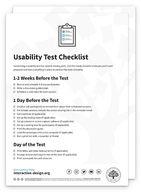
Get your free template for “Usability Test Checklist”
Questions related to Usability Evaluation
How do you evaluate the usability of a website?
UX design professionals use usability testing to evaluate how easy it is to use a website:
1. Recruit real users to conduct usability testing.
2. Use Heuristic evaluation such as Nielsen's 10 heuristics, to identify potential usability problems.
3. Perform cognitive walkthroughs to identify potential usability issues.
4. Analyze user feedback and available analytics from user feedback forms, support tickets, and web analytics.
Accessibility and usability are closely related in web design. Watch the video below and read the article, Usability for All, to learn more.
ShowHide
video transcript
Transcript loading…
What is a usability checklist?
A usability checklist outlines the steps needed during a usability test. The researcher is the only person who uses the usability checklist. They do so to ensure they remember to do or say anything important during the test.
Get your free template for “Usability Test Checklist”
What is the difference between usability and heuristic evaluation?
Heuristic evaluation is a specific method within usability evaluation. Experts, often UX professionals, test the product using some predetermined rules or guidelines.
William Hudson, author and instructor in user-centered design, shares what it means to conduct a heuristic evaluation.
ShowHide
video transcript
Transcript loading…
What are some highly cited scientific research about usability evaluation?
1. Nielsen, J. (1993). Usability Engineering. Academic Press.
You’ll find a framework for usability engineering and improving the usability of interactive systems in this book by Jakob Nielsen.
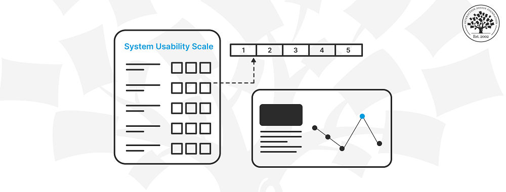
2. Brooke, J. (1996). SUS: A quick and dirty usability scale. In Usability evaluation in industry (Vol. 189, pp. 4-7). CRC Press.
Designers use John Brooke’s System Usability Scale (SUS) to evaluate the usability of products and services.
3. Lewis, J. R. (1995). IBM computer usability satisfaction questionnaires: Psychometric evaluation and instructions for use. International Journal of Human-Computer Interaction, 7(1), 57-78.
Lewis’s paper presents the IBM Computer Usability Satisfaction Questionnaires (CSUQ). These are well-established standardized questionnaires for assessing user satisfaction.
4. Tullis, T., & Stetson, J. (2004). A comparison of questionnaires for assessing website usability. Paper presented at the Usability Professionals Association Conference.
This conference paper compares various questionnaires for assessing website usability.
5. Bangor, A., Kortum, P. T., & Miller, J. T. (2009). An empirical evaluation of the system usability scale. International Journal of Human-Computer Interaction, 24(6), 574-594.
This paper critically evaluates the System Usability Scale (SUS).
Usability testing can be both formative and summative. How you classify it depends on when the testing takes place and for what reason,
Designers use formative usability testing during the initial stages of the design process. You can then use summative testing after the product is released to see how well it works.
Each of these five factors aren’t always equally important for every project.
Short on time or resources? These 5 Simple Usability Tips are easy to implement and won’t break the bank.
What is usability in HCI (Human Computer Interaction)?
Usability is a cornerstone concept in Human-Computer Interaction (HCI). The five usability factors in HCI are how easy it is to learn, how efficiently it works, how well you remember how to use it, how often mistakes happen, and how satisfied you are with the experience.
Remote usability testing is a widely used research method. UX researchers use online tools to capture how test participants use a digital product. The most common types of data collected are screen and voice recordings.
In moderated remote testing, UX researchers follow along in real time and talk to users as they do specific tasks. Moderated testing works well for tricky tasks where more talking and asking questions will help with testing.
In unmoderated testing, the researcher shares a set list of tasks, and the participant does them on their own. Remote usability testing is a practical and money-saving way to observe real people do real tasks.
UX researchers can use AI to streamline tedious work processes. AI tools can look at data, spot trends and figure out how users feel about your product. UX designers who choose to make use of the AI tools available will have more time and mental energy to focus on more important tasks.
It’s important to know AI tools can bring in human biases when people use AI-powered results in decision-making. Designers must use critical thinking when dealing with any type of AI-generated content. Read ‘How Can Designers Adapt to New Technologies?’ to learn more.
AI will eventually impact all areas of UX design. Let’s hear what Don Norman, author and co-founder of the Nielsen Norman Group, thinks about AI.
ShowHide
video transcript
Transcript loading…
Earn a Gift, Answer a Short Quiz!
Question 1
Question 2
Question 3
Get Your Gift
Try Again! IxDF Cheers For You!
0 out of 3 questions answered correctly
Remember, the more you learn about design, the more you make yourself valuable.
It's Easy to Fast-Track Your Career with the World's Best Experts
Master complex skills effortlessly with proven best practices and toolkits directly from the world's top design experts. Meet your experts for this course:
Marc Hassenzahl: Professor of Ubiquitous Design/Experience & Interaction in the Department of Business Computing at the University of Siegen.
William Hudson: User Experience Strategist and Founder of Syntagm.
Put simply, usability evaluation assesses the extent to which an interactive system is easy and pleasant to use. Things
Book chapter
Open Access—Link to us!
We believe in Open Access and the democratization of knowledge. Unfortunately, world-class educational materials such as this page are normally hidden behind paywalls or in expensive textbooks.