User experience (UX) is very much about communicating, advocating and spreading. As UX practitioners, we spend a great amount of our time engaged in these types of activities. To help you learn and understand new buzzwords, I have written this article to introduce some of the words related to the User Experience Ecosystem Design. You will see how often different words cover the same terms in slightly different ways. How do you make sense of this?! Well, I suggest that you pick the words that are easier for you to remember, explain and show with examples.
Not that long ago, we had trouble explaining and conveying the importance of usability. Now, even the term "usability" seems outdated. Human-computer interaction has always been very technical. User-centered design (UCD) is closer to the industry and working environment. It is also self-explanatory. However, as humans, we tend to prefer getting our minds around the shortest concepts.Certainly, UCD is not short enough. It is a framework of processes; as such, it shows the end user's wants, needs, and limitations extensively concerning a particular product or service. It is an intricate, multi-stage process for problem solving: hardly the sort of thing that the human mind can comfortably take in. User experience, on the other hand, is just about right in terms of length and is easier to understand. The difficulty with UXis that most people have not yet grasped its real meaning. UX is as much about strategy as it is about design. It encompasses all of a company’s activities. Nowadays, with the ecosystems invasion in full swing, we definitely need to embrace the holistic meaning of UX.
I’m writing this article using Microsoft Word, and the fact that it keeps highlighting its keywords shows the newness of them. Be aware, though: this will soon change. Omnichannel, touchpoint, transmedia, inter singularity, cross-channel, inter-usability, etc. are words that will, most likely, become part of our everyday vocabulary very soon.
Since language molds our understanding, we need to absorb these new words and use them everyday if we want to keep on top of the changes. We no longer live in just the information age. For this new cross-channel, multiplatform, transmedia information age, we need a whole new glossary.
Dictionary: Cross/Multi/Omni-channel UX Design
The first concepts that I want to introduce have to do with the idea that the ecosystem environment has more than one channel. Not so long ago, we were designing for a single component, such as a website. Now, to design an interactive product, we need to take care of several channels that are related to each other.
Cross-channel seems to be the oldest term used to define our current environment, where technology has faded into the background and information has become shapeless. Information has also got more contextual, and it just surrounds us - it's everywhere. On our hand-held devices and at our desks, we are swimming in a constant flow of information. You can be anywhere in the physical world and still have your personal, professional, and social worlds in the palm of your hand. Modern living is highly interactive and highly personal.
But cross-channel is not alone on this; the same idea goes for multichannel and omnichannel, too. It is about the user having a seamless experience. Whether he or she is using one more screens at the same time on a desktop or mobile device, using a telephone, or is in a traditional bricks-and-mortar store, the experience is one that is smooth and uninterrupted.
The well-known User Advocate, Jakob Nielsen, uses the word transmedia design. In discussing this design, he emphasizes the need to create a separate and distinct UI (user interaction) for each device. At the same time, however, it is vital to retain the feel of a product family, ensuring continuity at several levels. These levels (visual, feature, data, and content) are essential for us to identify products in the marketplace and recognize the brands we know and love.
Do you still feel that all this is too far from your everyday life?
UX Ecosystem Design is here, there and everywhere!
Just think about your book shopping experience, or what the airplane ticketing process is like for you. Or, how about when you are doing your banking. How many channels do you use to deal with these sectors? In the old days (not quite all that long ago, though!), the relationship was 1:1; now, we are in the age of the 1:N relationship. The aim is the same: read a book, take a trip, or manage your bank account. But, where we used to have only one way of doing each activity, and spending an expected amount of time doing it, things have changed. Now, there are multiple ways of reading a book, booking a flight, or doing your banking. There are also multiple stages, or moments, involved in each of these processes now.
Most of us can still recall going to the travel agency to buy a plane ticket. It involved going into town and sitting down at an agent's desk. That was not that long ago! At the same time, though, just to show how much has changed in such a short space of time, those three examples I just used - publishing, air travel, and banking - seem quite old to mention as illustrations now. There are plenty of other industries where we can see this idea in action: home automation, transportation, and health and fitness, for example. There are trendier playgrounds for user experience ecosystems now, not just the old traditional conveniences we once marveled at: times have changed indeed.
In 2014, the best example of the new ecosystem came from the Walt Disney Company with their Magic Band, an RFID (radio-frequency identification) wristband. Walt Disney Park guests wear it to get in priority queues for the attractions, pay for their purchases at the concession stands, and they can even get into their hotel rooms with it. This small wearable accessory is part of the My Magic + service. The Walt Disney Company has invested $1 billion in this set of services. As intended, this has completely changed the park experience.

The Magic Band is a simple wristband that guests can also customize with their favorite Disney characters.
Doesn’t Disney and everything that Disney does and touches feel like an ecosystem all of its own? Concerning the parks, the company has always worked hard to make the guests feel like they are “in a whole new world”. This could largely be why guests go there; they have expectations of being catapulted into a whole new world. The users' wants and needs are being met by a signature and standard that only Disney can deliver. The Magic Band is many things in one package: a device, a website, an app, and, above all, a holistic user experience, right there on the user's wrist. The Walt Disney Company created the Magic Band to enable a seamless interaction of channels, systems, and divisions that goes across boundaries smoothly and effectively. It is a good cross-channel UX strategy and design because of this, and all packed into a single wristband!
The term "ecosystem" has its origins in biology and in the rich and complex interaction between animals, plants, natural resources and the environment. As user experience designers, we can easily relate to this idea that nothing exists in isolation and free from the effects of context.
Dave Jones, a user experience designer at The Nerdery in Minneapolis, defines a UX ecosystem as, "...a set of interdependent relationships between components within an information environment”. The components are the people, their goals and practices, the digital and analog technologies that they use to connect and share information, and the information they share.
This means that they are points of interaction between a business and its end users. Peter Morville, a pioneer in the fields of information architecture and user experience, gives us (in the image below) a touchpoint taxonomy. Although it is not comprehensive, it does make the point that the sheer diversity of products, channels, devices, platforms, scales, media, and contexts is an awesome one.
This is where service design comes in handy. It is not just about website or app design; it is about taking into account ALL touchpoints, both in the digital and physical worlds. Service design, with tools such as the service blueprint, the touchpoint matrix, or the customer experience map, is the approach to use in the UX design of ecosystems. If we want to ensure seamless interactions across systems and devices, we need methods and tools that help us point them out and ensure a consistent experience among them.
The definition of service design on the Service Design Network website outlines the main characteristics of this “new” type of design. “Service design is the activity of planning and organizing people, infrastructure, communication and material components of a service in order to improve its quality and the interaction between service provider and customers. The purpose of service design methodologies is to design according to the needs of customers or participants, so that the service is user-friendly, competitive and relevant to the customers.”
Service design and the taxonomy of touchpoints
With the ecosystem concept comes the “touchpoint” idea. It is very important to understand that we cannot view these “points” as the components mentioned above. Instead, we must look on them as being key moments of contact between the company and the user.
In a single image, we see the myriad of components that we need to take into account. Yes, it is about user interface and interaction design. However, there is much more to it than that. We also have the topics of inter-usability (a new way of coping with cross-platform design so that the user feels that all his or her devices are working in concert), industrial design, service design, conceptual models, manufacturing and productization, and platform design to consider here.There are others, too.

Author/Copyright holder: Peter Morville. Copyright terms and licence: All rights reserved Img source
Peter Morville created this slide to advocate for cross-channel strategy and the importance of touchpoints.
Doesn’t the definition ring a bell? Isn’t the last sentence also applicable to user-centered design or UX? Indeed, the aim is to tailor the design to the customer.Therefore, the mindset is the same, except that, in the design of services, we consider more components and apply methods and tools conceived to take all touchpoints into account.
Intertwingularity and the cross-channel crystal
We have briefly outlined a definition of ecosystem design and the techniques related to it. Let’s see some of its design principles now. Seamless interaction is the end goal, but how do we ensure it? Jakob Nielsen mentions continuity at different levels. Peter Morville has put the main aspects in the cross-channel crystal, in which we also find the continuity principle:

Author/Copyright holder: Peter Morville. Copyright terms and licence: All rights reserved Img source
These are Morville’s explanations for each facet:
Composition: The mix of platforms, devices, and media (and their features). Is the service multi-channel or cross-channel?
Consistency: The company has to balance its brand, features, organization, and interaction perfectly against platform-specific optimization so that there is symmetry between each part.
Connection: Bridges across channels (e.g., links, tags, addresses, barcodes, signs, maps) must be visible at the point of need.
Continuity: Apps should maintain state, so users can flow between devices while reading books, watching movies, shopping, etc.
Context: How will time, location, device constraints, and personal or social context impact usage and user psychology and behavior?
Conflict: To address channel conflict and free riding, we may need to realign incentives, metrics, the business model, and the organizational chart.
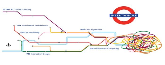
Remember that intriguing image we had at the beginning of the article? After shedding some light over multi-channel strategies and the wide spectrum of service touchpoints, we are now equipped to come full-circle and understand what inter singularity is:
Intertwingularity. The American pioneer of information technology, Ted Nelson, coined this term to express the complexity of interrelations in human knowledge. Basically, it refers to the point that, while people believe that they can put an order to information (i.e., categorize it and sort it into sequences, etc.), they actually can't do this. Intertwingularity is all about information being in a kind of flux, where there are no easily found subjects because everything is so cross connected. An example could be a university subject that is multidisciplinary, such as Linguistic Archaeology. There, there are many subjects buried by the complexity of their relationship to one another. Another example is a polyseme - a word with different but still related senses, such as "good" (you can be a good writer, but if you don't do anything else, you may not be a good friend, citizen, etc.). Intertwingularity defines an era at the crossroads of ubiquitous computing and the Internet. In an era where we can interact and access information anywhere and everywhere, we find ourselves at a place where information blurs the boundaries between products and services. It is ironic that the same advancements that enable cross-channel, multiplatform, transmedia, and physico-digital user experiences - things that simplify and improve life for us - are subject to inter singularity. Perhaps that is the price of sophistication.
I hope that this short dictionary helped you make sense of all the closely related words in the User Experience Ecosystem Design. Which one is your personal favorite and why? Do you keep your own UX dictionary?
Keep in mind that this is just the beginning! We are now setting the stage as we adapt our mindsets to something new. Next, we will have to get to know and get some practice with the methods and techniques we will need. For now, just watch this space!
References:
Header Image: Author/Copyright holder: Peter Morville. Coypright terms and licence: CC BY 2.0
