Have you ever clicked on a button that didn't respond? Or have you found yourself lost in a maze of confusing menus? You’re not alone! Such interactions lead to users' frustration and missed business opportunities.
If you’re a designer, developer, or business owner, you’ll want to understand what counts as good design vs bad design. After all, it helps you create a better digital product for your users.
We’re taking a different route. Instead of highlighting what to do right, we’ll examine glaring examples of bad UI design. This educational detour can help you save time, money, and your user’s patience.
© Interaction Design Foundation, CC BY-SA 4.0
You might wonder, “Why focus on the negatives?”
Recognizing bad user interface examples alerts you to trouble before you make the same mistakes in your projects. For example, 88% of online shoppers say they won't return to a site after a bad user experience. That kind of insight shows why you should be familiar with the pitfalls related to bad UI design.
Note: While the websites and apps featured in this article may have been updated since its publication, they still serve as valuable examples of bad UX design to learn from and avoid. Since platforms—especially popular ones—are constantly evolving, you may want to revisit their current versions to identify any new UX issues.
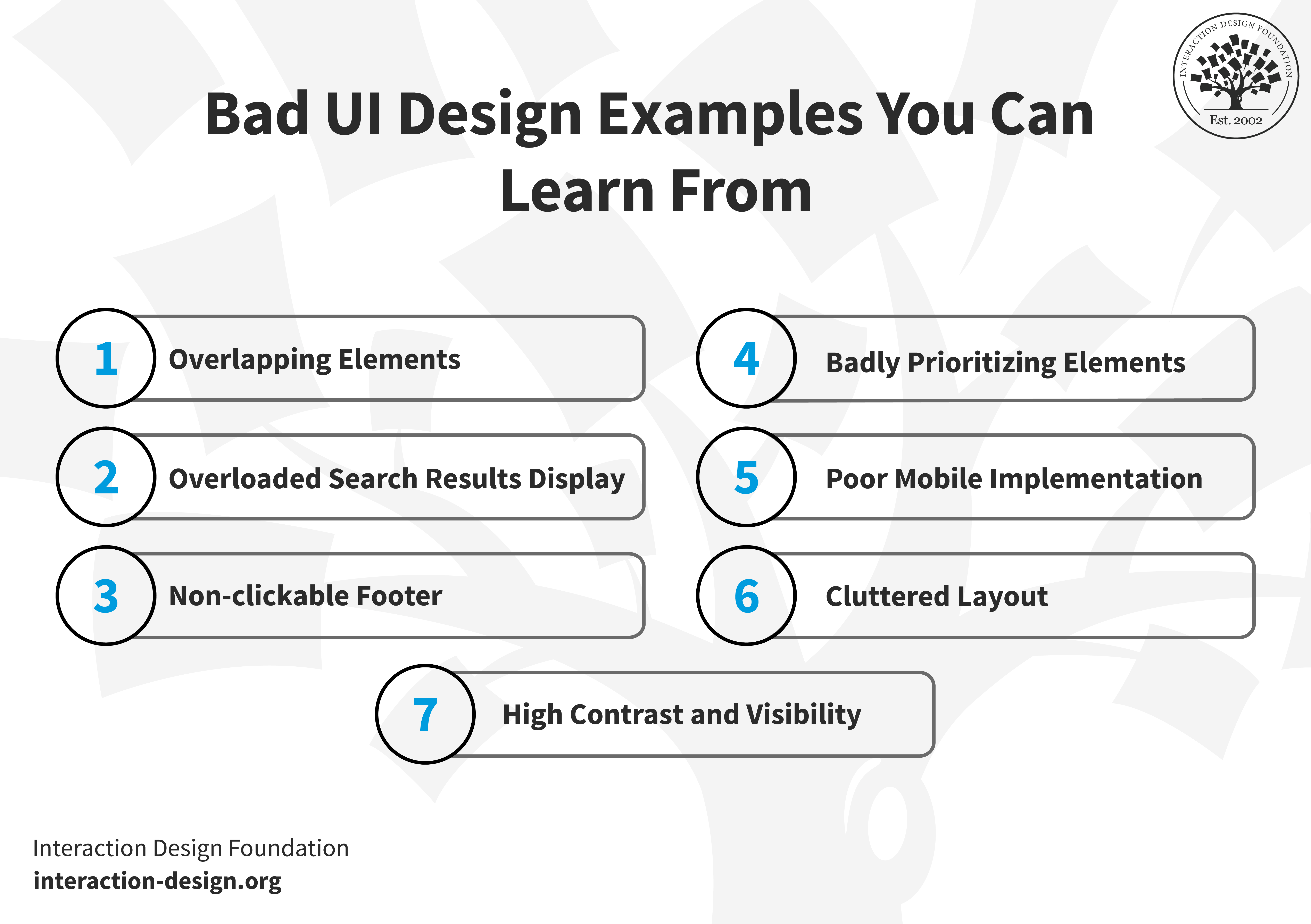
Table of contents
- Example 1: Overlapping Elements
- Example 2: Overloaded Search Results Display
- Example 3: Non-clickable Footer
- Example 4: Badly Prioritizing Elements
- Example 5: Poor Mobile Implementation
- Example 6: Cluttered Layout
- Example 7: High Contrast and Visibility
- Most Common Bad UI Design Mistakes and How to Avoid Them
- The Take Away
- Where to Learn More
Example 1: Overlapping Elements

© X, Fair use
In user interface design, we aim for perfection. However, even the most prominent platforms sometimes miss the mark. Here's a look at a particular UI example from X, previously known as Twitter.
Why Does This Example Stand Out?
The graphic showcases a snapshot from X, a platform with 368 million monthly active users worldwide. Given its prominence, one would expect impeccable design. Yet, this snippet reveals a glaring issue that may annoy many users. Thus, we find this example a worthy subject for our analysis.
The Mistake
At first glance, you'll notice the overlapping "+" icon, partially obscuring the tweet's text. Not only does it make the tweet harder to read, but it also disrupts the visual flow. Overlapping elements, especially the main content and an action button, can lead to user confusion, mis-clicks, and frustration.
Why Avoid Such Overlaps?
Overlaps like the one observed can detract from the user's experience. Today’s users skim and engage. Any hindrance can decrease user engagement or even platform abandonment.
Moreover, with an increasing emphasis on accessibility, platforms strive for inclusivity for all users. Such mistakes can further alienate a significant user base.
Learnings and Ideal Solutions
From this design misstep, we learn:
Importance of thorough testing:
You must test across multiple screen sizes, resolutions, and devices. Understand that design glitches might not appear uniformly but need addressing even if a minority faces them.
Ideal solution - spacing and prioritization:
Reposition, resize, or dedicate space for action buttons like "+."
Avoid overlap with dynamic content such as tweets.
Adopt a grid system and maintain consistent spacing.
Importance of iterative feedback loops:
Engage real users for feedback.
Large platforms like X should prioritize regular usability tests.
Address and implement user feedback promptly.
Example 2: Overloaded Search Results Display
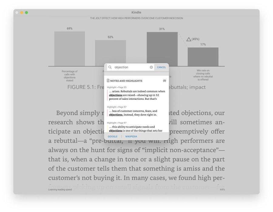
© Kindle Mac app, Fair use
The Kindle Mac app offers a vast collection of books in digital format. With its emphasis on user experience, convenience, and portability, the platform has gained 30 million active users in the US alone.
Why Does This Example Stand Out?
This Kindle Mac app differs from the familiar Kindle and other e-reader platforms. Such a bold departure highlights the importance of examining the impact of UI decisions on the user experience.
The Mistake
The biggest misstep is the search result presentation. The search function holds more importance in digital reading environments. Users look for specific sections, references, or recaps of certain parts.
Instead of leveraging a familiar, organized sidebar or a drop-down menu, the app opts for an intrusive overlay method. This disrupts the reading flow and leaves users grappling with out-of-context snippets.
Avoiding Over-Complexity
Such an unconventional method brings forth the question, Why?
Innovation is laudable but should not come at the cost of user experience. Over-complicating a traditionally straightforward feature can deter users.
This reminds designers of a golden rule: keep user needs front and center.
Learnings and Ideal Solutions
From this, we learn the significance of user-centric design and the dangers of unnecessary reinvention. An ideal solution would involve:
Sidebar Search Results: A retractable sidebar could present search results in a non-obtrusive manner. This can help users navigate results while keeping their place in the text.
Clear Graphics with Legends: All graphics should have clear indicators, legends, and interactive elements to provide context.
Intuitive Notes and Highlights: Instead of clustering them with search, notes and highlights could have their dedicated section. It will make them easily accessible and organized.
Example 3: Non-clickable Footer
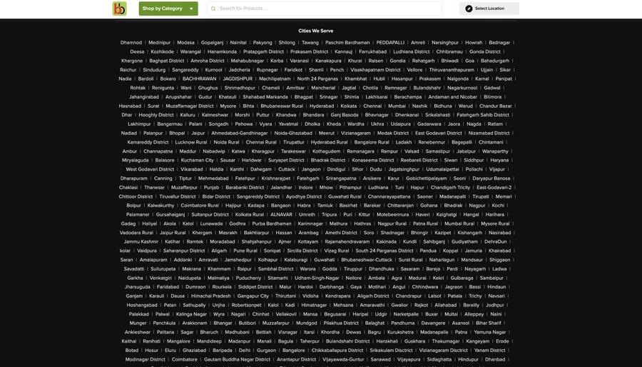
© Bigbasket, Fair use
BigBasket, a prominent online grocery store in India, offers a footer design that, at first glance, may strike one as comprehensive. It lists an impressive number of cities they serve. Upon closer inspection, this design choice reveals significant usability shortcomings.
Why Does This Example Stand Out?
The BigBasket footer is a relevant instance for discussion due to its deviation from typical UX/UI best practices. Web footers are secondary navigation areas that guide users to important links and information. This design allows one to balance comprehensive details and user experience.
Gain a deeper understanding of the concept of user experience in this video.
The Mistake
The primary flaw lies in the presentation of cities. While the vast list implies comprehensive service coverage, the non-clickability of these city names hinders user functionality. Usually, city names in such contexts serve as quick links to localized content or specific city portals. Here, they merely exist as text without providing any actionable path for the user. They are also in no particular order. Discovering a specific city is unnecessarily time-consuming.
Avoiding Functionality Oversights
It's crucial to remember that every design element, especially footers, should have a distinct purpose. Aesthetic features are essential, but not at the expense of functionality. In this case, an extensive list of non-clickable cities can confuse or frustrate users expecting a different outcome.
Learnings and Ideal Solutions
This design choice demonstrates the importance of aligning design elements with precise functions. Here are potential enhancements:
1. Clickable City Links
Transforming city names into an alphabetical list of clickable links would be the most intuitive solution. Clicking on a city could redirect users to a page tailored to that location with localized offers, news, or store listings.
2. Collapsible Lists or Drop-downs
Users may find this extensive list overwhelming. Collapsible sections or drop-down menus could make navigation more streamlined. For instance, designers can group cities based on states or regions to declutter the design while retaining functionality.
3. Clear Visual Indicators
Make non-clickable elements visually distinct from clickable items. A uniform design can mislead users into thinking everything functions the same way.
Example 4: Badly Prioritizing Elements
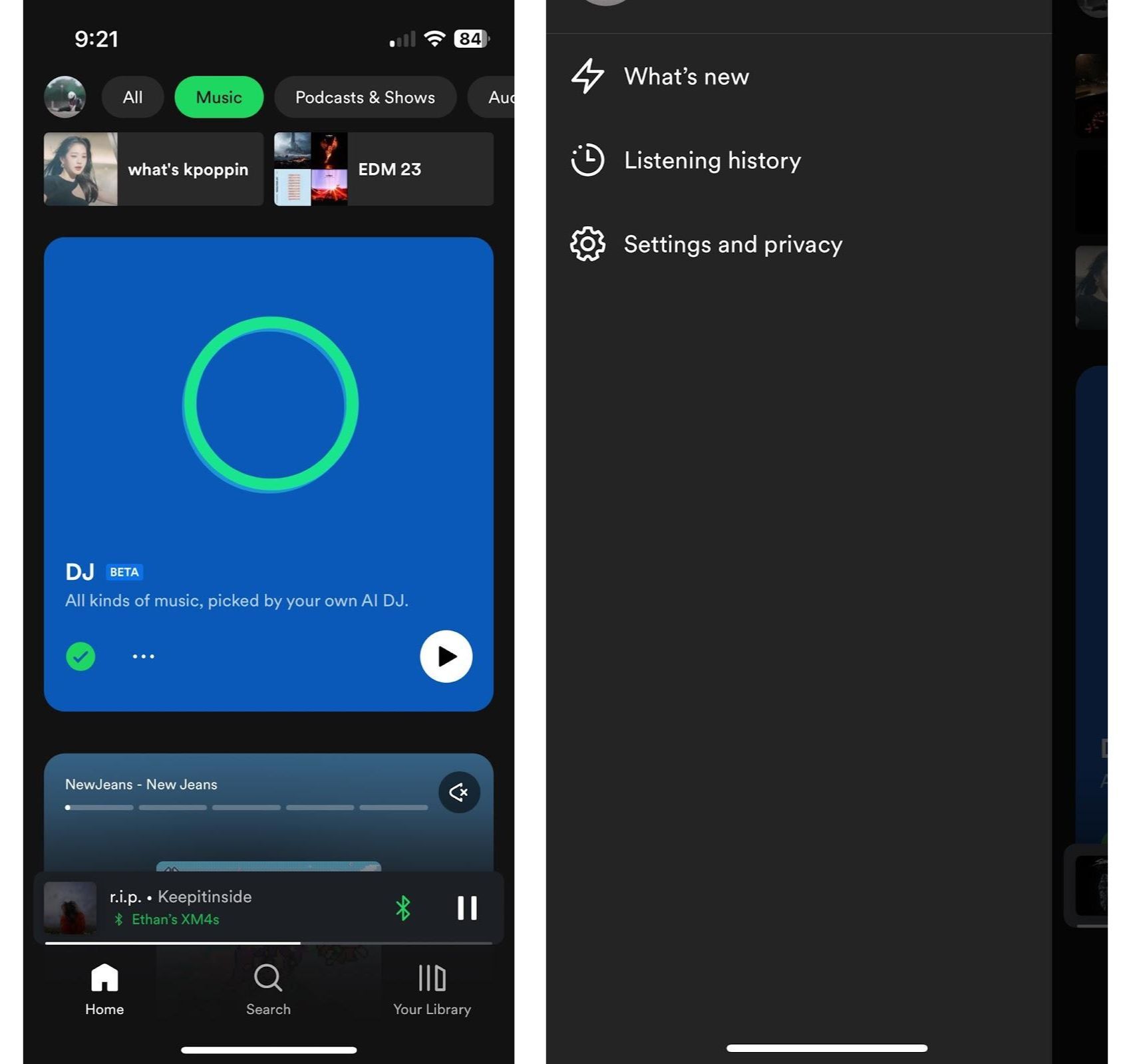
© Spotify, Fair use
Spotify's mobile user interface serves as an ideal model for app design. Its intuitive layout offers users a smooth experience that prioritizes aesthetics and functionality. The images showcase a precise categorization of music, podcasts, and other audio content, with user-friendly tabs like "Home," "Search," and "Your Library." Additionally, the AI-powered DJ feature enhances personalized music discovery.
Why Does This Example Stand Out?
Spotify stands tall as the world's most popular audio streaming subscription service. It boasts over 551 million users and 220 million subscribers across 180+ markets. With such a vast global reach, it must deliver an enjoyable experience. Any deviation from a flawless UI can set a precedent, given its stature and influence.
The Mistake
One notable mistake in this interface is the prominence of non-essential features over primary functions. For instance, Spotify makes essential tabs like "Search" and "Your Library'' less noticeable. Also, the sidebar doesn’t show much information. This layout might confuse or overwhelm a new user unfamiliar with the platform.
Avoiding Misplaced Priorities
Misplaced priorities in design can disrupt user navigation. Users, especially first-timers, look for familiar features, like search functions. Making secondary features more prominent can be puzzling. It may lead to decreased user satisfaction and platform engagement.
Learning and Ideal Solution
This example emphasizes the need for a clear design hierarchy in apps. Users must find the main features easy to use. Spotify can make main buttons like "Search" more extensive and place them in the center. It’ll help users find and use them faster.
Example 5: Poor Mobile Implementation
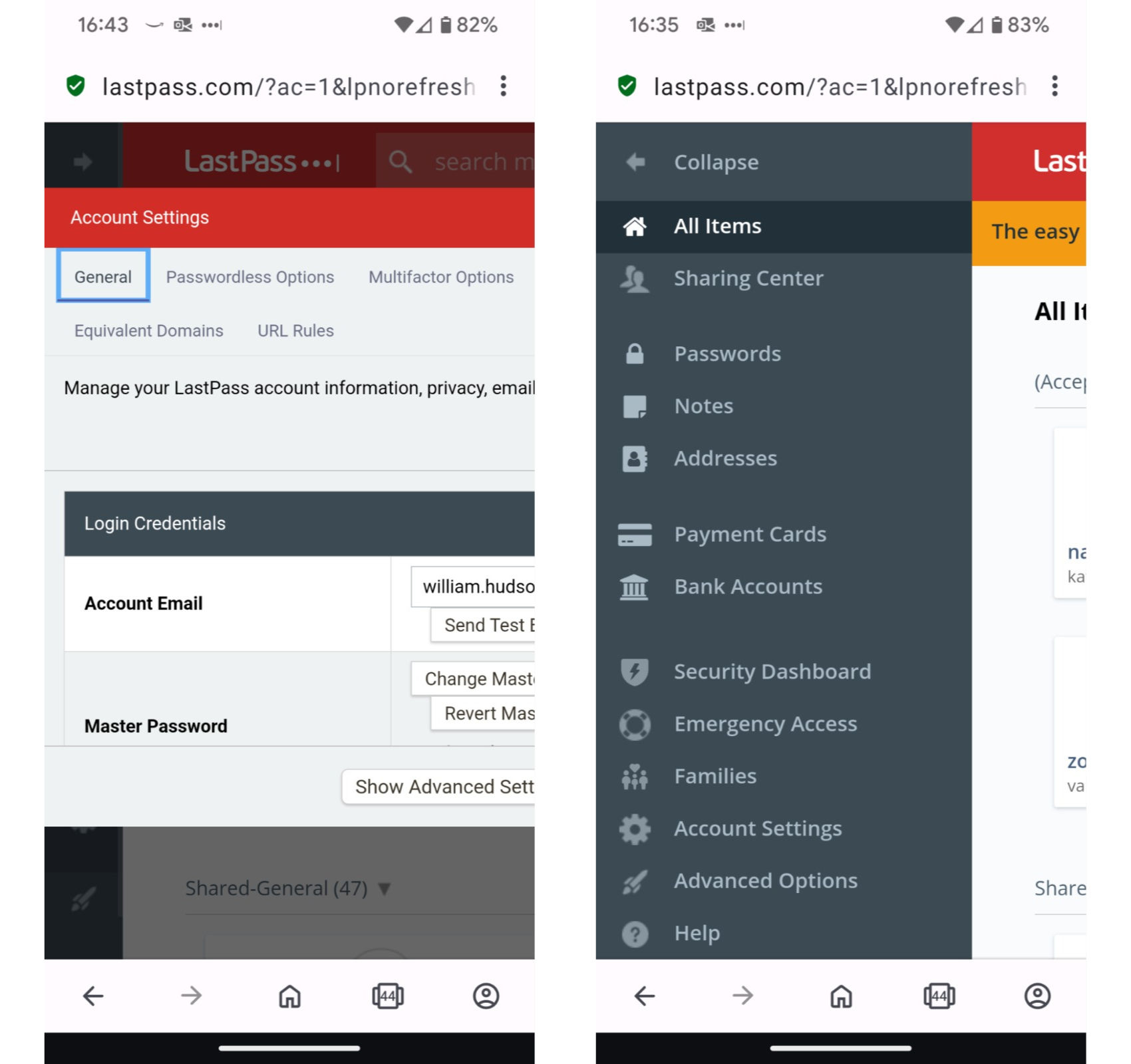
© LastPass, Fair use
LastPass, a password manager tool, earned the reputation of strengthening online security as millions of users and many online businesses use it. Yet, looking closely at its mobile web interface reveals significant discrepancies against its desktop version.
Why Does This Example Stand Out?
For a platform serving over 33 million people and 100,000 businesses, the platform needs to provide the best user experience across all devices. Surprisingly, the mobile version of the LastPass website mirrors the desktop version with no apparent optimization for smaller screens. It creates a jarring user experience.
The Mistake
LastPass didn’t adapt the website interface for the mobile version. Instead, it created a compressed desktop version for the mobile app. Collapsing the side menu to access core functionalities already feels unintuitive. The interface squeezes the vital account settings section and displays only 40% of it. Thus, it forces the users to scroll and adjust to access essential controls.
Avoiding the Desktop-only Approach
Mobile optimization involves much more than fitting desktop content onto a smaller screen. You must restructure, reimagine, and redesign to enhance user engagement on handheld devices. Platforms, especially with large user bases, must invest in responsive design that caters to various screen sizes and devices.
Learning and Ideal Solution
This example reminds you that you must provide consistent user experience across platforms. So, here’s what LastPass can do:
LastPass should work on a complete revamp of its mobile web interface following the design principles. This involves creating a responsive design tailored for its mobile users.
They must make sure that users can easily access essential features.
They should eliminate unnecessary elements that clutter the smaller screen space.
A mobile-optimized version would help Lastpass provide a better user experience and establish its reputation as the best password management platform.
Example 6: Cluttered Layout
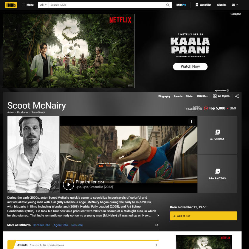
© IMDb, Fair use
The Internet Movie Database, or IMDb, is a renowned platform for movie enthusiasts. With its vast array of information, from actor biographies to film ratings, it has all the info for cinema lovers. But there's a catch: navigating its expansive content can be overwhelming, primarily due to its clunky user interface.
Why Does This Example Stand Out??
This example perfectly highlights the pitfalls of overloading a screen with too much information. While each element might hold individual importance, they collectively create a jumble of visuals that can frustrate users. A successful UI should seamlessly guide the user's journey, not challenge them to sift through a maze of options.
The Mistake
When users open IMDb, they frequently see prominent advertisements. The graphic shows a large section promoting a Netflix series at the top. While revenue from ads keeps the platform free, it counts as bad UX design. A user visits IMDb primarily for its content, and the advertisement's dominance can be off-putting.
Several elements compete for attention on the actor's page (Scoot McNairy, in this instance). There's the actor's photo, a trailer video, a brief biography, and many clickable buttons and links. The presence of various elements, all seemingly clamoring for attention, can be disorienting for users.
The challenge? Distilling what's essential and what's secondary.
Importance of a Well-designed User Interface
A well-designed user interface should guide the user's eyes in a structured manner. In IMDb's case, the visual hierarchy seems off. For instance, the play button on the trailer takes precedence due to its size and placement. This happens even if the user intends to read the actor's biography first.
IMDb houses a lot of data. Representing all that data without overwhelming users is challenging. However, the current design makes it difficult for users to discern and prioritize information.
For instance, the sidebar contains the actor’s star meter, related photos, and other content. It’s a lot to process at once.
Learning and Ideal Solutions
The goal isn’t necessarily minimalism but clarity. Streamlining content presentation and prioritizing user needs over ads can create a harmonious balance. Suggestions include:
Responsive Ad Placement: Instead of dominant ads at the top, consider interspersing them within the content. You can also place them on the sides of the page.
Structured Layout: Organize content into clearly defined sections. Photos, biographies, and filmography should have distinct areas if it's an actor's page.
Enhanced User Navigation: Simplify menus and utilize breadcrumbs. This will inform users where they are and where they can go next.
Example 7: High Contrast and Visibility
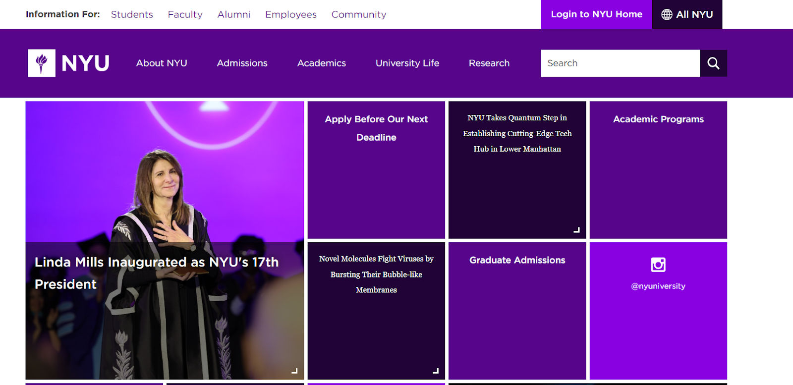
© NYU, Fair use
New York University's (NYU) website prominently features a dominant shade of purple. They use it to reflect their brand identity and serve design functions.
Why Does This Example Stand Out?
Contrast is crucial in web design. It ensures users can easily read and understand the content.
However, NYU’s UI underscores the pitfalls of excessive contrast. The dominant shade of purple matches NYU's branding. However, its overpowering presence can disrupt the natural flow of user interaction.
High contrast, although essential for readability, can become unsettling if not balanced. The panel in the bottom right also fails WCAG 2 color contrast with white for regular text for the AAA guidelines. It has a contrast ratio of 6.66:1 instead of the recommended 7:1.
The Mistake
The website prominently features a deep purple hue with stark white text. The headline "Linda Mills Inaugurated as NYU's 17th President" on a purple canvas makes the content easy to read. However, some viewers may find the color choice unsettling.
The extreme contrast can strain the eyes, especially during extended viewing. Moreover, the repetitive use of such a high-contrast color scheme throughout the site lacks variety. It may make the user experience monotonous, potentially deterring prolonged engagement.
Avoiding Overwhelming Monotony
While purple resonates with NYU's brand, an overreliance on a single shade might risk monotony, causing user fatigue. Using the same hue, without variations or complementary colors, can make the site appear one-dimensional.
Vital information might go overlooked if the color remains uniform without breaks. A user might miss essential sections if everything blends too much. For instance, while the profound purple works well for headlines, using it extensively without variation can overshadow other critical information.
Learning and Ideal Solution
The lesson here is the importance of balance. While maintaining brand consistency is vital, introducing variations or complementary colors can break the visual monotony.
An ideal solution would be to use shades of purple or introduce complementary colors. This will retain brand identity while adding depth and layers to the design. For instance, lighter shades of purple or soft gold could highlight important announcements, making them stand out.
Interested in simplifying your approach to color palettes? Check out this video.
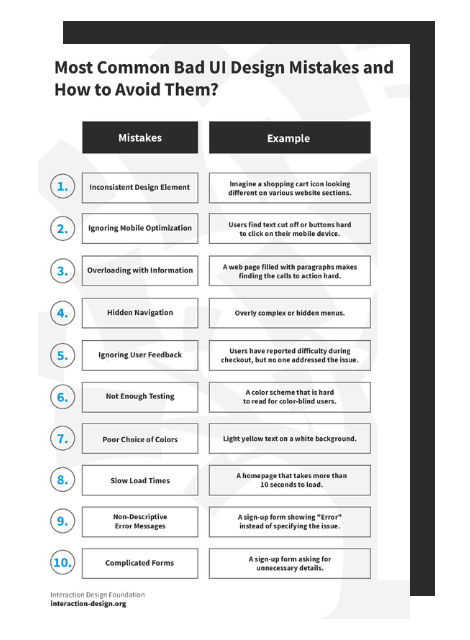
Most Common Bad UI Design Mistakes and How to Avoid Them
“Good design is actually a lot harder to notice than poor design, in part because good designs fit our needs so well that the design is invisible,”
— Don Norman, The Design of Everyday Things
You may find some evident mistakes in website design. Developers and designers can easily avoid these mistakes. Here’s a look at the most common UI mistakes and solutions.
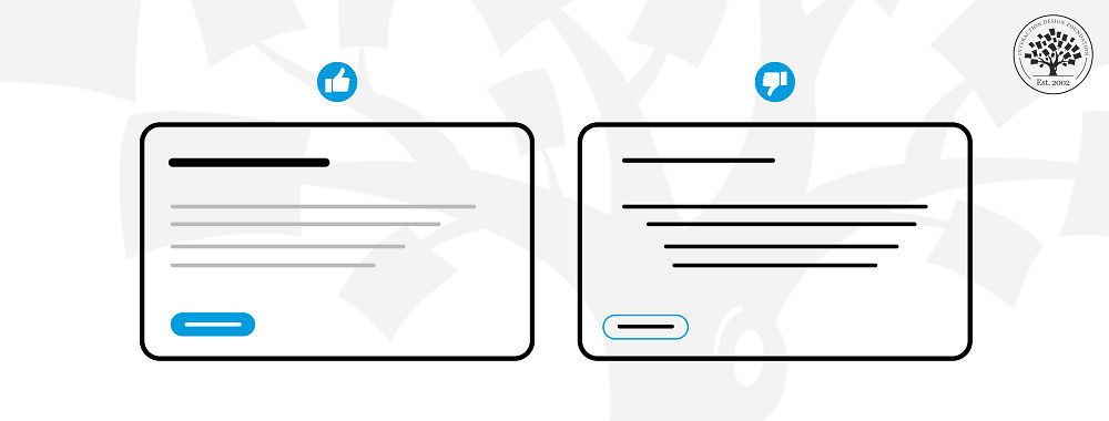
1. Inconsistent Design Element
Mistake: Using many fonts, colors, or button styles across pages.
Example: Imagine a shopping cart icon looking different on various website sections.
Take Away: Maintain design consistency for a professional look and user-friendly experience.
2. Ignoring Mobile Optimization
Mistake: A website looks great on desktop but not on mobile devices.
Example: Users find text cut off or buttons hard to click on their mobile device.
Take Away: Ensure designs are responsive and mobile-friendly to cater to all users.
© Interaction Design Foundation, CC BY-SA 4.0
3. Overloading with Information
Mistake: Bombarding users with too much information.
Example: A web page filled with paragraphs makes finding the calls to action hard.
Take Away: Embrace white space and prioritize essential information.
4. Hidden Navigation
Mistake: Making it hard for users to find what they're looking for.
Example: Overly complex or hidden menus.
Take Away: Ensure intuitive navigation and accessibility.
5. Ignoring User Feedback
Mistake: Not addressing user complaints or suggestions.
Example: Users have reported difficulty during checkout, but no one addressed the issue.
Take Away: Regularly collect and act on user feedback to improve UI.
6. Not Enough Testing
Mistake: Assuming that the design will work for all without thorough testing.
Example: A color scheme that is hard to read for color-blind users.
Take Away: Always test designs on various devices and with diverse user groups.
7. Poor Choice of Colors
Mistake: Using colors that don't align with the brand or aren't web-friendly.
Example: Light yellow text on a white background.
Take Away: Choose a color palette that contrasts nicely, aligns with the brand, and is easy on the eyes. Also, use the minimum color contrast ratio for web accessibility.
8. Slow Load Times
Mistake: Heavy graphics, bloated libraries, or unnecessary scripts slowing down a site.
Example: A homepage that takes more than 10 seconds to load.
Take Away: Optimize images and scripts to ensure fast load times.
9. Non-descriptive Error Messages
Mistake: Providing vague error messages that don't guide users.
Example: A sign-up form showing "Error" instead of specifying the issue.
Take Away: Error message content should be straightforward and instructive. Information needed by developers should be logged elsewhere.
10. Complicated Forms
Mistake: Long and complex forms that deter users.
Example: A sign-up form asking for unnecessary details.
Take Away: Keep forms short, simple, and user-focused. In many countries, requesting more information than is required for a given purpose is unlawful.
Consistency, responsiveness, and user-friendliness can help you avoid these common web design mistakes. Listening to user feedback, regular testing, and intuitive design can significantly impact user engagement and satisfaction.
The Take Away
As we examined the examples of bad UI design, the importance of meticulous attention to detail became clear. Always prioritize user feedback and engage in rigorous testing to make sure your designs are free from glaring errors. Some key insights include:
Always design with the user's experience in mind.
Establish trust through intuitive and aesthetic interfaces.
Continuously gather and act upon user feedback.
Prioritize functionality alongside visual appeal.
Avoid unnecessary complications; simplicity often prevails.
Where to Learn More
Watch Michał Malewicz’s Master Class Beyond Interfaces: The UI Design Skills You Need to Know.
Read some helpful advice to develop an approach to UI Design.
Learn what is User interface (UI) design and User interface (UI) design patterns.


