It’s getting better and better but, still, how many times have you had to justify why user experience matters and what it actually means? To be prepared, as part of your UX toolbox, you should have a set of examples and visuals to ground your arguments. Case studies are great ways to exemplify the relevance of UX for product and service development. Graphics are also great tools to become the perfect advocate of UX.
There are lots of classifications and forms to provide a visual overview of the User Experience field. The truth is that UX is a pretty high level term and often too ambiguous for people outside the field. What does UX exactly mean? Is it a philosophy, a process, a guideline, a standard, a discipline? It will definitely puzzle your colleague/boss/client/grandmother when you reply that UX is all of the above!
UX explained to your grandmother: A bird’s view
As a UX strategist or designer, you have had to explain your job to friends and family. How did it go? Do you still get the “I do not know what you actually do” or “What is it that your job is about, again?”. In these situations: aim for the bigger picture and give examples close to their everyday lives.
User Experience is about taking into account each and every aspect of the interaction between a person and a product or service. There are tons of photos from things designed without considering how it will be used afterwards. To start with, opt for the most obvious or the ones closer to the person you’re talking to.
What about the images below? Isn’t it obvious that the toilets and stairs were not designed and implemented with User Experience in mind? These poor designs are the polar opposites of our work as UX designers. Even if our work is with interactive products, these examples will help make your point.In addition, you can always use a standard TV remote control or a parking payment machine – both of which always seem to be poorly designed.

Author/Copyright holder: Unknown. Copyright terms and licence: Unknown Img source
The “You Had One Job!” website (http://hadonejob.com/) is great at collecting images of things that were done without thinking on the user experience or even thinking at all.
A strategy and process approach for your boss
Now that you have gathered some arguments and visuals to explain UX at a higher level, you can move onto economic and financial arguments. For example, having good case examples about the Return On Investment (ROI) of UX are great to convince stakeholders and decision-makers. But you will have to be more concise if you want your boss to include UX at the right phase(s) on a project. That is: the earlier, the better! Ground your point to make this happen.
The User Experience Professionals Association (UXPA) has a list of clear and specific benefits for businesses that add UX to a product development process. They are to the point and backed-up by a professionals association:
- Increased productivity
- Increased sales and revenues
- Decreased training and support costs
- Reduced development time and costs
- Reduced maintenance costs
- Increased customer satisfaction
Make sure you convey that UX can indeed ultimately be about money but that it is much more than that. Peter Merholz, co-funder of Adaptive Path and currently Sr. Director at Jawbone, defines “user experience as a strategic framework, a mindset for approaching product and service challenges. In that regard, it is akin to Six Sigma or Total Quality Management.” For him, the definition of Total Quality Management also applies to UX: “an integrative philosophy of management for continuously improving the quality of products and processes”.
To make his point even stronger, Merholz concludes “there is no such thing as a UX design profession”. We would say instead that there are many UX professions. After all, as a mindset and framework, UX requires observing, understanding and making and this can be broken down into many different competencies and job titles.
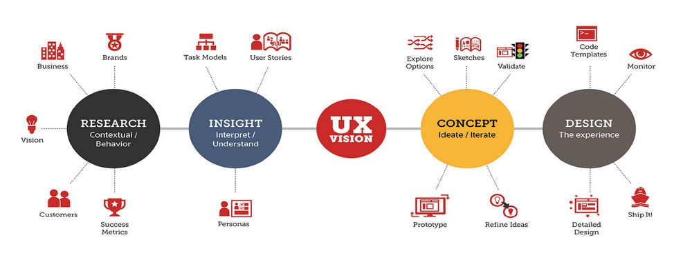
If we take a process stand-point, we find a clear division: UX Strategy vs UX Design or – in other words – the problem space vs. the solution space. You can also split a UX process into three parts: insight, ideation and implementation. It is at the ideation step that UX Design takes over from UX Strategy: In UX Design the problem is matched with a solution.
UX Strategy – or the problem space –is about the very high-level aspects of a project: understand the problem, perform need finding, interpret things. This is where UX practitioners need to understand business goals, where they design and run user research, and where they create deliverables for stakeholders to get their buy-in.
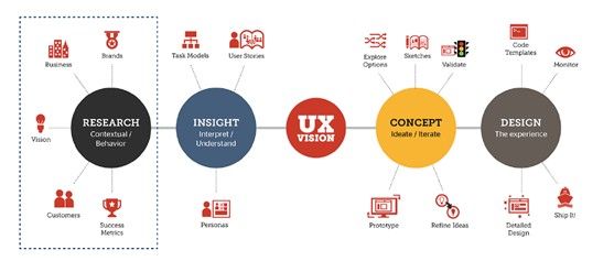
Author/Copyright holder: Headspace Design. Copyright terms and licence: All rights reserved Img source
The Elements of User Experience for your colleagues
Even if it dates back to 2000, Jesse James Garrett’s structure of “The Elements of UX” is still useful for the purpose of advocating and evangelizing the discipline of UX. His clear and concise illustration shows that UX includes several layers and that it goes from conception to completion and, therefore, from abstract to concrete.
While it is not a complete picture, you can use it to explain UX to your colleagues.They need to know what your expertise is, how you can contribute to a given project and which types of tasks you normally do.
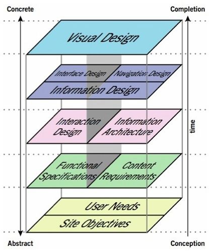
Author/Copyright holder: Jesse James Garret. Copyright terms and licence: All rights reserved Img source
The ISO 9241-210: A powerful reference for non-believers
I’m sure you have also met the type of people who only see the world from their own perspectives and that anything different sounds intimidating to them. To handle these types of people, you will need the must-have for a UX professional: empathy. You need to put yourself in their shoes to find the right way to bring them to yours.
There is this nice quote: “The biggest communication problem is we do not listen to understand. We listen to reply.”Avoid falling into this mode because you can be sure he/she is already there. Walk along with them and slowly lead them into a UX mindset. The photos from the “You Had One Job”website can help to break the ice. But you will also need something stronger, a solid and grounded argument. For example, ISO 9241-210: Ergonomics of human-system interaction, Part 210: Human-centered design for interactive systems is the most important standard in User Experience.
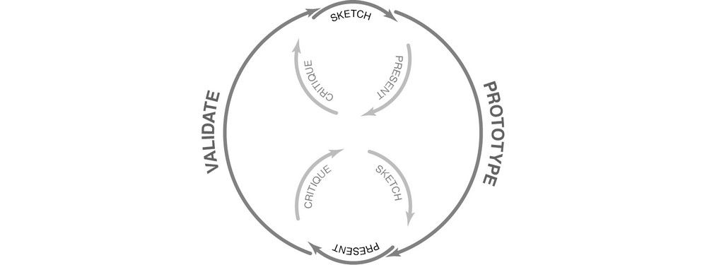
To explain this standard your best tool is probably the simple graphic below; it shows the UX process without making it too complicated and it also shows the 6 key principles that ensure a design is user-centered:
- The design is based upon an explicit understanding of users, tasks and environments.
- Users are involved throughout design and development.
- The design is driven and refined by user-centred evaluation.
- The process is iterative.
- The design addresses the whole user experience.
- The design team includes multidisciplinary skills and perspectives.
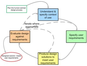
Author/Copyright holder: The Standard Interaction Design Process. Copyright terms and licence: All rights reserved Img source
The power of using an official standard is that it grounds UX and shows that it is much more than a “blah-blah” field. Make sure you have it as another tool in your UX Advocacy toolbox.
In this article, we have suggested a set of resources to make your case for UX and explain its relevance for any product or service development. We’re sure your toolbox already contains some of examples and visuals, if you want to share them with the IxDF community, send an message to editors@interaction-design.org.
Related links:
- Business benefits UXPA: https://uxpa.org/resources/about-ux
- User experience is strategy, not design: http://www.peterme.com/2012/05/04/user-experience-is-strategy-not-design/
- ISO 13407 is dead. Long live ISO 9241-210!http://www.userfocus.co.uk/articles/iso-13407-is-dead.html
