Here, we will explore and teach you about the incredible user experience opportunities which you can take advantage of when designing for interaction beyond the classical Graphical User Interface (GUI). Non-visual User Interaction (no-UI) is pioneered by the ground-breaking work of researchers who have realized that, in today’s world, we are surrounded by computers and applications that constantly require our attention: smartphones, tablets, laptops and smart-TVs competing for brief moments of our time to notify us about an event or to request our action. Staying abreast of developments will turbo-charge your skill set, so you can access users in more ingenious ways.
The bulk of these attention requests and actions take place through interaction with Graphical User Interfaces, peppered with a short audio or vibration cue here and there. However, rich user experiences are not only dependent on good visual design: they can take advantage of the context awareness, sensors and multimodal output capabilities of modern computing devices. So as to take advantage of non-visual interaction options, we need to design these carefully, considering the modern advances in software and hardware sensing, paired with Artificial Intelligence (AI), which continue to transform the way we interact with our computing devices. We’re gradually moving away from designing GUIs, which require the user’s full attention, and moving towards designing calmer, less obtrusive interaction, bringing human-computer interaction without graphics to the core of the User Experience: Welcome to the world of no UIs.
In a world where we are surrounded by information and digital events, Mark Weiser, a visionary former researcher at Xerox PARC and widely considered the father of Ubiquitous Computing, believed that technology should empower the user in a calm and unobtrusive manner, by operating in the periphery of the user’s attention.
“The result of calm technology is to put us at home, in a familiar place. When our periphery is functioning well we are tuned into what is happening around us, and so also to what is going to happen, and what has just happened. This is a key property of information visualization techniques, like the cone tree, that are filled with detail yet engage our pre-attentive periphery so we are never surprised.”
– Mark Weiser & John Seely Brown, Xerox PARC
A Definition by Example
For many decades, Graphical User Interfaces (GUIs) have dominated the way we interact with computers, and continue to be the primary way of interacting with our computing devices even though they are continuously evolving into radically different forms and becoming wildly more ubiquitous. Advances such as multi-touch, gestural input and capacitative screens have moved interaction far beyond early examples of the ‘90s, especially in mobile, although many of the interaction design elements remain the same (e.g., icon-driven interfaces, long, short and double taps, etc.).

The very first GUI-driven ubiquitous computing devices by Xerox PARC (the PARCPad) and Apple (Newton), and GUIs in everyday modern devices, were the smart fridge and smart remote control, seen here. Visually, not much has changed!
The primary goal of GUIs was to present information in such a way so as to be easily understandable and accessible to users, as well as to provide the visual controls and direct manipulation mechanisms through which a user could interact with this information and instruct the computer to carry out tasks. We are so accustomed to using GUIs that perhaps we take for granted the underlying principle by which GUIs are developed: It’s the computer’s job to present the data, interpret the user’s instructions and process the data. However it’s still our job as humans to understand the information, invent sequences of commands through which it can be transformed or processed, and—finally—make sense of the end results of computation by matching these with their intended goals or the surrounding environment.
Let’s take an everyday scenario to illustrate this. Imagine you are on holiday in a new place and want to find a good restaurant to eat in whilst walking down the main street of the city you’re visiting. You bring up the TripAdvisor app on your mobile. You provide it with your location (or allow it to be discovered by GPS) and instruct the app that you are looking for restaurants. The app presents a list of results matching your criteria, together with some basic information about each result (e.g., their name, type, rating and distance from you). By scrolling through the list, you are able to find a restaurant that sounds good (e.g., “La Pasteria” might appeal to a lover of Italian food), isn’t too far to get to (this might depend on how much you like it and are willing or are able to walk) and which has a decent rating (#1 out of 20 is very good, but #50 out of 500 is still also pretty good if it’s not too far and is Italian).
A good GUI design will help you achieve your goals by facilitating (and minimizing) the entering of text and commands provided by you and by laying out the results in a way which you can easily understand on seeing them. However, the hard part—i.e., deciding which one is ultimately a good candidate—is a processing task performed exclusively by you. Only you know your individual preferences, mood, and abilities as a human, and also, to perhaps a lesser extent, those of your companions. Ever noticed how much time it usually takes to make such a choice (especially if it’s not only yourself who will be going – and if you’re all hungry)?
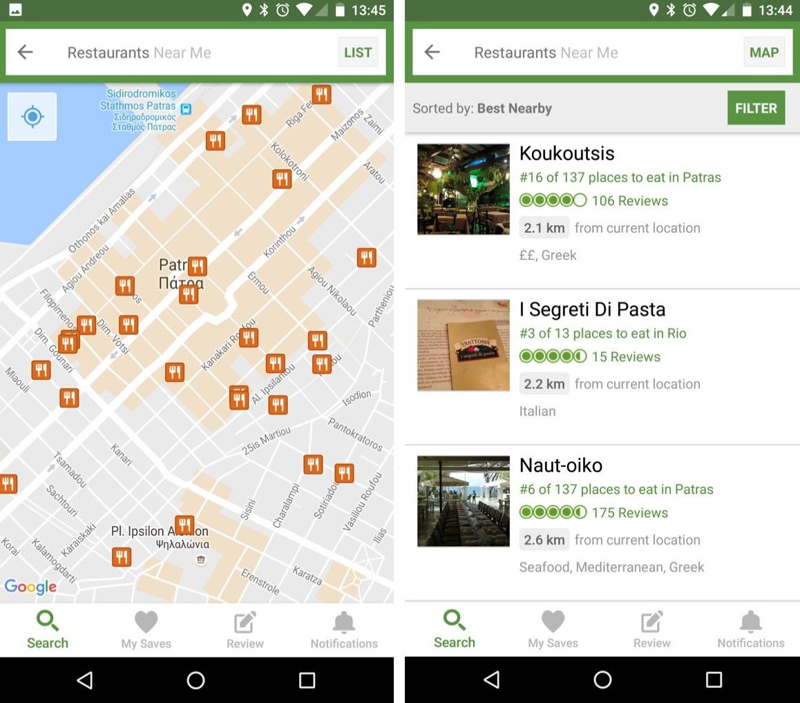
Are you hungry? How much time do you need to spend using an app to find a restaurant that sounds good? And how much more time will you spend if you get there and the restaurant is not what you expected?
Now imagine the same scenario without using a mobile app – instead, you’re walking down that street with a friend who lives in that city. As you walk along, dozens of options arise, but your friend will only initiate a conversation when you’re passing near a place she thinks you may like. So, she might proactively tell you the names of two or three restaurants only, but her advice is based on many more factors: places she has been to herself and has found to be good, experience from providing advice to other guests in the past and from taking their feedback, knowledge of how easy a restaurant is to get to, how busy it might get at the current time, how suited it might be for couples or large groups, etc. Effectively, your local friend has made a large number of observations and assumptions about you, added her own experience and knowledge and has narrowed the results down to just a few, thus doing the hard work for you. She has provided you with a “no-UI” experience: proactively initiating conversation about your goals, limiting interaction to a few natural questions and responses, factoring in a large number of observations and assumptions and presenting you with the results of hard and intensive computation. Now, the question is—can we replicate this experience when we design our applications and services? What technologies do we need so as to accomplish such a task?

The no-UI experience: curated knowledge at our periphery.
Three No-UI Interaction Building Blocks
You will have noticed from the previous example that no-UI interaction is heavily based on three basic building blocks:
Observations: the local friend has factored in a number of facts about yourself: whether you are dining alone or with a partner, your age and fitness level, the time of day and the distance of the hotel to other restaurants. These are facts that our mobile devices can “sense”. As a designer, you can leverage information provided via hardware sensors, data repositories internal or external to a device, or user profiling: for example, companionship via Bluetooth, location via GPS/networks and venue locations via databases, age and fitness via apps (e.g., Google Fit), time of the day via the clock. Don’t ask the user for information unless you can’t get it otherwise!
External knowledge: your friend also knows a lot of things: many tourists have given her feedback about some of the places she recommended, how much you might like a place depending on whether you are dining with a partner or group, how busy a place is likely to be, the quality of their food against their prices, her knowledge of the area and how complicated a route to a venue is, etc. As a designer, keep abreast of technological developments and be aware of techniques for extracting knowledge from external sources—e.g., semantically and emotionally analyzing comments and tips left at venues, knowing the daily spread of check-ins at venues, knowing the profiles of users who have visited a venue, etc. Various APIs from services such as FourSquare or Google+ are able to give us such knowledge, and there are ways of organizing it in a meaningful manner (e.g., ontologies).
Intelligence: Based on her observations and external knowledge, your friend has made a number of assumptions about you. Matching the observation to knowledge requires intelligence (and some creative thinking). This is the hardest part indeed – while the capture and organization of observation and knowledge is relatively easy, it needs prioritizing: for example, it’s no good recommending lunch at the most popular restaurant—which also happens to be very close to your location—if it’s closed at lunchtime. At other times, seemingly unimportant information might become crucial – it’s your partner’s birthday and her favourite food is Chinese; so, on that particular day—and only then—this becomes the number one criterion. Notice here that the criterion is not even about the user as an individual: We live in a world of complex relations with other humans and social rules, and capturing that context is not always easy, even for us as a species.
The critical element binding everything together here is intelligence. Without this step, a no-UI application is impossible. Intelligence determines not only what result you as a designer should present to the user, but also how you should present it.
“[…] deep learning [is], a process where the computer is taught to understand and solve a problem by itself, rather than having engineers code the solution. Deep learning is a complete game changer. It allowed AI to reach new heights previously thought to be decades away. Nowadays, computers can hear, see, read and understand humans better than ever before. This is opening a world of opportunities for AI-powered apps, toward which entrepreneurs are rushing.”
– Tony Aube, lead designer at OSMO
In the beginning of this, we spoke about moving away from the GUI – this means progressively attempting to interact with our users via multimodal interfaces. Sounds, speech synthesis, vibrations and even text, as in the case of chatbots, are ways with which we can convey information in varying degrees of granularity. You should not assume that you know how best to deliver multimodal interaction just because you are accustomed to the beeps and buzzes from the apps you use every day. Instead, multimodal interactions are things you must carefully design with the app’s purpose in mind and by accounting for the user’s abilities and context. For instance, in our previous example on tourism, an intense vibration on your phone might mean you’ve walked past the restaurant you wanted to visit, so you should turn back. Shaking the phone or pressing a hardware volume button while it’s vibrating might signal the device to give spoken instructions (e.g., “It’s behind you and to the right.”). Are these interaction examples good or bad? This is something you have to find out for yourself, through experimentation and human-centred design.
We also need a level of intelligence in order to interpret users’ physical and gestural interactions with the device (e.g., did the user shake the device with an intention to stop the current guidance, or was it an inadvertent action?). Additionally, we need intelligence to be able to determine an optimal way of presenting information (e.g., show a visual message instead of synthetic speech—if the user is in a very noisy environment). Also, finally, once we get the interaction during real-world use right (or wrong!), we should feed the outcomes back into our interaction models, helping the computer learn from the process of being used. This is the true meaning of intelligence – to be able to sense the world around us and learn from our interactions with it.
If it’s so Hard, Why Even Bother?
Humans have evolved primarily in using their vision to perceive and understand the world around them (whether physical or digital). So, GUIs are not going to disappear anytime soon, particularly when the use case calls for significant amounts of information to be presented to the user. In the world of ubiquitous computing, the need for information is constant; even so, we should not forget that much of the information required by users is succinct: a recommendation for a good restaurant, somebody’s phone number, the weather forecast for this afternoon, for instance. Snippets of information like these can require complex systems to generate them; however, this complexity should not mean that the means to obtain it must also be complex. The balance of interaction needed to obtain a bit of information versus the amount of information should be—at the very least—neutral and optimally leaning towards less interaction, while at the same time driving information towards our periphery and not the centre of our attention. Mark Weiser (1997) called this concept “Calm Computing”. Uwe Hansmann et al. (2003) and Stefan Poslad (2009), authors of two key texts on Ubiquitous Computing, both insist: Human Computer Interaction must be “transparent” or “hidden”. Minimizing interaction through no-UI techniques prevents the danger of the user experience being more about the device or app, rather than navigating the complexities of everyday life.
For example, researchers Antonio Krüger et al. (2004) at Saarland University and Katharine Willis et al. (2009) at Weimar University show that constant interaction with mobile maps results in a number of cognitive difficulties for users, such as a diminished ability to build detailed mental models of their surroundings, a failure to notice important landmarks and a detraction from the pleasure of the experience of visiting a new place
 These are the dangers of UI-interaction in mobile maps, as shown by Katharine Willis et al. (2008). Learning an area and its landmarks (a) using a mobile map (b), vs. using a paper map (c): Mobile users tend to focus on the routes between landmarks, while using a paper map gives a better understanding of the whole area.
Examples of No-UI Interaction
For the reasons stated above, considerable research has gone into reducing the interaction to multimodal, no-UI methods on mobile devices, but there are also some examples of commercially available services which have been gaining popularity since 2015. An example of the latter is chatbots, which attempt to provide a virtual assistant type of experience (though, arguably, a text interface is still a GUI). AI-driven chatbots became a trend in 2016 with the emergence of new companies such as Pana (formerly Native, a travel booking agency) and the integration of bots in existing services, such as Facebook’s messenger (using Facebook’s own engine or third-party AI engines such as ChatFuel). Other companies have jumped on the bandwagon, too, for their own services—e.g., in 2016, FourSquare introduced a conversational bot that would replace its traditional search interface and provide recommendations by responding to users’ questions. The FourSquare app also proactively issues notifications based on your location, time of day and profile (e.g., “Are you near Trafalgar Square? You might like to try John’s Coffee for coffee.”).

FourSquare’s proactive notifications provide information relevant to the user’s location, without the user needing to interact with the mobile application.
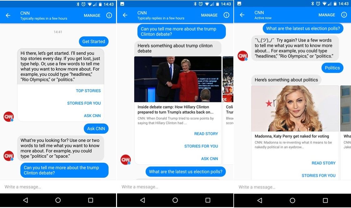
Above is an example of interaction with the CNN chatbot via Facebook Messenger. Although it’s still a UI-based interaction method, the interface resembles (but isn’t truly) natural language, without traditional widgets, menus and options. Notice how ambiguity is handled in the third picture!
Other interesting no-UI examples are found in research. Steven Strachan et al., at the Hamilton Institute, demonstrated a concept in 2005 where navigation instructions were provided to users listening to music on their headphones—by altering the volume of music (lower means further away) and its direction using 3D audio to indicate the target bearing.
In another research study related to non-visual navigation, Andreas Komninos and some colleagues at Glasgow Caledonian University (Komninos et al. 2012) used 3D audio to provide a constant audio stream of a person’s footsteps (in contrast to music, this example uses audio that is natural to the urban environment) – the direction of the sound indicates the bearing to the nearest segment of the calculated route to the target, and its volume shows how far away from that segment a user is.
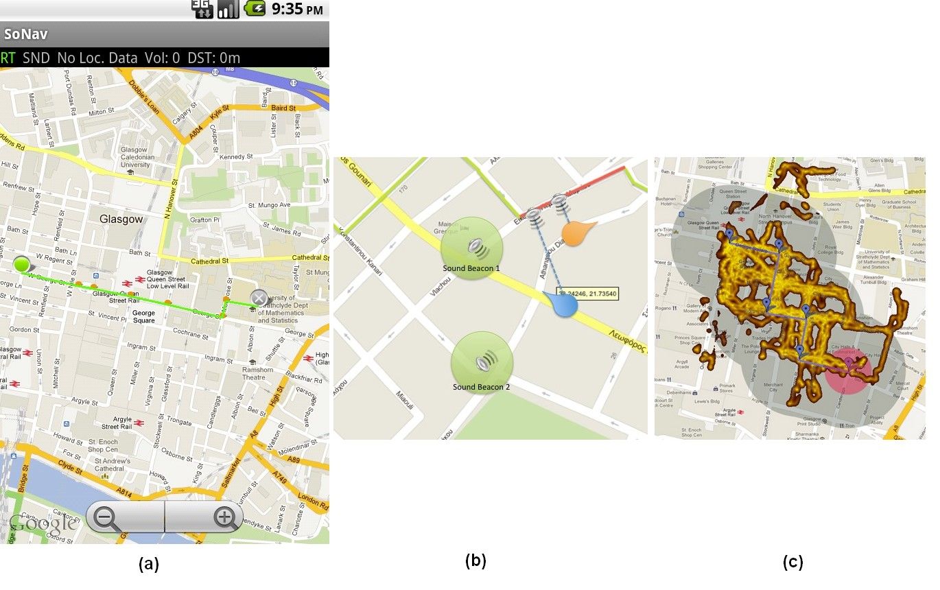
The SoNav prototype for navigation via 3D audio was created by Andreas Komninos et al. in 2012: The user simply selects a start and end point, while a route is automatically computed (a) – this is the only visual interaction element. From there on, the user hears a continuous sound from the direction of the nearest route segment, or audio beacons positioned at important landmarks (b). In an experiment, users started from the top left of the map and explored almost all of the area (GPS trace heatmap) covered by the route’s audio signal (grey-shaded area) to reach the target audio beacon (red-shaded area), each user taking a different route and freely exploring the city (c).
David McGookin and Stephen Brewster (2012), from the University of Glasgow, also demonstrated a 3D-audio based system, using the sound of flowing water and the splashes of stones being thrown in it, to show how heavily users have been tweeting in an urban area (thus indicating the social “pulse” of the area). The water stream’s sound volume shows the temporal density of tweets, while individual stone splashes are rendered in 3D‑audio and show the actual tweets being made near the user’s location (which fit a number of criteria). Other modalities such as haptic feedback, which are advanced vibration patterns and waveforms to convey information to a user, feature in this—allowing users to monitor the “state” of their device without looking at it. For example, Fabian Hemmert (2008), a researcher at Deutsche Telekom, developed a system where a constant vibration presents the number of missed calls or incoming messages to the user—the vibration is almost imperceptible at first, but it rises in intensity and frequency as more “events” accumulate on the device. As a designer, you have to think twice before applying haptic feedback as the user may not be interested in being disturbed by constant vibrations. It may be fine if a person has one app which is using rising intensity and frequency of vibration as feedback for missed calls. On the other hand, try to imagine a user who has five apps which are all using vibration as feedback for each time, for example, a new email message, “breaking news” or a new online message come through. Would you be interested in using those apps yourself?
More exotic ideas include the use of thermal interfaces for mobile devices: Graham Wilson et al. (2012), at the University of Glasgow, have shown how the use of heat-transmitting pads on a device can do the job of showing users the source (work or personal) and the importance of incoming messages.
In all the above examples, the no-UI approach is incomplete. Conversational bots have access to external knowledge and also use rather sophisticated AI (mostly to interpret your questions) but do not make direct observations about the user, using device sensors. It’s also the user who initiates the interaction, instead of the app taking a proactive approach. Users are also still faced with the burdensome task of providing information about their goals and desired tasks. In the research examples, sensors have the role of obtaining information about the user and also obtaining external knowledge, but the use of AI is rather limited. In our research examples, the use of a GUI is also part of the experience, as users need this in order to input some basic information (e.g., their navigation target) or to initiate the service, thus implicitly stating a current goal. Nevertheless, in these examples, we see how the no-UI approach works well in allowing users to shift their attention easily to monitoring the state or progress of an ongoing task, without really needing to interact with the GUI physically (as you would, for example, when using a simple map application, where you might occasionally bring the device out from your pocket so as to see where you are).
The Take Away
An effective no-UI approach is heavily based on the concept of context awareness, which includes the user’s goals and preferences, knowledge of the surrounding environment, social rules and device abilities for knowing how and when to deliver information in an non-visual way to users. The level of context awareness required for a complete no-UI service is difficult to obtain, but the examples above show where no-UI approaches are likely to work best: Allow the user to monitor the progress of ongoing tasks or get updates on important information as it emerges.
The key advantage of no-UI design here is that it eliminates the need for constant visual interaction with the device. You take the device from your pocket, causing it to exit stand-by mode, unlocking itself, and bringing the desired application to the foreground or expanding notifications for you so you can assess all the information displayed and make a decision.
In a world where we are surrounded by information and digital events, Mark Weiser foresaw the necessity for calm technology. As a designer, your task remains to harness and influence the developments in technology, deploying its capabilities with one thing in mind: to allow the user to keep calm and carry on (with the tasks at hand)!
References & Where to Learn More
Weiser, M., & Brown, J. S. (1997). “The coming age of calm technology”. In Beyond calculation (pp. 75-85). Springer New York.
Hansmann, U., Merk, L., Nicklous, M. S., & Stober, T. (2003). Pervasive computing: The mobile world. Springer Science & Business Media.
Krüger, A., Aslan, I., & Zimmer, H. (2004). “The effects of mobile pedestrian navigation systems on the concurrent acquisition of route and survey knowledge”. In International Conference on Mobile Human-Computer Interaction (pp. 446-450). Springer Berlin Heidelberg.
Strachan, S., Eslambolchilar, P., Murray-Smith, R., Hughes, S., & O'Modhrain, S. (2005, September). “GpsTunes: controlling navigation via audio feedback”. In Proceedings of the 7th international conference on Human computer interaction with mobile devices & services (pp. 275-278). ACM.
Hemmert, F. (2008). “Ambient Life: Permanent Tactile Life-like Actuation as a Status Display in Mobile Phones”. In Adjunct Proc. of the 21st annual ACM symposium on User Interface Software and Technology (UIST) Monterey, California, USA.
Poslad, S. (2009). Ubiquitous computing: smart devices, environments and interactions. John Wiley & Sons.
Willis, K. S., Hölscher, C., Wilbertz, G., & Li, C. (2009). “A comparison of spatial knowledge acquisition with maps and mobile maps”. Computers, Environment and Urban Systems, 33(2), 100-110.
McGookin, D., & Brewster, S. (2012, May). “PULSE: the design and evaluation of an auditory display to provide a social vibe”. In Proceedings of the SIGCHI Conference on Human Factors in Computing Systems (pp. 1263-1272). ACM.
Komninos, A., Barrie, P., Stefanis, V., & Plessas, A. (2012, September). “Urban exploration using audio scents”. In Proceedings of the 14th international conference on Human-computer interaction with mobile devices and services (pp. 349-358). ACM.
Wilson, G., Brewster, S., Halvey, M., & Hughes, S. (2012, September). “Thermal icons: evaluating structured thermal feedback for mobile interaction”. In Proceedings of the 14th international conference on Human-computer interaction with mobile devices and services (pp. 309-312). ACM.
Pana, the virtual chatbot travel agent: https://pana.com/
Seth Rosenberg, How to build bots for Messenger, 2016: https://developers.facebook.com/blog/post/2016/04/12/bots-for-messenger/
ChatFuel, an AI engine for ChatBots: https://chatfuel.com/
Vindu Goel, With New App, Foursquare Strives to Be ‘Magic’ in Your Pocket, 2013: http://bits.blogs.nytimes.com/2013/08/29/with-new-app-foursquare-strives-to-be-magic-in-your-pocket/?_r=1
Images
Copyright holder: Roy Want, Copyright terms and license: Fair use.
Copyright terms and license: Public Domain.
Copyright holder: David Berkowitz, Copyright terms and license: CC-BY-2.0.
Copyright holder: © William Hook Copyright terms and license: CC-BY-SA-2.0.
Copyright holder: The Author, Copyright terms and license: CC-BY-2.0
Copyright Holder: Kaique Rocha, Copyright terms and licence: CC0 (http://pexels.com)
Copyright holder: The Author, Copyright terms and license: CC-BY-2.0
Copyright holder: The Author and OpenStreetMap. Copyright terms and license: CC BY-NC 2.0
Copyright holder: The Author. Copyright terms and license: CC BY-NC 2.0
Copyright holder: The Author. Copyright terms and license: CC BY-NC 2.0
Copyright holder: The Author. Copyright terms and license: CC BY-NC 2.0
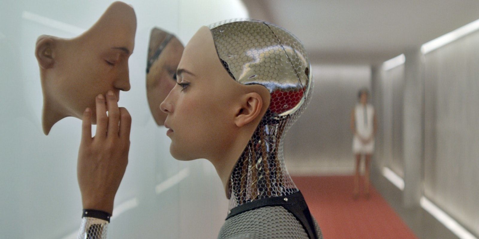
Hero Image: Copyright holder: DNA Films, Ex Machina (2015). Copyright terms and license: All rights reserved.
