I Can’t Electronically Sign My %#$@&^ Tax Return!
Blame the user: me, a UX expert with more than 40 years of experience, who has designed more than 100 successful commercial products and evaluated the inadequate designs of nearly 1,000 more. I was angry that the link my accountant had sent me to electronically sign last year’s tax returns led to a system where I could not complete the task. Like all of you, I have found my way through many instances of poorly designed software. But this time, I was truly stumped. Of course, it turned out that the system was working “as designed.” This was not some back-end server bug that I was pulling my hair out over.
I contacted my accountant immediately. I was flummoxed by an error message on the last screen. After wading my way through a six-page wizard that asked me to answer a list of personal questions to validate my identity, I was rewarded with discovering the system would not accept my signature. My accountant confirmed that many other clients had called to inform him that this new e-sign system was broken. I gave up. I printed the forms, signed them and drove over to his office. So much for technology making our lives better.
What was the usability issue that made me feel like such an idiot? It was an action grammar mistake so obvious that I couldn’t figure it out. UX Actions are one third of the foundation for Semantic Interaction Design (IxD), the Objects we act upon, and their attribute values provide the other 2 legs of the stool as I will shortly describe below in more detail.
After having answered all the security questions and previewed my tax returns, I arrived on a screen that asked me to confirm, sign and “ENTER a PIN.” But I don’t have a PIN! I don’t have an account with this e-sign company. My password for the accountant’s portal failed. I had never used this system before. Underneath this field was a cryptic hint “(anything but 000000)”. I guess that was a valuable clue, but I was not playing the exploration game
Myst. I was in a hurry to get my tax return filed and drive to San Jose State University to teach a UX design class. I reread the accountant’s email several times, looking for a PIN they might have assigned on my behalf. I looked for additional emails where the PIN might have been sent separately. I looked on my phone for a text message with the PIN. It was nowhere to be found.
A competent UX designer should have first developed a Conceptual Model to determine in advance the optimal expression of objects and actions to be visualized on the screen as well as how they would flow together in order to execute the user task. If this work had happened then before this hack was released, the action would have been “CREATE.” And… this verb would have been used as the field label, along with instructions for what a valid PIN (an attribute) should look like, not what it can’t look like. ENTER and CREATE are not action synonyms. Here was a bad design which induced a painful spike in my cognitive load because of one miserable little label. Out of the kindness of my heart, I will blame the developers and assume no professional UX person was employed by this particular software vendor. If this product was usability tested and passed, somebody needs to go to jail for practicing UX without a license!
The Conceptual Model defines the grammar through which HCI occurs
UX Conceptual Models are the foundation of Semantic IxD because when humans communicate with machines, our brains utilize the same intrinsic memory and linguistic processing capabilities that we all use in human-to-human communications every day.
Spoken languages consist of nouns, verbs, adjectives and adverbs. An adjective modifies the state of a noun. The way these four types of words are assembled into sentences defines the
grammar of a spoken language. The same is true for the creation of computer programming languages, graphical user interfaces (GUIs) and conversational experiences (chatbots). We humans map natural linguistic structures directly to on-screen digital artifacts as shown in the table below.

Natural Language to IxD grammar mapping.
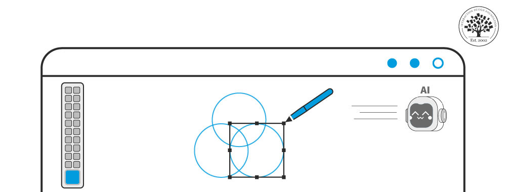
The simple graphical interface diagram below will illustrate this common Semantic IxD mapping pattern. It will help you visualize the table above as a specific experience pattern you will immediately recognize. In this drawing program, we’ve broken down the functionality into an observable set of objects that the user can manipulate via actions they select to create or transform the graphical objects. Moreover, objects have a set of attributes the user may alter.
In a classic direct manipulation-style GUI,
actions are presented in pulldown menus and the
objects are represented in the window canvas area as geometric shapes. Text is just a special case of a shape. The color
attribute selection is presented in a dialog box/pallet once the context (an object) has been selected in the canvas area. In a touch UX, actions may be invoked via gestures as well.
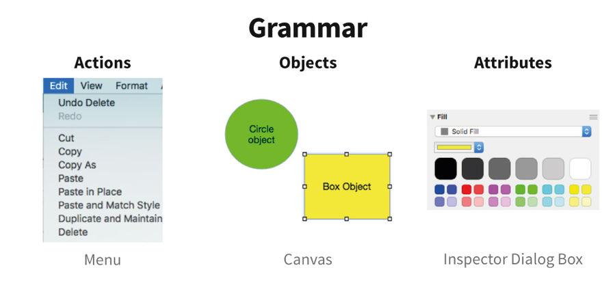
Many patterns can be used to visualize objects, actions and attributes. In this example, a pulldown menu, a canvas window and a dialog box are used. But let’s not get distracted with that right now. The main point is that if we don’t do a good job designing the UX grammar, we are screwed (just like the tax return true-life story above) and our decisions regarding design pattern or UI component selections won’t save us.
But… not all grammars are created equal!
Science shows us that UX inconsistencies increase cognitive load. They heavily tax our memory recall abilities and also subvert our recognition skills. That is why consistency has been a core principle in HCI guidelines from the very beginning. It is also why some UX grammar designs are inherently better than others.
If you compare two conceptual model variations of GUI actions and objects where one is compact and consistent and the other is not, then two important cognitive science principles come into play that quantify which is better (aka more usable).
These principles are:
Language is the basis of conscious human thought.(1) (2)
Language structure impacts human cognitive load.(3)
This can be illustrated with a word processing application UX grammar example with which all readers will be familiar. It is built around the standard cut, copy and paste actions common for the previous 3 decades in all GUIs. As the figure below shows in the consistent case, cognitive load from a perfectly symmetric grammar will grow linearly as the number of actions and objects increase. The poor grammar version below full of inconsistencies due to redundancy and empty gaps that form exceptions to be memorized will cause cognitive load to grow exponentially.
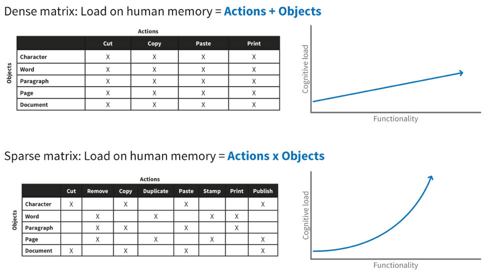
That is why even before you sketch your first screen it is beneficial to develop a designer’s conceptual model(4) and use it as the baseline for guiding all future interaction design decisions.
Cognitive load can be measured in the lab, but by then it is too late and expensive to make architectural changes. It’s much better to proactively design the conceptual model before you design any screens at all. In addition to the minimization of cognitive load, this approach will also provide two side benefits. First, it can contribute to developing a solution with the least number of screens, and secondly, by doing so, it can facilitate reaching that goal in the fewest number of iterations. Simply put, use of semantic IxD can save time and money and help you get a better result. Sounds magical, doesn’t it?
Semantic IxD is your magical UX superpower
So, with this brief foundational explanation complete, let me introduce the full scope of Semantic IxD. Conceptual models are not a new HCI invention, but specifically leveraging them in additional interaction design dimensions is.
The word “framework” has been used and abused by many professions. It is laden with baggage. Unfortunately, I am not aware of a better term in the English language. So… please accept my apology in advance for retaining it. The best I can offer is a clear definition for the term’s usage in this article.
In practice, an IxD framework is a systematic structure defining the layers of a comprehensive UI specification. The Semantic IxD framework draws upon both descriptive and exploratory HCI theories from several pioneers in the field—to name just a few, Design by Levels(5)(Foley), Stages of Action(6)(Norman), Activity Theory(7)(Nardi) and leveraging Consistency(8)(Shneiderman). All of these theories incorporate a focus on object-action relationships and their sequencing during user experiences.
The figure below illustrates the Semantic IxD framework. A suboptimal decision on any lower layer will cascade through all the layers above. This is why designing the conceptual model grammar with the lowest cognitive complexity at the very start, and then actively reinforcing it within the upper layer decisions you make, is so powerful. I assure you that competent grammar expression across all four layers will indeed appear to outsiders as a UX superhero power indistinguishable from magic.
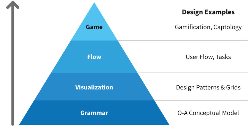
To further clarify, the four IxD framework layers are:
Grammar—The semantic relationship between functionality and user goals (modeled as actions and objects).
Visualization—The semantic grid layout containing recognized design patterns (composed of UI controls, Widgets and screen Archetypes).
Flow—The navigation over time, combination of content and the actions that advance task steps one at a time.
Game—The influencing and rewarding of user behavior through incentivizing specific actions over others.
Specific Sematic IxD techniques, tools and models exist for each layer. They always maintain the focus on creating the most effective and efficient experience and avoiding inconsistencies that will trip up the user and add unnecessary complexity.
A bad example
A simple example of a semantic inconsistency in the visualization layer for control selection would be using the drop-list UI control as a proxy action menu. You don’t see this mistake often anymore, but it was very common in the early GUI days. The screen shot below illustrates a potential mis-mapping. In the lower-right UI, the library menu button implies that it will hold actions related to an object type while the Rip menu button is providing access to attribute setting choices which would be better visualized in a property sheet widget or preferences dialog for the whole application. Rip is the standard action name for stealing the content from a CD, but in this example it does not invoke an action. Then the “Burn” action, which writes content to a CD, sits right next to it and is not visualized as a clickable button. Here inside one toolbar with little to no visual differentiation are objects, an attribute list and some actions. Without an understanding of the technical jargon of CD duplication, no clear mental model of the task can be deduced. This is a classic “designed by geeks for geeks” UX example.
If the only tool you own is a hammer, then every problem looks like a nail. In this case, the dropdown menu is the hammer and every species of interaction grammar gets stuffed into it like a bag of rusty nails.

A good example
At the visualization layer, only a small number of UI components such as buttons, links and menus are used to communicate actions. However, most widgets are specialized to visualize actions, objects or object attributes but generally not all of them and certainly not all at the same time and place. The menu is the most flexible widget. So, let’s look at a simple example of how Semantic IxD manifests at the visualization layer in a multidimensional fashion. When placed in the center of the screen, the menu control typically represents a collection of objects. When activated through a dropdown behavior, it usually contains action names. A dual deployment of the menu widget within the same screen appears below. You should recognize it as the job-seeking screen from the LinkedIn social network. The screen’s central region displays a menu of jobs (objects) using the card widget. The pulldown menu widget associated with the user profile photo/avatar contains actions.

Because the visualizations of these two menu widget instances differ in semantic grid position as well as UI control style, this is totally acceptable. It does not increase cognitive load. Users recognize the menu of objects pattern as distinct from the menu of actions pattern the same way they can tell the difference between cats and dogs. If both menu implementations looked and behaved identically, then that would inflict serious damage on conceptual model cohesion, spike user cognitive load and therefore reduce usability significantly.
When you glance over these two different menu implementations contained within a single LinkedIn screen, you have specific preconceived notions as to what each region will contain (actions versus objects) and how they should behave. This is not because you are a UX professional reading this article.
5 Billion people recognize the implied grammar of most UX patterns
Today’s UX meta-challenge is to design for an already digitally enabled world. So, who recognizes UX patterns? Actually, the majority of people in today’s first and second world countries do. About 5 billion of them use a smartphone daily! Over 3 billion use a personal computer or kiosk screen daily.
Older experienced users and digital natives will exhibit UX pattern-recognition and matching skills based on the grammar of human natural language (aka object-action grammar). They do so immediately when they glance at a GUI screen and infer its personality and purpose—also, to infer the mechanics of the UI controls the screen contains. For example, show any user a bare screen containing two vertically stacked text entry fields with a single button below minus any labels and they will interpret it as a sign-on experience to enter their user ID and password. Today in 2020, the majority of people on this planet must use their natural language semantic and syntactic understanding to make sense of the world around them every time they interact with a digital artifact to accomplish a personal goal.
And… the other 2.7 billion people, you ask?
Of course, a first-time digital user cannot map what they see on a screen to a prior digital experience. However, their cognitive processing of any digital artifact will still be based on natural language. Linguistically associating physical-world metaphors to on-screen actions and objects provides them entry to participate in a human-to-computer interaction. There is no other mental process available to them to solve the puzzle.
Language is the basis for human conscious thought, independent of computer literacy level—in fact, independent of any literacy level. When novices are taught to use technology through in-person training or video lessons, the instructor’s explanations are articulated through natural language. These explanations always point to the underlying grammar and visual semantics that organize the UX and on-screen content. They will be filtered through the instructor’s own mental model and terminology, but it will remain an instance of learning a new language and its grammar for the first-time user.
Become a UX Magician!
This article is, of course, just a tiny introduction to the magical power of Semantic Interaction Design. You can find in-depth knowledge about how to start implementing and benefiting from it in my new book, UX Magic. It takes conviction to title a user experience book that stands solidly on a cognitive science foundation as “Magic”; however, through the practice of the Semantic Interaction Design method this book introduces, you will appear to many as possessing superhero UX powers. The Semantic IxD method will help you transform product requirements into experiences guaranteed to result in the minimum cognitive load with the smallest number of screens and fewest flow steps possible. An additional benefit it provides is a 10X speed increase at which you can achieve these magical results. The specific parameters that sum up to the 10X advantage are enumerated below.

You will need to blend your knowledge about Semantic Interaction Design into your overall palette of HCI tools and techniques. While this method focuses specifically on the design creation step of reaching from known product or service requirements to first UX sketches, don’t neglect discovery user research and later usability validation. No design technique is immune to the garbage-in, garbage-out syndrome.
What you will gain from mastering and applying the Semantic IxD method is a significant improvement in both the quality of initial designs you generate as well as the speed at which you can produce them to meet both business and user goals. As a UX magician, you’ll be able to put a stop to the expensive and endless A/B trials resulting in suboptimal products propagated by the proponents of design Darwinism. You will also be able to mitigate the excessive hours wasted in opinion- and personality-oriented UX debates during product development meetings.
For a complete understanding of how to leverage the benefits of Semantic IxD to serve both end users and the tech business that employs you, check out my book UX Magic, published by the Interaction Design Foundation. It walks through the theory, practice and execution of Semantic IxD across all 4 framework layers in deep detail. It also covers the creation of “design languages”, today’s UX hot topic as well as how IxD semantics should intersect with UI standards and guidelines and in particular when to follow or ignore them because they might screw up the integrity of your design concept.
The book can be found on Amazon.com at:
https://www.amazon.com/UX-Magic-Daniel-Rosenberg
I invite you to become a UX magician and when you reach the master level introduce the power of Semantic IxD to your colleagues, product teams and entire company or clients.
![]() About the Author
About the Author
Daniel Rosenberg is a prominent UX designer, global design executive, author and educator who invented many of the GUI patterns used today. In 2019, he received the prestigious ACM SigCHI Lifetime Practice award for his numerous technical and leadership contributions to the field. You can find him on the web at rcdoux.com
Footnotes:
Whorf, B.L. (1956) Science and Linguistics. (In Carroll, J.B. Language, Thought, and Reality: Selected Writings of Benjamin Lee Whorf). MIT Press. pp. 212–214
Gleitman, L. & Papafragou, A. (2005) Language and thought. (In K. Holyoak and B. Morrison (eds.), Cambridge Handbook of Thinking and Reasoning)
Casasanto, D. (2017) Relationships between language and cognition. (In B. Dancygier ed., Cambridge Handbook of Cognitive Linguistics)
Henderson, A. & Johnson, J. (2011) Conceptual Models: Core to Good Design.
Foley, J. et al. (1995) Computer Graphics: Principles and Practice 2nd Edition.
Norman, D. (2013) The Design of Everyday Things.
Nardi, B. (1996) Studying context: A comparison of activity theory, situated action models and distributed cognition. Context and Consciousness: Activity Theory and Human-Computer Interaction. MIT Press.
Shneiderman B. et al. (2018) Designing the User Interface: Strategies for Effective Human-Computer Interaction 6th Edition.

 About the Author
