Tree Testing reveals where users lose their way in your navigation. It’s a focused approach to evaluate a site's navigational structure. But it’s more useful in certain scenarios—so, you need to understand where you’ll benefit from tree testing the most. Learn about the pros and cons of testing tools so you can make informed decisions about their application.
Did you know that unclear navigation is one of the things that can drive customers away? Forbes revealed that vague website labels lead to confusion and lost business.
Fortunately, that's where tree testing comes in and handily offers a method to streamline and validate site navigation—and you can use it to make sure that your labels and categories really make sense to your audience. Learn how this technique can help you enhance user experience, reduce confusion and help retain customers on your digital platform.
Tree testing provides goal-oriented verification of a navigation hierarchy. You don’t involve any other part of the solution since users only interact with a simulation of the menus. In this video, UX Strategist and Consultant William Hudson discusses how you can start tree testing.
Table of contents
- What is a Tree Test?
- Tree Testing and Other UX Testing Methods
- Benefits of Tree Testing
- When to Use Tree Testing?
- Tree Testing Examples
- How to Conduct Tree Testing: Your Step-by-Step Guide
- The Pros and Cons of Tree Testing Tools
- Using Methods Together or Separately
- Tree Testing Tools
- The Take Away
- Where to Learn More
What is a Tree Test?
A tree test is a simulation of the navigation structure of a website or app—a powerful tool to evaluate the findability of topics or features. Imagine—if you will—a library system, with each section that’s got books categorized under various topics. A tree test works in a similar way. It doesn't actually show the design or layout—instead, it presents a text-based version of the site's structure.
Participants navigate through the structure in a tree test, and they look for items or information as they’d search in a real scenario. The goal in tree testing is to check if they can find things easily without visual help. This method doesn’t just highlight navigation issues but helps improve the user experience, too.
To set up a tree test, you need two components:
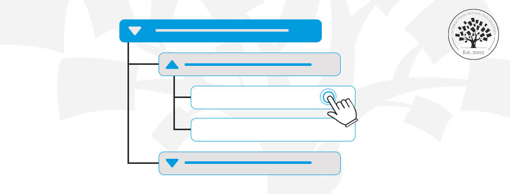
● The Tree—or the hierarchical menu—which you’ll display as a series of accordions. It shows the site's navigation categories without any design or content.
● The Tasks are realistic goals that users might want to achieve—they can encompass a wide range of things, such as buying a new saucepan or checking last month’s phone bill.
Participants click on categories to see subcategories. They navigate through the tree until they think they’ve reached the goal specified in the task. This process requires no prototypes, designs, visuals or written content. Here’s an example, shown as a breadcrumb line, for the task of “Buy goat milk yogurt”:
Browse Shop > Fresh & Chilled Food > Yogurts > Goat & Sheep Yogurt
This looks easy enough, but in the hierarchy in question, the “Yoghurts” menu item was immediately preceded by “Dairy & Eggs.” Yogurts are dairy, so that might be distracting. That is what tree testing will help us discover.
Tree Testing and Other UX Testing Methods
Tree testing stands out among various UX testing tools, and each method offers unique insights into both user experience and usability. Here's a closer look at tree testing alongside other common usability methods. Understand when to use them together or separately. These are in the order they are often used in a project:
● Card Sorting: Users sort content into categories to shape or evaluate IA. It's a great start before tree testing. It helps you craft the IA, which you'll later test for navigational clarity.
● First-click Testing: This one tracks the initial click in a task—and that’s crucial for successful outcomes. This form of testing can complement tree testing and does it by showing where users expect to begin their navigation experience.
● Heatmaps: These are often generated by first-click testing and eye-tracking tools. They show where users click, move and scroll–how they engage with a page. Heatmaps detail interaction with a designed interface; tree testing narrows the focus on navigation paths.
● Usability Testing: Observers watch users interact with your product to complete tasks. Unlike tree testing, this method covers design, content and interactions. Use tree testing for early IA checks and usability testing for a broader user experience overview.
● A/B Testing: This compares two versions of a page or app to see which one users prefer. It's something that’s ideal for design decisions—meanwhile, tree testing focuses on the IA beneath the design.
Benefits of Tree Testing
You already have a variety of UX methods. So, what benefits does tree testing provide?
It's Efficient: You can set up, conduct and analyze a tree test within a week—a method that’s fast and effective.
No Need for a Prototype: You only need a topic tree, some tasks and participants to start, so it’s perfect for early testing.
Focuses on Structure: Tree testing isolates site structure for examination—and so lays a solid foundation for later design elements.
Outperforms Closed Card Sorting: Tree testing offers a more realistic assessment than closed card sorting does—and that’s because it evaluates all tree levels effectively.
Provides Objective Evaluation: You gain quantitative feedback on your headings and terms. This complements qualitative user feedback and stakeholder opinions.
Recruitment is cheaper and easier. Tree tests can be as short as 10 to 15 minutes—which means it can be much less troublesome to find and reward participants than for hour-long usability tests.
When to Use Tree Testing?
Tree testing proves invaluable at several key points throughout the product development journey. These include:
● Product Development: Information architecture is key whenever you’re creating a new website, mobile app or any digital platform. Tree testing lets you assess and confirm the usability of your planned structure without the need to design, write or code—so, you can do this before you spend time and resources on development.
● Start of a Redesign: Early in the redesign, tree testing helps you understand how well your current IA setup works, and it finds problem areas that you’ve got to fix. Unlike regular usability tests that look at the design and feel, tree testing focuses on finding things easily.
● After Card Sorting: Card sorting, a technique used to help design or evaluate the information architecture of a site, establishes how users think about the terms in your navigation. Specifically, it reports how often pairs of words are grouped and suggests navigation structures that take advantage of those pairings. However, it does not provide a single, definitive navigation structure unless you are fortunate enough to have participants who all think the same way. Testing your structure after card sorting makes sure it works well for users.
● Identify the Best Information Grouping Method: Tree testing really shines when you aim to discover the most effective way to group information for your users. So, use it to compare different organizational schemes and see which one your target audience navigates easily.
Here’s one common way to work on your product’s structure:
● Begin by testing how easy it is to find things on your current site or product. This will help you spot what may not work.
● Use card sorting to help think of new ways to organize things.
● Test these new structures with tree testing. This step’s about making sure your new setup helps users find what they need before you start on creating content or designs.
Tree Testing Examples
Tree testing can illuminate the usability of a website or app's structure through several illustrative examples.
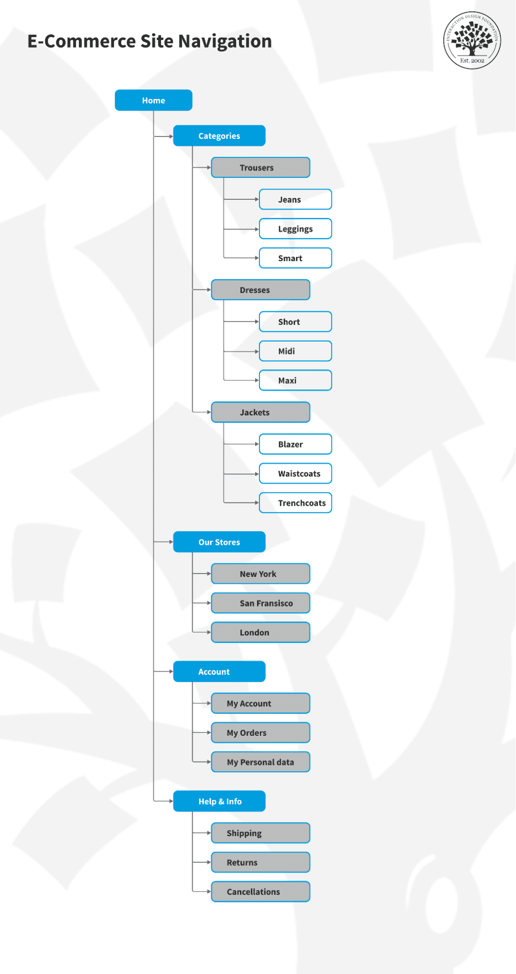
1. E-commerce Site Navigation: This example tests if users can quickly find items like blazers or shorts, and it checks if the site’s categories are logical and easy to navigate.
© Interaction Design Foundation, CC BY-SA 4.0
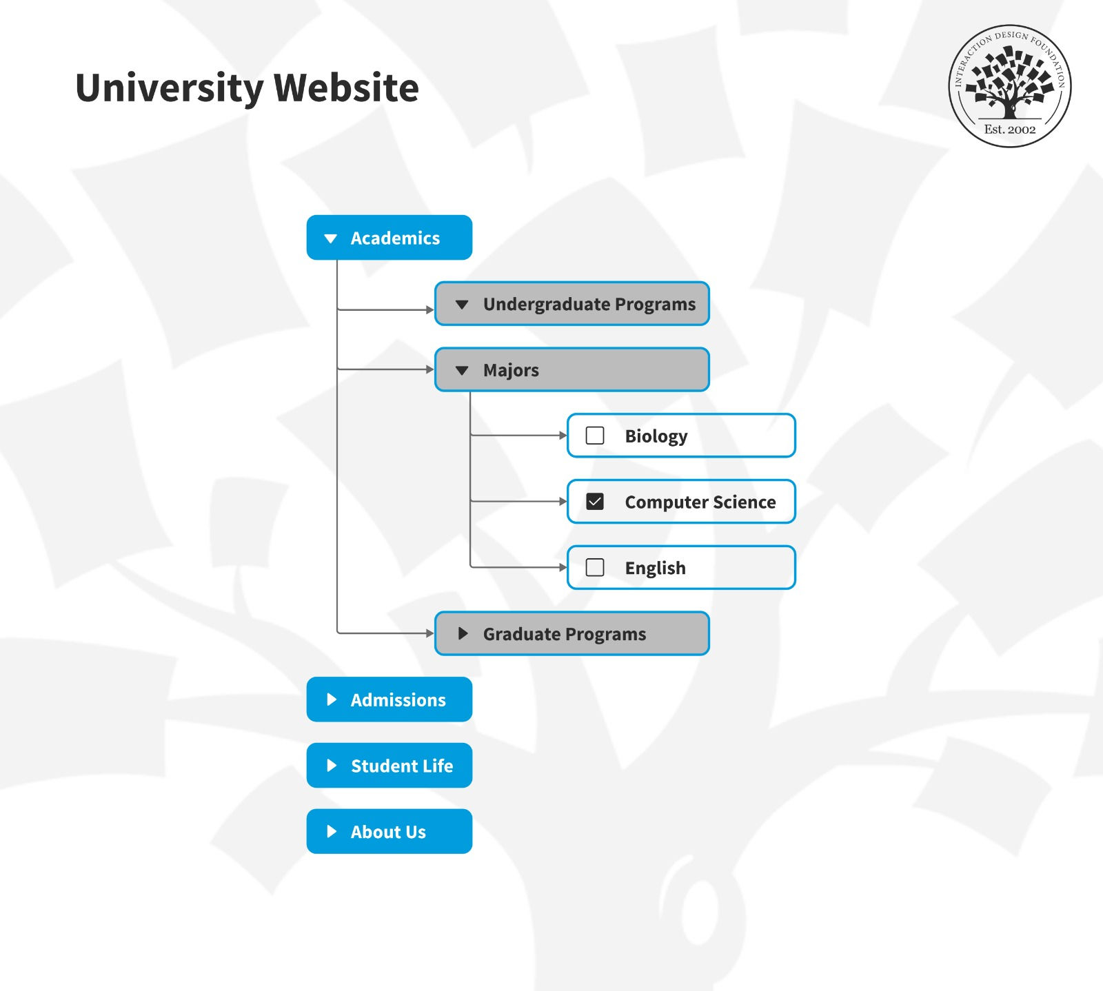
2. University Website: This tree test could help work out whether a university's website lets prospective students find information about specific majors, the admissions process and campus resources—and it evaluates the clarity and logic of the information organization.
© Interaction Design Foundation, CC BY-SA 4.0
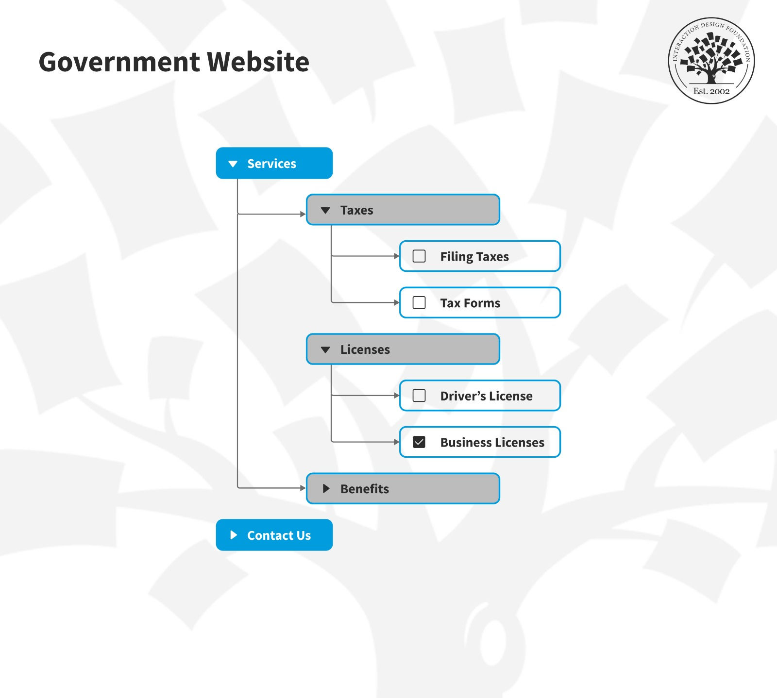
3. Government Website: This example can assess whether citizens can easily find the government services they’re after. It would highlight any confusing navigation or labeling within the website's structure, point the way for a designer to address such usability issues and help make government services that much more accessible to users.
© Interaction Design Foundation, CC BY-SA 4.0
These examples highlight how tree testing evaluates a site's navigational structure—in that tree testing makes sure that users can easily find information and that you’ve logically organized it. When you do this kind of testing, you can identify and address navigational challenges before they impact the user experience and long before a brand’s official product release. That’s a big deal when it comes to web design, for example, with many important pages—including product pages—and internal links leading off from a landing page or home page.
How to Conduct Tree Testing: Your Step-by-Step Guide
Tree testing is a straightforward method for you to validate your website or app’s navigational structure. So, why not follow this guide to conduct a successful tree test:
Step 1: Define Your Objectives
To start with, set clear objectives for your tree test. You might want to see how easily users can find information. Maybe your aim is to spot confusing areas in your site's layout so you can iron out any kinks. Or you could compare various ways to organize content.
Clear goals help shape your test. You craft tasks based on these goals for participants. They also sharpen your focus when you analyze the data.
Clear objectives also make the testing process efficient—and when you have them, it ensures that you’ll receive relevant feedback. It’s a strategy that can really help you improve your site or app based on solid evidence.
Step 2: Build Your Tree
For this step, make a text-only blueprint of your site or app's structure—and this blueprint needs to include all main and sub-categories, but skip the design elements. It's crucial that the tree you create accurately mirrors your actual or planned navigation setup.
Every layer of your hierarchy needs to make sense and be easy to understand. Use clear, descriptive labels for each category. It helps test participants navigate your tree with just the text. This foundational work is what tests the structure's ability to guide users to their destinations without visual aids—which will tell you a great deal about this vital aspect of your design.
Step 3: Choose a Tool for Tree Testing and Input the Tree
After you’ve built your tree, it’s time to select a suitable tree testing tool and input your tree structure into it—this step is also vital. So, look for a user-friendly tool that aligns with your test goals and offers detailed analytics. Popular options include Optimal Workshop's Treejack, UserZoom or other UX testing platforms that support tree testing functionality, and you can even use a simple tool like Google Forms.
Once you’ve picked your tool, input the hierarchical structure that you created—a process that typically involves entering your categories and subcategories in a format which the tool can understand. You can do this through a simple text editor, or you might upload a structured file.
Review the tree within the tool for accuracy and usability before you design your tasks. This step doesn’t just help you set up your test environment; it allows for an efficient and effective testing process, too.
Step 4: Design Your Tasks
When you set up tasks for tree testing, think about the real actions that users would take on your site or app—and each task should give participants a goal to find something specific. This approach helps you evaluate if your information architecture (IA) really does meet user needs. For instance, if you want to test a retail site, you might ask users to "Find a pair of men's running shoes under $100." You’ve got to craft such tasks if you’re going to get insightful tree testing results in return.
Tasks in tree testing vary and play unique roles in assessing your IA:
● Resource-Finding Tasks: These align with key business goals. You ask users to locate major products, services or vital information.
● Potential Problem Areas: Identify new categories that stakeholders suggest or spark debate in card-sorting studies. Testing these areas helps spot and resolve navigational issues early.
● Label or Location Comparisons: Test alternate names or placements for the same category to see which works best.
● Warmup Task: Start with an easy task to familiarize participants with the testing process. It also helps weed out inattentive participants in unmoderated settings.
For every task, define the correct answer(s) or location(s) within the tree. This setup lets the testing tool automatically calculate success rates for each task. It offers clear metrics on your IA's performance.
Sometimes, you may wish to test only the upper levels of a hierarchy. This commonly happens when the lower levels are too numerous–such as in an e-commerce site with tens of thousands of items. But in some cases, your main interest may be in the categories above.
Step 5: Choose Your Participants
You must consider the quality of participants for your tree test—so, aim for individuals who mirror your real users regarding their behaviors and needs. When you get this diversity on board, it’ll ensure the feedback you receive reflects a broad spectrum of experiences.
Typically, a group of 5-15 users is enough to provide a solid basis for actionable insights. Make sure that the chosen participants have varying levels of familiarity with your site or app. This mix offers a balanced view of how intuitive your navigation feels to new and seasoned users.
As with most research tools, you need to decide what you’re trying to find out and who to conduct your research with. In this video, William Hudson talks about these important questions and the related issues of participant recruitment and screening.
Step 6: Screen Your Participants
The quality of any research depends on the suitability of participants. Having decided whether to test with existing users or new visitors, you must ask participants carefully worded questions to assess their suitability. Do not ask direct questions about the site or app in question.
Participants may have been offered incentives to participate in the research and may simply answer to receive those incentives. Instead, ask general questions, such as “How often have you used the following websites/apps?”. The site or app you’re working on will turn up on a list along with several others. If participants don’t qualify, the testing tool will allow you to politely refuse their involvement.
William Hudson discusses this in more detail below.
Step 7: Run the Test
Use your chosen tree testing tool to launch the test and share it with your participants. These tools will monitor how users navigate the tree and track their choices, clicks and time spent on each task. This provides valuable data—and potentially extremely useful insights—on user interaction with your information architecture (IA).
Step 8: Analyze the Results
Review the collected data to understand user behavior. Look at where users clicked, how many tries it took them to find the correct category and at which points they stopped or turned back. Spot patterns in this data to understand areas of your IA that may confuse or slow users.
When you analyze tree test results, focus on key metrics: success rate, directness, time and path.
● Success Rate: This is the percentage of participants who completed a task.
● Directness: This measures how many users found the correct answer on their first attempt without having to backtrack.
● Time: Look at how long it took participants to complete each task.
● Path: Examine users' routes through the tree so you can understand their navigation choices.
This step helps you spot important places where you can improve your site or app's structure. It points out where simplification or reorganization could make navigation more intuitive and hence the user experience a great deal better.
Step 9: Refine Your IA
It’s time to use the insights you got from your analysis to make informed changes to your IA. You may have to rename categories for better understanding, reorder them to follow a more logical progression or change the hierarchy to run in line better with user expectations.
Most importantly, the objective here is to make your site or app as easy and natural as possible for your users—based on their actual behaviors and feedback.
Step 10: Repeat as Necessary
Remember, tree testing is an iterative process—so, it's not about running a single test but about continuous improvement. After you've made changes, it's important to get back out and test again. This makes sure that your adjustments really will have the desired effect and that your refined IA meets user needs more effectively. Regular testing and refinement help gradually improve the usability of your site or app to be the best it can be.
The Pros and Cons of Tree Testing Tools
Tree testing tools offer a specialized approach to evaluate the usability of a website or application's information architecture (IA). So, here's a breakdown of their advantages and disadvantages:
Pros of Tree Testing Tools
Focused Insight: Tree testing isolates the structure of your IA, and it lets you assess navigational paths without the influence of design elements specifically. This pure focus can uncover issues that visual design might obscure in other forms of testing.
Cost-Effective: Tree testing doesn't call for a fully designed prototype or content, and it saves time and resources that you can put to use in more developed project stages. As tree-testing is typically very quick for participants, you can also lower the research costs.
Quick Setup and Execution: Many user-friendly tree testing tools require minimal setup time. You can easily distribute tests online and complete them quickly.
Quantitative Data: These tools offer quantitative insights. They can measure success rates, time and directness while you collect participant feedback—although you’d have to interact with the participants after they complete the tree test to get qualitative feedback.
Wide Reach: You can distribute tests to a broad audience regardless of their geographical location—something that can really boost the diversity of your user research.
Cons of Tree Testing Tools
Lack of Context: Participants might struggle to make realistic decisions without visual and content cues in front of them. What’s more, the test environment doesn't replicate the actual user experience.
Overemphasis on Structure: Tree testing focuses solely on the IA. It might lead to overlooking how other elements—like design and content—impact usability and the user experience.
Participant Misinterpretation: The abstract nature of tree testing may confuse users as they might be unfamiliar with such tests. What’s more, you may not understand why participants navigated in a certain way when you conduct tree testing remotely.
Limited Engagement: The text-based approach mightn’t engage users as fully as interactive prototypes could.
Analysis Complexity: You may find it easy to collect data; interpreting it, though—especially understanding the reasons behind users' navigational choices—can be challenging and demand additional qualitative research.
User research helps you understand more about the users before you start with product development or before you start the design. That’s when all research methods come into play. Watch William Hudson, CEO of Syntagm, UX expert and Author, discuss the common practices for user research and when to use them.
Using Methods Together or Separately
● Together: Pair card sorting with tree testing to build and validate your IA. After you refine the IA, add first-click testing and heatmaps to understand interactions with your interface.
● Separately: Opt for tree testing to refine your site's or app's structure early. Switch to usability testing, A/B testing and heatmaps at later stages for insights into the user experience, including design and content.
Tree Testing Tools
You need the right tool for tree testing for better UX research. Look at recommendations for tools that stand out and their pros and cons.
1. UserTesting
© UserTesting, Fair Use
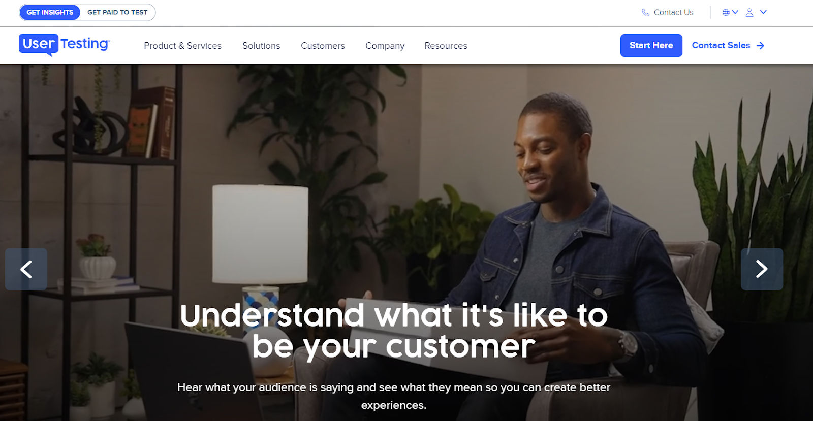
UserTesting serves as a human insight platform that focuses on video recording. It simplifies the design process for digital tools through insights into the target audience's behavior across various experiences and explanations for these behaviors.
Pros
● Quick participant responses
● Clear report dashboard
● Reuses screener questions
● Offers a broad range of testing options
Cons
● Poorly-designed website
● More suited for B2C than B2B studies
● Expensive for larger teams to access
● Lacks a tagging structure
● Advanced features locked behind higher plans
2. Optimal Workshop Treejack
© Treejack, Fair Use
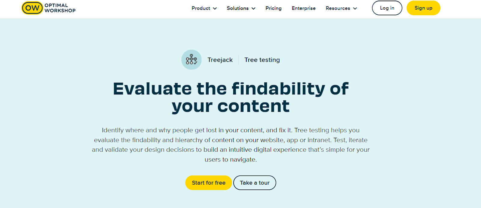
Optimal Workshop is a UX research platform that offers testing, participant recruiting and product features analysis in one place. They have a tree testing tool called Treejack. It helps you identify wrongly placed menu items. You can then fix the mistakes to create an intuitive information architecture.
Pros
● Organizes feedback data effectively
● Good design interface
● Fast, understandable graphic reports
Cons
● Performance issues with larger studies
● Can be expensive for smaller entities
● High learning curve for non-tech users
3. UXtweak
© UXtweak, Fair Use
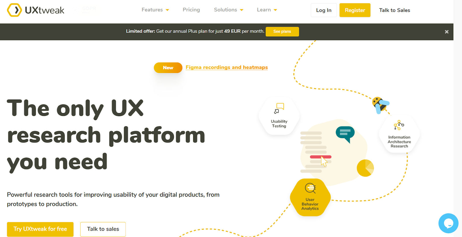
UXtweak is a research platform with various tools to enhance user experience—empowering users to build detailed studies, customize tasks and analyze results through advanced segmentation and filtering. You can create and share in-depth PDF reports for collaboration with teams or clients. What’s more, you can craft studies from scratch, import data for testing and collect insights with precision, too.
Pros
● User-friendly interface with GTM manager integration
● Advanced user session filter
● Recruiting widget and direct tree upload from your website
● Flexible tree building from scratch or import
Cons
● Occasional bugs in task creation
● Complexity may deter non-technical users
4. UXmetrics

© UXmetrics, Fair Use
UXmetrics provides a robust tool designed to refine and validate information architecture. It caters to remote and in-person testing and supports quick setup—plus, it provides visual breadcrumbs for easy path tracking.
Pros
● Works for remote and in-person testing
● Automated analysis for insights
● Moderated or unmoderated testing options
● Provides ability to manage individual participants with ease
Cons
● Learning curve for creating tests
● Budget constraints for smaller teams
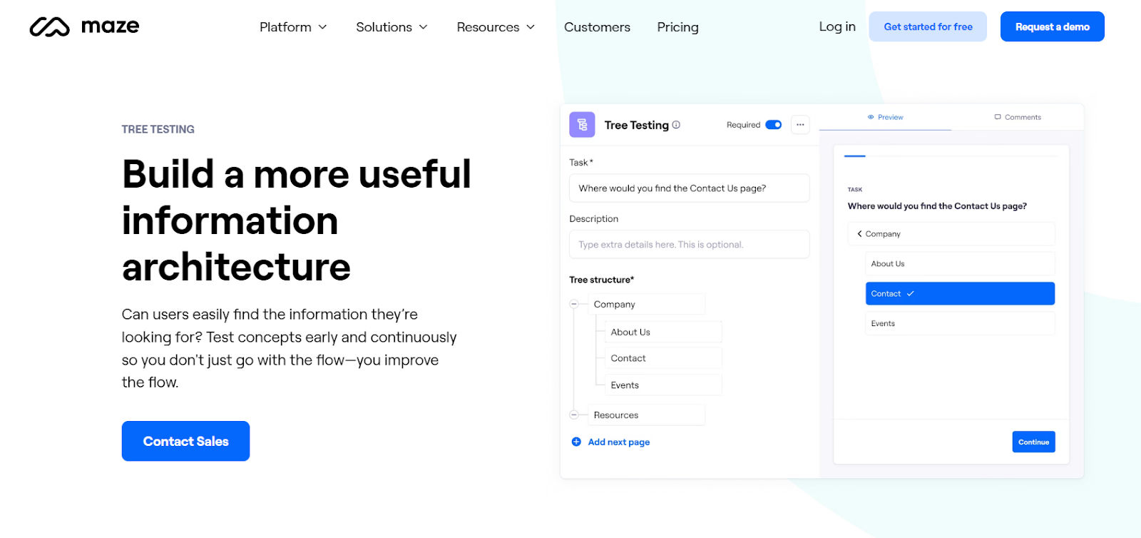
5. Maze
© Maze, Fair Use
Maze is a user-testing platform that enables rapid, actionable insights through remote, unmoderated testing. It helps you test prototypes, validate ideas and gather user feedback efficiently. The tool integrates with design tools to streamline workflows, and you can use it for iterative testing and decision-making in your design process.
Pros
● Rapid testing cycle
● Direct integration with design tools
● Cost-effective
Cons
● Limited testing methods
● New users need time to understand the tool
● Doesn’t support mobile app testing
The Take Away
Tree testing is crucial to access a website or app's navigation efficiency—a vital part of the user experience—and it focuses on testing the information architecture (IA) where users interact with a text-based menu layout without design distraction. This method proves beneficial during the different phases of product development. You have certain key points to remember during tree testing:
● Start with clear goals to focus your test.
● Build a tree that shows your menu's structure clearly.
● Pick the right people for the test to get useful feedback.
● Use a good tree testing tool to run your test smoothly.
● Look closely at the results to make your menu better and easier to use.
Armed with insights from your tree testing, you’ll have a clear path forward to set out your web pages and more. Refine your information architecture based on feedback so you can make your website or app more intuitive and user-friendly. As the roots of tree testing are firmly planted in the reality of how users get to grips with what you set before them, you’ll be much more likely to enjoy some bountiful fruits of your labors when it comes to iterating towards a truly great digital solution.
Where to Learn More
Read Tree Testing for Websites by UX Designer/Researcher and Information Architect, Dave O'Brien.
Take our course Data-Driven Design: Quantitative Research for UX
Understand the best way to interpret the results of tree testing from the article Analyzing tree test results.
Use Notion’s Tree testing for UX Research template to get started.
