UX design portfolios are your shop window as a professional, so you’ll want to shine your best for potential clients and employers—but where to start making this perfect self-promotion item, which may be the most important design you’ll put your name to? Sure, there are templates to reach for and tweak, or you can code from scratch. So, let’s explore some readymade solutions and some helpful design guidelines to make your online UX portfolio gleam, and we’ll end with a demo website we’ve made just for you!
An online UX portfolio website acts as your digital business card. It shows your skills, your style, and your experience. We can’t overstate the importance of having an online portfolio as a UX designer.
Imagine you’re on the other side of the hiring desk—a hiring manager who’s just clicked on a UX designer’s portfolio website, only to find the navigation confusing. But just as bad—or maybe even worse—it took ages to load, so what do you do? Instinctively, you leave within a few seconds.
That’s the last thing a designer wants when they’re after a good—or better—design poistion, but the problem can creep up on even the best designers if they’re unwary. The issue is in how you see it: a portfolio or portfolio website is far more than a resume. It’s a project in itself, and—as such—it’s a design that speaks volumes about you as a designer through its user experience, as if to say: “This is what you can expect from me.”
So, you make a design to encapsulate the best of yourself as a designer—fine, but what should your portfolio website look like? Naturally, it’s got to be user-friendly and visually appealing, and a beautiful and smooth-running site says you care about the user—in this case, potential employers. Plus, it tells them you're the real deal, so stay tuned to see how to build an online UX portfolio that’s an engaging one, too.
Table of contents
- Use Ready-made Platforms to Create Your Online UX Portfolio with Ease
- How to Choose the Right Portfolio Builder
- Code Your Own Online UX Portfolio
- 7 Design Guidelines to Follow When You Build Your Own Online UX Design Portfolio
- 1. Give a Short, Concise Introduction on Your Home Page
- 2. Include Only 2–3 UX Case Studies
- 3. Make it a Great User Experience!
- 4. Create an About Page or Section with More Information About Yourself
- 5. Place Side Projects in A Separate Page or Section
- 6. Make Your Portfolio Visually Pleasing and Consistent
- 7. Keep it Simple
- Download Our Template for 7 Design Guidelines to Follow in Your Online UX Portfolio
- Use Our Sample UX Portfolio Site as a Reference
- The Take Away
- References and Where to Learn More
Use Ready-made Platforms to Create Your Online UX Portfolio with Ease
© Interaction Design Foundation, CC BY-SA 4.0
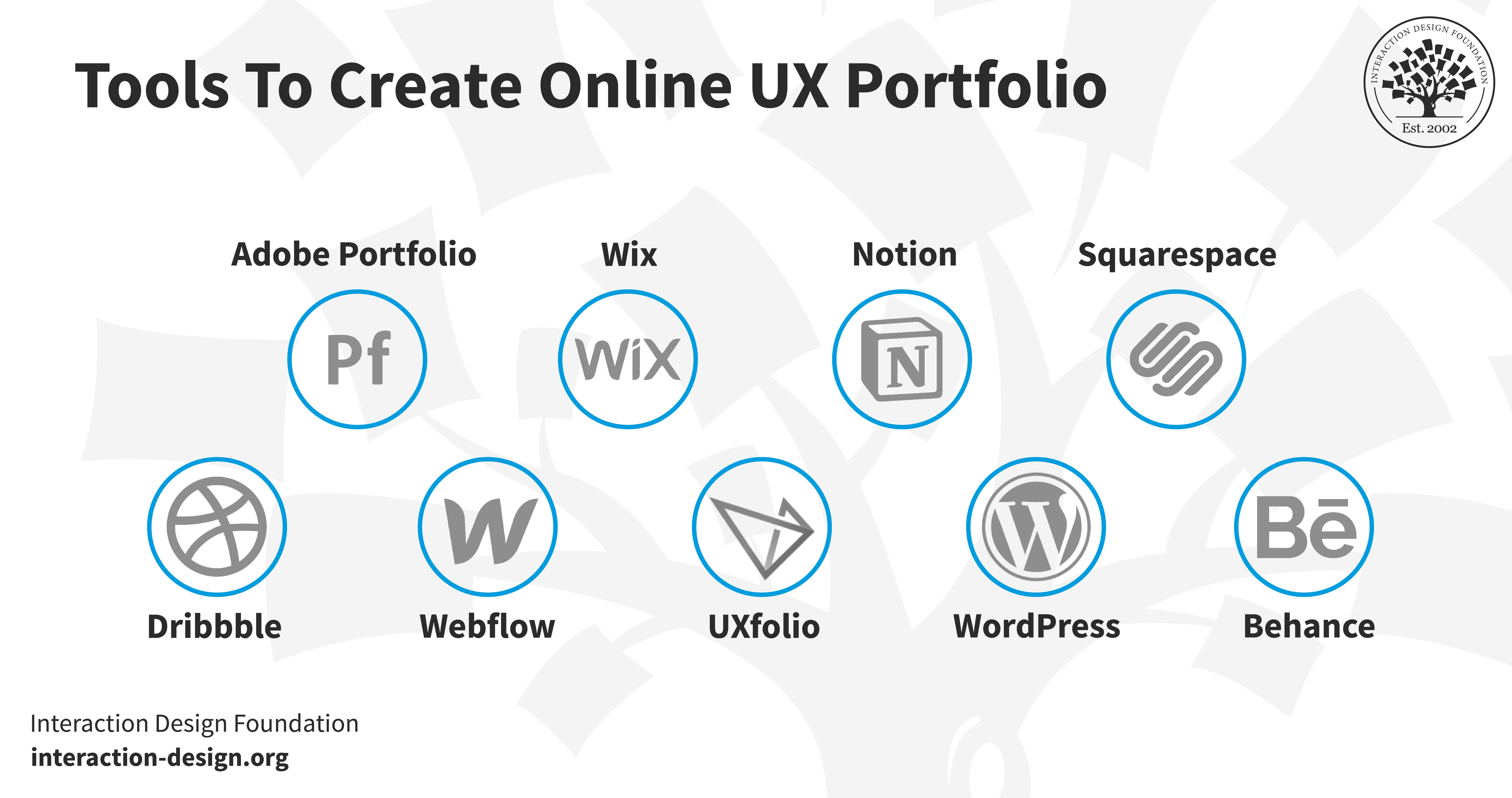
“What happens if I don’t have any coding experience?” might very well be the first thing that pops into your mind—don’t worry. You can create a UX portfolio with a readymade solution—and there are ones like website design and hosting services—where you can create an online portfolio without the need to code.
Please note that we do try to be as unbiased as humanly possible, and we don’t receive any form of sponsorship or payments from our recommendations below. We picked them because they’re popular among fellow designers and because we think they’re easy to use. You should do further research to find out if other platforms are out there that fit your specific needs.
1. Behance
© Behance, Fair Use
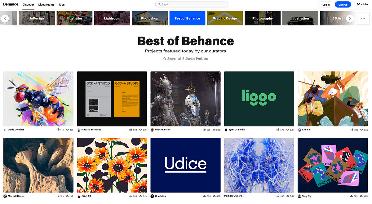
Behance is a leading online platform for creative professionals to showcase their work—including UX designers—and it’s got over 10 million members, so it offers an extensive network for exposure and collaboration. The platform lets you create a personalized portfolio URL and add individual “projects” to work for you as case studies.
Another neat point about Behance is that its user-friendly project editor supports text, images, and videos, and this makes it easy for you to narrate your design process—plus, you can join the platform for free to share your work and connect with the design community out there.
Main Features
Advanced editing tools
Multi-owner collaboration
Visitor interaction
Free feedback loop
Example websites
Pros
Free
A large, engaged community
Multimedia support (text, images, videos)
Collaboration features
Comment section for critiques to get feedback
Cons
Fewer design options
No personal domain
High Competition since there are over 10 million members
Less SEO control
Pricing
Free plan
Rating
4.5/5 (g2)
2. WordPress
© WordPress, Fair Use
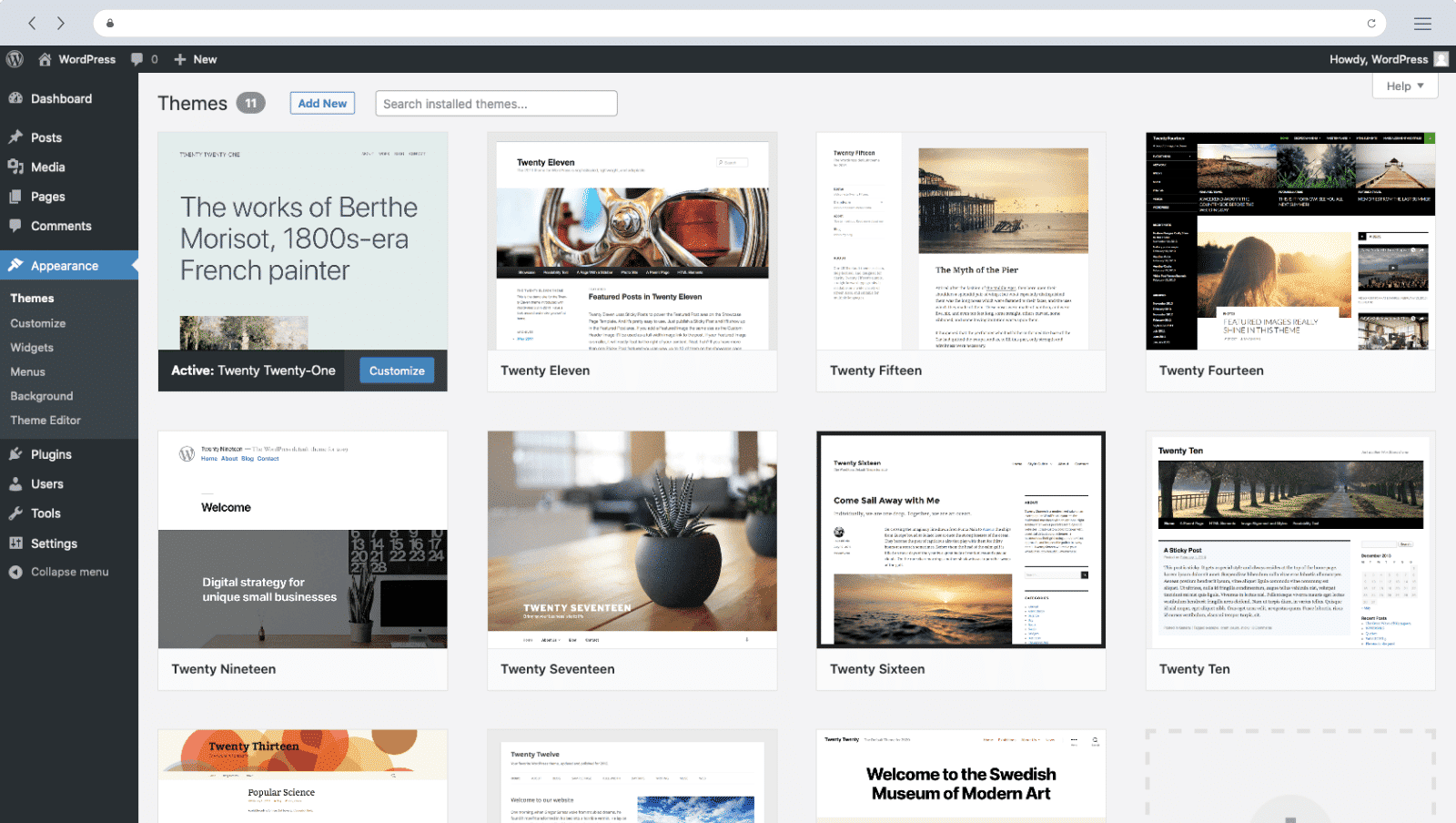
WordPress is a good, solid choice for beginners as it helps them build a personal website, and what is maybe the best part about this well-known brand is that you don’t need a plan at all for it. With that said, you can upgrade to a paid plan for a unique URL. As you go through the sign-up process, the platform suggests themes for you to align with your website’s purpose. What’s more, WordPress is available for anyone to install for free on their own website as well.
UX case studies are seriously important for a designer’s portfolio, and they’re nice and straightforward to create with WordPress’s intuitive editor—which gives you a live preview and supports various "blocks" for adding elements like headings, images, and tables; a nifty point that makes WordPress a versatile pick for designers of all types.
Main Features
Customizable Themes
Intuitive Editor
SEO-Friendly
Plugin Support
Live Preview
Create WordPress websites directly from Figma
Example Websites
Pros
Offers a vast array of themes and plugins
An intuitive dashboard and editor make it easy to use
Built-in features and plugins help optimize search engine rankings
Large online community for troubleshooting and advice
Cons
While user-friendly, mastering features takes time
Premium themes, plugins, and hosting can be expensive
Too many plugins can slow down site performance
Pricing
Free forever account with subdomain or self-hosted
Starts at $4/month (billed annually)
Rating
4.4/5 (g2)
3. Squarespace
© Squarespace, Fair Use
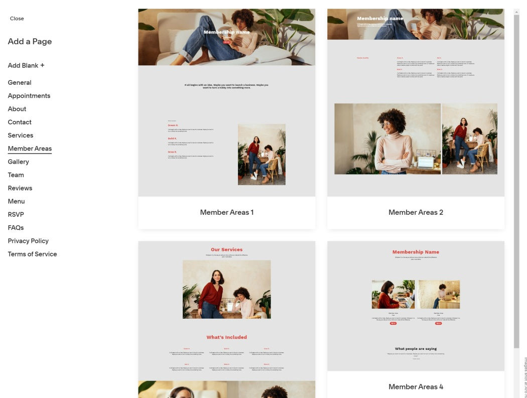
Squarespace is an online platform to build a website on, and it offers you a drag-and-drop interface and collects all the essential tools so they’re together in one place. So, it does away with any need for you to switch between different platforms.
This a great builder for you to put an innovative design portfolio website together with. The platform provides you with customizable templates, SEO tools, and integrated marketing features that will help you to make anything from portfolios to e-commerce sites.
Main Features
SEO tools
Customizable templates
Integrated marketing tools
E-commerce support
Example Websites
Pros
No-code editing capabilities
Ready-made templates
Cons
Limitations to customizing templates
Confusing user experience in some places
Shortage of plugins and extensions compared to other website builders
Pricing
A free 14-day trial
$16 per month (billed annually)
Rating
4.4/5 (g2)
4. Dribbble
© Dribbble, Fair Use
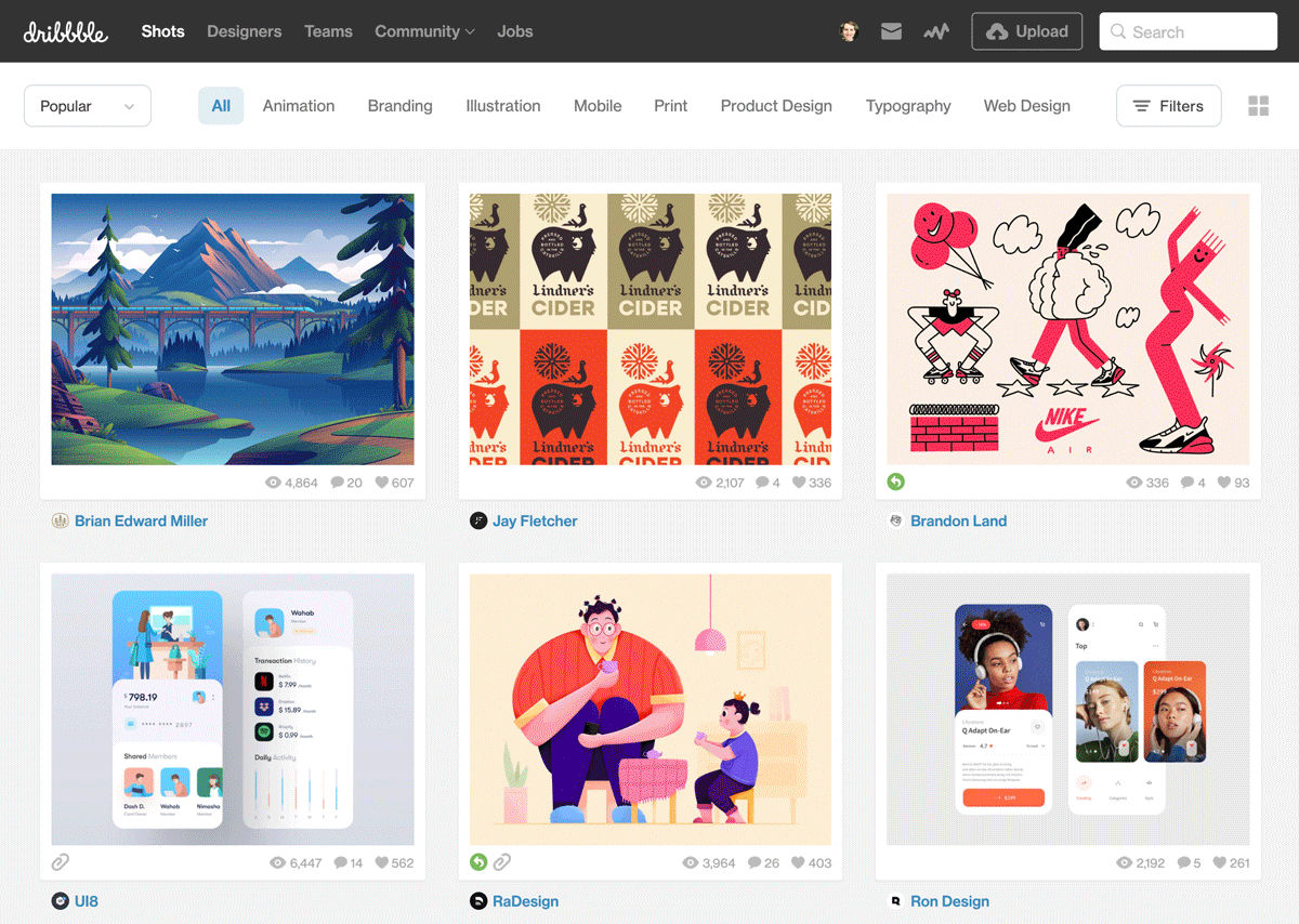
Dribbble is a well-known platform among designers, and it’s especially well-known for designers who are looking to create a UX portfolio to get themselves out there. It works as a social network and a portfolio platform—not like traditional website builders—and you upload individual works as “shots,” which are small screenshots of your designs.
Audience engagement is high on Dribbble—and you get likes, comments, and even job offers that come directly from viewers—and each shot can form part of a bigger “project,” which lets you group related works together.
Dribbble offers you basic analytics, too, and to help you understand what’s grabbing viewers’ attention, you’re able to track views, likes, and the reach your portfolio has. While it might be less customizable than other online portfolio website builders, Dribbble is nevertheless exceptionally user-friendly.
Main Features
Showcase design projects as "shots"
Connect with other designers and potential clients
Receive comments and critiques on your work
Participate in themed contests to gain exposure
Example Websites
Pros
User-friendly interface for portfolio management
High visibility in the design community
Valuable critiques from skilled designers
Cons
Focuses mainly on visual design
A high number of designers can dilute visibility
"Shots" may not showcase full project depth
Some features require a paid subscription
Pricing
$8/month (billed annually)
Rating
4.2/5 (g2)
5. Wix
© Wix, Fair Use
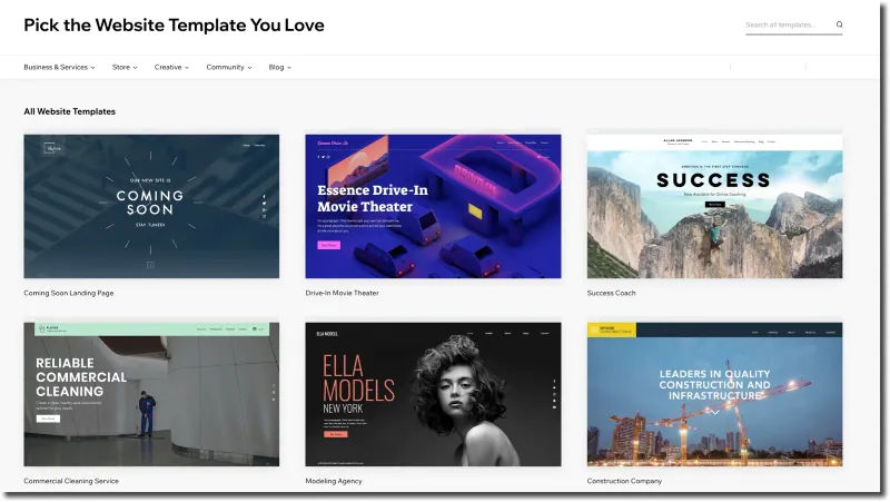
Wix is a popular pick for professionals of all types—including artists, photographers, and freelancers, who showcase their work—when they want to build portfolio websites, and it’s got a nice and easy-to-use drag-and-drop interface. There’s a wide range of tailored design templates for portfolios on Wix.
Wix has got features like SEO tools and social media integration—very helpful with marketing. For instance, SEO Wiz helps tailor your site so it’s more visible on search engines, and social media buttons permit quick sharing of your work.
Main Features
500 designer-made templates
Built-in SEO tools
Mobile-optimized
100+ fonts available
Advanced design features like animation, video backgrounds, and scroll effects
Example Websites
Pros
Good customization options
Massive template collection
Intuitive drag-and-drop interface
Cons
Tracking and analytics require a paid plan
Your site isn’t transferrable
Restriction on switching templates once the site goes live
Pricing
Free plan
Premium plans start at $1 and go up to $159 monthly.
Rating
4.2/5 (g2)
6. Webflow
© Webflow, Fair Use
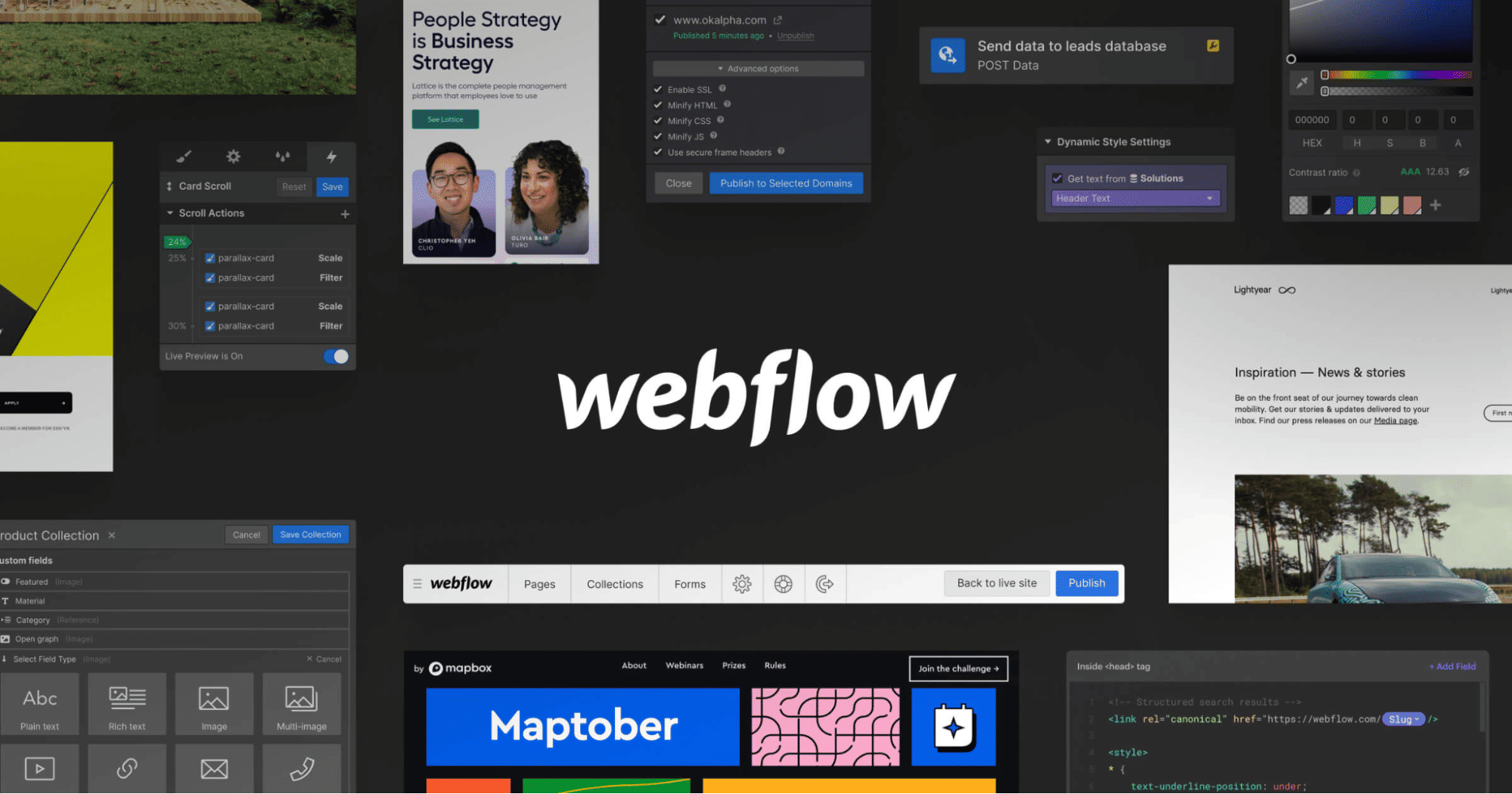
Webflow—a web design tool where you get visual design combined with coding power—offers a strong, no-code platform for you to create custom websites, and its high degree of customization, responsive design, and seamless animations mean it’s an excellent portfolio choice for UX designers.
Webflow has got built-in CMS and hosting, and it’s a one-stop shop for designers who want a tailored portfolio that stands out, and—what is more—its range of professional templates and design interactions can make your portfolio an experience that can grab the visitor.
Main Features
Customizable templates and elements
Real-time visual builder
Powerful CMS for dynamic content
Export the site’s HTML, CSS, and Javascript (using paid plans)
Easy integration with other services such as email marketing platforms, social media platforms, and more
Example Websites
Pros
Live prototyping
No plugins required
Collaboration options
Quicker development time
Cons
Lack of code customizations
No mobile app to edit content
Extensive pricing plans
Pricing
A free forever plan
Paid plans start at $14 and go up to $39 monthly
Rating
4.4/5 (g2)
7. UXfolio
© Otilia Pandelea, Fair Use
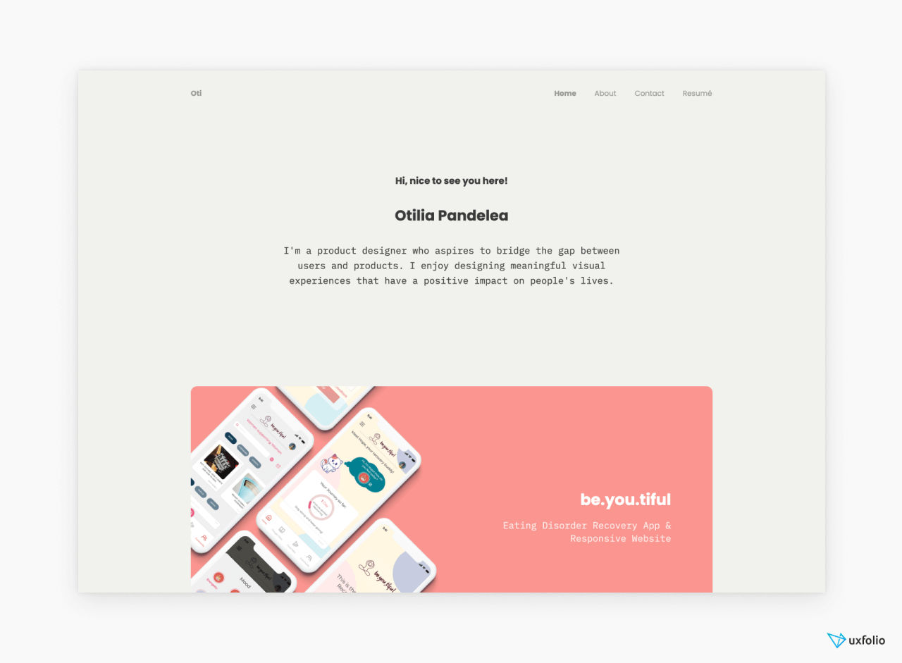
UXfolio is a portfolio-creation specialist choice for UX/UI designers, and its tailored features like case study templates you can use for design processes and outcomes are welcome things to have in a resource.
Uxfolio nicely zeroes in on UX professionals’ needs—unlike general website builders—and the environment it provides is there to showcase not just the end product, but the UX research, problem-solving, and journey that went into it, too.
Main Features
Customizable pre-made templates
Custom case-study layouts
Built-in device mockups
Copywriting prompts and tips
Interactive prototype embedding
Example Websites
Pros
Strong emphasis on creating impressive UX case studies
Easy to use
Community review for better insights
Cons
Limited customization options compared to other portfolio builders
Relatively simple designs
Pricing
7-day free trial to try every premium feature
$9/month (billed annually)
Rating
4.3/5 (g2)
8. Notion
© Notion, Fair Use
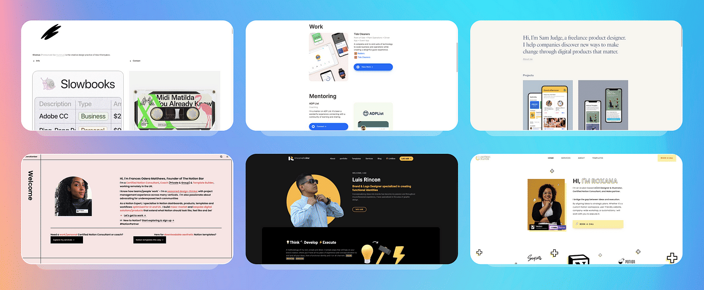
Notion is a versatile productivity tool—what people seem to primarily know it for—but Notion’s flexibility allows you to adapt it for building UX portfolios, too, in a simplified and structured environment where you can create and showcase your work. Its unique feature is how it uses “blocks” for various types of content—ranging from text and images, to videos you embed.
Super is a specialized tool that takes Notion's flexible content management capabilities and turns them into fully functional websites, which includes portfolios. Also—unlike Notion alone—Super provides enhanced design customization that allows you to apply custom domains, fonts, and analytics as you need and desire.
Main Features
Nested pages for structure
Blocks for varied content
Collaboration in real-time
Customizable workspace
Multi-platform access
Example Websites
Pros
Suits various use cases beyond portfolios
Intuitive drag-and-drop interface
Accessible on different devices
Cons
Fewer design options
Less optimized for search engines
Privacy concerns for portfolios
Pricing
Free plan for individuals
Paid plans start at $10/month (billed annually)
Rating
4.7/5 (g2)
9. Adobe Portfolio
© Adobe Portfolio, Fair Use
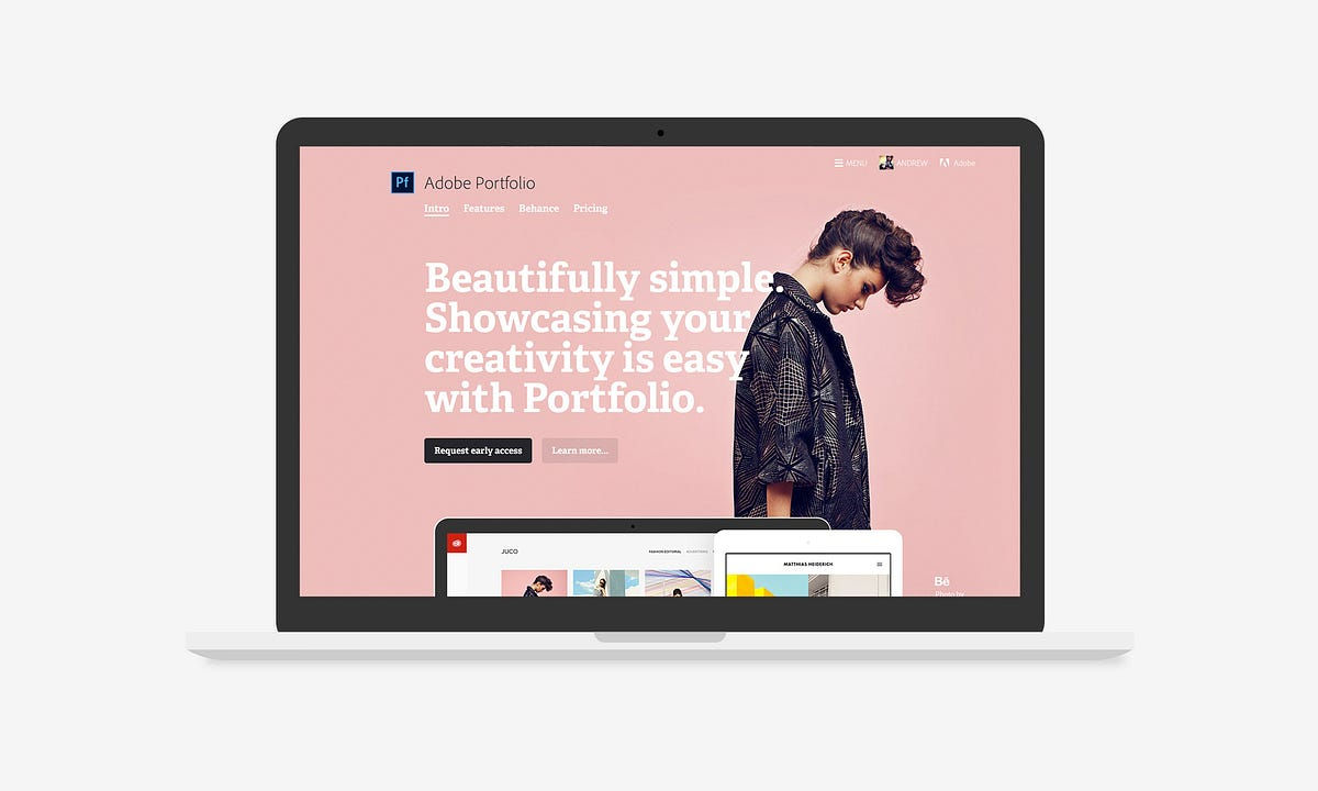
Adobe Portfolio is a specialized website builder in the Adobe Creative Cloud suite, and it’s ideal for designers as it offers a range of themes to build multi-page or single-page portfolios. What’s more, its seamless integration with Behance makes sharing work effortless for designers.
The builder includes essential features—things like custom domain connectivity, responsive image grids, and password-protected content—and familiarity with Adobe tools gives you an easy navigation experience with this.
Main Features
Customizable themes
Responsive image grids
Behance integration
Adobe Fonts access
Password protection
Example Websites
Pros
No extra cost with Creative Cloud
Basic features for professional portfolio
Lots of templates
Cons
Requires Creative Cloud subscription
Less user-friendly than competitors
Preview mode needed to view the site
Pricing
Free with any Adobe Creative Cloud plan
Paid plans start at $22.99/month (billed annually)
How to Choose the Right Portfolio Builder
© Interaction Design Foundation, CC BY-SA 4.0
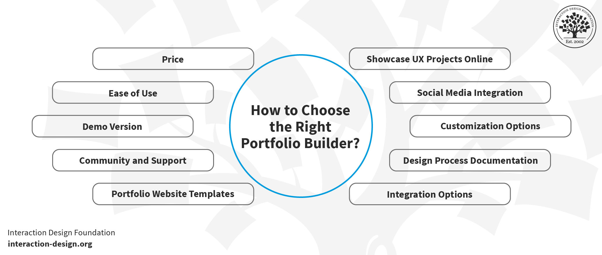
Your UX portfolio is—to put it simply—one of the most important designs you will ever create, and so it’s nothing short of critical to pick the right portfolio builder. As we’ve seen, the choices are plenty—and each has got its own set of features to help make it a strong contender for you to think about picking. Key factors for the best website builder for an online UX portfolio include these:
1. Price
Some online UX portfolio website builders offer free plans, but they’ve got limited features. And then—on the other hand—paid services like Uxfolio provide more customization options. So, it’s best to plan your budget for your precious portfolio project and compare offerings.
2. Ease of Use
A user-friendly UX portfolio builder is essential, and you don’t want anything getting in the way—much like you’d maximize ease of use for your own users and prove it through your portfolio. So, options like drag-and-drop functionality can make a world of difference.
3. Community and Support
A strong community can offer UX portfolio examples, tips, and general guidance. So, do check out those forums and reviews to gauge what level of community support each UX portfolio website builder has got.
4. Demo Version
Most of the best UX portfolio builders provide demo versions, and it’s best to use these to test customizable, responsive portfolio websites and more. One reason is that the demo can give you insights into what you can—and cannot—do.
5. Portfolio Website Templates
Most builders offer UI design portfolio templates—and these are handy tools that can be a great starting point for creating an impressive UX portfolio. However, do make sure that they’re customizable to fit your unique style.
6. Showcase UX Projects Online
The platform you pick should have the essential elements you must showcase in your UX portfolio. So, do be sure to look for features like image galleries, case studies, and text blocks that will let your work shine.
7. Social Media Integration
Social media links are pretty much a “must” in the digital age. That’s why it’s so vital to make sure the builder allows easy integration so you can give your online presence a powerfully palpable boost.
8. Customization Options
The more you can do to customize things, the better—especially since your UX portfolio needs to mirror the unique you as a designer and those ultra-special qualities you can bring to the table for employers or clients. So, look for customizable UX portfolio website resources that let you change things like colors, fonts, and layouts.
9. Responsive Portfolio Websites
In a mobile-first age, responsive portfolio websites are non-negotiable—and so much more than a nice-to-have. So, your portfolio should look good on all devices and screen sizes, and in turn mirror the point that you know how to design for all screens when it comes to what you can do for an employer or client.
Code Your Own Online UX Portfolio
Nothing beats coding your website from scratch, but what if you really want to code your own portfolio but have no coding skills and haven’t a clue how to write HTML, CSS, and JavaScript code? Well, if you love a challenge, you can consider the following online platforms that teach you how to code—and treat these online coding courses as part of your long-term plan to get into coding, so you’ll eventually be able to code your own personal website.
Khan Academy (Free)
Khan Academy is a nonprofit online platform that provides free courses for everyone—and we love Khan Academy’s mission. We recommend that you take Khan Academy’s courses on HTML, CSS, and JavaScript, particularly, and they’ll teach you the basics you need to create your own website.
We found Khan Academy’s interface particularly suited to learning coding. For instance, their “video” lessons contain a two-panel layout where on the left panel you’ll see the live code being updated as the instructor speaks, while—on the right—you’ll see a live preview of the website on show for you to see right away what works well for your needs.
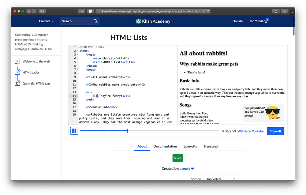
In Khan Academy’s lessons, you can see a code preview and a live website preview showing at the same time.
© Khan Academy, Fair Use
Codecademy (Free and Paid)
Codecademy is another great online learning platform—and it focuses entirely on coding. You can take courses on Codecademy for free, or you can upgrade to a paid “pro” plan to unlock career paths and code-oriented portfolio-building exercises, among other features.
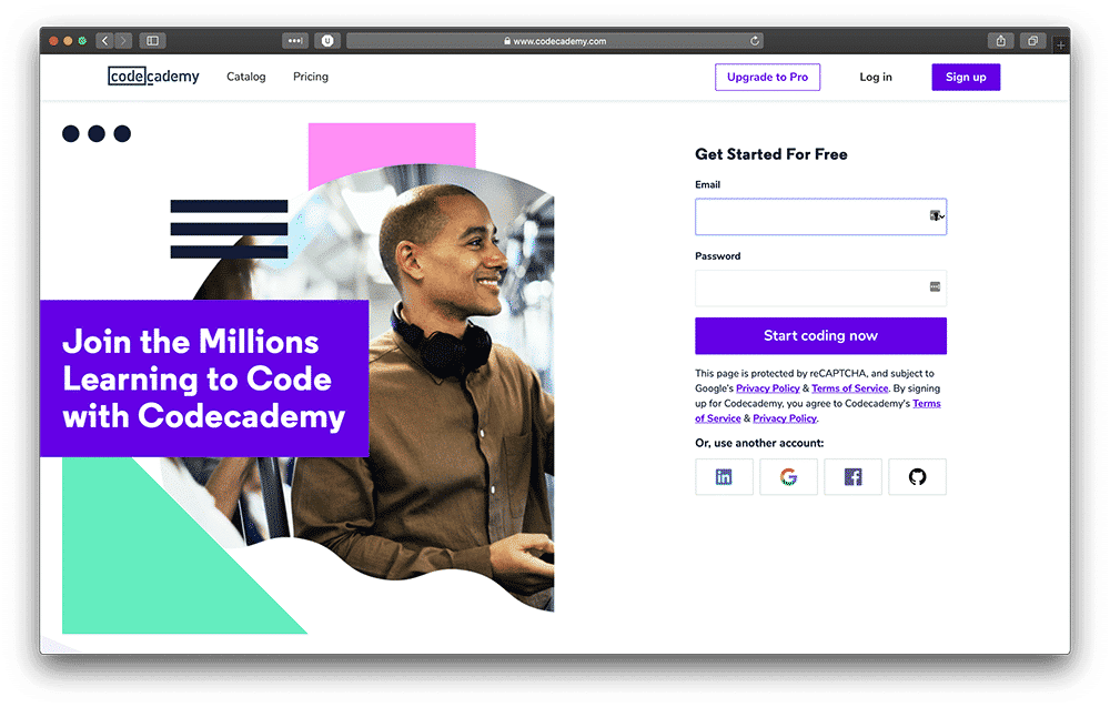
Codecademy specializes in code courses, and you can start learning for free.
© Codecademy. Fair Use
We suggest that you take Codecademy’s introduction courses to HTML, CSS, and JavaScript—that way, you’ll get a firm grip on the foundational knowledge which you’ll need to build your online UX portfolio.
As a matter of fact, if you want to master the basics of HTML, CSS, and JavaScript, we highly recommend that you take courses from both Khan Academy and Codecademy—and that’s because both platforms teach with different methodologies and from different perspectives. So, if you take courses from both platforms, you’ll have a holistic picture of the basics of front-end development and be all the better equipped.
7 Design Guidelines to Follow When You Build Your Own Online UX Design Portfolio
© Interaction Design Foundation, CC BY-SA 4.0
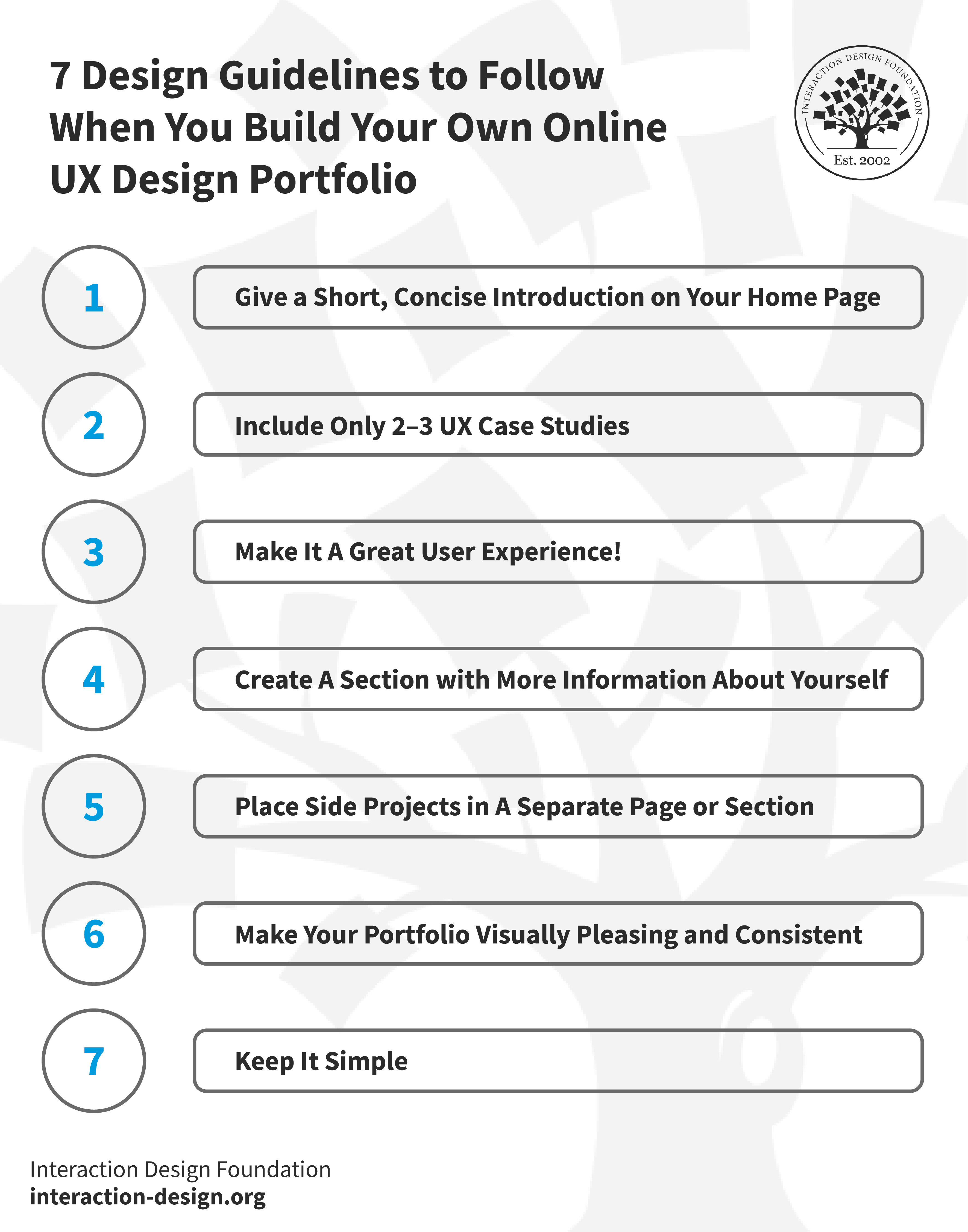
1. Give a Short, Concise Introduction on Your Home Page
Give a concise introduction of yourself right at the top of your home page—as in, a short and precise piece—so potential recruiters will immediately get a clear idea of what they can expect from you. Remember, your portfolio is a design in itself—just like the websites you claim to be able to create so well—and the home page is prime real estate: the very first impression you’ll make on those whom you want to work for.
Here, it’s important to include your name and current job position or the job role you aspire to, as well as, if it’s applicable, your current location, too. Keep it nice and short—your introduction should be, at most, three sentences long—and be sure to write it conversationally, like how you'd speak in a friendly and professional setting, and reflect your personality.
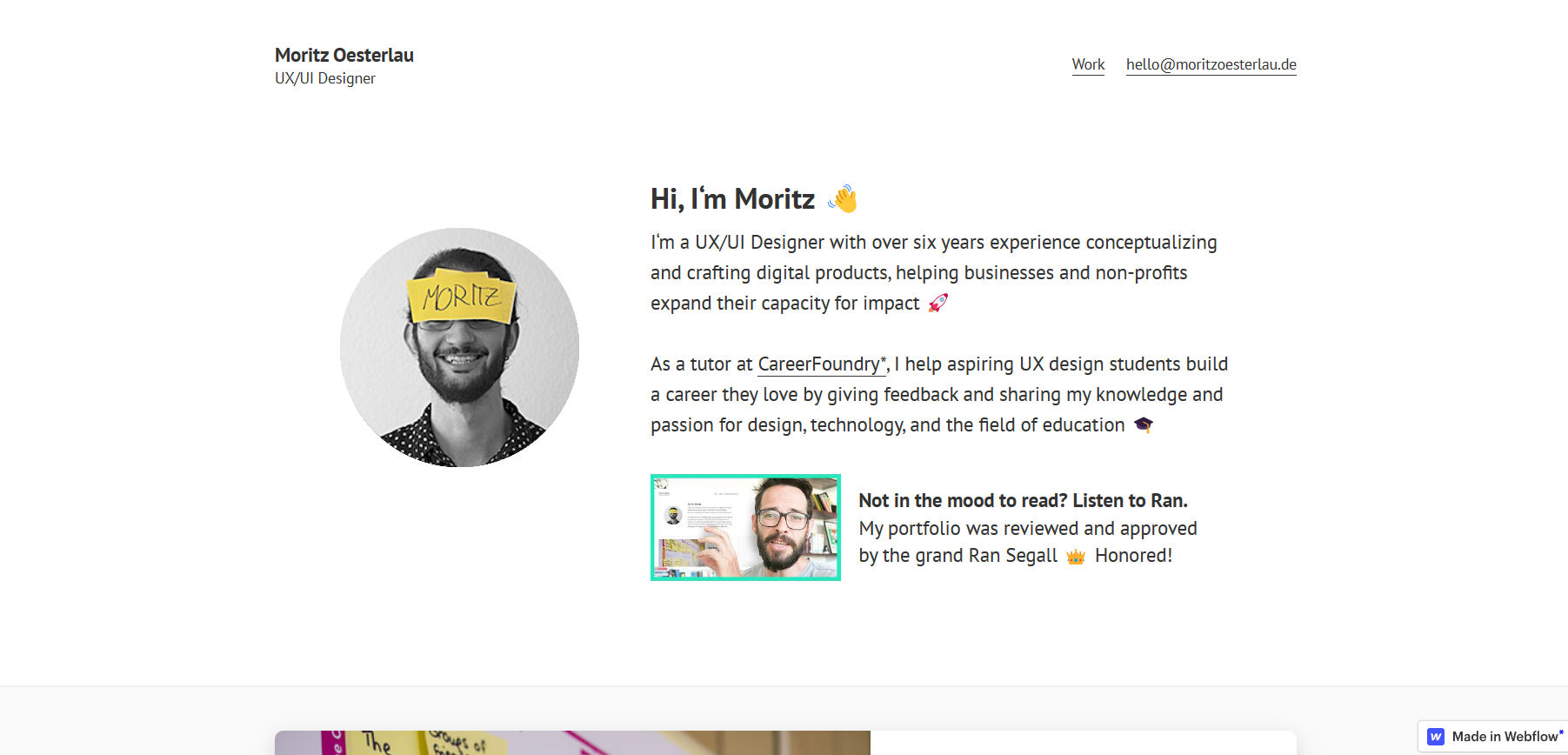
© Moritz Oesterlau Portfolio, Fair Use
When you arrive at the homepage of Moritz Oesterlau's portfolio, a delightful animation seizes your attention and in it, Moritz introduces himself, and—what’s more—his name appears prominently, and a welcoming wave emoji accompanies it. This is proof of how Moritz effectively communicates his rich experience, areas of expertise, and how he brings value to potential clients or employers.
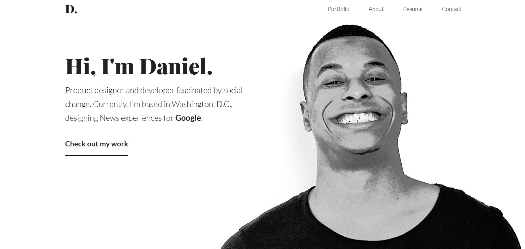
© Daniel Autry - Product Designer & Developer, Fair Use
Daniel Autry's portfolio hits the sweet spot between personable—with his photo featuring a broad smile that shows he’s approachable and credible—and professional, and right away, the bold "Hi, I'm Daniel." draws you in. He’s a product designer and developer who’s passionate about social change, and his concise bio reveals his current role at Google, melding purpose with prestige.
Notice how, in both Moritz’s and Daniel’s portfolios, they chose to get the most important information across to the viewer first—and you should do that, too, with your name and job role the most essential pieces of information that bring you right there to meet the potential client or employer. Hobbies and side projects are less important and should go below, and you might want to put your hobbies only on your “About” page rather than on the home page.
2. Include Only 2–3 UX Case Studies
Carefully select and showcase 2–3 of your best UX case studies—and these should be the best of your “greatest hits,” to use an analogy. Yes, we know how hard it is to resist the temptation to show your recruiters everything you’ve done, but—believe us—you need to showcase only case studies that are both exceptional and relevant to your UX job role: the cream of the crop.
Take a cue from Victoria Kazakova's perfect UX portfolio, where she elegantly underscores quality over quantity by showcasing just three of her top-tier case studies—a nifty masterclass in the 'less is more' mantra!
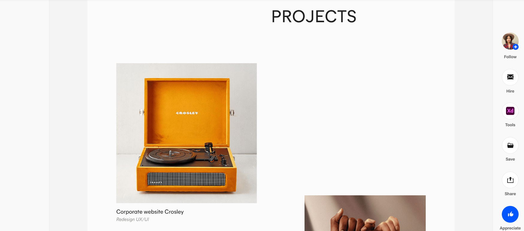
© Victoria Kazakova’s Portfolio, Fair Use
3. Make it a Great User Experience!
Recruiters are going to judge your online portfolio as a product design in itself, and any UX problems will negatively affect you and could turn them off right away.
Here are some essential usability guidelines you need to follow:
Make sure navigation is nice and simple and easy.
Design proper affordances into your links and interactive elements—for instance, underline the links and use a different color.
Pay attention to readability and color contrast, and do make sure your fonts are big enough and check your color contrast using WebAIM’s color contrast checker.
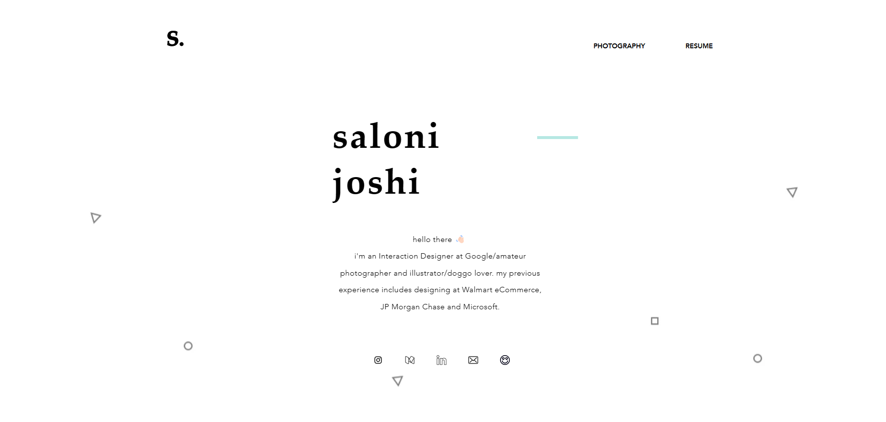
© Home | Saloni Joshi, Fair Use
Saloni Joshi's portfolio brilliantly showcases how good usability should underpin a UX design, and her website truly thrives on minimalism—note the absence of unnecessary distractions and how it focuses squarely on her work and accomplishments.
4. Create an About Page or Section with More Information About Yourself
Since it’s so important for you to keep the introduction on your home page short, we suggest that you make a separate “About” page—or section—to show more information about yourself, and in it include:
Further details about yourself, such as your hobbies and interests;
Your work history and educational background; and
Social media links to your professional profiles, such as LinkedIn, Medium, and Behance.
Make sure that you update your work history and education on your About page and other online accounts such as LinkedIn, Medium, and Behance. For example, whenever you complete a course with the Interaction Design Foundation (IxDF), you’ll always get an industry-recognized Course Certificate to prove your achievements. Include that along with the unique link you get for each course you’ve completed so that recruiters can verify the authenticity of your certificate. Showing new skills becomes more accessible with this approach, and you do it in the best company because leading UX companies such as Adobe, Accenture, Philips, and IBM have taken up company memberships with the Interaction Design Foundation.

© Interaction Design Foundation, CC BY-SA 4.0
Include the Interaction Design Foundation Course Certificate(s) on your About page and your LinkedIn and Dribbble pages to show your achievements.
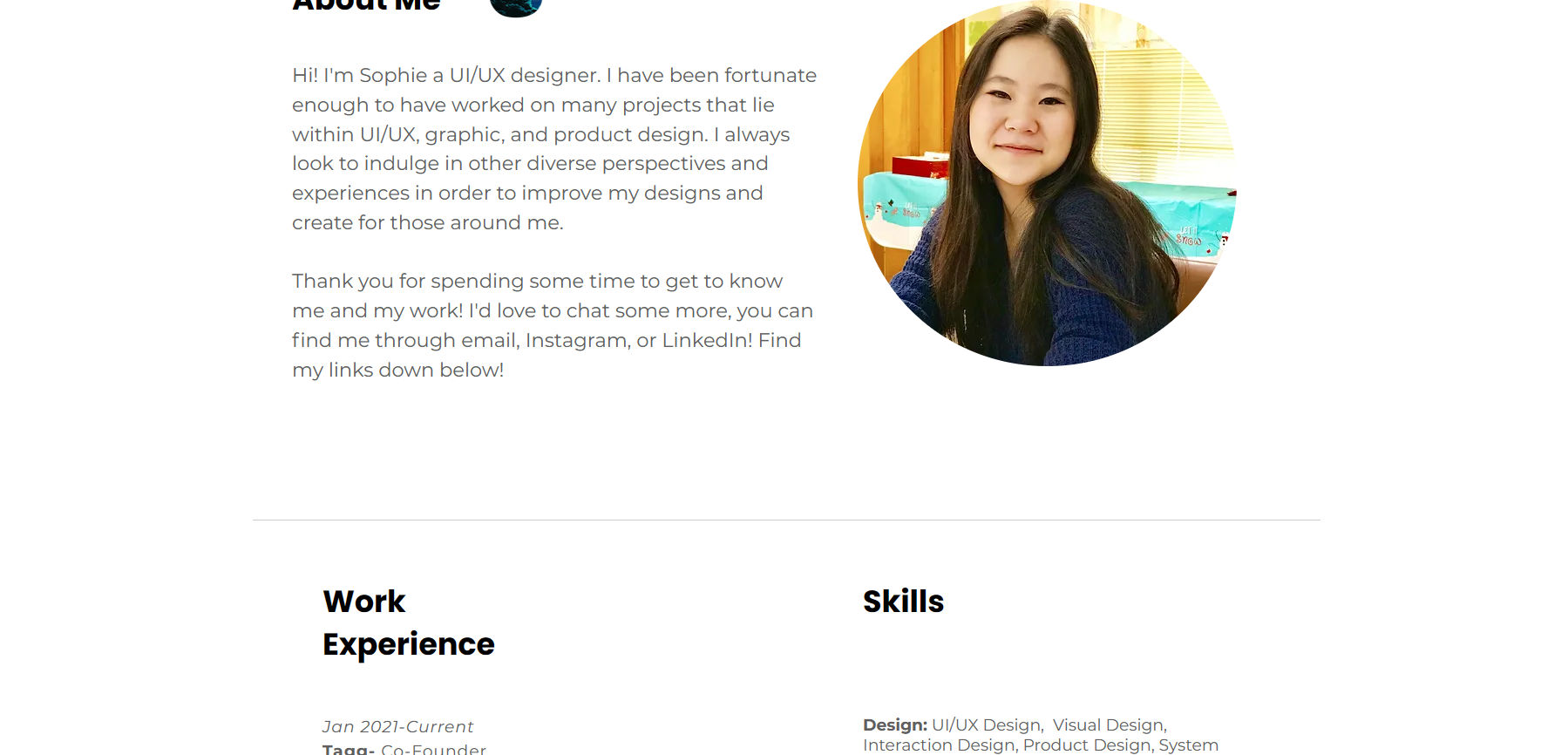
© About | Sophie Chen (sophiemchen.com), Fair Use
Sophie Chen's UX portfolio brilliantly highlights the essence of a comprehensive “About” page. Because she details her journey and seamlessly integrates her work history and skills, it offers a full-spectrum view of her expertise.
5. Place Side Projects in A Separate Page or Section
Put your side projects in your online UX portfolio—as they help showcase your passions and give recruiters a better sense of your personality. And it’s wise, as in very wise, to create a separate section or page for all your side projects.
For instance, Yu-Hsuan created a separate section for “side projects”—which he placed below his case studies—and he can showcase his passion for design while he puts the main spotlight on his case studies.
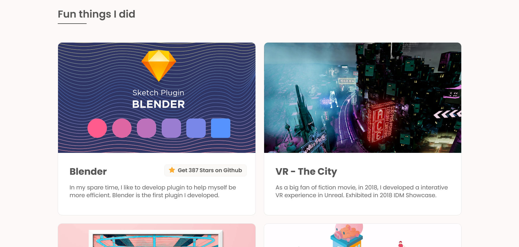
© Yu-Hsuan's Portfolio (yuhsuanlin.com), Fair Use
6. Make Your Portfolio Visually Pleasing and Consistent
Even if you don’t have a background in visual design, your online UX portfolio should look aesthetically pleasing and be visually consistent, as—like we mentioned above—recruiters will judge your online UX portfolio like any other designed product, so looks and functionality are ultra-important.
Thankfully, it’s easier than ever now to create a visually pleasing website, and if you’re not confident in your visual design skills, you can use a platform such as WordPress or Squarespace, which provides nicely designed templates.
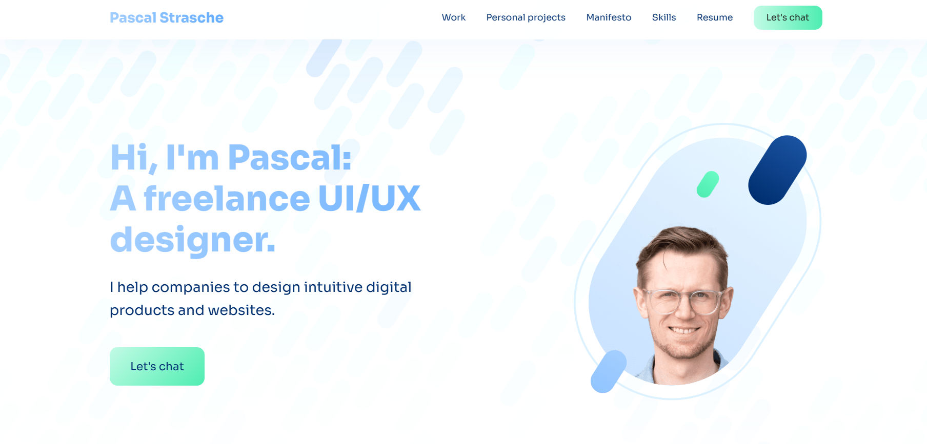
© Pascal Strasche – Freelance UI/UX Designer, Fair Use
Pascal Strasche's UX portfolio exemplifies visual harmony and consistency, and seamlessly weaving together a palette of well-balanced colors, it captivates the viewer—with cohesive design showcasing his aesthetic acumen and demonstrating meticulous attention to detail, and so making it visually pleasing and effectively communicative.
7. Keep it Simple
Think about the essentials of your message, and don’t aim to make the most perfect or beautiful website, and that’s because your online UX portfolio will continually evolve and change. You’ll have to maintain and change the case studies you show regularly, your intro copy, etc.
Here’s another super-important bit of advice: you should aim to create and push out a good enough version of your online UX design portfolio rather than wait for months to perfect it. “Why?” you might ask, “Won’t that harm my chances in the job market if it’s not totally perfect?” Well, once you’ve published your online UX portfolio, you can spend more time improving it, and notice that we said “good enough,” which means good enough for the purpose. At the same time that you’re tweaking something that’s already good enough, you would’ve already had an important asset you can use to apply for jobs.
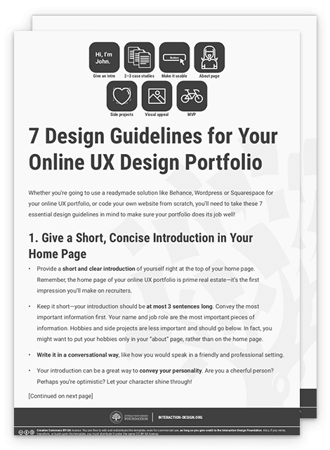
Download Our Template for 7 Design Guidelines to Follow in Your Online UX Portfolio
We’ve specially created a PDF template with a summary of the seven essential design guidelines we’ve mentioned above. Download yours now:

Use Our Sample UX Portfolio Site as a Reference
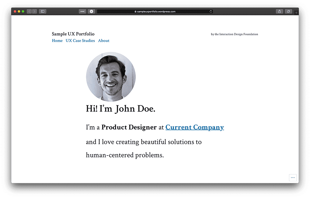
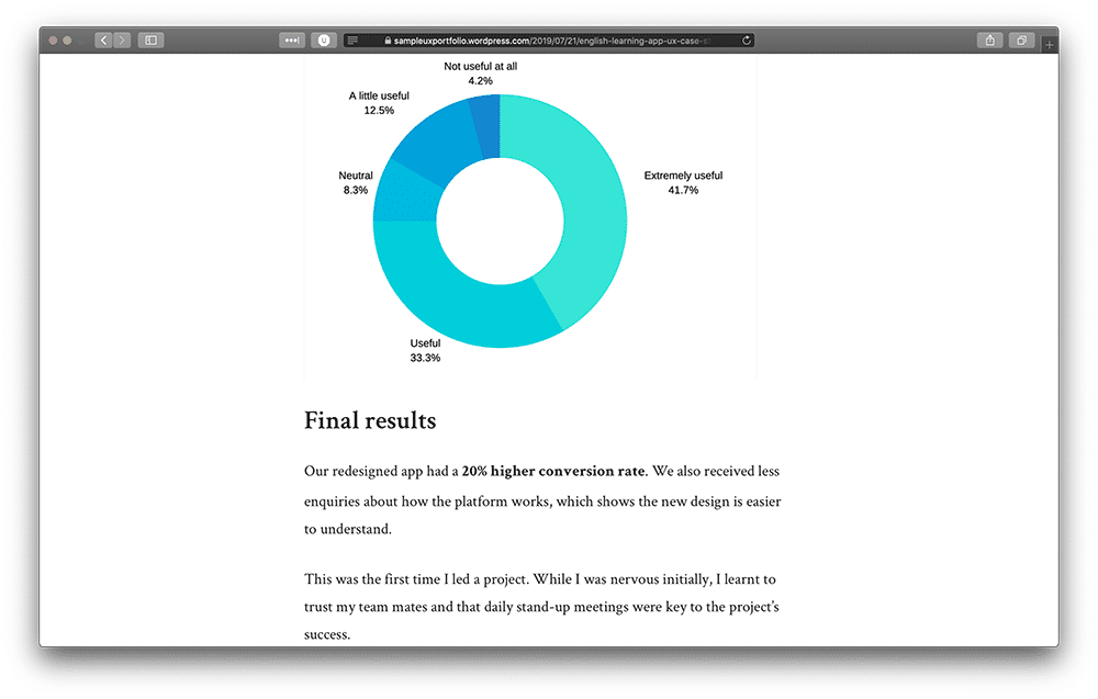
To further help you in your mission to create your online UX portfolio and represent yourself as a brand worth hiring, we’ve created a sample site you can reference and in our sample site, you’ll know what your online UX portfolio should look like.
© Interaction Design Foundation, CC BY-SA 4.0
© Interaction Design Foundation, CC BY-SA 4.0
Yes, we’ve actually created an entire online UX design portfolio so you can refer to it when you make yours!
Head over to our sample UX portfolio site now: https://sampleuxportfolio.wordpress.com
The Take Away
When you want to create your online UX design portfolio and get ready for hire, you’ve got two options: use a ready-made solution such as Behance or WordPress or code your website. If you’re unfamiliar with coding, though, Behance, WordPress, and Squarespace are excellent solutions, and—in particular—WordPress and Squarespace allow you to have your website and provide many templates for you to choose from. Alternatively, nothing beats coding your website if you’re interested in coding or know how to code.
When you create your online UX portfolio, do be sure to keep these seven essential design guidelines in mind:
Give a short, concise introduction on your home page.
Include only 2–3 UX case studies.
Make it a great user experience!
Create an “About” page or section with more information about you.
Place side projects in a separate page or section.
Make your portfolio visually pleasing and consistent—a design solution in and of itself.
Keep it simple and straightforward.
References and Where to Learn More
Check out our sample UX portfolio site built with WordPress.
To check the color contrast of your online portfolio’s text and elements, you can use WebAIM’s color contrast checker.
Check out Netguru’s UX case study on Behance for a taste of how yours could look.
