We’ve said it before and we’ll probably say it again; the copy used in products is as important to the user experience as any other part of the design. Great graphics, awesome information architecture and simple processes can still be completely wasted if the text sucks.
More importantly, from a business perspective, the copy can create action. Want a user to fill in a form? The right wording can make that happen. The same goes with encouraging users to share their experiences on social media or for closing a sale.
Getting good at writing copy takes practice. It also takes fluency in the language you’re writing in. I have huge admiration for second language users but the majority of them lack proper fluency. Awkward grammatical and sentence construction problems ensue from that. In most cases it’s much harder to learn to write a language than it is to speak it; mainly because you will normally get much more practice at speaking it than writing it.
Then there’s the need for localization. American, British, Australian, Indian, etc. English are all slightly different. There’s a need to breathe authenticity into your copy as well as words.
However, that should all be taken for granted. Hiring a copywriter that can tick those boxes is straightforward but there are a lot of tricks that can turn an average copywriter into a great one. Here are 5 ideas that should help boost the UX of your copy to new levels:
It’s All About Benefits, Selling is a Constant Process
If you want to convert business, and let’s be fair that’s what websites are all about, you need to consider that every interaction you have is a step in the sales process. If your home page sends people running for the hills… you aren’t going to get them to your product pages and wow them with your offerings.
Your visitors need to be convinced to spend their time on your site. That means explaining the benefits of doing so. That’s also how you get people to sign up to a mailing list to get further information. Don’t tell them what they’re getting, tell them why it matters. You can use images to enhance the copy so that benefits become even more tangible.
Which is more likely to win the click?
- Click here for a copy of our e-book.
- Subscribe now and learn how to make your first $1 million before you turn 30!
Benefits are the key to conversion. So make certain that you explain the benefits at every turn possible.
![]() Author/Copyright holder: afunkydamsel. Copyright terms and licence: CC BY-ND 2.0
Author/Copyright holder: afunkydamsel. Copyright terms and licence: CC BY-ND 2.0 You Only Have One Voice and Thus One Audience
Sure, you’ve got a bunch of user personas and they constitute your target audience but when it comes to copy – you can only talk to one customer. That’s the customer that stays and reads what you have to say and buys what you have to sell.
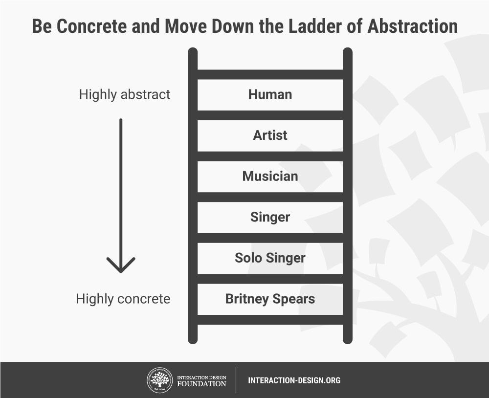
That means revisiting the research in this area. You need to distil the essence of a single perfect user out of your research. If you try to be all things to all men; you will sound confused. You want a detailed profile of that user. What do they earn, what do they read, where do they work, how much do they earn, etc?
That profile allows your copywriter to talk to the ideal user. It allows them to develop a strong identifiable voice that rises above the background noise.
Talk to Your Users, What’s Their Language?
I’m from England. I went to Public School and I’ve worked internationally for more than a decade. If you sit and talk with me, you’ll have a very different impression of English people than if you talk to someone with a different background.
This matters because you need to speak the language of your users. If I’m your target audience there’s no point in peppering your copy with accessible British street slang; I haven’t set foot on a British street in the best part of a decade. Likewise, if your audience is a bunch of English teens – they’re not going to get on with the kind of copy I like. They’re au fait with slang and expect it in their content.
![]() Author/Copyright holder: Eric Andresen. Copyright terms and licence: CC BY-NC-ND 2.0
Author/Copyright holder: Eric Andresen. Copyright terms and licence: CC BY-NC-ND 2.0 Your copy needs to feel natural to the audience. Your profile will help with this. You can easily work out when a sentence is completely wrong for an audience but the subtleties require a lot more effort.
Features Aren’t Benefits
When I worked as a salesman, years ago, the first thing I learned was a little acronym FAB. It stands for features, advantages and benefits. People don’t buy features and they don’t really buy advantages – they buy benefits.
Features are what something does, the price point, the visual appeal, etc. they’re the contents of the box. Advantages sound like they should be benefits but in fact are simply a better explanation of a feature. It’s the benefits that count.
So for example, if you were selling a shirt:
- Made of 100% Egyptian Cotton! Is a feature.
- Egyptian Cotton is silkier than regular cotton. Is an advantage.
- Egyptian Cotton shirts are the most comfortable products on the market because you barely know that you’re wearing them! Is a benefit.
Test Your Copy
Make your copy jump through hoops before it goes live. Find some users in your target audience and have them read the copy. Get their feedback. Does it speak to them? Or are you missing the mark in some perceptible manner?
You wouldn’t dream of not testing other areas of the user experience so don’t neglect the copy. The more you test, the more certainty you have that you’re going to succeed with the copy when it goes live.
Most importantly test variants of text. If you want to know whether “click here” or “sign up now!” works best, this is the easiest way to find out.
![]()
Author/Copyright holder: ABC Copywriting. Copyright terms and licence: All rights reserved. Img Summary
Copywriting is an art. Like almost all arts, it can be learned. The tips here will help your copywriters focus more on the outcomes of their copy than the writing process itself naturally assumes.
Header Image: Author/Copyright Holder: Rachel. Copyright terms and licence: CC BY-NC 2.0