
A UX sitemap is a visual tool that’s a handy aid for you as a user experience (UX) designer. It doesn’t just organize a website's content and structure—in how it displays how web pages connect and relate—but identifies gaps and prioritizes content, too. From that, it’s a great aid to nurture a good, solid, cohesive design, so users navigate websites easily with a clear, logical flow. Read on and we’ll explore how to create sitemaps, tools, and best practices—a prime chance to get your content set out for success.
First of all, imagine that you’re navigating through a complex maze that’s loaded with treasures—plenty of which you might well miss if you don’t have a map, and that’s like building a website without a UX sitemap, since you can look on your website like a kind of digital maze. Site organization is a big deal, since in this “maze,” you’re going to have pages, blog posts, product descriptions, and contact details and you’re always going to need to have a clear structure for it.
Cue the blueprint powers a sitemap bestows when you learn to organize your website's content—and content strategy—effectively, and discover how it visually represents the structure and hierarchy of your website pages and provides a hierarchical overview of how web pages and sections interconnect.
Learn from Priscilla Esser, Ph.D., who discusses the importance of visual frameworks and hierarchy in web design—and see how you can apply these concepts.
Show
Hide
video transcript
- Transcript loading…
A well-crafted UX sitemap guides users nice and effortlessly through a website—but there’s a bonus effect in that in website development, it also serves as a collaborative tool, so people from other teams, including stakeholders with non-design backgrounds, can refer to it to make sure the website’s layout is in line with user needs and business goals. What’s more, a good site map means teams can spot gaps that they might otherwise miss, and prioritize essential content that’s better in tune with true user-centric design.
© Interaction Design Foundation, CC BY-SA 4.0
How to Create an Effective UX Sitemap
© Interaction Design Foundation, CC BY-SA 4.0
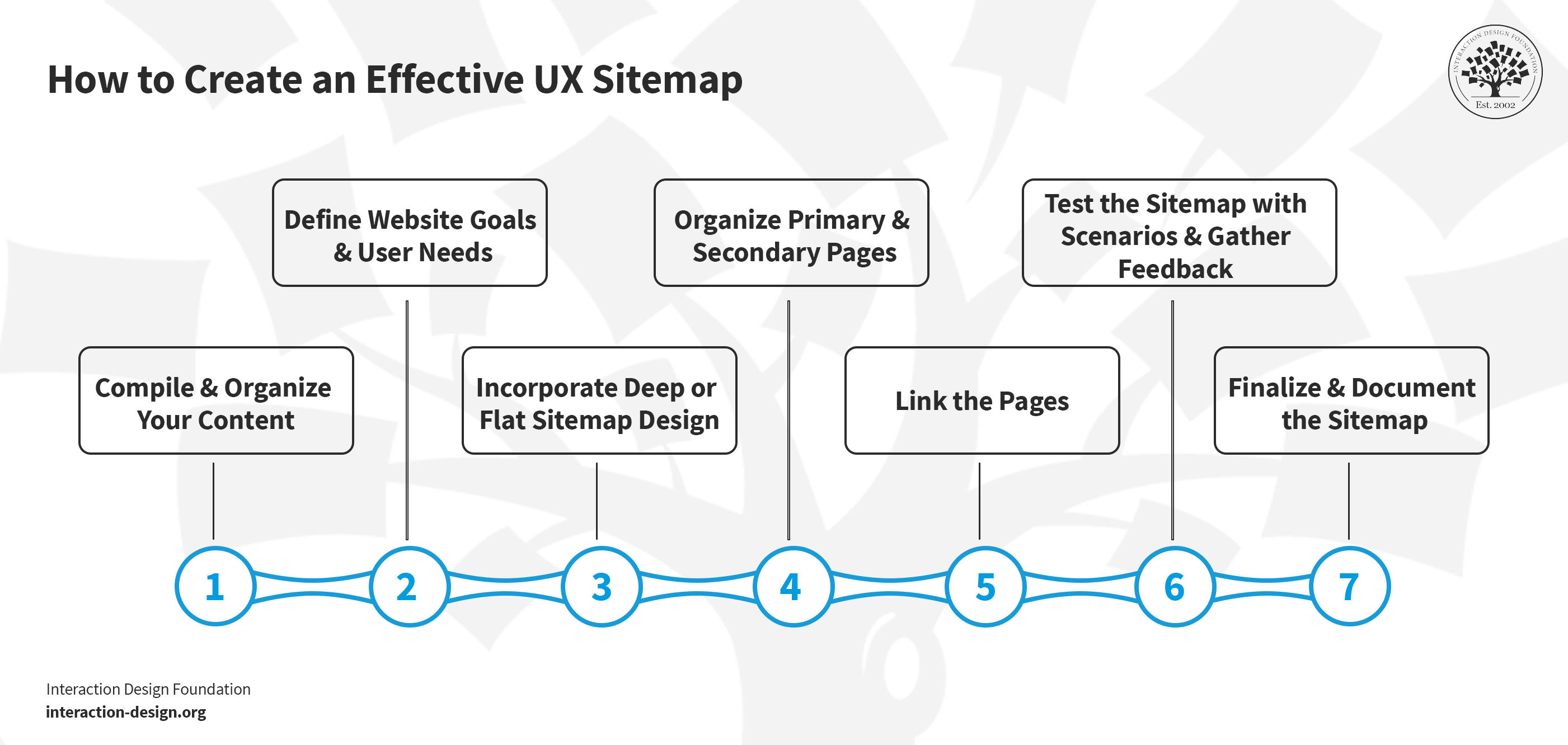
1. Compile and Organize Your Content
First of all, get all your website content together, and be sure to list every page, URL, or title for future pages—and use a tool like Excel or some such to make this list, and it’ll show you what you’ve got currently and what needs development.
Next, you’ll want to look at each page and decide how relevant it is to the sitemap—and you may only find some pages that are truly essential for the primary navigation structure, so pick out key pages that users frequently visit or ones that are more crucial to your business objectives.
You’re going to have to group similar pages to streamline the structure, cut down on the clutter, and—of course—make user navigation nice and simple, and you can consolidate multiple “Contact Us” pages with different access paths under one main menu, for instance.
2. Define Website Goals and User Needs
For the next step, it’ll take a clear understanding of what your website’s purpose is and what the target audience’s needs are—and once you know what your users expect from your website, it’ll guide how you make the sitemap, so ask yourself:
“What specific challenges do my users face?”
“What aspects of my website or product need enhancement?”
To get insights into these and understand your user needs and preferences, that’s where user personas come in, and you can use these personas based on interviews with current—or past—users or hypothetical profiles of your target audience for new sites.
Watch Alan Dix, Professor and Expert in Human-computer Interaction, discuss how important and helpful personas are for understanding user characteristics.
Show
Hide
video transcript
- Transcript loading…
You’re going to need to make sure you tailor your sitemap so you can address problems effectively and make sure that your site includes a well-organized and user-centric structure—and content—and that’s why you’ll need to ask users questions like these:
“In what situations do you typically visit our site?”
“How frequently do you find yourself using our site?”
“What motivates you to use our site?”
“What changes or improvements would enhance your experience on our site?”
3. Decide on Flat or Deep Sitemap Design
You’ve got two options for how you go about creating your UX sitemap—it’ll depend on the type of websites, so think carefully about the size of your website, the amount of content, and how you want users to interact with your site:
Flat sitemap design: A flat sitemap design has got a limited number of hierarchical levels—usually up to four—and it’s better for smaller websites that have got fewer pages. This makes for quick and easy access to any page with just a minimal number of clicks. More precisely, it’s:
Suitable for smaller websites with about 10 pages.
Got up to four hierarchical levels.
Got any page being easily reachable in four clicks or fewer.
Ideal for straightforward and easy navigation.
Deep sitemap design: A deep sitemap design has got many hierarchical levels, and it’s more apt for larger websites that have got extensive content and need something to handle numerous pages and categories, something that can give the site detailed and comprehensive structuring. More precisely, it’s:
Best for larger sites—like e-commerce platforms—with 100 or more pages.
Got deeper levels of hierarchy.
Good to accommodate extensive content.
Going to call for features like breadcrumbs—for easy navigation of deeper content.
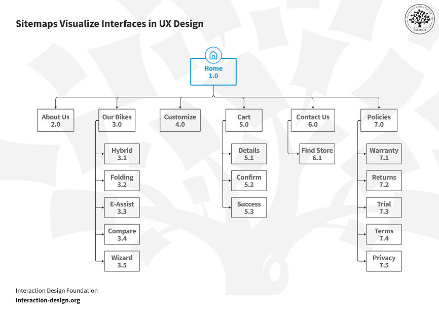
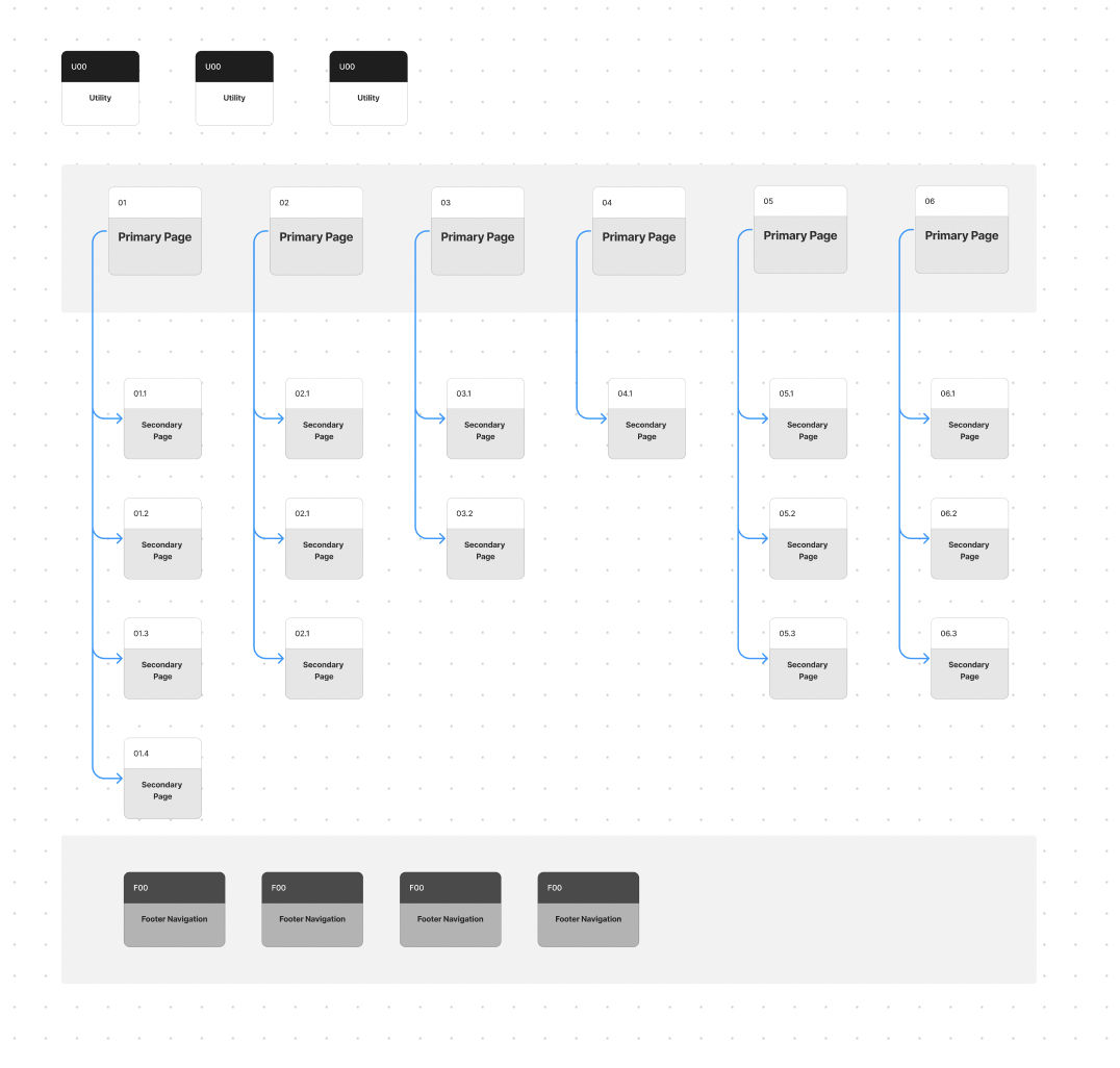
4. Organize Primary and Secondary Pages
It’s a good idea to start with the homepage—or landing page—not least since it’s the central hub or the primary page. Then, from there, branch out to other main category pages—and they’ll work as your primary pages, and examples of these pages often include major sections like Products, Services, About Us, or Blog.
Secondary pages are the subcategories inside of these primary pages—like under Products, you might have different product categories like Electronics, Clothing, Books, etc.—and you can represent each one as 1.1, 1.2, 1.3, and so on in your numbering system. When you’ve got this methodical categorization in place, it’ll help you keep a clear and intuitive website structure, and you’ll be able to take things to finer-tuned levels past the primary level of a product page—whatever’s appropriate for your site’s pages.
What’s more, look what the footer does in your website's architecture, the space you use for subsidiary—but essential—links like Contact, Privacy Policy, and Terms of Service, and the footer acts as a separate navigation area for users to access important information no matter where they are on your site.
Last—but not least here—make sure you’ve got an “Error 404” page to redirect users who land on a nonexistent page inside of your site to relevant sections instead.
5. Link the Pages
Once you’ve got your primary and secondary pages all organized, it’s time to do this:
Link all primary pages from the homepage, and make sure the links are all visible and accessible to make a nice and intuitive navigation path for your users.
Connect secondary pages to respective primary pages next, and as you’re doing this internal linking, make sure the hierarchy is clear and logical so users get to enjoy easy navigation.
Focus on the user journey, and plan links so you lead users to the relevant, expected content they’ll be after.
What’s more, update the sitemap regularly and add new pages and integrate them into the existing structure, so you’ll keep the UX sitemap good and relevant—and efficient.
6. Test the UX Sitemap with Scenarios and Gather Feedback
Once you’ve organized your sitemap, go on and test it through various user scenarios—and imagine how different personas—as in, ones that represent your target audience—would navigate your site. It’ll show how user-friendly your sitemap is, plus potential navigation issues which users may run into, too.
One big ally you’ve got when you’re doing UX sitemap testing is tree testing, and it lets you evaluate your sitemap on its own—what you do is you create a list of objectives and then ask users to navigate to where they think the required content would be. Tree testing services such as Treejack just call for the details of your sitemap, and they maintain statistics on user success rates and details about where navigation seems to fail.
Always be sure to get your team and stakeholders involved in this testing phase, and that’s because their diverse perspectives can provide valuable insights—as long as they give honest feedback on the sitemap's layout, usability, and effectiveness.
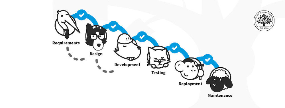
Feedback and testing are vital forces to help you shape the product as you work in iterative refinements so it ends up better meeting user needs and enhancing UX design and usability—and it’s impossible to overstate how precious these are, especially when you get them in context among the various steps and elements UX design involves, as this video shows:
Show
Hide
video transcript
- Transcript loading…
7. Finalize and Document the Sitemap
Once you’ve tested and refined the sitemap based on feedback, it’s time to finalize it. Document the sitemap for the current website structure and any future modifications—and it’s particularly important to ensure that all team members can easily access the final sitemap both for reference and for implementation.
Toolkit for Visual Sitemaps
Visual sitemaps give several advantages when you’re working with website development—and, when you create a sitemap, it’s particularly good when you’ve got the right tools, so let’s look at some now.
© Interaction Design Foundation, CC BY-SA 4.0
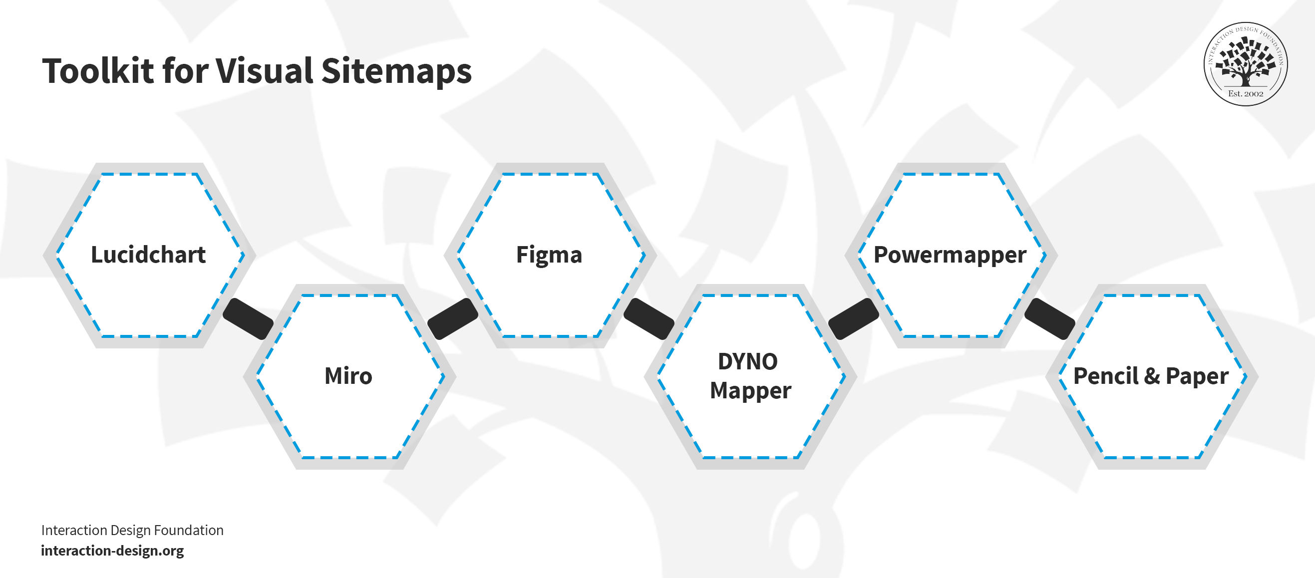
1. Lucidchart
© Interaction Design Foundation, CC BY-SA 4.0
Lucidchart specializes in complex diagrams like UX sitemaps, it’s got a user-friendly interface, and it includes a variety of templates and shapes. Its drag-and-drop functionality makes diagramming fast, while the real-time collaboration it gives team members lets them work together from various locations.
2. Miro
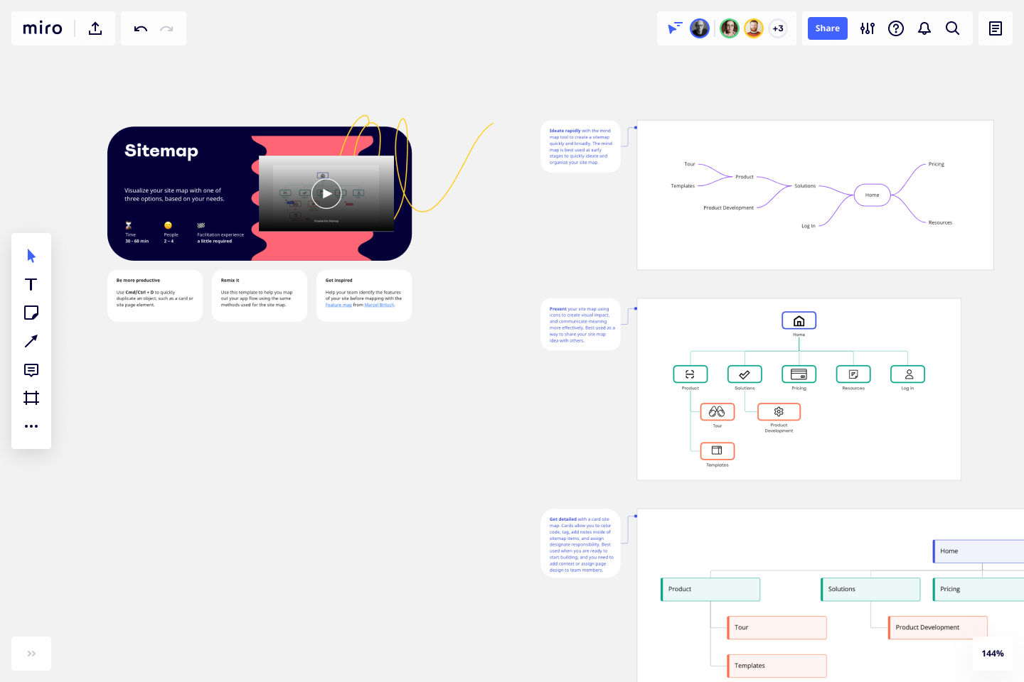
© Miro, Fair Use
Miro acts as a digital whiteboard, and it’s great for easy brainstorming and team design, and—what’s more—teams get to work smoothly together, wherever they’re located, plus Miro includes features that help you create UX sitemaps, journey maps, and wireframes.
3. Figma
© Figma, Fair Use
Figma provides strong design and prototyping tools, so you can create interactive prototypes to test your website flows, and Figma lets many users work on a sitemap at the same time.
4. DYNO Mapper
© DYNO Mapper, Fair Use
DYNO Mapper is great for you to create, customize, edit, and share interactive sitemaps, it integrates with Google Analytics for content inventory, audit, and keyword tracking, and the tool lets you enjoy easy collaboration and website accessibility testing.
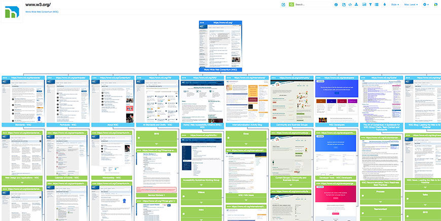
5. PowerMapper
© PowerMapper, Fair Use
PowerMapper maps, tests, and analyzes websites—and companies like IBM and NASA use this UX sitemap generator—and it scans websites to capture thumbnails and metadata, and it creates visual sitemaps, which you can check for various website issues.
6. Pencil and paper

© WordPress, Fair Use
Last—but certainly not least—let’s get to the low-tech, or perhaps even “no-tech,” section with good old-fashioned pencil and paper, which give you a simple yet effective way to plan sitemaps as you can group content items easily on the page; plus, it’s a good method to help you optimize information architecture. Still, you can use whiteboards, chalkboards, or easels for planning, too—whatever works best here.
Practical Aspects of UX Sitemaps
1. Visual Clarity
A UX sitemap has got to have straightforward visual elements working for it so there’s no confusion and everyone can understand the site’s structure at a glance, and that’s why clean lines, easily readable fonts, and a straightforward layout are essentials.
2. Intuitive Structure
The structure of a UX sitemap really needs to mirror the user's thought process, and logically group related content so users get to have that natural browsing experience that helps them navigate the site well, with related pages all nicely linked in a way that feels nice and natural and coherent.
3. User-Centric Design
As they do elsewhere, user needs take priority in a UX sitemap, and the hierarchy has got to make important pages easy to find and access.
User-centered design is about getting that focus on tailoring the product to create a better user experience, and that’s why it’s good to know what elements make up the user experience. Check out this closer look at the five elements of user experience outlined by Jesse James Garrett in "The Elements of User Experience."
Show
Hide
video transcript
- Transcript loading…
4. Scalability
Flexibility for growth characterizes a well-designed UX sitemap—and it’s that ability to build and append that’s another big plus, accommodating new pages or sections as the site evolves so there’ll be no need for major redesigns.
UX Sitemap Best Practices and Examples
UX Sitemap Best Practices
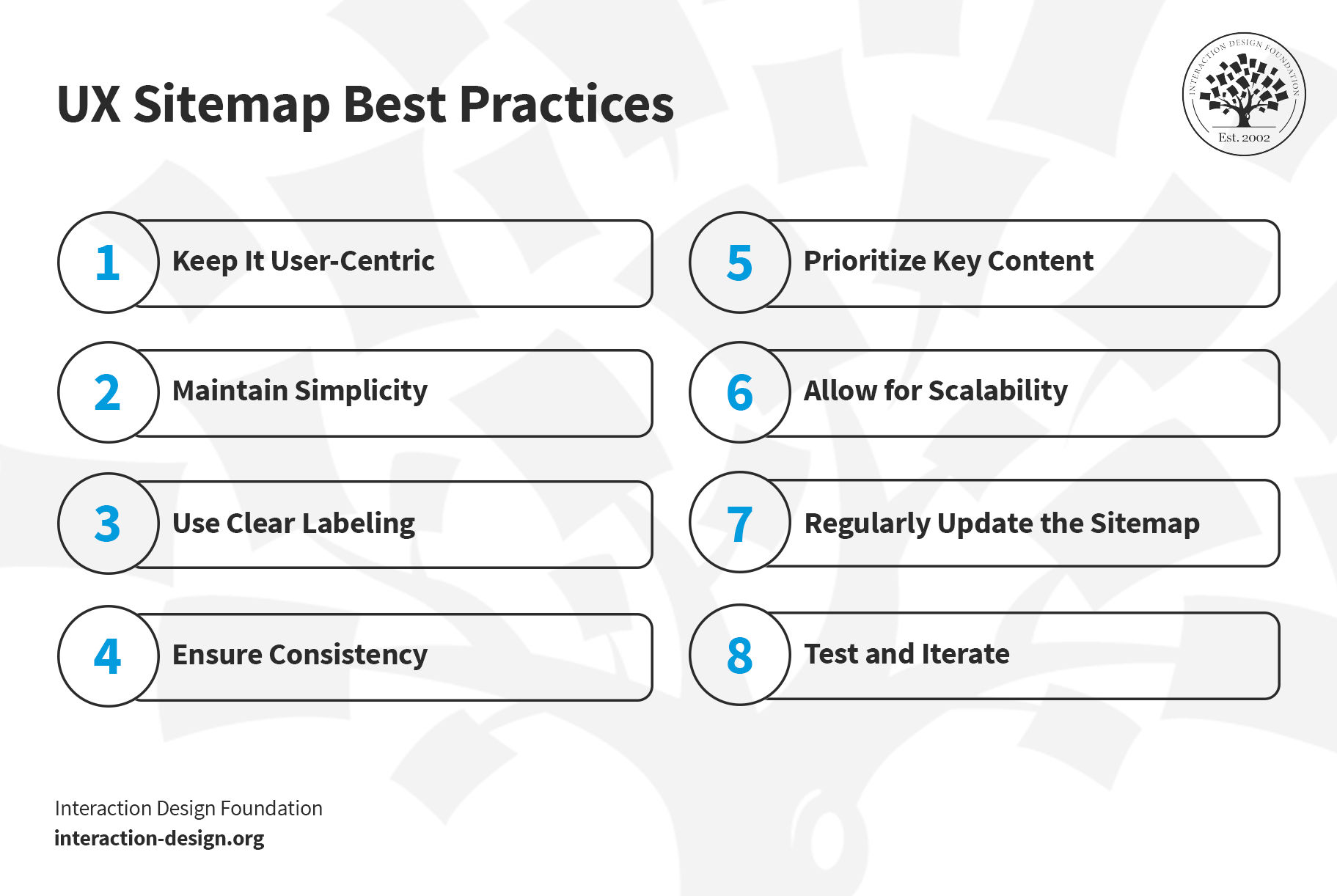
© Interaction Design Foundation, CC BY-SA 4.0
Keep it user-centric: Design the sitemap with the user's journey firmly in mind, and keep a tight focus going on how users search for—and navigate through—information on your site.
Maintain simplicity: Even if you’ve got a really complex site, go for a sitemap that’s as simple as possible, since a structure that’s too, too involved (as in, overly complicated) will likely end up confusing whoever gets to see (and try to use) it.
Use clear labeling: Use clear, descriptive names and labels for categories and pages so an “average user” can make sense of it, and don’t have any technical jargon in there unless it's common in your industry.
Be sure there’s good consistency: Keep consistent categorization and naming conventions going throughout your sitemap.
Prioritize key content: Put the most important, most-frequently-accessed web pages in prominent locations.
Allow for scalability: Think ahead—and design your sitemap for future expansion, so you (or others involved in it) can add new pages or categories without messing up the current structure in any way.
Regularly update the sitemap: As your site evolves, so should your sitemap, too.
Test and iterate: Continuously test the sitemap with real users—and use their feedback to make changes that bring results and prove good iteration.
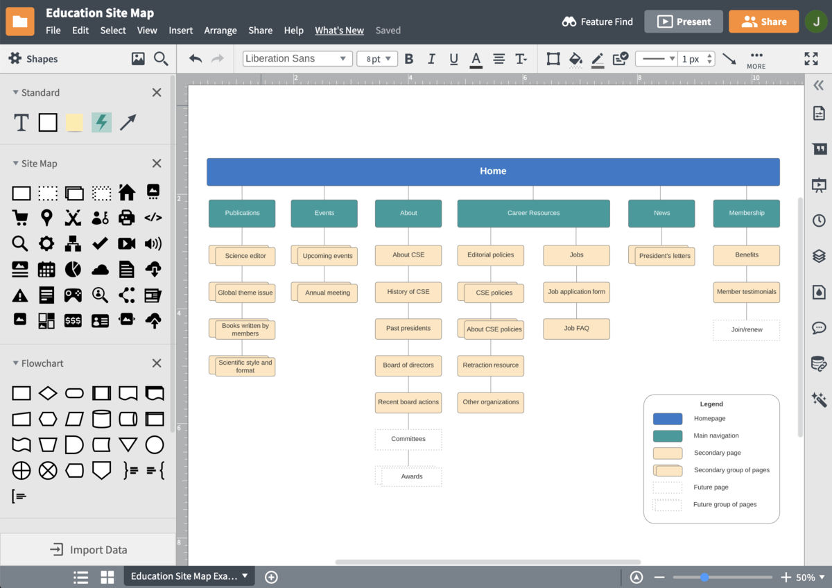
UX Sitemap Examples
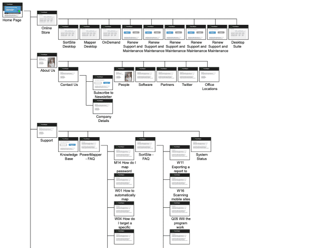
Example 1: Home Decor Website
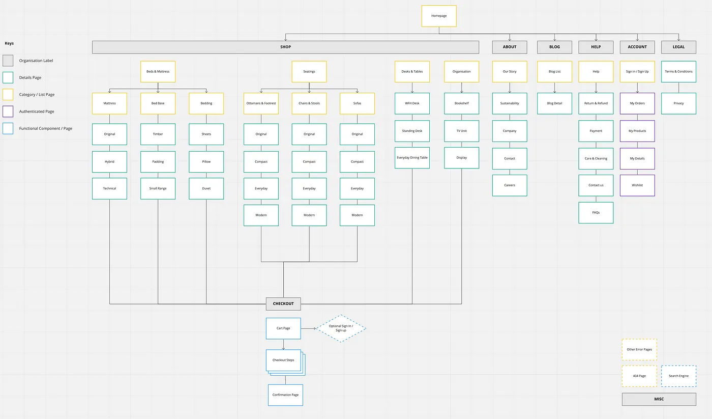
© Medium, Fair Use
The sitemap has got a well-organized breakdown of a website's content going across several key categories—like 'Shop,' 'About,' 'Blog,' and more—with each branching neatly into subcategories, and those get further detailed into individual pages or topics.
The sitemap uses color coding and shapes to distinguish between different types of pages—and a hierarchical, tree-like structure helps you visualize the relationships between sections and pages.
Example 2: SaaS Application
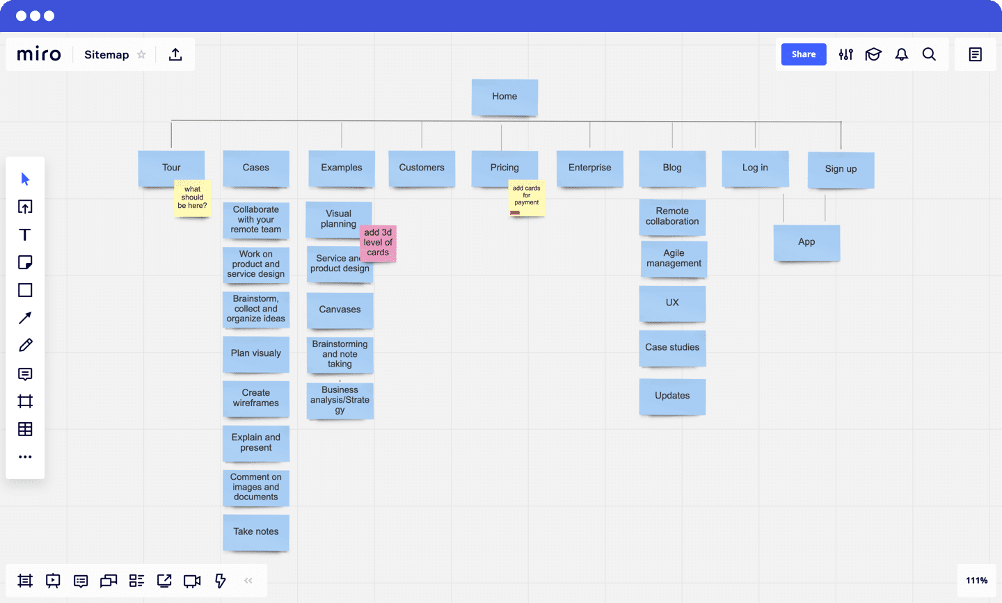
© Miro, Fair Use
On this one, we’ve got a different approach on show to organizing the web pages, with this sitemap’s clear top-level view that starts from the “Home” page and then branches into main categories like Tour, Cases, Examples, etc. It’s got a clean, grid-based layout that’s easy to understand the site’s structure at a glance with, and consistent color coding for all items.
Notes such as "add 3d level of cards" suggest that this sitemap still needs a little work, and it shows how the sitemap can work as a living document, one that evolves with the project.
The Take Away
A UX sitemap is a great tool that works as a blueprint both for organizing website content and for establishing a user-friendly structure and visual hierarchy—and it’s something that helps you guide users through a website and meet business objectives of your brand. So:
Design sitemaps with a focus on user navigation.
Keep the sitemap structure clear and simple.
Update the sitemap to reflect the content and structural changes.
References and Where to Learn More
Get started with UX Design in our course, User Experience: The Beginner’s Guide.
Access Miro’s UX sitemap template that helps you create UX sitemaps in different layouts and structures.
Read Monica Maye Pitts, founder of MayeCreate, talk about the difference between XML and UX sitemaps in detail.


