Your UX design portfolio is bait—and only bait—to get you into the first stage of your job application process. It’s what recruiters use to determine whether or not to call you in for a face-to-face interview or have a phone screener call with you. Many companies will spend less than 5 minutes to see whether you’re a good fit for what they’re looking for—and if they cannot get an answer within 5 minutes, they’ll move on to the next candidate. That’s how crucial it is for you to get your portfolio just right.
If you want to break into the UX field, you’ll most likely have heard of the term “UX design portfolio”. Through your portfolio, you summarize yourself as a UX designer: You introduce yourself and showcase a few case studies of your past projects to highlight what you can do, demonstrate how you approach problems and show some of your work processes and results.
However, you need to take a step back to understand what a portfolio really is before you rush off to create it. You see, there are many popular misconceptions of what a UX design portfolio is—and if you’re not careful, you might create something that misses the mark. Since your portfolio is the most important (and sometimes only) factor in getting the first interview, you’ll want it to be in its best possible shape.
Don’t worry—we’ve got you covered. Let’s take a look at what a UX design portfolio is and what you should include in your portfolio!
What is a UX portfolio?
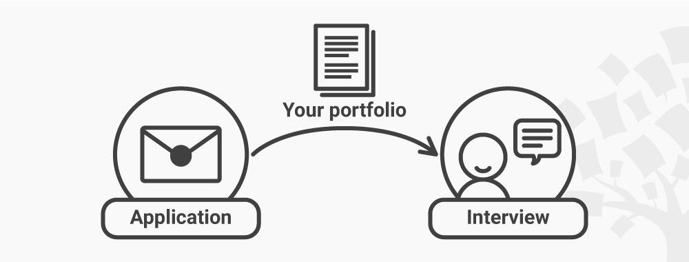
In its simplest sense, a UX design portfolio is bait. Its main purpose is to get a recruiter interested in you as a potential colleague. In other words, it’s your tool to lure a recruiter so you get to the first stage in the hiring process: either a face-to-face interview or a phone screener interview. Your UX design portfolio therefore has a very specific purpose—keep this in mind when you create it!
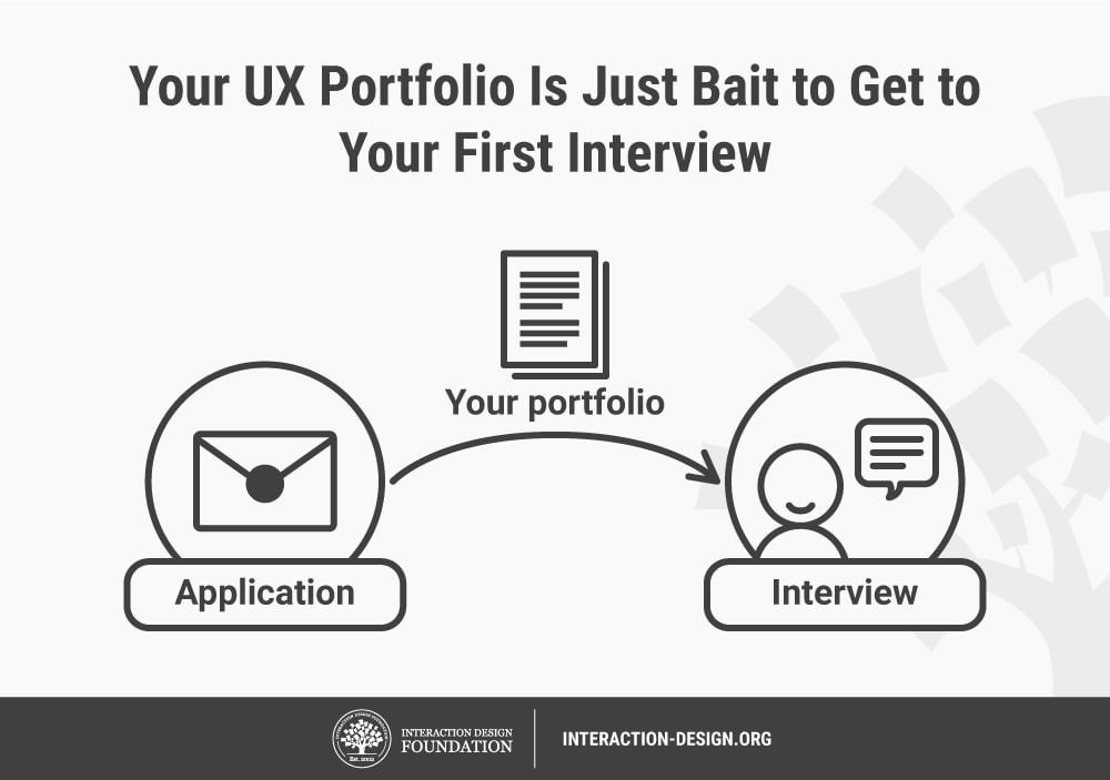
Keep in mind that your UX design portfolio is often the primary factor in whether you get an interview.
© Teo Yu Siang and Interaction Design Foundation, CC BY-NC-SA 3.0
To further understand what exactly a UX design portfolio is, let’s put on our designer hats. We begin by understanding the user of your portfolio.
The user of your portfolio is a company who is looking for a new UX designer. That’s a little broad, so let’s get more specific. In clearer terms, your users are HR (human resources) staff, design lead(s) and/or senior designer(s) in a team. These are the people usually involved in the hiring process. These users have a specific need: they’re looking for a new team member.
So, what kinds of information do your users require to solve their need of finding a new colleague? To get a better idea, let’s take a moment to imagine what it’s like to be a recruiter: What will you want to know about a candidate when you look for a new UX designer to join your team?
First, since you’re only human, you’ll want to know about the candidate as a designer and as a fellow human. You’ll be interested to know what drives them as UX designers and what kinds of work they love to do. You’ll also be interested in what drives them as a human being―what’s meaningful to them and what fills them with energy. This is not only interesting but also relevant in the search for a new colleague, because we often perform best when we’re fueled by our passions.
Second, you’ll be keen to know what they can do. After all, you’re hiring someone because you have some tasks that need to be done. So, can this candidate do the tasks well?
Third, you’ll also want to know how they work and think. This has two parts to it. The first one is that you’ll want to understand how they think as a designer. For example, do they design based on their gut feeling (not such a good idea), or do they use a design methodology? The second part relates to how they work in a team. You’ll be curious about whether the candidate is humble, open to feedback and earnest to learn. In other words, you’ll want to know if you’ll find it a joy (or a nightmare) to work with the person.
Okay, let’s step out of the shoes of the recruiter and back into your own shoes as an applicant. To sum up what we’ve learnt, these are three main questions a UX recruiter will have in mind:
Who is this person? What drives them, and what’s their background?
What can this person do? It’s essential to note that for junior UX positions, recruiters will understand that candidates might lack some skills that can only be acquired through work experience.
How does this person work and think? How do they approach a problem? How will this person work with us? Will we enjoy working with them?
Therefore, you should answer these three overall questions through your UX design portfolio to make it the best possible piece of bait to get you an interview. Remember to answer all three questions—many applicants will neglect to answer the last questions about how they work and think, and lose out to other candidates who do so. The great news is you’re now armed with an insight that will make your portfolio stand out from the rest!
Your portfolio should also answer these questions quickly. That’s because your users are extremely short on time. Recruiters typically spend less than 5 minutes on your portfolio since they usually have more portfolios than they can evaluate. After skimming through your portfolio, recruiters should have a good idea of whether they’d love to work with you. Think 2-minute teaser video, not full-length feature film. Your portfolio speaks on your behalf. It’s what travels ahead of you to meet, greet and convince time-starved strangers you’re worth their time and more. It’s got to capture the best of you.
What Should Your Portfolio Contain?
Now that you understand your users’ needs better, you’ll find it becomes easier to design for them. Your UX design portfolio should contain:
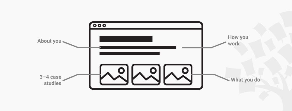
Some information about you to describe your background and motivations. So, how much information should you include? Show your work history, your education and a short write-up about yourself. Add some information about your passion in design and why you love or would love a career in UX. Be brief and relevant. Remember, you’re not telling your life story.
A straight-to-the-point description of what you can do and which skills you have mastered. Remember to include your relevant degrees and certificates.
3–4 relevant case studies, which are summaries of your past projects, to highlight what you can do and which skills you’ve mastered, how you approach problems and how you work with others.
But what do you do if you’re transitioning into UX design and you don’t have a single case study just yet? We have several courses which are tailor-made for you, because they’ll help you create a case study—for example, on user research or design thinking. We’ve crafted our courses so you can create your case study for your portfolio as you learn your new skills. This way, you’ll not only create your portfolio faster but also reinforce and better remember what you’ve just learned. These portfolio-building courses are also perfect for experienced designers who need new or more solid knowledge and skills in specific areas of design to show to their future employers. For example, we have these courses which will help you create a case study as you learn:Design Thinking: The Beginner’s Guide, which will let you apply the entire design thinking process on a project.
Conducting Usability Testing, which will enable you to plan and run your own usability test, and then analyze your results.
User Research – Methods and Best Practices, which will guide you through the different user research methods to craft a solid case study.
How Do You Verify Your Skills and Knowledge?
When you describe what you can do, your previous work experience is obviously crucial. On top of that, it’s also essential to back your skills up with your degrees and certificates. This is especially imperative if you’re an upcoming or new UX designer. Don’t worry; we have you covered at the Interaction Design Foundation (IxDF).
We help you by awarding you an industry-recognized Course Certificate for each course you complete to prove your achievements. You should highlight and link to your Course Certificates on your resume, CV, LinkedIn profile or your portfolio website. That way, you back up your case studies and portfolio with Course Certificates that are verifiable and trusted by industry leaders. For each case study (or item in your portfolio), you should include a link to a course certificate, if possible. That way, your future employers will know that you’ve based your case studies and skills on industry-trusted knowledge and best practices.
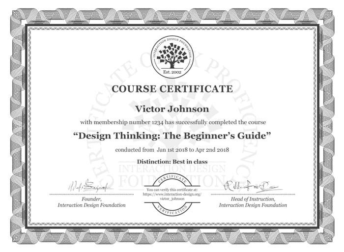
IxDF Course Certificates are trusted by industry leaders such as Adobe, Accenture, Philips and IBM, who’ve taken up company memberships with the IxDF. Each Course Certificate has a unique URL where your current and future employers and colleagues can verify its authenticity.
What Should Go into Your Case Studies?
If there’s one thing to remember, it’s this golden rule: case studies are not just about the end results, but also about the processes. It’s about how you work and your thought processes, not just about what you’ve created.
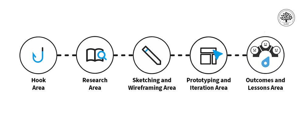
To clarify, this means your case studies should not just be a bunch of screenshots of your designs. You should tell a story about your project, the problems you faced as well as the design processes you’ve employed to solve the problems. For instance, if you’ve used the design thinking methodology in your project, then your case study should outline the entire process from how you empathized with users to how you prototyped and tested solutions, not just the final design.
You should also curate your case studies. This means you should choose your best work and only include case studies relevant to the role you apply for. If you want to become a user researcher, for example, you should show case studies that highlight your experience and expertise with research methods. Yes, it sounds so obvious, but you’ll be surprised to know how many people forget about this. This brings us to an important point: What your UX design portfolio should NOT be.
What a UX Portfolio is NOT
Contrary to popular belief, your UX design portfolio should never be a gallery of screenshots of your final designs. Designer sites such as Dribbble, which focus on beautiful screenshots, have popularized this notion of what a portfolio should be. You couldn’t be further from the mark if you were to follow this trend blindly!
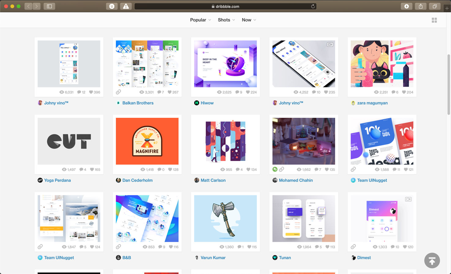
Portfolio sites like Dribbble have popularized the wrong idea that portfolios are all about pretty pixels.
© Dribbble, Fair Use
We can understand the appeal of a portfolio focused on end results. After all, they’re so pretty! Wouldn’t it impress a recruiter if your portfolio shines the spotlight on beautifully crafted mockups of your final designs?
Well, not quite.
You see, as we’ve gone through earlier, a recruiter is not only interested in what you can do, but also how you approach a problem. Beautiful mockups of your end results are important, but they tell only a small part of your story. On its own, a gallery of finished products—no matter how amazing they are—won’t shed light on what a recruiter wants to see behind the scenes. If you want a recruiter to comprehensively understand you as a UX designer, you need to bring them through the entire process.
But don’t take this from us. Hear it from Sarah Doody, who’s had more than 10 years of experience in UX design:
“I wish that portfolio sites had a better way for UX designers to show how they THINK and not just pretty pixels & nice wireframes.”
—Sarah Doody, UX Designer & Product Strategist
Or from Jeremie Tisseau, CEO, Co-Founder & UI/UX Designer of UX agency Morphosis Apps with over 12 years of experience:
“Open letter to UX designers:
If you apply for a UX design position and all I see in your portfolio are UI design and graphic design work, you are probably not the right fit for the job.
I am expecting to see complete case studies that can clearly explain the problem you are trying to solve, the business goals, your processes and methodologies, the research you conducted, web personas, customer journeys, user stories, user flow charts, wireframes, results from user testing sessions...
One big part of being a UX designer is to be able to communicate your solutions in a clear manner. If you can't do that, maybe you should try a different career.”
—Jeremie Tisseau, CEO, Co-Founder & UI/UX Designer, Morphosis Apps
So, don’t just focus on pretty pixels. Write a story about your design processes. Show your recruiters how you went from the starting point to the finish line. Let them understand which steps you took and why you made certain decisions.
Because much like life, your case study should be a journey, not just a destination.
The Take Away
Your UX design portfolio is bait (and only bait) for getting you to the first stage of the hiring process—an interview or a phone call. Your recruiters will use your portfolio to get a sense of who you are, what you can do, how you solve problems and how you work with others. If they can’t get the answers to these questions within 5 minutes of reading your portfolio, they will likely move on to the next candidate.
To help yourself succeed, you should therefore include an introduction to yourself as well as 3–4 case studies that showcase your design process leading to the end results.
Remember that you should not focus entirely on your end results. You’ll need to showcase not only what you’ve managed to create, but also how you managed to do it. This way, your recruiters will have a good idea of whether they’d like to work with you—and, by extension, whether you’ll get your first interview.
References and Where to Learn More
Sarah Doody writes about the importance of writing in UX design portfolios.
Jeremie Tisseau’s quote on what he expects from case studies.
© Rawpixel on Unsplash, edited by Teo Yu Siang, Unsplash License.
