Your constantly-updated definition of Color Symbolism and
collection of videos and articles. Be a conversation starter: Share this page and inspire others!
177shares
What is Color Symbolism?
Color symbolism is the subjective meaning humans attach to various colors. People respond to color in three ways—biologically (e.g., red = fear), culturally (e.g., red = wellbeing in many Eastern societies) and personally from experience. Designers use color symbolism in (e.g.) logos to gain users’ trust and attention.
“Depending on context, colour can convey meaning often more effectively than words.”
— Zena O’Connor, Ph.D. in human responses to color, who established Design Research Associates
See why color symbolism matters greatly in design.
ShowHide
video transcript
00:00:00 --> 00:00:30
Why do we see color? Designers intuitively know the answer to this question: It's to help us distinguish one thing from another and even to understand the thing itself. And what I mean by that is if you're looking at someone's face and they look very pale,
00:00:30 --> 00:01:02
maybe with a yellow cast or a blue cast, we might understand that that person is sick or something is wrong; or, we're looking at a series of tomatoes, each one more ripe than the next – we are clued in to when the tomato is ready to eat. Maybe we're looking at a subway map and we see that each line is a different color, helping us to understand
00:01:02 --> 00:01:35
which line we want to go on and where we want to go to. Along with shape, texture, movement, darkness and lightness, the more color that we could see, the more we could interpret about the world around us. By using color, designers are giving people a shorthand for how to use the products that they are designing. For example, if you are designing a pill bottle with pills inside,
00:01:35 --> 00:02:04
the color of the bottle and the color of the pills themselves can distinguish not only from other pills that someone might be taking but even different dosages between them. Things like a traffic light, which, sure we could memorize what the order of the traffic light is, but having *color on top of order* gives us an incredibly quick and easy mechanism
00:02:04 --> 00:02:33
for our brain to understand what to do next. Even things like sports uniforms – the reason that we have different colors for different uniforms is that it gives fans that immediate clue as to what to do when someone runs down one side of a field or another: do we cheer or do we boo? Just as important to the question of "Why do we see color?" is:
00:02:33 --> 00:03:01
Why do we not see all the colors that are in our vision at once? And I'm not talking about ultraviolet or infrared or colors outside of the ability of our color vision. I'm talking about when we look at, for example, a red house and one side is in shadow and one side is in light; we're not seeing that house as partly dark red and partly pink.
00:03:01 --> 00:03:31
We are just seeing it as a red house, and there's a very good reason for that. Just as I don't feel every sensation that is happening to my body every minute, like my glasses on the bridge of my nose – I'm not thinking about that until I actually think about it. My feet on the floor, that sensation – I'm not aware of it until I bring my mind to it, and throughout my body, there are all kinds of sensations going on all at once;
00:03:31 --> 00:04:05
but it would be too much for the brain to be thinking about those things *all the time* on top of all the other sensations that we have, one of which is the light that is entering our eyes. So, if we were to register the millions of colors that are coming into our eyes all at once, our brain would just shut down; it would be too much; we wouldn't be able to make our way through the world, to make decisions, to move – all of these things. So, this becomes very important for designing because we have to decide
00:04:05 --> 00:04:34
what we want the *focus* of people's attention to be. If we go back to this idea that color gives us information to help interpret the world, then we have to think about: "How are we using color so that it is giving us the right information to give us the right interpretation?" So, too much color, too much sensation, and then what follows we call *perception* – what we're actually
00:04:34 --> 00:05:02
perceiving – can be confusing. Too little color might not give us enough information. We also take our clues about color from the *culture* where we live. So, for example, in the Western world, yellow is not a color that is particularly beloved, but in the Eastern world, it is.
00:05:02 --> 00:05:31
So, the messaging that comes with the colors that you choose depend on *who* is receiving that color. We also have very personal associations with color which make it hard for designers because we don't know – unless we're designing for one person – what each person's reaction to a color is going to be. And lastly, we have these *biological reactions* to color, which at this point we know very, very little about.
00:05:31 --> 00:06:00
So, when you go on the internet and you read, for example, that peach makes you hungry, the color peach, well, we don't know that at all – that's just a bunch of internet fake news. But we do know certain things about blue light, for example, or about the color red, and there are associations – biological – rooted in our biology in these colors that have an effect on us.
00:06:00 --> 00:06:32
But taken together with the cultural and the personal, there's lots and lots of clues that are being given to a person, and these have to be accounted for in the design process – maybe not the personal part, but certainly the biological – the little that we know – and the cultural piece of it. So, to sum this up, why do we see color? We see color to help give us information so that we can make our way through the world
00:06:32 --> 00:07:08
without harming ourselves and hopefully with helping ourselves. And color is this extraordinary tool, and it's one with a very fine point. It's one that was developed late in the development of the human brain. It is not essential to our being alive; take color-blind people, for example, but it's one that gives us the opportunity to be able to navigate quickly, easily and often with joy.
Color is a powerful tool for evoking emotions, expressing thoughts and communicating with—and persuading—your users, but its symbolism is subjective and depends on the context. How humans react to color is complex, stemming from our:
Biological response: For example, the color red can inspire fear and sexual desire, while blue light can help psychologically.
Cultural response: Different cultures value certain colors differently. Western societies typically esteem blue well above yellow; Eastern ones tend to prize yellow and see red without alarming or erotic overtones.
Personal associations with color: Our experiences can color our view of certain colors—e.g., someone’s childhood skiing accident might permanently scar their appreciation of white.
When designing, you can conjure a multitude of meanings through your color choices. Brand logos and colors need to resonate with the target audiences. So, industry and global market location are among the factors designers consider for leveraging color symbolism according to widely accepted associations, notably these:
Remember, context is key. And, while most “facts” about color psychology lack scientific basis, a deeper look at the palette can reveal some essential insights:
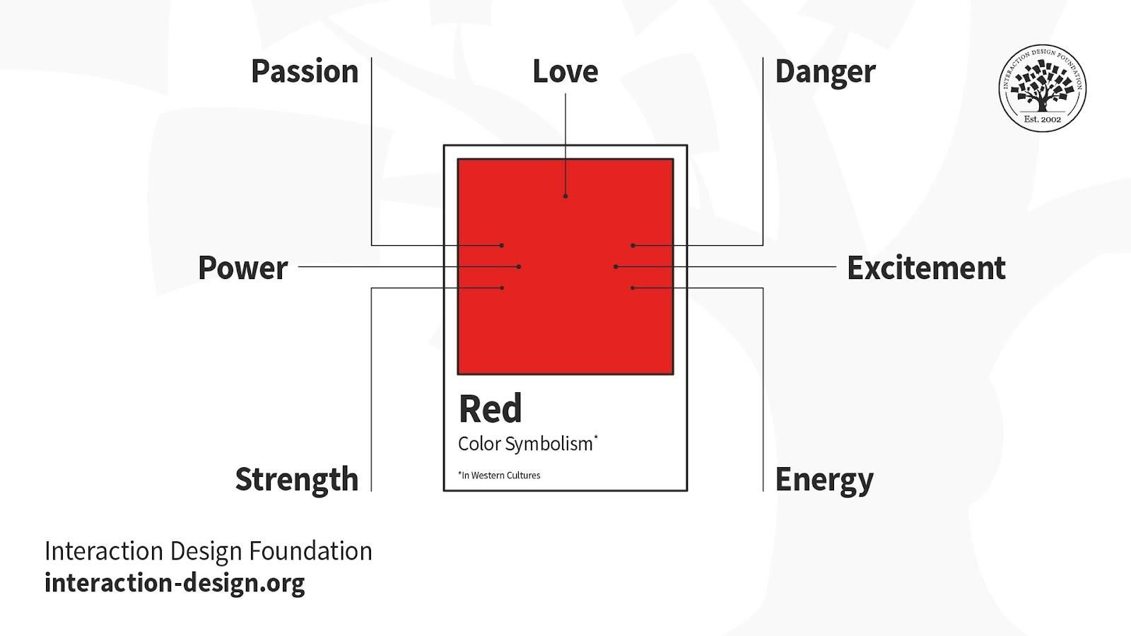
Red – Scarlet and crimson are among the variations that make red sexy and dangerous to Western eyes. Red may be bloody and arresting in the form of revolutionary rage and wounded bank balances, but red’s far less dramatic to Eastern eyes.
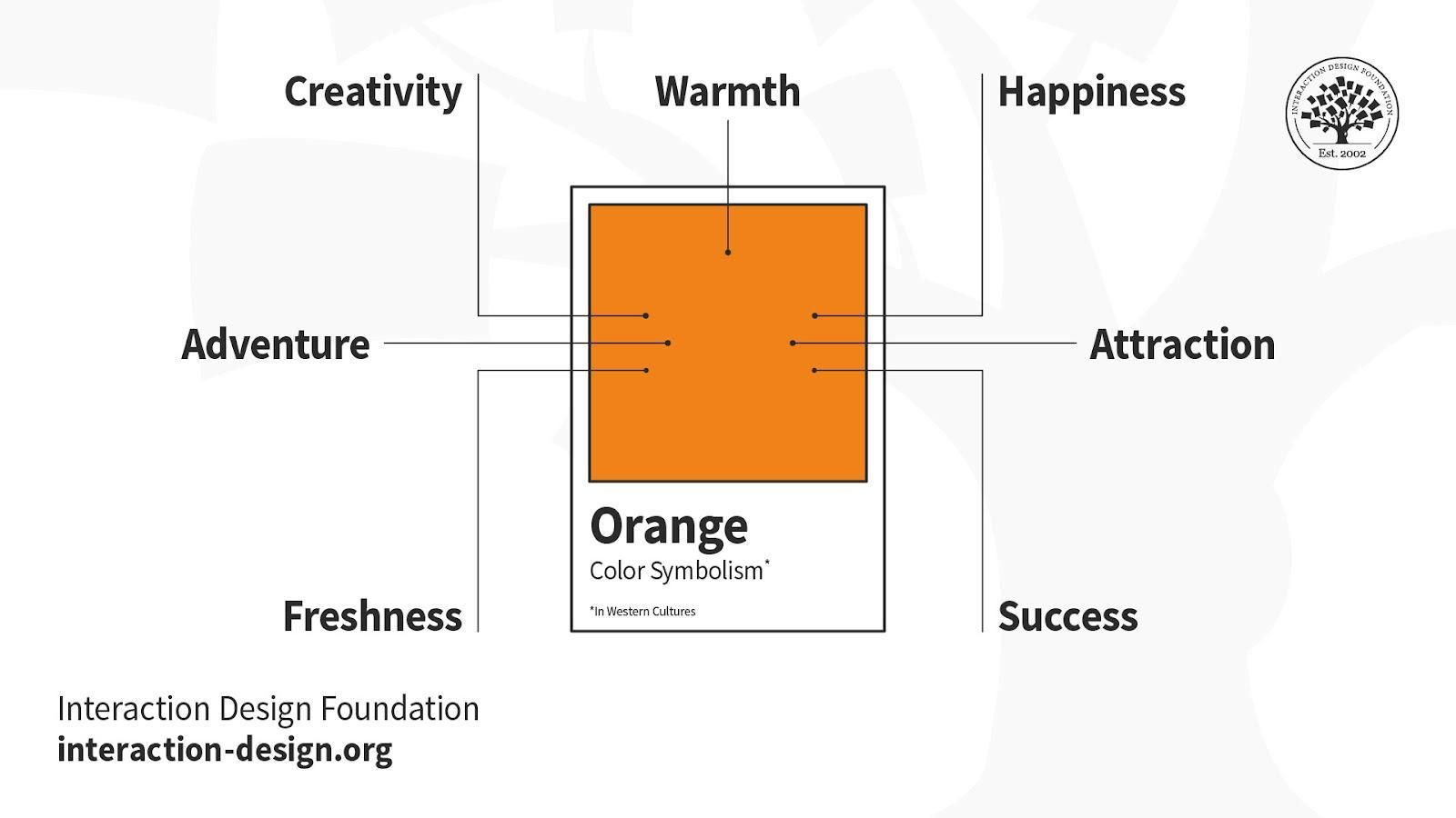
Orange – Linked with creativity and happiness, orange declares national and religious identity and defines athletic applications. Like red, it can grab attention (e.g., prisoner jumpsuits). Consider it for youthful, energetic brands as opposed to luxury, traditional or serious ones.
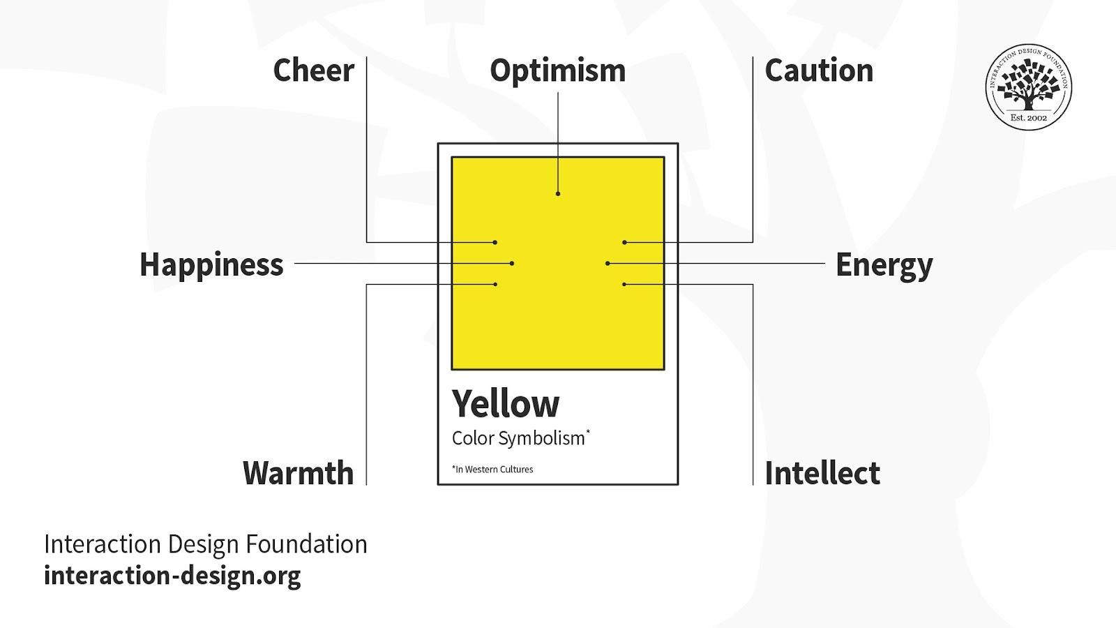
Yellow – The color of the Sun highlights with eye-catching warmth. Yellow can represent happiness, warmth, alarm, sickness, cowardice; take your pick. Some shades can look cheap, though, so it’s a noteworthy example of the need to research users’/customers’ reactions.
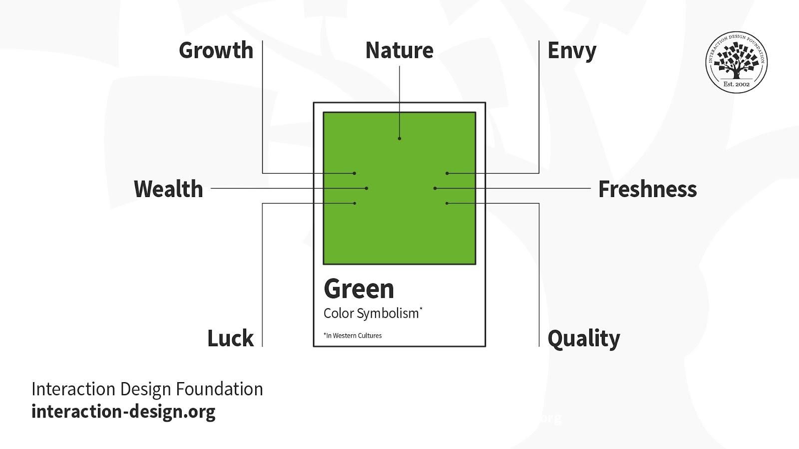
Green – It’s the color of Mother Nature and her life-sustaining bounty, with connotations of recycling and healthy finances. Green also means “proceed”; but there’s also inexperience and envy. The shade matters. Brighter, lighter greens indicate growth, vitality and renewal; darker, richer greens represent prestige, wealth and abundance.
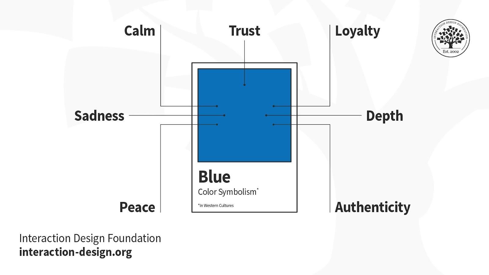
Blue – People find blue trustworthy, assuring, calming and masculine. It’s a tranquil sea and peaceful wonder at the sky; but then it can “mood-swing” to depression. You can bank on blue for designing financial and corporate dependability, although the right shade is vital.
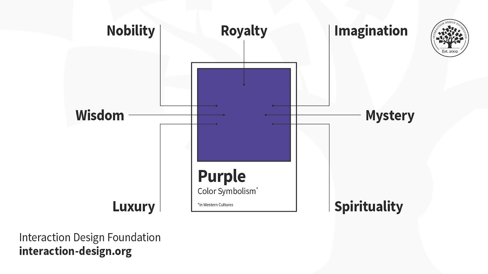
Purple – Long associated with royalty, purple connotes luxury and indulgence. But its majesty doesn’t always translate to design; for example, only women favor it as a top-tier color. Purple is uncommon in branding.
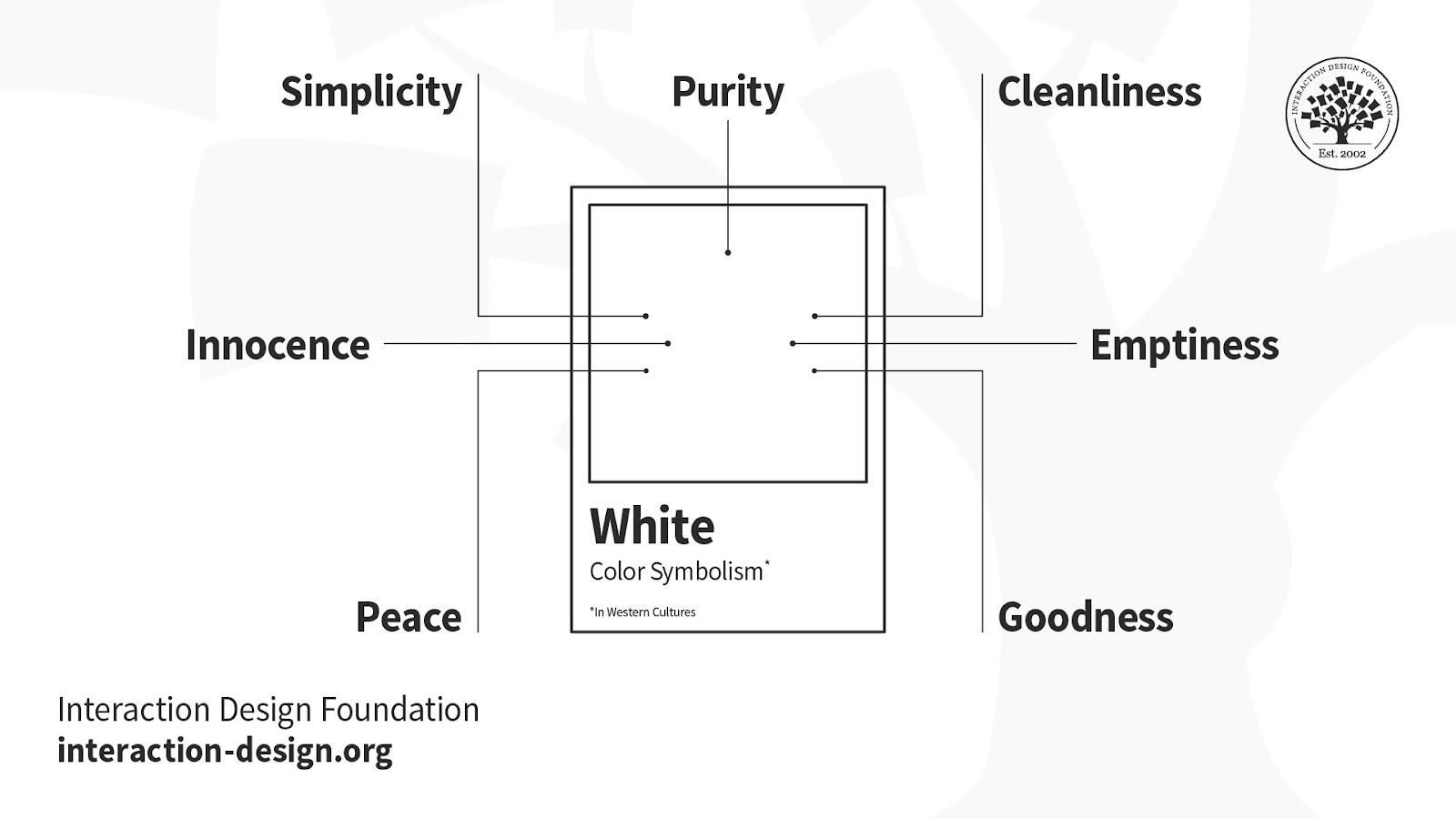
White – Cleanliness, goodness, innocence and simplicity are all associated with white. It’s as pure as a fresh snowfall, yet it signifies mourning in the East and means surrender internationally. Although innately positive, white lacks a dynamic personality, so it’s best left for brands that are indeed pure, simple and transparent.
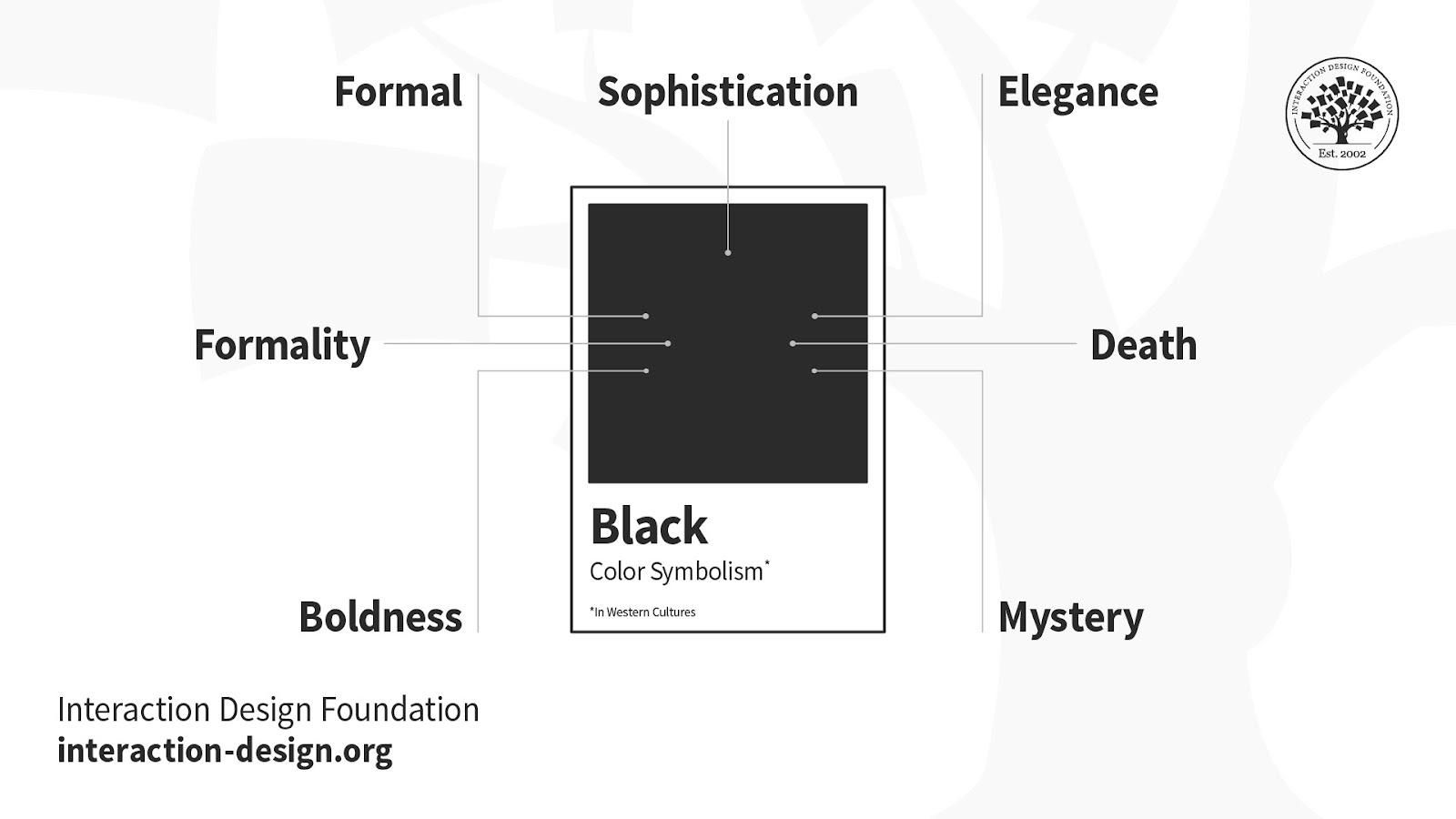
Black – Black means serious business, with overtones of severity and mystery, of death and grief. However, its inherent darkness doesn’t always convey negativity. It’s also a positive bank balance and smart, attractive clothing. It’s best to consider contrasting it with a bright color: gold for luxury or white for a bold, simple statement. Also, its texture and glossiness can influence your brand’s message.
Lastly, the colors you choose need to match your users and their sensibilities, not your personal preferences.
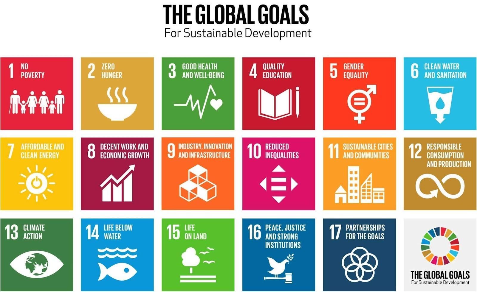
A notable example of the application of color symbolism is the icons for The Global Goals. This project, undertaken by designer Jakob Trollbäck, head of Trollbäck + Company, made the old Sustainable Development Goals for eliminating world hunger, etc., more universally resonating. The highly symbolic designs and palette carefully consider cross-cultural relevance and serve as part of the hopeful language to inspire everyone, everywhere to act for improvements and equality in the lives of people across the planet.
Colors are the most vital aspects of visual art and can often be more effective than words. Color symbolism in art means the usage of color as a symbol. Artists aim to draw attention, evoke specific emotions, or convey symbolic meanings by strategically using color and color modes. Different cultures and societies have cultural associations and symbolic significance to colors. Artists leverage these associations to enhance the depth and impact of their artwork.
What does each color symbolize?
Here are some common meanings of different colors in many Western cultures:
🔴Red: Passion, Love, Anger
🔵Blue: Calm, Strength, Trust
🟡Yellow: Happiness, Hope, Deceit
🟢Green: New Beginnings, Abundance, Peace
🟠Orange: Energy, Happiness, Vitality
🟣Purple: Creativity, Royalty, Wealth
⚫Black: Mystery, Elegance, Power
⚪White: Purity, Cleanliness, Virtue
🟤Brown: Warmth, Wholesomeness, Dependability
This video explains why we see and react to colors like we do. It shows how color affects our understanding and choices, making it easier to navigate the world.
ShowHide
video transcript
00:00:00 --> 00:00:30
Why do we see color? Designers intuitively know the answer to this question: It's to help us distinguish one thing from another and even to understand the thing itself. And what I mean by that is if you're looking at someone's face and they look very pale,
00:00:30 --> 00:01:02
maybe with a yellow cast or a blue cast, we might understand that that person is sick or something is wrong; or, we're looking at a series of tomatoes, each one more ripe than the next – we are clued in to when the tomato is ready to eat. Maybe we're looking at a subway map and we see that each line is a different color, helping us to understand
00:01:02 --> 00:01:35
which line we want to go on and where we want to go to. Along with shape, texture, movement, darkness and lightness, the more color that we could see, the more we could interpret about the world around us. By using color, designers are giving people a shorthand for how to use the products that they are designing. For example, if you are designing a pill bottle with pills inside,
00:01:35 --> 00:02:04
the color of the bottle and the color of the pills themselves can distinguish not only from other pills that someone might be taking but even different dosages between them. Things like a traffic light, which, sure we could memorize what the order of the traffic light is, but having *color on top of order* gives us an incredibly quick and easy mechanism
00:02:04 --> 00:02:33
for our brain to understand what to do next. Even things like sports uniforms – the reason that we have different colors for different uniforms is that it gives fans that immediate clue as to what to do when someone runs down one side of a field or another: do we cheer or do we boo? Just as important to the question of "Why do we see color?" is:
00:02:33 --> 00:03:01
Why do we not see all the colors that are in our vision at once? And I'm not talking about ultraviolet or infrared or colors outside of the ability of our color vision. I'm talking about when we look at, for example, a red house and one side is in shadow and one side is in light; we're not seeing that house as partly dark red and partly pink.
00:03:01 --> 00:03:31
We are just seeing it as a red house, and there's a very good reason for that. Just as I don't feel every sensation that is happening to my body every minute, like my glasses on the bridge of my nose – I'm not thinking about that until I actually think about it. My feet on the floor, that sensation – I'm not aware of it until I bring my mind to it, and throughout my body, there are all kinds of sensations going on all at once;
00:03:31 --> 00:04:05
but it would be too much for the brain to be thinking about those things *all the time* on top of all the other sensations that we have, one of which is the light that is entering our eyes. So, if we were to register the millions of colors that are coming into our eyes all at once, our brain would just shut down; it would be too much; we wouldn't be able to make our way through the world, to make decisions, to move – all of these things. So, this becomes very important for designing because we have to decide
00:04:05 --> 00:04:34
what we want the *focus* of people's attention to be. If we go back to this idea that color gives us information to help interpret the world, then we have to think about: "How are we using color so that it is giving us the right information to give us the right interpretation?" So, too much color, too much sensation, and then what follows we call *perception* – what we're actually
00:04:34 --> 00:05:02
perceiving – can be confusing. Too little color might not give us enough information. We also take our clues about color from the *culture* where we live. So, for example, in the Western world, yellow is not a color that is particularly beloved, but in the Eastern world, it is.
00:05:02 --> 00:05:31
So, the messaging that comes with the colors that you choose depend on *who* is receiving that color. We also have very personal associations with color which make it hard for designers because we don't know – unless we're designing for one person – what each person's reaction to a color is going to be. And lastly, we have these *biological reactions* to color, which at this point we know very, very little about.
00:05:31 --> 00:06:00
So, when you go on the internet and you read, for example, that peach makes you hungry, the color peach, well, we don't know that at all – that's just a bunch of internet fake news. But we do know certain things about blue light, for example, or about the color red, and there are associations – biological – rooted in our biology in these colors that have an effect on us.
00:06:00 --> 00:06:32
But taken together with the cultural and the personal, there's lots and lots of clues that are being given to a person, and these have to be accounted for in the design process – maybe not the personal part, but certainly the biological – the little that we know – and the cultural piece of it. So, to sum this up, why do we see color? We see color to help give us information so that we can make our way through the world
00:06:32 --> 00:07:08
without harming ourselves and hopefully with helping ourselves. And color is this extraordinary tool, and it's one with a very fine point. It's one that was developed late in the development of the human brain. It is not essential to our being alive; take color-blind people, for example, but it's one that gives us the opportunity to be able to navigate quickly, easily and often with joy.
What does the color white symbolize?
In many cultures, white symbolizes purity, cleanliness, or innocence. In addition, the color white often embodies several other personalities and concepts. Since color meanings vary from culture to culture, white can have positive and negative connotations. For some, white can convey new beginnings, freshness, or simplicity. For others, white can seem too cold, sterile, and isolated.
Understand Color Symbolism in this article to discover all the personality traits of white and other colors.
What does the color blue symbolize?
As explained in Color Symbolism, people find blue trustworthy, assuring, calming, and masculine. It is the color of the ocean and the sky. Hence, they associate it with open spaces, freedom, intuition, imagination, inspiration, and sensitivity. However, the meaning of blue varies depending on the shade and hue. For instance, light blues are calming and relaxed. Dark blues like navy represent strength and reliability. Bright blues can be energizing and refreshing. Understand the transitory nature of color and how our perceptions of color can shift under different lighting conditions and surroundings in this video.
ShowHide
video transcript
00:00:00 --> 00:00:31
Let me introduce myself; my name is Joann Eckstut. I am the co-author of *What Is Color? 50 Questions and Answers on the Science of Color*. When I'm not writing, I spend my time working as an interior designer. Today, I would like to discuss with you the transitory nature of color.
00:00:31 --> 00:01:06
There are four primary ways in which colors appear to change or shift. Number 1: Daylight is constantly changing. So, the colors we see change constantly as well. Number 2: Changing a light source changes what colors we see. Number 3: Colors appear to change depending on what colors surround them. And Number 4: Colors that appear to match in one setting do not match in another.
00:01:06 --> 00:01:32
Let's start with number one. Daylight is constantly changing. So, the colors we see change constantly as well. Although we don't necessarily realize it, millions of changes in light happen all throughout the day. Here, it's beautifully illustrated in this time-lapse image of the Statue of Liberty, which takes place just as the Sun sets.
00:01:32 --> 00:02:02
You can see that even in this short period of time there are myriad changes. We could be overwhelmed by this information about constantly changing light, but our brains help us to hold steady. So, for example, when viewing the red house in this illustration, the human brain has no difficulty in seeing it as entirely one red, even though the side in the Sun looks coral and the side in the shade looks maroon.
00:02:02 --> 00:02:31
When you isolate the colors and place them side by side, as in the two swatches here, the coral and the maroon tell a different story. Number 2: Changing a light source changes the colors we see. When we change the light source illuminating a space, the elements in the space reflect *different* wavelengths of light, causing the space and the objects in it to change their color appearance.
00:02:31 --> 00:03:03
For example, daylight emits light evenly across the spectrum, so no particular color is emphasized, while incandescent light emphasizes reds, oranges and yellows, so objects lit in this way emphasize those tones. Fluorescents have an uneven pattern of emissions, giving objects a green or a yellow-green kind of a cast; whereas LEDs are weak in violet, blue-violet and red areas,
00:03:03 --> 00:03:32
but peak in the orange, yellow and green range. In the example that we see here, the pencils on the left, lit in incandescent light, show the red as enhanced and the natural wood as pinker. The penicils in the middle, that are lit with LEDs, slightly neutralize all the colored pencils and the wood appears beige. The pencils on the right, that are lit with fluorescent lights,
00:03:32 --> 00:04:01
are more muted generally and the natural wood appears a light brown. So, the source of the light determines the way colors are perceived. Number 3: Colors appear to change depending on what colors surround them. This phenomenon is known as *simultaneous contrast*. Simultaneous contrast reveals something of utmost importance: Color is not a fixed entity.
00:04:01 --> 00:04:33
Color isn't constructed solely via particular wavelengths of light, but by a larger visual field. Simultaneous contrast can make a color look more saturated, duller, darker, lighter, or some combination thereof, depending on what color it sits next to. In the example seen here, all of the X's are printed in the same color, although they appear to change color as they are paired with different backgrounds.
00:04:33 --> 00:05:05
In the second example, the turquoise-blue in the circle on the left and the bright lime-green in the circle on the right are actually the *same color*. I know this seems impossible at first glance, but I assure you this is true. They *appear* to be completely distinct colors only because the colors they sit next to are different. Number 4: Colors that appear to match in one setting do not in another.
00:05:05 --> 00:05:32
Two materials can appear to be the same matching color under particular lighting, but no longer match when moved to a different light source. This called *metamerism*. For example, a blue carpet and a blue fabric swatch, as seen in this illustration, may look the same when observed in a showroom that is lit with bulbs that are close to daylight in temperature.
00:05:32 --> 00:06:05
*However*, inside a room lit with *incandescent* bulbs, that reflect more red, the carpet may appear to have a more purple cast and no longer match the upholstery fabric as it did in the showroom. This is the bane of every designer's existence: color appearing one way in the showroom, another in the interior where it's going to be used. So, beware! This is due to the different molecular properties of the dyes – say, a vat dye versus a pigment dye –
00:06:05 --> 00:06:20
and the different molecular properties of the fibers – say, a wool versus a nylon. So, now that you are aware of how ephemeral color can be, you will be prepared to work with it.
What does the color black symbolize?
The symbolism of black color runs far and wide. In some cultures, it associates itself with darkness, heaviness, depression, death, mourning, and evil magic. In others, it can also symbolize elegance, wealth, and power. Black is also called “A color of many sentiments” due to the contrasting feelings it elicits.
Another fact about this color is that people often misunderstand black and associate it with sadness. However, far more than a depressing color, black is also powerful, striking, and a source of protection.
What does the color green symbolize?
Green is a calming color. It has strong associations with nature and brings trees, forests, and lush grass to mind. Like all colors, different shades and hues of green have different meanings and evoke different emotions.
Bright Green: Rebirth, Spring
Yellowish Green: Illness, Envy, Decay
Aqua: Cleanliness, Freshness, Water
Pale Green: Peace
Olive Green: Tranquility, Earthiness, Elegance
Dark Green: Fertility, Greed, Money, Drive
What does red color symbolize?
The most common feelings that red can stimulate are danger, excitement, aggression, dominance, and passion. Red is the warmest and most contradictory color associated with positive and negative emotions. It has more opposing emotional associations than any other color.
Red has contrasting meanings around the world. In the West, red evokes excitement, danger, urgency, and love. When combined with green, the color scheme becomes festive. In China, India, and other Asian countries, it symbolizes happiness and good fortune.
What are the four psychological Colors?
The four primary colors in color theory are: red, yellow, blue, and green.
🔴Red is an intense color associated with physical aptitude.
🟡Yellow is a potent emotional stimulator that inspires positive thinking and confidence.
🔵Blue is a calming color that inspires clarity of thought and serenity.
🟢Green facilitates the harmony between the other chromes: red, yellow, and blue.
Always remember colors are subjective and use them in the right context. The article Use Color to Prevent Confusion and Help Your Users will help you learn the meaning of color and the importance of context.
Which color symbolizes love?
Red, also called the color of love, represents love and passion. There are several reasons for this symbolism. The color red connects with the heart. A bright red icon ❤️ symbolizes the heart. This link contributes to red being a powerful symbol of love. In addition, the Greeks and Hebrews saw red as a sign of love. Lastly, because of its link with desire and passion, red is the color of love.
Where to learn more about color symbolism?
This course onVisual Design: The Ultimate Guide can help you strengthen your foundations of visual design. You’ll learn to use the right colors, type, visual design elements, and all the secrets to create a good design. You’ll also learn the significance of visual design, understand the impact of history on the present, and uncover practical ways to enhance your own work. You can also watch this brief video to learn “What is Color?”
ShowHide
video transcript
00:00:00 --> 00:00:33
Hi. My name is Arielle Eckstut, and I am the author of What Is Color? 50 Questions and Answers on the Science of Color. Color is an incredibly difficult subject, one that encompasses all kinds of categories of science and history and culture – you name it.
00:00:33 --> 00:01:04
But today in about five minutes I'm going to try to answer this question: What is color? And I'm going to do that by starting with yet another question. In the fall, do the leaves change color if no one is there to see them? Take a moment to think about that: Do the leaves change color if no one is there to see them? Now, the *obvious answer* to this question is "Of course they change color
00:01:04 --> 00:01:37
because the color of the leaves are inherent to the leaves themselves." But in fact, that is not true at all, and the answer is a resounding *no*. If there is not a living being with a brain observing those leaves, the leaves do not change color. And the reason for this is that there's no such thing as color without the *eyes* and the *brain*.
00:01:37 --> 00:02:02
So, different brains process visual information differently. And I realized that this idea that color does not exist outside of our perception can be very difficult to swallow. And in fact, our brains go to great lengths to give us all of the colors that we see.
00:02:02 --> 00:02:36
The source of our color vision is in our *retina*, a credit-card-thin sheet of neurons in the back of our eyeballs. And it's actually a part of our brain, our retina. It's the only part of our brain that exists outside of our skulls. And our retina is what we typically associate with sight in general. If I were to ask you, "Why do we have eyes?" most people would say, "So we can see."
00:02:36 --> 00:03:03
But that was actually not the original purpose of our eyes and our retina. The original purpose was to tell us when to be awake and when to be asleep. So, our eyes sensed when it was light out and when it was dark out, and "when" is the most important word here because our eyes, our retinas have three different systems:
00:03:03 --> 00:03:32
the *when system* being the most primitive and the first use of our eyes. The next system is the *where system*, and that tells us where we are situated in the world. Are we right at the edge of a cliff? Are we too close to a potential predator? Or are we too far to reach a berry that is ripe that we would like to eat?
00:03:32 --> 00:04:00
Lastly, we get to our *what system* – the system that designers deal with on a daily basis but the one that is actually *least important* to our visual system. The what system is the system that we use when we are *focusing on something*, whether that be a computer screen or a phone or a face or a road sign. It's also the system that we use to see color.
00:04:00 --> 00:04:30
Color scientist Mark Rea has a great quote that I adore: "Color is a pigment of our imagination." And that really is true. Our imagination plays such a big role when it comes to color. And our brains are constantly taking in information from the outside world to help inform us about what time of day it is, where we are in the world, what we're looking at,
00:04:30 --> 00:04:36
which really gets us to the next question, which is: Why do we see color to begin with?
Earn a Gift, Answer a Short Quiz!
Question 1
Question 2
Question 3
Get Your Gift
Try Again! IxDF Cheers For You!
0 out of 3 questions answered correctly
Remember, the more you learn about design, the more you make yourself valuable.
In this course, you will gain a holistic understanding of visual design and increase your knowledge of visual principles, color theory, typography, grid systems and history. You’ll also learn why visual design is so important, how history influences the present, and practical applications to improve your own work. These insights will help you to achieve the best possible user experience.
In the first lesson, you’ll learn the difference between visual design elements and visual design principles. You’ll also learn how to effectively use visual design elements and principles by deconstructing several well-known designs.
In the second lesson, you’ll learn about the science and importance of color. You’ll gain a better understanding of color modes, color schemes and color systems. You’ll also learn how to confidently use color by understanding its cultural symbolism and context of use.
In the third lesson, you’ll learn best practices for designing with type and how to effectively use type for communication. We’ll provide you with a basic understanding of the anatomy of type, type classifications, type styles and typographic terms. You’ll also learn practical tips for selecting a typeface, when to mix typefaces and how to talk type with fellow designers.
In the final lesson, you’ll learn about grid systems and their importance in providing structure within design. You’ll also learn about the types of grid systems and how to effectively use grids to improve your work.
You’ll be taught by some of the world’s leading experts. The experts we’ve handpicked for you are the Vignelli Distinguished Professor of Design Emeritus at RIT R. Roger Remington, author of “American Modernism: Graphic Design, 1920 to 1960”; Co-founder of The Book Doctors Arielle Eckstut and leading color consultant Joann Eckstut, co-authors of “What Is Color?” and “The Secret Language of Color”; Award-winning designer and educator Mia Cinelli, TEDx speaker of “The Power of Typography”; Betty Cooke and William O. Steinmetz Design Chair at MICA Ellen Lupton, author of “Thinking with Type”; Chair of the Graphic + Interactive communication department at the Ringling School of Art and Design Kimberly Elam, author of "Grid Systems: Principles of Organizing Type.”
Throughout the course, we’ll supply you with lots of templates and step-by-step guides so you can go right out and use what you learn in your everyday practice.
In the “Build Your Portfolio Project: Redesign,” you’ll find a series of fun exercises that build upon one another and cover the visual design topics discussed. If you want to complete these optional exercises, you will get hands-on experience with the methods you learn and in the process you’ll create a case study for your portfolio which you can show your future employer or freelance customers.
You can also learn with your fellow course-takers and use the discussion forums to get feedback and inspire other people who are learning alongside you. You and your fellow course-takers have a huge knowledge and experience base between you, so we think you should take advantage of it whenever possible.
You earn a verifiable and industry-trusted Course Certificate once you’ve completed the course. You can highlight it on your resume, your LinkedIn profile or your website.
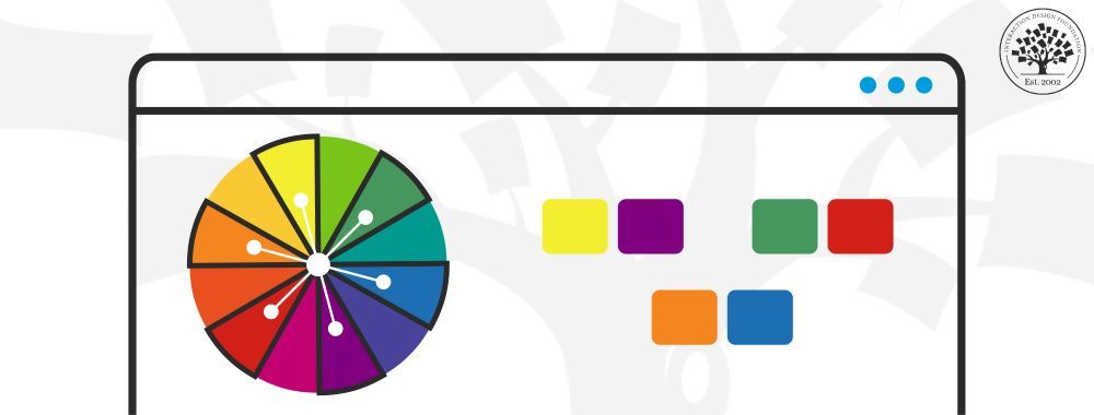
Part of the magic of how colors work together in impressive designs lies in the art of color selection. Designers often
856 shares
3 mths ago
Open Access—Link to us!
We believe in Open Access and the democratization of knowledge. Unfortunately, world-class educational materials such as this page are normally hidden behind paywalls or in expensive textbooks.