Ease of use is something that designers strive for but how can you design for ease-of-use? It’s a common question at the start of projects; “If we’re going to do this well, it will need to satisfy ease-of-use for our customers. What kind of universal metrics can we apply to ensure that the product does just that?”
Someone at IBM said: “Ease of use may be invisible but its absence sure isn’t.”
Universal Metrics for Ease of Use?
Unfortunately for designers there are no universal metrics for ease of use. Each product and project is different. What will define “ease of use” for a spoon is likely to fail to define “ease of use” for a digital camera.
You can define project specific metrics for ease of use. For example, if you were building an MP3 player you might have a target of “The user must be able to find and play their chosen song within 3 seconds of accessing the interface.” Or you could decide; “A user must be able to pause play by any interaction with the interface so that they can deal with any interruption without having to find a pause button.”
How do you Reach These Project Specific Metrics?
That’s a great question and one which you probably, deep down, already know the answer to. We reach project specific metrics for ease of use by conducting user research. We need to know what the user’s objectives are and what they think is reasonable to reach those objectives to define ease of use metrics.
For example; you might want to think about different types of goals for your product and interact, observe, etc. users to see what their goals are in those spheres:
Life goals – what does the user aspire to in their life? How might your product get them to that goal? What would motivate a user to choose your product over a competing product that achieves this objective?
Completion goals – what do users expect to happen at the end of using your product? What can you measure when this takes place?
Behavioral goals – when users undertake achieving the goal without using your product, how do they do it? How can your product mimic that process so that the product is familiar to them? (E.g. it mimics their mental models).
Note: Mental models are the models we all have of things we do all the time. We know that we push buttons, for example, and that’s why so many computer applications have buttons that look like “real life” buttons; they fit the mental model.
![]()
Author/Copyright holder: Jurgen Appelo. Copyright terms and licence: CC BY 2.0
Understanding Ease of Use from a User’s Perspective
If you want to know what ease-of-use looks like from a user’s perspective, without user research, there are a couple of questions you can try to get there through visualization but it’s worth remembering – it is always best to carry out user research on the models you develop through this process; user feedback is essential to product design.
What if this process took place by magic? If your user could complete their chosen task via the use of magic and no work whatsoever what would the experience feel like? This gives you a “perfect scenario” as a starting point. You can then add the fewest possible additional steps to create the product with the greatest degree of “ease of use” without delivering something from J K Rowling’s imagination.
What if the user had an incredibly knowledgeable helper to carry out the process? If you imagine that your product is that helper (who is say a very, very smart human being with a lot of experience in reaching that objective) – what would the experience feel like then? Again you can use this to deliver a starting point which you can then add the fewest possible steps to in order to deliver something tangible.
![]()
Author/Copyright holder: Pixabay. Copyright terms and licence: Free to Use.
Ease of Use and Commercial Reality
It is important to remember that when designing for ease of use; you may not be able to deliver the perfect experience from a user’s perspective. It’s important to remember the commercial realities of the design process too. If something requires cutting edge technology (e.g. expensive to buy, own and implement) but is only going to deliver marginal returns; it’s unlikely that the business is going to support your efforts to include this technology in your design.
Ease of use cuts both ways and ease of use includes the impact that your work has on the business as a whole. Your designs must be easy to use from a commercial viability perspective to deliver true “ease of use”. This may mean compromises on the way through the design process to balance the demands of your user and your business.
Ease of Use and Functionality
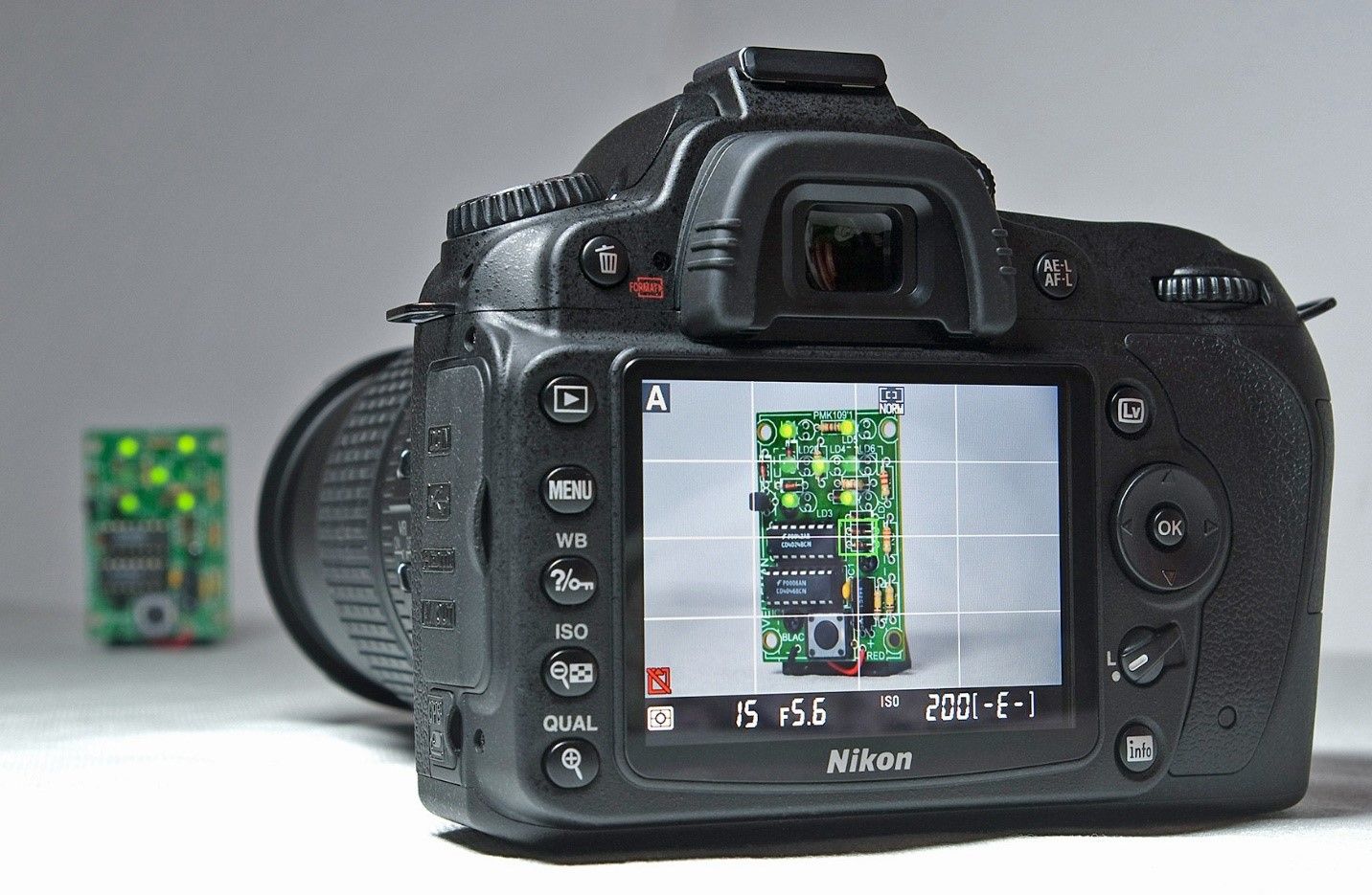
It is also worth remembering that while it sometimes worth sacrificing functionality to provide ease of use that many products sacrifice ease of use for functionality. The most common example of this is the smartphone camera vs. the DSLR camera.
Smartphone cameras are incredibly simple to use and the mass market loves them. Push the camera icon, point the phone (perhaps pinch to zoom) and then push the camera icon again to take the photo. There may be some other basic controls but not very many.
In contrast a DSLR such as those made by Canon, Nikon, Fuji, etc. offers a huge amount of control over the camera experience but it comes at the price of ease of use. You need to learn about lenses, about flash, about controlling aperture, shot speed, ISO, etc. And while there’s no denying that smartphones have many more users than DSLRs – there is still a very healthy market for DSLR cameras. Some people will always prioritize functionality over ease of use while others will always prioritize ease of use over functionality (this assumes that the functionality being offered is useful in some way – useless functionality will never be preferred by users).
![]()
Author/Copyright holder: Bill Bertram. Copyright terms and licence: CC BY-SA 3.0
The Take Away
Design for ease of use requires talking to users and discovering what they mean by “ease of use”; there is no “one size fits all” checklist that you can use on projects to determine ease of use in advance. You can put yourself in the user’s shoes when you design for ease of use by asking some simple questions. It’s also important to remember that ease of use must not conflict with business goals and that it may be necessary to sacrifice a certain amount of ease of use to deliver more complex functionality.
References
Alan Cooper’s - The Inmates Are Running the Asylum: Why High Tech Products Drive Us Crazy and How to Restore the Sanity
WQ Usability - Looking Beyond Ease of Use
Hero Image: Author/Copyright holder: Sindre Wimberger. Copyright terms and licence: CC BY-SA 2.0
 Author/Copyright holder: Bill Bertram. Copyright terms and licence: CC BY-SA 3.0