With the dawn of personal computing skeuomorphic design became important to introduce users, unfamiliar with technology, to new concepts. Skeuomorphism takes a simple approach – it creates lifelike affordances in user interfaces (UI) that the user can relate to from their real lives. Thus when you delete a file – it goes in the trash can on screen. The act of throwing something away is something that everyone can relate to.
As time progressed skeuomorphic design became ever more realistic with concepts lovingly rendered in 3-dimensions. Many designers felt that this approach was becoming increasingly redundant. Users were more familiar with IT than ever before and in addition there was nothing about a 3D trash can that added any particular value over a 2D rendering of the same trash can.
Flat design is a style of interface design that rejects the 3D elements of skeuomorphism. It does not, contrary to popular opinion, abandon skeuomorphism in its entirety but rather focuses on rendering objects in flat minimalist form. It avoids the excessive use of gradients, textures, and drop shadows designed to deliver 3D effects for simpler elements focusing on simple flat elements, typography and flat color schemes.
![]()
Author/Copyright holder: crassuscz. Copyright terms and licence: CC BY 3.0
Flat design is all encompassing in its approach and can be found everywhere in certain designs if you look hard enough. For example; these flat emoticons.
There is an added benefit of this design approach – it is not just for aesthetics – 2 dimensional objects are far easier to scale within responsive designs that adapt to different screen or browser sizes. This has become far more important with the advent of the mobile web.
A Brief History of Flat Design
Flat design is not entirely new and has been inspired from 3 existing forms of art: The Swiss Style (or International Typographic Style), Bauhaus and Modernism. Of the three, it is probably Swiss Style which has had the largest impact on flat design. Flat design in the real world became popularized in the 1950s and 1960s but the digital world would be rather slower to catch up.
There is a good example of early digital flat design to be found in Microsoft’s ill-fated Zune MP3 player which was launched back in 2006. The interface was both clean and simple and used lower-case typography in a large font size, silhouette styled logo design and plain monochromatic fonts.
The Zune may no longer be with us but the UI styling continued first into Windows Phone and later into the much derided (though not for its flat design) Windows 8 operating system.
![]()
Author/Copyright holder: Bkwparadox. Copyright terms and licence: CC BY-SA 3.0
The Zune may never really have captured the MP3 player market’s imagination but its legacy lives on in flat design.
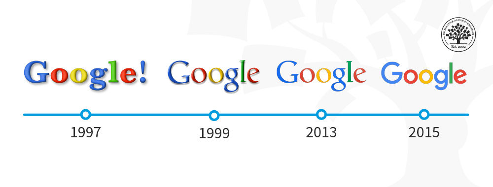
In 2013 Apple joined the flat design party with the release of iOS7 deliberately rejecting previous skeuomorphic designs.
Jony Ive (Head of Design for Apple) said; “When we sat down last November (to work on iOS 7), we understood that people had already become comfortable with touching glass, they didn’t need physical buttons, they understood the benefits,” says Ive. “So there was an incredible liberty in not having to reference the physical world so literally. We were trying to create an environment that was less specific. It got design out of the way.”
Isn’t Flat Design Boring?
Well, Microsoft and Apple don’t think so but yes, some people think that flat design is boring design. However, the truth is that minimalistic design styles are popular and eliminating unnecessary clutter from a design can improve its usability. If a component of a design serves no utility it may hinder the user experience and thus it should be eliminated from the design itself.
Much of the appeal of flat design is found in the implementation. The use of attention grabbing bright (and highly contrasting) color, for example, can help make icons, images, etc. really stand out from backgrounds. Clever use of flat design can also help guide the user’s eyes to where the designer wants them to be in their design.
![]()
Author/Copyright holder: alexlasek. Copyright terms and licence: CC BY 3.0
Flat design definitely doesn’t have to be boring, though it can be. User testing can help you determine whether your flat designs wow users or turn them off.
It’s also easy to argue that the simplicity of flat design is what makes it so effective. The simpler the image that conveys a message – the easier the message is to understand.
What Does Flat Design Mean to UI Designers?
Flat design enables the UI designer to think of their designs as a functional tool. Their work will be measured based on the value that the design brings to the user rather than simply on aesthetic appeal. Many UI designers feel that this focus enables them to concentrate on user experience more than graphic design to the benefit of their businesses and customers alike.
What Goes Into a Flat Design?
The good news is that flat designs are pretty easy to create. The designer needs to focus on simple experiences and can then use:
Strong, contrasting colors to add emphasis on details within icons, illustrations, etc.
Sans serif typography in large and easy to read fonts that offer straightforward indications of what an icon or illustration is for
Crisp, clean UI elements that are easy to see and easy to comprehend
This should bring together a visually consistent and functional design for the UI.
![]()
Author/Copyright holder: dtafalonso. Copyright terms and licence: CC BY 3.0
iOS7 showed how much could be achieved through flat design in the hands of skilled designers.
The Take Away
Flat design is a minimalist approach to UI design. It is intended to reduce complexity in the design and thus enhance the user experience. It is not the only approach to UI design and material design and skeuomorphism (in the form of rich design) are also possible considerations when putting together a UI. It is important to carry out research to discover what it is that your users want and not rely on any standard approach for UI design without getting their input first.
References
Read Jony Ive’s take on Flat Design at Cult of Mac here.
An interesting examination of Flat Design vs Skeuomorphism can be found here.
Hero Image: Author/Copyright holder: Pixel Fantasy. Copyright terms and licence: CC BY-NC-ND 2.0