Ergonomics in UX/UI Design
What is Ergonomics in UX/UI Design?
Ergonomics is a scientific discipline that addresses the effective design of products, work environments and more. In user experience (UX) design, it refers to how designers streamline digital products to minimize effort, movement and cognitive loads for users, so lessening their fatigue while improving productivity and—by association—a product’s desirability.

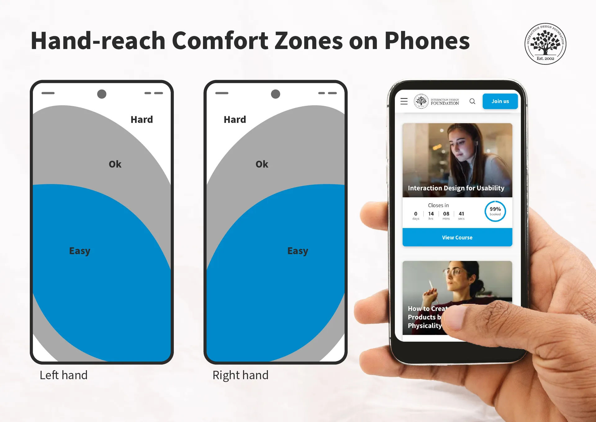
Just one dimension of ergonomics—hand-reach comfort zones.
© Interaction Design Foundation, CC BY-SA 4.0
Why is Ergonomics Important in Design?
Ergonomics has for long been at the forefront as a consideration for designers to improve products—as well as working environments, among other areas—for consumers and users. So, good ergonomics—and ergonomy, which is the discipline behind it—is a central part of human-centered design. The principles of ergonomics govern aspects of human-to-product or human-in-environment functionality, mainly to optimize conditions for individuals so that they:
Have a safeguard when they use products or work at workstations, from risks of injuries—such as from accidents and repetitive strain injuries (RSI)—and fatigue.
Can maximize their productivity levels, since the devices or environments they work with and within are optimally tailored to their needs.
Can enjoy peace of mind that the organizations behind these devices and environments subscribe to a spirit of health and safety—and so it bolsters the brand’s reputation as being one that truly cares about people.
Given its existing background in physical products—ranging from keyboards and chairs, to work benches, car production lines and far beyond—ergonomics translates naturally to the world of UX design. UX ergonomics encompasses two main areas for UX and user interface (UI) designers to consider carefully when they apply design principles to account best for their users’ needs and how designs work to satisfy—and exceed—these needs and expectations:
1. Physical Ergonomics
To design best for users in the physical sense, designers have to tailor their brand’s products in several ways. First, there are the devices themselves—hardware such as smartphones and tablets. The companies that create these products account for the comfort of their human users in terms of grip, position of camera lens and other factors.
For UI designers—as well as designers involved in augmented reality (AR) and virtual reality (VR) experiences—ergonomics extends to design considerations such as to create the best buttons in the most accessible areas of a smartphone touchscreen. An example is the need to design experiences for users who can complete tasks with one hand. Especially in the era of mobile-first design, it’s vital to tailor UIs that are fat-finger friendly and that can maintain the “magic” of a seamless experience. For example, if a user tries to order a product while holding on to a railing on public transport, a considerate design would facilitate their being able to get through the checkout process with minimal typing. Designers therefore need to consider the users’ scenarios and design accordingly.
Author and Human-Computer Interaction Expert, Professor Alan Dix explains user scenarios in this video—and why they’re so helpful for designers:
Show
Hide
video transcript
-
00:00:00 --> 00:00:30
Personas capture what your users are like. They're a way of representing to you and to those you work with, who your users are. Scenarios do the same job but are about *how* people do things. Scenarios are *stories* for design. They're ways you can use your understanding you've gained
-
00:00:30 --> 00:01:03
from talking or observing users, to others. To capture it for yourself, to retain it yourself, but also to communicate with others. They can also be used to validate other kinds of models. So, if you're doing a detailed task analysis or perhaps doing a walk-through, a cognitive walk-through for evaluation later, they're a way of validating that. You can say "Does this actually agree with these scenarios, these scenarios that have come from my experience of users? Do the way in which we play these out in more detailed forms actually accord to it?"
-
00:01:03 --> 00:01:31
They also help you to understand the dynamics of design. So, it's very easy to think about static images or static states of a system. Scenarios are about helping you understand the dynamics, the way something moves from point to point. They have limitations; they are linear. They capture just one view through. But they are very, very rich. So, what will your users want to do? These are questions that scenarios are going to help you do.
-
00:01:31 --> 00:02:00
How do you do this? You create a step-by-step walk-through. What can I see? If I'm a user using a new piece of technology, what am I seeing? What am I hearing at this point? What's the immediate perception? What can I do with what I've got with me? So, again, what are the steps? Is somebody going to pick something up? Are they going to press something? Are they going to say something? What's their potential actions? What are they thinking? What's going on in their head?
-
00:02:00 --> 00:02:26
So, can you capture these, within a story? If you do a sketch on a system, that captures one point of time, but this is about looking... and that perhaps might help you answer the "what can they see?" question, but of course not "what can they do, what are they thinking?". The scenario's about capturing this rich view of what users are doing or could do or might want to do.
In AR and VR design, physical ergonomics plays perhaps an even more important role in safeguarding users from potential harm and fatigue—while offering them maximum comfort and encouragement to continue their experiences safely. Systems that respond to hand and head movements, for example, need to factor in which ones are most comfortable for users. At the same time, they’ve also got to account for the need to prevent accidental system responses because equipment or apps misinterpret those more subtle movements that users didn’t intend as gesture commands.
CEO of Experience Dynamics, Frank Spillers explains additional important points about safety in AR experiences:
Show
Hide
video transcript
-
00:00:00 --> 00:00:34
So, an important consideration in AR is *safety*. What do I mean by 'safety'? I mean *physical safety* – falling, tripping, crashing or endangering others. I'm also meaning *social safety*. So, data sharing, stalking, bullying – anything that could endanger someone socially. When we think about AR engagement and immersion and keeping someone's attention,
-
00:00:34 --> 00:01:01
we have to think about safety because there are limits to how much immersion or attention stealing we can take. And it really comes down to managing *task load*. So, how much can you take away from someone's attention while they're performing a task? Because they've got the physical environment to deal with and the social environment as well. So, outside of the data issues of the system leaking information like that,
-
00:01:01 --> 00:01:31
let's talk about how you as a designer can prevent that. Adidas was exploring a virtual try-on mirror. And they decided that there were many, many safety concerns with scanning a person's body size, keeping that record on a server or potentially sharing it with other people, and the violation that that might have to that person's identity. And they didn't want
-
00:01:31 --> 00:02:00
to create that feeling. They just wanted to use it as a sizing guide. And it kind of gives you a moment to pause and ask with your design, are you designing for safety? It's really about *reducing harm*. And I think about this as having, there's a *physical body* that you need to protect. That's so you don't fall into things, stub your toe or hurt your face or your head if you're walking into a wall, for example.
-
00:02:00 --> 00:02:33
There's also the *social body* – you know – your identity, the way you express yourself. And finally, an *emotional body* or your feelings and the way that you express your feelings with AR, for example. And so, how we're portrayed or how our identity is used and how we feel are the things we're protecting. When we talk about safety as well, we're also talking about *inclusion*.
-
00:02:33 --> 00:03:04
And making sure that we've included folks from underrepresented communities. And this includes folks with disabilities. And so, the main disabilities that we should be thinking about with AR inclusion are: blind, low vision, mobility impairments, deaf, hard of hearing and cognitive or neurodiversity as well. So, these are important areas to be careful of in terms of design.
-
00:03:04 --> 00:03:30
But there are also opportunities to *innovate and create more interesting AR experiences*. And one of my favorite examples is the Hololens for blind users. And what it does is it uses the technology of sonification to detect objects because sound can detect objects, the density of an object, and it can be used just like a cane can be used to detect objects in space.
-
00:03:30 --> 00:03:52
And this is an example from a bus stop detection. So, the problem is blind users don't know where bus stops are. And in this case Hololens is being used as a way to give blind users *audible cues* about where bus stops are as they walk out in their neighborhoods.
Video copyright info
Copyright holder: Resolution Games Appearance time: 0:35 - 0:47 Copyright license and terms: All Rights Reserved BY Link: https://www.youtube.com/watch?v=hWQKD9TKWsU&ab_channel=ResolutionGames
Copyright holder: The Holo Herald Appearance time: 3:12 - 3:25 Copyright license and terms: CC BY Link: https://www.youtube.com/watch?v=6kVe00UUdBA&t=297s&ab_channel=TheHoloHerald
Copyright holder: Dylan Fox Appearance time: 3:35 - 3:37 Copyright license and terms: CC BY Link: https://www.youtube.com/watch?v=SPnoeb0zqRs&ab_channel=DylanFox
Designers also have a massive design consideration in the form of accessibility and inclusive design. Accessibility is a legal requirement in many jurisdictions—and can carry stiff penalties for brands that ignore the needs of users with disabilities. Fortunately, accessible design is an asset for brands, anyway, since it helps all users and provides several ways to access design solutions. For example, features such as Alt text for screen readers and optimal color contrasts are well worth the effort, especially for a brand’s reputation and credibility.
Watch our video about accessibility for key points regarding this vital design consideration:
Show
Hide
video transcript
-
00:00:00 --> 00:00:30
Accessibility ensures that digital products, websites, applications, services and other interactive interfaces are designed and developed to be easy to use and understand by people with disabilities. 1.85 billion folks around the world who live with a disability or might live with more than one and are navigating the world through assistive technology or other augmentations to kind of assist with that with your interactions with the world around you. Meaning folks who live with disability, but also their caretakers,
-
00:00:30 --> 00:01:01
their loved ones, their friends. All of this relates to the purchasing power of this community. Disability isn't a stagnant thing. We all have our life cycle. As you age, things change, your eyesight adjusts. All of these relate to disability. Designing accessibility is also designing for your future self. People with disabilities want beautiful designs as well. They want a slick interface. They want it to be smooth and an enjoyable experience. And so if you feel like
-
00:01:01 --> 00:01:30
your design has gotten worse after you've included accessibility, it's time to start actually iterating and think, How do I actually make this an enjoyable interface to interact with while also making sure it's sets expectations and it actually gives people the amount of information they need. And in a way that they can digest it just as everyone else wants to digest that information for screen reader users a lot of it boils down to making sure you're always labeling
-
00:01:30 --> 00:02:02
your interactive elements, whether it be buttons, links, slider components. Just making sure that you're giving enough information that people know how to interact with your website, with your design, with whatever that interaction looks like. Also, dark mode is something that came out of this community. So if you're someone who leverages that quite frequently. Font is a huge kind of aspect to think about in your design. A thin font that meets color contrast
-
00:02:02 --> 00:02:20
can still be a really poor readability experience because of that pixelation aspect or because of how your eye actually perceives the text. What are some tangible things you can start doing to help this user group? Create inclusive and user-friendly experiences for all individuals.
An important factor to consider about ergonomics is how it relates to efficiency as well as comfort. That’s why, for physical ergonomics, Fitts’ law is a valuable one to know. It states that how much time it takes a person to move a pointer—like a mouse cursor—to a target area is a function of the distance to the target divided by the size of the target. So, the longer the distance and the smaller the target’s size, the longer it takes.
© Interaction Design Foundation, CC BY-SA 4.0
2. Cognitive Ergonomics
The second sphere of ergonomics is equally important in UX design. Designers need to also appreciate their users’ cognitive abilities in the context of use. Principally, this has a direct bearing on users with cognitive disabilities—or neurodiverse users. For example, for designers to include these users, they need to tailor digital solutions that don’t present difficulties for users to understand instructions, system responses and more.
Much like optimal design for physical accessibility, to design with cognitive ergonomics in mind also helps all users. For example, even the most “able” users will find themselves in situations from time to time where they can easily become confused. Consider a user, for example, who urgently needs to purchase flight tickets at the last minute, owing to a family emergency. Their stress levels alone will affect their threshold for understanding a system’s responses to their requests. So, all users—regardless of ability levels—can run into scenarios where they face limitations in their ability to work with a digital solution and get what they need or want without delay.

Spotify’s car mode shows how the brand considered their users’ safety and comfort as they tailored the ability to play music on the road.
© 9to5Google, Fair Use
This is where designers can come to the rescue with products that are simple, clear and easy to use—whatever the scenario or whoever the user. They strive to make digital designs that feature the best principles of visual design for all screen sizes and so users can enjoy—and easily and efficiently use—brands’ products or services. So, by association, the brands that afford these helpful design features prove that they care—and that they’re considerate, trustworthy and have the users’ best interests at heart.
Much like Fitts’ law applies to the physical side of ergonomics, Hick’s law is an essential consideration for designers when it comes to cognitive ergonomics. This law states that the more choices a person has to think about, the longer it will take them to make a decision. When users access a brand’s UI, they might already have a good idea of what they want. However, there’s always the chance that the presence of many options can delay them, or make them hold off from picking a selection altogether—and they might even leave the interface without converting.

UI design patterns help users get what—and to where—they desire via a digital solution.
© Interaction Design Foundation, CC BY-SA 4.0
How to Design with Ergonomics in Mind?
1. Design for Human Users in the Context
What are the users’ needs, abilities and potential risks in the context? When they do solid UX research, designers need to focus on:
Fast learnability and the user’s context: How can the user begin to use the solution with minimum onboarding? Plus, it’s vital to factor in what issues can arise to cause disappointment, discomfort and even potential harm. For example, for a driving app, users need to keep their eyes on the road and hands on the wheel.
Clear affordances and signifiers: Give strong cues—like buttons and labels—so users can know right away how to do what they want and achieve goals. Affordances are everywhere in the real world—such as doors with push plates—and so are signifiers, such as “PUSH” etched into a door’s push plate. A lean, clean, minimalist interface can greatly help users to perform tasks efficiently and with a minimum risk of confusion.
Watch our video on affordances for important details about what they do in—and for—designs:
Show
Hide
video transcript
-
00:00:00 --> 00:00:34
"The term affordance refers to the relationship between a physical object and a person." — Don Norman Sometimes it can be difficult to know how we can interact with an object if its affordances are invisible. Some affordances are perceivable; others are invisible. Affordances exist even if they are invisible – it's your job as a designer to make them visible. Let's look into invisible affordances; let's look into *glass*.
-
00:00:34 --> 00:01:01
Glass affords transparency – we can see through glass. Glass affords seeing through. We can pour water into glass – glass affords containing water. We can use glass as a table because glass affords support. That's because glass blocks the passage of air and physical objects. Well, okay, atomic particles can pass through glass, but that's not our focus here.
-
00:01:01 --> 00:01:33
It's an *anti-affordance* that water, fingers, air and all other physical objects can't pass through glass. Glass prevents that interaction. When you design, it's your job to ensure that affordances and anti-affordances are discoverable and understandable. People have to be able to perceive them with their senses. If not, people will not know what the design affords. It can be tricky to create a design where the affordances
-
00:01:33 --> 00:02:02
and anti-affordances are *discoverable*. Let's take a simple example. One of the reasons we like glass is that it's almost invisible. However, since it's almost invisible Birds often try to fly through windows. But glass does not afford passage – in that manner, glass is an anti-affordance. Anti-affordance: Define what actions are impossible. Glass does not afford passage of objects.
-
00:02:02 --> 00:02:34
Affordance: Define what actions are possible. Glass affords seeing through. When birds and people don't discover the anti-affordance, it's a messy affair. "The presence of an affordance is jointly determined by the qualities of the object and the abilities of the agent that is interacting." Now, back to your job – if people cannot perceive the affordance and anti-affordance, it's your job to design some kind of *signifiers* to help people understand that it's there.
-
00:02:34 --> 00:03:02
Signifiers help people perceive the affordances and anti-affordances. Here, you see that some designers put arrows to signify the anti-affordance of the glass door. The arrows signify that the glass door blocks the passage when it's closed. Likewise, when you design apps, products and services, it's your job to help people discover the affordances and anti-affordances.
-
00:03:02 --> 00:03:21
Where can – and should – they press, tap and scroll to fulfill their goals? It's your job to make it as easily discoverable and understandable as you possibly can. Interaction Design Foundation
Clear and immediate feedback: Users need to know if they’re on the right track with what they intend to do. In the driving example, sound feedback should give users plenty of advance notice regarding directions, potential road hazards and more. As user groups, vehicle drivers require particular care and attention in ergonomic design—they, and the people who share the road with them, can’t afford distractions.
2. Consistency and Predictability
For a user-friendly environment, it’s essential that digital interfaces keep consistency and predictability strong across all elements. That includes uniformity in behaviors, terminology, icons and color schemes across different screens. This will lighten the cognitive load and minimize the learning curve. Users can then navigate and interact with a digital interface in a way that feels intuitive and familiar.
The design should be consistent across different operating systems and devices. This is why responsive design is so important and helpful.
Frank Spillers explains important points about responsive design so designs look great, consistently from device to device:
Show
Hide
video transcript
-
00:00:00 --> 00:00:30
Now, just to start off by saying responsive is a default. Responsive is not an option – *do it*. And the reason is because that's where the world is at. Everyone expects things to be mobile-optimized, and responsive just means that if I switch from my laptop to my tablet to my phone, the site's going to fit to that resolution; it's going to kind of follow me.
-
00:00:30 --> 00:00:52
And we know that users do that; that's the default. So, by doing responsive design, you're supporting device switching, and that's why it's important. You're also potentially making things a little bit more accessible and SEO-friendly, which is a factor for Google's algorithm that prioritizes responsive sites.
Consistency is also a vital ingredient for users’ trust in a brand. For example, consistent cues and navigation help users understand their current location within a website or the stage of the operation they’re engaged in. Reliable design patterns are therefore extremely helpful here—while introducing a fresh brand personality.
Watch our video on User Interface (UI) Design Patterns to appreciate more about what works best for human users:
Show
Hide
video transcript
-
00:00:00 --> 00:00:33
User Interface Design Patterns are recurring components which designers use to solve common problems in interfaces. like, for example, when we think about those regular things that often are repeating themselves to kind of appear in, you know, in complex environments We need to show things that matter to people when they matter and nothing else. Right. it's just really sad what we see. Like, for example, if you look at Sears, right? Sears is just one of the many e-commerce sites, you know, nothing groundbreaking here. So you click on one of the filters and then the entire interface freezes
-
00:00:33 --> 00:01:00
and then there is a refresh and you're being scrolled up. And I always ask myself, is this really the best we can do? Is really the best kind of interface for filtering that we can come up with, or can we do it a bit better? Because we can do it a bit better. So this is a great example where you have galaxies and then galaxies, you have all this filters which are in rows. Sometimes they take three rows, sometimes four or sometimes five rows. That's okay. Show people filters, show people buttons if they important show them.
-
00:01:00 --> 00:01:32
Right. But what's important here, what I really like is we do not automatically refresh. Instead, we go ahead and say, "Hey, choose asmany filters as you like", right? And then whenever you click on show results, it's only then when you actually get an update coming up in the back. Which I think is perfectly fine. You don't need to auto update all the time. And that's especially critical when you're actually talking about the mobile view. The filter. Sure, why not? Slide in, slide out, although I probably prefer accordions instead.
-
00:01:32 --> 00:02:01
And you just click on show products and it's only then when you return back to the other selection of filters and only when you click okay, show all products, then you actually get to load all the products, right? Designing good UI patterns is important because it leads to a better user experience, reduces usability issues, and ultimately contributes to the success of a product or application. It's a critical aspect of user centered design and product development.
3. Flexibility, Redundancy and Customization
Another important aspect of ergonomic design is to empower users to adjust interfaces to how they can use them best—and most efficiently. This takes a solid understanding of how new users need to intuit their way around a UI, while more experienced or power users might prefer a “fast track” or to have advanced options easily findable and usable.
So, designers should allow users to find their own most efficient ways to work on interfaces. For example, it’s best to give them numerous approaches to play a song or movie, move a file or make a purchase. This redundancy of some command features lets individual users find ways to use it that they’re most content with. When they do so, they’ll not just enjoy better efficiency—they’ll enjoy a better user experience from feeling that it’s a product that’s made “just” for them, and that the brand truly knows their needs and desires and hence values them greatly as individual people.
4. Accessibility and Inclusivity
Accessibility in ergonomic UX design calls for designers to create digital products that accommodate users with a wide range of abilities. That includes those with physical, cognitive or sensory impairments. So, designers should make sure that every interactive element on a page is something that users can navigate using assistive technologies such as keyboard-only navigation and screen readers—among other accessibility tools.
Designers should also consider how they can cater to users’ neurodiversity—and bolster the user-friendliness and efficiency of their design solutions so everyone can benefit from designs that are truly inclusive.
Watch as UX Content Strategist, Architect and Consultant, Katrin Suetterlin explains important points about inclusive design:
Show
Hide
video transcript
-
00:00:00 --> 00:00:31
Universal design is a design practice that is generally considered to be a design that has gone through all the design processes while hoping to take everyone into consideration. You just would have to design it in a way that everyone can use it. The *problem* with the approach of universal design is, though, that *you cannot really design for everyone*.
-
00:00:31 --> 00:01:02
To design with 8 billion people in mind is strictly impossible: a design that is utopian or more academic or more a discourse subject rather than something that we can really and truly design. But you can do *inclusive design* as a part of design practices that strive for inclusion. The difference is that inclusive design is the umbrella above,
-
00:01:02 --> 00:01:31
for example, accessible design because accessibility is an accommodation. It is checking boxes whether your design is truly accessible. And if it serves the purpose for your audiences. Inclusive design is the same umbrella. Universal design is more of a juxtaposition, but it's more battling against inclusive design because if you think of everyone, you think of no one.
-
00:01:31 --> 00:02:01
And in this inclusive way, we can look towards architecture, we can look towards city planning and also how buildings are built in the past decades because they have taken aboard the inclusive approach. They do all the accommodations they can think of – for example, no stairs, ride towards those who have to take a wheelchair. Or it could be beneficial to people with a trolley or with something heavy that they have to carry.
-
00:02:01 --> 00:02:30
So, thinking of this benefits everyone. And now imagine the internet being a public space, and how we can learn from city planning and architecture and interior design, that we are *accommodating those who need accommodation*. And that's what the inclusive approach is about. So, to sum this up, your research cannot be universal, because you cannot serve that, but it can be personalized and it can be also tailored to the needs of the audience you are serving.
5. Minimalism and Good Aesthetics
Another integral part of ergonomic UX and UI design is that the interface must cater to the main target actions users will have on a given page. So, each screen needs to be simple and uncluttered—so users can quickly intuit their way to complete a task. For example, to check out and purchase goods, users will want to make sure—at a glance—that they have the desired quantity of items, that their delivery address is correct and that all the relevant options are as they want them, for example. So, hide or remove elements that might confuse users or make them hesitate.
Negative space—or white space—is a greatly helpful ally in minimalist UIs. It doesn’t just calm an interface down; it can draw users’ attention to the elements it frames, too—like a bulls-eye effect. What’s more, it can make for more attractive designs overall.

Google’s famously minimalist design—a unique blend of clean aesthetics and user-friendly, efficient interface engineering—helps users comfortably and quickly get to where they want.
© Google, Fair Use
Designers should proceed to prototyping as early as possible to see how ergonomically designed their proposed solutions are—data that can surface even in the earliest usability tests.
Professor Alan Dix explains important points about prototyping:
Show
Hide
video transcript
-
00:00:00 --> 00:00:31
So, why do you need prototyping? Well, we never get things right first time. It's about getting things *better* when they're not perfect and also *starting in a good place*. Maybe if I'm going to make a wall for a house, I know exactly how big the wall should be. I can work out how many bricks I need. I can make it exactly the right size.
-
00:00:31 --> 00:01:00
So, I can get it right first time. It's important to. I don't want to knock the wall down and retry it several times. However, there I have a very clear idea of what I'm actually creating. With people involved, when you're designing something for people, people are not quite as predictable as brick walls. So, we *don't* get things right first time. So, there's a sort of classic cycle – you design something, you prototype it,
-
00:01:00 --> 00:01:31
and that prototyping might be, you might sort of get a pad of paper out and start to sketch your design of what your interface is going to be like and talk through it with somebody. That might be your prototype. It might be making something out of blue foam or out of cardboard. Or it might be actually creating something on a device that isn't the final system but is a "make-do" version, something that will help people understand.
-
00:01:31 --> 00:02:03
But, anyway, you make some sort of prototype. You give it to real users. You talk to the real users who are likely to be using that about it. You evaluate that prototype. You find out what's wrong. You redesign it. You fix the bugs. You fix the problems. You mend the prototype, or you make a different prototype. Perhaps you make a better prototype, a higher-fidelity prototype – one that's closer to the real thing. You test it again, evaluate it with people, round and round and round. Eventually, you decide it's good enough. "Good enough" probably doesn't mean "perfect", because we're not going to get things perfect, ever.
-
00:02:03 --> 00:02:33
But "good enough" – and then you decide you're going to ship it. That's the story. In certain cases in web interfaces, you might actually release what in the past might have been thought of as "a prototype" because you know you can fix it, and there might not be an end point to this. So, you might in delivering something – and this is true of any product, actually – when you've "finished" it, you haven't really finished, because you'll see other problems with it, and you might update it
-
00:02:33 --> 00:03:02
and create new versions and create updates. So, in some sense, this process never stops. In one way, it's easy to get so caught up with this *iteration* – that is an essential thing – that you can forget about actually designing it well in the first place. Now, that seems like a silly thing to say, but it is easy to do that. You know you're going to iterate anyhow. So, you try something – and there are sometimes good reasons for doing this –
-
00:03:02 --> 00:03:32
you might have *so little* understanding of a domain that you try something out to start with. However, then what you're doing is creating a *technology probe*. You're doing something in order to find out. Of course, what's easy then to think about is to treat that as if it was your first prototype – to try and make it better and better and better. The trouble is – if it didn't start good, it might not end up very good at the end, despite iteration. And the reason for that is a phenomenon that's called *local maxima*.
-
00:03:32 --> 00:04:02
So, what I've got here is a picture. You can imagine this is a sort of terrain somewhere. And one way to get to somewhere high if you're dumped in the middle of a mountainous place – if you just keep walking uphill, you'll end up somewhere high. And, actually, you can do the opposite as well. If you're stuck in the mountains and you want to get down, the obvious thing is to walk downhill. And sometimes that works, and sometimes you get stuck in a gully somewhere. So, imagine we're starting at this position over on the left. You start to walk uphill and you walk uphill and you walk uphill.
-
00:04:02 --> 00:04:31
And, eventually, you get onto the top of that little knoll there. It wasn't very high. Now, of course, if you'd started on the right of this picture, near the *big* mountain, and you go uphill and you go uphill and you go uphill and you get uphill, you eventually end up at the top of the big mountain. Now, that's true of mountains – that's fairly obvious. It's also true of user interfaces. *If you start off* with a really dreadful design and you fix the obvious errors,
-
00:04:31 --> 00:05:00
*then you end up* with something that's probably still pretty dreadful. If you start off with something that's in the right area to start with, you do better. So, the example I've put on the slide is the Malverns. The Malverns are a set of hills in the middle of the UK – somewhere to the southwest of Birmingham. And the highest point in these hills is about 900 feet. But there's nothing higher than that for miles and miles and miles and miles.
-
00:05:00 --> 00:05:30
So, it is the highest point, but it's not *the* highest point, certainly in Britain, let alone the world. If you want to go really high, you want to go to Switzerland and climb up the Matterhorn or to Tibet and go up Mount Everest, up in the Himalayas, you'll start somewhere better, right? So, if you start – or on the island I live on, on Tiree, the highest point is 120 meters. So, if you start on Tiree and keep on walking upwards, you don't get very high.
-
00:05:30 --> 00:06:04
You need to start in the *right* sort of area, and similarly with a user interface, you need to start with the *right* kind of system. So, there are two things you need for an iterative process. You need a *very good starting point*. It doesn't have to be the best interface to start with, but it has to be in the right area. It has to be something that when you improve it, it will get really good. And also – and this is sort of obvious but actually is easy to get wrong – you need to understand *what's wrong*. So, when you evaluate something, you really need to understand the problem.
-
00:06:04 --> 00:06:31
Otherwise, what you do is you just try something to "fix the obvious problem" and end up maybe not even fixing the problem but certainly potentially breaking other things as well, making it worse. So, just like if you're trying to climb mountains, you need to start off in a good area. Start off in the Himalayas, not on Tiree. You also need to know which direction is up.
-
00:06:31 --> 00:07:03
If you just walk in random directions, you won't end up in a very high place. If you keep walking uphill, you will. So, you need to *understand where to start* and *understand which way is up*. For prototyping your user interface, you need a *really rich understanding* of *your users*, of the nature of *design*, of the nature of the *technology* you're using, in order to start in a good place. Then, when you evaluate things with people,
-
00:07:03 --> 00:07:30
you need to try and *really deeply* understand what's going on with them in order to actually *make things better* and possibly even to get to a point where you stand back and think: "Actually, all these little changes I'm making are not making really a sufficient difference at all. I'm going around in circles." Sometimes, you have to stand right back and make a *radical change* to your design. That's a bit like I'm climbing up a mountain
-
00:07:30 --> 00:08:00
and I've suddenly realized that I've got stuck up a little peak. And I look out over there, and there's a bigger place. And I might have to go downhill and start again somewhere else. So, iteration is absolutely crucial. You won't get things right first time. You *alway*s need to iterate. So, prototyping – all sorts of prototypes, from paper prototypes to really running code – is very, very important. However, *crucial to design is having a deep and thorough understanding of your users*,
-
00:08:00 --> 00:08:05
*a deep and thorough understanding of your technology and how you put them together*.
Spotlight on Ergonomic Mobile App Design
Mobile UX design involves unique benefits and challenges for designers, and this applies to ergonomics as well. For example, the screen real estate, physiological limitations of users’ fingertips and the need to consider their contexts in more potentially hazardous settings have a massive bearing on how designers should apply good ergonomic UI design. Users “on the go” often have to think on their feet and don’t have the luxury of sitting in a comfortable space to reflect on potential options and decisions at their leisure.

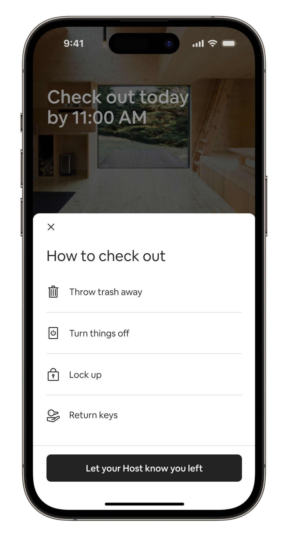
Airbnb’s highly user-friendly design represents careful consideration for comfort and efficiency on mobile screens.
© Airbnb, Fair Use
For a practical view on how to leverage ergonomics well in UX design, consider mobile applications in particular, where designers focus on:
The users’ needs and contexts: Designers tailor the app for the ease of interaction between user and interface in these scenarios. A well-designed app considers the user's perspective from the outset, and proves that the designer has identified the key actions and necessary information throughout the overall structure and flow of the application.
Intuitive navigation: The app should guide the user effortlessly through its features, with intuitive navigation that feels as natural as swimming. So, critical elements are within easy reach—often referred to as the “thumb zone”—and all navigational buttons are visible and easily accessible.
Simplified user interaction: The application must minimize the number of steps in the registration or transaction processes. So, when designers suggest default values and reduce the need for data entry, it can greatly lower the chances of user friction—and boost users’ overall experience.
Optimized information architecture: The structure of the app should be logical and straightforward—where the users’ needs obviously come first. So, designers need to prioritize those key features that are in line with the target audience’s goals and simplify the content hierarchy.
Usability enhancements: The design should make it easy for users to understand and interact with the app. Clear and concise microcopy that guides the user through their interactions helps tremendously with this—as do clear and actionable call-to-action buttons.
Author, Speaker and UX Writer at Google, Torrey Podmajersky explains important points about UX writing and microcopy:
Show
Hide
video transcript
-
00:00:00 --> 00:00:30
I'm working at the TAPP Transit System; this is a made-up transit system app. And it says, 'Oh, we need a notification for when someone's payment method has expired.' So, first I do the strategic work and I say, 'What's the *point* here?' What's the point for our user, and what's the point for the business or the organization? And what are our *voice concepts* that we want to make sure that we're landing so that it's in our brand?' So, I take it and then I start including *purpose*.
-
00:00:30 --> 00:01:03
And it gets longer and longer. And I just *iterate and iterate*, and I keep all these iterations. Thank heavens for tools like Sketch and Figma where I just make artboard after artboard after artboard or frame after frame and keep them all. I choose the best of those, and I work on making it *more concise* – more concise and more concise, and you see it's getting shorter and shorter. It gets so short here at the end, it's not particularly usable. So, I'm going to go with the second to the end and go forward.
-
00:01:03 --> 00:01:31
I'm going to make it more *conversational*: is this something a person would actually say? And I make more iterations. And I have my favorite among those. And then I look at all of them together, and I say, 'Here's my best ones,' and that's what I'm going to tell my team about. I'm going to say the original message doesn't follow the voice and really doesn't meet the purpose. I'm going to say which one I recommend and why and give them another couple of options.
-
00:01:31 --> 00:01:42
The secret here is: *I'm happy with all three of these*; I don't care which ones they choose; and, frankly, I'd prefer to A/B test them against each other and learn more about the language.
Overall, effective ergonomic designs are ones that translate to exceedingly smooth and highly enjoyable user experiences for every user, no matter the target audience involved. When designers mindfully apply the best design patterns and tailor their UIs to help users in their many contexts, the results can spell success long term for their brands.
How comfortably users can enjoy the digital solution, how effectively and efficiently they can get and do what they want, and how much—or how little—they have to think about the design of the UI itself are factors that will translate to how well they enjoy a seamless experience with the brands whose products they choose to use and stay with as loyal customers. So, designers have much to consider on the road to not just keep users safe, comfortable and unconfused—but to meet them with a unique brand identity, too. The ultimate goal is to make the tasks so intuitive and easy that the user senses a direct interaction with the brand—comfortably and securely—and forgets that there’s a device’s screen in the way.
Learn More about Ergonomics
For valuable information and tips, watch our Master Class Accessible and Inclusive Design Patterns with Vitaly Friedman, Senior UX Consultant, European Parliament, and Creative Lead, Smashing Magazine.
For a deep dive into the exciting realm of designing for real users, take our course User Experience: The Beginner’s Guide.
Go to What Are Principles of Ergonomics in UI Design? by Flowmapp for many helpful insights.
Read Designing for Human Performance and Well-being: The Importance of Ergonomics in UI Design by Arzath Areeff for further valuable details.
Check out Ergonomics and UX Research by Florine Auffrait for additional helpful details.
Questions about Ergonomics
What are the main principles of ergonomic design?
Key principles of how to design to maximize users’ comfort and efficiency include:
User-centered design: Prioritize user needs, preferences and limitations so you make a comfortable and efficient environment.
Adjustability: Make sure that tools and equipment can adapt to various user sizes, postures and preferences—to reduce strain and discomfort.
Neutral postures: Design products that let users keep natural, comfortable postures and that minimize stress on muscles and joints, including in the fingers and neck.
Repetition reduction: Minimize repetitive tasks; it will lower the risk of strain injuries.
Environment optimization: Consider the user’s lighting, noise levels and climate so they can use the digital product in a comfortable workspace.
Safety: Last—but not least—always incorporate safety features to prevent accidents and injuries. That’s especially vital in high-risk user environments such as roads and public transport settings.
Watch our video on User Interface (UI) Design Patterns to appreciate more about what works best for human users:
Show
Hide
video transcript
-
00:00:00 --> 00:00:33
User Interface Design Patterns are recurring components which designers use to solve common problems in interfaces. like, for example, when we think about those regular things that often are repeating themselves to kind of appear in, you know, in complex environments We need to show things that matter to people when they matter and nothing else. Right. it's just really sad what we see. Like, for example, if you look at Sears, right? Sears is just one of the many e-commerce sites, you know, nothing groundbreaking here. So you click on one of the filters and then the entire interface freezes
-
00:00:33 --> 00:01:00
and then there is a refresh and you're being scrolled up. And I always ask myself, is this really the best we can do? Is really the best kind of interface for filtering that we can come up with, or can we do it a bit better? Because we can do it a bit better. So this is a great example where you have galaxies and then galaxies, you have all this filters which are in rows. Sometimes they take three rows, sometimes four or sometimes five rows. That's okay. Show people filters, show people buttons if they important show them.
-
00:01:00 --> 00:01:32
Right. But what's important here, what I really like is we do not automatically refresh. Instead, we go ahead and say, "Hey, choose asmany filters as you like", right? And then whenever you click on show results, it's only then when you actually get an update coming up in the back. Which I think is perfectly fine. You don't need to auto update all the time. And that's especially critical when you're actually talking about the mobile view. The filter. Sure, why not? Slide in, slide out, although I probably prefer accordions instead.
-
00:01:32 --> 00:02:01
And you just click on show products and it's only then when you return back to the other selection of filters and only when you click okay, show all products, then you actually get to load all the products, right? Designing good UI patterns is important because it leads to a better user experience, reduces usability issues, and ultimately contributes to the success of a product or application. It's a critical aspect of user centered design and product development.
For valuable information and tips, watch our Master Class Accessible and Inclusive Design Patterns with Vitaly Friedman, Senior UX Consultant, European Parliament, and Creative Lead, Smashing Magazine.
How do you balance aesthetics and ergonomics in design?
Follow these key steps:
Understand user needs: Do your user research thoroughly to determine what users need for comfort and functionality. This will help make sure that your design supports ergonomic principles without compromising on visual appeal.
Prioritize comfort: Ensure that ergonomic features like adjustable elements and proper support come first and foremost. Comfort is essential for user satisfaction—and that includes cognitive as well as physical comfort.
Integrate style: Once you’ve set the ergonomic base, add aesthetic elements. Use colors, textures and shapes that enhance the visual appeal but that don’t dilute or distort the functionality.
Test prototypes: Create and test prototypes with real users—and collect feedback to refine both the ergonomic and aesthetic aspects.
Iterate and improve: Continuously iterate the design to improve the balance—and use feedback to boost both the usability and visual elements.
Watch our video on User Interface (UI) Design Patterns to appreciate more about what works best for human users:
Show
Hide
video transcript
-
00:00:00 --> 00:00:33
User Interface Design Patterns are recurring components which designers use to solve common problems in interfaces. like, for example, when we think about those regular things that often are repeating themselves to kind of appear in, you know, in complex environments We need to show things that matter to people when they matter and nothing else. Right. it's just really sad what we see. Like, for example, if you look at Sears, right? Sears is just one of the many e-commerce sites, you know, nothing groundbreaking here. So you click on one of the filters and then the entire interface freezes
-
00:00:33 --> 00:01:00
and then there is a refresh and you're being scrolled up. And I always ask myself, is this really the best we can do? Is really the best kind of interface for filtering that we can come up with, or can we do it a bit better? Because we can do it a bit better. So this is a great example where you have galaxies and then galaxies, you have all this filters which are in rows. Sometimes they take three rows, sometimes four or sometimes five rows. That's okay. Show people filters, show people buttons if they important show them.
-
00:01:00 --> 00:01:32
Right. But what's important here, what I really like is we do not automatically refresh. Instead, we go ahead and say, "Hey, choose asmany filters as you like", right? And then whenever you click on show results, it's only then when you actually get an update coming up in the back. Which I think is perfectly fine. You don't need to auto update all the time. And that's especially critical when you're actually talking about the mobile view. The filter. Sure, why not? Slide in, slide out, although I probably prefer accordions instead.
-
00:01:32 --> 00:02:01
And you just click on show products and it's only then when you return back to the other selection of filters and only when you click okay, show all products, then you actually get to load all the products, right? Designing good UI patterns is important because it leads to a better user experience, reduces usability issues, and ultimately contributes to the success of a product or application. It's a critical aspect of user centered design and product development.
For valuable information and tips, watch our Master Class Accessible and Inclusive Design Patterns with Vitaly Friedman, Senior UX Consultant, European Parliament, and Creative Lead, Smashing Magazine.
How can I make sure my design is ergonomically friendly?
Try these steps:
Study user needs: Understand the physical needs—and limitations—of your users in their contexts. Conduct user research and collect valuable feedback to know what works best for them.
Prioritize comfort: Design with user comfort in mind—and choose proven design patterns that support cognitive and physical ergonomics.
Make sure there’s good adjustability and personalization: Create designs that users can adjust to fit their preferences—so they can achieve tasks in the best ways for them.
Promote natural postures: Design tools and interfaces that allow users to maintain natural and neutral postures—particularly important in augmented reality (AR) and virtual reality (VR) designs. This helps prevent discomfort and injury.
Test and iterate: Test your design with real users. Use their feedback to make necessary adjustments and improvements.
Watch as CEO of Experience Dynamics, Frank Spillers explains important points about Augmented Reality (AR):
Show
Hide
video transcript
-
00:00:00 --> 00:00:32
What is AR? Well, the old definition is that, you know, you see a visualization with an iPad or a phone and it kind of something just pops up, a static visualization. The new definition of AR utilizes technologies that embody spatial mapping that actually map out the room and uses headsets more like this headset where you're looking around and you're have more contact than just through your phone.
-
00:00:32 --> 00:01:03
So you have holograms and stories or narratives that actually merge with the actual environment, and that's the exciting potential of AR designing for augmented reality. It's about deepening the meaning of real and augmented objects and contexts that is playful and helps guide your discovery that you can visualize and have intuitive discovery and manipulation of objects or content,
-
00:01:03 --> 00:01:29
and but that it allows you to extend your cognitive abilities to think, to decide, to imagine. It couples with reality to create more meaning. And finally, that is collaborative. And the question is, what's the difference between VR? VR you wear a headset and you're fully underneath that head mounted display, whereas AR your have something that keeps you in contact with the real world.
For valuable information and tips, watch our Master Class Accessible and Inclusive Design Patterns with Vitaly Friedman, Senior UX Consultant, European Parliament, and Creative Lead, Smashing Magazine.
What are some common ergonomic mistakes in UI design?
Here are some common ergonomic UI design mistakes:
Small click targets: Designers often make buttons and links too small, causing users to struggle with precision—so, make sure click targets are large enough for easy interaction for users. Use at least 44x44 pixels for clickable areas.
Poor contrast: Low contrast between text and background strains users’ eyes. Use high contrast to optimize your design’s readability.
Crowded interfaces: Don’t overload the interface with too many elements—it can overwhelm users. Keep the design clean and simple.
Inconsistent navigation: Don’t place navigation elements inconsistently—it confuses users and slows their progress.
Lack of feedback: Keep users constantly in the loop with immediate—visual or auditory—feedback on user actions, and especially offer clear feedback to confirm actions.
For a deep dive into the exciting realm of how to design for real users, take our course User Experience: The Beginner’s Guide.
What tools can I use to ensure ergonomic design?
Consider these tools:
Platforms like UserTesting and Lookback allow you to observe real users interacting with your design and gather feedback.
Anthropometric Data Tools: Resources like Human Factors and Ergonomics Society databases provide data on human body measurements to guide your design.
Virtual Reality (VR) Tools: VR tools like Unity and Unreal Engine offer immersive environments to test ergonomic aspects before finalizing the design.
UX Strategist and Consultant, William Hudson explains important points about user testing:
Show
Hide
video transcript
-
00:00:00 --> 00:00:32
If you just focus on the evaluation activity typically with usability testing, you're actually doing *nothing* to improve the usability of your process. You are still creating bad designs. And just filtering them out is going to be fantastically wasteful in terms of the amount of effort. So, you know, if you think about it as a production line, we have that manufacturing analogy and talk about screws. If you decide that your products aren't really good enough
-
00:00:32 --> 00:01:02
for whatever reason – they're not consistent or they break easily or any number of potential problems – and all you do to *improve* the quality of your product is to up the quality checking at the end of the assembly line, then guess what? You just end up with a lot of waste because you're still producing a large number of faulty screws. And if you do nothing to improve the actual process in the manufacturing of the screws, then just tightening the evaluation process
-
00:01:02 --> 00:01:17
– raising the hurdle, effectively – is really not the way to go. Usability evaluations are a *very* important tool. Usability testing, in particular, is a very important tool in our toolbox. But really it cannot be the only one.
For a deep dive into the exciting realm of how to design for real users, take our course User Experience: The Beginner’s Guide.
What ergonomic considerations should I make for users with disabilities?
Accessibility: Make sure your design complies with accessibility standards like WCAG. Provide alternatives for visual, auditory and motor impairments. What’s more, use high contrast and large fonts for better readability. Also, include voice control options for users with limited hand mobility. Think ahead to anticipate all users’ needs, including those with disabilities.
Adjustability: Create designs that users can easily adjust—and, where applicable, allow customization for height, size and input methods to accommodate different needs.
Clear navigation: Simplify navigation and make it intuitive. Use large buttons, clear labels and logical layouts to help users with cognitive disabilities—and so help users in all contexts that much more. Apply high contrast and large fonts for better readability.
Assistive technologies: Integrate with assistive devices like screen readers, voice recognition and alternative input devices.
Comfort and safety: Make sure all users can interact comfortably and safely.
See why accessibility is such a vital concern in design:
Show
Hide
video transcript
-
00:00:00 --> 00:00:30
Accessibility ensures that digital products, websites, applications, services and other interactive interfaces are designed and developed to be easy to use and understand by people with disabilities. 1.85 billion folks around the world who live with a disability or might live with more than one and are navigating the world through assistive technology or other augmentations to kind of assist with that with your interactions with the world around you. Meaning folks who live with disability, but also their caretakers,
-
00:00:30 --> 00:01:01
their loved ones, their friends. All of this relates to the purchasing power of this community. Disability isn't a stagnant thing. We all have our life cycle. As you age, things change, your eyesight adjusts. All of these relate to disability. Designing accessibility is also designing for your future self. People with disabilities want beautiful designs as well. They want a slick interface. They want it to be smooth and an enjoyable experience. And so if you feel like
-
00:01:01 --> 00:01:30
your design has gotten worse after you've included accessibility, it's time to start actually iterating and think, How do I actually make this an enjoyable interface to interact with while also making sure it's sets expectations and it actually gives people the amount of information they need. And in a way that they can digest it just as everyone else wants to digest that information for screen reader users a lot of it boils down to making sure you're always labeling
-
00:01:30 --> 00:02:02
your interactive elements, whether it be buttons, links, slider components. Just making sure that you're giving enough information that people know how to interact with your website, with your design, with whatever that interaction looks like. Also, dark mode is something that came out of this community. So if you're someone who leverages that quite frequently. Font is a huge kind of aspect to think about in your design. A thin font that meets color contrast
-
00:02:02 --> 00:02:20
can still be a really poor readability experience because of that pixelation aspect or because of how your eye actually perceives the text. What are some tangible things you can start doing to help this user group? Create inclusive and user-friendly experiences for all individuals.
Read our Topic Definition of Inclusive Design to understand critical points about this equally important dimension of design.
How can I design ergonomic navigation menus?
Follow these key steps:
Prioritize clarity: Use clear and simple labels for each menu item—and make sure users quickly understand the options. Use high-contrast colors for menu items to improve visibility.
Put accessibility first: Make menus accessible to all users—including those with disabilities. Use large, clickable areas and make sure there’s compatibility with screen readers.
Optimize placement: Place navigation menus in familiar—and easily reachable—locations, like the top or side of the screen.
Use a consistent structure: Keep a consistent menu structure across all pages, to keep users from getting confused.
Minimize steps: Reduce the number of clicks users need to make to reach important pages. Group related items logically to streamline navigation.
Provide keyboard shortcuts for quicker navigation.
Test your menus with real users to identify and fix usability issues.
Read our Topic Definition of Accessibility to understand more about this essential design subject.
Watch our video on visual hierarchy for important insights:
Show
Hide
video transcript
-
00:00:00 --> 00:00:31
Visual hierarchy refers to the arrangement or organization of elements within a design in a way that guides the viewer's eye through the content in a specific order of importance. It's about creating a clear and logical structure that helps users navigate and understand the information presented. You can use size and scale, color and contrast typography, white space
-
00:00:31 --> 00:01:00
alignment, repetition, proximity, visual elements such as icons, images, textures and graphics and reading patterns. By using these principles effectively, Designers can guide the viewer's focus, ensuring that the most important elements are noticed first and create a more intuitive and engaging experience.
What role do colors play in ergonomic design?
Colors play a crucial role in ergonomic design—in that they enhance usability and comfort. Colors should guide and help users understand what’s in front of them. In this sense, ergonomics applies even to the simplest graphic designs, since good ergonomics means viewers can quickly make sense of what they’re looking at. Here are key points to consider for UI design:
Visibility and readability: Use high-contrast color combinations to make text and important elements stand out. This reduces eye strain and improves readability, especially for users with visual impairments.
Guidance and navigation: Employ colors to guide users through the interface. Consistent use of specific colors for buttons or links helps users to quickly find interactive elements.
User comfort: Choose colors that reduce eye fatigue. Softer, neutral tones create a calming environment—while overly bright colors can cause discomfort. Use a color palette that balances aesthetics with functionality.
Accessibility: Ensure color choices meet accessibility standards. Don’t rely on color alone to convey information, as colorblind users may miss important cues. Use tools like contrast checkers to verify color accessibility.
Test your design with users to collect feedback on the color choices, too.
For great points about how to make the most of color in your design solutions, watch our Master Class How To Use Color Theory To Enhance Your Designs with Arielle Eckstut and Joann Eckstut, Leading Color Consultants and Authors, who are among the most definitive authorities on color in the United States.
Watch as UX Strategist and Consultant, William Hudson explains important points about user testing:
Show
Hide
video transcript
-
00:00:00 --> 00:00:32
If you just focus on the evaluation activity typically with usability testing, you're actually doing *nothing* to improve the usability of your process. You are still creating bad designs. And just filtering them out is going to be fantastically wasteful in terms of the amount of effort. So, you know, if you think about it as a production line, we have that manufacturing analogy and talk about screws. If you decide that your products aren't really good enough
-
00:00:32 --> 00:01:02
for whatever reason – they're not consistent or they break easily or any number of potential problems – and all you do to *improve* the quality of your product is to up the quality checking at the end of the assembly line, then guess what? You just end up with a lot of waste because you're still producing a large number of faulty screws. And if you do nothing to improve the actual process in the manufacturing of the screws, then just tightening the evaluation process
-
00:01:02 --> 00:01:17
– raising the hurdle, effectively – is really not the way to go. Usability evaluations are a *very* important tool. Usability testing, in particular, is a very important tool in our toolbox. But really it cannot be the only one.
How can I design ergonomic touch interfaces?
Follow these key steps:
Optimize touch targets: Ensure buttons and interactive elements are large enough for easy tapping. A minimum size of 44x44 pixels works well.
Space elements appropriately: Place touch targets with enough space between them to prevent accidental taps—it will lessen the chances that users get frustrated.
Consider hand positions: Design for various hand positions and grips. Place frequently used elements within easy reach to minimize hand strain. Position primary actions within the thumb's natural range for one-handed use.
Provide visual feedback: Offer immediate visual feedback when users tap an element. This confirms their actions and improves the user experience.
Make sure the design has good consistency: Keep a consistent layout and design language throughout the interface—to help users navigate smoothly.
Also, use mockups to test touch target sizes with real users. Regularly collect feedback so you get insights that will help you refine your design.
Watch as CEO of Experience Dynamics, Frank Spillers explains important points about UI patterns for mobile:
Show
Hide
video transcript
-
00:00:00 --> 00:00:30
All right, so now it's time to take a look at some common UI patterns and how to use them. So, we use UI patterns as a way to help users not have to relearn, and there's a really great example here from Down Dog. And in particular, their onboarding, their visual design, their affordances, their contrast, it's all just beautifully executed.
-
00:00:30 --> 00:01:04
It's actually one of the most popular apps for yoga and other types of fitness training. *Gestures* – of course, this is a gesture-based medium. But gestures are classically difficult to learn. And so, they've kind of become standardized on all mobile operating systems, more or less. There may be some unique gestures, and there are some gesture hints you can give. So, you can say, "Swipe up to begin." So, you can give like a hint like that. But just be familiar with the fact that gestures in the very beginning of mobile
-
00:01:04 --> 00:01:33
had all these different variances across operating systems and most users just did not learn and did not take the time; they don't care. So, the most basic – you know – tap, swipe. There are some gestures like the Tinder gesture that was made famous, like was it: swipe left, swipe right. The other pattern is *integration*, that if you send them to email to validate and they click on email, it should take them back to the app, hopefully.
-
00:01:33 --> 00:02:02
So, there's a little bit of technology there in terms of opening the container. Some apps do it really well; other apps don't. They send you to a website. Click on another button; then that launches the container. I think that's okay, too, as long as it makes the connection and the app actually opens. But you should have seamlessness between notifications, the websites or email and the app itself so that if anyone is on any of those touchpoints, they're fluidly able to jump in between.
-
00:02:02 --> 00:02:33
*Back buttons* are important. It's important that the back buttons act like back buttons and a user can go back to previous content or to a previous section, and that they're *not lost*. And that's actually another point about if you're using accordions and the accordion opens up, the user might get lost inside of the accordion menu. So, you want users to be able to control where they left off, especially if it's a lot of content and to be able to go back and kind of have
-
00:02:33 --> 00:03:01
more control over that. There's nothing wrong with accordions – they're great – but they can lose their robustness in terms of lost in navigation. Also remember *contrast and affordance* so that – you know – the open / close, whether it's an arrow or plus minus sign, however you illustrate that affordance, that that's visible as well; unless you're deliberately giving the user some kind of focus where they need to be like on that particular page,
-
00:03:01 --> 00:03:30
it's better if you show navigation and let them quickly bail out because remember you're in that micro interaction, that clipped attention span. *Hamburger menus* can do without actually the three bars is what the research showed, so a menu with a square around it. And putting that little square or that line around it really helps. Be sure to *test*, of course, to make sure your users can get in there. Be sure to *tag* it from an accessibility standpoint, in other words, so that
-
00:03:30 --> 00:04:09
a screen reader can know that it's a menu that can be opened. *Use search diligently* – in other words, let users search your mobile app or your mobile site, but if you're letting them drill into a search – say that it's for this section, so this is a news search or this is an archive search or this is – you know – so a lot of sites will just use search and just assume that users know, when really it's like a global search. The key to using different UI controls such as presenting information in a carousel
-
00:04:09 --> 00:04:31
or in a bigger menu like a mega menu for mobile is to give people visibility. Don't make them look at each single item. Let them actually get a glance of it and so that they can go on to the next screen. *Videos*, of course, are popular content, but videos force users to sit and watch them.
-
00:04:31 --> 00:05:02
So, maybe tell them what the video is about and let them scan it quickly, so you might put *markers* in the videos. Make sure those videos are *captioned* for accessibility, for deaf and hard of hearing users. And the same with *infographics*; if you use infographics, make sure that the infographics have good described by Aria tags. So, Aria is perfect for mobile and can be used on mobile to make it more accessible. So, it's really important, that customization, personalization.
-
00:05:02 --> 00:05:34
Giving users *control* of their data is a really good idea. Be *careful of random features*. Make sure that your features are based on desirability and from observed user behavior. Remember *touch target size and placement and tappability signifiers* so that users know they can tap certain objects and *watch out for accidental touches*.
-
00:05:34 --> 00:05:56
You know, you can support undo or you can have good error handling to deal with that. Think about how you can help take a user to their task, give them what they need, build motivation, build momentum and have them, you know, essentially convert or engage if it's not an e-commerce or transactional type of thing.
Watch our Master Class Boost Mobile UX with UX Design Principles and Best Practices with Miklos Philips, Lead UX Designer/Product Designer.
What are ergonomic considerations for gesture-based interactions?
Consider the following:
Simplicity: Use simple gestures that feel natural and intuitive. Complex gestures can cause confusion and strain.
Comfortable range: Make sure gestures fall within a comfortable range of motion. Don’t make users stretch or make awkward movements. Design gestures that users can perform with minimal effort and movement. Likewise, consider the setting—users in AR or VR experiences might injure themselves or others if they make certain movements.
Consistency: Keep gesture controls consistent across the interface—this helps users learn and remember them easily.
Feedback: Provide immediate feedback for gestures to confirm actions and reduce errors. Visual or haptic feedback works well for that.
Customization: Let users customize gesture controls to fit their preferences and physical capabilities.
What’s more, test gestures with a diverse group of users to find the most intuitive and comfortable ones. Also, use clear visual cues to guide users in performing gestures correctly.
Watch as Frank Spillers explains how to design gestures for Augmented Reality (AR) and Virtual Reality (VR) experiences:
Show
Hide
video transcript
-
00:00:00 --> 00:00:32
There's a reason why in HoloLens they said they have this this interaction. It's called the bloom. Right. And the bloom brings back your menu. And then the other interaction that they have in terms of gesture is the air tap. So those the reason those those are so simple is because we don't want to overlook our users.
-
00:00:32 --> 00:01:01
We don't want them to learn a new language. You see on the right hand side, this, this is the grab gesture, select gesture for the meter to in the matter to CEO. They're on stage showing that off and he has an object and he's, you know, basically release, grab, release. I mean, just very simple. Right. And the bloom, the air tap, you know, and the the grab to move gesture. Very, very simple.
-
00:01:01 --> 00:01:31
The other thing to watch out for with gesture is arm fatigue. Right. So if you're getting people to do too much of this, it's a problem. You want to basically give people breaks, give your user a break, and also mix gesture and speech. Right. So watch out for something that's constantly requiring too much air tapping, too much reliance on over gesturing. You don't want to wear people out. This is exactly why the idea of a UI that you're constantly waving your hands.
-
00:01:31 --> 00:02:01
You know this this minority report type of UI image that we see. That's a great fantasy, but it would be lead to arm fatigue. And this is the problem with that one looks really cool on a movie looks really cool on on the web, you know but humans have have again, gravity constraints and it's just not natural to do a lot of movement with our necks or with our arms. And so you really have to balance that nicely.
-
00:02:01 --> 00:02:30
Now, one of the examples here that I'd like to share is from Christoph Tozier, who is a lead designer at Facebook spaces and Facebook spaces as a social VR for Facebook. And he he tells a story of of designing the the the controller for Oculus. This is the Oculus Touch controller and using the natural interaction of you know, of your hand.
-
00:02:30 --> 00:03:03
So his whole thing was follow natural interactions, follow what feels natural, follow, you know, and acted out. Remember, use your improv so act out the the the the amount of effort that a user's going to have to go into. And you know it's it's it's pretty naturalistic users like the the touch controllers over the the HTC Vive its controller which is this big wand of very strange it's almost very heavy to lift as well.
-
00:03:03 --> 00:03:33
It's very heavy down here. You know the point of this is remember like you don't want to wear out your users. So if you're if you're designing hardware, this is obviously a huge issue. But since you may be stuck with hardware such as this one, you have to be careful that you don't overload the amount of gesturing that you're requiring. And it feels fatiguing physically on the muscle, just as you would a voice avoid, not mouse strain,
-
00:03:33 --> 00:04:03
you know, which I don't even think people care about anymore. They just strain away. So we want to avoid that. You know, the other thing the Oculus Touch added is when you're when you're interacting, you get haptic feedback. So it feels like you're interacting and you also get audio feedback. So it creates more immersion between the user and the virtual or, you know, basically virtual hands. Now, outside of the controllers, we have, you know,
-
00:04:03 --> 00:04:32
an advance there from leap motion that you're just using your actual hand. And this animation is showing the leap motion controllers that it's actually very naturalistic, you know, and they really, really have that mapping of the hand styled in. And you can sort of move along very nicely. So some of the gesture tips that Christophe Tauziet shares from his experience of designing the touch,
-
00:04:32 --> 00:05:02
the higher the person has to raise their arm to perform an interaction, the faster the interaction should be to avoid fatigue. Right? So don't make your users strain raising your arm high enough that your elbows no longer in contact with your body can be tiring. Again, Minority Report just exhausting for her user. Right. Makes nice demo but doesn't really match the reality. Interacting with a moving interface can be challenging and should be primarily used for quick actions.
-
00:05:02 --> 00:05:33
Right. So some really, really good tips here. Some people have trouble visually reading depth and may need some time and practice in order to learn how far they have to reach out to manipulate objects. Right. So be careful when you're designing that. You get used to the interaction. You get used to using your virtual hands or controller and then, you know, your users might not. So this is why testing is so critical when sitting reaching out towards objects that are too close to your virtual body
-
00:05:33 --> 00:06:00
can be challenging, you know, and be careful sitting versus standing. Watch out for height bias. You know, again, the question in our experience design plan was where's your what's your user doing? You know, how what's their comfort level? What is what are their goals? So you have to think about those things very carefully with each senior designing hands that visually look realistic can be creepy. More Tips. A familiar object
-
00:06:00 --> 00:06:31
that often communicates how it should be picked up, held and used. For example, people expect to use a gun shaped prop to aim at things, right? So I've used too many objects in virtual reality games that don't seem normal, right? It's weird. And then you're like, they didn't think about the actual natural interaction with that object. But finally got a physical object. May need to have different physics when being held, right?
-
00:06:31 --> 00:07:02
If you're holding the pen and you go through the table, you probably don't want that pen to hit the table and bounce, but rather go through the table with your hand. For example, people lose track of their real world, physical surroundings when in VR that's a big one, right? That's our users brain. In 3D, people also lose track of time, right? So-called time dilation or, you know, it's essentially the time distortion is the phenomenon that's occurring there.
-
00:07:02 --> 00:07:34
So so there's no there's no you could just put a clock in there. You know, I I'm like, well, I've heard a lot of people talking about time dilation and time distortion and in immersive environments and just stick a clock in there, stick an artifact, you know, let the user know how many minutes they've been in there. You know, for example, if it's relevant to the world, if you want them to get lost and you want them to spend time in there, then obviously that's to your advantage. Then finally, here, he adds that hand gestures are inherently social, right?
-
00:07:34 --> 00:08:02
So I thought, that's a really great another really great tip that he learned when designing the touch. So a visual indication that your friend is also interacting, It might there might be some some awkwardness going on with social situations. I you know, this is a huge issue for social VR, you know, when you have multiple users and then you have to have social affordances. And so what he's talking about there is social affordances.
-
00:08:02 --> 00:08:31
Yeah. I think one of the things that I love about Kristof's work is that he says, you know, a lot of it is through trial and error. They they learned these mistakes when they were designing this by usability testing. So this is probably not going to happen any time soon. Right. Makes for a really cool image, but probably not realistic. Can you imagine a summer? I can see somebody spraining their ankle or breaking their legs are breaking their knees.
Watch our Master Class Boost Mobile UX with UX Design Principles and Best Practices with Miklos Philips, Lead UX Designer/Product Designer.
What are some highly cited scientific articles about ergonomics?
Chen, Z. (2023). Research on the application of ergonomics in UI interface design. Applied Mathematics and Nonlinear Sciences, 8(2), 1-10.
This publication has been influential in bridging the gap between ergonomics and user interface (UI) design—and it offers a comprehensive approach to creating more user-friendly digital interfaces. The paper explores how ergonomic principles are applicable to UI design—and emphasizes the importance of considering human factors in the design process.
Earn a Gift, Answer a Short Quiz!
- Question 1
- Question 2
- Question 3
- Get Your Gift
Try Again! IxDF Cheers For You!
Remember, the more you learn about design, the more you make yourself valuable.
Improve your UX / UI Design skills and grow your career! Join IxDF now!
- Question 1
- Question 2
- Question 3
- Get Your Gift
Congratulations! You Did Amazing
You earned your gift with a perfect score! Let us send it to you.
Check Your Inbox
We've emailed your gift to name@email.com.
Improve your UX / UI Design skills and grow your career! Join IxDF now!
Literature on Ergonomics in UX/UI Design
Here's the entire UX literature on Ergonomics in UX/UI Design by the Interaction Design Foundation, collated in one place:
Learn more about Ergonomics in UX/UI Design
Take a deep dive into Ergonomics with our course User Experience: The Beginner’s Guide .
If you’ve heard the term user experience design and been overwhelmed by all the jargon, then you’re not alone. In fact, most practicing UX designers struggle to explain what they do!
“[User experience] is used by people to say, ‘I’m a user experience designer, I design websites,’ or ‘I design apps.’ […] and they think the experience is that simple device, the website, or the app, or who knows what. No! It’s everything — it’s the way you experience the world, it’s the way you experience your life, it’s the way you experience the service. Or, yeah, an app or a computer system. But it’s a system that’s everything.”
— Don Norman, pioneer and inventor of the term “user experience,” in an interview with NNGroup
As indicated by Don Norman, User Experience is an umbrella term that covers several areas. When you work with user experience, it’s crucial to understand what those areas are so that you know how best to apply the tools available to you.
In this course, you will gain an introduction to the breadth of UX design and understand why it matters. You’ll also learn the roles and responsibilities of a UX designer, how to confidently talk about UX and practical methods that you can apply to your work immediately.
You will learn to identify the overlaps and differences between different fields and adapt your existing skills to UX design. Once you understand the lay of the land, you’ll be able to chart your journey into a career in UX design. You’ll hear from practicing UX designers from within the IxDF community — people who come from diverse backgrounds, have taught themselves design, learned on the job, and are enjoying successful careers.
If you are new to the Interaction Design Foundation, this course is a great place to start because it brings together materials from many of our other courses. This provides you with both an excellent introduction to user experience and a preview of the courses we have to offer to help you develop your future career. After each lesson, we will introduce you to the courses you can take if a specific topic has caught your attention. That way, you’ll find it easy to continue your learning journey.
In the first lesson, you’ll learn what user experience design is and what a UX designer does. You’ll also learn about the importance of portfolios and what hiring managers look for in them.
In the second lesson, you’ll learn how to think like a UX designer. This lesson also introduces you to the very first exercise for you to dip your toes into the cool waters of user experience.
In the third and the fourth lessons, you’ll learn about the most common UX design tools and methods. You’ll also practice each of the methods through tailor-made exercises that walk you through the different stages of the design process.
In the final lesson, you’ll step outside the classroom and into the real world. You’ll understand the role of a UX designer within an organization and what it takes to overcome common challenges at the workplace. You’ll also learn how to leverage your existing skills to successfully transition to and thrive in a new career in UX.
You’ll be taught by some of the world’s leading experts. The experts we’ve handpicked for you are:
Alan Dix, Director of the Computational Foundry at Swansea University, author of Statistics for HCI: Making Sense of Quantitative Data
Ann Blandford, Professor of Human-Computer Interaction at University College London
Frank Spillers, Service Designer, Founder and CEO of Experience Dynamics
Laura Klein, Product Management Expert, Principal at Users Know, Author of Build Better Products and UX for Lean Startups
Michal Malewicz, Designer and Creative Director / CEO of Hype4 Mobile
Mike Rohde, Experience and Interface Designer, Author of The Sketchnote Handbook: The Illustrated Guide to Visual Note Taking
Szymon Adamiak, Software Engineer and Co-founder of Hype4 Mobile
William Hudson, User Experience Strategist and Founder of Syntagm
Throughout the course, we’ll supply you with lots of templates and step-by-step guides so you can start applying what you learn in your everyday practice.
You’ll find a series of exercises that will help you get hands-on experience with the methods you learn. Whether you’re a newcomer to design considering a career switch, an experienced practitioner looking to brush up on the basics, or work closely with designers and are curious to know what your colleagues are up to, you will benefit from the learning materials and practical exercises in this course.
You can also learn with your fellow course-takers and use the discussion forums to get feedback and inspire other people who are learning alongside you. You and your fellow course-takers have a huge knowledge and experience base between you, so we think you should take advantage of it whenever possible.
You earn a verifiable and industry-trusted Course Certificate once you’ve completed the course. You can highlight it on your resume, LinkedIn profile or website.
Open Access—Link to us!
We believe in Open Access and the democratization of knowledge. Unfortunately, world-class educational materials such as this page are normally hidden behind paywalls or in expensive textbooks.
If you want this to change, , link to us, or join us to help us democratize design knowledge!