Your constantly-updated definition of Navigation in UX/UI Design and
collection of videos and articles. Be a conversation starter: Share this page and inspire others!
703shares
What is Navigation in UX/UI Design?
Navigation in user experience (UX) design refers to the system that lets users move through a digital interface—such as a website or app—efficiently and intuitively. It is crucial as it directly affects user experience, engagement and satisfaction. Designers aim for good navigation when they create simple, consistent menus, with clear labels and recognizable symbols. They also conduct usability testing to refine navigation paths and ensure users can find information quickly and easily.
Great navigation is a vital part of how users enjoy a positive user experience, and it’s something that can make or break how people feel about a product like a website or mobile app. Designers need to understand their users—deeply—and think carefully about how to organize information for them. The findings they get from research will be vital to create navigation that's simple yet effective for users. The reason navigation plays a crucial role in user interface (UI) and UX design is that it acts as a silent guide. Through helpful navigation, users can find information, explore content and interact with applications or websites without obstacles.
Welcome to eBay—where do you want to go? Perhaps a click on My eBay to see some possibilities?
This is one way to help define navigation, amid a wealth of choices on eBay. Users enjoy a smooth ride in terms of their UX navigation—to sell, search, monitor and more.
Because it’s so important to provide users with hassle-free access to solutions for their problems, designers who make effective navigation in their solutions help to boost their users’ understanding of what to do. That intuitiveness is essential. What’s more, effective navigation builds confidence and makes the product or website—and the brand behind it—more trustable.
From the moment they arrive on a landing page, through all the web pages users get to and on into the actions they take to convert—for example, if they become customers and buy something or sign up for a newsletter—users must find the entire experience seamless. What helps that is easily accessible navigation—and what helps the designers who understand exactly why users access a digital solution in the first place is user research.
UX Strategist and Consultant, William Hudson explains essential points about UX research:
ShowHide
video transcript
00:00:00 --> 00:00:30
User research is a crucial part of the design process. It helps to bridge the gap between what we think users need and what users actually need. User research is a systematic process of gathering and analyzing information about the target audience or users of a product, service or system. Researchers use a variety of methods to understand users, including surveys, interviews, observational studies, usability testing, contextual inquiry, card sorting and tree testing, eye tracking
00:00:30 --> 00:01:02
studies, A-B testing, ethnographic research and diary studies. By doing user research from the start, we get a much better product, a product that is useful and sells better. In the product development cycle, at each stage, you’ll different answers from user research. Let's go through the main points. What should we build? Before you even begin to design you need to validate your product idea. Will my users need this? Will they want to use it? If not this, what else should we build?
00:01:02 --> 00:01:31
To answer these basic questions, you need to understand your users everyday lives, their motivations, habits, and environment. That way your design a product relevant to them. The best methods for this stage are qualitative interviews and observations. Your visit users at their homes at work, wherever you plan for them to use your product. Sometimes this stage reveals opportunities no one in the design team would ever have imagined. How should we build this further in the design process?
00:01:31 --> 00:02:00
You will test the usability of your design. Is it easy to use and what can you do to improve it? Is it intuitive or do people struggle to achieve basic tasks? At this stage you'll get to observe people using your product, even if it is still a crude prototype. Start doing this early so your users don't get distracted by the esthetics. Focus on functionality and usability. Did we succeed? Finally, after the product is released, you can evaluate the impact of the design.
00:02:00 --> 00:02:15
How much does it improve the efficiency of your users work? How well does the product sell? Do people like to use it? As you can see, user research is something that design teams must do all the time to create useful, usable and delightful products.
Be it a site containing blog posts or an e-commerce giant with many thousands of product pages, when paths are clear and menus are simple, users feel far more comfortable and confident while they’re navigating a digital product. Success breeds success, too, as this ease of use encourages users to explore more. From that, they build a positive association with the brand. Plus, smooth navigation adds a touch of professionalism on top of that trustworthiness. When designers prove they care about the user's experience, users can get on with what they’re there to do—achieve their goals and forget that they’re interacting with the brand through a device.
Naturally, the definition for navigation extends beyond websites to software and back to the early days of computing. Consider company intranets and desktop computers, for example—both can feature navigation possibilities that include factors like permissions. This task-oriented navigation structure gears the UX around certain user tasks—and so it’s best suited to apps or systems that ask users to complete specific tasks.
A vertical bar on the left or right side, this one’s ideal for websites with extensive content that requires quick navigation without scrolling—but has other uses, too.
Allowing users to access a list of options by clicking a single button, it’s great for feature-rich applications.
5. Full-Screen Navigation
Ideal for knowledge-sharing or skill-building platforms, full-screen menus are especially helpful on smaller screens where excessive information might overwhelm users—they have a variety of uses.
Why Is Information Architecture Vital for Navigation?
Information architecture (IA) is possibly the most vital ingredient for designers to organize and structure content so they can help users understand and navigate a website or app better. It's more than just navigation, as it covers the overall organization, labeling and structure of information.
A deep or 5-level hierarchy—a site’s hierarchy will determine how many levels users need to go through to access subpages from the home page or point of entry. Designers need to get a clear idea of what to work with to facilitate the best navigation for users.
Organizational structure: This defines how a designer groups information, including categories and how they relate to each other.
Content structure: This is about how information shows up, including its hierarchy and types of content used.
Navigation structure: This outlines the paths and tools that users use for moving through the information—like menus, links and search functions.
Designers have numerous things to consider with these structures. For example, users on a government site might need to access certain web pages in order and sequential navigation—with “Previous” and “Next” labels and arrows—would be an effective solution. In any case, when a designer needs to construct navigation from scratch, card sorting can be a helpful tool. It allows designers to research how users group and organize information.
UX Strategist and Consultant, William Hudson explains important points about information architecture:
ShowHide
video transcript
00:00:00 --> 00:00:33
In a world overflowing with information, how do we find exactly what we're looking for, both online and offline? Enter Information Architecture, or IA: the discipline that helps us navigate through vast data landscapes. Information architecture is the framework of organization and labeling we use to structure and categorize content and data, primarily within digital products to make it easy to understand and navigate. Is like organizing a massive global library so you can find that one book without getting lost.
00:00:33 --> 00:01:03
Whether it's grouping Jurassic Period fossils in a museum, or arranging your favorite snacks in the supermarket, IA can guide us through physical and digital spaces alike. At its core, IA focuses on arranging the part of something to be understandable as a whole. In the context of UX design, IA is akin to the blueprint of a building: it lays out the foundation and structure upon which user experiences are built. It operates on the understanding that we perceive information as places
00:01:03 --> 00:01:30
made of language: labels, menus, visuals that can be organized for better navigation. Good IA is shaped by the content available, the context in which it's sought and the users seeking it, forming a complex information ecology. For UX designers, this means starting with understanding users needs, which leads to the creation of intuitive site maps, navigation and user flows that make digital experiences seamless.
00:01:30 --> 00:02:00
After a designer identifies user needs and content requirements, they will create a hierarchy that aligns with user behavior and psychology. This involves defining how information is grouped, how it flows from one section to another, and how users access it through navigation and search functionalities. Effective IA results in a coherent, intuitive user interface that allows users to find information quickly, accomplishes tasks efficiently, and understand the location within the digital space at any given time.
00:02:00 --> 00:02:13
Effective information architecture isn't just an initial step. It's the foundation upon which effective user experience is built, ensuring that every digital interaction is meaningful and easy to navigate.
What Are Common Navigation Patterns and When To Use Them?
There are various navigation patterns—each has its own strengths and best uses.
1. Horizontal vs. Vertical Navigation
Horizontal navigation bars are a popular choice for many websites. They work well for sites with a small to moderate number of top-level items—and they often appear at the top of company websites and blogs. They're familiar to users and don't take up much vertical space.
Vertical navigation, on the other hand, is great for sites with many categories. It often features in dashboard applications and content management systems. Vertical menus can hold more items and users find them easier to scan. As more users tend to look at the left side of the screen, left-side vertical navigation is a highly noticeable feature.
To choose between horizontal and vertical navigation, it’s important to consider:
Content amount: Horizontal works for fewer items, vertical for more.
Screen space: Horizontal frees up vertical space for content.
Future growth: Vertical is easier to expand later.
User familiarity: Horizontal is more common and may feel more natural to some users.
Vertical and horizontal user experience navigation considerations for designers to suit to their digital solutions.
To create successful navigation designs, consider the following key elements, starting with navigation definition:
Pick the right pattern for the UI content and the target users: This is fundamental, and it’s the best way to start on the path to truly user-centered designs, since navigation is the backbone of a digital product.
Keep clarity and consistency top of mind: Use clear labels and familiar UX copy throughout the design to help users understand where they are and where they can go.
Use meaningful labels: Boost SEO and provide relevant information by using specific, descriptive labels instead of generic terms like "products."
Consider mega menus: Mega menus might work better than dropdown menus for better usability; that’s because they’re larger, divided into contextual groups and visible at once.
Senior UX Consultant, Vitaly Friedman explains important points about mega menus:
Align the navigation with user goals: It’s vital to cater to primary user groups and their goals when designing navigation. User personas can help capture these primary groups effectively.
Author and Human-Computer Interaction Expert, Professor Alan Dix explains important points about user personas:
ShowHide
video transcript
00:00:00 --> 00:00:34
Personas are one of these things that gets used in very, very many ways during design. A persona is a rich description or description of a user. It's similar in some sense, to an example user, somebody that you're going to talk about. But it usually is not a particular person. And that's for sometimes reasons of confidentiality.
00:00:34 --> 00:01:02
Sometimes it's you want to capture about something slightly more generic than the actual user you talked to, that in some ways represents the group, but is still particular enough that you can think about it. Typically, not one persona, you usually have several personas. We'll come back to that. You use this persona description, it's a description of the example user, in many ways during design. You can ask questions like "What would Betty think?"
00:01:02 --> 00:01:35
You've got a persona called / about Betty, "what would Betty think" or "how would Betty feel about using this aspect of the system? Would Betty understand this? Would Betty be able to do this?" So we can ask questions by letting those personas seed our understanding, seed our imagination. Crucially, the details matter here. You want to make the persona real. So what we want to do is take this persona, an image of this example user, and to be able to ask those questions: will this user..., what will this user feel about
00:01:35 --> 00:02:01
this feature? How will this user use this system in order to be able to answer those questions? It needs to seed your imagination well enough. It has to feel realistic enough to be able to do that. Just like when you read that book and you think, no, that person would never do that. You've understood them well enough that certain things they do feel out of character. You need to understand the character of your persona.
00:02:01 --> 00:02:30
For different purposes actually, different levels of detail are useful. So I'm going to sort of start off with the least and go to the ones which I think are actually seeding that rich understanding. So at one level, you can just look at your demographics. You're going to design for warehouse managers, maybe. For a new system that goes into warehouses. So you look at the demographics, you might have looked at their age. It might be that on the whole that they're older. Because they're managers, the older end. So there's only a small number under 35. The majority
00:02:30 --> 00:03:01
are over 35, about 50:50 between those who are in the sort of slightly more in the older group. So that's about 40 percent of them in the 35 to 50 age group, and about half of them are older than 50. So on the whole list, sort of towards the older end group. About two thirds are male, a third are female. Education wise, the vast majority have not got any sort of further education beyond school. About 57 percent we've got here are school.
00:03:01 --> 00:03:34
We've got a certain number that have done basic college level education and a small percentage of warehouse managers have had a university education. That's some sense of things. These are invented, by the way, I should say, not real demographics. Did have children at home. The people, you might have got this from some big survey or from existing knowledge of the world, or by asking the employer that you're dealing with to give you the statistics. So perhaps about a third of them have got children at home, but two thirds of them haven't.
00:03:34 --> 00:04:05
And what about disability? About three quarters of them have no disability whatsoever. About one quarter do. Actually, in society it's surprising. You might... if you think of disability in terms of major disability, perhaps having a missing limb or being completely blind or completely deaf. Then you start relatively small numbers. But if you include a wider range of disabilities, typically it gets bigger. And in fact can become
00:04:05 --> 00:04:32
very, very large. If you include, for instance, using corrective vision with glasses, then actually these numbers will start to look quite small. Within this, in whatever definition they've used, they've got up to about 17 percent with the minor disability and about eight percent with a major disability. So far, so good. So now, can you design for a warehouse manager given this? Well,
00:04:32 --> 00:05:01
you might start to fill in examples for yourself. So you might sort of almost like start to create the next stage. But it's hard. So let's look at a particular user profile. Again, this could be a real user, but let's imagine this as a typical user in a way. So here's Betty Wilcox. So she's here as a typical user. And in fact, actually, if you look at her, she's on the younger end. She's not necessarily the only one, you usually have several of these. And she's female as well. Notice only up to a third of our warehouse ones are female. So
00:05:01 --> 00:05:31
she's not necessarily the center one. We'll come back to this in a moment, but she is an example user. One example user. This might have been based on somebody you've talked to, and then you're sort of abstracting in a way. So, Betty Wilcox. Thirty-seven, female, college education. She's got children at home, one's seven, one's 15. And she does have a minor disability, which is in her left hand. And it's there's slight problem in her left hand.
00:05:31 --> 00:06:00
Can you design, can you ask, what would Betty think? You're probably doing a bit better at this now. You start to picture her a bit. And you've probably got almost like an image in your head as we talk about Betty. So it's getting better. So now let's go to a different one. You know, this is now Betty. Betty is 37 years old. She's been a warehouse manager for five years and worked for Simpkins Brothers Engineering for 12 years. She didn't go to university, but has studied in her evenings for a business diploma.
00:06:00 --> 00:06:31
That was her college education. She has two children aged 15 and seven and does not like to work late. Presumably because we put it here, because of the children. But she did part of an introductory in-house computer course some years ago. But it was interrupted when she was promoted, and she can no longer afford to take the time. Her vision is perfect, but a left hand movement, remember from the description a moment ago, is slightly restricted because of an industrial accident three years ago.
00:06:31 --> 00:07:04
She's enthusiastic about her work and is happy to delegate responsibility and to take suggestions from the staff. Actually, we're seeing somebody who is confident in her overall abilities, otherwise she wouldn't be somebody happy to take suggestions. If you're not competent, you don't. We sort of see that, we start to see a picture of her. However, she does feel threatened – simply, she is confident in general – but she does feel threatened by the introduction of yet another computer system. The third since she's been working at Simpkins Brothers. So now, when we think about that, do you have a better vision of Betty?
00:07:04 --> 00:07:32
Do you feel you might be in a position to start talking about..."Yeah, if I design this sort of feature, is this something that's going to work with Betty? Or not"? By having a rich description, she becomes a person. Not just a set of demographics. But then you can start to think about the person, design for the person and use that rich human understanding you have in order to create a better design.
00:07:32 --> 00:08:06
So it's an example of a user, as I said not necessarily a real one. You're going to use this as a surrogate and these details really, really matter. You want Betty to be real to you as a designer, real to your clients as you talk to them. Real to your fellow designers as you talk to them. To the developers around you, to different people. Crucially, though, I've already said this, there's not just one. You usually want several different personas because the users you deal with are all different.
00:08:06 --> 00:08:30
You know, we're all different. And the user group – it's warehouse managers – it's quite a relatively narrow and constrained set of users, will all be different. Now, you can't have one persona for every user, but you can try and spread. You can look at the range of users. So now that demographics picture I gave, we actually said, what's their level of education? That's one way to look at that range. You can think of it as a broad range of users.
00:08:30 --> 00:09:02
The obvious thing to do is to have the absolute average user. So you almost look for them: "What's the typical thing? Yes, okay." In my original demographics the majority have no college education, they were school educated only. We said that was your education one, two thirds of them male – I'd have gone for somebody else who was male. Go down the list, bang in the centre. Now it's useful to have that center one, but if that's the only person you deal with, you're not thinking about the range. But certainly you want people who in some sense
00:09:02 --> 00:09:24
cover the range, that give you a sense of the different kinds of people. And hopefully also by having several, reminds you constantly that they are a range and have a different set of characteristics, that there are different people, not just a generic user.
Conform the navigation to users’ mental models: These are the internal representations and expectations that users have about how a website or app should work—something that their previous experiences and interactions with digital products will have shaped. That’s why it’s extremely important to make the navigation and user flow be in line with what users already know and expect—for example, to purchase flight tickets. As with the consistency of design elements, consistency in how an intuitive and user-friendly navigation works for users and helps make it feel familiar and natural to them is crucial for design success and trust in the brand behind it.
Chief Operations Officer at The Team W, Inc., Guthrie Weinschenk explains essential aspects of mental models:
ShowHide
video transcript
00:00:00 --> 00:00:32
And my favorite example of this is – has anyone ever heard, especially someone who is maybe older say, 'Hey, I need to look something up at *the Google*. I need to go to The Facebook.'? And there's been jokes about it and memes and people sort of laugh about that. But if you really break down what they're trying to say there, what happens is that, what's the mental model of someone who is maybe 100 years old when they need to go and look something up? What do they do? They go to *the library*. They're going to a physical place.
00:00:32 --> 00:00:50
So, the mental model of the search for knowledge involves *going somewhere*. And so, it makes sense that when they're talking about Google, they're going to go to 'the Google'. It's the mental model of how *they* search for information. So, they go to *cyberspace*; it's a place they go.
Use progressive disclosure: It’s important in navigation because it helps prevent overwhelming users with too much information at once. Designers should gradually reveal information and options as users progress through a website or app, and so guide them through the experience in a more manageable and intuitive way. Users can then focus on the most relevant content and tasks—with lower cognitive load while they enjoy greater overall usability. Progressive disclosure can help prioritize important information and actions, too—pointing users to easily find what they need without feeling overwhelmed.
UX Strategist and Consultant, William Hudson explains important points about progressive disclosure:
ShowHide
video transcript
00:00:00 --> 00:00:31
Imagine walking into a room filled with countless doors, each leading to a different destination. Where do you begin? This is how users feel when faced with a new and confusing interface. To combat this, designers use progressive disclosure, a user centered design method that carefully reveals information and features to users as they are needed. The purpose here is to avoid overwhelming the user with a cluttered interface. We are talking about this beast. How do we fix that, right?
00:00:31 --> 00:01:01
Well, there is a very simple way of fixing it. First of all, for tables, you usually would have not that many options In customize and sorting, you would have, you know, probably some hopefully not hover actions, but a button saying actions, which would be a dropdown opening things on tap, on click, have us you know, the checkboxes on the left allowing you to select things. We have 49 filters. We have 49 dropdowns with approximately 300 options living within those dropdowns.
00:01:01 --> 00:01:33
Now imagine that you're working on Finviz. That means that you are, you know, you have your screen application, so you might be managing a portfolio with 60 different assets, right, of sixty different customers. You also want to kind of understand trends of what you know, what is going on. You also want to navigate the table to understand what is going on there. Right? So maybe there are some companies that are performing really badly. Some companies are performing better. You kind of monitoring it. And very often you would be looking at this interface for 6 to 8 hours a day.
00:01:33 --> 00:02:00
Right? Speed is important here. Dropdowns are the worst thing you can give for people who want to be fast. Dropdowns are the slowest mode of interaction. And you know what is the fastest? Buttons! There is nothing wrong with just 200 buttons. Give people 200 buttons. Just organize them better. And they'll be happy because this is going to be much faster. How can we do that? Well, if we think about the filtering experience,
00:02:00 --> 00:02:31
well, surely enough, we have 49 of those. So we better organize them in some way, like this. So we have this different groups of filters, right? And then we basically need a search engine or like a little search autocomplete for filters. We do it in two steps. The first step is we select what filters we want to have. Right? So we go for the sections. We just have a couple of checkboxes to mark the filters that we need. And in the second step for each of those filters, we define what the properties should have.
00:02:31 --> 00:03:00
You know what? What properties every filter should have. I'll show you an example in a moment. And there is nothing wrong, again, just show buttons. A lot of buttons. Just show buttons. There is nothing wrong with showing buttons. It's fine. In its simplest form, it could look like this. You search your filters. It's kind of a filtering for filters, where you go for all the different groups. Then you select what filters you actually want to have. And then for each of them, you actually define the properties that you want to define.
00:03:00 --> 00:03:32
Now, in example, this is what it looks like on Financial Times, which is a great example of equity screen. You have exactly the same amount of filter actually, but it looks differently. We have a core audience. We have the split menu. We saw this already, right? You select what attributes you care about first. You have buttons so you can actually tap on those quickly, relatively quickly. And if we open equity attributes right, not only do we get this button kind of giving you this overview of what is the most common kind of area where you should be expecting those results, you also can add
00:03:32 --> 00:04:00
or change criteria, and this is how it works. Balance sheet. Okay, I need to add cash per share. Boom. And I need to add price, boom. And I need to add 52% receivable turnover. Right. And so I kind of always show what you need and you never show what you don't need. Which I think is actually pretty cool and pretty useful as well. So that's actually very, very helpful. And I guess this is actually what it needs to be, right?
00:04:00 --> 00:04:22
You show what you need when you know that people need it. And most importantly, you do not show things that are likely to be irrelevant to people. We just say, “here is everything we've got, all the navigation, you've got, you figure it out”. Or “here are all the filters you've got, you figure it out”. No. We need to show things that matter to people when they matter and nothing else.
Do prototyping and testing well: It’s vital to use prototyping to understand the digital product, its direction and what success means for the target audience and users in general. Designers should test their navigation design to ensure it meets user needs.
Author and Human-Computer Interaction Expert, Professor Alan Dix explains important points about prototyping:
ShowHide
video transcript
00:00:00 --> 00:00:31
So, why do you need prototyping? Well, we never get things right first time. It's about getting things *better* when they're not perfect and also *starting in a good place*. Maybe if I'm going to make a wall for a house, I know exactly how big the wall should be. I can work out how many bricks I need. I can make it exactly the right size.
00:00:31 --> 00:01:00
So, I can get it right first time. It's important to. I don't want to knock the wall down and retry it several times. However, there I have a very clear idea of what I'm actually creating. With people involved, when you're designing something for people, people are not quite as predictable as brick walls. So, we *don't* get things right first time. So, there's a sort of classic cycle – you design something, you prototype it,
00:01:00 --> 00:01:31
and that prototyping might be, you might sort of get a pad of paper out and start to sketch your design of what your interface is going to be like and talk through it with somebody. That might be your prototype. It might be making something out of blue foam or out of cardboard. Or it might be actually creating something on a device that isn't the final system but is a "make-do" version, something that will help people understand.
00:01:31 --> 00:02:03
But, anyway, you make some sort of prototype. You give it to real users. You talk to the real users who are likely to be using that about it. You evaluate that prototype. You find out what's wrong. You redesign it. You fix the bugs. You fix the problems. You mend the prototype, or you make a different prototype. Perhaps you make a better prototype, a higher-fidelity prototype – one that's closer to the real thing. You test it again, evaluate it with people, round and round and round. Eventually, you decide it's good enough. "Good enough" probably doesn't mean "perfect", because we're not going to get things perfect, ever.
00:02:03 --> 00:02:33
But "good enough" – and then you decide you're going to ship it. That's the story. In certain cases in web interfaces, you might actually release what in the past might have been thought of as "a prototype" because you know you can fix it, and there might not be an end point to this. So, you might in delivering something – and this is true of any product, actually – when you've "finished" it, you haven't really finished, because you'll see other problems with it, and you might update it
00:02:33 --> 00:03:02
and create new versions and create updates. So, in some sense, this process never stops. In one way, it's easy to get so caught up with this *iteration* – that is an essential thing – that you can forget about actually designing it well in the first place. Now, that seems like a silly thing to say, but it is easy to do that. You know you're going to iterate anyhow. So, you try something – and there are sometimes good reasons for doing this –
00:03:02 --> 00:03:32
you might have *so little* understanding of a domain that you try something out to start with. However, then what you're doing is creating a *technology probe*. You're doing something in order to find out. Of course, what's easy then to think about is to treat that as if it was your first prototype – to try and make it better and better and better. The trouble is – if it didn't start good, it might not end up very good at the end, despite iteration. And the reason for that is a phenomenon that's called *local maxima*.
00:03:32 --> 00:04:02
So, what I've got here is a picture. You can imagine this is a sort of terrain somewhere. And one way to get to somewhere high if you're dumped in the middle of a mountainous place – if you just keep walking uphill, you'll end up somewhere high. And, actually, you can do the opposite as well. If you're stuck in the mountains and you want to get down, the obvious thing is to walk downhill. And sometimes that works, and sometimes you get stuck in a gully somewhere. So, imagine we're starting at this position over on the left. You start to walk uphill and you walk uphill and you walk uphill.
00:04:02 --> 00:04:31
And, eventually, you get onto the top of that little knoll there. It wasn't very high. Now, of course, if you'd started on the right of this picture, near the *big* mountain, and you go uphill and you go uphill and you go uphill and you get uphill, you eventually end up at the top of the big mountain. Now, that's true of mountains – that's fairly obvious. It's also true of user interfaces. *If you start off* with a really dreadful design and you fix the obvious errors,
00:04:31 --> 00:05:00
*then you end up* with something that's probably still pretty dreadful. If you start off with something that's in the right area to start with, you do better. So, the example I've put on the slide is the Malverns. The Malverns are a set of hills in the middle of the UK – somewhere to the southwest of Birmingham. And the highest point in these hills is about 900 feet. But there's nothing higher than that for miles and miles and miles and miles.
00:05:00 --> 00:05:30
So, it is the highest point, but it's not *the* highest point, certainly in Britain, let alone the world. If you want to go really high, you want to go to Switzerland and climb up the Matterhorn or to Tibet and go up Mount Everest, up in the Himalayas, you'll start somewhere better, right? So, if you start – or on the island I live on, on Tiree, the highest point is 120 meters. So, if you start on Tiree and keep on walking upwards, you don't get very high.
00:05:30 --> 00:06:04
You need to start in the *right* sort of area, and similarly with a user interface, you need to start with the *right* kind of system. So, there are two things you need for an iterative process. You need a *very good starting point*. It doesn't have to be the best interface to start with, but it has to be in the right area. It has to be something that when you improve it, it will get really good. And also – and this is sort of obvious but actually is easy to get wrong – you need to understand *what's wrong*. So, when you evaluate something, you really need to understand the problem.
00:06:04 --> 00:06:31
Otherwise, what you do is you just try something to "fix the obvious problem" and end up maybe not even fixing the problem but certainly potentially breaking other things as well, making it worse. So, just like if you're trying to climb mountains, you need to start off in a good area. Start off in the Himalayas, not on Tiree. You also need to know which direction is up.
00:06:31 --> 00:07:03
If you just walk in random directions, you won't end up in a very high place. If you keep walking uphill, you will. So, you need to *understand where to start* and *understand which way is up*. For prototyping your user interface, you need a *really rich understanding* of *your users*, of the nature of *design*, of the nature of the *technology* you're using, in order to start in a good place. Then, when you evaluate things with people,
00:07:03 --> 00:07:30
you need to try and *really deeply* understand what's going on with them in order to actually *make things better* and possibly even to get to a point where you stand back and think: "Actually, all these little changes I'm making are not making really a sufficient difference at all. I'm going around in circles." Sometimes, you have to stand right back and make a *radical change* to your design. That's a bit like I'm climbing up a mountain
00:07:30 --> 00:08:00
and I've suddenly realized that I've got stuck up a little peak. And I look out over there, and there's a bigger place. And I might have to go downhill and start again somewhere else. So, iteration is absolutely crucial. You won't get things right first time. You *alway*s need to iterate. So, prototyping – all sorts of prototypes, from paper prototypes to really running code – is very, very important. However, *crucial to design is having a deep and thorough understanding of your users*,
00:08:00 --> 00:08:05
*a deep and thorough understanding of your technology and how you put them together*.
Factor in responsive design: Make sure that navigation menus and links display correctly on all devices, regardless of screen size or resolution.
CEO of Experience Dynamics, Frank Spillers explains key points about responsive design:
ShowHide
video transcript
00:00:00 --> 00:00:30
Now, just to start off by saying responsive is a default. Responsive is not an option – *do it*. And the reason is because that's where the world is at. Everyone expects things to be mobile-optimized, and responsive just means that if I switch from my laptop to my tablet to my phone, the site's going to fit to that resolution; it's going to kind of follow me.
00:00:30 --> 00:00:52
And we know that users do that; that's the default. So, by doing responsive design, you're supporting device switching, and that's why it's important. You're also potentially making things a little bit more accessible and SEO-friendly, which is a factor for Google's algorithm that prioritizes responsive sites.
Include an effective search functionality: Put in a well-designed search function to help users quickly find information—something that’s especially vital in large or complex sites.
Insert location indicators: Use breadcrumbs or highlight current menu items to help users understand where they are within the app or website.
Have a strong visual hierarchy: Vary the design of UI elements to indicate the hierarchy of the site—use different font sizes, styles or icons to distinguish between primary and secondary navigation.
Watch our video about visual hierarchy to understand more about why it’s vital:
ShowHide
video transcript
00:00:00 --> 00:00:31
Visual hierarchy refers to the arrangement or organization of elements within a design in a way that guides the viewer's eye through the content in a specific order of importance. It's about creating a clear and logical structure that helps users navigate and understand the information presented. You can use size and scale, color and contrast typography, white space
00:00:31 --> 00:01:00
alignment, repetition, proximity, visual elements such as icons, images, textures and graphics and reading patterns. By using these principles effectively, Designers can guide the viewer's focus, ensuring that the most important elements are noticed first and create a more intuitive and engaging experience.
Design well for mobile UX: This is especially important as more users access sites and apps on handheld devices—so:
Keep it simple: Limit the number of main navigation items.
Make touch targets big enough: Aim for at least 44x44 pixels.
Use clear labels: Avoid jargon or unclear icons.
Consider context: Think about how users hold their phones and where their thumbs can reach.
Frank Spillers explains essential aspects of context and content for users:
ShowHide
video transcript
00:00:00 --> 00:00:30
Now, when you do journey maps or you create personas, and when you think about content strategy or improving your content and making it more useful, more desirable for your users, it's important that you get that guidance from user research and specifically doing field studies, sitting down with users, going to their homes;
00:00:30 --> 00:01:03
if it's B2B, going to their office place, sitting beside them. I once was doing an internal intranet study for a big hospital. I would go from desk to desk talking to different users. When I would come up with an artifact, so when I would discover an artifact, in one case it was a list of telephone numbers of – you know – frequent people to call; you really need to dig deeper and discover *all the opportunities that exist*. And I ended up carrying a stack of papers.
00:01:03 --> 00:01:30
And one of the users said, "You know, it would be really nice if I had a list of frequent people to call..." And I pulled it out for my stack of papers and said, "Oh, you mean something like this?" And she went, "Yeah. That's exactly right!" I'll tell you another story from a store – it's like a country store. So, on the West coast of the United States there are a new generation of farmers. The focus of this study was to discover what the experience was for younger, for Millennial farmers,
00:01:30 --> 00:02:02
and in particular what content they might need to go along with an e-commerce experience. So, we went out to farms and interviewed people – actually we recruited through, we joined groups on Facebook and we could actually see from the Facebook groups that people were recommending our client's brand and other brands, and they were asking questions like "Where can I sell chicken eggs?" because when you start farming at home, out in the countryside, like chickens are a popular one, goats are the other one; you start developing the byproducts of those of those things.
00:02:02 --> 00:02:31
So, we talked to a lawyer – she's a lawyer by day, when she goes into Seattle, the nearest biggest city, she takes her Nubian goats and sells them to people that buy the goats. It's really interesting. Then the other thing she made was soap with the lard she was making with the extra fat that she was getting from her pigs. She was making her own soap and then selling her own soap as kind of a cottage industry. So, we could see this – we heard from the users that kind of stuff; we saw them doing this online as well.
00:02:31 --> 00:03:02
So, we had a kind of the social side of it, and Facebook groups are extremely important for certain communities like this. They also act as a way to sell products if you have excess products. But one thing we found out is the users said they want to be able to do this at the stores as well. They said they like the physical events, the social events that stores put on. So, you know, come to the store – a little music, a little bit of food: community essentially. They really liked that, but they wanted more of them. We also discovered that a lot of women
00:03:02 --> 00:03:34
were making the buying decisions. One of our personas was the manager of the farm. A lot of these people have just learned how to do farming off of YouTube; they call it the University of YouTube. So, that small content about how to make your own sauerkraut, how to raise goats, how to make a fence that is deer-proof so the deer don't come and eat your vegetables. All these kinds of things they rely on YouTube, so that was a content discovery source for us. We realized as well that these women were one of the primary personas; they kept coming up.
00:03:34 --> 00:04:00
The irony here was the CEO of the company was actually a woman, but they didn't tell us to interview women – they didn't tell us anything about the gender side of it. We went and did some research just because it was one of our findings and it turns out that in Oregon, anyway, 50% of new farmers are women. This is a huge cultural shift from the 1950s, '60s, where it was like 85 to 90% men.
00:04:00 --> 00:04:30
This is an inclusion and a bias story of discovering bias. Women were complaining that the jeans were designed for men. Women said that after going on a horse for like 20 minutes, the jeans would rip. Then the crotch would just rip out, so they're throwing away, wasting money on clothes that were not designed for a woman's body, for her physical needs as well as social and other in these. In other words, they were made cute, so little tiny pockets that you can't put anything in – no tools, no phone.
00:04:30 --> 00:05:00
Whereas the men's clothing had that functionality. And there's a bias on clothing, in particular work clothing, and there are actually brands that cater specifically to women that understand this, and there are two or three brands. But it's still very niche; it's very like edge case. Yet up to 50%, in California, close to 35 to 40% of farmers are women now. And these are government statistics, and it matched kind of our study.
00:05:00 --> 00:05:33
So, it was a finding that we stumbled upon by making sure that we interviewed the right users, that we listened to – we didn't just assume that farmers were men. We kept an open mind when we created the study. The content ideas that poured out of this gave us all the types of things that users were saying they needed, and we were able to tell our client to have their social media team and make the kind of content that would work, that would resonate emotionally with the kind of problems that users were trying to solve, in addition to the e-commerce.
00:05:33 --> 00:05:58
And actually when that site launched after six months, (there was) a 10x increase in sales from that site. So, they did something right, and a lot of it had to do with just doing one of these very open baseline professional field studies that can give you all the content and desirability insights that you need to make the right decisions.
Do proper user testing and make iterations accordingly: Testing is crucial to make sure products work well and meet user needs. Designers and UX researchers should evaluate a product with a group of representative users to see if it's easy to use and if users can achieve their goals. Effective navigation analytics tools can help them observe how users get on with the navigation in their designs. Here are several ways to conduct user testing:
Usability testing: Watch users as they try to complete tasks with the product, to pinpoint any issues and get their feedback on how to improve things.
William Hudson explains important points about usability testing:
ShowHide
video transcript
00:00:00 --> 00:00:32
If you just focus on the evaluation activity typically with usability testing, you're actually doing *nothing* to improve the usability of your process. You are still creating bad designs. And just filtering them out is going to be fantastically wasteful in terms of the amount of effort. So, you know, if you think about it as a production line, we have that manufacturing analogy and talk about screws. If you decide that your products aren't really good enough
00:00:32 --> 00:01:02
for whatever reason – they're not consistent or they break easily or any number of potential problems – and all you do to *improve* the quality of your product is to up the quality checking at the end of the assembly line, then guess what? You just end up with a lot of waste because you're still producing a large number of faulty screws. And if you do nothing to improve the actual process in the manufacturing of the screws, then just tightening the evaluation process
00:01:02 --> 00:01:17
– raising the hurdle, effectively – is really not the way to go. Usability evaluations are a *very* important tool. Usability testing, in particular, is a very important tool in our toolbox. But really it cannot be the only one.
A/B testing: Compare two versions of the product with different features—or designs—to see which of them works better.
William Hudson explains essential aspects of A/B testing:
ShowHide
video transcript
00:00:00 --> 00:00:32
A/B testing is all about changes in behavior. We present people with alternative designs and we look to see how much that alters their subsequent response. So in the simple A/B case, we show them design A, we show them design B, and we measure typically a completion goal, which a lot of subject areas in user experience we refer to as conversions.
00:00:32 --> 00:01:04
So signing up to a newsletter, adding an item to a shopping basket, making a donation to a charity. These are all things that are important to their respective organizations. And typically for the interactive technology that we're working on. So websites and and apps, for example. So these are the things often that we're measuring, but they're not the only things that we can measure. We can measure really straightforward stuff like time spent on page, time spent in the site and also bounce rates.
00:01:04 --> 00:01:33
For example, we'll be looking at some of those a bit later on. Just a reminder that because A/B testing is done very late in the day with live sites and large numbers of users, you really want to make sure that your solution is sound before you get this far. You're not going to be able to test everything that is possibly worrying you or possibly causing problems to users. It's just too long involved and potentially expensive in terms
00:01:33 --> 00:02:00
of user loyalty and also the amount of effort you'd have to put into it. So we are looking at using A/B testing to basically polish the solution rather than to rework it. Bear that in mind and make sure that you've done adequate testing up to this point. Also, bear in mind that A/B testing tends to be focused on individual pages, so it is possible to have multi-page tests, but
00:02:00 --> 00:02:30
it's a more complex area than we're going to be looking at in this lesson. So experiments have research questions that basically the things that you're trying to answer and because A/B testing focuses on changes in behavior, the research questions are going to be centered on defined goals. And as I've mentioned already, typically conversions. So will as an example, moving the add button above the fold improve sales conversions? I would imagine it would actually do something. I always find people
00:02:30 --> 00:03:01
are making the mistake of getting too talkative on the first screen of the page and the actual “buy this” or “add to basket” button gets pushed further and further down until users actually don't even see it. Will a more clearly worded charitable purpose increase donations? If people have a better understanding of what your charity's about or where this money is going, would that improve conversions for those users? So both of these can be A/B tested by using goals that you almost
00:03:01 --> 00:03:30
certainly have already defined in your analytic solution. So these are very good candidates for A/B and multivariate testing. But I'll give you some examples of bad questions too. So obviously I will repeat the words “don't ask this” when I've mentioned them because they're not meant as examples that you should be taking away. Conversely, research questions that are not directly related to improved goal completions tend not to be suitable for AB testing.
00:03:30 --> 00:04:02
And a kind of vague question like “will better product photos reduce questions to customer service?”, don't ask this, is the sort of thing that you simply cannot effectively test in A/B testing. And the reason is that there are all kinds of channels to customer service and only some of them are through the website and only some of them can be effectively measured as goals. So it's just not a suitable scenario for A/B testing. There is a related question you could ask though,
00:04:02 --> 00:04:30
which might be just as good, although not exactly equivalent, and that would be: “Will better product photos improve sales conversions?” Because if it reduces queries to customer service, it's almost certain that people are going to be much more confident about placing orders, adding those things to their basket. So that is a very easily measured outcome in terms of A/B testing, and that is the kind of question that A/B testing is very good at.
00:04:30 --> 00:04:43
So simply rewording or rethinking the question in terms of defined user and business goals is one way of getting to a satisfactory conclusion, even if you have a slightly squiffy question to start with.
In any case, to test navigation with users, it’s important to:
Set clear goals for what a designer wants to learn.
Choose the right participants who represent the target audience.
Use realistic scenarios that mimic real-world use.
Analyze the results and use them to improve the product.
Test early and often throughout the design process.
Design for accessibility and inclusivity: Accessible designs are a legal requirement in many jurisdictions—and when designers design for the diverse needs of a wide range of users, they’ll help all users, too. So, designers should:
Incorporate features such as alternative text for images, clear and concise labels, and keyboard navigation options.
Make sure that color contrast meets accessibility standards and provide options for font size adjustment.
Remember to user test with individuals with different abilities to find any usability issues—and make improvements to create a more inclusive navigation experience.
Watch our video on accessibility to understand how fundamental a part of design it is:
ShowHide
video transcript
00:00:00 --> 00:00:30
Accessibility ensures that digital products, websites, applications, services and other interactive interfaces are designed and developed to be easy to use and understand by people with disabilities. 1.85 billion folks around the world who live with a disability or might live with more than one and are navigating the world through assistive technology or other augmentations to kind of assist with that with your interactions with the world around you. Meaning folks who live with disability, but also their caretakers,
00:00:30 --> 00:01:01
their loved ones, their friends. All of this relates to the purchasing power of this community. Disability isn't a stagnant thing. We all have our life cycle. As you age, things change, your eyesight adjusts. All of these relate to disability. Designing accessibility is also designing for your future self. People with disabilities want beautiful designs as well. They want a slick interface. They want it to be smooth and an enjoyable experience. And so if you feel like
00:01:01 --> 00:01:30
your design has gotten worse after you've included accessibility, it's time to start actually iterating and think, How do I actually make this an enjoyable interface to interact with while also making sure it's sets expectations and it actually gives people the amount of information they need. And in a way that they can digest it just as everyone else wants to digest that information for screen reader users a lot of it boils down to making sure you're always labeling
00:01:30 --> 00:02:02
your interactive elements, whether it be buttons, links, slider components. Just making sure that you're giving enough information that people know how to interact with your website, with your design, with whatever that interaction looks like. Also, dark mode is something that came out of this community. So if you're someone who leverages that quite frequently. Font is a huge kind of aspect to think about in your design. A thin font that meets color contrast
00:02:02 --> 00:02:20
can still be a really poor readability experience because of that pixelation aspect or because of how your eye actually perceives the text. What are some tangible things you can start doing to help this user group? Create inclusive and user-friendly experiences for all individuals.
What Are Key Metrics to Measure and Optimize Navigation Performance?
To gauge how effective their UX and UI navigation designs are, UX professionals track several key metrics and key performance indicators (KPIs). These offer them insights into how users interact with a product's interface and help designers spot areas for navigation UI/UX improvements. Here are some important ones:
1. Search vs. Navigation Ratio
This measures whether users prefer to use the search function or navigate through menus to find information. To calculate this, designers set specific tasks for users and observe their behavior. The percentage of successful users who used search is what designers compare to those who used navigation. For example, in a test with 20 participants, if 12 used search and 8 used navigation, the ratio would be 60% search to 40% navigation.
2. Click-Through Rates
These refer to the percentage of users who click on a specific link or button within a navigation menu. It measures the effectiveness of the navigation design in guiding users to their desired destinations. A high CTR indicates that users are successfully finding and engaging with the content they’re looking for, while a low CTR may indicate usability issues or a lack of clarity in the navigation structure.
3. Bounce Rates on Navigation Pages
These refer to the percentage of users who leave a website or app after they’ve viewed just one page within the navigation—showing a lack of engagement or dissatisfaction with the content or user experience. High bounce rates may suggest issues with the navigation design—like confusing labels or a lack of clear call-to-action buttons.
4. Time Spent on Navigation-Focused Pages
When designers carefully analyze the average time users spend on these pages, they’ll be more likely to find areas where users are maybe getting stuck or experiencing difficulties.
5. User Navigation Paths
These refer to the specific routes and sequences that users take when they’re navigating through a website or app—giving valuable insights into user behavior, preferences and the effectiveness of the navigation design. If designers analyze user navigation paths, they can find popular or frequently used paths—as well as any paths that may lead to dead ends or confusion.
This Amplitude Sankey diagram displays common user flows in an app—note the overlapping pathways.
Why is Navigation in UX Design Important in UX Portfolios?
First, it’s important to understand some key aspects about UX portfolios and how they function as designs in themselves for potential employers and clients to access, use and base their decisions on.
Design Director at Societe Generale CIB, Morgane Peng explains important points about UX portfolios:
ShowHide
video transcript
00:00:00 --> 00:00:36
Most people are really excited about this stage of making their portfolio and indeed it's time to work on the visual identity of your portfolio. I'll introduce here the main visual elements that you need to define and although those elements need to reflect you and your identity, I will also cover the good practices of making your portfolio easy to navigate for your visitors. Fonts and typographic scale are usually made of the following: a heading for your page titles, subheadings for your section titles,
00:00:36 --> 00:01:00
lead text for bigger text sizes like in hero areas, your intros or quotes, body text to use for most of your content, and caption text to use as captions for your images or embedded elements. I'd like to mention that it's usually okay to choose one font that is different for your headings compared
00:01:00 --> 00:01:31
to your body text, but I would recommend using a standard font for your body text. These fonts are standard for a reason: they are easy to read and you actually don't want to strain the eyes of your reader, especially if they've been looking at portfolios all day long. Colors I use for the following elements: text color, usually black or dark gray, don't go too light as it may make your text difficult to read and not accessible. The reverse applies if you want a portfolio in a dark
00:01:31 --> 00:02:00
theme. A dominant color for your main call to actions like buttons and links, a supporting color for your secondary actions, usually less vibrant and less saturated than the dominant color. An accent color, if you're including illustrations or pictures, you can be intentional and choose an accent color and use touches of it for your portfolio. Some background colors, usually a combination of white and grays, to organize your content sections. Again, if you're doing a dark theme, they will
00:02:00 --> 00:02:30
be a combination of black and dark grays. And unless you're an expert in visual design, don't go crazy with colors. Use online palette editors to help you choose and calibrate your colors. A grid system. If you're designing your portfolio for the web, you will also need to define your grid system, similar to when you do it for your digital projects. Things to consider are, for example, what's your maximum width? Do you want to center your content on one main column or use
00:02:30 --> 00:03:02
layouts and organize content into two or three columns? You can also play with grid offsets to structure your content as long as it's consistent across your portfolio. Responsiveness, again, here for the web, you need to care about how your content is displayed on various screen sizes, usually desktop, tablet, and mobile. You can rely here on the web builder tools that you choose to use and their behaviors, or if you have code knowledge, you can do it with media queries and flex boxes.
00:03:02 --> 00:03:34
Accessibility. Your website must be accessible. If your case studies showcase your work on accessibility but your portfolio is not, well, it may constitute a red flag for hiring managers. And finally, a logo. A well-crafted logo can be a big plus for your portfolio's visual identity. However, it is not mandatory at all. If you don't have a strong background in visual design, I would even recommend not to have any logo at all as it can be badly designed and play against you.
00:03:34 --> 00:03:57
If you are a UX designer with no visual background at all or maybe a UX researcher with no visual background, then I would actually recommend you to use templates online. Choose one that you can customize, again using palette editors to make sure that your colors are consistent. But you can play around with that and also, as usual, get feedback on your work and iterate from there.
A designer’s ability to create effective navigational structures in interfaces is a crucial skill to showcase in their portfolio for several reasons, since it:
1. Demonstrates Problem-Solving Skills
Effective navigation showcases how able a designer is to solve user problems from organizing content efficiently. It highlights their understanding of how users interact with a product and how they guide users to achieve their goals. So, the case studies designers show should include how they built up to making the navigation in the end product as one of its key features.
2. Reflects User-Centric Design
To include navigation in a portfolio shows how a designer prioritizes the user’s journey and makes sure that users can easily find what they need in seamless and enjoyable experiences.
3. Exhibits Design Thinking
To do navigational design well calls for critical thinking and strategic planning. Designers can—through their case studies and how they present the portfolio as a design for prospective employers and clients to navigate—illustrate their ability to think through complex design problems and create intuitive solutions.
UX Strategist and Consultant, William Hudson explains key aspects of design thinking:
ShowHide
video transcript
00:00:00 --> 00:00:33
Design thinking is a non-linear, iterative process that teams use to understand users, challenge assumptions, redefine problems, and create innovative solutions to prototype and test. It is most useful to tackle problems that are ill defined or unknown. In a rapidly changing world, organizations must be able to adapt and innovate quickly to survive. Design thinking is a powerful tool that can help organizations to do just that. By focusing on the user and their needs, he can help teams to develop creative solutions
00:00:33 --> 00:01:00
that meet the real needs of the people they serve. The end goal of a design thinking process is to create a solution that is desirable, feasible and viable. This means that your product should satisfy the needs of a user, be feasible to implement and have a financial model as well. During the bulk of your design thinking process, you'll focus on desirability as you are concerned with testing your ideas and validating your hypothesis about your users.
00:01:00 --> 00:01:08
Towards the end of your project, however, you should bring the focus to feasibility and viability so that your solution can be sustainable.
4. Highlights Technical Skills
It takes a designer’s knowledge of various design tools and techniques to design navigation UX well—so evidence of this can showcase how proficient a designer is with these tools and their technical capabilities.
5. Demonstrates Attention to Detail
Good navigation is often subtle yet essential. A designer who showcases it in their portfolio highlights their attention to detail and their understanding of the nuances that make a design effective.
Morgane Peng explains additional helpful points about UX portfolios for designers:
ShowHide
video transcript
00:00:00 --> 00:00:36
Most people are really excited about this stage of making their portfolio and indeed it's time to work on the visual identity of your portfolio. I'll introduce here the main visual elements that you need to define and although those elements need to reflect you and your identity, I will also cover the good practices of making your portfolio easy to navigate for your visitors. Fonts and typographic scale are usually made of the following: a heading for your page titles, subheadings for your section titles,
00:00:36 --> 00:01:00
lead text for bigger text sizes like in hero areas, your intros or quotes, body text to use for most of your content, and caption text to use as captions for your images or embedded elements. I'd like to mention that it's usually okay to choose one font that is different for your headings compared
00:01:00 --> 00:01:31
to your body text, but I would recommend using a standard font for your body text. These fonts are standard for a reason: they are easy to read and you actually don't want to strain the eyes of your reader, especially if they've been looking at portfolios all day long. Colors I use for the following elements: text color, usually black or dark gray, don't go too light as it may make your text difficult to read and not accessible. The reverse applies if you want a portfolio in a dark
00:01:31 --> 00:02:00
theme. A dominant color for your main call to actions like buttons and links, a supporting color for your secondary actions, usually less vibrant and less saturated than the dominant color. An accent color, if you're including illustrations or pictures, you can be intentional and choose an accent color and use touches of it for your portfolio. Some background colors, usually a combination of white and grays, to organize your content sections. Again, if you're doing a dark theme, they will
00:02:00 --> 00:02:30
be a combination of black and dark grays. And unless you're an expert in visual design, don't go crazy with colors. Use online palette editors to help you choose and calibrate your colors. A grid system. If you're designing your portfolio for the web, you will also need to define your grid system, similar to when you do it for your digital projects. Things to consider are, for example, what's your maximum width? Do you want to center your content on one main column or use
00:02:30 --> 00:03:02
layouts and organize content into two or three columns? You can also play with grid offsets to structure your content as long as it's consistent across your portfolio. Responsiveness, again, here for the web, you need to care about how your content is displayed on various screen sizes, usually desktop, tablet, and mobile. You can rely here on the web builder tools that you choose to use and their behaviors, or if you have code knowledge, you can do it with media queries and flex boxes.
00:03:02 --> 00:03:34
Accessibility. Your website must be accessible. If your case studies showcase your work on accessibility but your portfolio is not, well, it may constitute a red flag for hiring managers. And finally, a logo. A well-crafted logo can be a big plus for your portfolio's visual identity. However, it is not mandatory at all. If you don't have a strong background in visual design, I would even recommend not to have any logo at all as it can be badly designed and play against you.
00:03:34 --> 00:03:57
If you are a UX designer with no visual background at all or maybe a UX researcher with no visual background, then I would actually recommend you to use templates online. Choose one that you can customize, again using palette editors to make sure that your colors are consistent. But you can play around with that and also, as usual, get feedback on your work and iterate from there.
Overall, navigational UX is like the best-designed highway for the seamless journeys that users should enjoy. So, designers need to prove they understand not just where these individuals want to go but also why, when and how—as well as that all-important “who” element they’ll take away as an impression of a brand they should want to keep coming back to long into the future.
How do I design effective navigation for a website?
To design effective navigation for a website, keep it simple and intuitive. Use clear labels that match what visitors expect, like "Home" or "Contact." Limit the number of menu items to avoid overwhelming users. Group related pages together so people can easily find what they’re looking for. Make sure the navigation is consistent on every page, so visitors don’t get lost. Use a search bar for easy access to specific content. Remember, mobile users need simple navigation too, so use a collapsible menu or icons that work well on small screens.
Watch our video about visual hierarchy to understand more about why it’s vital:
ShowHide
video transcript
00:00:00 --> 00:00:31
Visual hierarchy refers to the arrangement or organization of elements within a design in a way that guides the viewer's eye through the content in a specific order of importance. It's about creating a clear and logical structure that helps users navigate and understand the information presented. You can use size and scale, color and contrast typography, white space
00:00:31 --> 00:01:00
alignment, repetition, proximity, visual elements such as icons, images, textures and graphics and reading patterns. By using these principles effectively, Designers can guide the viewer's focus, ensuring that the most important elements are noticed first and create a more intuitive and engaging experience.
What are the best practices for mobile navigation design?
For effective mobile navigation design, keep things simple. Menu icons like hamburger menus can save space and keep the screen clean. Place the navigation where it’s easy to reach with a thumb, like at the bottom of the screen. Use clear, easy-to-read labels so users know what each menu item does. Don’t cram too many options into the menu—stick to the essentials. Add a search bar to help users find what they need quickly. Always test your design on different devices to make sure it works well everywhere.
Frank Spillers explains important points about mobile UI patterns:
ShowHide
video transcript
00:00:00 --> 00:00:30
All right, so now it's time to take a look at some common UI patterns and how to use them. So, we use UI patterns as a way to help users not have to relearn, and there's a really great example here from Down Dog. And in particular, their onboarding, their visual design, their affordances, their contrast, it's all just beautifully executed.
00:00:30 --> 00:01:04
It's actually one of the most popular apps for yoga and other types of fitness training. *Gestures* – of course, this is a gesture-based medium. But gestures are classically difficult to learn. And so, they've kind of become standardized on all mobile operating systems, more or less. There may be some unique gestures, and there are some gesture hints you can give. So, you can say, "Swipe up to begin." So, you can give like a hint like that. But just be familiar with the fact that gestures in the very beginning of mobile
00:01:04 --> 00:01:33
had all these different variances across operating systems and most users just did not learn and did not take the time; they don't care. So, the most basic – you know – tap, swipe. There are some gestures like the Tinder gesture that was made famous, like was it: swipe left, swipe right. The other pattern is *integration*, that if you send them to email to validate and they click on email, it should take them back to the app, hopefully.
00:01:33 --> 00:02:02
So, there's a little bit of technology there in terms of opening the container. Some apps do it really well; other apps don't. They send you to a website. Click on another button; then that launches the container. I think that's okay, too, as long as it makes the connection and the app actually opens. But you should have seamlessness between notifications, the websites or email and the app itself so that if anyone is on any of those touchpoints, they're fluidly able to jump in between.
00:02:02 --> 00:02:33
*Back buttons* are important. It's important that the back buttons act like back buttons and a user can go back to previous content or to a previous section, and that they're *not lost*. And that's actually another point about if you're using accordions and the accordion opens up, the user might get lost inside of the accordion menu. So, you want users to be able to control where they left off, especially if it's a lot of content and to be able to go back and kind of have
00:02:33 --> 00:03:01
more control over that. There's nothing wrong with accordions – they're great – but they can lose their robustness in terms of lost in navigation. Also remember *contrast and affordance* so that – you know – the open / close, whether it's an arrow or plus minus sign, however you illustrate that affordance, that that's visible as well; unless you're deliberately giving the user some kind of focus where they need to be like on that particular page,
00:03:01 --> 00:03:30
it's better if you show navigation and let them quickly bail out because remember you're in that micro interaction, that clipped attention span. *Hamburger menus* can do without actually the three bars is what the research showed, so a menu with a square around it. And putting that little square or that line around it really helps. Be sure to *test*, of course, to make sure your users can get in there. Be sure to *tag* it from an accessibility standpoint, in other words, so that
00:03:30 --> 00:04:09
a screen reader can know that it's a menu that can be opened. *Use search diligently* – in other words, let users search your mobile app or your mobile site, but if you're letting them drill into a search – say that it's for this section, so this is a news search or this is an archive search or this is – you know – so a lot of sites will just use search and just assume that users know, when really it's like a global search. The key to using different UI controls such as presenting information in a carousel
00:04:09 --> 00:04:31
or in a bigger menu like a mega menu for mobile is to give people visibility. Don't make them look at each single item. Let them actually get a glance of it and so that they can go on to the next screen. *Videos*, of course, are popular content, but videos force users to sit and watch them.
00:04:31 --> 00:05:02
So, maybe tell them what the video is about and let them scan it quickly, so you might put *markers* in the videos. Make sure those videos are *captioned* for accessibility, for deaf and hard of hearing users. And the same with *infographics*; if you use infographics, make sure that the infographics have good described by Aria tags. So, Aria is perfect for mobile and can be used on mobile to make it more accessible. So, it's really important, that customization, personalization.
00:05:02 --> 00:05:34
Giving users *control* of their data is a really good idea. Be *careful of random features*. Make sure that your features are based on desirability and from observed user behavior. Remember *touch target size and placement and tappability signifiers* so that users know they can tap certain objects and *watch out for accidental touches*.
00:05:34 --> 00:05:56
You know, you can support undo or you can have good error handling to deal with that. Think about how you can help take a user to their task, give them what they need, build motivation, build momentum and have them, you know, essentially convert or engage if it's not an e-commerce or transactional type of thing.
How can I simplify navigation in a complex application?
To start, organize features into clear categories or sections. Use tabs or menus to group related tasks together, so users don’t feel overwhelmed. Prioritize the most important functions by placing them where they’re easy to find—like on the home screen or main menu. Add shortcuts for frequently used features to save time. Keep labels simple and straightforward, so users understand them quickly. If your app has many features, consider adding a search bar so users can jump directly to what they need.
Watch our video about visual hierarchy to understand more about why it’s vital:
ShowHide
video transcript
00:00:00 --> 00:00:31
Visual hierarchy refers to the arrangement or organization of elements within a design in a way that guides the viewer's eye through the content in a specific order of importance. It's about creating a clear and logical structure that helps users navigate and understand the information presented. You can use size and scale, color and contrast typography, white space
00:00:31 --> 00:01:00
alignment, repetition, proximity, visual elements such as icons, images, textures and graphics and reading patterns. By using these principles effectively, Designers can guide the viewer's focus, ensuring that the most important elements are noticed first and create a more intuitive and engaging experience.
How do I choose the right navigation pattern for my design?
First, think about how users will interact with your site or app. If your content is simple, a top or side menu works well. For mobile, consider using a hamburger menu or bottom navigation bar that’s easy to tap. If you have lots of categories, consider a mega menu that shows everything at once. Always keep your users’ needs in mind—pick a pattern that helps them find what they’re looking for quickly. Test different patterns to see which one feels most natural and easy to use.
CEO of Experience Dynamics, Frank Spillers explains important points about mobile UI patterns:
ShowHide
video transcript
00:00:00 --> 00:00:30
All right, so now it's time to take a look at some common UI patterns and how to use them. So, we use UI patterns as a way to help users not have to relearn, and there's a really great example here from Down Dog. And in particular, their onboarding, their visual design, their affordances, their contrast, it's all just beautifully executed.
00:00:30 --> 00:01:04
It's actually one of the most popular apps for yoga and other types of fitness training. *Gestures* – of course, this is a gesture-based medium. But gestures are classically difficult to learn. And so, they've kind of become standardized on all mobile operating systems, more or less. There may be some unique gestures, and there are some gesture hints you can give. So, you can say, "Swipe up to begin." So, you can give like a hint like that. But just be familiar with the fact that gestures in the very beginning of mobile
00:01:04 --> 00:01:33
had all these different variances across operating systems and most users just did not learn and did not take the time; they don't care. So, the most basic – you know – tap, swipe. There are some gestures like the Tinder gesture that was made famous, like was it: swipe left, swipe right. The other pattern is *integration*, that if you send them to email to validate and they click on email, it should take them back to the app, hopefully.
00:01:33 --> 00:02:02
So, there's a little bit of technology there in terms of opening the container. Some apps do it really well; other apps don't. They send you to a website. Click on another button; then that launches the container. I think that's okay, too, as long as it makes the connection and the app actually opens. But you should have seamlessness between notifications, the websites or email and the app itself so that if anyone is on any of those touchpoints, they're fluidly able to jump in between.
00:02:02 --> 00:02:33
*Back buttons* are important. It's important that the back buttons act like back buttons and a user can go back to previous content or to a previous section, and that they're *not lost*. And that's actually another point about if you're using accordions and the accordion opens up, the user might get lost inside of the accordion menu. So, you want users to be able to control where they left off, especially if it's a lot of content and to be able to go back and kind of have
00:02:33 --> 00:03:01
more control over that. There's nothing wrong with accordions – they're great – but they can lose their robustness in terms of lost in navigation. Also remember *contrast and affordance* so that – you know – the open / close, whether it's an arrow or plus minus sign, however you illustrate that affordance, that that's visible as well; unless you're deliberately giving the user some kind of focus where they need to be like on that particular page,
00:03:01 --> 00:03:30
it's better if you show navigation and let them quickly bail out because remember you're in that micro interaction, that clipped attention span. *Hamburger menus* can do without actually the three bars is what the research showed, so a menu with a square around it. And putting that little square or that line around it really helps. Be sure to *test*, of course, to make sure your users can get in there. Be sure to *tag* it from an accessibility standpoint, in other words, so that
00:03:30 --> 00:04:09
a screen reader can know that it's a menu that can be opened. *Use search diligently* – in other words, let users search your mobile app or your mobile site, but if you're letting them drill into a search – say that it's for this section, so this is a news search or this is an archive search or this is – you know – so a lot of sites will just use search and just assume that users know, when really it's like a global search. The key to using different UI controls such as presenting information in a carousel
00:04:09 --> 00:04:31
or in a bigger menu like a mega menu for mobile is to give people visibility. Don't make them look at each single item. Let them actually get a glance of it and so that they can go on to the next screen. *Videos*, of course, are popular content, but videos force users to sit and watch them.
00:04:31 --> 00:05:02
So, maybe tell them what the video is about and let them scan it quickly, so you might put *markers* in the videos. Make sure those videos are *captioned* for accessibility, for deaf and hard of hearing users. And the same with *infographics*; if you use infographics, make sure that the infographics have good described by Aria tags. So, Aria is perfect for mobile and can be used on mobile to make it more accessible. So, it's really important, that customization, personalization.
00:05:02 --> 00:05:34
Giving users *control* of their data is a really good idea. Be *careful of random features*. Make sure that your features are based on desirability and from observed user behavior. Remember *touch target size and placement and tappability signifiers* so that users know they can tap certain objects and *watch out for accidental touches*.
00:05:34 --> 00:05:56
You know, you can support undo or you can have good error handling to deal with that. Think about how you can help take a user to their task, give them what they need, build motivation, build momentum and have them, you know, essentially convert or engage if it's not an e-commerce or transactional type of thing.
How do I balance aesthetics and functionality in navigation design?
To start, focus on usability. Make sure users can easily find what they need, even if it means that you keep the design simple. Then, add visual elements that enhance the look without getting in the way, like clean fonts, matching colors or subtle animations. Don’t overcrowd the screen with too many fancy features; instead, highlight key elements. Test your design with real users to see if it looks good and works well at the same time. Remember, a beautiful design is only effective if users can navigate it easily.
Watch as UX Strategist and Consultant, William Hudson explains important points about information architecture (IA):
ShowHide
video transcript
00:00:00 --> 00:00:33
In a world overflowing with information, how do we find exactly what we're looking for, both online and offline? Enter Information Architecture, or IA: the discipline that helps us navigate through vast data landscapes. Information architecture is the framework of organization and labeling we use to structure and categorize content and data, primarily within digital products to make it easy to understand and navigate. Is like organizing a massive global library so you can find that one book without getting lost.
00:00:33 --> 00:01:03
Whether it's grouping Jurassic Period fossils in a museum, or arranging your favorite snacks in the supermarket, IA can guide us through physical and digital spaces alike. At its core, IA focuses on arranging the part of something to be understandable as a whole. In the context of UX design, IA is akin to the blueprint of a building: it lays out the foundation and structure upon which user experiences are built. It operates on the understanding that we perceive information as places
00:01:03 --> 00:01:30
made of language: labels, menus, visuals that can be organized for better navigation. Good IA is shaped by the content available, the context in which it's sought and the users seeking it, forming a complex information ecology. For UX designers, this means starting with understanding users needs, which leads to the creation of intuitive site maps, navigation and user flows that make digital experiences seamless.
00:01:30 --> 00:02:00
After a designer identifies user needs and content requirements, they will create a hierarchy that aligns with user behavior and psychology. This involves defining how information is grouped, how it flows from one section to another, and how users access it through navigation and search functionalities. Effective IA results in a coherent, intuitive user interface that allows users to find information quickly, accomplishes tasks efficiently, and understand the location within the digital space at any given time.
00:02:00 --> 00:02:13
Effective information architecture isn't just an initial step. It's the foundation upon which effective user experience is built, ensuring that every digital interaction is meaningful and easy to navigate.
How do I handle navigation in a single-page application (SPA)?
In a single-page application (SPA), use simple, sticky navigation that stays visible as users scroll. Since everything loads on one page, anchor links can help users jump to different sections without scrolling endlessly. A top or side menu works well, with clear labels to guide users. Use visual cues like highlighting the active section in the menu, so users know where they are. Keep the navigation lightweight to avoid slowing down the app. If the SPA has a lot of content, consider adding a search bar for quick access to specific sections.
When should I use a tabbed navigation vs. a sidebar menu?
Use tabbed navigation when you have a few main sections that users need to switch between quickly. Tabs work best on smaller screens, like mobile devices, and when the content is closely related, such as different categories in a product listing—but can become cramped or call for scrolling if there are too many tabs.
Choose a sidebar menu when you have more options or detailed subcategories. Sidebars work well for complex apps or websites where users need to explore many sections without feeling overwhelmed. Sidebars are also great for desktop layouts, where you have more screen space to display a list of options.
UX Strategist and Consultant, William Hudson explains important points about information architecture (IA):
ShowHide
video transcript
00:00:00 --> 00:00:33
In a world overflowing with information, how do we find exactly what we're looking for, both online and offline? Enter Information Architecture, or IA: the discipline that helps us navigate through vast data landscapes. Information architecture is the framework of organization and labeling we use to structure and categorize content and data, primarily within digital products to make it easy to understand and navigate. Is like organizing a massive global library so you can find that one book without getting lost.
00:00:33 --> 00:01:03
Whether it's grouping Jurassic Period fossils in a museum, or arranging your favorite snacks in the supermarket, IA can guide us through physical and digital spaces alike. At its core, IA focuses on arranging the part of something to be understandable as a whole. In the context of UX design, IA is akin to the blueprint of a building: it lays out the foundation and structure upon which user experiences are built. It operates on the understanding that we perceive information as places
00:01:03 --> 00:01:30
made of language: labels, menus, visuals that can be organized for better navigation. Good IA is shaped by the content available, the context in which it's sought and the users seeking it, forming a complex information ecology. For UX designers, this means starting with understanding users needs, which leads to the creation of intuitive site maps, navigation and user flows that make digital experiences seamless.
00:01:30 --> 00:02:00
After a designer identifies user needs and content requirements, they will create a hierarchy that aligns with user behavior and psychology. This involves defining how information is grouped, how it flows from one section to another, and how users access it through navigation and search functionalities. Effective IA results in a coherent, intuitive user interface that allows users to find information quickly, accomplishes tasks efficiently, and understand the location within the digital space at any given time.
00:02:00 --> 00:02:13
Effective information architecture isn't just an initial step. It's the foundation upon which effective user experience is built, ensuring that every digital interaction is meaningful and easy to navigate.
How can I design a breadcrumb navigation effectively?
To start, put it at the top of the page—just below the header. Use clear labels that show each level of the website's hierarchy, from the homepage to the current page. Separate each level with a simple symbol like a ">" or "/". Make the breadcrumbs clickable, so users can easily navigate back to previous sections. Keep the text short to avoid clutter and ensure it’s easy to read. Breadcrumbs are most helpful on large websites with multiple layers—guiding users back without their needing to rely on the "Back" button.
Watch as UX Strategist and Consultant, William Hudson explains important points about information architecture (IA):
ShowHide
video transcript
00:00:00 --> 00:00:33
In a world overflowing with information, how do we find exactly what we're looking for, both online and offline? Enter Information Architecture, or IA: the discipline that helps us navigate through vast data landscapes. Information architecture is the framework of organization and labeling we use to structure and categorize content and data, primarily within digital products to make it easy to understand and navigate. Is like organizing a massive global library so you can find that one book without getting lost.
00:00:33 --> 00:01:03
Whether it's grouping Jurassic Period fossils in a museum, or arranging your favorite snacks in the supermarket, IA can guide us through physical and digital spaces alike. At its core, IA focuses on arranging the part of something to be understandable as a whole. In the context of UX design, IA is akin to the blueprint of a building: it lays out the foundation and structure upon which user experiences are built. It operates on the understanding that we perceive information as places
00:01:03 --> 00:01:30
made of language: labels, menus, visuals that can be organized for better navigation. Good IA is shaped by the content available, the context in which it's sought and the users seeking it, forming a complex information ecology. For UX designers, this means starting with understanding users needs, which leads to the creation of intuitive site maps, navigation and user flows that make digital experiences seamless.
00:01:30 --> 00:02:00
After a designer identifies user needs and content requirements, they will create a hierarchy that aligns with user behavior and psychology. This involves defining how information is grouped, how it flows from one section to another, and how users access it through navigation and search functionalities. Effective IA results in a coherent, intuitive user interface that allows users to find information quickly, accomplishes tasks efficiently, and understand the location within the digital space at any given time.
00:02:00 --> 00:02:13
Effective information architecture isn't just an initial step. It's the foundation upon which effective user experience is built, ensuring that every digital interaction is meaningful and easy to navigate.
This study compared the usability of left- and right-justified navigation menus on websites. It's been influential in providing empirical evidence for navigation design decisions. The findings—which showed a slight advantage for left-justified menus—have been widely cited and have influenced the standard practice of placing primary navigation on the left side of web pages. This research exemplifies the importance of empirical testing in UX design and it’s shaped navigation conventions across the web.
What are some popular books on the subject of navigation in UX design?
This book has been influential in the field of navigation design by providing a comprehensive guide to creating effective web navigation systems. Kalbach explores the principles of information architecture, user behavior and interaction design as they relate to navigation. The book offers practical advice on how to create navigation that supports users' goals and business objectives. It covers topics such as labeling, search, social navigation and mobile navigation—making it a valuable resource for UX designers working on various types of digital products.
Earn a Gift, Answer a Short Quiz!
Question 1
Question 2
Question 3
Get Your Gift
Try Again! IxDF Cheers For You!
0 out of 3 questions answered correctly
Remember, the more you learn about design, the more you make yourself valuable.
“Your portfolio is your best advocate in showing your work, your skills and your personality. It also shows not only the final outcomes but the process you took to get there and how you aligned your design decisions with the business and user needs.”
— Morgane Peng, Design Director, Societe Generale CIB
In many industries, your education, certifications and previous job roles help you get a foot in the door in the hiring process. However, in the design world, this is often not the case. Potential employers and clients want to see evidence of your skills and work and assess if they fit the job or design project in question. This is where portfolios come in.
Your portfolio is your first impression, your foot in the door—it must engage your audience and stand out against the hundreds of others they might be reviewing. Join us as we equip you with the skills and knowledge to create a portfolio that takes you one step closer to your dream career.
The Build a Standout UX/UI Portfolio: Land Your Dream Job courseis taught by Morgane Peng, a designer, speaker, mentor and writer who serves as Director of Experience Design at Societe Generale CIB. With over 12 years of experience in management roles, she has reviewed thousands of design portfolios and conducted hundreds of interviews with designers. She has collated her extensive real-world knowledge into this course to teach you how to build a compelling portfolio that hiring managers will want to explore.
In lesson 1, you’ll learn the importance of portfolios and which type of portfolio you should create based on your career stage and background. You’ll discover the most significant mistakes designers make in their portfolios, the importance of content over aesthetics and why today is the best day to start documenting your design processes. This knowledge will serve as your foundation as you build your portfolio.
In lesson 2, you’ll grasp the importance of hooks in your portfolio, how to write them, and the best practices based on your career stage and target audience. You’ll learn how and why to balance your professional and personal biographies in your about me section, how to talk about your life before design and how to use tools and resources in conjunction with your creativity to create a unique and distinctive portfolio.
In lesson 3, you’ll dive into case studies—the backbone of your portfolio. You’ll learn how to plan your case studies for success and hook your reader in to learn more about your design research, sketches, prototypes and outcomes. An attractive and attention-grabbing portfolio is nothing without solid and engaging case studies that effectively communicate who you are as a designer and why employers and clients should hire you.
In lesson 4, you’ll understand the industry expectations for your portfolio and how to apply the finishing touches that illustrate your attention to detail. You’ll explore how visual design, menus and structure, landing pages, visualizations and interactive elements make your portfolio accessible, engaging and compelling. Finally, you’ll learn the tips and best practices to follow when you convert your portfolio into a presentation for interviews and pitches.
Throughout the course, you'll get practical tips to apply to your portfolio. In the "Build Your Portfolio" project, you'll create your portfolio strategy, write and test your hook, build a case study and prepare your portfolio presentation. You’ll be able to share your progress, tips and reflections with your coursemates, gain insights from the community and elevate each other’s portfolios.
All open-source articles on Navigation in UX/UI Design
Mobile devices contribute to over 60% of online traffic—and it’s a fact that shows the need to provide superior user exp
471 shares
2 weeks ago
Open Access—Link to us!
We believe in Open Access and the democratization of knowledge. Unfortunately, world-class educational materials such as this page are normally hidden behind paywalls or in expensive textbooks.
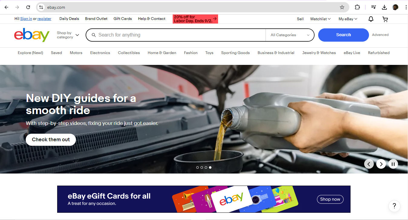
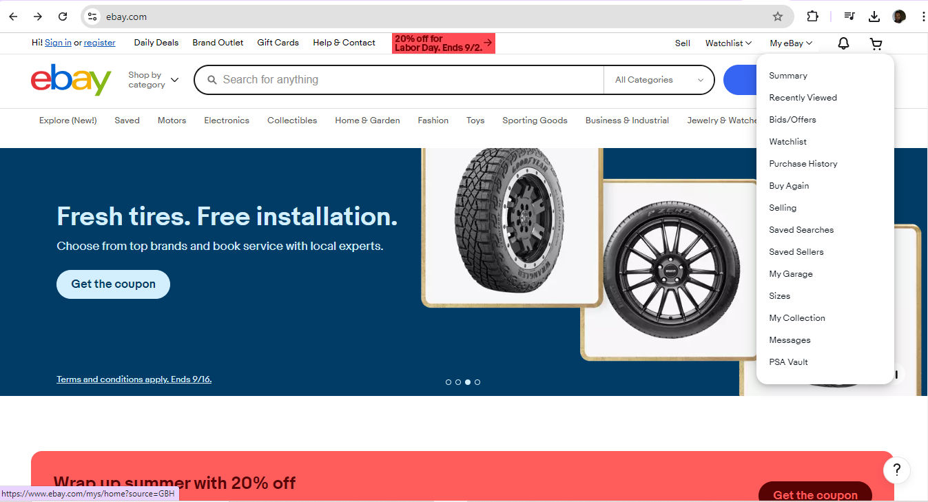
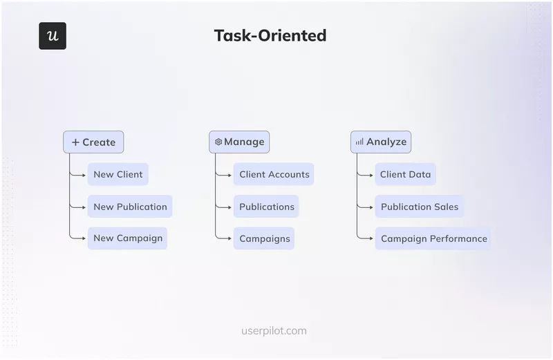
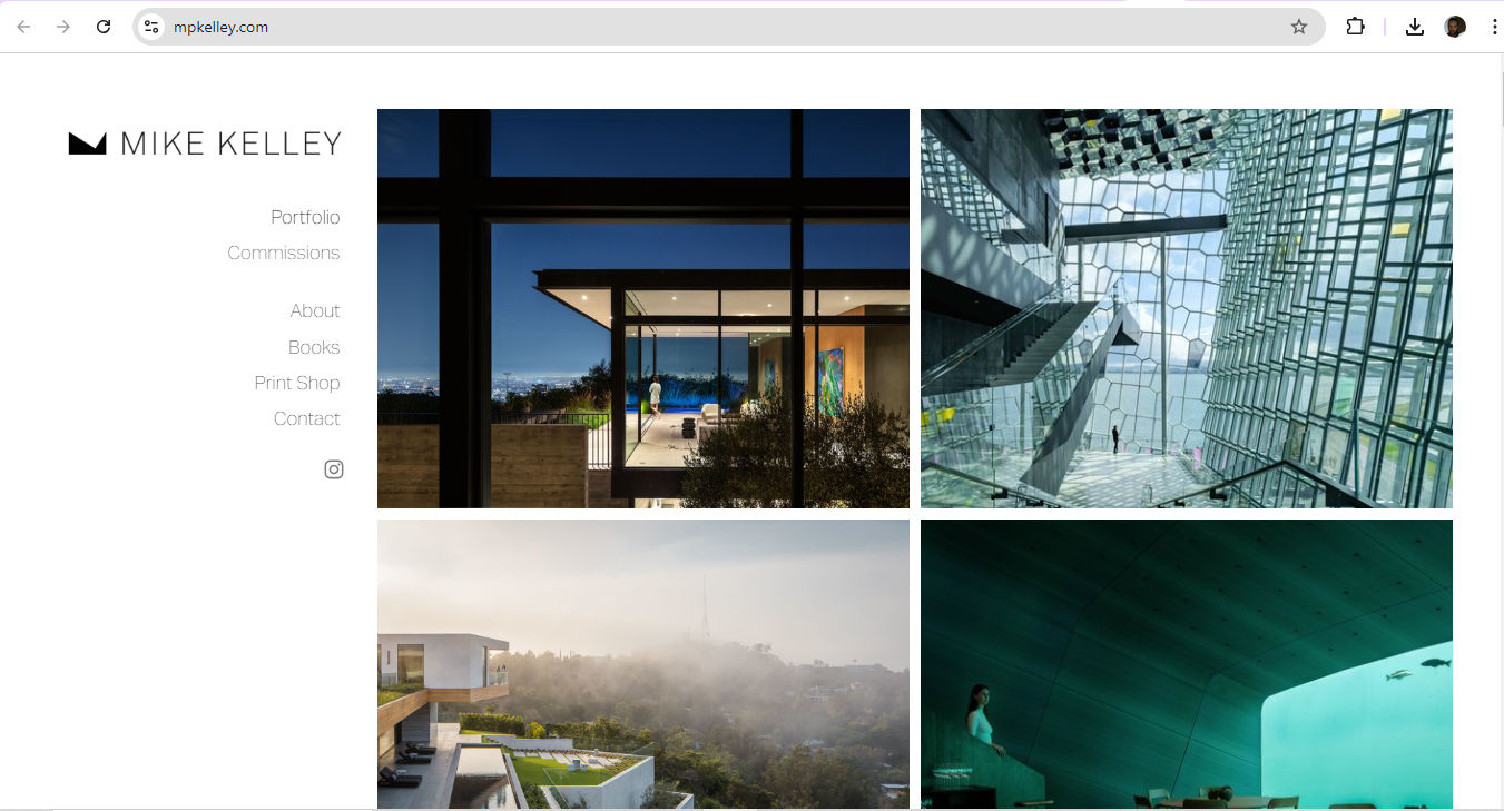
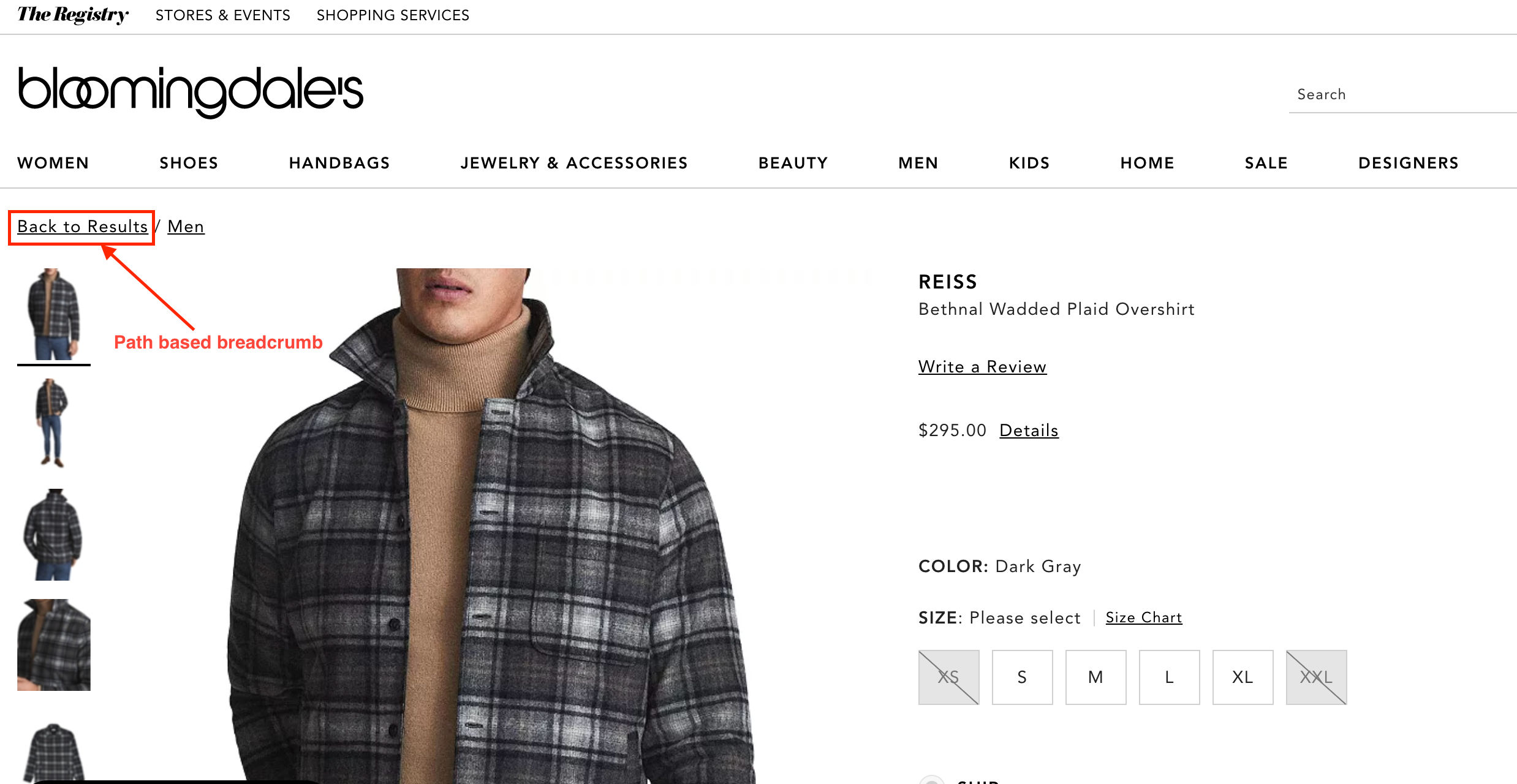
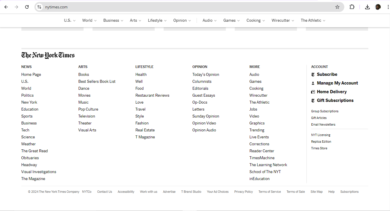
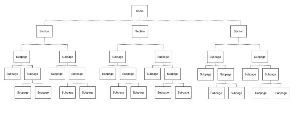
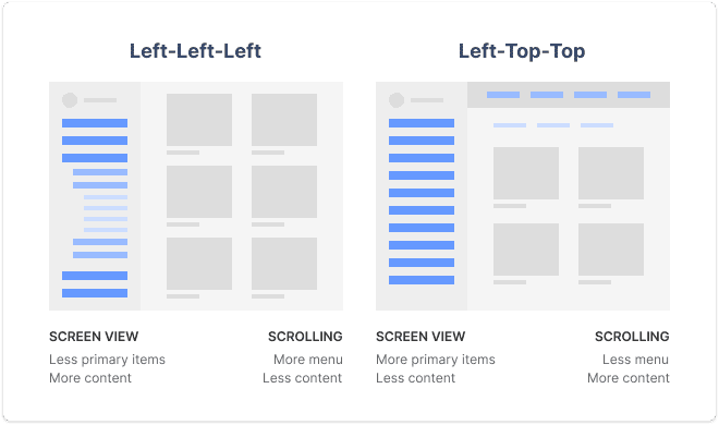
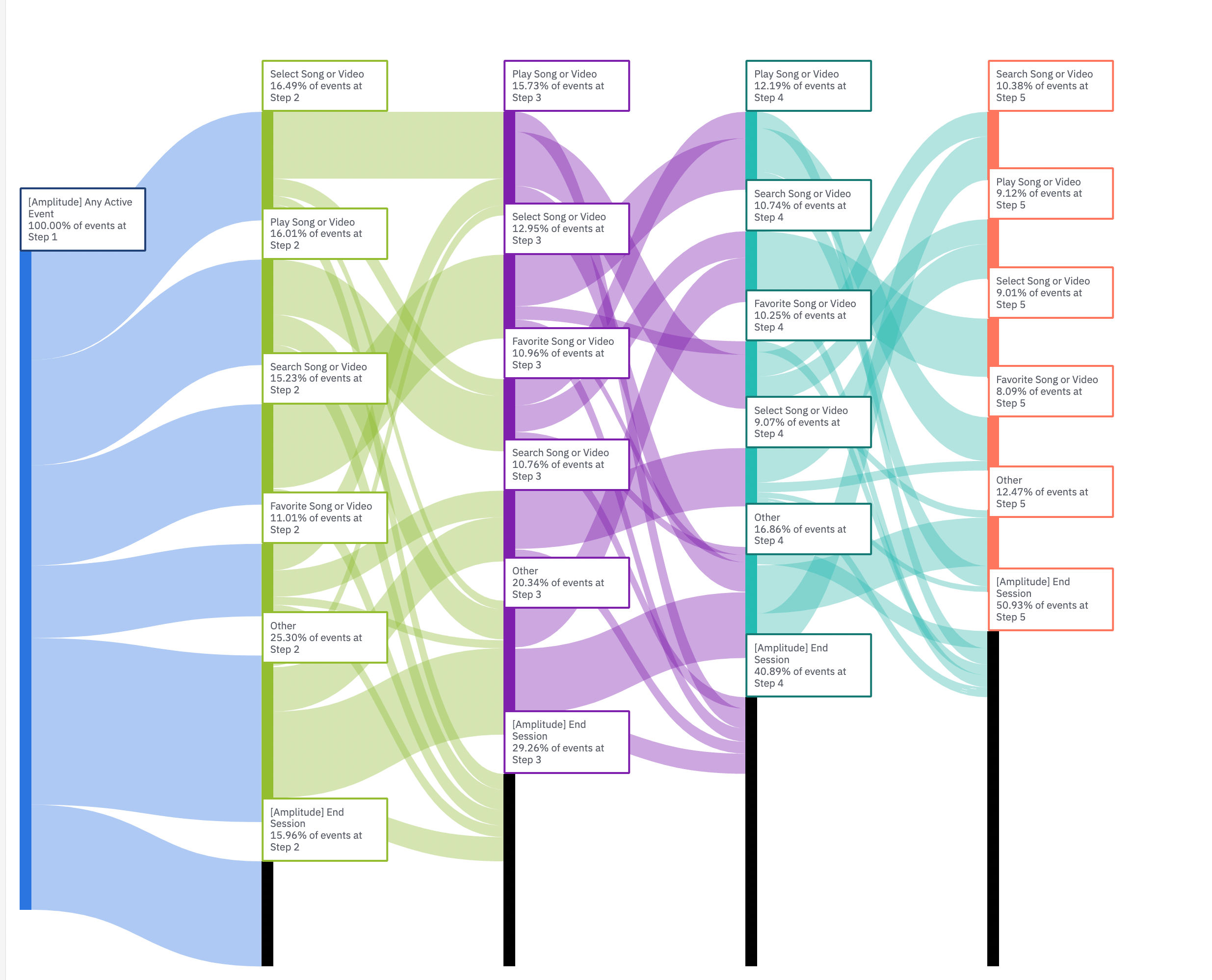


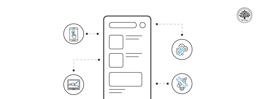