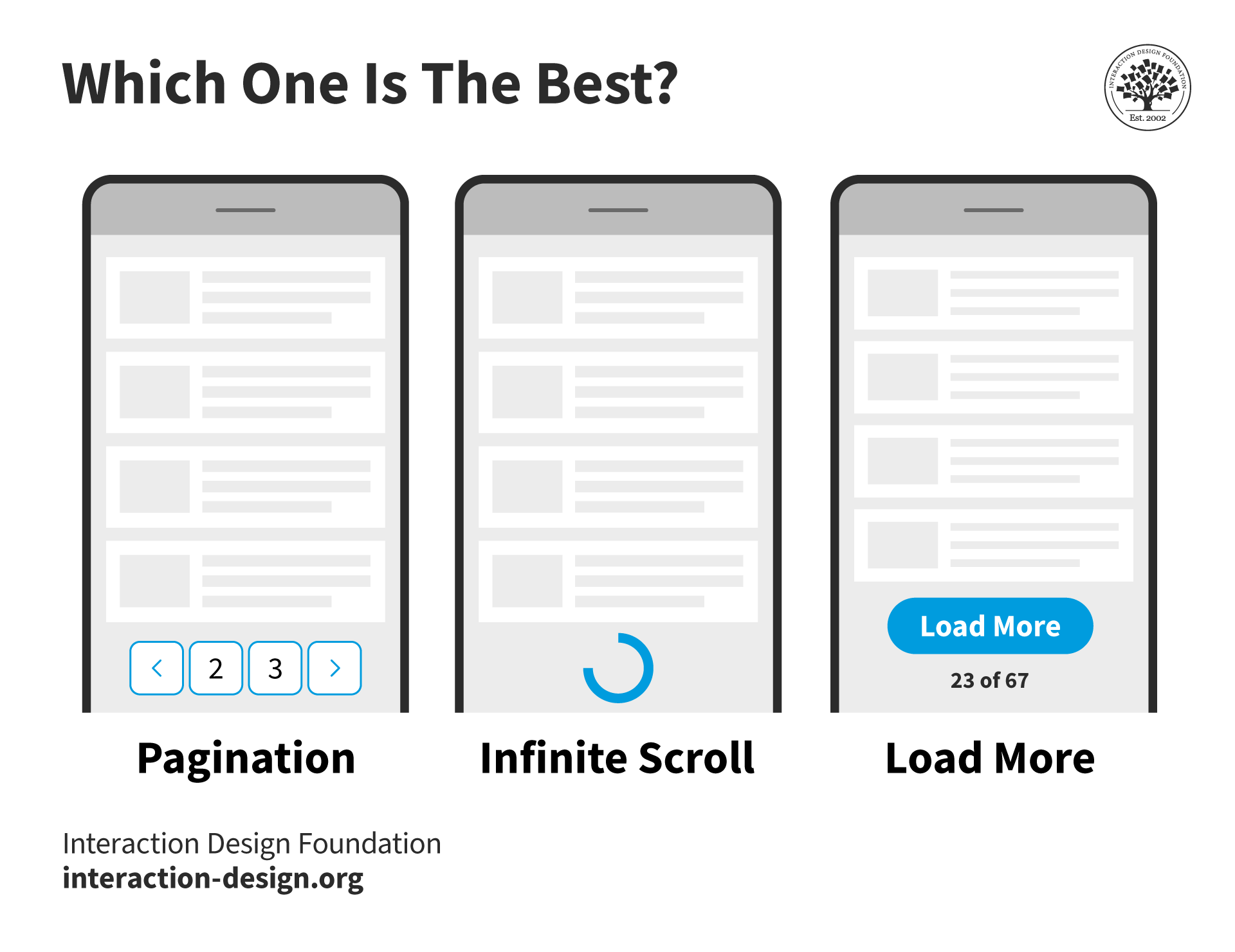
The pagination design pattern is widely used in websites that open up a lot of content to users. From search engines such as Google and Firefox, to e-commerce sites such as Amazon and Asos—the use of pagination is very, very broad. And although it seems straightforward, implementing pagination in the right way has some very specific points that require your attention. That’s why we are about to show you everything you need to take into consideration when implementing this powerful pattern. Done in the right way, it can keep your users on the ‘same page’ as you but ready to devour reams more of inviting content.
The Design Problem
You are dealing with a large set of ordered data that is difficult to display on one page, but the user may need to view specific items from this set.
The Design Solution
Pagination is the process of splitting the contents of a website, or a section of contents from a website, into discrete pages. This user interface design pattern is what we designers use to save site visitors from being overwhelmed by a mass of data on one page – we take that ‘continental’ chunk and splinter it sensibly into ‘islands’, literally distinct pages which users will be able to devote their attention to without sighing in exasperation. For an analogy, we might imagine visiting a brand-new but very badly laid-out giant supermarket, one that has no aisles, signage or any other kind of indication telling how items are stored, but has instead been set up like a massive hall, with everything lying in bins or on shelves against the wall. When faced with such mayhem, our eyes have the unenviable job of raging for order, desperately trying to make sense of where our targets might be. In our nightmare supermarket, we could still find our needed items, but imagine the time you’d need to go up and down, panning your eyes and scanning for things! Such is the case with websites, which would also require lengthy scrolling and scanning in order to identify target items. Scrolling adds to the user’s efforts to complete a task, and increases the chance of mistakes due to information that remains unnoticed.
Pagination in web applications is usually controlled by a code, which typically orders dataset items from newest to oldest. It is prevalent in web design, appearing in most web applications to allow direct access to divided contents across a number of different pages. When dealing with very large numbers of items, these codes see that page breaks are automatically set with the use of rules and algorithms, which are based on cultural and semantic factors. These factors determine which page of contents each item belongs to in the pagination number list (i.e., whether they are related, in which case they should be on the same page, or a different page if they are not connected). Algorithms and rules are also employed when dividing contents in search engines, where items are arranged on the basis of a number of different factors, such as the regularity with which the search term appears within websites and electronic documents.
Pagination patterns are usually placed at the bottom of all the pages—containing the individual items—within the dataset.
![]()
Author/Copyright holder: Google. Copyright terms and license: Fair Use.
As a typical example of large sets of items to show to users, a Google web page always has the pagination design pattern informing users of their location within the set at the bottom of the page. Here, we are right at the first page of hits – prime SEO ‘real estate’ in other words.
Why Choose a Pagination Design Pattern?
“An interface is humane if it is responsive to human needs and considerate of human frailties.”
—Jef Raskin, American Human-computer interaction interface expert and pioneer of the Apple Macintosh computer
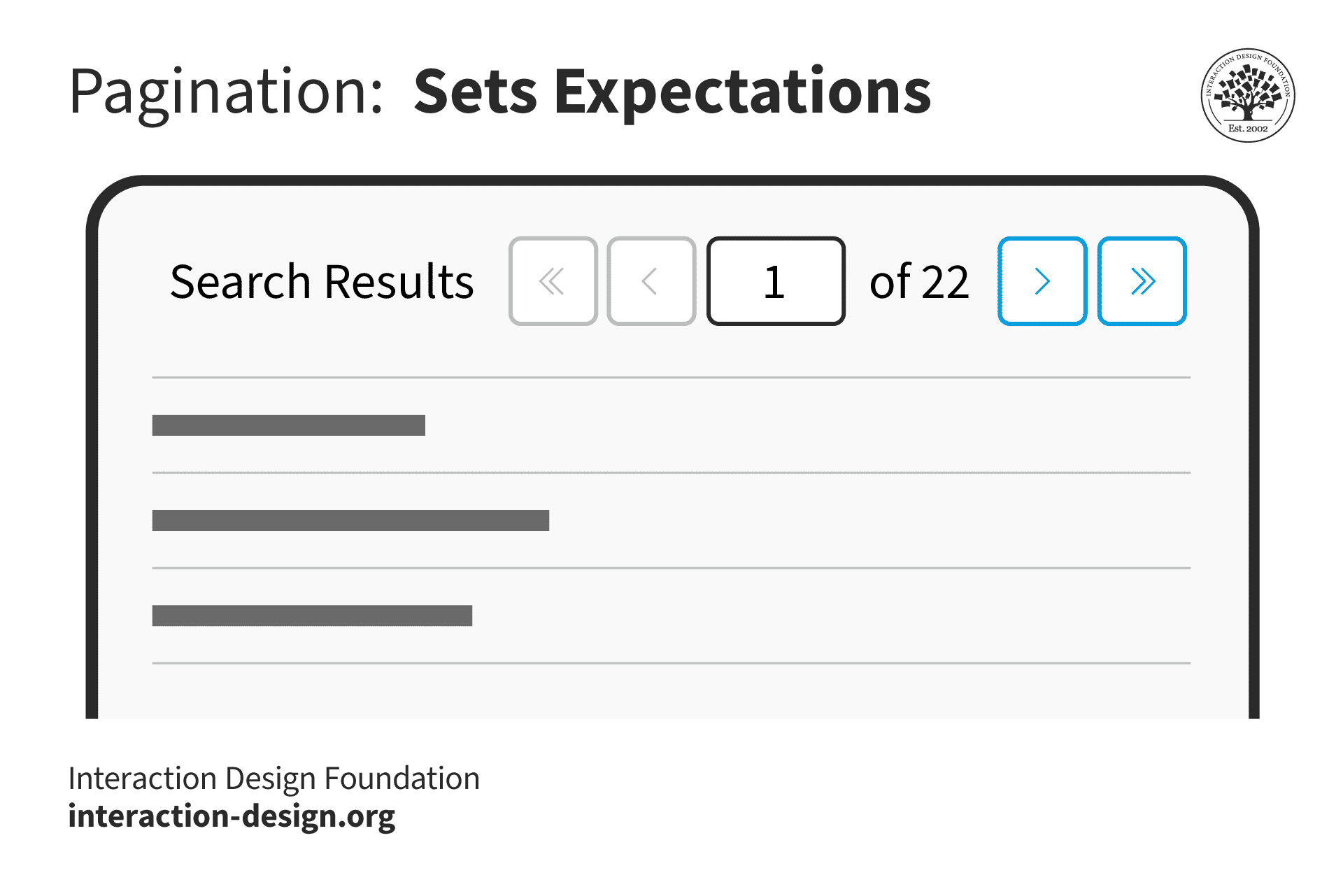
As designers, taking oceans of information and channeling them into non-sanity-threatening (and as inviting as possible) forms may as well be engraved in our job description. Indeed, it’s up to us to chart the stretches of what we create thoroughly, so as to make the way as easy as possible for users to navigate, no matter the size of the material at hand. That method of ‘channeling’—otherwise known as pagination—features in most search engines and websites, so users will be familiar with them and the way they work as a means of navigation. Besides this, once users have reached the end of the items listed on a particular page, they can use pagination to navigate to another group of items. Therefore, pagination acts as a page break, leaving the users to consider their next move and providing them with the means to jump from one set of items to another. The number list in the pagination pattern also allows users to determine how many other pages there are left to investigate. It informs them of the size of the dataset. When implemented correctly, visited page numbers appear in a different color to the pages they have yet to visit; therefore, this feature saves the users from having to revisit pages to determine which group of items they have already considered.
![]()
Author/Copyright holder: Pixabay. Copyright terms and license: Fair Use.
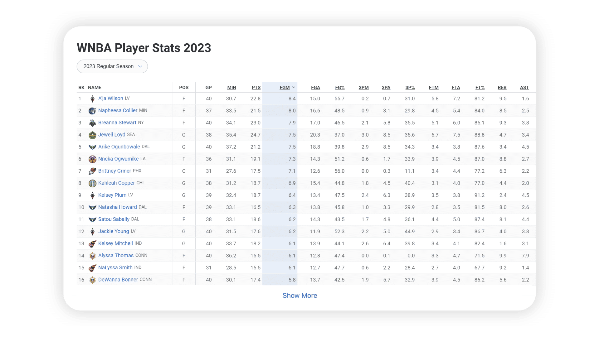
Besides allowing users to jump from one group of items to another, pagination also informs users of the size of the dataset and allows them to jump to a specific page in the result set. This is great practice when you have many pages (i.e., to allow users to skip several pages and not have to scroll down constantly so as to keep clicking “next”). In this example from the Pixabay website, this is achieved by indicating the total number of pages in the lower-right corner and having an editable input field to jump to a desired page. Say goodbye to déjà-vu!
Best Practice: How to Implement Pagination
Begin by dividing the overall dataset into smaller groups of items. Having an equal number of items on each of these individual pages is best. Decide upon an appropriate number of items to display on a page as a ‘default’, striking a good balance between content, legibility, and ease of navigation. (That said, some problems can arise, and we’ll cover these in full later on here.)
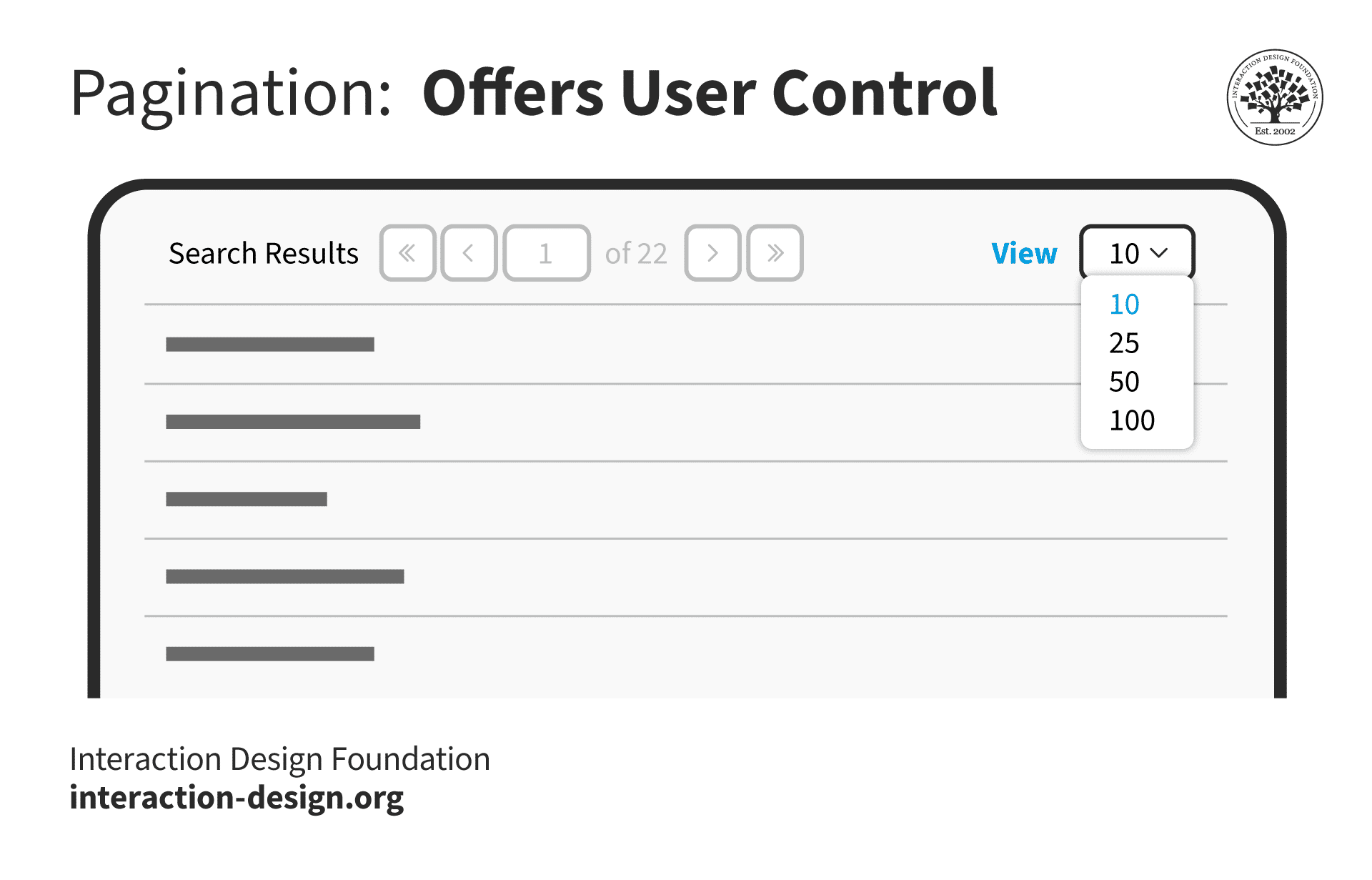
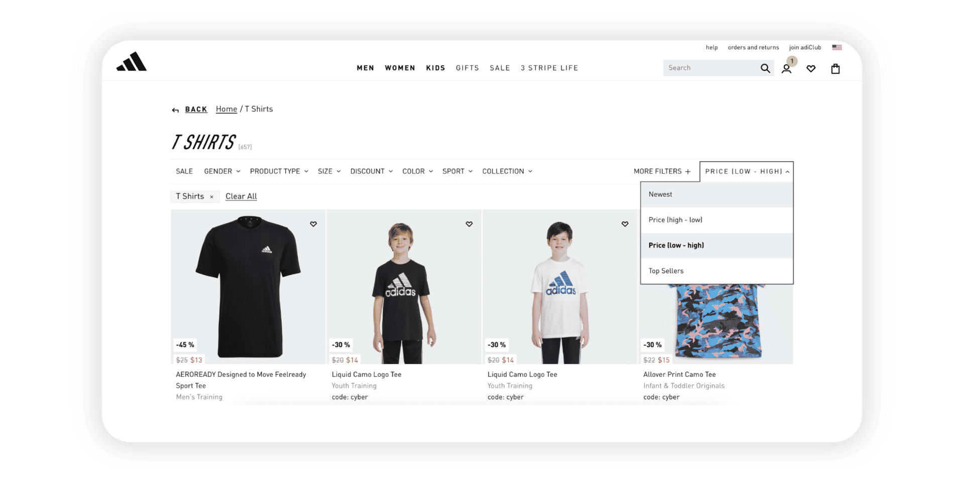
Determine how much control the user should have over the way the items are grouped or ordered, or the number of items displayed on one page. As in the example below, web shops often let users choose if they want to sort the search results by date, price, popularity, or by recommendations. Sometimes, allowing the user to set the number of items on each page might be advantageous. For example, the default number might be 10, but what if the users wish to view more per page? These users do not want to have to keep switching between different sets of items. Therefore, a small dropdown menu of items per page—or controls that perform the same function—could be a useful addition to pagination.
Add pagination controls to allow the user to move forwards and backwards through the different pages, such as east- and west-facing arrows. Provide links or other controls that enable the user to skip straight to the beginning or end of the dataset, or to specific pages in the set. These are usually the first and last numbers or double greater and less than symbols (i.e., << and >>), such as are found on remote controls for rewind and fast forward. However, when your dataset fluctuates in size, you are better off not including a link to the last page. By allowing skipping to a specific page, you can provide either an option for the user to enter a page number manually—or select a page number—or you can add controls for skipping a given number of pages. As the user moves through the different pages, the numbers in the pagination pattern should change accordingly. For example, if the user is on the fiftieth page, then the succeeding page numbers (51, 52, 53...) should be available in the set of links in the pagination pattern.
When the user has visited a page, and the page numbers of visited pages are visible, the color of the link number should change. Users can then immediately determine which pages they do not need to investigate, or to whittle down those they need to return to.
![]()
Author/Copyright holder: Asos. Copyright terms and license: Fair Use.
The Asos web shop uses the pagination design pattern and allows users to choose the way in which the items are sorted in the top-right corner. This influences the algorithms used to divide items on the different pages.
To help you get started implementing pagination, you can download and print our “Pagination” template:
Get your free template for “Pagination”
Potential Problems with Pagination
Correctly implementing pagination can be difficult, as there are a number of factors that are difficult to account for, such as the number of items in a dataset. Three of the many different usability questions that should be considered are the following:
Whether there should be "previous" and "next" links in pagination;
How many links to pages should be displayed; and
Whether there should be a link to the first and last pages.
Jakob Nielsen, usability expert and cofounder of the Nielsen/Norman Group, established some important pagination usability considerations. These range from being able to select how many items are shown on a single page, to being able to customize the display options to personal preferences.
A number of problems are inherent within pagination as a means of navigation. Given this, you will not find tackling them with usability guidelines easy.
First, the numbers do not serve to help users identify what is on each page; every selection is something of a 'shot in the dark', as the users do not know what they will find on any given page. Sometimes, you might be able to mitigate this. For example, if you’re designing a website with a catalog of people, instead of having page numbers you could use an A–Z format to identify pages.
Secondly, as the dataset might be very large, but the available space for pagination is limited, only a small selection of the page links can be displayed at any one time. Therefore, the user can only ever jump to those pages displayed in the pagination at that particular point (e.g., in a series of 205 page links, users might only see from ‘20’ to ‘26’ displayed). You can mitigate this by allowing users to skip X number of pages, or to enter a specific page number (e.g., per the Pixabay page above).
Thirdly, while changing the color of link numbers shows the users which pages they have already visited, there is no record of what they saw or were interested in on these pages. Therefore, they must remember the page number for a particular item, which burdens their short-term memory. Consequently, as they move through the different pages, they will likely forget the association between a specific page number and a specific item.
Despite these hazards, you have a wealth of choice at your fingertips in shaping your site’s content in the optimal way for your visitors. All in all, never lose sight of the point that pagination isn’t just about sorting a sea of facts into a comprehensible series of prettier frames.
“Since pagination’s primary purpose is to serve as an improved navigation, it is supposed to make it clear for the visitors where they are, where they’ve already been and where they can go next. These three facts give users a complete understanding of how the system works and how the navigation should be used.”
—Sven Lennartz, Cofounder and former CEO of “Smashing Magazine”
The Take Away
Pagination is the process of splitting the contents of a website, or a section of contents from a website, into discrete pages. As designers, we use this user interface design pattern so site visitors do not get overwhelmed by a mass of data on one page, which would also require lengthy scrolling and scanning in order to identify target items. Implementing pagination involves dealing with the tiny details: providing exactly the right links to get people to the pages they want. Although some inherent problems of pagination cannot be completely taken away, some general usability guidelines are available to tackle the main issues, ranging from users’ being able to select how many items are shown on a single page, to their being able to customize the display options to personal preferences. As this design pattern serves as something between a compass or GPS and a steering wheel, if you use it well you will empower users while you minimize their effort in searches, both of which are vital for driving conversions and long-term brand loyalty.
References & Where to Learn More
Hero Image: Author/Copyright holder: unsplash. Copyright terms and license: CC0.
Course: Web Design for Usability
Jenifer Tidwell, Designing Interfaces: Patterns for Effective Interaction Design, 2010
Martijn van Welie, Pattern Library, 2008
Jakob Nielsen, Users’ Pagination Preferences and “View All”, 2013:


