Let’s look at a topic that deals with, oddly enough, how we look at designs. Once you understand how the human eye processes these, you’ll find yourself better able to arrange your elements more effectively.
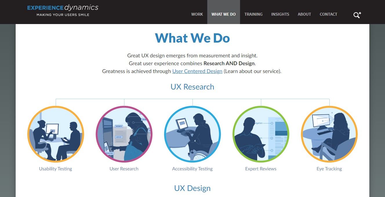
Content in any digital page layout will follow a specific hierarchy. Headers appear above body text. Menus go at the top, bottom, left, or right of the screen (or any combination of these). Designers try to organize content so that they present the highest priority content on any given page first. Then, they deliver the rest of the content from highest to lowest priority.
“Hierarchy” is simply a nicer way of saying organized from most to least important. We also use “hierarchy” to show relationships (where relationships exist) between content blocks.
Users define the visual hierarchy of a website or app. The item that first grabs the eye’s attention is at the top of the hierarchy. Each item that next draws attention is subordinate to the one before it.
Hierarchy Principle
![]()
Author/Copyright holder: Digital Markketing. Copyright terms and licence: CC BY 2.0
The human eye perceives information visually rather than as blocks of data. Unlike computers, we’re at the mercy of our eyes’ natural tendencies. The reading material we likely encountered as young children featured many pictures and larger print. Whether these were comics, coloring books, or story books, we could take in what was going on because we perceived the illustrations and interpreted the sequence of events alongside the easy-to-read text.
The way we perceive information is affected by several factors that contribute to how we rank the hierarchy of the content within the layout. Jones (2011) showed that the factors that affect hierarchy include:
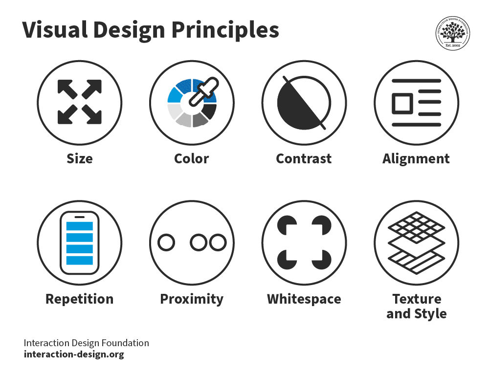
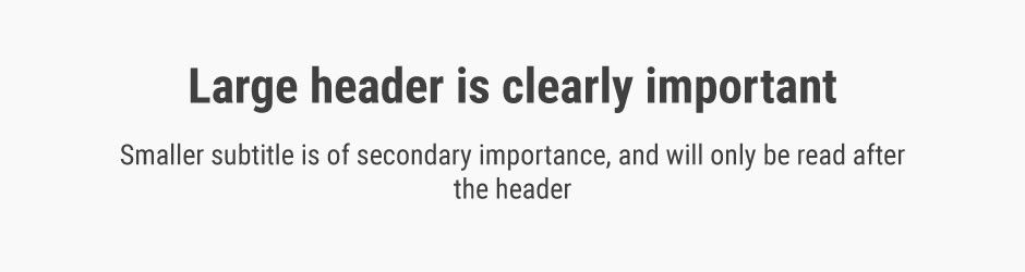
Size: The larger the element, the more attention it will attract, compared to smaller elements. Think of a newspaper headline. The newspaper uses that (large font) header text to signal what the rest of the text (in smaller font) will deliver. Let’s take a hypothetical “breaking story”. Your eye should go right to the headline. Notice how it dominates, spurring you to find out what it’s about?
Color: Bright colors are more likely to draw attention than drab shades. We’ve probably all used a highlighter to mark outstanding points on a photocopied handout. Yellow is richer and brighter than white (in the sense that white is more muted), so it stands out. After bright colors, richer and darker ones will grab the eye’s attention. Lighter tints follow, because they seem more washed out and distant. At the bottom of the color hierarchy are the grayscale or muted, subdued colors. Think of a foggy day, and you’re trying to find four friends. One wears a hi-vis vest: he’ll stand out first; the one in a deep burgundy trench coat will stand out next. Someone’s wearing a cream-colored long coat; she’ll be harder to spot. You meet up with each other and start talking, asking where Jim is. Unfortunately, Jim is wearing a smoky gray hoodie and matching sweatpants. He’s seen you all already, though.
Contrast: Dramatically contrasting colors will catch the eye more than slightly contrasting colors. Contrast helps you show what’s more important in your design. Everything is relative. Imagine you want to make a design based on an architect’s plan for high-rise apartment blocks. You want to show the light, airy and eco-friendly buildings above ground, but you also need to show the strong, deep foundations and underground car park below. By dividing your design in this way, you’ll draw the eye to the cheery living features of the forest-side apartments. This plays off against the lower section—the footer—where you’re showing the utility and safety side of the structures. A little hierarchy goes a long way to engaging the user.
Alignment: Alignment can create order between design elements. For example, placing content and then a sidebar column creates a priority for the reader. We expect important information (such as login buttons) to be in the top right-hand corner of a page. We also see this at work in magazines. If you’re near one, why not flick through; look out for a pull quote. That’s part of, say, an interview, where the writer wants to highlight what the subject said. With its larger font and its break with the alignment of the other text, it makes a hierarchy that draws our eye first.
Repetition: Repeating styles can give the viewer a sense that content is related. For example, we’ve presented most of the text in this document in a similar fashion. If we broke that style, say, by using red text, it could quickly draw attention from the familiar surroundings. It worked, didn’t it? What if we did it again? Another good example is hyperlinks. When you visit a page that has lots of blue words underlined, you know right away that you can click to a lot of other pages.
Proximity: How closely we place design elements to each other tells our users how likely they are to be related. In our list, we’ve separated items with a single row of whitespace. We don’t separate headers in this lesson from the first paragraph of information. This proximity shows that list items are separate (though not so much as to be completely unrelated to each other) but that headers are related to the content that follows.
Whitespace: You can use the space around content (it can be any color, not just white) to draw attention to certain pieces of content. Imagine how much work you’d have without it! It does two jobs: it makes information easier for the eye to digest, and it lets the eye zero-in on each area of information (paragraphs in this case).
Texture and style: The use of textures and styles can help prioritize content, too. Like fonts, they can set the tone of the design. Imagine a pair of projects. Two travel agents want a landing page to show their resort package deals. One is beach-themed, one lake-themed. For the beach-themed resort, we presented a background close-up view of the clear water overlying beautiful white sand. The effect was pleasing. However, when we tried repeating that with the lake, we found that the crystal clear water gave us a lot of large, dark pebbles and stones. That texture ended up being too distracting because it was far more textured than the smooth sand.
“Eye-Catching Designs Need Psychology"
Reports from Copenhagen confirm that more designers, especially web designers, are appreciating the need to engage users more directly. Reaching back into their art school days while working a little psychology into the mix seems to do the trick.
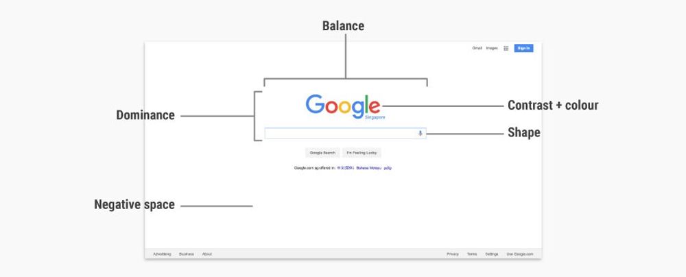
Hierarchy Patterns
![]()
There are common patterns for hierarchy both on the printed page and for the digital page. These patterns are based on the movements that our eyes tend to make when presented with a fresh page. English, for example, is read from left to right. English readers have a set scanning pattern when facing a page of text. Arabic readers have a different pattern. Why? It’s because Arabic is read from right to left.
It’s important to understand how your audience processes information before adopting a hierarchy pattern. As this lesson is in English, we’ve included two common left-to-right patterns here:
Z Pattern
![]() Author/Copyright holder: Supermariolxpt. Copyright terms and licence: CC BY-NC-ND 2.0
Author/Copyright holder: Supermariolxpt. Copyright terms and licence: CC BY-NC-ND 2.0
In websites with a low level of text content (e.g., websites that act as small advertisements for a business or a product rather than delivering volumes of information), the Z pattern of eye scanning is common. The user sees the “text-lite” page and scans from the top left to top right, then glances down through the content (following a diagonal) to the bottom left, before moving to the bottom right.
You can make use of this pattern by ensuring that you include the most important information along the Z pattern this eye movement follows. You’ll have four points joined by three lines going in a Z-shape.
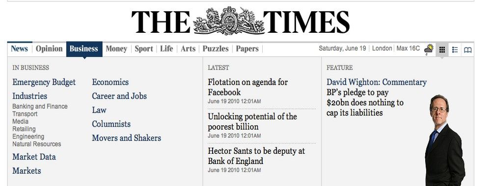
F Pattern
Designers usually apply the F pattern on websites that include text-heavy content and/or video content.
With the F pattern, users begin by scanning left to right along the top, but then scan down the left side of the page, looking for visual clues to the information they seek. When they find such a clue, they scan from left to right. They repeat this process until they reach the end of the page.
This scanning pattern often produces a heat map that looks like the letter “F”, as shown in the image at the top of this article.
It’s perfectly possible to use both Z and F pattern pages on the same website. For example, you might have a very clean homepage that utilizes the Z pattern; however, when the user delves deeper into the site, you might present much more data and use an F pattern instead.
The Take Away
Hierarchies give us order to make sense of a design easily. We want to prioritize headers and menus according to how we know what our users want and what we want them to do. We process information visually, perceiving elements in the order in which the designer has emphasized them according to:
Size — Larger elements will dominate and catch eyes first.
Color — Bright colors catch eyes ahead of muted, drab ones.
Contrast — Stark differences between elements draw eyes to the brighter one.
Alignment — Users expect to find certain elements in the same place.
Repetition — A repeated quality (e.g.,colored parts of text) draws the user’s eye.
Proximity — Putting related elements (e.g., header with associated text) close together means these are related.
Whitespace — Including whitespace around elements singles them out as separate groups of information.
Texture and Style — Using distinct textures/styles (e.g., chunky, military-style buttons) draws the eye while setting the theme.
In the Western World, we read designs according to two common hierarchical patterns:
The Z Pattern — In designs without much text, our eye starts scanning from top left to top right, then diagonally down to bottom left, stopping at the bottom right.
The F Pattern — In designs with more text, we scan across the top, from left to right, then down the left, searching for clues to what we want to know. On finding one, we’ll scan across to the right.
You have your user’s eye to guarantee that you can include these factors to make more effective designs. Keep all of these in mind as you plan. Your best effort might involve using them all, including a fusion of the Z and F patterns. Remember that you’re designing for your users. What are they using, and how might they want to see it online?
Where To Learn More
Course: The Ultimate Guide to Visual Perception and Design
Jones, B. (2011) Understanding Visual Hierarchy in Web Design.Web Design Tuts Plus. http://webdesign.tutsplus.com/articles/understandi...
Bank, C. (2015).“Understanding Web UI Visual Hierarchy”
Bradley, S. (2015). “Design Principles: Dominance, Focal Points And Hierarchy”
Cao, J. (2015). “The 5 Pillars of visual hierarchy in Web design”. The Next Web/TNW.
 Author/Copyright holder: Teo Yu Siang and
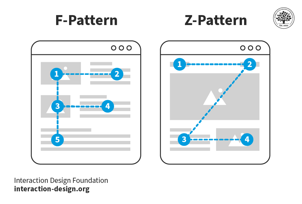
 Copyright: Fair use

