Data analysis is one of those terms that “is what it sounds like,” although there’s more to it than may meet the eye. In any case, it’s a valuable skill for making better decisions—a skill that you can bring to bear on both your professional and personal life, from personal budgeting to analyzing customer experiences. Data analysis is more than a stepping stone to your career advancement, and no matter if you’re looking to upskill at work or kickstart a career in data analytics, the fascinating area of analyzing data is a superb springboard to help all across the board, too!
The history of data analysis dates back to the 1640s, when John Grant, a hatmaker, started collecting the number of deaths in London, and was the first person to use data analysis to solve a problem. Later on, Florence Nightingale—best known as a nurse from 1854—made significant contributions to medicine through data analysis, particularly in public health and sanitation and spurred on massive strides in life-saving tactics.
Then, in a similar vein—no pun intended—the team of J. F. Pantridge and J. S. Geddes revolutionized cardiac medicine in 1966, and what they did was to address the statistics of heart attack victims with the mobile defibrillator and a program to launch life-saving care to save those who experienced cardiac incidents at their place of attack, not waiting until they were brought to hospital.
An important thing to note is how the simple practice of data analysis has evolved and broadened over time, and what forms the bigger picture is “data analytics,” which employs data, tools, and techniques—and these topics are coming up in depth soon!—to discover new insights and make predictions.
Why is Data Analysis so Important Now?
Or, to put it in terms that show more about its value: how do businesses make better decisions, analyze trends, or invent better products and services? The simple answer is this; they leverage the distinct methods of data analysis to reveal insights that would otherwise get lost in the mass of information, and big data analytics is getting even more prominent owing to the below reasons.
1. Informed Decision-making
This one can pretty much seem to be the “leader,” not least since the modern business world relies on facts rather than it does on intuition—and it’s data analysis that serves as that all-important foundation of informed decision-making. It’s best here to show this in a UX (user experience) light, so consider what the role of data analysis in UX design is, specifically when it’s about dealing with non-numerical, subjective information.
Qualitative research gets right down into the “why” and “how” beneath—or behind—user behavior, and reveals nuanced insights. It provides a foundation for making well-informed decisions regarding color, layout, and typography, and if you apply these insights, it means you can create visuals that deeply resonate with your target audience.
2. Better Customer Targeting and Predictive Capabilities
It might sound close to a cliche—or even a truism—but data has become the lifeblood of successful marketing, and organizations do rely on data science techniques—and how they can create targeted strategies and marketing campaigns that work. Big data analytics helps uncover deep insights about consumer behavior—vital arteries of information to tap and channel to direct efforts later—for instance, Google collects and analyzes many different data types, and it examines search history, geography, and trending topics to deduce what consumers want.
3. Improved Operational Efficiencies and Reduced Costs
Another big benefit data analytics brings—or advantage of it—is streamlining operations and reducing organization costs, and it’s something that makes it easier for businesses to identify bottlenecks and opportunities for improvement, and so they’re more able to be in a better position to optimize resource allocation and—ultimately—bring costs down.
Procter & Gamble (P&G)is a leading company, and they use data analytics to optimize their supply chain and inventory management, and data analytics helps this industry leader reduce excess inventory and stockouts, achieving cost savings for them.
4. Better Customer Satisfaction and Retention
Customer behavior patterns enable you to understand how they feel about your products, services, and brand—vital sentiments to appreciate and comprehend at a deep level. But there’s more than that, in that different data analysis models help uncover future trends—and trends allow you to personalize the customer experience and improve satisfaction, so winning more “points”—of the kudos variety—and loyalty with your customers as time goes on and they stick with your brand.
The eCommerce giant Amazon learns from what each customer wants and likes, and what it then does is it recommends the same or similar products when they come back to the shopping app. Data analysis helps create personalized experiences for Amazon customers and improves user experience—and it’s part of what’s behind the “magic” customers feel that the brand knows them and the types of things they need, want, and enjoy.
Watch and enhance your knowledge by understanding “when” and “why” to use data analytics—UX Consultant, Expert, and Author William Hudson explains:
ShowHide
video transcript
00:00:00 --> 00:00:30
*When and Why to use Analytics* Primarily, we're going to need to be using analytics on existing solutions. So, if you're talking about *green field* – which is a brand-new solution, hasn't been built and delivered yet – versus *brown field* – which is something that's already running but perhaps we want to improve it – then we're decidedly on the brown field side.
00:00:30 --> 00:01:00
So, we're looking at existing solutions because it's only existing solutions that can provide us with the analytics. If you haven't got an existing solution, you're going to have to use another technique. And there are obviously many other techniques, but they're not going to provide you with much in the way of *quantitative data*. We do have early-research methods, which we'll be talking about very briefly as an alternative, but predominantly analytics for existing deployed solutions.
00:01:00 --> 00:01:31
Having said that, then if you're looking at a rework of an existing site or app, then looking at current analytics can tell you a lot about what you might like to address; what questions you might like to raise with your team members, stakeholders, users. So, those are important considerations. A good starting point in organizations or teams with low UX maturity is analytics because analytics are easier to sell – to be honest – than qualitative methods.
00:01:31 --> 00:02:01
If you're new to an organization, if they're only just getting into user experience, then trying to persuade colleagues that they should be making important decisions on the basis of six to eight qualitative sessions, which is typically what we do in the usability lab, then you should find by comparison web analytics a much easier thing to persuade people with. And the other issue particularly relevant to qualitative methods
00:02:01 --> 00:02:33
is that quantitative methods tend to be very, very much cheaper – certainly on the scale of data, you are often having to talk in terms of hundreds of dollars or pounds per participant in a *qualitative* study, for various expenses; whereas a hundred dollars or pounds will get you potentially hundreds or thousands of users. And, in fact, if you're talking about platforms like Google Analytics which are free, there is no cost other than the cost of understanding and using
00:02:33 --> 00:03:01
the statistics that you get out; so, obviously it is very attractive from a cost perspective. Some of the things that we'll be needing to talk about as alternatives to analytics or indeed *in addition* to analytics: Analytics can often *highlight* areas that we might need to investigate, and we would then have to go and consider what alternatives we might use to get to the bottom of that particular problem.
00:03:01 --> 00:03:32
Obviously, *usability testing* because you'll need to establish *why* users are doing what they're doing. You can't know from analytics what users' motivations are. All you can know is that they went to *this* page and then they went to *that* page. So, the way to find out if it isn't obvious when you look at the pages – like there's something wrong or broken or the text makes no sense – is to bring users in and watch them actually doing it, or even use remote sessions – watching users doing the thing that has
00:03:32 --> 00:04:00
come up as a big surprise in your analytics data. A/B testing is another relatively low-cost approach. It's – again – a *quantitative* one, so we're talking about numbers here. And A/B testing, sometimes called *multivariate testing*, is also performed using Google Tools often, but many, many other tools are available as well; and you show users different designs;
00:04:00 --> 00:04:33
and you get statistics on how people behaved and how many converted, for example. And you can then decide "Well, yes, putting that text there with this picture over here is better than the other way around." People do get carried away with this, though; you can do this ad nauseam, to the point where you're starting to change the background color by minute shades to work out which gets you the best result. These kinds of results tend to be fairly temporary. You get a glitch and then things just settle down afterwards.
00:04:33 --> 00:05:03
So, mostly in user experience we're interested in things which actually really change the user experience rather than getting you temporary blips in the analytics results. And then, finally, *contextual inquiry* and *early-design testing*: Contextual inquiry is going out and doing research in the field – so, with real users doing real things to try to find out how they operate in this particular problem domain; what's important to them; what frustrations they have;
00:05:03 --> 00:05:30
how they expect a solution to be able to help them. And early-design testing – mostly in the web field these days but can also be done with software and mobile apps; approaches like *tree testing* which simulate a menu hierarchy. And you don't actually have to do anything other than put your menu hierarchy into a spreadsheet and upload it – it's as simple as that; and then give users tasks and see how they get on.
00:05:30 --> 00:06:00
And you can get some very interesting and useful results from tree testing. And another early-design testing approach is *first-click testing*. So, you ask users to do something and you show them a screenshot – it doesn't have to be of an existing site; it can be just a design that you're considering – and find out where they click, and is where they click helpful to them? Or to you? So, these are examples of early-design testing – things that you can do *before* you start building
00:06:00 --> 00:06:34
a product to work out what the product should look like or what the general shape or terminology or concepts in the product should be. And both of these can be used to find out whether you're on the right track. I have actually tested solutions for customers where users had no idea what the proposition was: "What does this site do?"; "What are they actually trying to sell me?" or "What is the purpose of it?" – and it's a bit late to be finding that out in usability testing towards the end of a project, I have to say. And that was indeed exactly what happened in this particular example
00:06:34 --> 00:07:08
I'm thinking of. So, doing some of these things really early on is very important and, of course, is totally the opposite of trying to use web analytics, which can only be done when you finish. So, do bear in mind that you do need some of these approaches to be sure that you're heading in the right direction *long before* you start building web pages or mobile app screens. Understand your organization's *goals* for the interactive solution that you're building.
00:07:08 --> 00:07:31
Make sure that you know what they're trying to get out of it. Speak to stakeholders – stakeholders are people typically within your organization who have a vested interest in your projects. So, find out what it's supposed to be doing; find out why they're rebuilding this site or why this mobile app is being substantially rewritten. You need to know that; so, don't just jump in and start looking for interesting numbers.
00:07:31 --> 00:08:02
It's not necessarily going to be that useful. Do know the solutions; become familiar with them. Find out how easy it is to use them for the kinds of things which your stakeholders or others have told you are important. Understand how important journeys through the app or website work. And get familiar with the URLs – that's, I'm afraid, something that you're going to be seeing a lot of in analytics reports – the references for the individual pages or screens,
00:08:02 --> 00:08:33
and so that you'll understand, when you actually start looking at reports of user journeys, what that actually means – "What do all these URLs mean in my actual product?" So, you're going to have to do some homework on that front. You're also going to have to know the users – you need to speak to the users; find out what they think is good and bad about your solutions; find out how they think about this problem domain and how it differs from others and what kind of solutions they know work and what kind of problems they have with typical solutions.
00:08:33 --> 00:08:59
Also ask stakeholders and colleagues about known issues and aspirations for current solutions. So, you know, if you're in the process of rebuilding a site or an app, *why* – is it just slow-ish? Is it just the wrong technology? Maybe. Or are there things which were causing real problems in the previous or current version and that you're hoping to address those in the rebuild.
Types of Data Analysis Methods
“We are surrounded by data, but starved for insights.”
— Jay Baer, Customer Experience Expert & Speaker
The above quote is a neat capture of how strategic analysis must support data if it’s to produce meaningful insights, and there are ways to go about doing data analysis: to break them down, there are data analysis methods and there are data analysis techniques.
1. Quantitative Data Analysis
The name pretty much gives away what quant analysis is about—quantitative analysis means to look at the “what” that you’ve got: as in, the complex data, the actual numbers, or the rows and columns, and it’s something perhaps best illustrated through a scenario:
Your e-commerce company wants to assess the sales team’s performance and see how everyone’s doing on it, so you gather quantitative data on various key performance indicators(KPIs), and they’re things that include the number of units sold, the sales revenue, the conversion rates, and—last, but not least—the customer acquisition costs. So, from doing an analysis of these numeric data points, the company is then able to calculate its monthly sales growth, the average order value, and the return on investment (ROI) for each sales representative: more than a little important to have.
How does it help?
The quantitative analysis is a pretty handy thing that can help you identify the top-performing sales reps, the best-selling products, and the most cost-effective customer acquisition channels—and these are metrics that help the company make data-driven decisions and improve its sales strategy—ultra-important insights to be able to wield in a competitive marketplace.
2. Qualitative Data Analysis
Quant data can help with bucket-loads of insights, but—for all its value—there are situations where numbers in rows and columns are just impossible to fit, and that’s where qualitative research can help you understand the data’s underlying factors, patterns, and meanings via non-numerical means and get behind what’s going on.
To see “qual data” in action, imagine you’re a product manager for an online shopping app and what you want to do is to improve the app’s user experience and boost user engagement. You’ve got quantitative data that tells you what’s going on but not why—which is why you’ve got to collect customer feedback through interviews, open-ended questions, and online reviews, as well as conduct in-depth interviews to explore their experiences.
Watch as Professor of Human-Computer Interaction at University College London, Ann Blandford explains how you can elevate your interview preparation to a more professional level:
ShowHide
video transcript
00:00:00 --> 00:00:30
As an interviewer, I think it's important to go in with an attitude of *openness*, with an attitude of *wanting to learn*, of *respecting the expertise* of your interviewee, whatever kind of expertise that is, and wanting to learn from them. I sometimes perhaps take that to extremes.
00:00:30 --> 00:01:04
But I think that an important part of interviewing well is to listen to people and not to come with preconceptions about what they're going to say or what they can share. And the other, of course, is about an interviewing style that's open and respectful and *not aggressive* to people so that they do feel relaxed and able to say things and not feel judged for what they're sharing and what they're saying.
00:01:04 --> 00:01:38
So, quite a lot of my research now is around health technologies, particularly. So, that can lead into some fairly sensitive topics. We've done projects looking at how people might use technology to manage their alcohol consumption or their exercise or their diet. And these are all topics that people can feel very defensive about. You know – "How dare you suggest I drink too much or I'm a couch potato or I eat too many carbs!" or whatever.
00:01:38 --> 00:02:01
You know, they're topics where people *can* feel judged. But if people feel judged, then they're not going to give you a real understanding of how you might design technologies that will *really* help them. And so, it's really important to *not* be judgmental – to be open, to respect where they're coming from
00:02:01 --> 00:02:32
and to understand what matters to *them*, as opposed to what you think should matter to them. Well, I certainly work quite hard with students to try to get them to question their own assumptions and not to expose their assumptions when they're interviewing – so that they are actually open to hearing what people are really saying, what people are really trying to express.
00:02:32 --> 00:03:05
Another point is if interviewers are not *intentionally* leading. By coming with too many assumptions about what you're expecting people to care about or expecting people to say, you can unwittingly lead people quite a long way. And leading questions will result in you hearing what you expected to hear, which doesn't necessarily give you the information that you actually need to gain insight from any study.
00:03:05 --> 00:03:39
And surely the point of doing interviews is to get some insight that you didn't already have. If you already knew the answer, there'd be no point in interviewing people about the topic, whatever it is. D.H.: You always have assumptions, right? Otherwise, you wouldn't do a study. A.B.: Yes. D.H.: So, what's the best way to sort of balance or use your assumptions in a constructive way? A.B.: So, I think what you try to do is to have questions more than assumptions.
00:03:39 --> 00:04:04
A *qualitative* study I think is driven by a *question*. *Quantitative* studies are more often driven by a *hypothesis* – i.e. you have a belief and you want to test it – whereas qualitative studies are much more driven by questions. And I've certainly got partway through several studies and suddenly realized that I had a set of assumptions
00:04:04 --> 00:04:11
that aren't necessarily valid. And so, I'm forced to question my own assumptions.
How does it help?
From reading and summarizing the comments, you can identify issues, sentiments, and areas that need improvement, and that qualitative insight is what can guide you to identify and work on areas of frustration or confusion—and alleviate them or remove them altogether.
Learn more about quantitative and qualitative user research as Author and Human-Computer Interaction Expert, Professor Alan Dix explains important points:
ShowHide
video transcript
00:00:00 --> 00:00:32
Ah, well – it's a lovely day here in Tiree. I'm looking out the window again. But how do we know it's a lovely day? Well, I could – I won't turn the camera around to show you, because I'll probably never get it pointing back again. But I can tell you the Sun's shining. It's a blue sky. I could go and measure the temperature. It's probably not that warm, because it's not early in the year. But there's a number of metrics or measures I could use. Or perhaps I should go out and talk to people and see if there's people sitting out and saying how lovely it is
00:00:32 --> 00:01:01
or if they're all huddled inside. Now, for me, this sunny day seems like a good day. But last week, it was the Tiree Wave Classic. And there were people windsurfing. The best day for them was not a sunny day. It was actually quite a dull day, quite a cold day. But it was the day with the best wind. They didn't care about the Sun; they cared about the wind. So, if I'd asked them, I might have gotten a very different answer than if I'd asked a different visitor to the island
00:01:01 --> 00:01:31
or if you'd asked me about it. And it can be almost a conflict between people within HCI. It's between those who are more *quantitative*. So, when I was talking about the sunny day, I could go and measure the temperature. I could measure the wind speed if I was a surfer – a whole lot of *numbers* about it – as opposed to those who want to take a more *qualitative* approach. So, instead of measuring the temperature, those are the people who'd want to talk to people to find out more about what *it means* to be a good day.
00:01:31 --> 00:02:02
And we could do the same for an interface. I can look at a phone and say, "Okay, how long did it take me to make a phone call?" Or I could ask somebody whether they're happy with it: What does the phone make them feel about? – different kinds of questions to ask. Also, you might ask those questions – and you can ask this in both a qualitative and quantitative way – in a sealed setting. You might take somebody into a room, give them perhaps a new interface to play with. You might – so, take the computer, give them a set of tasks to do and see how long they take to do it. Or what you might do is go out and watch
00:02:02 --> 00:02:30
people in their real lives using some piece of – it might be existing software; it might be new software, or just actually observing how they do things. There's a bit of overlap here – I should have mentioned at the beginning – between *evaluation techniques* and *empirical studies*. And you might do empirical studies very, very early on. And they share a lot of features with evaluation. They're much more likely to be wild studies. And there are advantages to each. In a laboratory situation, when you've brought people in,
00:02:30 --> 00:03:00
you can control what they're doing, you can guide them in particular ways. However, that tends to make it both more – shall we say – *robust* that you know what's going on but less about the real situation. In the real world, it's what people often call "ecologically valid" – it's about what they *really* are up to. But it is much less controlled, harder to measure – all sorts of things. Very often – I mean, it's rare or it's rarer to find more quantitative in-the-wild studies, but you can find both.
00:03:00 --> 00:03:34
You can both go out and perhaps do a measure of people outside. You might – you know – well, go out on a sunny day and see how many people are smiling. Count the number of smiling people each day and use that as your measure – a very quantitative measure that's in the wild. More often, you might in the wild just go and ask people. It's a more qualitative thing. Similarly, in the lab, you might do a quantitative thing – some sort of measurement – or you might ask something more qualitative – more open-ended. Particularly quantitative and qualitative methods,
00:03:34 --> 00:04:01
which are often seen as very, very different, and people will tend to focus on one *or* the other. *Personally*, I find that they fit together. *Quantitative* methods tend to tell me whether something happens and how common it is to happen, whether it's something I actually expect to see in practice commonly. *Qualitative* methods – the ones which are more about asking people open-ended questions – either to both tell me *new* things that I didn't think about before,
00:04:01 --> 00:04:32
but also give me the *why* answers if I'm trying to understand *why* it is I'm seeing a phenomenon. So, the quantitative things – the measurements – say, "Yeah, there's something happening. People are finding this feature difficult." The qualitative thing helps me understand what it is about it that's difficult and helps me to solve it. So, I find they give you *complementary things* – they work together. The other thing you have to think about when choosing methods is about *what's appropriate for the particular situation*. And these things don't always work.
00:04:32 --> 00:05:00
Sometimes, you can't do an in-the-wild experiment. If it's about, for instance, systems for people in outer space, you're going to have to do it in a laboratory. You're not going to go up there and experiment while people are flying around the planet. So, sometimes you can't do one thing or the other. It doesn't make sense. Similarly, with users – if you're designing something for chief executives of Fortune 100 companies, you're not going to get 20 of them in a room and do a user study with them.
00:05:00 --> 00:05:07
That's not practical. So, you have to understand what's practical, what's reasonable and choose your methods accordingly.
10 Best Data Analysis and Modeling Techniques
We—as in, the combined human efforts on Earth—generate over 120 zettabytes daily, which works out to be about 120 billion copies of the entire Internet in 2020, daily. To call that an ocean of info would perhaps be an understatement—and then some!—but it’s a humongous volume of data to trawl, and, without the best data analysis techniques, businesses—however big they are—will never be able to collect, analyze, and interpret data into real, actionable insights. And that’s why they—and you—need to sharpen their picture of data analysis into something that’s workable, and so apply the top methods of data analysis or top techniques of data analysis; there are “five-a-side" for quantitative and qualitative, to put it one way.
This one may sound familiar—and it goes by the names of segmentation analysis and taxonomy analysis, too—and it’s a method to identify structures within a dataset, a bit like sorting objects into different boxes (clusters) based on their similarities. That’s a massive help when it comes to working out what’s what, because data points within a similar group are similar to each other (homogeneous), and—likewise—they’re dissimilar to data points in another cluster (heterogeneous).
The point with cluster analysis is that you’re wanting to find hidden patterns in the data, and it can be your go-to approach if you require additional context to a trend or dataset.
Let’s say you own a retail store and you want to understand your customers better to tailor your marketing strategies to be spot-on for them; so, you collect customer data—including their shopping behavior and preferences. You’re after information that can help you target your marketing efforts so they’re more efficient—and effective. So, to cluster analyze things, you can help yourself group customers with similar behaviors and preferences. Customers who visit your store often and shop a great deal may form one cluster, while those who don’t shop so often and spend less could make up another cluster.
2. Regression Analysis
Regression analysis is a powerful data analysis technique—and it too may sound familiar, not least since it’s quite popular in economics, biology, and—sure—psychology. This one’s a technique that helps you understand how one thing (or more) influences another—a handy thing to look at for knock-on effects. For this one, suppose you’re a manager and you’re trying to predict next month’s sales—and you’ve got many factors, like the weather, promotions, or the buzz about a better product, as things that can affect these figures.
But there’s more, because some people in your organization might have their own theory as to what might impact sales the most—with remarks like, “When winter starts, our sales go up.”
All the above factors are “variables,” and now, the “dependent variable” is always going to be the factor being measured (in our example—the monthly sales), and then, what’s next is you’ve got your independent variables—and they’re the factors that might impact your dependent variable.
Regression analysis can mathematically sort out which variables have an impact, and this statistical analysis identifies trends and patterns and so is a vital way to make predictions and forecast possible future directions. You’ve got many types of regression analysis to pick from—and these include linear regression, non-linear regression, binary logistic regression (and there are more)—and the model you choose will to a very great degree depend upon the type of data you’ve got.
3. Monte Carlo Simulation
This one—also!—may look familiar, and it’s a mathematical technique that is an excellent way to estimate the possible outcomes of an uncertain event. And what more uncertain an event could one “hope” to find themselves in than being in a gambling house (and, to be sure, the method derives its name from the Monte Carlo Casino in Monaco).
All right, don’t worry about the gambling element—because business is serious business!—but let’s say you want to know how much money you might make from your investments in the stock market. So, you make thousands of guesses instead of just one guess—and then, you consider several scenarios, which could be a growing economy or an unprecedented catastrophe like Covid-19. In any case, what you want to do with this is to test many random situations to estimate the potential outcomes.
4. Time Series Analysis
This one is pretty much what it says “on the label”—it’s to analyze data collected over time, and it’s a good way to spot trends and cycles over time periods, where one data set recorded at different intervals helps you understand patterns and so make forecasts. The sorts of industries that leverage time-series analysis to predict trends include finance, retail, and economics—which is more than a little understandable when one considers that they deal with ever-changing currency exchange rates and sales data.
To be sure, time series analysis at work in the stock market shows up as a prime example of this technique in action, not least since many stocks exhibit recurring patterns in their underlying businesses (due to seasonality or cyclicality)—and time-series data analysis can uncover these patterns in a neat way so investors can take advantage of seasonal trading opportunities—or adjust their portfolios as they need to.
Time series analysis is part of predictive analytics. It can show likely changes in the data to give up a better understanding of data variables—and make for better forecasting.
5. Cohort Analysis
Cohort analysis involves breaking down datasets into relative groups (or cohorts) too—like cluster analysis—but, in this method, you focus on studying the behavior of specific groups over time, so you can understand different groups’ performance within a larger population. Not for nothing, then, is this technique popular amongst marketing, product development, and user experience research teams.
To see why, let’s say you’re an app developer and want to understand user engagement over time; so, with this method, you define cohorts based on a familiar identifier (which could be the demographics, app download date, or users making an in-app purchase). In this way, your cohort represents a group of users who had a similar starting point. Then, with the data in hand, you analyze how each cohort behaves over time and look at some things in particular—such as, do users from the US use your app more frequently than people in the UK?
Qualitative Methods
6. Content Analysis
Now to get into the “qual” side of things; when you think of “data” or “analysis,” do you think of text, audio, video, or images? Probably not—you might be thinking of the “dry” stuff, like number crunching—but, to be sure, these forms of communication are an excellent way to uncover patterns, themes, and insights.
In fact, this one sees wide use in marketing, and content analysis can reveal public sentiment about a product or brand—which makes it more than a little valuable in such a “vocal” digital age. For instance, analyzing customer reviews and social media mentions can help brands discover hidden insights.
What’s more, this technique splits into two further categories: conceptual analysis (which focuses on explicit data, such as the number of times a word repeats in a piece of content) and relational analysis (which examines the relationship between different concepts or words and how they connect). It’s not about counting but about understanding how things fit together, and a user experience technique—or a UX technique—called card sorting can help with this. This technique involves counting and measuring the frequency of categorical data, and it also studies the meaning and context of the content, and that’s why content analysis can be both quantitative and qualitative.
Get your free template for “How to Improve Your Design with Task Analysis”
7. Sentiment Analysis
This one also goes by the name of opinion mining, and it’s a technique that is a valuable business intelligence tool—and it can help you to enhance both your products and your services. In the modern business landscape, there are substantial amounts of textual data, including emails, social media comments, website chats, and reviews. You often need to know whether this text data conveys a positive, negative, or neutral sentiment, so you can act according to it to optimize things.
Sentiment analysis tools help scan this text to determine the emotional tone of the message automatically, and the insights from sentiment analysis are far more than a little helpful in terms of how they can improve customer service and elevate brand reputation to levels that are healthy—and prosperous.
8. Thematic Analysis
No matter whether you’re an entrepreneur, a UX researcher, or a customer relationship manager—thematic analysis is something that can help you better understand user behaviors and needs.
The thematic technique analyzes large chunks of text data—or textual data—such as transcripts or interviews, and it then groups them into themes or categories that come up often within the text. The thematic method uses just qualitative data, and—what’s more—it’s a very subjective technique since it depends on the researcher’s experience to derive insights.
9. Grounded Theory Analysis
You can think of grounded theory as being something that you—as a researcher—might do, and instead of starting with a hypothesis and trying to prove or disprove it, you get ahold of and collect information and construct a theory as you go along. It’s like a continuous loop—a loop where you collect and examine data and then create a theory based on what you discover, and you keep on repeating this process until you’ve squeezed out all the insights from the data that you can.
This method allows theories to emerge in a natural way from the information, which makes it a flexible and open way to explore new ideas; and it might be right up your street for what you need to do. Another thing to consider is that grounded theory is the basis of a popular user-experience research technique—contextual enquiry.
10. Discourse Analysis
Discourse analysis is a popular analytics approach in linguistics, sociology, and communication studies—and the aim of it is to understand the meaning behind written texts, spoken conversations, or visual and multimedia communication. The things it seeks to uncover are how individuals structure a specific language, what lies behind it, and how social and cultural practices influence it.
For instance, if you’re working as a social media manager and if you analyze social media posts, you go beyond the text itself—and you would consider the emojis, hashtags, and even the timing of the posts. For example, you might find that a particular hashtag is used to mobilize a social movement.
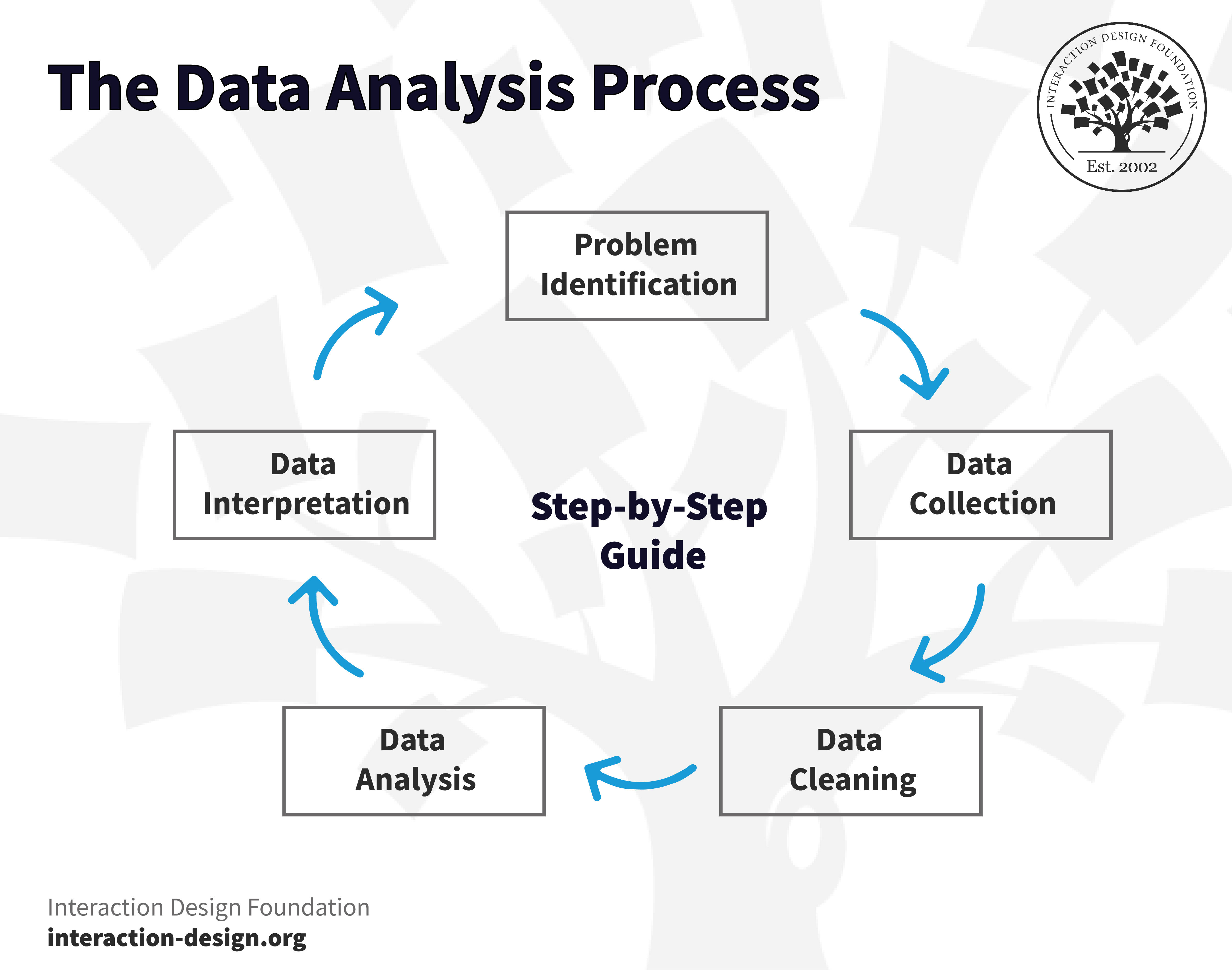
The first step in the data analysis process is to find out what the problem you’re trying to solve is—so, what research question do you want to address with your data analysis? For instance, if you’re an analyst who’s working for an e-commerce company and there’s been a recent fall in sales and the company needs to know why this is happening, then the problem statement is to find the reason for the decline in sales.
2. Data Collection
The next step is to collect data and get in the information you need—and you can do this through various internal and external sources; for example, surveys, questionnaires, focus groups, interviews, and the like.
Delve deeper into the intricacies of data collection with Ann Blandford in this video:
ShowHide
video transcript
00:00:00 --> 00:00:32
Ditte Hvas Mortensen: In relation to data gathering, there are obviously different ways of doing it. You can record video or sound, or you can take notes. Can you say something about the advantages or disadvantages of doing it in different ways? Ann Blandford: Yes. So, I think it depends on how the data-gathering method is going to affect what
00:00:32 --> 00:01:00
data you can gather. So, sometimes people are not comfortable being recorded. And they don't *want* to be voice-recorded. And you'll get more out of the conversation if you just take notes. Of course, you don't get quite such high-quality data if you just take notes. On the other hand, it's easier to analyze because you haven't got so much data.
00:01:00 --> 00:01:31
And you can't do as much in-depth analysis if you've only got notes, because you can only analyze what you recognized at the time as being important, and you can't pick up anything more from it later. So, I certainly like to audio-record where possible for the kinds of studies that we do. And different people may have different needs, and therefore that might be more or less important to them.
00:01:31 --> 00:02:02
We also use quite a lot of still photos, particularly in healthcare. We have to have quite a lot of control over what actually features in an image so that it doesn't violate people's privacy. So, using still photos allows us to take photos of technology and make sure that it doesn't include any inappropriate information. Whereas video – well, firstly, video means that you've got a *lot* more data to analyze.
00:02:02 --> 00:02:33
And it can be a lot harder to analyze it. And it depends on the question that you're asking in the study, as to whether or not that effort is merited. And for a lot of us, it's not merited, but also it's harder to control what data is recorded. So, it's more likely to compromise people's privacy in ways that we haven't got ethical clearance for. So, we don't use a lot of video ourselves.
00:02:33 --> 00:03:01
But also, particularly if one is trying to understand the work situation, it's often also valuable to take *real notes*, whether those are diagrams of how things are laid out or other notes about, you know, important features of the context that wouldn't be recorded in an audio stream. And also, video can be quite *off-putting* for people.
00:03:01 --> 00:03:30
You know, it's just that much more intrusive. And people may become much more self-conscious with a video than with audio only. So, it can affect the quality of the data that you get for that reason. So, I think when you're choosing your data-gathering *tools*, you need to think about what impact they will have in the environment.
00:03:30 --> 00:04:00
It may or may not be *practical* to set up a video camera, quite apart from anything else. Audio tends not to be so intrusive. As I say, there are times when just written notes will actually serve the purpose better. But it also depends on what you're going to *do* with the data. You know – how much data do you need? What kinds of analysis are your going to do of that data? And hence, what *depth of data* do you actually need to have access to, anyway?
00:04:00 --> 00:04:35
If you've got more data than you can deal with, then it can feel overwhelming, and that can actually be quite a deterrent to get on with analysis. And analysis can be really slowed down if, as a student or other researcher, you just feel so overwhelmed by what you've got that you don't know where to start! Actually, that's not a good place to be. So, having too much data can often be as difficult as not having enough.
00:04:35 --> 00:04:38
But what matters most is that you've got an *appropriate* kind of data for the questions of the study.
What the key here is is to collect and aggregate the appropriate statistical data—and, by “appropriate,” we mean the data that could help you understand the problem and build a forecasting model, and this data can be quantitative (sales figures) or qualitative (customer reviews).
All types of data can fit into one of three categories: first-party data is data that you, or your company, can collect directly from customers; second-party data is the first-party data of other organizations (for instance, sales figures from one of your competitor companies); and then third-party data, which is data that a third-party organization can collect and aggregate from numerous sources (things like government portals or open data repositories).
3. Data Cleaning
Now that you’ve got the necessary data in, the next step is to prepare it for analysis—which means you’ve got to clean or scrub it, which is essential since acquired data can be in different formats. Cleaning makes sure you’re not dealing with bad data and your results are dependable. In any case, some critical data-cleaning steps are to remove white spaces, duplicates, and formatting errors; to delete unwanted data points; and to bring structure to your data.
For survey data, you’re going to need to do consistency analysis, too, and some of this relies on good questionnaire design, but you also need to ensure that respondents are not “straight-lining” (all answers in a single column); that similar questions get answered consistently; and that open-ended questions contain plausible responses.
Watch as William Hudson explains important points about ensuring data quality:
ShowHide
video transcript
00:00:00 --> 00:00:32
We're going to be talking about ensuring quality. One of the really most straightforward things – and it's quite quick and simple to do – is to walk through the survey with other people. And this is something in HCI referred to as a "cognitive walkthrough", but it's really nothing to be afraid of. I've used the word "cognitive" and it sounds frightening, but it shouldn't be. It's just we want people to tell us what they think we mean by these questions.
00:00:32 --> 00:01:01
So, even the most carefully designed surveys can cause confusion, frustration and certainly unexpected responses. And we try to minimize that risk by walking through the surveys with a small number of participants or proxies. And when I say "small number", it might be as few as three – maybe. Just like in usability testing, if you find on the first walkthrough that you've got a number of problems and then on the second walkthrough that you've *still* got a number of problems,
00:01:01 --> 00:01:30
even after you've fixed the first ones, and on the third walkthrough you have more problems *again*, then you need to keep going until you've actually had a couple of walkthroughs without any new problems. You might end up conceivably with seven, but you would have been very unlucky if that actually turns out to be the case; you must have misunderstood some aspect of your audience in terms of them understanding the questions or realizing what it is that you're asking. The best way of doing this is to actually get people to either visit you or you go and visit people
00:01:30 --> 00:02:03
with the questionnaire, and you can do this remotely if you wish; you can walk through the questionnaire on the screen. But it's a lot better to have people face-to-face in this kind of situation. Certainly when I'm doing user research, being able to see what people are doing with their faces or maybe just with their *posture* – you know – you can tell when people are uncomfortable or confused a lot easier, I think. I mean, I recently read an article that says you can do all that from voice alone, but I'm a bit skeptical, personally, having sat next to people trying to struggle with a piece of user interface.
00:02:03 --> 00:02:31
You can *tell* that they're struggling. It's not just the delay; it's the facial expression, and maybe a little *sigh* – that kind of thing. You might get the sighs online – maybe – if you have a really good microphone. But face-to-face does work a lot better for that kind of thing. Use "think-aloud" protocol. Don't overuse it. I fear that a lot of people believe that think-aloud protocol means that participants should be speaking all the time – and that is counterproductive.
00:02:31 --> 00:03:00
We know that speaking continuously is taxing mentally; so, you're actually detracting from ability of people to understand complicated questions or to think in any kind of deep way about what they're looking at. So, use "think-aloud" to have participants say what gives them pause for thought. So, I deliberately prime participants in research that I'm doing to say, "Let me know particularly if something is confusing to you or not the way that you think it should be, or anything that
00:03:00 --> 00:03:32
basically makes you stop and think, you should mention to me." And if I notice that somebody is perhaps not thinking aloud as much as would be useful to me, then I do ask them to tell me, but I think it would be better to err on the side of not too much thinking aloud than to have it as a continuous stream of words. And do, of course, talk to participants about their responses, especially if they aren't what you were expecting; so, just confirm that they've understood the question and they're answering in a way that is consistent with your expectations.
00:03:32 --> 00:04:03
But you could run the surveys with a small number of *proxies*. Proxies are people who aren't actually in your intended audience, but they're near enough. So, these might be fellow workers – people from another department who perhaps fit your demographic in some way, but they aren't familiar with the survey, or perhaps they aren't familiar with a particular product or service, and so you can ask them about it as if they were new users – potentially. And just for the purposes of walking through surveys, that is perfectly acceptable.
00:04:03 --> 00:04:38
The next step is to do at least one *trial run*, so with a very small number of real participants. And I would suggest that you try to aim for maybe 30. One of the main reasons for doing this is that once you launch a survey, most survey tools will not let you change it, which would actually – in some cases – it would be very convenient, especially if it's just a misspelling. But because *anything* that you change could potentially alter the results in terms of participants' responses,
00:04:38 --> 00:05:00
most simply freeze the survey until you're done; and if you need to launch it again, you need to start again. So, you want to make sure it's right before you launch it to your wide audience. So, try to recruit 25 or 30 test participants. Check the responses; see if they make sense to you. Look at the timing; you'll get timing from almost any online survey service.
00:05:00 --> 00:05:30
You'll find out how long people spend; you'll actually get start time, finish time and duration, in my experience. And see if it makes sense. If you're getting people going through it really quickly, it means they're not very engaged; so, you should ignore those; but if your average is considerably longer than you're expecting, then see if you can find some non-essential questions to drop out or expect to increase the incentive to your participants. And then, finally, get your colleagues to take the survey because they may well answer in different ways
00:05:30 --> 00:06:03
than you were expecting and that will just make sure that you haven't got any technical issues. And if, like me, you typically ask people for their email addresses so they can be entered into a prize draw of some sort, then you can easily identify your colleagues in the test run because you know their email addresses – tell them to use your corporate email address or your organization's email address. Otherwise, you can have just a quick test run separate from the first in order just to see how these slightly different users react to your questionnaire.
00:06:03 --> 00:06:35
Although your screening question should remove *most* unsuitable participants, there will still be the issue of engagement. And poor engagement means that people just aren't reading the questions thoroughly or they're answering as quickly as they can. Straight-lining is just where you go just down one column with your mouse or pencil. And, in this particular case, it doesn't make a great deal of sense because some of the questions required you to answer at the other end of the spectrum. So, "I would like being bit by a shark" – and you really ought to strongly disagree with that if you were paying any attention!
00:06:35 --> 00:07:00
So, that's just a flippant or frivolous example, but you can get the general idea that if by changing the polarity of some of these things, you can make sure that anybody who is just straight-lining is going to be somewhat obvious. The other way of finding out about straight-lining is to calculate the standard deviation for each participant in a group of questions;
00:07:00 --> 00:07:34
and if their answers vary almost not at all, you will get a zero – or very close to zero – standard deviation, and that should give you some pause for concern. You should avoid grids, but where they are necessary; that gives you a chance to actually look at the data and say, "Well, these people aren't answering honestly, or they're not reading the questions." The other issue I mentioned much earlier on – the other *approach* I mentioned much earlier on – was to put *detractors* in, so questions that you would expect people not to answer because they're made up or frivolous in some way.
00:07:34 --> 00:08:03
And, conversely, you can put in things which you would expect people to answer quite frequently; and if they don't, then you have to again give these people an increase in their *suspiciousness score* – you know – their laziness score goes up so that you actually know that you should dismiss them from your results. Include responses that should have a high incidence and investigate outlying participants. And what I mean by "outlying" is that you always get a spread of responses
00:08:03 --> 00:08:33
and people who are in the sort of outer one standard deviation or so are doing things somewhat differently to everyone else; so, you can just have a scan through those if they're seeming suspicious to you; you can then take them out. Look for also too many or too few answers, in general. You know – if you're giving people lots of options to choose and they choose everything, then that usually isn't right. Unhelpful open-ended responses are always extremely obvious, but you have to go through and read them;
00:08:33 --> 00:09:01
so, if people are just putting nonsense, gibberish – and they'll put gibberish in even if you put in, of course, a minimum word count or letter count. You say that you want at least 10 words or 10 characters, and they'll just rattle their fingers on the keyboard until they get there; so, those are quite easy to spot, but it's time-consuming to do that. People with very quick completion time – that actually is usually a dead giveaway if people – again – if you look at the spreadsheet download, if you can do that on your tool,
00:09:01 --> 00:09:33
you would look at the durations and you would do an average and a standard deviation. People who are outside about three standard deviations are doing it really, really quickly or really, really slowly, and you may well not want to include either of those groups in your survey. Also, look for duplicated email addresses; although people who do this kind of semi-professionally tend to know that they shouldn't duplicate email addresses, but you might get people who are just not that au fait; and occasionally, of course, you will get people who do it twice for reasons that are perfectly legitimate.
00:09:33 --> 00:10:05
I've had people, when they've known that I was involved in a survey – because we give contact details, typically – write to me and say, "I did it twice because I think I really just misunderstood it the first time through or realized halfway through the first time that I misunderstood it, so I did it again." So, that will happen from time to time. That is moderately rare. And as I was mentioning earlier on, do report people whose data you have found to be unhelpful to you, partly because this will help the respondent service to improve their panel,
00:10:05 --> 00:10:35
and also they should give you the cost of those respondents back, give you credit for those against your invoice for the service that they've provided. Finally, I wanted to mention a potentially very confusing topic. You will probably discover in most online survey tools the option to limit participants to one per IP address – "IP" standing for "internet protocol". And each one of those represents a computer, a device, not a person.
00:10:35 --> 00:11:01
So, the option that a lot of the tools offer you, which is to limit participants to one response per IP address, only works if you assume that everyone is using exactly one device. So, if you're anticipating that all your respondents are going to have a cell phone – a smartphone, I should say – and they're going to fill it out on that and no one else is going to use their cell phone – the other person's smartphone – to do that,
00:11:01 --> 00:11:30
then you're fine. But if there is – like there is in our house – a communal computer that we can all easily use – and we find it particularly useful for certain things – then the fact that I've filled out the survey and then someone else in my household wants to fill it out, they would be told that we'd already filled it out and that would be the end of it. And the same thing can happen at work and in other organizations. So, generally don't do this, unless you're really certain that you want to limit one participant per device.
00:11:30 --> 00:12:00
If, when you're looking at your results, you're a little bit suspicious about something going on like similar email addresses or very similar response times, then use a spreadsheet like Excel just to sort by IP address and see if you're getting multiple responses in quick succession from a single device, because that probably indicates that somebody is just gaming the questionnaire – they're just doing it as quickly as possible to get further credits from the panel.
00:12:00 --> 00:12:09
And that would show up as as a number of very quick completions from the same address in, generally speaking, a short space of time.
4. Data Analysis
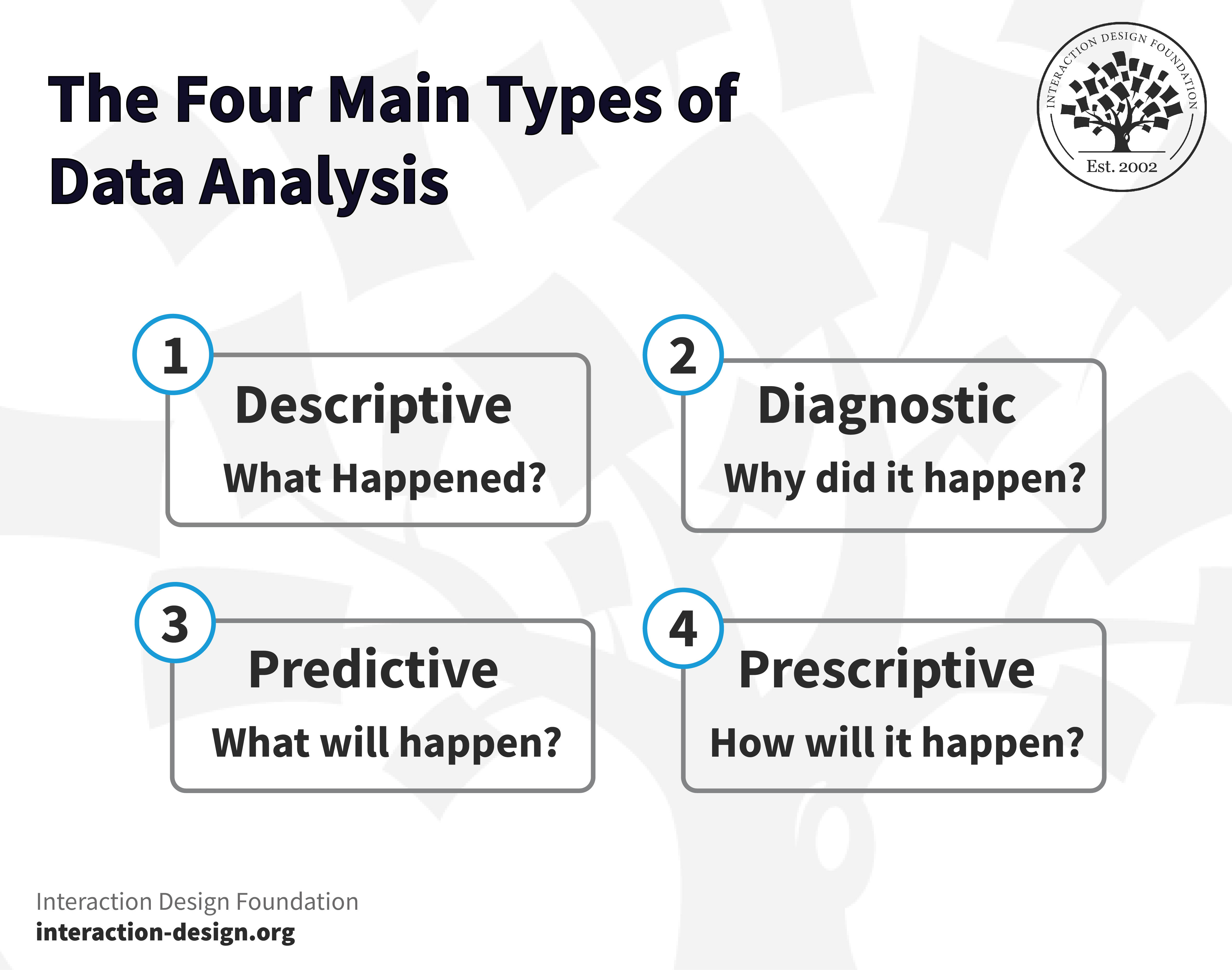
Now’s where the actual analytics begin in earnest, and this is the stage where you’d be ready to leverage any one or more of the data analysis and research techniques mentioned above. The choice of technique depends on the data you’re dealing with and the results you desire to get, and all types of data analysis fit into the following four categories.
Descriptive analysis focuses on what happened—and it’s the starting point for any research before you’d proceed with deeper explorations, and, as the first step, it involves breaking down data and summarizing its key characteristics.
B. Diagnostic Analysis
This analysis focuses on why something has happened—and pretty much just as a doctor uses a patient’s diagnosis to uncover a disease, you can use diagnostic analysis to understand the underlying cause of the problem.
C. Predictive Analysis
This third type of analysis allows you to identify future trends based on historical data, and it generally uses the results from the above analysis, machine learning (ML), and artificial intelligence (AI) to forecast future growth.
D. Prescriptive Analysis
Now you know what to do, you’re also going to need to understand how you’ll do it—enter prescriptive analysis, which aims to determine your research’s best course of action.
5. Data Interpretation
This step you can think of being like connecting the dots in a puzzle, and this one is where you start making sense of all the data and analysis done in the previous steps. It’s where you dig deeper into your data analysis findings and visualize the data to present insights in meaningful and understandable ways, and so get it worked out well to know what’s going on.
Explore this comprehensive video resource to understand the complete user research data analysis process:
ShowHide
video transcript
00:00:00 --> 00:00:33
Ditte Hvas Mortensen: Talk about the steps that are normally involved when you analyze an interview. And if we start at the beginning – when you've done your interviews, you have a lot of data; you have video, audio, notes, and that can be a bit overwhelming! What's the first step that you take? Ann Blandford: Usually, the first step – certainly for audio data – is *transcribing*.
00:00:33 --> 00:01:00
Sometimes, you will transcribe everything. There are some very detailed video-coding methods that involve *annotating* fine details of what's in a video or larger chunks. It's obviously much harder to transcribe video because it's a much more dynamic medium with too many details
00:01:00 --> 00:01:38
often. Unless there are very, very specific things that you're making notes of, that's a much harder thing to do. And photos you might just annotate in various – again, depending on the purpose of the study: what the question is. So, I'll focus on transcribed audio because that's the most common kind of data to use to focus on for interviews. Normally, once you've got a transcription, you would start to familiarize yourself with it.
00:01:38 --> 00:02:04
I personally like – if I've got *time*, which, of course, I don't often have anymore – but if I do have time, I like to transcribe my own data because the very act of transcribing it is starting to get me much more familiar with the data and I'm starting to think about how I'll code it. And I often make notes on the side – of things that I notice when I'm transcribing that I want to look at in
00:02:04 --> 00:02:39
more detail when I actually get around to doing the analysis. Some colleagues don't like doing their own transcribing. They feel that that's not a good use of their time. And so, they then have to invest a bit more time in getting familiar with the data after it's been transcribed by somebody else. And they may do that by starting to code it. And by "coding", what I mean is making notes in the transcription of particular kinds of points that are made
00:02:39 --> 00:03:08
or particular words or phrases that are used, or particular ideas that seem to be expressed in the data. And so, there's a layer of getting familiar with the data that involves a *first level of coding*. I always like doing that first with pen and paper and colored pencils and things like that
00:03:08 --> 00:03:31
– to get myself more familiar with the data. If you have a lot more data, though, and if you've got a bigger data set, it's useful to use qualitative data analysis tools at this point – tools like NVivo or ATLAS or Dedoose or MAXQDA. There are probably others I don't know the names of
00:03:31 --> 00:04:05
– all of which basically help you to code the data, to be consistent in the descriptions of the codes as you're annotating bits of text. You can tell that I think about this visually because my hand is going backwards and forwards in front of the screen here. And you're building up a set of codes that capture the main ideas in the data. If you have some very, very clear questions from the outset, you might have predefined your codes that you're
00:04:05 --> 00:04:33
using and then look through the data to find and play instances of those codes. If you're doing an *exploratory analysis*, you may be developing a set of codes as you go through the data. And certainly, you will almost always find that you'll get partway through a data set and realize that there's some important idea that you've actually encountered a few times before this point and you've only just noticed that it matters.
00:04:33 --> 00:05:01
So, you'll almost certainly have to go through the whole data set more than once to be sure that it's all coded consistently, or you may find that your mental definition of a code drifts as you go through the data set, and so it started to mean one thing at the beginning, and then by the end it actually means something that's not completely unrelated but is importantly different.
00:05:01 --> 00:05:32
And, of course, you may also realize that you've got two separate codes for things that you *thought* were importantly different, but actually they're both – you realize that they are actually the same basic idea and that the differences don't matter too much. So, you then might combine two codes into one – so, you can separate them out; you can combine them. But what you're trying to do through this process is partly just *get more familiar with the data*.
00:05:32 --> 00:06:06
Develop ways of navigating through the data set where you're starting to work out what the important themes in the data are, how those themes are related. So, some of it is in the overt actions that you're doing – whether that's with a pencil and paper, or whether it's using qualitative data analysis software. So, the external actions are helping actually the internal – the *cognition*.
00:06:06 --> 00:06:31
Your making sense of the data is a really important part of what's going on in this process. And then, you identify which are the themes that seem to matter to you in the data. Obviously, if you've got a very, very specific question from the outset, then the themes will fall out quite quickly because you've already decided what they are.
00:06:31 --> 00:07:05
But if it's a more exploratory analysis, then that does actually involve creating narratives from codes; working out how codes relate to each other; building stories; looking for supporting evidence, but also for contradictory evidence, and for explanations all in the data; building accounts, building narratives of what you're finding in the data – what the evidence for that is.
00:07:05 --> 00:07:34
If there's contradictory evidence that's suggesting that your narrative isn't actually accurate, then you need to take that into account and think about what's wrong with your story or why some of the data might be contradicting other bits of the data. Maybe it's because you've got one or two participants who have a very different background and very different
00:07:34 --> 00:08:02
experience from other participants – in which case, is it about narrowing the generalizability of your conclusions and going, "It applies to people like this, but it doesn't apply to people like that."? Or it's important to understand why your results are the way they are. If it all points in the same direction and you've looked through the data and there are no contradictions,
00:08:02 --> 00:08:33
then you can be pretty confident. As part of the process of developing a reasonable narrative, you're typically writing it up because the process of writing is very often an important part of actually doing those later stages of sense-making of the data. And very often we use examples from the data:
00:08:33 --> 00:09:00
you know, illustrative quotations to show how we've interpreted the data. So, you're building the report, kind of, as you're doing the late stages of analysis. And by the time you've finished analysis, you've almost finished writing it up, as well. So, I think those are the main stages, but really what matters is that you're making sense of the data
00:09:00 --> 00:09:33
and finding things in the data that perhaps weren't immediately obvious to somebody else. And sometimes, you find things in the data where there aren't quotations from the data that actually say what it is you've realized, because your insights go beyond what's actually overtly available in the data to things that underlie that that are actually what's driving the things that people are saying
00:09:33 --> 00:10:01
and the account of the use of technology or the way that technology is designed. D.M.: It sounds like an analysis is typically a very iterative process where you go from data to coding to themes and maybe even back to gathering more data. And I guess sort of *the searching for something that opposes your themes* is really an important part
00:10:01 --> 00:10:30
both in checking your data and in telling you when you are done with the analysis. A.B.: Yes, and methods such as Grounded theory talk about *theoretical saturation*, which is the idea that actually you get more data and you're not learning anything new. So, you analyze new data, and all the themes in it are themes that are already familiar to you.
00:10:30 --> 00:10:50
And that's the ideal stopping point for a study. But as I've already said, you know – pragmatically, realistically we often have to stop a study earlier than the point where we've got saturation, and that may mean that the theory or the insights are more bounded or have a narrower scope or less certainty underpinning them.
The Best Tools and Resources to Use for Data Analysis in 2023
The world’s best and most user-friendly spreadsheet software features calculations and graphing functions—and it’s ideal for non-techies to perform basic data analysis and create charts and reports.
Similar to Microsoft Excel, Google Sheets stands out as a remarkable and cost-effective tool for fundamental data analysis. Not only does it handle everyday data analysis tasks, including sorting, filtering, and simple calculations, but it is known for its seamless collaboration capabilities as well.
Digital marketers and web analysts use this one widely, and this tool helps businesses understand how people interact with their websites and apps, and it provides insights into website traffic, user behavior, and performance to make data-driven business decisions.
Pros
Free version available.
Integrates with Google services.
Cons
Limited customization for specific business needs.
RapidMiner is ideal for data mining and model development, and it’s a platform that offers remarkable machine learning and predictive analytics capabilities. It allows professionals to work with data at many stages, including preparation, information visualization, and analysis.
Tableau is one of the best commercial data analysis tools you can get, and it’s famous for its interactive dashboards and data exploration capabilities. Data teams can create visually appealing and interactive data representations through its easy-to-use interface and powerful capabilities.
This one is an excellent choice for creating insightful business dashboards, and among its nifty features it boasts incredible data integration features and interactive reporting, so making it ideal for enterprises.
The name is short for Konstanz Information Miner, and KNIME is an outstanding tool for data mining, with its user-friendly graphical interface that makes it accessible even to non-technical users, enabling them to create data workflows easily. What’s more, KNIME is a cost-effective choice, and hence, it is ideal for small businesses operating on a limited budget.
Artificial intelligence and machine learning fuel this one, and Zoho Analytics is a robust data analysis platform. A neat point is how its data integration capabilities empower you to seamlessly connect and import data from diverse sources while offering an extensive array of analytical functions.
Qlik Sense offers you a wide range of augmented capabilities, and it’s got everything from AI-generated analysis and insights to automated creation and data prep, machine learning, and predictive analytics.
Pros
Impressive data exploration and visualization features.
Can handle large datasets.
Cons
Steep learning curve for new users.
How to Pick the Right Tool?
Consider the below factors to find the perfect data analysis tool for your organization:
Your organization’s business needs.
Who needs to use the data analysis tools?
The tool’s data modeling capabilities.
The tool’s pricing.
How to Become a Data Analyst?
Data analysts are in high demand—and that’s owing to the soaring data boom across various sectors—and so it’s possible to enjoy quite some success in this rewarding role. As per the US Bureau of Labor Statistics, the demand for data analytics jobs will grow by 23% between 2021 and 2031. What’s more, roles offer excellent salaries and career progression, and as you gain experience and climb the ranks, your pay scales upwards, which makes it one of the most competitive fields in the job market.
Learn data analytics methodology and it can help you give an all-new boost to your career, and here are some tips to become a data analyst:
1. Take an Online Course
You don’t necessarily need a degree to become a data analyst—to be sure, a degree can give you solid foundational knowledge in relevant quantitative skills, but so can certificate programs or university courses.
2. Gain the Necessary Technical Skills
Getting hold of a set of specific technical skills will help you deepen your analytical capabilities—and you’ll need to explore and understand the data analysis tools to deal with large datasets and comprehend the analysis.
3. Gain Practical Knowledge
You can work on data analysis projects to showcase your skills, and then, create a portfolio highlighting your ability to handle real-world data and provide insights. If internship’s something you’re up for, you’ll find you can also seek internship opportunities that provide valuable exposure and networking opportunities.
4. Keep Up to Date with the Trends
Since data analysis is rapidly evolving, it’s pretty much a foregone conclusion that you’ll need to keep pace with cutting-edge analytics tools, methods, and trends—something you can do through exploration, networking, and continuous learning.
5. Search for the Ideal Job
The job titles and responsibilities are going to keep on changing—and expanding—in data analytics. Beyond “Data Analyst,” you can explore titles like Business Analyst, Data Scientist, Data Engineer, Data Architect, and Marketing Analyst, but—in any event—your knowledge, education, and experience can guide your path to the right data job.
The Take Away
Data analysis encompasses a wealth of factors and concepts like the four main types of data analysis (descriptive, diagnostic, predictive, and prescriptive) and the types of data analysis techniques for both quantitative (the “what,” such as cluster analysis and regression anaylsis) and qualitative analysis (the “why,” such as content analysis and sentiment analysis).
We have designed The IxDF courses and certifications to align with your intellectual and professional objectives. If you haven’t already, take the initial step toward enriching your data analytics skills by signing up today. Your journey to expertise in data analysis awaits.
2. Ensure all the touchpoints of your service are perfect through this certification in Service Design.
3. Learn more about the analytics data types we encounter daily in this video.
ShowHide
video transcript
00:00:00 --> 00:00:34
We're going to be looking at how analytics fits into the user experience profession. It's been around for a long time. Analytics have been around for as long as the web, obviously. And so has usability and user experience. They've been around since before – *long before*, in fact, if we're talking about usability. But the two have really not come very much into contact with each other until fairly recently – I'd say in the last five or seven years,
00:00:34 --> 00:01:02
we're starting to have much more interest in analytics from a user experience perspective. And bear in mind that analytics is really quite a big topic and that there are people who spend their entire lives looking at analytics. We're obviously going to be skimming the surface somewhat, but from a user experience perspective. So, the kinds of things that we're hoping to get out of analytics, whether we're talking about web or mobile app – I'm not going to differentiate
00:01:02 --> 00:01:32
between the two very much. In fact, Google Analytics treats them pretty much as equivalent. But the kinds of things we can get out are largely around the area of behavioral data – which is obviously of great interest to us from a user experience perspective. But we'll also be looking at some of the other kinds of data – typically demographic – which also can be useful for user experience. So, *bounce rates* is a number that is often quoted in analytics circles.
00:01:32 --> 00:02:01
It's how *often people appear* at a page on your website and then *immediately disappear*. So, they've bounced. Obviously, it's very disappointing for web designers to see that they've got high bounce rates on certain pages; and, of course, it can be a variety of issues that leads to that happening, and that's really one of the challenges facing us from a user experience perspective: Is it the content? Is it stuff that directed people to our site without our particularly being aware of it?
00:02:01 --> 00:02:33
Is it faulty information? What kinds of things go on? *Conversion rates* – really the queen of statistics from an analytics perspective: Are people doing what you want them to do? That's what a conversion is. Are people coming to your website and buying stuff? Or subscribing to your newsletter? Or voting for your candidate in whatever kind of organization this might be? Those are all examples of conversions. And, from a UX perspective, we tend to think of those as achievement of goals, and
00:02:33 --> 00:03:01
there is also the question, which we'll be talking a bit about later on, of our organizational goals versus users' individual goals; hopefully, those are aligned, but they may not be; and sometimes the analytics can help us with that. *Repeat usage* – how often people come back; obviously very important for most websites – we don't want people just dropping in and then disappearing forever. We really would like them to engage with our content in most cases.
00:03:01 --> 00:03:33
*User profiles*, *demographics*, *platforms* – these are all the kinds of things that the analytics tools can tell us. And some of this information has been available since year dot in the web arena – information that's passed back to a web server by the browser, for example. But it has become much more elaborate and much more sophisticated of late, especially with platforms like Google Analytics doing a lot of that work for us. *Search behavior* – this has become a little bit complicated in recent years,
00:03:33 --> 00:04:01
mostly because the search information used to be passed in with the request for a page. So, if you went to Google or Bing and you typed in a search string and then clicked on one of the resulting links, the search page would very kindly tell the server what the user was searching for at the time, but for various reasons that isn't happening so much now – some of it for information privacy reasons.
00:04:01 --> 00:04:33
So, search behavior is dealt with slightly differently these days. We're not going to go into great detail on that particular topic, but if you're working with Google Analytics, which is what we're going to be using as an example of an analytics platform, then rest assured that you can get to the search behavior, but it involves integrating Google's search analytics with the web analytics for your interactive solutions. *User journey* is obviously very interesting from a user experience perspective –
00:04:33 --> 00:05:00
Where are people going? What kind of people go where? How long are they spending at various locations? Does visiting one page or another improve or decrease the chances of them actually converting – buying something or signing up, what have you? Analytics is a really huge field, and we're going to be just kind of skimming in and looking at some of the highlights there and trying to understand how it all fits in. So, how this data is collected and reported
00:05:00 --> 00:05:27
– what's good about it? What's bad about it? There are inherent weaknesses in some of the data that we're going to be looking at, and you obviously need to know and understand that. And that is one of the things that I'm planning to do for you – is to point out some of the really important weaknesses and obviously some of the important strengths, too, but a lot of this data can be very helpful when it comes to locating and possibly even fixing user experience problems.
Video copyright info
Author: Stewart Cheifet. Appearance time: 0:22 - 0:24. Copyright license and terms: CC / Fair Use. Modified: Yes. Link: https://archive.org/details/CC1218greatestgames
The big question – *why design with data?* There are a number of benefits, though, to quantitative methods. We can get a better understanding of our design issues because it's a different way of looking at the issues. So, different perspectives often lead to better understanding. If you're working in project teams or within organizations who really don't have
00:00:30 --> 00:01:06
a good understanding of *qualitative methods*, being able to supplement those with quantitative research is very important. You might be in a big organization that's very technology-focused. You might just be in a little team that's technology-focused, or you might just be working with a developer who just doesn't get qualitative research. So, in all of these cases, big, small and in between, having different tools in your bag is going to be really, really important. We can get greater confidence in our design decisions.
00:01:06 --> 00:01:13
Overall, that means that we are making much more *persuasive justifications* for design choices.
7 Simple Ways to Get Better Results From Ethnographic Research
The first step in any user experience or design thinking process will involve you getting to know your users. The proble
829 shares
1 mth ago
Open Access—Link to us!
We believe in Open Access and the democratization of knowledge. Unfortunately, world-class educational materials such as this page are normally hidden behind paywalls or in expensive textbooks.