Mobile makes up over 54% of global website traffic—a far different world from how users used to get online. Exceptional mobile user experiences are a prime necessity in our digital-first world, and the quality of a mobile user experience can mean the difference between a product that thrives and one that just survives. With the IxDF Mobile UX Strategy: How to Build Successful Products course, you can learn how to transform your ideas into winning products—so find out about the course’s major learning outcomes in this piece.
You may have a groundbreaking new product that’s got great promise. Well done, but—drumroll—a staggering reality awaits. The market sees over 30,000 new products coming out every year—and 95% of these fail. That’s over 28,500 brand products that tank per year; sad but true. What’s the reason for this terrible “waste”? It’s a lack of understanding of how to launch a product effectively—and often, inadequate market research stands (and falls) as the root cause.
Many companies overlook how vital it is to get mobile user experiences spot-on exceptional—if not perfect—and they manage to just scrape by in the marketplace. They struggle to get anywhere ahead of the competition, and that sad situation is thanks to their failure to seize the mobile user experience and keep it top of mind. It’s a poor approach that can only lead to poor mobile user experience—and it puts off potential customers, too. And poor mobile UX, in turn, leads to a decline in downloads, engagement, and revenue for the business—a tragedy that could have been avoided if the brand had just had a better view of something from the get-go.
That “something” is strategy—and it makes sense that you need a good strategy to launch a successful product. Your mobile UX strategy ensures that the mobile experience matches—or even exceeds—the desktop experience. To be sure, it’s best to strive to design excellent user experiences across all devices—it’s just that it’s easy to overlook the mobile experience, and in particular when there’s no mobile-first mindset behind the design.
The key to a smooth ride for your brand’s users is a seamless experience—one where they forget they’re interacting through a device because your brand has got everything right about the design aspect. Users expect seamless product interaction on a phone, tablet, or computer—and a mobile UX strategy addresses these expectations for them, and goes a long way to safeguarding your brand from bad UX. And since a good mobile UX strategy optimizes design, functionality, and content for mobile platforms, it means that companies that prioritize mobile UX are more likely to attract and retain more users.
Table of contents
- What are the Top 9 Things To Know for a Good Mobile UX Strategy?
- About the Mobile UX Strategy: How to Build Successful Products Course
- References and Where to Learn More
What are the Top 9 Things To Know for a Good Mobile UX Strategy?
Conduct User Research (Tips 1, 2, & 3)
The lack of user research—or enough of the right kind—often leads to product failure. User research helps designers understand several key aspects, like user needs and preferences, pain points and challenges, and usage contexts and environment. And to get to know your users, including user behaviors and needs, you’ll need to know how to conduct mobile UX research:
1. Embrace the “Get Out of the Building” Approach
To take the “Get Out of the Building” (GOOB) approach, you get to have direct interaction with target users in their environment—just like ethnographic research. With this method, you want to gather real-world insights and feedback, which you can when you do GOOB and observe and engage with people in their natural environments.
For example, if you want to develop a fitness app, you might do well to visit local gyms. When you’re there, you could watch how people use their existing fitness apps, and it might be a good idea to ask them what features they wish those apps had. This direct interaction from seeing users doing what they do “in the field” provides valuable information that can shape the development of a more user-centric product.
When you get out of the building—in a literal sense—you step outside a more closed design environment and expand your perspective. From seeing what problems customers face out there, you can get ideas to help tailor your product to address those needs. And that’s good news for your brand and its stakeholders, too, since it means more meaningful and cost-efficient products get released—boosting profitability and maybe making the brand a household name.
In this video, Frank Spillers, CEO at Experience Dynamics, talks about the Get Out Of the Building approach:
You’re going to want a plan for the GOOB approach—so set clear objectives before you engage with potential customers. It takes a structured approach to make interactions with potential customers meaningful and can bring actionable insights your way. And to get out of the building and do well with it, first you’ll need to identify the target audience for your product.
Once you’ve worked out the “who” aspect, you’ll want to prepare specific questions so you can understand the needs and preferences of the target users—and customers—of what you might design. Where these target users are is another story—and consideration—for you as you’ll need to pick the suitable locations where they may be. And once you’ve detected their “environment,” you’ll want to decide on methods for recording feedback from them—be it notes or voice recordings, for example (note, however, that if you’re going to record people, you must ask for their consent).
2. Gain Insight into User Preferences with Research
A successful mobile app designer needs to have a firm grasp of user needs and preferences in mind—and prove it in the digital product that emerges. For instance, research may reveal that fitness app users prefer easy-to-use tracking features over complex analytics. This specific insight leads the app’s design focus towards the areas a design team would need for that: simplicity and usability.
How you get to those distinct insights is through attitudinal and behavioral approaches in user research.
Attitudinal research focuses on what users say (think “attitude” and words coming out). It captures opinions, preferences, and—yes—attitudes to understand what users feel about a product or service, and this approach helps predict how users may receive new features.
Behavioral research centers on what users do, which can differ from what users say they do and what they even think they do. As this one is where you observe real user interactions with a product—often through usability testing, analytics, and eye-tracking studies—it’s a method that can get you concrete data on how users navigate and use a product.
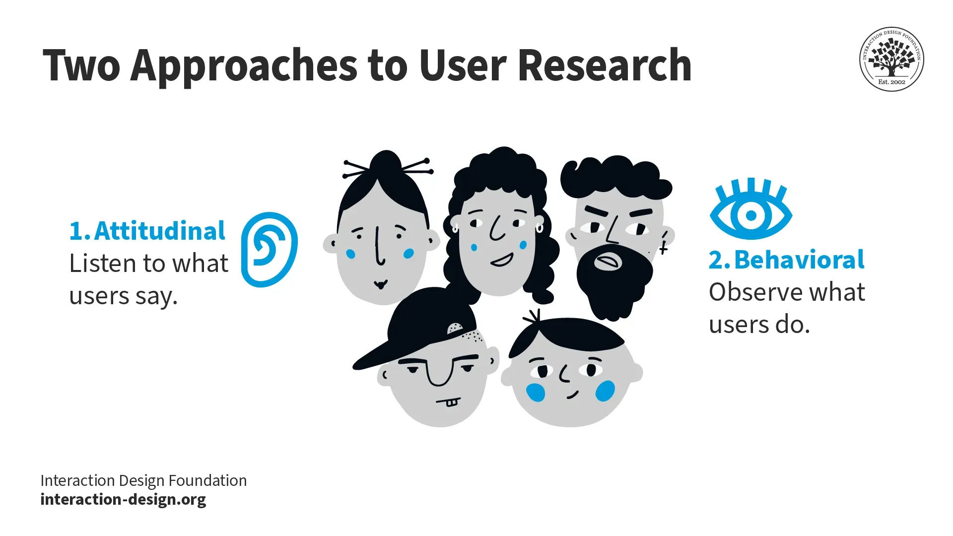
Attitudinal research records user sentiments and opinions—through self-reported data—and behavioral research examines user actions.
© Interaction Design Foundation, CC BY-SA 4.0
You can use qualitative research to get these insights in, and a neat point about “qual” research is it uses non-numerical methods to uncover detailed insights—and more personal and “human” ones. Because this approach focuses on smaller groups through techniques like interviews, it means you can explore attitudes, behaviors, and hidden factors—including aspects you mightn’t have thought about unless you asked users—to gain a deeper understanding of users’ thoughts and feelings.
Unlike quantitative research—which leans on statistics and numbers, or the “what” of what’s going on—qualitative research reveals the “why,” as in users’ motivations, hopes, needs, and pain points. This rich information helps you and your design team guide the design process from the early stages. And because it sheds light on a “truer” picture of your users, it helps prevent costly mistakes as you can keep projects aligned well with user expectations.
3. Leverage a Variety of User Research Methods
To be sure, qualitative research uses observations, responses, and insights for product development, but for mobile apps, four key methodologies stand out:
Diary Studies
Diary studies invite users to document their journey with an app over a certain period. They record when and where they use the app and their immediate thoughts and observations around that. This method is rich in contextual details, but—and a major thing for you to bear in mind—it requires participants to remember to log their experiences consistently. People are human, and consistency can sometimes be a hurdle, but—despite this—the depth of insights you can get is invaluable and full of nuggets of actionable data (and it can be very “human” in the richness and depth it covers).
Lab Studies
Participants use the app in a controlled setting—and while they’re doing so, researchers observe from afar in lab studies. To be sure, this setup does allow for a focused study of user interaction with the app, but one potential flaw to look out for is how the controlled environment may not mirror real-world usage in full.
There is a risk that “inauthentic” things may arise—for example, participants may act in unnatural ways to please researchers or be so self-conscious because they think they’re in an “exam” that they miss the point of the whole exercise. So, it takes foresight and consideration to steer around risks of this sort—and only well-designed studies can minimize these issues and yield crucial data.
Task Analysis
Task analysis focuses closely on how users complete tasks in an app, with a few key things in its scope—like, how a person achieves their objectives and the detailed actions they take to finish a task. Then there’s the unique experience and abilities a person uses to complete a task, too, along with the impact of the surroundings on the task performer.
While that’s going on, there’s also the individual’s emotions and perceptions for the task. Then, last but not least, is the existing process that culminates in the task’s fulfillment.
There’s more to task analysis than may meet the eye, and researchers observe and record these details with care to make the most of what they do. This approach helps you create apps that users find attractive and easy to use, because you’re already several steps ahead of how your users may respond.
A well-planned—and well-executed—task analysis helps you understand what users need from the app at each step. With this insight, you can make apps more user-friendly and intuitive, and ones that feel good to use (rather than just look good). From that, you’ll be closer to a successful product because it will meet and exceed user expectations that much better.
Task analysis is an important technique in user research. Frank discusses more about this technique in this video.
Ethnographic Field Studies
Ethnographic field studies may sound more like they belong in an anthropology course, but they’re great “tools” in UX design, too, since they take researchers into the natural environments of their users. Take it as a method and it helps you understand the app’s role in the user’s daily life, for one thing, but there’s more.
You can learn about the broader cultural, social, and emotional contexts that influence how and why users use the app, too. They’re studies that combine various techniques—such as contextual interviews and task analysis—to offer a holistic view of the user experience so you end up with a great deal more than just a picture of what users go through and get up to with design solutions “in the wild.”
Plan the Mobile UX Strategy (Tips 4, 5, & 6)
Now you’ve got the “preliminaries” sorted out, it’s time to get going on some steps toward a well-defined strategy that aligns with your mobile user needs, behaviors, and preferences to make mobile interactions seamless, intuitive, and engaging.
4. Use Mental Models
Mental models represent what users believe about how systems—like websites or apps work. Jakob Nielsen, Co-founder of NN Group, defines them as what the user believes about the system. Users rely on these models to easily navigate new digital products based on their past experiences.
For instance, someone who’s familiar with weather apps expects certain features—like forecast locations or temperature displays—to be in specific places. If you match these expectations in a new app quickly, it makes the user comfortable and more trusting of your design (and, by association, your brand).
Most people have similar mental models for common tasks, such as online shopping or searching for information. For example, think of shopping on Amazon and what you as a user expect to see when you’re on the site. You design with these shared models to smooth out the user experience—and help them trust your digital solution and the brand behind it.
Mental models are everywhere in the human world, and people rely on them for all sorts of things (it would be a very confusing and “unpredictable” world without them!). You can find out what users’ mental models are like through user research methods like interviews and testing. This will show you what users expect from a product—and if things don’t match up, don’t worry; you can change the design or help users with tutorials or demos. The main thing is that they will take to your design—quickly—and they don’t have to pause to think about the user interface (UI). Of course, you can still serve up a delightful, original design (mental models aren’t about being a copycat); it just needs to deliver a seamless experience that’s in line with their expectations.
Create a Conceptual Model out of a Mental Model
Conceptual models turn users’ mental models into visual representations.
First, you gather user research insights through interviews and surveys.
Second, you observe how users interact with products.
From these insights, you develop visual guides—and these guides show how brands believe users perceive and engage with the system. These visual guides can use common formats like flowcharts, diagrams, wireframes or prototypes.
Watch as Author and Human-Computer Interaction Expert, Professor Alan Dix explains important points about prototyping:
Conceptual models clearly explain the design process and how you expect users to interact with the product—or service—you intend to offer them. Get things nice and clear, and the clarity will help you align the design process with user expectations—so you don’t get any surprises or rude awakenings when it comes to prototyping and beyond.
You can sketch conceptual models early to save time—and it can be a big help if you do it early on—plus, it helps streamline the development of user interfaces, too, so they match users’ thoughts and behaviors.
5. Focus on Content Strategy and UX Writing
In UX design—and not just mobile, but in general user experience design—content is “king” (while context is more like the “queen”). Content is “king” in design, and for good reason, because content shapes user experience in the digital world. People use their devices to find answers, solve problems, or enjoy entertainment—and that’s why you want to (and should) prioritize content so much in mobile UX design.
For example, think about sites like Reddit and Wikipedia, and how they thrive on high-quality content. Content is big, any way you slice it—although don’t try to slice it unless you’re editing to make your content better! It proves that if you give users a choice, they’ll prefer quality content—nourishing nuggets of great material—over the “surface joy” of visual appeal.
“Ultimately, users visit your website for its content. Everything else is just the backdrop.”
— Jakob Nielsen, Co-founder of NN Group
When you think about content, it’s something that extends far beyond just long-form articles and goes way deeper. So much is riding on what you show content-wise, and a strong content strategy reflects a business’s values, establishes credibility, and nurtures user trust as well. This trust is vital as it “imbues” users with the kind of warm feelings that turn visitors into loyal customers who come back for more.
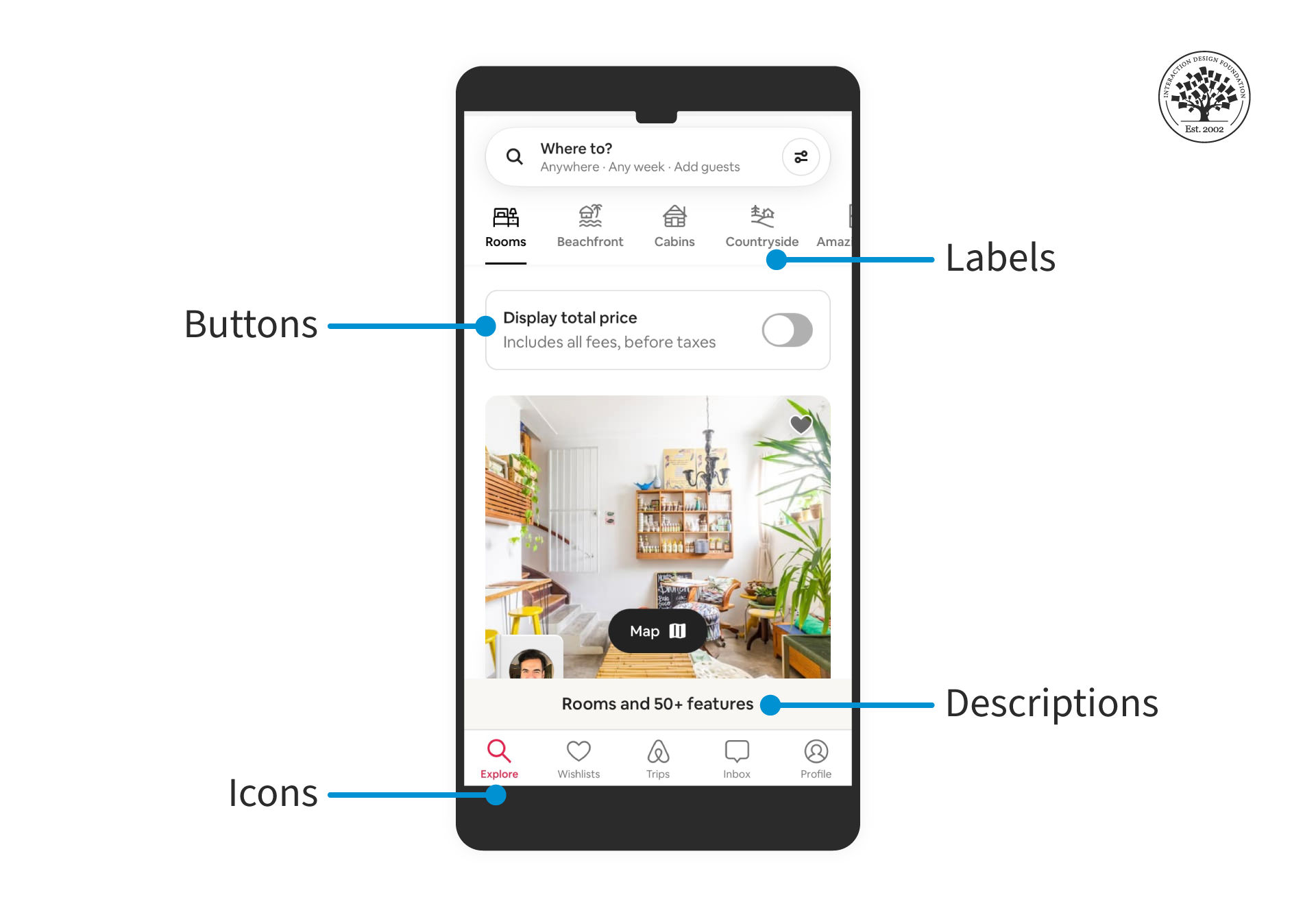
UX writing is crucial for designers to create smooth and intuitive user experiences. It addresses and resolves pain points.
© Interaction Design Foundation, CC BY-SA 4.0 and Airbnb, Fair Use
First, you’ll want to understand user needs through research, and when you know their “language” (i.e. what they expect to see), you can start to create engaging content for them. UX writers use clear and concise language when they craft messages that they know will prompt action from users. When you’ve got a UX writer mindset, or work alongside a user experience writer, you’ll see how to align messages with the user’s mental models to create content that resonates with them.
A good content strategy also considers localization, so it’s vital to use real text—not just placeholders—to get accurate translations for everyone worldwide. Designs should fit text from different languages that don’t cause layout problems—and bear in mind that words that are short in English can be longer when translated in other languages.
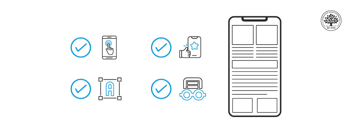
6. Follow Mobile UX Best Practices
Certain mobile UX guidelines can help you improve the user experience, and they’re rules that help make your app smooth to use on any device:
Simplify navigation to keep navigation both simple and intuitive, as users should find what they need with minimal taps. Use recognizable icons and clear labels to help with that.
Optimize for touch because of what mobile users do with their screens. When you design with touch in mind, you make buttons and interactive elements large enough to tap easily (think “fat-finger friendly”). Also consider the thumb’s reach when you place key elements—as users often use mobile devices with one hand.
Minimize input effort and cut down on the need to type—as far as possible—and have dropdowns, toggles, and auto-complete functions in there. This more than makes sense when we see how a “traditional” desktop keyboard can be four or five times the size of a smartphone, and it’s also a great idea to—whenever possible—offer alternatives like voice input.
Enhance readability by choosing easy-to-read fonts and sizes on small screens to help your users spot things at a glance, and contrast text with the background to enhance visibility for them.
Make fast loading a priority because it looks good for your brand and because users can be very unforgiving if things take even a second too long for them. So, optimize images and code for quick loading times and bear in mind that users expect instant access to information and features—even in areas with patchy signal coverage.
Design for interruptions because mobile users are often on the move—and in all kinds of user contexts, often busy ones. Design your app to handle interruptions gracefully and be kind to your users (who may be in stressful or frustrating contexts, like running to catch a train or bus). It should save progress automatically where needed (the app, that is, not the public transport).
Test across devices to make sure your app provides a nice and consistent experience across different devices and operating systems—and “seamless” is the keyword! Test on a regular basis to identify and fix issues, and better to start sooner than later.
Focus on accessibility because accessible design is a big deal, is the law, and is in line with common sense. It’s vital to incorporate accessibility features to cater to all users—including users with disabilities—so give them screen reader-friendly layouts and provide text alternatives for images. What’s more, remember the readability factor here, as that contrast and easy language will help all users on bright days and in so many ways.
Provide feedback to users in real-world and in real time, and make it immediate feedback on their actions to let them know what’s going on. Visual cues or haptic feedback enhance the interaction experience, and this kind attention to detail doesn’t just make the app feel responsive and alive. It shows them you care about them, too.
Prioritize privacy and security because this one’s a biggie (not that the others aren’t) and is a massive concern in an era where there’s so much cybercrime and illicit data use going on. So, have empathy for your users, be transparent about data usage, provide secure authentication methods, and protect user data to build trust. That trust of theirs will pay serious dividends, after all.
Watch our video on empathy to understand how to build it between your brand and its users:
Enhance UX with User Testing and Accessibility (Tips 7, 8, & 9)
You’re going to want to create intuitive and inclusive apps to reach a wider audience. User testing and accessibility play a huge role in this—and they’re vital ingredients, in fact. These practices ensure that your product meets the diverse needs and preferences of all users—and the “accessibility” part makes sure it meets all users.
7. Make the Product Accessible for Mobile
Mobile accessibility is the “magic” approach you use to make sure that everyone can use apps and websites you design on their phones. This includes people with disabilities—who find it hard to see, hear, move, or think—and you’ve got to factor in all kinds of disabilities. When you make your app easy for everyone to use, you reach more people and improve everyone’s experience. For example, that’s a huge help to even those users with “normal” vision because on a bright sunny day, they’ll struggle to see what’s on their phone screens—unless you’ve already taken care of it for them by designing for accessible contrast.
Best Practices for Mobile Accessibility
Use large, legible fonts: Choose font sizes and styles that users can easily read on small screens. Clear text helps users with visual impairments—which can include users who are in a high-stress context like walking fast while trying to complete an action (and with one eye on the way ahead of them).
Provide sufficient contrast: Text and background colors should contrast well so information stands out well. High contrast makes content readable even under different lighting conditions or for those with low vision.
Make interactive elements easy to tap: Make buttons and links large enough to tap easily, as this helps users with motor difficulties but also all users who may be glad of the convenience because of their user context (for example, holding onto a support rail on public transport).
Provide alt text for images: Describe images with alternative text to keep everyone in the loop as to what the picture shows. Screen readers use this text to convey image content to users who cannot see them.
Enable voice commands: Voice recognition allows users to navigate and interact through voice commands. This feature benefits users with physical or visual impairments, to be sure, and also can be a great convenience for all users in general (think of the benefits of Alexa, for example).
Offer subtitles and transcriptions: Include subtitles for videos and transcriptions for audio content on your designed product. This practice helps users who are deaf or hard of hearing—and other users who will be glad of it, for example, in loud environments.
Test with screen readers: Regularly test your app with screen readers to make sure compatibility is alive and well and to look out for your users with vision disabilities—and when you identify areas that need improvement, you can help seamless experiences happen for them, too.
8. Focus on Mobile Usability
A healthy level of mobile usability ensures that mobile apps and websites are easy and efficient for users to navigate and interact with—and that’s no matter what the device or context may be. While accessibility focuses on digital products that people with disabilities can use however they access them, usability focuses on optimizing the overall user experience for everyone who comes into contact with your product design—two vital worlds to bring together for the best in UX design.
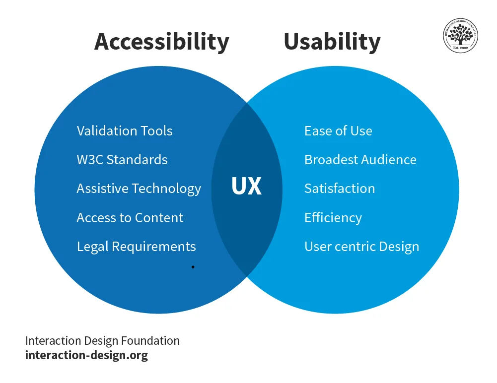
Accessibility and usability in user experience ensures that everyone has access to a good user experience, irrespective of how they view a product.
© Interaction Design Foundation, CC BY-SA 4.0
Google shared best practices for mobile app usability to enhance user satisfaction and retention. We have already discussed all the tips above, but here’s a recap for your convenience.
Use easy-to-read fonts.
Make sure users can access key information offline.
Make buttons big enough for easy tapping.
Keep controls where users expect them to prevent mistakes.
Load things fast to keep users happy.
Use pop-ups for simple tasks without losing progress.
Place action buttons where users can easily see and tap them.
For forms, protect user data and guide users. Use animations to make interactions fun.
Google also pinpointed four key mistakes in mobile app design that can harm the user experience.
Don’t use the same design for Android and iOS apps. They should look different.
Skip underlined links. In apps, use buttons instead.
Keep users within your app, not in a web browser.
Wait before you ask for ratings. Let users enjoy the app first.
9. Prioritize User Testing
Last—but in no way least—it’s time to user test that digital product you’re working on. In user testing, you get real users to interact with yours to observe their behavior and gather feedback from them. This process helps weed out any usability issues or spot areas for improvement—and it’s key in helping you create a final product that will well and truly meet the needs and expectations of its intended users.
In the early stages of design, user testing can reveal how users understand your app’s navigation and if they can achieve their goals smoothly—which is why it’s vital to start testing from early on. Then, as you refine the design, testing helps you—along with your design team—to fine-tune interactions and interfaces for better usability to come about. And then, before—drumroll—launch day, it ensures the app works well in real-world scenarios, and you can check if the app does provide that all-important seamless experience for all users.
Several popular user testing methods help improve mobile UX design, so be sure to look into these:
Usability testing: This involves observing users as they complete tasks on your app, and it highlights areas where users struggle—and what works well.
Surveys and questionnaires: After using the app, give users these so they can provide feedback so you know what opinions on the user experience are like.
A/B testing: In this method, you compare two versions of a page or app feature, with different users testing “A” and “B” and their interactions determine which version performs better.
Interviews: One-on-one interviews offer deep insights into users’ thoughts and feelings about the app, so tap into these for some eye-opening data.
Eye tracking: This method tracks where—and how long—users look at different parts of the app screen. It shows what attracts user attention and what they ignore, and from that, you can deduce where improvements may be wanted.
About the Mobile UX Strategy: How to Build Successful Products Course
Mobile UX Strategy: How to Build Successful Products is a 4-week journey into the very heart of mobile UX design. Throughout this course, you’ll gain skills to distinguish your mobile UX strategy and make smart design decisions—ones that can lead to big wins for your digital product. You’ll engage with topics such as user research, interface evaluation, and the nuances of mobile user behavior.
The course emphasizes practical learning. It offers best practices and strategies that can help you design successful products.
This course suits a wide range of professionals who want to deepen their understanding of mobile UX design:
UX and UI designers aiming to improve their mobile strategy and focus on user-centric design.
Software developers who want to include UX principles in their development for enhanced user experiences.
Entrepreneurs and business stakeholders seeking a market edge through a robust mobile UX strategy.
Product designers keen on learning how mobile UX strategy influences project success and user satisfaction.
Marketers desiring improved collaboration with product teams to create unique products.
Design educators wishing to keep abreast of mobile UX strategy trends to enrich their curriculum.
The “Build Your Portfolio” project is a core part of this course. It allows you to apply what you’ve learned through practical exercises. These hands-on activities reinforce your understanding and help you create a comprehensive case study for your portfolio. This project is a valuable showcase of your new mobile UX design capabilities.
Led by Frank Spillers, CEO of Experience Dynamics, an author, speaker, and renowned expert in usability, this course offers a rich learning experience. Frank’s expertise brings you the latest in research and real-world examples, and it equips you with the knowledge to enhance mobile user experiences.
References and Where to Learn More
Enroll in the Mobile UX Strategy: How to Build Successful Products course. It’s a part of an IxDF membership. To become a member, sign up here.
Read our topic definition on Mobile user experience (UX) Design.
For more practical tips on Mobile UX, read a comprehensive guide to mobile app design.
Get inspiration from top Mobile UX designs on Dribbble.
See the percentage of mobile device website traffic worldwide from 1st quarter 2015 to 4th quarter 2023.