Have you ever wondered how your brain makes sense of the world? It's a fascinating process! If you want to design helpful products and services that people love, you must first understand how they think. A large part of human interaction relies on perception, our ability to see, hear and feel our surroundings. But we also need to be able to connect these things. That's where memory comes in—it helps us connect the dots. Learn about the role of perception and memory in design through the IxDF Perception and Memory in HCI and UX course.
We often design the world based on how we experience it, but this limits our solutions. Diverse people have diverse needs. Age, ability and skill all affect how people use technology.
True universal design is a lofty goal. Yet, we can get close. We must study how people perceive the world and understand how their memory functions. This knowledge can help you build better, more accessible tools.
We gain valuable insights as we focus on how people's senses and minds work (in other words—perception and memory). This helps us support a broader range of users and our solutions can better address the limitations some people face.
Explore how a deeper understanding of perception and memory can enhance your design skills and help you create more inclusive products.
The Basics of Perception and Memory in HCI and UX
Human-Computer Interaction (HCI) and User Experience (UX) are fields that aim to make technology intuitive and enjoyable for people. If you understand perception and memory within these fields, you can create systems that align with how users' minds naturally work.
1. What is Perception?
Perception is how we sense the world around us. We use our senses to notice objects and relationships. This process gives us vital information about our surroundings. Perception needs our brainpower. We use memory to recall a friend's face or a familiar smell. This lets us identify things and react to our environment.
Watch Alan Dix, Professor and Expert in Human-Computer Interaction, discuss the types of memory we have.
Show
Hide
video transcript
- Transcript loading…
Our five senses help us perceive—sight, touch, hearing, taste and smell. We also have proprioception. This is our sense of body position and self-movement. We face a constant flood of information. Perception filters this to stop us from feeling overwhelmed and helps us understand the world.
How does Perception Work?
Perception increases our awareness of the world. It helps us react.
We use it in communication: It tells us how loved ones feel.
It guides our behavior: It shapes our views of people and groups.
We perceive the world constantly but rarely think about it. Light hits our eyes and becomes an image instantly. Our skin senses subtle pressure to let us feel objects. All of this happens without effort.
2. Design Principles on Multi-Sensory Experiences
How you design for the senses goes beyond the obvious—sight, sound and touch. True sensory design weaves various ways users perceive the world to create richer experiences. Let's explore some key principles:
Know your senses: Understand how senses work. Research how the brain processes sight, hearing, smell, taste and touch. Consider how sensory disorders and unique sensory experiences might influence your design choices.
Senses are a team: Our senses never work alone. Our brains constantly combine information from multiple senses to guide how we react to the world. Test how your sensory design elements work together—they might create unexpected results.
Do research: Hunch-based design won't cut it. That’s why it’s vital to collect user insights on how they interact with your product through multi-sensory methods, and a wealth of scientific literature guides your choices if formal research isn't feasible.
Target carefully: Always start with a clear goal for each sensory element. Haptic feedback, distinct sounds or even subtle visual cues should all have a defined purpose.
Spark synesthesia-like effects: Our brains naturally seek connections between senses. Words can evoke 'taste' while colors can have a 'feel.' Tap into these associations to make the digital experiences more real and engaging.
Uncover hidden effects: Your design choices might trigger unintended sensory responses. Be mindful of this. Words, colors and patterns can all impact some users.
Design without sight: Temporarily 'turn off' your focus on sight. How would your product work if users relied on sound, touch or smell? This exercise sparks innovation and reveals how reliant we often are on visuals.
Provide balance: Sensory overload is a very real concern, and if you combine too many elements, it may well distract users and ruin their experience. So, always find the right balance—and remember, sensory details should enhance, not obstruct.
Create a strategy: Don't treat sensory features as an afterthought—you’ve got to plan them from the start and align with your overall product vision. These elements are going to have a big impact on how users feel about your brand if done well.
3. Use Sensation and Perception in Design
In this video, Alan Dix discusses what sensation and perception are all about.
Show
Hide
video transcript
- Transcript loading…
Video copyright info
Copyright holder: Michael Murphy _ Appearance time: 07:19 - 07:37 _ Link: https://www.youtube.com/watch?v=C67JuZnBBDc
Imagine you try to capture the essence of reality through your senses. Sensation and perception play pivotal roles in this process. Sensation gathers raw data from our environment through our senses. Perception interprets this raw data within the brain.
However, perceptions can—sometimes—deceive us. Real-world applications complicate these processes. Our senses interact and our past experiences influence our perceptions. Add the complexity of processing visual information and it becomes astonishing that observers can agree on a shared experience. Here's an example to help you understand this:
Let’s think about a shopping app that highlights sale prices in blue. While effective for most people, users with color vision deficiency well may not notice this, as the blue blends into the background for them. This example shows how design based on one perception can mislead others with different sensory experiences.
There are a few reasons why this matters in design:
Optical illusions: Illusions like the Ponzo or Müller-Lyer trick make our brains think that we see lines of different lengths or objects of different sizes, when they’ve actually got the same length and the like. You should be aware of these effects, as visual choices can mislead users unintentionally.
Two popular optical illusions include the Ponzo Illusion and Muller-Lyer Illusion.
© Interaction Design Foundation, CC BY-SA 4.0
Experience matters: Even seemingly basic perception isn't universal. People raised in different environments might see the world in subtly different ways. Consider the diversity of your audience when you make design choices.
Our brains seek meaning: We try to find patterns and make sense of things. You can use this to guide user perception and make experiences feel intuitive. However, it also means users can misinterpret seemingly clear visuals if you don't consider alternate viewpoints.
It’s vital to be aware of the fluidity of sensation and perception to deliver successful experiences. Consider the potential for misinterpretation due to illusions, personal histories and our pattern-seeking brains—and the users’ brains that might misinterpret something are the same brains that can (mis)judge your design. As you understand these complexities and anticipate diverse user responses, you can craft designs that guide perception effectively to create intuitive and inclusive products for all.
4. Use Touch and Haptics in Design
Touch is our sense of feeling things through physical contact—and it can be extremely sensitive. In design, this mainly refers to how users interact with touchscreens. Haptics is the technology that simulates the sense of touch. Think of subtle vibrations or bumps on your phone. Haptics add a physical dimension to digital interactions.
Imagine a map app. A button zooms in on your location. Traditionally, you'd see the view change visually. Now, add a subtle haptic “click” as you press zoom. This adds another sensory layer. It confirms the action and makes the interaction more satisfying.
Use these five guidelines to add touch and haptics to the design:
Purposeful: Don't add vibrations for fun. Haptics should have a clear role—to provide feedback, guide actions or enhance immersion.
Subtle: Users may feel annoyed if you overdo haptics. Small, precise vibrations usually work best.
Make meaningful pair: Match haptic effects to what happens on-screen. A heavier 'bump' might indicate an error, while a light series of taps could mimic typing.
Flexible: Provide options to adjust or turn off haptics. Some users might feel distracted or even physically uncomfortable.
Device specific: Haptic effects feel different on phones versus smartwatches. Test thoroughly on your target device.
Learn How to Use Vision and Sound Senses
Eyes and ears help us take in most of the world. When we design things, it's important—and then some—to understand how people see and hear. This helps us create websites, products and even spaces that are easy to use and provide a pleasing experience. If you think about color, shape, sound and how they grab attention, you make things work better for everyone.
1. Understand The Science Behind Amazing (but Tricky) Vision
Light enters our eyes and hits special cells at the back. These cells send signals to our brain. Our brain turns them into the images we see. This sounds simple, but our brains do a lot of extra work.
Our brains fill in the gaps of what we see. This is why optical illusions work. People see things differently so you must be careful when you design—your user might be colorblind or have low vision. Shapes and colors can mislead if we don't plan well. Good designers think about these differences. They make sure their work is clear for everyone. For example:
Color: Color theory explains how colors trigger deep emotions in humans. Reds might mean love or danger, blues calm or sadness—it depends on the person. You must know these complex associations, especially since they shift across cultures.
Lighting: Our brains respond to light, and soft, warm tones create coziness, while bright, cool light evokes focus. You can use light to set the desired mood for a space.
Layout: Layout affects us at a subconscious level. Spaciousness, grid systems and natural elements each evoke different feelings. You can use these elements carefully to create a space that supports the desired experience for the user.
Design For Peripheral Vision
Peripheral vision lets you see what's outside your direct focus. It's less sharp than your central vision but helps you spot things in your surroundings and guides your attention.
It's important to understand peripheral vision for a good user experience because users scan interfaces with both central and peripheral vision. Design elements need to consider both to avoid missed content and frustration.
Let's say a user clicks a button and gets an error message on the far side of the screen. They missed it because it was outside their central vision. This is a common problem—and one that can frustrate users a great deal—when the design doesn't consider peripheral vision. So, follow these tips to design for peripheral vision:
Center important items: Place key elements where users can most likely see them directly—and that means in the screen's center.
Use visual cues: Employ color, size and contrast properly, to make important items stand out in peripheral vision.
Use white space: Separate elements to reduce visual clutter and aid peripheral scanning.
Consider subtle animation: Guide attention to key items with brief flashes or gentle movement.
Test with users: Verify your design is usable in peripheral vision with real user feedback.
Maintain consistency: Use familiar design patterns throughout your product for ease of use.
Offer clear tutorials: Help users learn the interface to maximize efficiency.
2. Use Sound to Shape Design
Sound brings the experience to life in games, movies and virtual reality. But even in simpler apps and websites, the right sound can make the digital world feel more tangible and engaging. Here's a breakdown of how designers use sound in design:
Feedback and confirmation: Clicks, beeps and swooshes tell us whether an action was successful (or not!). This is essential in digital products where we lack the physical feedback of the real world.
Emotional connection: Music sets a mood. A suspenseful soundtrack in a game builds tension. A meditation app with gentle, calm music and natural sounds can help users relax and focus on breathing.
Alerts and notifications: Unique sounds help users distinguish what needs their attention. Think about how Facebook Messenger uses the distinctive notification tone.
Accessibility: Sound cues can guide users with vision impairments. Think of a navigation app with a distinct rising tone to indicate "You're heading in the right direction."
Immersion: Realistic sound effects or spatial audio in games and VR experiences make the world feel believable—and users can get so much more into it, and out of it.
Follow these tips to use sound effectively in design:
Purposeful: Sound should serve a clear goal—feedback, ambiance, etc.
Subtle and unobtrusive: Overly loud or repetitive sounds can quickly annoy the users.
Matches the experience: A playful sound effect might fit a children's app but feel out of place in a banking site.
User control: Provide options to mute or adjust the sound volume.
Leverage Human Memory to Your Advantage
Our brains aren't perfect memory machines—there’s the potential for misremembering things, for instance. But if you understand how memory works, you can create products and experiences that feel more natural and easier to use. This means less frustration for users and better results for your designs.

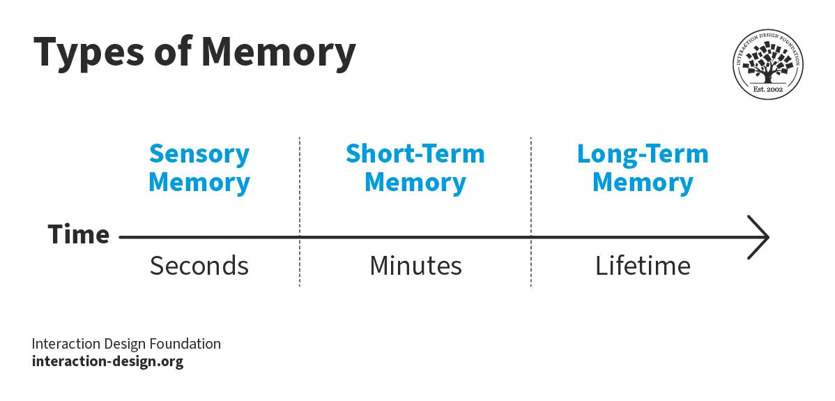
Human memory has three facets: sensory, short-term and long-term.
© Interaction Design Foundation, CC BY-SA 4.0
1. Understand How to Use Short-term Memory in Design
Short-term memory serves as a vital processing hub—in the short term, indeed. It takes in sensory memories of interest and holds them for up to a minute. This duration can extend to a few hours with rehearsal, such as repetition.
Watch Alan Dix discuss sensory memory and how it works in this video.
Show
Hide
video transcript
- Transcript loading…
Short-term memory operates on limited capacity. Renowned psychologist George A. Miller explored this in his seminal work, "The Magical Number Seven, Plus or Minus Two." His experiments suggest we can hold between five and nine items in our short-term memory.
"Chunking" is one of the ways to extend this capacity. In this method, you group individual items into larger, more manageable units. For example, if you group the digits into pairs, a 12-digit phone number becomes so much easier to remember. This results in six chunks—a manageable number within the typical memory span—rather than twelve separate digits.
You can also apply chunking to visual and alphanumeric data. Think about a bar chart in a presentation. Each bar represents a chunk of information. It simplifies complex data into digestible pieces. This technique allows visual designers to present information that short-term memory can quickly process.
Chunking Technique | Benefit for User Experience | Examples |
Group information into categories | Improves user's ability to process and retain information | Website menu with categories like "Home," "About," Products," and "Contact" |
Break down complex data into digestible pieces | Reduces cognitive overload and frustration | Product comparison table with features listed in columns to make selection easier |
Allows users to focus on what matters most | Creates a more user-friendly experience | Signup form broken into sections (personal info, address, payment) |
2. Understand How to Use Long-Term Memory in Design
Long-term memory serves as our mind's vast storage system—and we retain memories that we make conscious efforts to remember. This effort includes practices like how you study for tests or make meaningful connections. These connections help form long-lasting memories.
For instance, you make a vivid impression if you experience a static shock—it’s a painful experience that creates a strong emotional memory after just one occurrence. This shows how potent emotional and physical experiences are for memory retention.
We also use long-term memory to define our identities. It holds our experiences, knowledge and skills that inform who we are. This storage allows us to retrieve important information about our values and past experiences. It plays a crucial role in shaping our behavior and decision-making.
In design, especially in information visualization, the focus often remains on the immediate interaction. Users rarely store the details of a design in long-term memory. Instead, they remember the insights or understanding they gain from it. This selective memory is what makes sure that we keep hold of only the most relevant information.
Follow these five tips to leverage long-term memory in design:
Emotional design: Create designs that evoke strong emotions for better memorability—we’re talking about impressions and feelings here. Products that generate joy, surprise or nostalgia can forge lasting memories and deepen brand connections.
Storytelling: Use narratives to make complex information so much more relatable and memorable. Stories that resonate with users can enhance recall and engagement with your brand or product—and they’ll associate something much more profound than just data with it; humans really do love tales.
Repetition and familiarity: Employ consistent visual elements, slogans, or sounds across various platforms to reinforce memory. Familiar branding makes it easier for users to recognize and remember your product.
Priming and cues: Use visual or auditory cues to trigger specific actions or memories. It’s an approach that helps users quickly recall their interactions with your interface.
Personalization: Tailor experiences to individual users so you forge deeper emotional connections and create memorable interactions for them. Platforms that adapt to user preferences or history—like Netflix or Amazon—demonstrate the effectiveness of this strategy to enhance long-term brand loyalty.
The Take Away
The IxDF Perception and Memory in HCI and UX course will help you gain deeper insights into what we discussed. You’ve got to understand how users perceive and remember information to design effective interfaces. This course goes deep into the cognitive processes that shape human interaction with technology. You'll explore the major human senses and the role memory plays in processing and storing information. In this course, you'll learn about:
The role of perception in human-computer interaction.
The dynamics between sensation and perception.
Insights into touch and haptics, as well as vision and hearing.
Understanding memory, including its structure and limitations, to design more effectively.
Professor Alan Dix, a leader in the field of Human-Computer Interaction, brings his expertise to this course. As co-author of a best-selling textbook on HCI and Director of the Computational Foundry at Swansea University, his insights provide invaluable learning opportunities.
This course is ideal for you if you are a:
UX designer seeking deeper theoretical insights.
Project manager aiming to create intuitive products.
Software engineer interested in the cognitive aspects of HCI.
Entrepreneur dedicated to standout product design.
Marketer looking to deeply understand customer interactions.
Newcomer to design considering a switch to HCI or UX design.
Participate in the "Build Your Portfolio: Perception and Memory Project" to apply what you've learned through practical exercises. These activities allow you to create case studies for your portfolio and showcase your skills to potential employers or clients.
References and Where to Learn More
Enroll in the IxDF Perception and Memory in HCI and UX course. It's included in an IxDF membership. Sign up to become a member.
Read our topic definitions on Perception and Memory.
Learn about what types of memory do we have?
Learn how to use sensation and perception when we design.
Read National Institutes of Health (NIH) research titled From Perception to Attention.


