There’s nothing more annoying than when things don’t function the way we expect them to. When users interact with a UI, they make sense of its elements in relation to the “real world”—think of the trash can icon or a button: in essence, they look like their physical world counterparts. Cognitive friction occurs when the cues don’t match our users’ expectations. Here you’ll learn how to avoid cognitive friction in UI design to make the UX of your products even better.
What is Cognitive Friction?
Alan Cooper, the father of Visual Basic and UX consultant, wrote about cognitive friction in his book The Inmates are Running the Asylum. Cognitive friction occurs when a user interacts with an interface or affordance that appears intuitive but delivers unexpected results.
Imagine if you visited a mobile site and saw a button on that site that said: “Sign Up” but when you pushed the button, it took you to another website. That would be an example of cognitive friction in a digital product. You expect to go to a signup screen and not elsewhere on the internet.
The more times that cognitive friction occurs when a user interacts with a product, the more jarring the user experience is. If it occurs often enough, there is a reasonable likelihood that the user will seek an alternative means to carry out their task, resulting in so-called user churn.
Cognitive friction matters because it can damage the user experience and reduce revenue both in the short and long term.
How to Avoid Cognitive Friction
The user experience design team works in conjunction with the interaction and UI design teams to avoid cognitive friction.
Before Development
Identify where cognitive friction is likely to take place and proactively avoid it:
Conduct user interviews: Learn how your users expect to undertake the task with the product. Ask questions specifically related to the interface during prototyping and sketching.
Create task flows: If you can create the simplest possible task flow with the greatest degree of automation (where the computer, not the user, does the work), you are likely to minimize cognitive friction.
Create easy-to-use information architecture (IA): The simpler the IA, the less often a user will get lost or confused with the product. Use methods such as first-click and tree testing and get feedback directly from users.
Remove irrelevant or broken touchpoints: Touchpoints are areas where users and organizations interact to exchange value, such as a customer service conversation or important information in a mobile flow.
Mobile user experience (UX) design provides additional challenges when it comes to cognitive friction. You can use the same techniques to identify, avoid and test for cognitive friction for mobile design. However, mobile offers far more ways to interact with a device than the traditional mouse/keyboard combination. There are gesture controls, eye movement controls, motion controls, touch screens, camera inputs, etc.
This means that it’s vital for the UX designer to examine these interactions closely; in many cases, there are no “standards” (like the floppy disk, save button or the paper file, folder combination) for these interactions. It takes great care and thought to create intuitive interactions that avoid cognitive friction.
During Development Iteration
Test for cognitive friction during the development lifecycle at each iteration of the product:
Conduct expert evaluations: Cognitive walkthroughs and heuristic evaluations can help you detect cognitive friction, even the one that isn’t immediately obvious to users.
Run usability tests on wireframes and prototypes: Nothing beats direct interaction with the product to test interaction design and examine how users will react to that design. The more user input you get, the more cognitive friction you can identify and thus you can focus on how to eliminate it in the next iteration.
What is Inclusion Friction?
You can cause friction in your experiences by not being inclusive. Ensure that you consider the diversity within your target audience, including members of any minority groups. For example, if you offer only two gender options to your users, you can cause inclusion friction because you leave out many other genders.
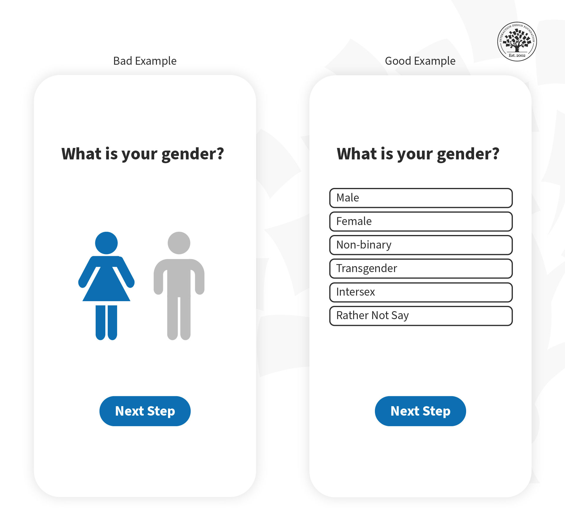
In this image, you can see how you can avoid inclusion friction (example on the right side) when asking for gender information.
© Frank Spillers, Fair Use
Below, you can see another example of how to avoid inclusion friction when asking for gender.
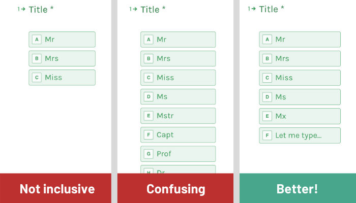
© Ruth Ng, Fair Use
Always consider inclusivity in your user experiences and research current best practices to make the best decision for your products and thus avoid friction.
You should also consider people with physical or intellectual disabilities within your target audience. Remember that when you design for accessibility, you design for all of us. As a result, you’ll deliver much better experiences.
The Take Away
Cognitive friction occurs when something in a product doesn’t behave as we expect it to because it resembles a real-world object. It’s a source of user frustration and can potentially mar the user experience enough to create user churn. You can avoid it through user research and user testing.
References and Where to Learn More
See Ruth’s full article on asking gender respectfully in forms.


