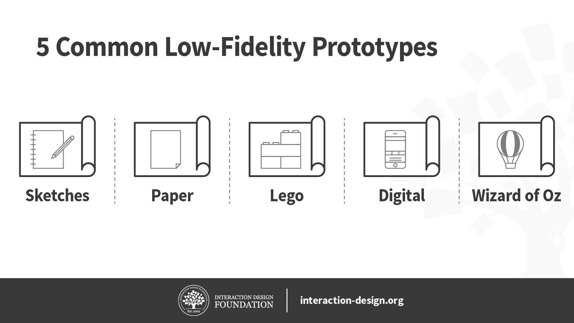
Low-fidelity prototypes allow us to quickly and inexpensively test ideas, so we can validate our hypotheses and improve our solutions. To maximize their effectiveness, it’s important for us to know which low-fidelity prototypes we should use, their pros and cons, as well as how to create them. Here, let’s look at the best practices of five of the most common low-fidelity prototypes: sketches, paper prototypes, Lego prototypes, wireframes and Wizard of Oz prototypes.
Before we begin looking at these five low-fidelity prototypes, let’s briefly talk about when you should use low-fidelity prototypes in the first place. Low-fidelity prototypes let us test ideas quickly and cheaply, which makes them useful during the early divergent stages of the design process, when we want to create and test as many ideas as we can. Since they require less time to create, we are less likely to get attached to them, so they allow us to discard bad ideas more easily than high-fidelity prototypes do.
We should use low-fidelity prototypes to test only for broad concepts rather than fine details such as animations. This is because low-fidelity prototypes tend to lack details and realism. For instance, we can use low-fidelity paper prototypes to test different solutions for a problem at the very early stages of ideation.
© Interaction Design Foundation, CC BY-NC-SA 4.0
With this in mind, let’s dive into five commonly used low-fidelity prototyping methods!
Sketches
While sketches are often considered to not be technically prototypes, they can be extremely helpful for making decisions, mostly because they are incredibly easy to create and even easier to discard. We don’t need any artistic skill to sketch well, so this is a great tool for designers and non-designers alike.
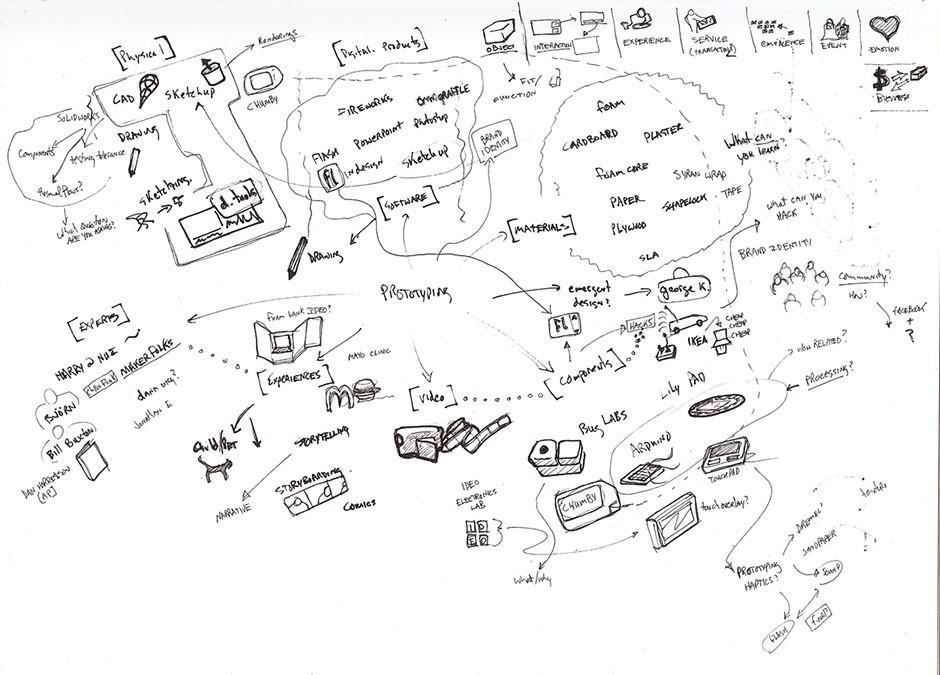
Even the messiest of scrawls (not that what we see above is a messy scrawl) can serve as nurturing “soil” to make the seed of an idea sprout into a first-class end product.
© Tom Maiorana, CC BY 2.0.
Pros and Cons of Sketches
Pros of sketches
They are extremely cheap and fast to create. As such, you can sketch out a large number of ideas in a short amount of time.
You can do it anywhere: with pen and paper or digitally on your smartphone, tablet or desktop computer.
They are disposable, so you won’t get attached to sketches that turn out to be bad ideas.
Cons of sketches
Sketches lack detail and are ambiguous by design. As such, you cannot use sketches to convey complex interactions of an app, for example.
Sketches are almost never of high enough fidelity to be useful with people outside of the team, since they rarely have the context to understand what the sketch is meant to convey.
Sketches are not very helpful in convergent processes where you want to select a few best ideas—other forms of prototypes, such as paper prototypes or wireframes, are more helpful.
When to Use Sketches
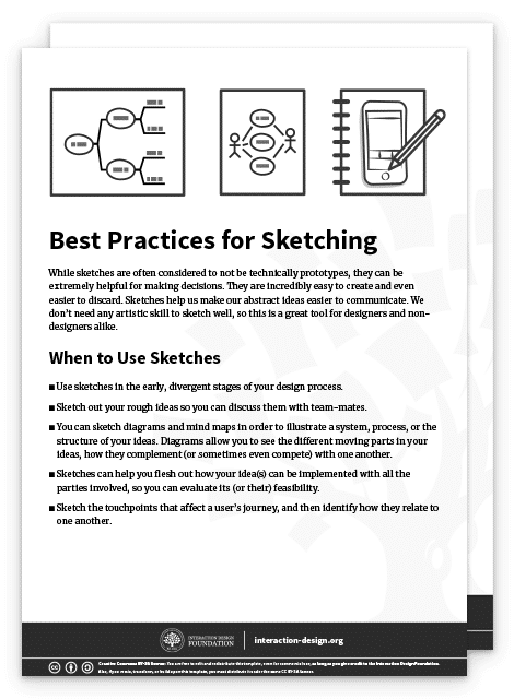
Use sketches in early, divergent stages of your design process.
Sketch out your rough ideas so you can discuss them with team-mates.
You can also sketch diagrams and mind maps in order to illustrate a system, process or the structure of your ideas. Flesh out how your idea(s) can be implemented with all the parties involved, so you can evaluate its (or their) feasibility.
Sketch the touch points that affect a user’s journey, and then identify how they relate to one another.
Best Practices and Tips for Sketching
Always sketch out your ideas, rather than store them in your head! Design thinking emphasizes a bias towards action. Whenever you have an idea, sketch it out, no matter how silly it seems—you will be able to evaluate it much better when it’s on paper rather than in your head.
Use the right amount of detail: remember that a sketch should be rough and quick. Don’t spend extra time adding details which are not required for your quick sketch.
Draw diagrams to map out complex ideas or use cases, where many factors and players affect one another. Journey maps, behavior maps, system flow diagrams and a range of other mapping methods are at your service to help you scope out complex situations.
Invite other team-mates to join in your sketching sessions, when appropriate. Because sketches are so easy to create, they are great opportunities for you to involve other stakeholders in the design process.

Paper Prototypes
Show
Hide
video transcript
- Transcript loading…
William Hudson explains the power of paper prototypes, as well as when and how to use them.
Pros and Cons of Paper Prototypes
Pros of Paper Prototypes
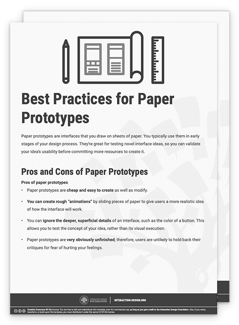
Paper prototypes are cheap and easy to create as well as modify.
You can create rough “animations” by sliding pieces of paper to give users a more realistic idea of how the interface will work.
You can ignore the deeper, superficial details of an interface, such as the color of a button. This allows you to test the concept of your idea, rather than its visual execution.
Paper prototypes are very obviously unfinished; therefore, users are unlikely to hold back their critiques for fear of hurting your feelings.
Cons of Paper Prototypes
While generally easy to create, sometimes you might spend a bit of time to make a paper prototype. You might get emotionally attached as a result and become unable to objectively evaluate its merits. Also, while it’s fairly easy to make small changes, sometimes larger, more structural changes are tricky because they can require completely recreating whole sections of the prototype.
Paper prototypes are less helpful to test commonly used user interface patterns. That’s because users are likely to already know how the user interface works. In such cases, you should skip the paper prototype and move on to a higher-fidelity prototype instead.
You can only test paper prototypes in person. Since the prototype is physical, you’ll find it very difficult to conduct remote tests with it.
While better than sketches, paper prototypes still require imagination from users. This means some users might struggle when they try to understand how the interface works.
When to Use Paper Prototypes
Use paper prototypes when you’re exploring novel solutions, to test whether people understand your solution.
Don’t use paper prototypes when you’re revisiting the same solution, or using a standard user interface pattern to solve a problem. In such cases, you can skip the paper prototype and move to the next stage of your design process.
Use paper prototypes when you’re exploring different ways of solving a problem. For instance, if you have different interface ideas to achieve the same user goal, you might want to sketch out a couple of different paper prototypes to test them on users.
Best Practices and Tips for Paper Prototypes
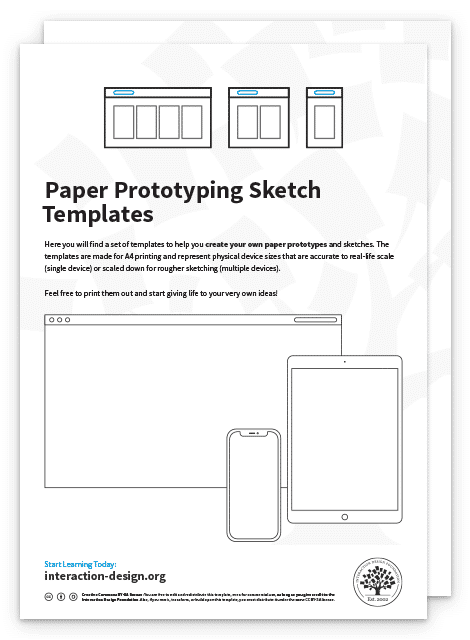
Paper prototype sketching templates can help you speed up your process. However, you don’t need them and simple sketches on blank sheets of paper will work just as well.
You don’t even need to use a ruler—however, you should ensure your paper prototypes are neat and legible, of course.
Test your paper prototypes on users. Play-act with them to let them know what happens when they click on a certain button, for instance.
Do a dry run of your paper prototype testing session before you involve real users. Get your team-mates to try it out first. This is because you’ll likely find that it’s more difficult to host a paper prototype testing session than you think. You’ll need to know how to explain to your users the way your prototype works, as well as answer the many questions they will ask you.
Download our template for best practices for paper prototyping.

You can also download and print our paper prototyping sketch templates to speed up your paper prototyping.

Lego Prototypes

Lego’s genius transcends child’s play—we have much to tap from Lego as regards prototyping.
© Arto Alanenpää, CC BY-SA 4.0.
Lego is a staple of any kid’s toy box. Its versatility and ability to spark the imagination is what drives the company’s success. As a designer, you can take advantage of Lego’s versatility to create quick and simple prototypes of your ideas. The best part of using Lego pieces to build your prototypes is that they become easy to dismantle and tweak; simply detach a part of your Lego prototype, swap it with an alternative design and play with it to see if it works.
Tim Brown, CEO of international design firm IDEO, recounts in his book Change by Design that Lego prototyping has been widely used in IDEO’s design thinking process. The design team at IDEO even used it to create a prototype for a complex insulin injection device!
Pros and Cons of Lego Prototypes
Pros of Lego prototypes
Lego bricks allow you to quickly create physical prototypes—you can build a rough model faster than most 3D printers can! They allow you to produce relatively cheap prototypes for products that are physical and tangible.
Lego prototypes are versatile and easy to modify and dismantle. You can easily remove, add or rotate bricks to change your prototype.
Lego prototypes encourage experimentation and fun, which are important components of success in the design thinking process.
Cons of Lego prototypes
Lego prototypes are not suitable for digital products, such as mobile apps or websites. However, they can still be used to create user journey stories for such intangible products.
Lego prototypes are relatively expensive low-fidelity prototypes—especially if you don’t have a set of Lego bricks. In that case, you of course have to first purchase some bricks, which cost more than other forms of prototypes such as paper prototypes.
When to Use Lego Prototypes
Use Lego prototypes to empathize with your users. Use Lego bricks to recreate and reenact user journeys cheaply and visually.
Use Lego prototypes when your solution involves a complex system of different parties. You can use different Lego characters to represent each party involved, so you don’t miss any of their needs in the final product.
When you’re creating complex physical products, you can use Lego pieces to create quick and dirty prototypes. Use these to get a rough sense of how large or heavy the final product will feel.
Best Practices and Tips for Lego Prototypes
Like sketches, Lego prototypes don’t require any level of artistic talent. Use this as an opportunity to involve your non-designer team-mates and stakeholders.
Lego prototypes are best used to reenact user journeys. Use Lego characters to run through what a day is like for your user—this is a great empathy-building exercise for your team!
Use Lego prototypes to mimic the actual size of a proposed physical product. This way, for example, you can test whether it fits into your jeans pocket.
You can also use Lego prototypes to mimic the actual weight of your proposed product. Since the Lego bricks are pretty light, remember that you can always place weights into your Lego creations to add more heft to them!
Download our template for best practices for Lego prototypes.


Digital Wireframes
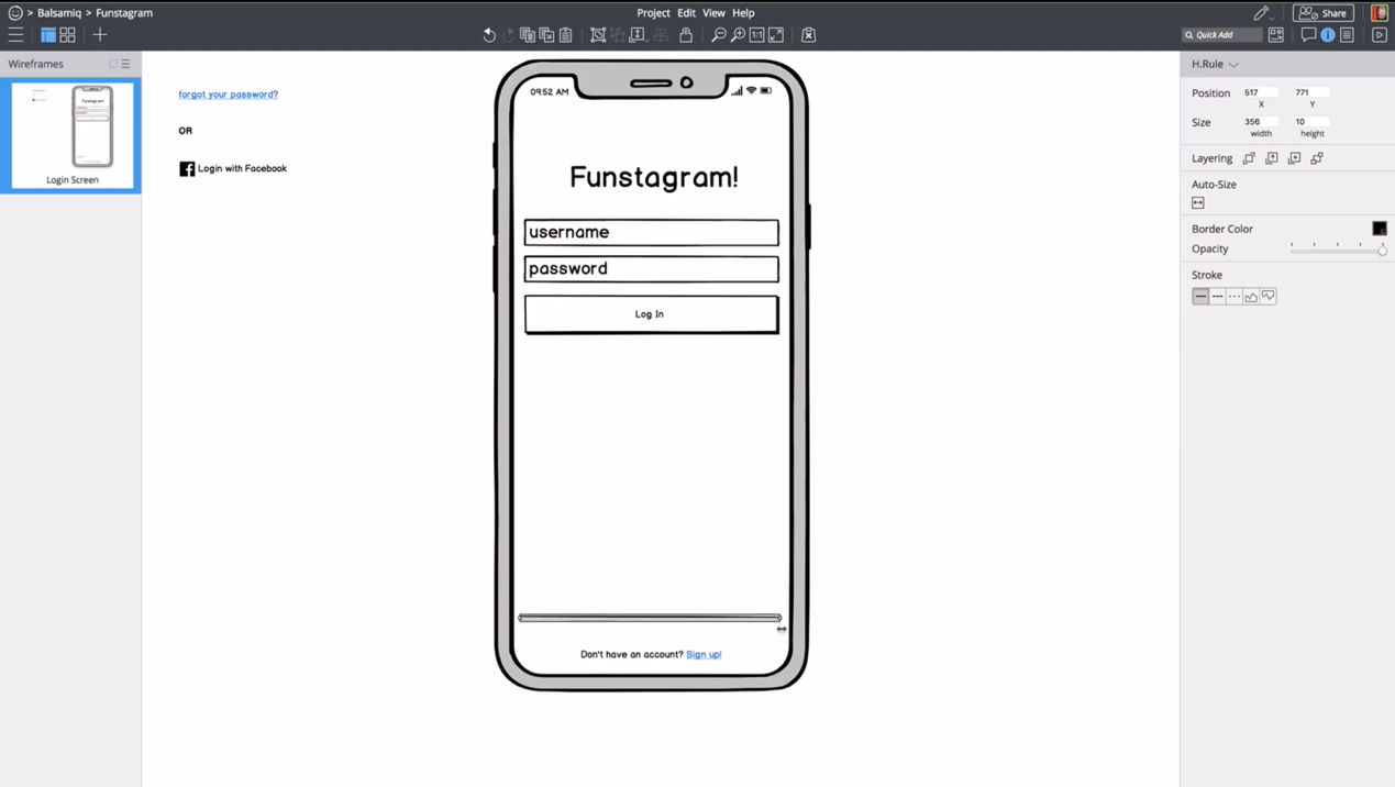
Wireframing apps such as Balsamiq, shown above, allow you to create quick illustrations of your app or website.
© Balsamiq, Fair Use.
Wireframes are simple, bare-bones illustrations of your app or website. They allow you to ignore the visual and interactive aspects of your prototype and focus on content structure and functionality. Technically, paper prototypes (which we mention above) are low-fidelity wireframes. But for our purposes here, we refer to digital wireframes when we say “wireframe”.
Pros and Cons of Wireframes
Pros of wireframes
You can quickly change your wireframes, compared with higher-fidelity prototypes such as app mockups. This is because wireframes don’t contain details such as images and colors.
Wireframes let you focus on the functionality and content structure of the product. On top of that, your users will focus their feedback on functional problems, rather than visual preferences. This means you can ignore visuals, such as colors and fonts, in favor of polishing the core functions of the app.
Wireframes, compared with other low-fidelity prototypes, let you communicate the relation between different pages in your product. Users and team-mates can easily see where each page leads and what clicking each button does.
Cons of wireframes
Since wireframes are still quite bare-bones, users might struggle to understand how what you present to them works. You’ll need to let users know that they should ignore the visuals of the wireframe and instead focus on functionality and other content such as copy.
Wireframes have encouraged “lorem ipsum”, or placeholder content, in the past. This is no longer advised, since copy and images that are significantly different from your placeholders will absolutely affect the final user experience. While you don’t need to have absolutely final text or images, you should at least use a rough approximation to get any value when showing the interface to people outside your team.
When to Use Wireframes
Use wireframes slightly later in your design process, when you are ready to flesh out a few design ideas.
You may not want to use wireframes until you are ready to focus on the content, layout, information architecture and space allocation of various elements. In other words, you should not use (digital) wireframes when you are in the divergent stages of your design process if they slow you down. In the divergent stages—where you want to create as many ideas as possible—sketching might be a lower-friction method for testing out ideas. However, wireframing applications have gotten good enough that some folks can generate ideas just as quickly digitally as they can with pencil and paper.
Use wireframes when you are ready to think about topics such as how to create optimal user flows, what kinds of templates you should use for various screens and pages and how much space to allocate various elements on a screen.
Best Practices and Tips for Wireframes
Use wireframes to flesh out the information architecture and layout of your app, rather than focus on visual elements such as brand colors and typography.
Wireframes are great tools for you to think about which layout templates you need to create your product. Try to stick to as few layouts as you need to create a consistent experience.
Use wireframes to focus on functionality, rather than animations and other visuals.
Don’t use colors in your wireframes. If you have to, use shades of gray.
Stick to one font in your wireframes. Use different font sizes to indicate different heading levels.
Minimize placeholder copy. Your wireframes should be 100% usable, and you should therefore focus on crafting copy that will help users understand how to use your product. Use placeholder copy only in areas where you know the content will not affect usability—for example, in the body text of an article.
Download our template for best practices for digital wireframes.


Wizard of Oz Prototypes
© Interaction Design Foundation, CC BY-NC-SA 4.0
Wizard of Oz prototypes are prototypes with fake functions—for instance, where you get a team-mate to mimic complex interactions rather than code a piece of software for it. Like the Wizard of Oz in the story (who generates an ominous and deceptive appearance from behind a curtain), you are mimicking some aspects of your product. They’re a kind of low-to-medium-fidelity prototype, where the key functions are not functional at all while other aspects such as visuals are fully designed.
The idea of Wizard of Oz prototypes is to get users to believe that the prototype is fully functional, so you can test it while saving time and resources. For example, you can create a Wizard of Oz prototype for a smart assistant, where your team-mate types out responses to trick the user into thinking that the smart assistant is fully functional.
Pros and Cons of Wizard of Oz Prototypes
Pros of Wizard of Oz prototypes
You can test particularly complex parts of your design without having to build it. This allows you to validate your design before you spend more resources to implement it.
You can test future technologies easily without building a complicated prototype. This allows you to fine-tune the requirements of the technology.
Users tend to provide realistic feedback, since Wizard of Oz prototypes are more believable and interactive.
Cons of Wizard of Oz prototypes
You’ll need to spend some time to build your Wizard of Oz prototype. Since you need the user to believe that it’s fully functional, you’ll need to make it look convincingly polished.
You have to train a “wizard” who’ll simulate the responses of the system. The wizard also must be present during all tests. This means your prototype requires more time and labor.
The wizard might not act consistently throughout tests. Thus, your system might behave differently from test to test, which affects your test results. This means you’ll need to pay extra attention to train wizards and give them rules to follow.
When to Use Wizard of Oz Prototypes
Use Wizard of Oz prototypes in the late stages of the design process.
Use Wizard of Oz prototypes when you’re designing complex systems or designing for future technologies.
Wizard of Oz prototypes can also be extremely useful when prototyping any sort of voice interface or chat system where the backend would be hard to build but easy for a human to fake.
Best Practices and Tips for Wizard of Oz Prototypes
Figure out what questions you want to answer through your Wizard of Oz prototype before you begin to build it.
You can use ready-made tools such as social media, instant messaging and videos to create realistic imitations of computer interactivity. For instance, you can create a set of simple screens together with messages sent to a computer to fake the interactions of a social media website.
Prepare a set of behavior instructions for the wizard. In it, provide instructions for common and predictable scenarios so the wizard knows how to react and guide the user.
Note that the Wizard of Oz prototype doesn’t test for the reliability and accuracy of the system! Your tests will therefore not tell you how system performance failures might affect the user experience.
Download our template for best practices for Wizard of Oz prototypes.

The Take Away
Low-fidelity prototypes play an important role: they allow designers to quickly test ideas to improve the final design. We’ve looked at five common low-fidelity prototypes and their best practices. Here’s a brief summary of when you should use them:
Sketches: Use them to communicate and explore ideas early in the design process.
Paper prototypes: Use them to explore novel solutions slightly later in the design process.
Lego prototypes: Use them to explore physical products as well as build empathy through reenacting user journeys.
Wireframes: Use them to focus on content placement, information architecture and functionality.
Wizard of Oz prototypes: Use them to mimic complex systems, complex interactivity or future technologies before you spend resources to build them.
References and Where to Learn More
Jakob Nielsen, Paper Prototyping: Getting User Data Before You Code, 2003
Bill Buxton, What Sketches (and Prototypes) Are and Are Not
d.school: Wizard of Oz Prototyping
Tim Brown, Change by Design: How Design Thinking Transforms Organizations and Inspires Innovation, 2009
Images
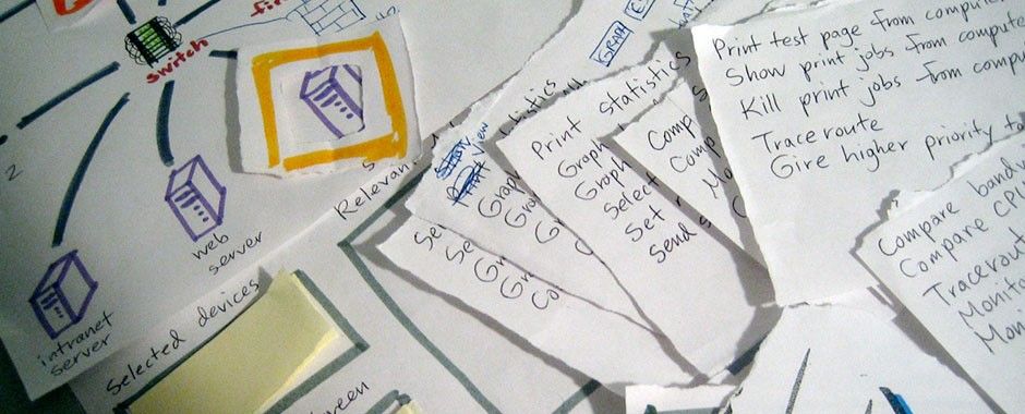
Hero Image: © Grant Hutchins, CC BY-SA 2.0
