Ideation for Design - Preparing for the Design Race

- 854 shares
- 4 years ago
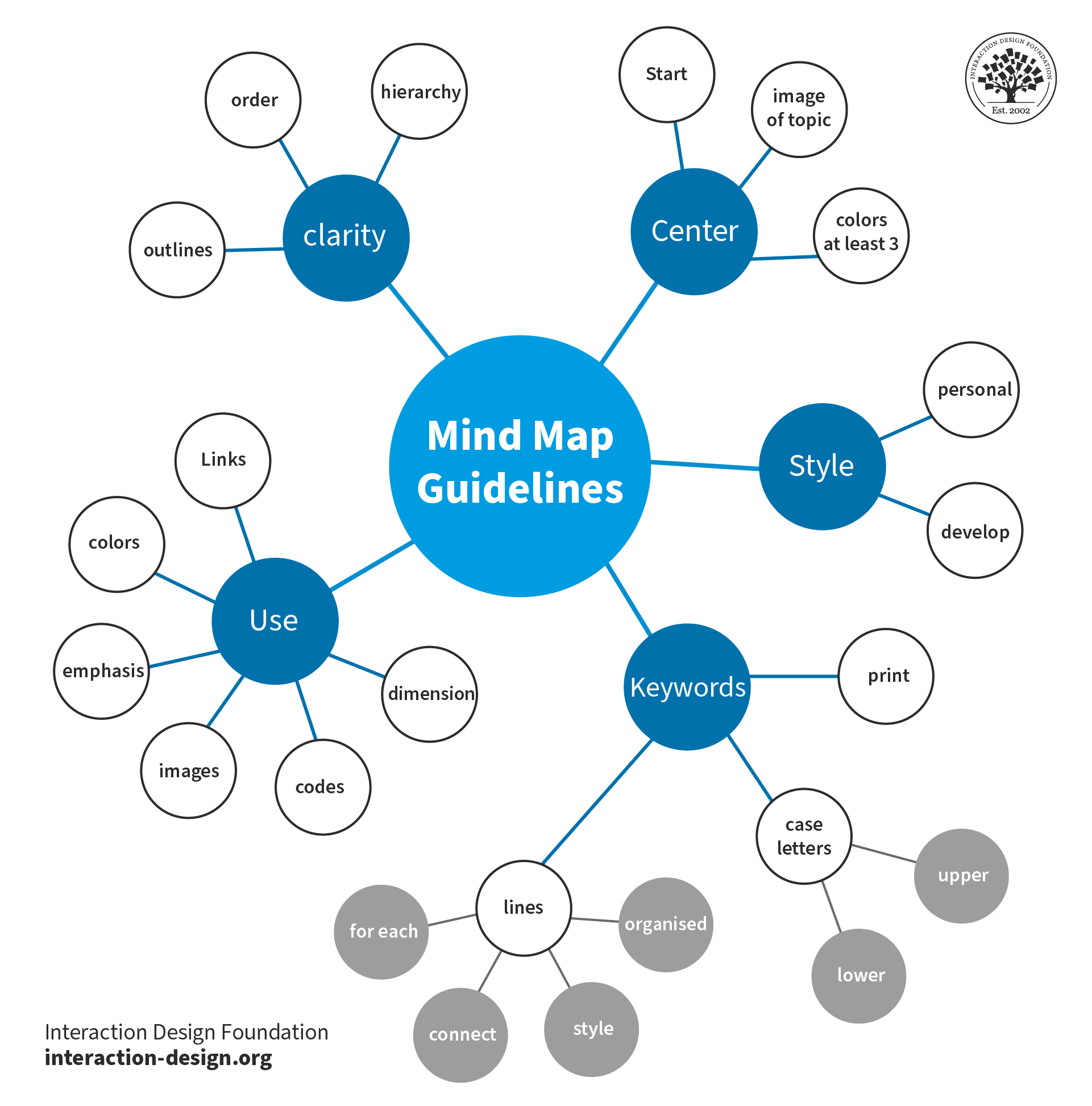
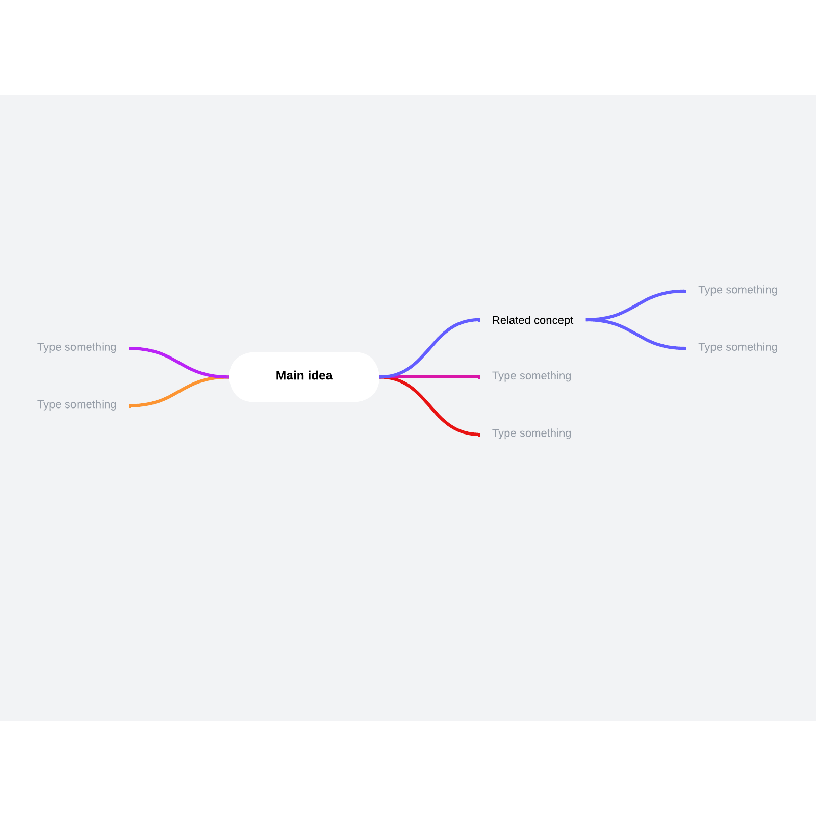
Mind maps are visual diagrams that structure information around a central idea, with linked ideas branching out. Designers use them to organize thoughts, analyze information and develop creative solutions. Mind maps give a clear structure and hierarchy of thoughts and make complex concepts easier to understand. They include a central idea, topics and subtopics showing as nodes, and branches connecting these nodes.
Mind maps are a helpful way to clearly flow out ideas and build on them.
© Nicoguaro. Copyright terms and licence: CC BY-SA 3.0
In user experience (UX) design, effective organization and a clear understanding of information are nothing short of vital for any digital product to succeed. Sure enough, designers and design teams depend on this clarity to help create user-friendly products and services. One powerful tool that designers can get working for them is a mind map. Psychology Author and Television Presenter Tony Buzan coined the term “mind mapping” in 1974 as a form of brainstorming. Mind maps—or spray diagrams or spider diagrams—give a visual representation of information. This makes it easier to navigate and comprehend complex concepts from a high level as well as in finer granularity.
Mind maps play a crucial role in UX design, project planning and many other areas—such as working with market research. They help designers organize their thoughts, analyze information and develop creative solutions from a big-picture vantage point. Such maps can also incorporate color coding and icons to help with comprehension and navigation. Here are some key reasons why these maps are important:
Mind maps are tools that empower designers to visually structure information and organize it in a clear way. When designers set out their ideas and concepts in a hierarchical style, they can easily achieve several things: They can find relationships, prioritize information and create logical flows within their designs. This improves the overall organization—as well as the clarity of the UX design process.
These maps stimulate creative thinking and problem-solving. That’s because they let designers get out and explore different possibilities and connections. When designers visually map out ideas, they can start building up new insights, identify patterns and uncover innovative solutions to the design challenges that are facing them. The visual nature of mind maps encourages out-of-the-box thinking—and it helps the design team generate creative ideas in their brainstorming sessions.
Author and Human-Computer Interaction Expert, Professor Alan Dix explains thinking outside the box in this video:
You've probably all heard that phrase 'thinking out of the box'. Everyone tells you, 'Think out of the box.' And it sounds so easy, and yet it's so difficult. If we're talking about theory and creativity, then we've got to think about *de Bono and lateral thinking*. So, if you're thinking out of the box, then lateral thinking is almost, not quite but almost, the same thing in different words.
And this idea of doing things that are breaking the mold, that are not following a line obviously covers a lot of creativity techniques, but particularly lateral thinking, de Bono's lateral thinking. The idea there is you've got, wherever you are, you've got your problem; you've got your start point. *Linear thinking*, in de Bono's terms, is very much about trying to follow the standard path, going along. So, if you're doing mathematics, you might pull the standard techniques off the shelf.
If you're writing a poem, you might be thinking line by line and thinking how each line fits and rhymes with the one before – if you're doing rhyming poetry, that is. So, it's all about following the same path of reasoning going on and on. *Lateral thinking is about trying to expand.* So, instead of following the same path of reasoning, are there *different places to start*? You know – are there different ways of thinking from the way where you are?
So, it's about trying to expand your idea of where you are outwards. So, that might be thinking of different solution strategies, so it might be thinking of different ways to start. Crucially, though, if you want to see out of the box or get out of the box, you actually often need to *see the box*. If you're literally in a cardboard box, you know you're in it. But mental boxes – you don't actually know you're in them. It's not that there's a cardboard wall and you don't go beyond it.
It's more like a hall of mirrors, so you never realize there's anything outside at all. Sometimes, *unusual examples* can help you see that. And that's, again, part of the reason for the bad ideas method, like *random metaphors* – things that, as soon as you've got something that *isn't in the box*, even if it's not a very good thing, it helps you to realize because you say, 'Well, *why* isn't this a good solution? Why doesn't it *work* as a solution?'
And as you answer that question about why, what you're doing is you're *naming that cardboard wall*. And once you've named the cardboard wall and you know it's there, you can start to think of what might be outside of that box but perhaps is a better solution. If you think about some of the analytic method— combining those, those are about building a map of the territory, which is very much about naming the box, naming the walls, naming the boundaries, and by naming them, by seeing from a distance what is there,
being able to then think of alternative solutions that are completely different. So, both alternative solutions help you to see the territory, help you to see the box. Of course, by seeing the box, that gives you the potential to have alternative solutions and actually you can iterate back and forth between those and hopefully build a better understanding of what is there and what is constraining you. If you understand what's constraining you, then you can start to break those constraints.
The maps serve as effective communication tools. They enable designers to present complex information in a simple and visually appealing format that’s easy to understand for other team members—some of whom may not be as much of visual designers. These maps make it easier for design team members to collaborate more effectively—along with stakeholders and clients—since they give a shared understanding of design concepts and project goals. Mind maps are deliverables that are really easy for design teams to share, review and modify—ideal for a design process that’s truly collaborative and iterative.
Mind maps help designers gain a deeper understanding of the users' needs, goals and preferences. As designers organize user research findings and insights this way, they can identify user patterns, customer touchpoints, pain points and motivations. This understanding informs the design process early on—and long before usability tests of the mobile apps that teams might design, for example. It enables designers to create user-centered experiences in digital products and services that meet their users' expectations and goals.
These maps can work as a powerful aid in project management since they give a visual overview of the design process. Designers can use mind maps to plan and track project milestones, allocate resources and set their priorities. The visual representation of tasks and timelines like this helps streamline the project management process. This streamlining goes a long way to making sure of an efficient workflow and the timely delivery of design projects.
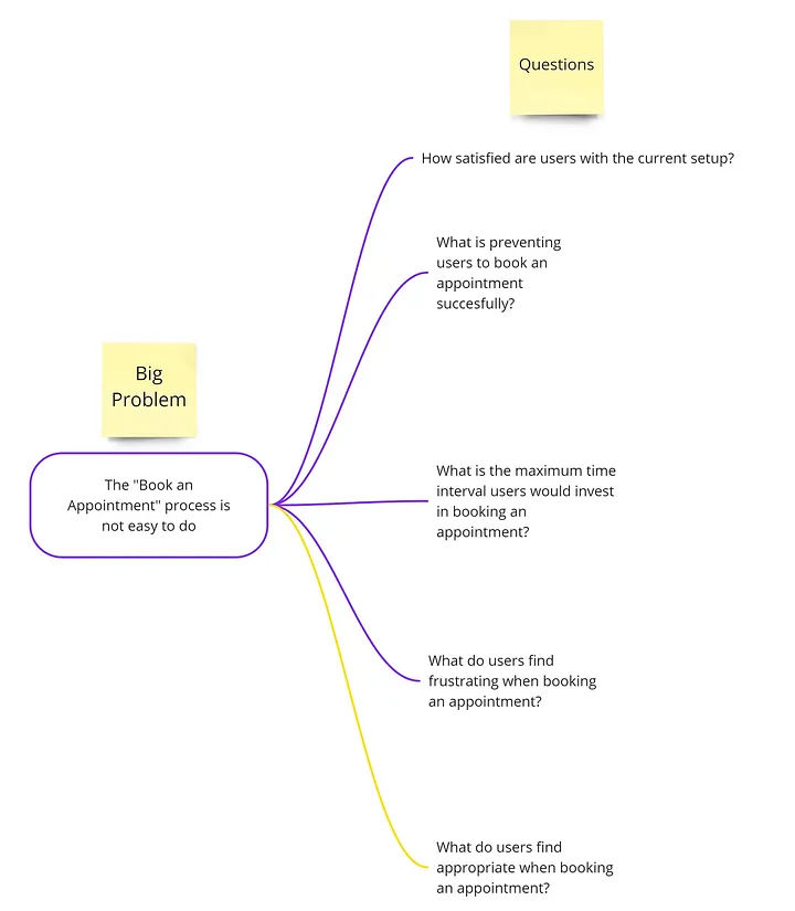
This mind map presents a big problem or main idea for a design team to address with questions.
© Magda Mihalache, Fair Use
Designers can employ mind maps at various stages of the design process to organize information, generate ideas and structure designs. Designers can follow this step-by-step process where they:
1. Define the central idea or main topic of the mind map. This should be a concise and clear statement that encapsulates the purpose or objective of the design project.
2. Identify key themes and subtopics related to the central idea. These can be broad categories or specific areas of focus within the design project.
3. Create nodes for each key theme or subtopic. These nodes will serve as the main branches that stem out from the central idea.
4. Add branches that connect each node to the central idea. These branches represent the relationships between the main topic and the subtopics.
5. Expand subtopics to make them more detailed. For each subtopic, designers further expand the map when they put in additional nodes and branches. These represent more specific ideas, concepts or features related to each subtopic.
6. Use color coding and icons to improve how visually clear the mind map is. Designers assign different colors to different themes or subtopics, and they use icons to represent specific ideas or concepts.
7. Review and refine the mind map to make sure that it accurately represents the information and relationships the designers want to show. They should refine the structure, wording and visual elements—as needed—to improve clarity and readability.
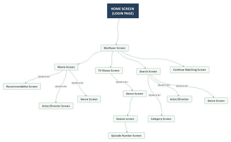
This mind map represents the workings of Netflix’s UI, as well as the flow involved when a user logs onto the app or website.
© EdrawMind, Fair Use
Designers can follow some best practices for mind mapping techniques, such as these:
Use concise and clear wording for nodes and branches. Avoid lengthy descriptions or complex language that may keep users from understanding properly.
Incorporate icons, symbols and images to boost the visual appeal of and how well people will understand the map. Visual elements can help carry information more effectively and engage viewers that much better.
Arrange nodes and branches in a logical and hierarchical order. Be sure to put the most important information in a position that’s prominent. Information that’s set out like this makes sure that the most crucial concepts and ideas are easy for team members and stakeholders to access and understand.
The map is there to develop; so, it’s vital to allow for flexibility and creativity in it. Encourage the exploration of different ideas and connections—even if they seem unconventional at first. These maps are a tool to help generate innovative solutions and think outside the box.
Mind maps aren’t static. The idea is that they evolve and adapt as the design process moves forward. Designers should continue to review, refine and update mind maps whenever new insights and ideas come to the surface.
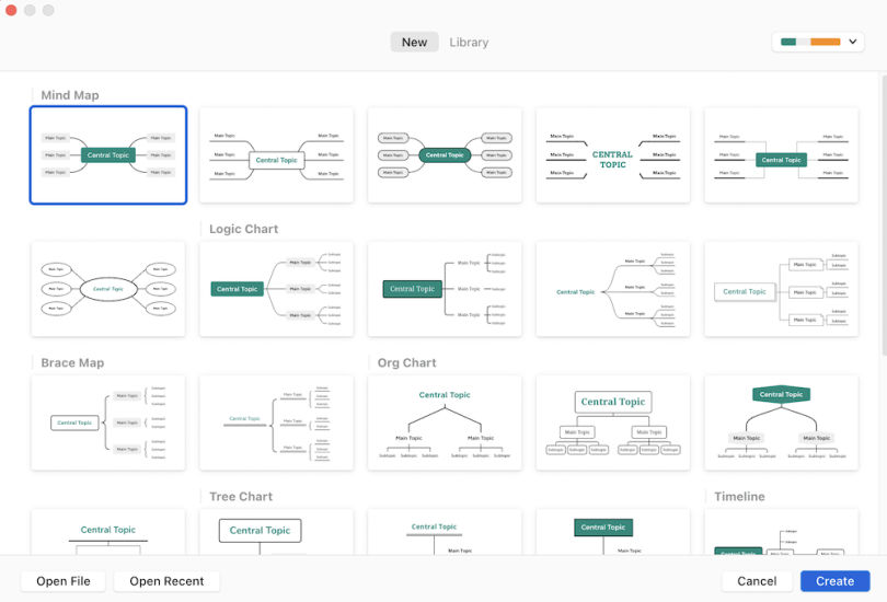
Here—and in no particular order—are some of the best programs that UX designers commonly use:
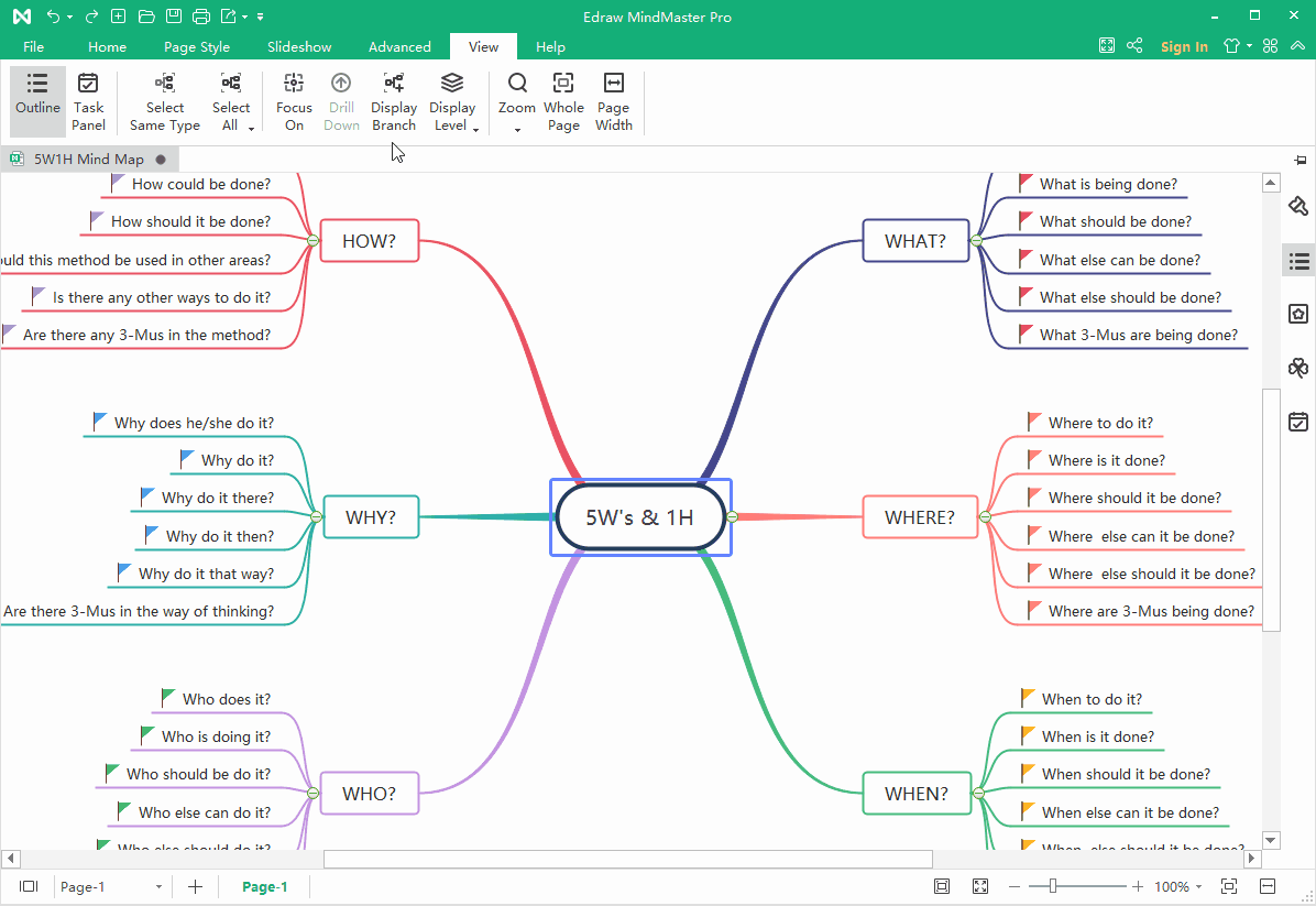
1. MindMeister: a popular online mind mapping tool that offers a user-friendly interface and collaborative features. It allows for easy creation, editing and sharing of mind maps—making it suitable for team collaboration.
A MindMeister mind map diagrams a launch meeting.
© MindMeister, Fair Use
2. XMind: a versatile mind mapping software that offers a range of features. These include various templates, advanced brainstorming tools, as well as seamless integration with other productivity tools.
XMind supports diagram formats in addition to mind maps, such as logic charts, brace maps, org charts and tree charts.
© Built In, Fair Use
3. EdrawMind: a full-featured cross-platform tool for mind mapping, brainstorming, outlining and presentation.
This EdrawMind map displays branches.
© EdrawMind, Fair Use
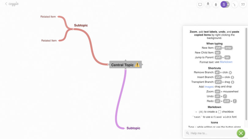
4. Coggle: a web-based mind mapping tool that provides a simple and intuitive interface. It offers real-time collaboration, customizable themes and the ability to add images and links to mind maps.
A work-in-progress Coggle mind map; the quick-keys guide is open (right-hand side).
© Built In, Fair Use
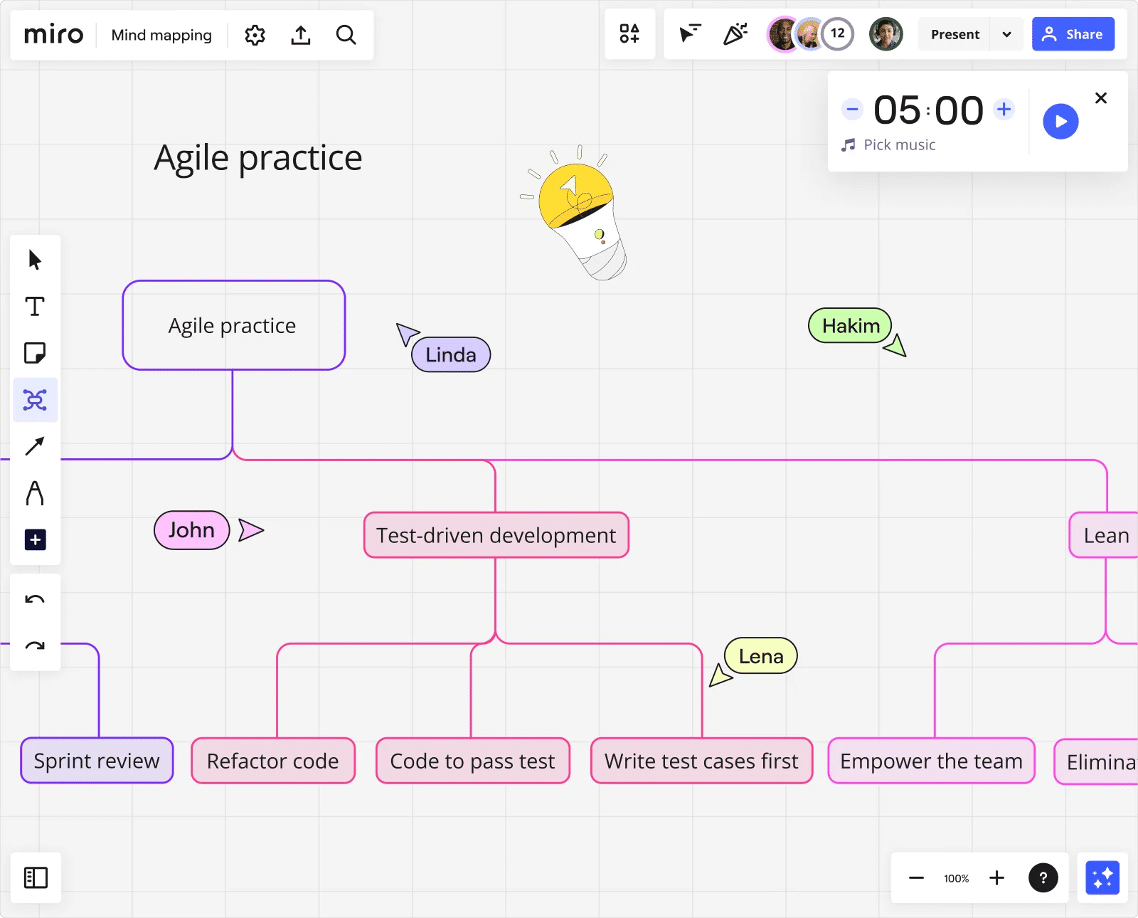
5. Miro: a digital collaboration platform that offers a wide range of tools, including mind mapping. It provides a collaborative workspace where teams can create, edit and share mind maps in real-time.
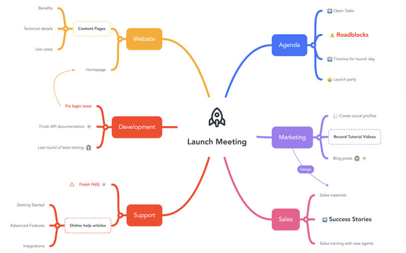
This Miro mind map charts processes and sub-processes in Agile software development.
© Miro, Fair Use
6. Lucidchart: a cloud-based diagramming tool that includes mind mapping functionality. It offers a drag-and-drop interface, collaboration features and integrations with other popular tools.
This template from Lucidchart can help designers and teams grow and flow ideas.
© Lucidchart, Fair Use
It’s important for designers to consider several factors when they select a mind mapping software program. These include ease of use, collaboration features, customization options and integration capabilities with other tools that they use in their design process.
Such maps can take various forms and have uses in a multitude of contexts. Here are some examples used in UX design:
A mind map can visually represent the user's journey through a product or service. It can highlight key touchpoints, pain points and opportunities for improvement. User journey maps and customer journey maps are important UX deliverables in any case—so, it’s valuable to have this visualization in place early on.
CEO of Experience Dynamics, Frank Spillers explains how to map a user journey for a service in this video:
I wanted to just spend a little bit of time on the *user journey*. So, we can see how important user research is to creating really compelling value propositions and creating value for organizations that are trying to use service design to innovate, improve, streamline and smooth out. Well, there's nothing better to tackle that with than the user journey.
I wanted to just spend a little bit of time on this technique in case you didn't have that much experience with it or maybe you were doing journeys in a way that was different to the way I'm going to present to you. At least, I just wanted to share a template with you that can give you better access to what you're looking for. For me, now, a journey is something that you *build on*. So, first off it's your *customer journey*.
And on that is your service blueprint. And remember that the journey is going to reveal those cross-channel like, say, *breakpoints*, *pain points*, *disconnects* that you can map in the different *swim lane diagrams* – is the official term for a journey map. So, it comes from that – these swim lanes. And so, you'll have like maybe your channels here – you know – you'll have your user tasks here, pains and gains, or you can just have positive (+) or negative (-).
And I tend to change my user journeys, try and improve them, try and improve them. One of the problems that I find with journey maps – and they became very popular, I think around 2010, maybe, was the heyday of user journeys – 2010 / 2012, maybe. It was all about this beautiful big visualization. Let's be clear: A customer journey map is *not* about impressing your team
with really cool, big swim diagram visualizations with tons of little icons. It's a document like all deliverables in a human-centered design perspective. It should work for the internal teams that are using it as a decision-making document *as well*. The thing about the journey map that's particularly of value to the service designer is that it's happening across time
or across stages or across goals. So, the stages of, say, the life cycle – you know – you might have Research, Compare, Purchase, then the Return shopping. In other words, it's not just the purchase. A lot of conversion optimization and approaches to selling online just focus on this part here: the compare and purchase, or the funnel – if you will – the purchase funnel. And I think it's important to have the acquisition as much as the retention.
This is the conversion here. So, these two steps are the conversion steps. It's important to have *all* those steps represented. *Happy / sad moments* – you can have a little smiley face; *disconnects and breaks* – you know – so that you're like: "Ah! This is a break right here. They're on their phone, and they're researching, but the site's not responsive or it's *partially* responsive. And then, compare – when they go to compare, it only allows three items. So, it's like "Ohh!" – and then we have a quote from the user going:
"Why does this only allow (imitated mumbling)?!" – you know – something communicating the pain point. The other thing it's going to have is your reflections from your ethnography, from your personas. It's going to have those real-world contexts, basically. Instead of basically making it up and doing it internally, you're going to base it on user data. You'll also want to have *recommendations*. So, down here at the bottom you can have a list of recommendations
as well. This is an example of a journey map we created. And you can see the touch points we've added along the way. So, we have these different stages. We've got this – as the user walks through. So, we have Pre-apply, Apply, Post-apply. This is an online application journey. And we have the various channels that are occurring there. We've got the pain points represented. And the steps are:
Discover, Research, Apply, Manage and Dream. Discover was important because a lot of people didn't know that the offers were there. This is for getting an account. And basically the value proposition is you're going to have these offers – targeted offers – sent to you. So, the key is to find out how people are currently applying and at what stage makes sense to offer them these upsells, basically. And that's the value add that's being offered here.
A mind map can help organize information and define the structure of a website or application. It can show the hierarchy of pages and their relationships. As such, it can serve as a kind of foundation or wireframe for what the design team have got in mind.
A mind map is an excellent tool to brainstorm with and explore different design concepts. As it facilitates such levels of creativity, it frees a design team to generate and organize ideas for a new product or feature.
Watch our video on brainstorming for insights into this powerful group activity:
Brainstorming is a group activity where people come together to share ideas and think creatively to solve problems or generate new concepts. The goal is to encourage free thinking and creativity without judgment or criticism, allowing participants to share any idea that comes to mind no matter how unconventional or seemingly impractical. The aim is to *spark creativity and explore various possibilities* which can later be refined or combined to develop more practical or innovative solutions.
Brainstorming sessions often involve structured or unstructured discussions, note-taking or visual aids to capture and organize the ideas generated by the group. So, how can you structure a brainstorming session? Define the goal. Clearly outline the problem or objective. Create a diverse group. Gather people with varied perspectives. Encourage participation and free thinking. Generate ideas without criticism. Build on ideas. Combine, refine or expand on suggested thoughts. Set a time limit. Keep the session focused and efficient.
And lastly, document and evaluate. Record all ideas and assess their feasibility later. You can spend some time after the session to categorize, reduce and analyze.
A mind map can help a design team plan and organize content for a website or application. It maps out the various sections, pages and content types—such as the best material for a landing page.
The versatility of mind maps lets designers adapt them to their specific design needs and objectives. In a similar way to how user personas help bring qualities and needs of a target audience to the surface for the design team to work with, mind maps help bring ideas to life for designers and developers and others associated with a project.
Remember the power of UX design mind maps as tools to foster collaboration regarding how to understand potential customers, feel out content ideas for ideal customers and users, identify types of content that best suit business goals—and much more. Mind mapping for design thinking is particularly effective, and it’s important to leverage mind map templates. With the right map, a team can drive innovation and help create user-centered design experiences and product designs that truly resonate with their target audience.
Take our course on Design Thinking: The Ultimate Guide.
Consult our piece The Principles of Information Visualization for Basic Network Data.
Read Figma’s resource How to Mind Map for additional information.
Consult 20 Best Mind Mapping Software For Visual Collaboration In 2024 by Ben Aston for more insights.
Read A mind map for gaining clarity in UX research by Magda Mihalache for further details.
When designers create mind maps, they often run into several challenges. These tend to include information overload, organizing complex data and making sure that productive collaboration happens. So as to address information overload, designers prioritize data by focusing on the most critical user needs and design objectives. This approach helps in filtering out less relevant information and maintaining clarity within the mind map. To organize complex data effectively, designers use colors, symbols and branches so they can categorize and link related ideas. This visual differentiation helps to navigate the mind map—and highlights relationships between different concepts. For instance, to use distinct colors for different user groups or design elements can make the map easier to understand at a glance.
To make sure that fruitful collaboration among team members occurs can also pose a challenge, and that’s especially so in remote settings. Designers tackle this by using digital mind mapping tools that allow for real-time collaboration. These tools empower team members to contribute simultaneously, share insights and provide feedback—which ensures that the mind map does indeed reflect a collective understanding of the project.
See more about brainstorming in our video:
Brainstorming is a group activity where people come together to share ideas and think creatively to solve problems or generate new concepts. The goal is to encourage free thinking and creativity without judgment or criticism, allowing participants to share any idea that comes to mind no matter how unconventional or seemingly impractical. The aim is to *spark creativity and explore various possibilities* which can later be refined or combined to develop more practical or innovative solutions.
Brainstorming sessions often involve structured or unstructured discussions, note-taking or visual aids to capture and organize the ideas generated by the group. So, how can you structure a brainstorming session? Define the goal. Clearly outline the problem or objective. Create a diverse group. Gather people with varied perspectives. Encourage participation and free thinking. Generate ideas without criticism. Build on ideas. Combine, refine or expand on suggested thoughts. Set a time limit. Keep the session focused and efficient.
And lastly, document and evaluate. Record all ideas and assess their feasibility later. You can spend some time after the session to categorize, reduce and analyze.
To start a mind map for a UX project, first, choose a central idea or concept related to the project. Write this idea at the center of a blank page or digital canvas. From there, draw branches that represent main categories or themes related to your central idea. These could be user needs, design elements or functionalities. For each main category, extend further branches to break down the categories into more specific aspects or tasks. Remember to keep your mind map clear and organized—use colors, icons or symbols to categorize or prioritize information. This visual organization helps you and others spot relationships between different elements of the project and nurtures creative solutions. Finally, make sure you review your mind map and update it as your project keeps evolving. This dynamic tool adapts to the changing needs and insights of your UX project. That makes it an invaluable resource for brainstorming, planning and communication among team members.
Take our Master Class Harness Your Creativity To Design Better Products with Author and Human-Computer Interactivity Expert, Professor Alan Dix.
Mind maps serve as powerful tools for understanding user needs in UX design. As mind maps visually organize thoughts and ideas, they let designers see connections and patterns that mightn’t be obvious at first glance. When you create a mind map, you start with the user at the center—and from there, branch out to different aspects of their experience, such as challenges, motivations and goals. This method highlights the hierarchy and relationship between different user needs—and so makes it easier to prioritize them in the design process.
What’s more, mind maps make collaboration easier among team members. They provide a clear and accessible overview of user needs. Plus, they make sure everyone understands the user perspective. This shared understanding helps with generating more targeted and creative solutions. Another point is that mind maps are adaptable. As new insights emerge from user research, you can easily update them, and so make sure the design process remains user-centered. Overall, mind maps are invaluable for distilling complex user data into a cohesive understanding—which guides the design process towards more intuitive and user-friendly solutions. So, they can serve as valuable deliverables within case studies where teams have worked their way towards winning design solutions.
Take our Master Class A Guide To Hassle-Free Designer-Developer Collaboration with Szymon Adamiak, Co-Founder, Hype4 Mobile.
In UX design, colors and images play crucial roles in enhancing mind maps. That makes them not just more visually appealing but more effective as tools for communication and idea organization, too. Colors help to categorize and prioritize information—letting designers quickly differentiate between various themes or concepts at a glance. For instance, if designers use a distinct color for each user need or design challenge, it makes it easier to identify and focus on specific areas of interest.
Images, on the other hand, serve as visual shorthand. They enable designers to represent ideas quickly and intuitively. They can symbolize complex concepts or emotions that might take longer to describe with words. So, they speed up the understanding and brainstorming process. What’s more, the use of images makes mind maps more memorable and engaging. That can be particularly useful in collaborative settings, and make sure that key insights stand out and that team members or stakeholders won’t overlook them.
Together, colors and images transform mind maps from simple outlines into dynamic, informative and inspiring visual tools. They make for deeper understanding and creativity; plus, they help UX designers to effectively explore and address user needs, while also nurturing a more collaborative and inclusive design process.
Arielle Eckstut, Author and Co-Founder of The Book Doctors and LittleMissMatched, and Joann Eckstut, Color Consultant and Founder - The Roomworks, explain color and its importance in this video:
Hi. My name is Arielle Eckstut, and I am the author of What Is Color? 50 Questions and Answers on the Science of Color. Color is an incredibly difficult subject, one that encompasses all kinds of categories of science and history and culture – you name it.
But today in about five minutes I'm going to try to answer this question: What is color? And I'm going to do that by starting with yet another question. In the fall, do the leaves change color if no one is there to see them? Take a moment to think about that: Do the leaves change color if no one is there to see them? Now, the *obvious answer* to this question is "Of course they change color
because the color of the leaves are inherent to the leaves themselves." But in fact, that is not true at all, and the answer is a resounding *no*. If there is not a living being with a brain observing those leaves, the leaves do not change color. And the reason for this is that there's no such thing as color without the *eyes* and the *brain*.
So, different brains process visual information differently. And I realized that this idea that color does not exist outside of our perception can be very difficult to swallow. And in fact, our brains go to great lengths to give us all of the colors that we see.
The source of our color vision is in our *retina*, a credit-card-thin sheet of neurons in the back of our eyeballs. And it's actually a part of our brain, our retina. It's the only part of our brain that exists outside of our skulls. And our retina is what we typically associate with sight in general. If I were to ask you, "Why do we have eyes?" most people would say, "So we can see."
But that was actually not the original purpose of our eyes and our retina. The original purpose was to tell us when to be awake and when to be asleep. So, our eyes sensed when it was light out and when it was dark out, and "when" is the most important word here because our eyes, our retinas have three different systems:
the *when system* being the most primitive and the first use of our eyes. The next system is the *where system*, and that tells us where we are situated in the world. Are we right at the edge of a cliff? Are we too close to a potential predator? Or are we too far to reach a berry that is ripe that we would like to eat?
Lastly, we get to our *what system* – the system that designers deal with on a daily basis but the one that is actually *least important* to our visual system. The what system is the system that we use when we are *focusing on something*, whether that be a computer screen or a phone or a face or a road sign. It's also the system that we use to see color.
Color scientist Mark Rea has a great quote that I adore: "Color is a pigment of our imagination." And that really is true. Our imagination plays such a big role when it comes to color. And our brains are constantly taking in information from the outside world to help inform us about what time of day it is, where we are in the world, what we're looking at,
which really gets us to the next question, which is: Why do we see color to begin with?
Take our Master Class How To Use Color Theory To Enhance Your Design with Arielle Eckstut and Joann Eckstut.
To convert a mind map into a UX design prototype is something that takes a few structured steps. First, review your mind map to identify the main user needs and design concepts. These elements form the backbone of your prototype, and guide the layout and functionality.
Next, prioritize the features or ideas in your mind map based on user needs and project goals. This step helps you decide what to include in the initial prototype. Begin sketching wireframes or using digital tools to create basic layouts that represent your prioritized ideas. These wireframes serve as the visual blueprint for your prototype—and they show how users are going to interact with the design.
After you sketch, select a prototyping tool that suits your project needs. Transfer your wireframe sketches into the tool, refining them into interactive prototypes. At this stage, focus on usability and user flow rather than detailed aesthetics.
Finally, test your prototype with users so you can get and gather feedback. Use insights from this testing to refine your design—and iterate until it meets user needs effectively. This process turns the abstract ideas in your mind map into a tangible and user-centered design prototype, ready for further development.
Professor Alan Dix explains the importance of and need for prototyping in this video:
So, why do you need prototyping? Well, we never get things right first time. It's about getting things *better* when they're not perfect and also *starting in a good place*. Maybe if I'm going to make a wall for a house, I know exactly how big the wall should be. I can work out how many bricks I need. I can make it exactly the right size.
So, I can get it right first time. It's important to. I don't want to knock the wall down and retry it several times. However, there I have a very clear idea of what I'm actually creating. With people involved, when you're designing something for people, people are not quite as predictable as brick walls. So, we *don't* get things right first time. So, there's a sort of classic cycle – you design something, you prototype it,
and that prototyping might be, you might sort of get a pad of paper out and start to sketch your design of what your interface is going to be like and talk through it with somebody. That might be your prototype. It might be making something out of blue foam or out of cardboard. Or it might be actually creating something on a device that isn't the final system but is a "make-do" version, something that will help people understand.
But, anyway, you make some sort of prototype. You give it to real users. You talk to the real users who are likely to be using that about it. You evaluate that prototype. You find out what's wrong. You redesign it. You fix the bugs. You fix the problems. You mend the prototype, or you make a different prototype. Perhaps you make a better prototype, a higher-fidelity prototype – one that's closer to the real thing. You test it again, evaluate it with people, round and round and round. Eventually, you decide it's good enough. "Good enough" probably doesn't mean "perfect", because we're not going to get things perfect, ever.
But "good enough" – and then you decide you're going to ship it. That's the story. In certain cases in web interfaces, you might actually release what in the past might have been thought of as "a prototype" because you know you can fix it, and there might not be an end point to this. So, you might in delivering something – and this is true of any product, actually – when you've "finished" it, you haven't really finished, because you'll see other problems with it, and you might update it
and create new versions and create updates. So, in some sense, this process never stops. In one way, it's easy to get so caught up with this *iteration* – that is an essential thing – that you can forget about actually designing it well in the first place. Now, that seems like a silly thing to say, but it is easy to do that. You know you're going to iterate anyhow. So, you try something – and there are sometimes good reasons for doing this –
you might have *so little* understanding of a domain that you try something out to start with. However, then what you're doing is creating a *technology probe*. You're doing something in order to find out. Of course, what's easy then to think about is to treat that as if it was your first prototype – to try and make it better and better and better. The trouble is – if it didn't start good, it might not end up very good at the end, despite iteration. And the reason for that is a phenomenon that's called *local maxima*.
So, what I've got here is a picture. You can imagine this is a sort of terrain somewhere. And one way to get to somewhere high if you're dumped in the middle of a mountainous place – if you just keep walking uphill, you'll end up somewhere high. And, actually, you can do the opposite as well. If you're stuck in the mountains and you want to get down, the obvious thing is to walk downhill. And sometimes that works, and sometimes you get stuck in a gully somewhere. So, imagine we're starting at this position over on the left. You start to walk uphill and you walk uphill and you walk uphill.
And, eventually, you get onto the top of that little knoll there. It wasn't very high. Now, of course, if you'd started on the right of this picture, near the *big* mountain, and you go uphill and you go uphill and you go uphill and you get uphill, you eventually end up at the top of the big mountain. Now, that's true of mountains – that's fairly obvious. It's also true of user interfaces. *If you start off* with a really dreadful design and you fix the obvious errors,
*then you end up* with something that's probably still pretty dreadful. If you start off with something that's in the right area to start with, you do better. So, the example I've put on the slide is the Malverns. The Malverns are a set of hills in the middle of the UK – somewhere to the southwest of Birmingham. And the highest point in these hills is about 900 feet. But there's nothing higher than that for miles and miles and miles and miles.
So, it is the highest point, but it's not *the* highest point, certainly in Britain, let alone the world. If you want to go really high, you want to go to Switzerland and climb up the Matterhorn or to Tibet and go up Mount Everest, up in the Himalayas, you'll start somewhere better, right? So, if you start – or on the island I live on, on Tiree, the highest point is 120 meters. So, if you start on Tiree and keep on walking upwards, you don't get very high.
You need to start in the *right* sort of area, and similarly with a user interface, you need to start with the *right* kind of system. So, there are two things you need for an iterative process. You need a *very good starting point*. It doesn't have to be the best interface to start with, but it has to be in the right area. It has to be something that when you improve it, it will get really good. And also – and this is sort of obvious but actually is easy to get wrong – you need to understand *what's wrong*. So, when you evaluate something, you really need to understand the problem.
Otherwise, what you do is you just try something to "fix the obvious problem" and end up maybe not even fixing the problem but certainly potentially breaking other things as well, making it worse. So, just like if you're trying to climb mountains, you need to start off in a good area. Start off in the Himalayas, not on Tiree. You also need to know which direction is up.
If you just walk in random directions, you won't end up in a very high place. If you keep walking uphill, you will. So, you need to *understand where to start* and *understand which way is up*. For prototyping your user interface, you need a *really rich understanding* of *your users*, of the nature of *design*, of the nature of the *technology* you're using, in order to start in a good place. Then, when you evaluate things with people,
you need to try and *really deeply* understand what's going on with them in order to actually *make things better* and possibly even to get to a point where you stand back and think: "Actually, all these little changes I'm making are not making really a sufficient difference at all. I'm going around in circles." Sometimes, you have to stand right back and make a *radical change* to your design. That's a bit like I'm climbing up a mountain
and I've suddenly realized that I've got stuck up a little peak. And I look out over there, and there's a bigger place. And I might have to go downhill and start again somewhere else. So, iteration is absolutely crucial. You won't get things right first time. You *alway*s need to iterate. So, prototyping – all sorts of prototypes, from paper prototypes to really running code – is very, very important. However, *crucial to design is having a deep and thorough understanding of your users*,
*a deep and thorough understanding of your technology and how you put them together*.
Mind maps greatly support the making of these since they give a visual framework to organize and analyze research data about potential users. When you start with a central concept—like a specific user group or project goal—you can branch out to include various characteristics of your target users. These branches can represent demographics, behaviors, needs, goals, frustrations and preferences.
As you add layers to the mind map, you categorize and connect different pieces of information. That helps you identify patterns and insights. This process makes it easier to see the common traits among potential users, and it guides you as you create detailed and accurate user personas. These personas then act as reference points for design decisions, and ensure that the product meets the real needs of its users.
Watch this video as UX Strategist and Consultant, William Hudson explains the significance of user personas in design:
Personas are representations of our *users*. They promote empathy by allowing us to focus on individuals rather than groups. It's this whole issue of empathy. We keep talking about "users". And even just talking about the *roles* like "customers" or "clerk" or "salesperson" doesn't make these roles seem real. It doesn't. We're not talking about real people. Real people have limited abilities.
Real people don't necessarily get computers in the same way that the development team does. Real people have needs that have been brought up by their circumstances or by their own personal beliefs. So, we need to know a bit *about* them. And personas are a great way of representing those understandings in the design of a real system. So, there is strong psychological evidence for *personal bias*. Our brains are wired to *empathize with individuals rather than groups*. The general feeling is that when we dehumanize people by referring to them
with these abstract collective nouns – because collective nouns *are* abstract by definition, so we're talking about "users" or we're talking about "customers" – we're taking the "people" away. We need to put the "people" back. Back in 1983, David Sears ran a study with two sets of participants. He gave the participants the same characteristics. And in one set of participants he said that these characteristics were of
*an individual*. And I believe he described the individual. And in the other set participants he said that these characteristics were of *a group of people*. And the participants who were told that they were seeing the characteristics of an individual *always rated the individual more highly* than the participants who rated the characteristics in connection with a group. So, that he called the *person-positivity bias*. And it basically is confirmation that our brains
– us as individuals – *prefer thinking about other individuals*. We're certainly more inclined to think more positively about other individuals than we are about collective nouns like "tourists" or "customers" or "users". The *scope-severity paradox* is a much more recent piece of work – 2010 – and is quite surprising. Two researchers, Nordgren and McDonnell, established that reactions to a fraud were more severe when it was presented with three victims rather than 30. So, it's the same kind of deal: two sets of participants,
both given exactly the same details of a crime, except that in one group they were told it affected three people and the other group were told it affected 30 people. And it was the people who were told that there were only three victims that thought that the crime was more severe. And they, on average, added a year on the prison sentence that the perpetrators of this crime should receive. So, again, that is just confirming this tendency for us to feel more strongly about individuals than we do about groups.
Personas are fabrications *based on research*. We mustn't let go or lose sight of that little parenthetical expression there, because we go out and we find out who these people are – the ones that we're interested in – find out what behaviors they have which drive them to need our solution, what motivations, what their circumstances are, what their contexts of use are,
just so we understand who we're building the solution for and other aspects that we describe in the context of use. These personas are representations of our users, who represent the goals, behaviors and motivations of those real users. They *promote empathy* by allowing us to *focus on individuals rather than groups*. So, instead of talking about "User Community One" or whatever catchy name we'd like to come up with for our user communities, we start talking about "Bob"
or "Jane" or "Elizabeth" – whoever – whatever everybody in the team is happy with. And there have been all kinds of documents and papers and studies written about personas. And you'll find that personas range from quite a limited description of a person. And, in fact, it can be just as little as changing the name "users" to a person's name. So, if you always refer to your customers as "Andrew", then you would actually
be doing yourselves a favor in terms of making that customer seem much more real. But at the other extreme it's not uncommon to hear about user research and persona development taking *weeks* – possibly even months: 2–3 months, which is, in my view and and quite a few others', certainly for an Agile environment well beyond the realms of possibility. So, we're going to be talking about something called a *minimal persona*. So, minimal persona – a name, age and other specific demographic details that a real person
would have. A photo – ideally realistic – showing the person in that setting or doing that thing. And then, basic information about why you're interested in them or why they're interested in us – our solution or product. So, their *primary goals*: *why* those are their primary goals and *what* they're hoping to achieve through our solution or product. And their *behaviors* – what are they doing before and after interaction with our solutions
fit with their daily routine, for example. And some of this comes from the fact that I have for years been astounded by how little the people developing software solutions know about their users. I've been involved in a couple of projects where there was no contact whatever. The development team had never met or seen a user, didn't know what the user was doing immediately prior to entering or receiving data from their system, didn't know what happened to the output data, knew almost nothing.
So, it wasn't surprising that the system when it was first launched was almost impossible to use, because it didn't actually fit. It was like having a random piece of a jigsaw puzzle and a very well-defined hole that it just did not slip into. So, these are the reasons we're trying to actually make sure that we understand at least something about our user communities. And that's what personas are trying to help us with. *Extended personas* – you might add lifestyle interests,
hobbies, as they apply to their motivations. I wouldn't add them just to make the person seem more complete. That isn't absolutely essential. But if some of those issues – lifestyles, interests or hobbies have an impact on your solution, then you should know about them. So, *keep to the details that are relevant* to the problem. Remember that we want to *motivate our team to help* our personas, *not* to drive them crazy with distracting detail, which is one of the complaints you will hear about personas.
Certainly when I've attended conference research papers on the use of personas in teams, often they were not well-received, because there just seemed to be so much of it – the persona specification. *Credibility*: ensure that the personas are *believable* and liked *as much as possible*. Certainly do *not* give personas unpleasant or dubious habits like being a heavy drinker or a heavy smoker or likes to bet on the horses – unless, of course, you're building a gambling app or something! *Change the name, photo and other details* until the whole team is comfortable with them.
It needs to be a collaborative effort between the user experience people and the people who are going to be using them. That would be the development team. So, the names and the photos are almost entirely arbitrary. If you've done research with a handful of participants, then you'd have a handful of photos. If not, then try to find photos from a stock photo site. But try to avoid overtly attractive people because it can be distracting. In user experience, we create often what are referred to as "design research personas",
or "design personas" for short. So, that's what these things are technically called. We go out and we research these user communities. We decide what behaviors and needs are relevant to us: Who are we building the solution for? And those personas are based on this design research. So, that's why we want to call them "design research personas" or "design personas". But there are lots of other things that also get tagged with personas.
And the most common of those I've come across, particularly in large companies, are *market research personas*. And they're not the same thing is the main problem that we have. So, beware that *other kinds of personas exist*, often based on demographics or market segmentation. These can be used for *validating design personas, but should never replace them*. There is little point in trying to reuse personas for different projects, as well, unless the same goals, motivations and behaviors are relevant.
And I've come across this whole approach in one particular vertical market in the U.K. And that is mobile phone service providers – that they have all got marketing personas based on age ranges. And they then attach labels to these age ranges to suggest how these people behave and what they need from our services, which, just to be honest, cannot really be true! You need to actually *forget about the demographics*. There will be some age-related behaviors, no doubt. But they shouldn't be
the motivating factors in the design of an interactive system, which is, after all, what we're trying to achieve. The main thing is that predominantly you have *one* or *two* primary personas. If you've got a project – and I've had people kind of come up to me almost in a boasting tone, saying: "Our project has got 20–30 personas!" And I'd say, "Oh, really? How is that?" They'd say, "Well, it's a hospital system." And the thing is, it's a *very* big system. And what you need to make it agile and to make these things work effectively
is to split the system into parts. So, you may well have some small number of primary personas that apply throughout. But in many cases you're going to have primary personas that are specific to that kind of system or that part of a system. So, let me give you some very simple examples. The one that I like to use is a hotel self-check-in. When I started writing about hotel self-check-ins, there were none in existence. And now I do come across them, funnily enough, in hotels that have got receptionists but all they do then is to
refer you to the self-check-in in front of the reception! I was motivated for this example by checking in at a conference hotel on one occasion. I actually got in pretty easily. I think it was a 20- or 30-minute process. But the next day I was walking through the reception and the queue – the line – of people waiting to check into this hotel went around the block. It was just utterly amazing. There must have been 200 or 300 people waiting to get in.
So, it occurred to me: "Well, why don't we just have some self-check-ins like we do at airports?" And, of course, self-check-in at airports is entirely bog-standard these days – it's what everyone does. So, for example, the primary persona of a hotel self-check-in service must be the customer checking in. It makes no sense for it to be otherwise. A *secondary persona* would be someone who is acting in a *supporting role* inside that system. So, a secondary persona might be a hotel manager or a receptionist or somebody who's
responsible for the upkeep of the hotel, for example. So, these are all *secondary roles*. They're not the people for whom we are building the system. They are people who are *involved in* the system and often in a backroom kind of interaction. These are people that primary personas rarely see or even know about. So, it's a difference between the primary roles in a stage production and just extras or people with non-speaking parts. That is kind of the difference between primary and secondary personas.
A lot of systems may have *only one* persona. This is the person that we're building this particular product for. And you can have all kinds of philosophical arguments about whether you're building a Swiss Army knife solution or whether you're building a carving knife solution. One is very good at one thing. Carving knives are very good at carving. Swiss Army knives are very good, but in a fairly different kind of way, at *all kinds* of things.
But they're not all that easy to use. So, it's up to you. The whole point of personas is to try to *give focus*. So, these are our customers. Other people, who do not fall into the definition or the descriptions of our personas, it's fine if they find our system easy to use. But unless we can actually identify some clear purpose in adapting the system to be more inclusive, then we would deliberately not pay much attention to their particular requirements. Now, things like *accessibility* and the *age ranges* of users – they fall outside the whole persona mechanism.
You must *always make sure that your systems are usable by those with disabilities* whether that's acknowledged specifically in your persona or not. I do have at least one colleague who, if they're dealing with a team who has little experience of accessibility – that is, systems that will be used by disabled people – he deliberately includes a disabled persona. But that really ought not to be necessary. But if that works for you, then that's absolutely fine, too.
Certainly I can see it being important when working with teams that don't have much experience. So, you must make sure that your solutions work for a *broad range of people* in terms of *accessibility* and *age issues*. But otherwise, we want to be very focused on the *specific behaviors* and *needs* of our primary personas. So, we stick to small numbers to maximize empathy. And we consider splitting larger projects, as I was discussing for the hospital example. For example, a hotel check-in system could be split into front desk and housekeeping projects
with separate personas. So, those could be two smaller Agile projects. And there is no magic number. But, like I have been saying, 1 or 2 primary personas is perhaps the most common, with maybe a few secondary personas thrown in, as well. Personas get used in all sorts of places. Obviously, their main focus is in *design*. So, "Who are we building this product for? How should the interactions take place? How much experience can we rely on them having of this kind of solution?" and so forth.
We will have to *recruit* these people. We want to do *research* with them, perhaps continuing research over several life cycles of the system. We want to recruit people for usability testing and user evaluation / usability evaluation in general, not just running them through early beta releases of the software. We might want to be testing with paper prototypes. We might be wanting to show them just wireframes and talking to them about the layout
and their understanding of the different components of the page and those sorts of issues. Sales and marketing will want to know *who* they should be targeting in terms of what the system does and for whom. And remember that you will need to describe the *demographics* and the *filtering questions* for your personas to a recruiter. So, when you're recruiting "Arthurs", what is it about Arthur that makes him your persona? It needs to be something that he wants or needs or you're *hoping* that he wants or needs. He needs a solution to a problem. So, what is that problem?
So, you need to actually talk to your recruiters about filtering questions. You know, what are you going to ask *potential Arthurs* that's going to help you to decide whether this person is really an Arthur? Now, this is quite an interesting area. And it may depend a lot on how enthusiastic your team is about personas. If you've done your job right, if you've *sold* personas, or if your team is already quite familiar and quite enthusiastic about personas,
then you might do some really fun things like getting mugs and coasters printed with maybe the face of the persona on one side and some of their relevant details with respect to your system on the other side. Ditto with mugs, maybe even T-shirts. And one thing that I was quite amused by – and I could actually see this working for some teams – is life-size cardboard cutouts. That's another possibility. So, you could actually have a room with your personas kind of standing around in unused corners.
I do know of organizations – I have heard of organizations – that would actually give the persona a desk, particularly if they were building a system for somebody in-house. And they might actually put all the stuff to do with that persona on the desk, just to make that person seem more real – you know. "Arthur would always be on holiday, but there's his desk" kind of thing. And I should mention – I'll just point out this very last thing – because it's quite important: at the very least, personas should appear in *easy-to-read* form on the project workspace
– whatever – sometimes, you'll hear this phrase – I used to hear it; I don't know that I've heard it very often – called "information radiators". Well, they're what you and I might refer to as "walls" or "partitions". They're the vertical spaces in your workspace. And you would pin important things to that, like all of the backlog for the next cycle and the design maps. So, these are things which everybody who's working on the project would actually be able to refer to quite readily. You might even hand these out in laminated plastic form,
just so everybody has easy access to them, for example.
Images
Copyright holder: Benoît Prieur. Appearance time: 10:32 - 10:36 Copyright license and terms: CC BY-SA 4.0. Modified: No. Link: https://commons.wikimedia.org/wiki/File:Avenue_Berthelot-_machine_pour_entrer_dans_l%27h%C3%B4tel.jpg
Take our Master Class How To Create Actionable Personas with Daniel Rosenberg, UX Professor, Designer, Executive and Early Innovator in HCI.
To do this, start by defining a clear central theme or question. This theme acts as the anchor for all subsequent ideas, and it makes sure the mind map remains relevant to your project goals. Next, use branches to categorize information logically, and group related ideas together. This structure helps to maintain clarity and prevents the map from becoming cluttered.
To use colors and symbols is another highly effective strategy. Assign different colors to various categories or priorities—and so make the map visually organized and easier to navigate. Symbols can represent specific types of information or actions, a factor that adds another layer of organization.
To limit the amount of text on each branch is good as it encourages simplicity and focus. Instead of long descriptions, use keywords or short phrases that capture the essence of an idea. This approach keeps the mind map clean and accessible.
It’s crucial to regularly review and refine the mind map. As the project evolves, some ideas may become less relevant, while new insights come up. Update the mind map to reflect these changes, and also remove outdated information and add new findings. This practice ensures that the mind map remains a useful, focused tool throughout the design process.
Consult our piece The Principles of Information Visualization for Basic Network Data.
To present a mind map to stakeholders in a UX project is a task that takes a clear and structured approach. First, make sure that the mind map is visually appealing and easy to understand. Use colors, symbols and clear labels to organize information logically. This visual clarity helps stakeholders quickly grasp the main ideas and their connections. Start the presentation by explaining the central concept or goal of the mind map. Then, guide stakeholders through the main branches; highlight key insights, user needs and design considerations. Focus on how these elements relate to the project objectives and the decisions they inform. Be prepared to zoom in on specific details or branches as questions arise.
Stakeholders might be interested in particular aspects of the project—like user pain points or design solutions. When you’ve got a flexible presentation style it lets you address these interests directly. What’s more, emphasize how the mind map has made the design process easier. Share examples of how insights from the mind map have influenced design choices or strategies. This demonstrates the value of the mind mapping approach in driving user-centered design decisions. Finally, invite feedback and suggestions. To engage stakeholders in a dialogue about the mind map can provide valuable perspectives and foster collaboration. It’s an opportunity to refine your understanding of user needs and project goals based on stakeholder input.
Take our Master Class Win Clients, Pitches & Approval: Present Your Designs Effectively with Todd Zaki Warfel, Author, Speaker and Leadership Coach.
Mind maps help do this by providing a visual and intuitive way to capture complex information. When you use a mind map, you start with a central theme related to your research—such as a specific user behavior or project goal. From this central point, you branch out to include different categories of findings, like user needs, pain points and preferences. This branching structure helps you logically organize data. That makes it easier to see connections between different observations. For example, you can link user needs directly to design recommendations, and create a clear pathway from research insights to actionable solutions. Also, mind maps enable you to prioritize information.
When you use different colors or symbols, you can highlight key findings or urgent issues, and make sure that they stand out and receive appropriate attention during the design process. Mind maps are also great ways to make collaboration easier and more effective. By presenting research findings in a visual format, you make it accessible to team members who mightn’t be familiar with the details of the research. This shared understanding helps align the team’s efforts and supports a user-centered approach to design. Overall, mind maps transform the complexity of UX research findings into a structured, understandable and actionable format. This makes them an invaluable tool in the UX design process.
Watch as William Hudson explains user research and why it is so important in this video:
User research is a crucial part of the design process. It helps to bridge the gap between what we think users need and what users actually need. User research is a systematic process of gathering and analyzing information about the target audience or users of a product, service or system. Researchers use a variety of methods to understand users, including surveys, interviews, observational studies, usability testing, contextual inquiry, card sorting and tree testing, eye tracking
studies, A-B testing, ethnographic research and diary studies. By doing user research from the start, we get a much better product, a product that is useful and sells better. In the product development cycle, at each stage, you’ll different answers from user research. Let's go through the main points. What should we build? Before you even begin to design you need to validate your product idea. Will my users need this? Will they want to use it? If not this, what else should we build?
To answer these basic questions, you need to understand your users everyday lives, their motivations, habits, and environment. That way your design a product relevant to them. The best methods for this stage are qualitative interviews and observations. Your visit users at their homes at work, wherever you plan for them to use your product. Sometimes this stage reveals opportunities no one in the design team would ever have imagined. How should we build this further in the design process?
You will test the usability of your design. Is it easy to use and what can you do to improve it? Is it intuitive or do people struggle to achieve basic tasks? At this stage you'll get to observe people using your product, even if it is still a crude prototype. Start doing this early so your users don't get distracted by the esthetics. Focus on functionality and usability. Did we succeed? Finally, after the product is released, you can evaluate the impact of the design.
How much does it improve the efficiency of your users work? How well does the product sell? Do people like to use it? As you can see, user research is something that design teams must do all the time to create useful, usable and delightful products.
To incorporate user feedback into a UX design mind map is something that takes a few key steps to make sure that the design process remains user-centered. First, gather feedback from users through methods such as interviews, surveys or usability testing. This feedback should cover various aspects of the user experience, including usability, satisfaction and any difficulties users encountered.
Next, review the feedback to identify common themes, problems and suggestions. This analysis helps in understanding the user's perspective and the areas that require improvement or reevaluation.
Once you’ve identified these key insights, update your mind map to reflect this new information. You can add branches to represent user feedback—categorizing it by themes such as usability issues, feature requests or user satisfaction. Use colors or symbols to highlight feedback that needs immediate attention or has a deep impact on the user experience.
To work user feedback into the mind map doesn’t just help in visualizing the changes needed; it also makes sure that the design process adapts to meet user needs. To regularly update the mind map with new feedback is something that keeps the design team aligned with user expectations; plus, it improves the overall design outcome.
UX Strategist and Consultant, William Hudson explains about usability testing in this video:
If you just focus on the evaluation activity typically with usability testing, you're actually doing *nothing* to improve the usability of your process. You are still creating bad designs. And just filtering them out is going to be fantastically wasteful in terms of the amount of effort. So, you know, if you think about it as a production line, we have that manufacturing analogy and talk about screws. If you decide that your products aren't really good enough
for whatever reason – they're not consistent or they break easily or any number of potential problems – and all you do to *improve* the quality of your product is to up the quality checking at the end of the assembly line, then guess what? You just end up with a lot of waste because you're still producing a large number of faulty screws. And if you do nothing to improve the actual process in the manufacturing of the screws, then just tightening the evaluation process
– raising the hurdle, effectively – is really not the way to go. Usability evaluations are a *very* important tool. Usability testing, in particular, is a very important tool in our toolbox. But really it cannot be the only one.
Take our Master Class How to Get Started with Usability Testing Webinar with Cory Lebson, Principal and Owner of Lebsontech LLC.
1. Farrand, P., Hussain, F., & Hennessy, E. (2002). The efficacy of the 'mind map' study technique. Medical education, 36(5), 426-431.
This study was one of the first to empirically investigate the effectiveness of mind mapping as a study technique among medical students. The researchers found that mind mapping led to improved long-term factual recall compared to traditional note-taking methods. This study has been highly cited and has contributed to the growing body of evidence supporting the use of mind mapping in educational and professional settings.
2. Eppler, M. J. (2006). A comparison between concept maps, mind maps, conceptual diagrams, and visual metaphors as complementary tools for knowledge construction and sharing. Information visualization, 5(3), 202-210.
This paper provides a comprehensive analysis and comparison of various visual mapping techniques, including mind maps, concept maps and conceptual diagrams. It explores the unique characteristics, strengths and applications of each technique, highlighting their complementary nature in knowledge construction and sharing. This work has been influential in clarifying the distinctions and relationships between these visual tools, guiding researchers and practitioners in selecting the most appropriate technique for their needs.
Buzan, T., & Buzan, B. (1996). The Mind Map Book: How to use radiant thinking to maximize your brain's untapped potential. Plume.
This seminal work by Tony Buzan and Barry Buzan is considered the foundational text on mind mapping. It introduced the concept of radiant thinking and provided a comprehensive guide on how to create and use mind maps to enhance learning, creativity and problem-solving. The book has been highly influential in popularizing mind mapping as a powerful cognitive tool and has inspired numerous subsequent studies and applications in various fields.
Remember, the more you learn about design, the more you make yourself valuable.
Improve your UX / UI Design skills and grow your career! Join IxDF now!
You earned your gift with a perfect score! Let us send it to you.
We've emailed your gift to name@email.com.
Improve your UX / UI Design skills and grow your career! Join IxDF now!
Here's the entire UX literature on Mind Maps by the Interaction Design Foundation, collated in one place:
Take a deep dive into Mind Maps with our course Design Thinking: The Ultimate Guide .
Some of the world’s leading brands, such as Apple, Google, Samsung, and General Electric, have rapidly adopted the design thinking approach, and design thinking is being taught at leading universities around the world, including Stanford d.school, Harvard, and MIT. What is design thinking, and why is it so popular and effective?
Design Thinking is not exclusive to designers—all great innovators in literature, art, music, science, engineering and business have practiced it. So, why call it Design Thinking? Well, that’s because design work processes help us systematically extract, teach, learn and apply human-centered techniques to solve problems in a creative and innovative way—in our designs, businesses, countries and lives. And that’s what makes it so special.
The overall goal of this design thinking course is to help you design better products, services, processes, strategies, spaces, architecture, and experiences. Design thinking helps you and your team develop practical and innovative solutions for your problems. It is a human-focused, prototype-driven, innovative design process. Through this course, you will develop a solid understanding of the fundamental phases and methods in design thinking, and you will learn how to implement your newfound knowledge in your professional work life. We will give you lots of examples; we will go into case studies, videos, and other useful material, all of which will help you dive further into design thinking. In fact, this course also includes exclusive video content that we've produced in partnership with design leaders like Alan Dix, William Hudson and Frank Spillers!
This course contains a series of practical exercises that build on one another to create a complete design thinking project. The exercises are optional, but you’ll get invaluable hands-on experience with the methods you encounter in this course if you complete them, because they will teach you to take your first steps as a design thinking practitioner. What’s equally important is you can use your work as a case study for your portfolio to showcase your abilities to future employers! A portfolio is essential if you want to step into or move ahead in a career in the world of human-centered design.
Design thinking methods and strategies belong at every level of the design process. However, design thinking is not an exclusive property of designers—all great innovators in literature, art, music, science, engineering, and business have practiced it. What’s special about design thinking is that designers and designers’ work processes can help us systematically extract, teach, learn, and apply these human-centered techniques in solving problems in a creative and innovative way—in our designs, in our businesses, in our countries, and in our lives.
That means that design thinking is not only for designers but also for creative employees, freelancers, and business leaders. It’s for anyone who seeks to infuse an approach to innovation that is powerful, effective and broadly accessible, one that can be integrated into every level of an organization, product, or service so as to drive new alternatives for businesses and society.
You earn a verifiable and industry-trusted Course Certificate once you complete the course. You can highlight them on your resume, CV, LinkedIn profile or your website.
We believe in Open Access and the democratization of knowledge. Unfortunately, world-class educational materials such as this page are normally hidden behind paywalls or in expensive textbooks.
If you want this to change, , link to us, or join us to help us democratize design knowledge!