5 Common Low-Fidelity Prototypes and Their Best Practices

- 1.2k shares
- 1 week ago
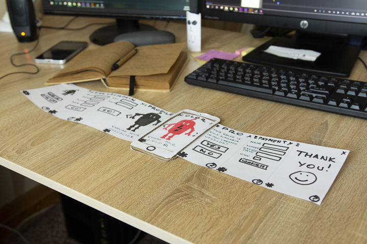
Paper prototyping is a process where design teams create paper representations of digital products to help them realize concepts and test designs. They draw sketches or adapt printed materials and use these low-fidelity screenshot samples to cheaply guide their designs and study users’ reactions from early in projects.
If you're looking at novel solutions, then paper prototyping is a great way of starting. This is a relatively short segment on paper prototyping, which is something that I don't think people really take very seriously, but they should do. It's a wonderful approach. It's very *cheap and easy to do* – so, low technology, low cost;
can be done at the *very early stages* of design and development; *easy to create modify and animate* because you do all that by hand. It *avoids distractions with superficial detail*; a fixation that that button is too large or it's too small or it's too blue or what have you. It *prevents* the you-must-be-very-nearly-finished impression that sometimes customers get when you're showing them higher-fidelity mockups, without them realizing there's an awful lot of work that still needs to be done behind the screens.
It's very much less intimidating to users. Users really do get that you're trying things out, and obviously they're quite keen to give you useful feedback. And tied up with that is the whole aspect that it just looks much more malleable, much more unfinished than any form of screen markup. So, as a concept, it's quite wonderful, but we don't do enough of it. It's not something you would actually do in an area where you're *revisiting* the same solution.
So, if your organization produces a lot of e-commerce sites and you've done this particular kind of solution 10 times before, then obviously no need to paper-prototype. But if you're looking at novel solutions, if you're the next big startup and you want to make sure that people understand your proposition and they know how to work with it, then paper prototyping is a great way of starting.
So, here's Carolyn Snyder, a friend of mine, who has written a book called *Paper Prototyping*. It's not a fantastically long or detailed book, but it does go through all the basics, and you can see just looking at this particular screenshot, or paper-shot even – it's not of a screen of course – it's showing little strips of paper that have been tacked on, and you can see that the cross on the
– with color has just been applied with some sticky tape, literally, and the text in the box underneath has been done the same way. And it's just all done with users, with *a user*, typically, and an agreed script, an agreed set of pages. And you ask users to interact as if this was for real. And they tell you what they would do, and you play-act it. So, it's fairly standard office supplies. You can do most paper prototyping with about
10 pounds', dollars' or euros' worth of office stationery. You need to, as I mention here, make sure that you've *tested* your process before the user arrives, that you know what you're going to do *if* certain things happen, and you need to *agree with the team* what this process is meant to look like so that you're not basically testing something different from what the design team is proposing to do.
See why paper prototyping is a small, yet invaluable investment.
“Paper prototyping is great for exploring design possibilities. You can try as many as you want, and if they don’t work for you it’s fine, just throw them in the bin and start over. It opens your eyes on things you haven’t thought of and gives you new design perspectives.”
— Chaymae Lougmani, CEO & Co-founder at www.Snaget.io
Paper prototyping is a core activity in design processes. You depict screenshots (in what you can call “paper-shots”) to help determine how your design/product should appear. Like other forms of low-fidelity prototyping—e.g., card sorting—paper prototyping is a cheap-and-easy way to help shape concepts. If you use it early on, you can prevent unwanted development costs.It’s useful in brainstorming, where your team searches how to address users’ problems best. As you proceed, you can do “down-and-dirty” or guerrilla testing to informally test ideas with users and course-correct as needed.
Consider the strengths and limitations of paper prototyping:
Quick iteration
You can build overviews without getting bogged down in details. In minutes, you can see whether an idea works on paper.
Cheap
Paper is inexpensive; so are printed prototyping materials/kits.
Universal
Everyone can make rough sketches of ideas. Stakeholders from outside the design team can join in.
Pieces serve as documentation
Later on, you’ll have annotated hard-copy evidence of what works and what doesn’t.
Team-building
When team members get creative, they can bond. Everyone can get involved in drawing, cutting and pasting and forget role/department barriers.
Honest feedback
People comment more freely than if they must criticize polished prototypes (i.e., someone’s “baby”).
Useful throughout the design process
You can use paper prototyping to help stay flexible about revisions throughout development.
Lack of realism
Whatever you draw, you can’t completely mimic an interactive design. Also, users’ gut reactions will differ compared with the finished product.
Inappropriateness in some contexts
You can’t always translate users’ constraints onto paper, especially regarding accessibility. You may need a sophisticated high-fidelity prototype to capture the user experience.
Requires in-person testing
You have a smaller pool of test users and greater risk of missing insights.
Lack of user control
Without an interactive design, users must give blow-by-blow accounts of their actions and thoughts. Also, you can’t moderate from a distance. You must give directions about next steps, without leading users.
More work
You’ll make digital prototypes, anyway. These may suit your concept without the need for primitive prototypes.
Interpret results carefully
Users can’t get a real feel of the product. Positive feedback is a good indicator of how to proceed, not a guarantee.
You should enter with the right tools and mindset. So,
Gather stationery – pens, pencils, markers, paper, card, Post-its, scissors, tape, glue, rulers and suitable stencils. About $10/£10/€10 is typically enough to cover this. You can use graph paper to help guide ideas. Colored paper is great for representing buttons.
Get building – Just go ahead and see where you go. As you get your ideas down on paper, you can think about them more concretely. Later, you can get insights about improving them.
Make one sketch per screen.
Move quickly – If you spend too long making your prototype, you’ll get attached to it. Don’t waste time erasing: You want to get ideas down rather than revise them and potentially miss insights from the raw version.
Remember what to test – Build with that purpose in mind, but stay aware of other factors.
Prototype for small screens first –When you go mobile-first, you can prioritize your content better.
Remember the users – As you’ll test your prototype against users’ behaviors and needs, consider their expectations as you build.
Remember, the earlier you use paper prototyping, the better.
Dive into our Design Thinking course to see all about paper prototyping.
This UX Planet blog has some helpful paper prototyping tips.
Discover a wealth of insights into paper prototyping from UX content strategist Jerry Cao.
Paper prototyping helps UX designers quickly explore ideas and test concepts early in the design process. It fits into the ideation and validation stages and lets teams refine layouts and interactions before they invest in digital prototypes.
Designers start by sketching rough screens, user flows, or interface elements. This helps visualize different solutions and test usability without coding. Example: A team designing a new checkout process might sketch multiple layouts and test them with users to see which flow feels most intuitive.
Paper prototypes improve collaboration, too. Designers, stakeholders, and users can review and adjust ideas in real time—reducing the risk of costly revisions later. Once a concept is validated, designers move to digital wireframes and interactive prototypes for deeper testing.
Because paper prototyping is fast, flexible, and low-cost, it’s an essential step in creating user-friendly, well-tested designs before development begins.
Watch as UX Strategist and Consultant, William Hudson explains important points about paper prototyping:
Read our piece on 5 Common Low-Fidelity Prototypes and Their Best Practices for more insights.
Common mistakes in paper prototyping can slow down the process and reduce its effectiveness. One major mistake is adding too much detail too soon—paper prototypes should focus on layout and user flow, not fine-tuned visuals. Example: Spending time perfecting colors or fonts on paper wastes effort when early testing should focus on usability.
Another mistake is skipping user testing. A prototype is only useful if it gets tested with real users. Example: A team designing a new checkout flow might assume their layout works, but testing could reveal confusion about button placement or terminology.
Some teams also fail to make changes, treating the prototype as final instead of a flexible tool. Paper prototypes should evolve based on feedback.
Finally, not simulating real interactions—just showing static sketches—misses key usability insights. Designers should mimic real navigation by swapping paper screens as users interact. Just because paper prototypes look “crude” doesn’t mean they can’t suggest details about interactivity early in design.
Watch as UX Strategist and Consultant, William Hudson explains important points about paper prototyping:
If you're looking at novel solutions, then paper prototyping is a great way of starting. This is a relatively short segment on paper prototyping, which is something that I don't think people really take very seriously, but they should do. It's a wonderful approach. It's very *cheap and easy to do* – so, low technology, low cost;
can be done at the *very early stages* of design and development; *easy to create modify and animate* because you do all that by hand. It *avoids distractions with superficial detail*; a fixation that that button is too large or it's too small or it's too blue or what have you. It *prevents* the you-must-be-very-nearly-finished impression that sometimes customers get when you're showing them higher-fidelity mockups, without them realizing there's an awful lot of work that still needs to be done behind the screens.
It's very much less intimidating to users. Users really do get that you're trying things out, and obviously they're quite keen to give you useful feedback. And tied up with that is the whole aspect that it just looks much more malleable, much more unfinished than any form of screen markup. So, as a concept, it's quite wonderful, but we don't do enough of it. It's not something you would actually do in an area where you're *revisiting* the same solution.
So, if your organization produces a lot of e-commerce sites and you've done this particular kind of solution 10 times before, then obviously no need to paper-prototype. But if you're looking at novel solutions, if you're the next big startup and you want to make sure that people understand your proposition and they know how to work with it, then paper prototyping is a great way of starting.
So, here's Carolyn Snyder, a friend of mine, who has written a book called *Paper Prototyping*. It's not a fantastically long or detailed book, but it does go through all the basics, and you can see just looking at this particular screenshot, or paper-shot even – it's not of a screen of course – it's showing little strips of paper that have been tacked on, and you can see that the cross on the
– with color has just been applied with some sticky tape, literally, and the text in the box underneath has been done the same way. And it's just all done with users, with *a user*, typically, and an agreed script, an agreed set of pages. And you ask users to interact as if this was for real. And they tell you what they would do, and you play-act it. So, it's fairly standard office supplies. You can do most paper prototyping with about
10 pounds', dollars' or euros' worth of office stationery. You need to, as I mention here, make sure that you've *tested* your process before the user arrives, that you know what you're going to do *if* certain things happen, and you need to *agree with the team* what this process is meant to look like so that you're not basically testing something different from what the design team is proposing to do.
Take our Design Thinking course to learn about prototyping more in-depth.
Include only as many screens as needed to test key user flows and interactions. A paper prototype should be simple and flexible, so don’t create unnecessary screens.
Five to seven screens for a basic usability test are often enough to cover a single task—like signing up for an account or completing a purchase. Example: If you’re testing a checkout process, include screens for the cart, shipping details, payment, and confirmation.
If testing multiple user journeys, you may need 10 to 15 screens, but keep it lightweight. The goal is to validate core interactions, not to recreate an entire app on paper.
Instead of adding too many screens, focus on key decision points where users might get confused. If users need more context, you can sketch new screens on the spot. When you keep it flexible, it helps you and your design team—as well as other stakeholders—iterate quickly and refine things without overcomplicating the process.
Watch as UX Strategist and Consultant, William Hudson explains important points about paper prototyping:
If you're looking at novel solutions, then paper prototyping is a great way of starting. This is a relatively short segment on paper prototyping, which is something that I don't think people really take very seriously, but they should do. It's a wonderful approach. It's very *cheap and easy to do* – so, low technology, low cost;
can be done at the *very early stages* of design and development; *easy to create modify and animate* because you do all that by hand. It *avoids distractions with superficial detail*; a fixation that that button is too large or it's too small or it's too blue or what have you. It *prevents* the you-must-be-very-nearly-finished impression that sometimes customers get when you're showing them higher-fidelity mockups, without them realizing there's an awful lot of work that still needs to be done behind the screens.
It's very much less intimidating to users. Users really do get that you're trying things out, and obviously they're quite keen to give you useful feedback. And tied up with that is the whole aspect that it just looks much more malleable, much more unfinished than any form of screen markup. So, as a concept, it's quite wonderful, but we don't do enough of it. It's not something you would actually do in an area where you're *revisiting* the same solution.
So, if your organization produces a lot of e-commerce sites and you've done this particular kind of solution 10 times before, then obviously no need to paper-prototype. But if you're looking at novel solutions, if you're the next big startup and you want to make sure that people understand your proposition and they know how to work with it, then paper prototyping is a great way of starting.
So, here's Carolyn Snyder, a friend of mine, who has written a book called *Paper Prototyping*. It's not a fantastically long or detailed book, but it does go through all the basics, and you can see just looking at this particular screenshot, or paper-shot even – it's not of a screen of course – it's showing little strips of paper that have been tacked on, and you can see that the cross on the
– with color has just been applied with some sticky tape, literally, and the text in the box underneath has been done the same way. And it's just all done with users, with *a user*, typically, and an agreed script, an agreed set of pages. And you ask users to interact as if this was for real. And they tell you what they would do, and you play-act it. So, it's fairly standard office supplies. You can do most paper prototyping with about
10 pounds', dollars' or euros' worth of office stationery. You need to, as I mention here, make sure that you've *tested* your process before the user arrives, that you know what you're going to do *if* certain things happen, and you need to *agree with the team* what this process is meant to look like so that you're not basically testing something different from what the design team is proposing to do.
Read our piece on 5 Common Low-Fidelity Prototypes and Their Best Practices for more insights.
To ensure your paper prototype reflects real user interactions, make it as interactive and realistic as possible—while keeping things simple, in the spirit of paper prototyping. Instead of just showing static sketches, simulate real navigation by letting users tap, flip, or move paper screens as they would in a digital product.
Use a “human computer” approach, where one team member acts as the system, changing screens based on user actions. Example: If you’re testing a login flow, when the user “enters” their password by pointing to a field, swap the screen to show the user the next step.
Include key interactions like buttons, menus, and pop-ups to mimic real experiences. Also, for best results, test with real users—not just team members—to catch usability issues you might overlook. If you’re stuck and need insights quickly, you can do “down the hallway” or “quick and dirty” paper prototype testing with colleagues or friends. Still, try to test with real users early on to get fresh eyes to try out your prototype. It’ll give you precious actionable insights you may not get from “test users” down the hall who are used to design.
Encourage users to think aloud while they’re interacting. Their feedback will help refine the prototype before it moves to digital design. A good paper prototype feels dynamic and helps uncover real usability insights early in the design process.
Watch as UX Strategist and Consultant, William Hudson explains important points about paper prototyping:
If you're looking at novel solutions, then paper prototyping is a great way of starting. This is a relatively short segment on paper prototyping, which is something that I don't think people really take very seriously, but they should do. It's a wonderful approach. It's very *cheap and easy to do* – so, low technology, low cost;
can be done at the *very early stages* of design and development; *easy to create modify and animate* because you do all that by hand. It *avoids distractions with superficial detail*; a fixation that that button is too large or it's too small or it's too blue or what have you. It *prevents* the you-must-be-very-nearly-finished impression that sometimes customers get when you're showing them higher-fidelity mockups, without them realizing there's an awful lot of work that still needs to be done behind the screens.
It's very much less intimidating to users. Users really do get that you're trying things out, and obviously they're quite keen to give you useful feedback. And tied up with that is the whole aspect that it just looks much more malleable, much more unfinished than any form of screen markup. So, as a concept, it's quite wonderful, but we don't do enough of it. It's not something you would actually do in an area where you're *revisiting* the same solution.
So, if your organization produces a lot of e-commerce sites and you've done this particular kind of solution 10 times before, then obviously no need to paper-prototype. But if you're looking at novel solutions, if you're the next big startup and you want to make sure that people understand your proposition and they know how to work with it, then paper prototyping is a great way of starting.
So, here's Carolyn Snyder, a friend of mine, who has written a book called *Paper Prototyping*. It's not a fantastically long or detailed book, but it does go through all the basics, and you can see just looking at this particular screenshot, or paper-shot even – it's not of a screen of course – it's showing little strips of paper that have been tacked on, and you can see that the cross on the
– with color has just been applied with some sticky tape, literally, and the text in the box underneath has been done the same way. And it's just all done with users, with *a user*, typically, and an agreed script, an agreed set of pages. And you ask users to interact as if this was for real. And they tell you what they would do, and you play-act it. So, it's fairly standard office supplies. You can do most paper prototyping with about
10 pounds', dollars' or euros' worth of office stationery. You need to, as I mention here, make sure that you've *tested* your process before the user arrives, that you know what you're going to do *if* certain things happen, and you need to *agree with the team* what this process is meant to look like so that you're not basically testing something different from what the design team is proposing to do.
Take our Design Thinking course to learn about prototyping more in-depth.
Do it correctly by focusing on clarity, interactivity, and user value. To start, explain the prototype’s goal—what problem it solves and what user flows it represents. Keep it simple and avoid overwhelming them with too much detail. Remember, they may not have design backgrounds—so communicate everything in terms they can understand. They’re like test users who are completely “fresh” to what you’re showing them—so note their responses to the prototype as well.
Next, walk them through key interactions by simulating real user actions. Example: If you’re presenting a mobile checkout process, physically swap paper screens as the user “taps” buttons to show how the flow works. This makes the experience engaging and easy to follow.
Encourage questions and feedback, but remind them that paper prototypes are for testing structure early—not hinting at final visuals. If stakeholders or clients focus too much on aesthetics, gently steer them back to functionality and usability. They need to remember why you’re showing them such low-fidelity prototypes and not get put off by “raw” looks.
Last but not least, highlight how user testing will refine the design before proceeding to digital development. A strong presentation keeps stakeholders engaged and aligned while reinforcing that user needs drive the design process.
Watch as Author, Speaker and Leadership Coach, Todd Zaki Warfel explains important points about how to present to clients:
This new narrative starts with *identifying your audience and intent*. The way you pitch an idea to a client, peer or executive requires an *adjustment to your language and approach*. Client – they're more of an occasional traveler. They don't know the system; they don't know the ins and outs. They're less likely to share your language. I mean, you're probably speaking design. They speak business and outcomes and results. So, you may need to establish a basic level of understanding.
Clients and executives are also less patient and don't want to waste 20 minutes going through every single detail just to get to the answer. Karen's what you would call an occasional traveler. She expected high-fidelity visual comps and just had a bottom-liner approach. Karen's one of these busy executives. She doesn't have time for – nor does she need to or want to hear – all the details. She just needs to know *why she should care*, *why it matters to her line of business*,
and then she can decide to support your proposal ...or not. Now, the last time the team had presented to Karen, they spent the *entire 60-minute meeting* walking her through *their process* and *justifying their decisions*. If you know anything about executives – a 60-minute meeting; *not* a good idea. Here's the rub. They never addressed the value of the business, and the team didn't come in with a clear ask.
In the own words of the team, it was the most grueling 60 minutes of their entire careers at this company. So, what do we do? Well, this time around, we started with audience and intent. We changed the story and wrote a new narrative and developed a new plan. We started with the *intended outcome* with Karen, shared a few *stories* and then highlighted the *value* that our approach would bring to her business – and quickly gained approval from her. And I'll never forget the moment; it was like eight minutes into my presentation.
I actually looked down at my watch to check, when Karen interrupted me mid-sentence and said, 'Okay, Todd – I get it. You've done your homework; you've clearly shown how the solution solves the problem and how it's better than my original idea. What do we need to do to move forward? What do you need from *me* to deliver this?'
Take our Design Thinking course to learn about prototyping more in-depth.
Paper prototyping is a fast and low-cost way to test design ideas before investing in digital development. It helps teams explore layouts, user flows, and interactions without needing code or complex tools.
One major benefit is speed—designers can sketch multiple ideas quickly and modify them right there on the spot. Example: A UX team designing a new mobile app can test different navigation structures in minutes by drawing screens on paper and rearranging them.
Paper prototypes encourage collaboration as well. Team members and stakeholders can give feedback early, reducing the chances of costly revisions later. Users can interact with paper screens, simulating a real experience and revealing usability issues before any digital design begins.
Furthermore, paper lowers creative barriers. Because sketches feel informal, people are more willing to suggest changes and won’t feel bad about criticizing someone’s hard work in a digital design. That leads to better design decisions.
Ultimately, paper prototyping saves time and resources—a great way to help designers refine ideas before moving to high-fidelity digital prototypes.
Watch as UX Strategist and Consultant, William Hudson explains important points about paper prototyping:
Sefelin, R., Tscheligi, M., & Giller, V. (2003). Paper prototyping—What is it good for?: A comparison of paper- and computer-based low-fidelity prototyping. CHI '03 Extended Abstracts on Human Factors in Computing Systems, 778–779.
This study compares the effectiveness of paper-based and computer-based low-fidelity prototyping methods in the context of user interface design. The authors conducted experiments to evaluate how each prototyping approach influences user feedback and the identification of usability issues. Findings suggest that paper prototyping is particularly advantageous during the early stages of design due to its simplicity and cost-effectiveness. The research underscores the value of paper prototyping in facilitating rapid iterations and engaging stakeholders in the design process.
Snyder, Carolyn (2003). Paper Prototyping: The Fast and Easy Way to Design and Refine User Interfaces. San Francisco: Morgan Kaufmann.
Carolyn Snyder, a seasoned usability engineer, offers a comprehensive guide to paper prototyping in this book. She provides practical advice on creating and testing paper prototypes for various user interfaces, including websites and software applications. The book includes numerous case studies and illustrations, demonstrating how paper prototyping can identify usability issues early in the design process—saving time and resources.
A paper prototype should be detailed enough to test key interactions and layouts but not so refined that it slows down the creative process.
Early sketches should focus on basic structure and user flow rather than fine details. Example: If you’re designing a mobile app, start with rough screens showing navigation, buttons, and content placement without worrying about colors or fonts.
As testing progresses, add more details like labels, icons, or annotations to clarify functionality. However, don’t overcomplicate things—paper prototypes should stay flexible, allowing quick changes based on feedback.
The goal is to validate ideas quickly and cheaply before moving on to digital prototypes. Too little detail makes testing unclear, while too much can make revisions harder. Keep it simple but effective!
Watch as UX Strategist and Consultant, William Hudson explains important points about paper prototyping:
Take our Design Thinking course to learn about prototyping more in-depth.
Do you want to improve your UX / UI Design skills? Join us now
You earned your gift with a perfect score! Let us send it to you.
We've emailed your gift to name@email.com.
Do you want to improve your UX / UI Design skills? Join us now
Here's the entire UX literature on Paper Prototyping by the Interaction Design Foundation, collated in one place:
Take a deep dive into Paper Prototyping with our course Design Thinking: The Ultimate Guide .
Some of the world’s leading brands, such as Apple, Google, Samsung, and General Electric, have rapidly adopted the design thinking approach, and design thinking is being taught at leading universities around the world, including Stanford d.school, Harvard, and MIT. What is design thinking, and why is it so popular and effective?
Design Thinking is not exclusive to designers—all great innovators in literature, art, music, science, engineering and business have practiced it. So, why call it Design Thinking? Well, that’s because design work processes help us systematically extract, teach, learn and apply human-centered techniques to solve problems in a creative and innovative way—in our designs, businesses, countries and lives. And that’s what makes it so special.
The overall goal of this design thinking course is to help you design better products, services, processes, strategies, spaces, architecture, and experiences. Design thinking helps you and your team develop practical and innovative solutions for your problems. It is a human-focused, prototype-driven, innovative design process. Through this course, you will develop a solid understanding of the fundamental phases and methods in design thinking, and you will learn how to implement your newfound knowledge in your professional work life. We will give you lots of examples; we will go into case studies, videos, and other useful material, all of which will help you dive further into design thinking. In fact, this course also includes exclusive video content that we've produced in partnership with design leaders like Alan Dix, William Hudson and Frank Spillers!
This course contains a series of practical exercises that build on one another to create a complete design thinking project. The exercises are optional, but you’ll get invaluable hands-on experience with the methods you encounter in this course if you complete them, because they will teach you to take your first steps as a design thinking practitioner. What’s equally important is you can use your work as a case study for your portfolio to showcase your abilities to future employers! A portfolio is essential if you want to step into or move ahead in a career in the world of human-centered design.
Design thinking methods and strategies belong at every level of the design process. However, design thinking is not an exclusive property of designers—all great innovators in literature, art, music, science, engineering, and business have practiced it. What’s special about design thinking is that designers and designers’ work processes can help us systematically extract, teach, learn, and apply these human-centered techniques in solving problems in a creative and innovative way—in our designs, in our businesses, in our countries, and in our lives.
That means that design thinking is not only for designers but also for creative employees, freelancers, and business leaders. It’s for anyone who seeks to infuse an approach to innovation that is powerful, effective and broadly accessible, one that can be integrated into every level of an organization, product, or service so as to drive new alternatives for businesses and society.
You earn a verifiable and industry-trusted Course Certificate once you complete the course. You can highlight them on your resume, CV, LinkedIn profile or your website.
We believe in Open Access and the democratization of knowledge. Unfortunately, world-class educational materials such as this page are normally hidden behind paywalls or in expensive textbooks.
If you want this to change, , link to us, or join us to help us democratize design knowledge!