As UX designers, we have a lot on our plates. The term “UX Unicorn” exists for a reason. We are responsible for our clients’ goals as well as our users’ needs. You might ask then, why should you think about Accessibility in your UX Design process?
Imagine going into a design workshop and telling your client that you need more hours to make his or her company website accessible. You’ll need a good use case to convince your client and maybe even yourself that accessibility should feature in the UX Design process. Here, we will look at the social need of why you should design with accessibility in mind.
People with Disabilities Form One of the Largest User Groups in the World
In 2023, the World Health Organization estimated there were 1.3 billion people with disabilities in the world or 16% of the global population. That is almost the entire population of China or India and about four times the population of the U.S. In fact, persons with disabilities are the largest minority in the world.
Disabilities can develop from birth, aging or accidental or health-related incidents. On average, people who are 70 years old or older will spend eight years as individuals with disabilities. As the Baby Boomers who were born in the years following the Second World War – approximately between the years 1946 and 1964 – have been aging, we have been seeing an increasing need for digitally inclusive and accessible solutions.
How to Use Personas to Start Thinking About Accessibility
Personas are fundamental for UX design projects. If we want to build accessibility design thinking into the UX process, then one of the best methods is to have a persona with a disability.
According to the Centers for Disease Control and Prevention (CDC), which is the leading national public health institute of the United States, a person with disability may have difficulty with the following:
Vision
Movement
Thinking
Remembering
Learning
Communicating
Hearing
Mental health
Social relationships
Here are examples of personas with disabilities:
Example 1: Vision Impairment
A 60-year-old retired woman with vision loss caused by diabetes—the woman’s disability is illness-/age-related.
Example 2: Physical Impairment
A 22-year-old male college student who has muscle weakness with his hands due to Multiple Sclerosis
Example 3: Cognitive Impairment
A 45-year-old female who immigrated to the U.S. for less than two years—English is her second language, and she needs extra time to read and write English phrases. As you can see, adding a disability to our personas makes it easier for us to think about accessibility for UX projects. In the following sections, you will learn about different models of disability and the social impact it has on us as designers.
Two Models to Look at How Disability Is Perceived in the Society
The definition of disability varies based on models of disability. The nonprofit organization Michigan Disability Rights Coalition listed nine different models of disability. For our purpose, we will look at the two dominant models: the Medical Model of Disability and the Social Model of Disability.
The Medical Model of Disability: The Person as the Cause For Disability
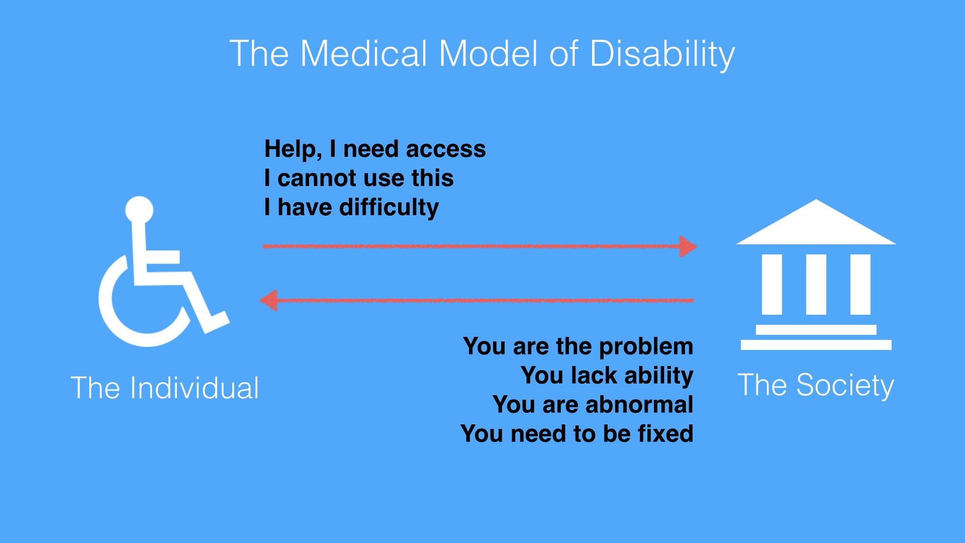
The Medical Model of Disability places the burden and responsibility on the person with a disability. The person is the problem or owns the problem. The Medical Model of Disability is harsh. It uses keywords such as ‘abnormality’, ‘lack of ability’ and ‘disadvantage’ to describe a person. The Medical Model of Disability applies the medical world’s view that one needs cures or fixes to be a normal functioning person.
© Ruby Zheng and Interaction Design Foundation, CC BY-NC-ND
The World Health Organization (WHO) published the International Classification of Impairments, Disabilities and Handicaps manual in 1980. The goal of the manual was to classify the consequences of diseases and their implications for the lives of individuals. It used the Medical Model of Disability as its basis to define disability.
According to the manual, here is the progression and definitions of diseases for persons with disabilities:
“Disease > Impairment > Disability > Handicap
Impairment: In the context of health experience, an impairment is any loss or abnormality of psychological, physiological, or anatomical structure or function.
Disability: In the context of health experience, a disability is any restriction or lack (resulting from an impairment) of ability to perform an activity in the manner or within the range considered normal for a human being.
Handicap: In the context of health experience, a handicap is a disadvantage for a given individual, resulting from an impairment or a disability, that limits or prevents the fulfillment of a role that is normal (depending on age, sex, and social and cultural factors) for that individual.” – World Health Organization (WHO), International Classification of Impairments, Disabilities, and Handicaps, 1980
Needless to say, these definitions are harsh and use keywords such as ‘abnormality’, ‘lack of ability’ and ‘disadvantage’ to describe a person. The Medical Model of Disability applies the medical world’s view that one needs cures or fixes to be a normal functioning person. And it places the onus on persons with disability.
The Social Model of Disability: Society as the Cause For Disability
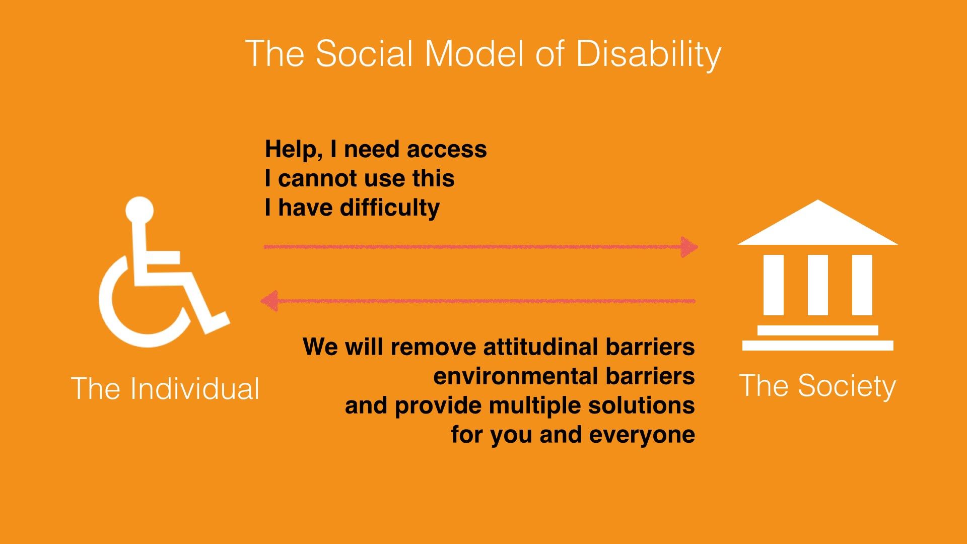
The Social Model of Disability does not place the burden and responsibility on the person with a disability. Instead, this model describes disability as a consequence of environmental, social and attitudinal barriers. Instead of fixing or curing a person with disabilities, it is up to society to remove barriers so as to improve his or her life. Hence, this model provides a deeper understanding and acceptance of people with disabilities.
© Ruby Zheng and Interaction Design Foundation, CC BY-NC-ND
The reaction from the disability community towards the WHO’s manual and the Medical Model of Disability was immediate. Three years after the WHO published the manual, Mike Oliver coined a new model called the Social Model of Disability. Oliver was a British author and disability rights activist.
In a paper titled "The Individual and Social Models of Disability”, Oliver contended against the Medical Model of Disability:
"The simple answer to this is that disability is a social state and not a medical condition. Hence medical intervention in, and more importantly, control over disability is inappropriate. Doctors are trained to diagnose, treat and cure illnesses, not to alleviate social conditions or circumstances."
– Mike Oliver, “The Individual and Social Models of Disability”, 1990
Oliver believed the Social Model of Disability provides a deeper understanding and acceptance of people with disabilities. It describes disability as a consequence of environmental, social and attitudinal barriers.
With this model, the onus is no longer on persons with disabilities but on society. Instead of trying to fix or cure a person with a disability, it is up to society to drive social integration and acceptance. As UX designers, we should take environmental, social and attitudinal barriers into consideration. For example, a common environmental barrier for users is being able to see the screen under bright sunlight. This barrier applies to both visually impaired users and ‘normal’ users. If we take this barrier into consideration, then we will design a solution with large fonts and strong color contrast.
The UN Convention on the Rights of Persons with Disabilities
The idea of barriers from the Social Mode of Disability is adopted into global policies for digital accessibility. The United Nations is one of the international catalyzers. It adopted the Convention on the Rights of Persons with Disabilities, which is often referred to as the CRPD or ‘the convention’, in 2006 and signed it into effect in 2007. It is the first major human rights treaty of the 21st century. It bases its philosophy and definition on the Social Model of Disability.
The official UN definition of disability is the following:
"The term persons with disabilities is used to apply to all persons with disabilities including those who have long-term physical, mental, intellectual or sensory impairments which, in interaction with various attitudinal and environmental barriers, hinders their full and effective participation in society on an equal basis with others." – UN, Secretariat for the Convention on the Rights of Persons FAQ, 2007
UN Example of an environmental barrier:
"A person in a wheelchair might have difficulties being gainfully employed not because of her condition but because there are environmental barriers such as inaccessible buses or staircases in the workplace which obstruct his or her access."
– UN, Secretariat for the Convention on the Rights of Persons FAQ, 2007
UN Example of an attitudinal barrier:
"A child with an intellectual disability might have difficulties going to school due to the attitudes of teachers, school boards and possibly parents who are unable to adapt to students with different learning capacities."
– UN, Secretariat for the Convention on the Rights of Persons FAQ, 2007
How the Convention for Persons with Disabilities Is Adopted Worldwide
By March 2024, 191 states had ratified the convention and 164 had signed it. (A signature indicates an intention to ratify, but it does not immediately create legal obligations.) Thus, the convention came to protect more than 80% of the world's population. The U.S. has not ratified the convention as of May 2024 but did add its signature in July 2009. Some U.S. lawmakers do not want to ratify the convention. They contend that the U.S. has its own regulations for accessibility. The two main regulations in the U.S. are the Rehabilitation Act of 1973 and the Americans with Disabilities Act (ADA) passed in 1990.
What Is Information and Communications Technology (ICT) Accessibility?
Article 9 of the convention is the section on accessibility. It includes accessibility needs for physical environment and transportation, and digital information and services. The convention uses information and communications technology (ICT) as an umbrella term for any digital device or application. There are two parts to this section.
Article 9 – Accessibility, Part I
The first part of Article 9 describes the types of public infrastructures that are to be considered under the convention.
"To enable persons with disabilities to live independently and participate fully in all aspects of life, States Parties shall take appropriate measures to ensure to persons with disabilities access, on an equal basis with others, to the physical environment, to transportation, to information and communications, including information and communications technologies and systems, and to other facilities and services open or provided to the public, both in urban and in rural areas.” – UN, Convention on the Rights of Persons with Disabilities, Article 9, 2006
Article 9 – Accessibility, Part 2
The second part of Article 9 lists the types of appropriate measures which should be taken under the convention. Promoting access to new ICTs, such as the Internet, is one of the required measures:
“Promote access for persons with disabilities to new information and communications technologies and systems, including the Internet” – UN, Convention on the Rights of Persons with Disabilities, Article 9, 2006
How ICT Accessibility Affects UX Design for the Web
When designing for digital devices or applications, all of us who are UX designers need to think about ICT Accessibility and how to implement solutions so as to enable access for all. The World Wide Web is an important component of information and communications technology. In this section, we’ll take a look at how ICT Accessibility affects UX Design for the web.
The World Wide Web Consortium (W3C) is an international community that develops standards for the web. It follows the principles of W3C Director and inventor of the World Wide Web, Tim Berners-Lee, and holds accessibility as a fundamental need for web design.
“The power of the Web is in its universality. Access by everyone regardless of disability is an essential aspect.”
– Tim Berners-Lee, W3C Director and inventor of the World Wide Web
The W3C follows the UN convention principles. It recognizes access to Information and Communications Technology (ICT) as a basic human right. As an effort to improve accessibility, the W3C launched the Web Accessibility Initiatives (WAI) in 1997. The WAI provides guidelines, standards and techniques for accessibility.
The WAI has created three core guidelines for the web:
Addresses the information on a website, including text, images, forms, sounds, and such.
Authoring Tool Accessibility Guidelines (ATAG)
Addresses software that creates Web sites.
User Agent Accessibility Guidelines (UAAG)
Addresses Web browsers and media players, and relates to assistive technologies.
The Web Content Accessibility Guidelines (WCAG) 1.0 was first published in 1999 and was updated to version 2.0 in 2008. WCAG version 2.2 became a recommendation in October 2023. It is an important source of reference for international policies, standards and legislation. In addition, this is good guidance for UX designers to learn about how to design accessible websites.
Web Content Accessibility Guidelines (WCAG) 2 Provide Four Layers of Guidance for UX Designers
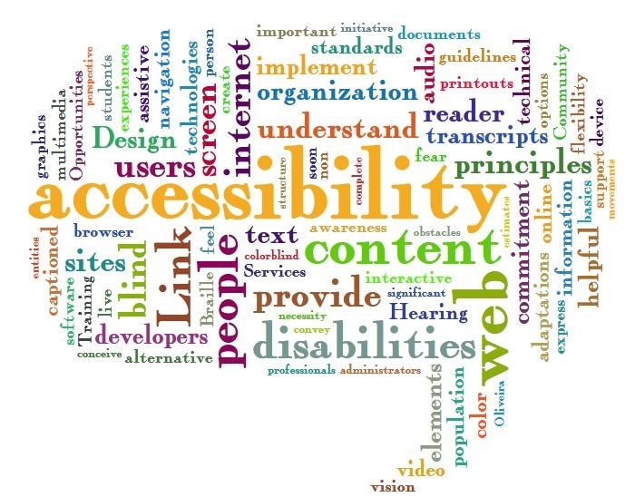
The Web Accessibility Word Cloud shows a collection of words often used in the accessibility design space. The size of the words shows how often they are used. Some of the frequently used words are ‘accessibility’, ‘content’, ‘web’, ‘internet’, ‘design’ and ‘disabilities’.
© Jil Wright, CC BY 2.0
WCAG 2 has an amazing set of design principles, guidelines and techniques. It is created for UX and web designers, content creators, and developers. You can start applying these principles and techniques right away. We are presenting them to you here and showing you how designers at Apple, TED talks and Twitter have already implemented the principles to the benefit of persons with disabilities as well as users without disabilities.
Principles – The top layer of guidance is four principles that provide the foundation for Web accessibility: Perceivable, Operable, Understandable, and Robust (POUR).
Guidelines – Under the principles are guidelines. The 12 guidelines provide the basic goals that designers should work toward in order to make their designs more accessible to users with different disabilities. The guidelines are not testable, but they provide the framework and overall objectives to help designers understand the success criteria and better implement the techniques.
Success Criteria – Each guideline has a set of testable success criteria to verify accessibility for a web application or website. Each criterion has three levels: A, AA, and AAA. Level A is the minimal level. In the U.S., companies generally design and develop toward Level AA compliance. A level AA compliance will cover most legal regulations.
Sufficient and Advisory Techniques – For each of the guidelines and success criteria, there are a wide variety of techniques that fall into two categories:
Those that are sufficient for meeting the success criteria.
Those that are advisory.
4 Principles and 12 Guidelines Which Will Help You Design for Accessibility
The following four principles – Perceivable, Operable, Understandable and Robust (POUR) – are easy to implement, and they will help you remember to design for accessibility whenever possible. We’ll show you how other designers have implemented the principles in a successful way.
Principle 1: Perceivable – and How UX Designers Can Incorporate the Principle
“Principle 1: Perceivable – Information and user interface components must be presentable to users in ways they can perceive.”
Guideline 1.1 Text Alternatives: Provide text alternatives for any non-text content so that it can be changed into other forms people need, such as large print, braille, speech, symbols or simpler language.
Guideline 1.2 Time-based Media: Provide alternatives for time-based media.
Guideline 1.3 Adaptable: Create content that can be presented in different ways (for example, simpler layout) without losing information or structure.
Guideline 1.4 Distinguishable: Make it easier for users to see and hear content, including separating foreground from background.
Design Example: TED Talks Video Transcripts
The TED talks, which are live lectures recorded in front of a large audience, are a great example of how videos include a transcript. This makes the TED talks accessible to a wide audience. People with hearing impairments can read the transcripts, and people with visual impairments can hear the audio. However, this feature is also great for people sitting in a bus who do not want to disturb other passengers.
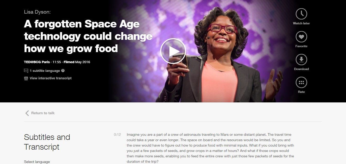
All TED talks provide subtitles and transcripts for all of their videos.
© TED Conferences, LLC, Fair Use
Principle 2: Operable – and How UX Designers Can Incorporate the Principle
“Principle 2: Operable – User interface components and navigation must be operable.”
Guideline 2.1 Keyboard Accessible: Make all functionality available from a keyboard.
Guideline 2.2 Enough Time: Provide users with enough time to read and use content.
Guideline 2.3 Seizures: Do not design content in a way that is known to cause seizures.
Guideline 2.4 Navigable: Provide ways to help users navigate, find content, and determine where they are.
Design Example: Apple AssistiveTouch
AssistiveTouch is an accessibility feature for Apple's iPhone, iPad and iPod. It provides alternative navigation methods and touch gestures for people with physical impairments. Users using AssistiveTouch can quickly access settings and the home screen and create their own touch gestures.
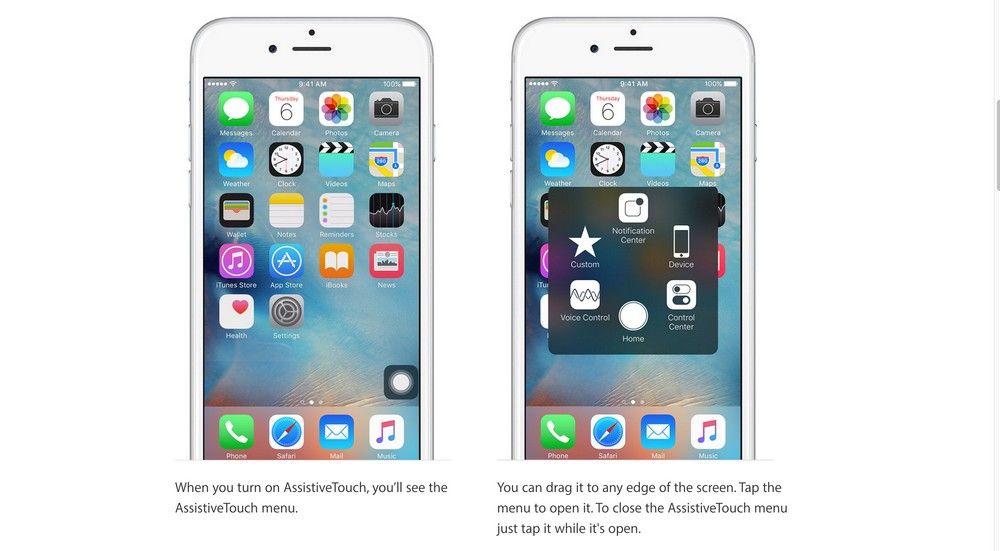
Apple’s AssistiveTouch provides alternative navigation methods and gesture controls.
© Apple, Inc., Fair Use
Principle 3: Understandable – and How UX Designers Can Incorporate the Principle
“Principle 3: Understandable – Information and the operation of user interface must be understandable.”
Guideline 3.1 – Make text content readable and understandable.
Guideline 3.2 – Make web pages appear and operate in predictable ways.
Guideline 3.3 – Help users avoid and correct mistakes.
Design Example: Twitter Error Message
Twitter error messages for its sign-up form are readable and understandable. The error messages are written in Standard English with no jargon or acronyms. Also, the error messages are marked in red and placed next to the input fields. It makes it easy for users to understand and correct their mistakes.
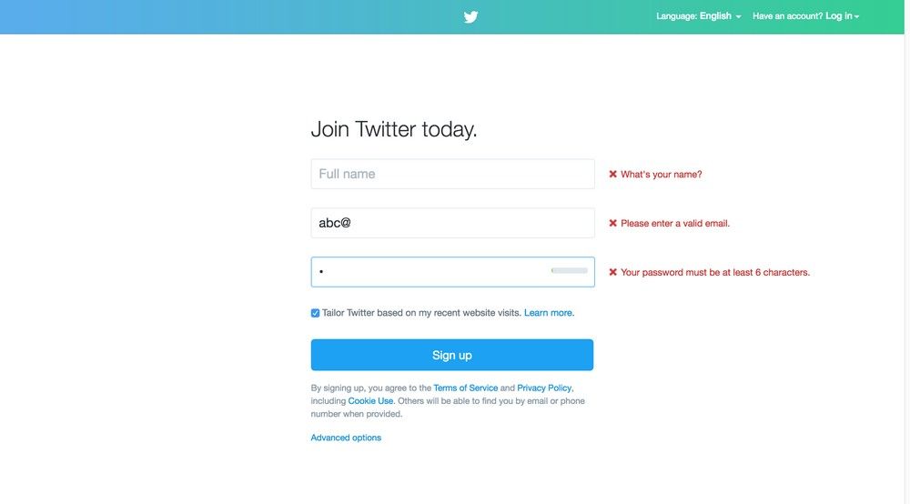
Twitter error messages use Standard English. Also, the error messages are marked in red and placed next to the input fields. It makes it easy for users to understand and correct their mistakes.
© Twitter, Inc., Fair Use
Principle 4: Robust – and How UX Designers Can Incorporate the Principle
“Principle 4: Robust – Content must be robust enough that it can be interpreted reliably by a wide variety of user agents, including assistive technologies.”
Guideline 4.1 – Maximize compatibility with current and future user agents, including assistive technologies.
Design Example: Responsive Web Design
Responsive Web Design is a web design approach coined by web designer and developer Ethan Marcotte in 2011. This approach enables designers to create websites that are robust, accessible and optimized for different browsers and screen sizes.
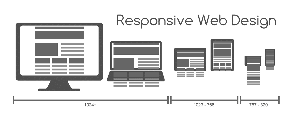
Responsive Web Design is an approach to creating websites for different browsers and screen sizes.
© Muhammad Rafizeldi, CC BY-SA 3.0
The Take Away
As designers, we need to plan and design for accessibility in UX projects. We have the responsibility, not only to our profession but also to our users and society, to design accessible digital solutions. One simple method of including accessibility in our UX projects is to assign a disability to one of the personas. Another method is to follow the Web Content Accessibility Guidelines (WCAG), as developed by the W3C (directed by the inventor of the World Wide Web, Tim Berners-Lee) and inspired by the UN convention principles.
As a community, we can remove discrimination against people with disabilities and protect their rights to be part of society. By doing so, we will create access to all products and services that will delight everyone.
Hero Image: © David Amsler, CC BY 2.0
References & Where to Learn More
Course: Accessibility - How to Design for All
World Health Organization(WHO), International Classification of Impairments, Disabilities, and Handicaps, 1980.
United Nations, Convention on the Rights of Persons with Disabilities, 2006.

