This article examines two closely related ideas that are both about looks. Our design world revolves around nice images/form, but did you wonder why we’re allured to beauty? Let’s quickly ponder another question: why is a pretty post office different from a gorgeous art gallery?
We’ll look at these two “sides” of this “coin”, namely Attractiveness Bias and Form Follows Function. With a grasp of both, you’ll be able to plan better designs.
The Attractiveness Bias or the power of beauty
We are biased towards aesthetic forms. That is a fact; we love looking at beautiful things and are drawn to prettiness, both in the bricks-and-mortar world and in the digital one. In the digital arena, a more attractive website is just one click away. When users visit a website or even try a new app, they make quick decisions on whether to stay on that site/app or keep looking for another one. Much of that decision hinges on the aesthetic appeal of the web page’s design. Cramped, ugly sites have a much harder time keeping a user engaged than well laid out sites. This is why, as designers, we can harness the principle of attractiveness bias to build relationships with users quickly. That might sound extremely obvious, but it’s crucial to understand and not take for granted. We can plan out a pretty picture.
It’s easy to get caught up in delivering an aesthetically pleasing website or app rather than one which delivers a great user experience. If you keep the rule of thumb that “form follows function” (which we will examine soon) in mind, you may be better placed to strike a balance between aesthetics and user experience.
The Call of Beauty
![]()
People have always been attracted to beauty or“attractiveness”. We see people who dress appealingly, and we respond favorably. We see a Ferrari or a Porsche, and our attention is captured by such “headturners”. Standards of beauty do differ from culture to culture and person to person. Have you heard the old expression, “there’s no accounting for taste”? There are, nonetheless, items, people, websites, etc. that the majority of folks find aesthetically pleasing. Eyes “understand” beauty, no translation required.
For centuries, architecture has harnessed the understanding that beauty matters. Buildings are permanent landmarks, so it’s important to enjoy them. Architects tend to design structures that appeal to those who live and work in them. Yes, there are always exceptions, but at least the monstrosities will remind us why getting it right is vital!
Attractiveness bias is simply the understanding that we’re drawn to beautiful things. When we see a group of people, we tend to see those we find the most attractive before noticing the rest of the group. People with confident smiles and moviestar looks may as well have a spotlight on them. Good clothes make them stand out more. Speaking of clothes...the same is true when you select jewelry or a garment from a display; the most beautiful piece will almost “leap out” from the other, less attractive pieces. Yes, most often it’s the most expensive one!
We designers can use this principle of attractiveness bias to help grab and hold the attention of users. We can use it in marketing to drive visits to a website. We can also use it to promote one product among many. Apple has done this incredibly successfully, enabling their products to shine in the consumer mind over many similar products from competitors.
The Short-term Effect of Attractiveness
It’s important to know that attractiveness bias is a short-lived effect. The most beautiful website cannot keep visitors without providing an equally attractive user experience. Once that “wow factor” has died down, it’s the utility of a site that holds the attention. Imagine a very good-looking actor turning up for an audition. The casting director will be impressed; however, our poor actor hasn’t mentioned that he’s only started acting school. Worse, he’s not good at acting and stammers when nervous. Alas, our casting director starts feeling disappointed very quickly.
In essence, while an ugly website may never grab the user’s attention, a beautiful website without any real use will not hold the user’s attention for more than a few seconds. Beauty may be in the eye of the beholder, but the eye gets tired very quickly, almost as quickly as it gets turned off by ugliness.
This also explains why an incredibly beautiful person who lacks intellect or personality may find it very easy to get a first date but very challenging indeed to get a second.
How Attractiveness Bias can help a website
Attractiveness bias can contribute to the success of a website in a variety of ways including:
Increased traffic to the website - An attractive site may draw more users via aesthetic appeal.
Emotional design - As people build an emotional connection with attractive people (even those they don’t know, such as actors and actresses), so do they form emotional connections with designs that move them or particularly appeal to them.
Lower bounce rate – Bounce rate is the time it takes a user to leave a website. An attractive website will likely hold the attention for longer than an ugly one. However, the main factor in deciding bounce rate will be the user experience. Pretty pictures can’t hold users for long: get the best of both worlds and enhance your beautiful design with one that gets users reading and clicking happily.
Increases in time on site and page views - If the website is pleasant-looking and the user experience is positive, it’s likely that users will spend more time on it.
While attractiveness bias is important to consider while designing your website, never forget the other half of the formula. Meeting the users’ needs and desires is in the long term more important to the success of your design.
Test your designs to see if they have the desired aesthetic appeal with your audience. A warm, sunny feel may be very appealing to the users of a website concerned with children’s toys. What about an adult using a horror movie website, though? The graveyard images, blood, gore and haunted nightscapes that they expect to find would scare off toy customers (unless Halloween is coming up and the pictures aren’t too shocking!).
Above all, stay mindful of how quickly the user’s eye will judge your design. You never get a second chance to make a first impression, so appeal to your users’ senses while you factor in everything else to keep them on your page.
Let’s now look at that ”everything else” and how they relate back to the look of what we choose to put in our designs. Let’s turn our ”coin” over and see, shall we?
![]()
Form Follows Function
The Guggenheim Museum and Google.com website exemplify how form follows function in design. “Form follows function” is an expression you’ll likely have heard, but what does it really mean? How can it help us when designing a website?
The phrase “form follows function” indicates that form, or the aesthetic design, should be derived from the function that it carries out. In his 1896 article, “The Tall Office Building Artistically Considered”, American architect Louis Sullivan wrote:
It is the pervading law of all things organic and inorganic, of all things physical and metaphysical, of all things human and all things superhuman, of all true manifestations of the head, of the heart, of the soul, that the life is recognizable in its expression, that form ever follows function. This is the law.
Sullivan’s assistant, Frank Lloyd Wright, went on to champion this idea ferociously. One of his buildings, the Guggenheim Museum, is a good example of form following function, with its spiral shape designed so that visitors can easily view the artwork within the museum.
From the world of design, we have this quote by Charles Eames that matches the ideas above: “Design is a plan for arranging elements in such a way as best to accomplish a particular purpose.”
[Did you miss our “Meet the Eames” article? Check it out to learn more about him and his wife Ray and their amazing contribution to design!]
Form Follows Function: Descriptive vs. Prescriptive Interpretation
![]()
Author/Copyright holder: Rose Business Technologies. Copyright terms and licence: All rights reserved
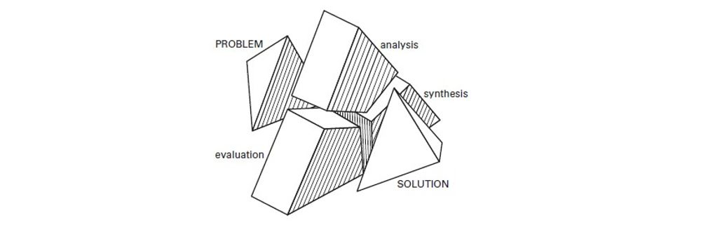
Is it true that forms follow function? If that’s the case, then there are a couple of ways to look at the idea:
The descriptive interpretation – Any beauty in a design must result from the “purity” of the function.
The prescriptive interpretation – Any aesthetic consideration when designing something must always take second place to the functional requirements of the design.
The descriptive interpretation is easy to dismiss. If we look at nature, mutations in the genome (those which cause evolution) are random. There’s no recipe to be followed. A species gets handed a form and then has to derive its function from that form. (Giraffes might prefer to eat food that grows under the ground, for example, but their long-necked form makes that impossible; thus, their function is to eat leaves from high branches.)
If we were to use this concept in design, we’d need to understand that function is more objective than aesthetics (we may both find something usable and useful, but you might consider it ugly, and I might think it beautiful, or vice-versa). Remember, there is no accounting for taste.
The prescriptive interpretation also leads to problems. It assumes that functionality is the only imperative for design. Usability, aesthetic appeal, and simple ergonomics are all secondary to the functionality.
If that were true, then all websites carrying out a similar task should be identical. After all, if we are to shop online, for example, the process of shopping should be the same each and every time. The functionality is all identical, and the prescriptive interpretation asks the designer to consider, “what should be left out of my design because it fails to serve the function?” There should only be one optimal form based on function.
“Form Follows Function” in Web and App Design
If you’re going to apply form follows function in your web or app design, you’ll have to reach a compromise. Begin by determining what aspects of the design (from a functional perspective) are most critical to your design’s success. For instance, a shop where you cannot place an order or a search engine with no “search box” is going to be somewhat useless!
Once you’ve decided on your design’s functionality, you can start to design. This doesn’t mean eliminating all design elements that distract from the functionality. Remember, aesthetic appeal matters to users. However, it can guide us to using designs that highlight the most critical functionality and which, to some extent, disguise less critical functions.
It can also help, when you’re time- or resource-poor, to understand where you can make trade-offs in the design process, both in terms of functionality and aesthetic design. You may make compromises: not to the critical functionality, but to all other functions and to aesthetic appeal. You want an attractive design that draws the user to use it for its chief purpose.
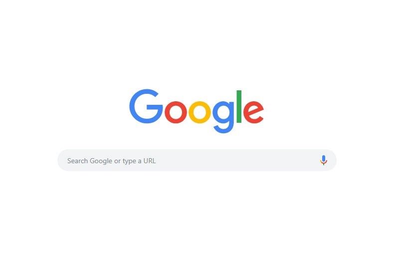
A great example of such compromise is Google.com, which deftly applies the “form follows function” rule. When you access Google's website, all you see is the search field, which is the primary function of the website. Google have put all other services at the top right-hand corner of the site. Google prioritizes the critical function of search over all other functions.
The Take Away
People are attracted to beauty. Attractiveness bias accounts for this systematic pattern of deviation. Although standards of prettiness differ from culture to culture and according to personal taste, the majority of folks will enjoy looking at a beautiful item, be it a website, a car, or another person. As designers, we can use this bias to our advantage.
However, attractiveness bias is a short-term effect. The aesthetic appeal of a design will ebb quickly, even if it has helped to latch with the user, showing in the following:
Remembering that we have a scant amount of time in which to hold our user’s interest, we must focus on the user experience. This means that we have to think about who our users are and how we can show our product, service, or message in the most adapted to their needs and desires.
This is when the idea of Form Follows Function comes into play. If we start with the “function” of the product or service, it is more likely that our users will stay with us after the pretty effect wanes. Keep the essential function of your product, service or message firmly in focus, tailoring the aesthetics around it and putting all non-essential aspects on the side, in smaller buttons or bars.
All in all, keep both concepts in mind as you work. Your users don’t want a disordered, ugly page. Still, after raising their eyebrows in a moment’s admiration at the “Mona Lisa” you’ve shown them, they’ll want to navigate quickly to find what they’re looking for. Balance is key.
Where To Learn More
Resources
Hero Image: Author/Copyright holder: Unknown. Copyright terms and licence: Unknown.


