What are the Five Elements of UX Design?
- 683 shares
- 9 years ago
Aesthetics is a core design principle that defines a design’s pleasing qualities. In visual terms, aesthetics includes factors such as balance, color, movement, pattern, scale, shape and visual weight. Designers use aesthetics to complement their designs’ usability, and so enhance functionality with attractive layouts.
“Design is the method of putting form and content together. Design, just as art, has multiple definitions; there is no single definition. Design can be art. Design can be aesthetics. Design is so simple, that’s why it is so complicated.”
— Paul Rand, Art director & graphic designer famous for logos such as IBM’s
See why good aesthetics involves careful consideration.
In this video, Michal Malewicz, Creative Director and CEO of Hype4, explains why you don’t need to be an artist to become a visual designer.
I want to tell you why those visual skills are important and why they're not really art related. So you don't need to be great at illustration drawing and anything like that to have better visual skills. You don't need to be an artist and design is definitely not art. It's not art because you have a very limited, you know, kind of scope of what you can do and you can't be too creative because that's going to make it unusable.
So a lot of those dribble shots are basically artworks and they're just not able to become a real product because they are done in a way to just kind of have like a flashy visual. So we need to understand that.
Aesthetics is an age-old principle that revolves around the nature of beauty and the fact that people prefer pretty things. It’s central to the fields of architecture, graphic design and more. As a vital ingredient in user experience (UX) design and interaction design, aesthetics impacts an interface’s UX in several ways. Humans are hard-wired for visual input, and users’ first impressions typically form in 50 milliseconds – as their gut reactions guide them to either continue using your design/product or abandon it. Aesthetics here refers to the lines, colors, spacing and more on websites and apps, namely what elements you choose and how you apply them. For example, when your website has good aesthetics, you:
Create an attractiveness bias – to appeal to users on a visceral level, leading to:
More traffic.
More time spent on site and page/screen views.
A lower bounce rate.
Make users more tolerant of usability issues – Studies show that users rate visually appealing designs as more usable than they truly are. This aesthetic-usability effect has been explored extensively, notably by UX design pioneer and author Don Norman.
Attractiveness bias is a short-term effect, though – good looks can’t save a bad product. So, it’s vital to design for the user experience and optimize usability, applying well-considered aesthetics to work together with your design’s functionality.
Copyright: Fair Use
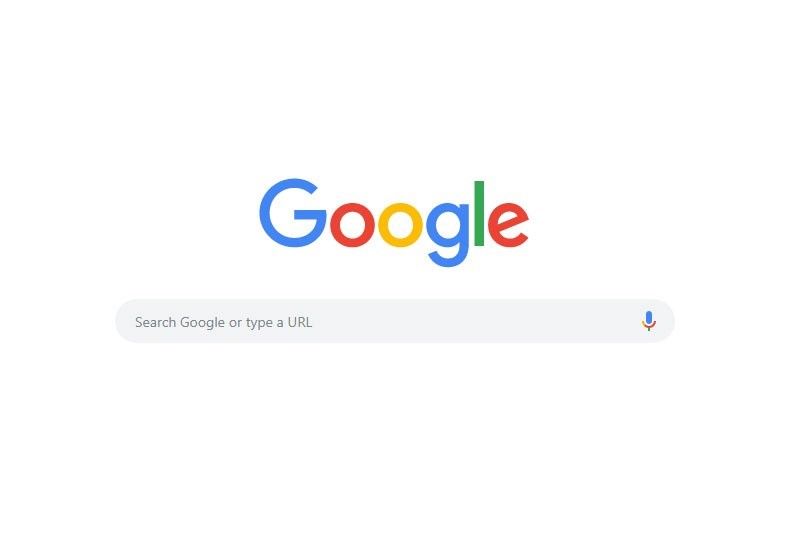
Google’s simple design showcases highly effective aesthetics – instantly declaring its purpose as users’ eyes are drawn to the function in the calm, clean layout they expect from Google.
In this video, Michal Malewicz talks about the aesthetic usability effect and explains why it’s important to keep it in mind when you create your design.
There is something called esthetic usability effect, which means that if something looks good, it's not really perceived by people as being more usable, even if it's not. So those visuals are important and we really, really need to keep that in mind. A lot of the users have now become very tech savvy. A lot of the people, you know, using apps and using websites have been using them for 15 or 20 years now, and they are very skilled.
So they understand the typical patterns. They know that checkout icons should be in the top right corner. They know how a good logging and registration works. So all things like that are kind of predetermined and there's pretty little innovation here. So you can do research to test the viability of the product. There isn't really much way to innovate and user interface. The visuals can be the differentiator. And of course we can use a design system like material design, but that would be
a horrible world to live in because those apps would be all looking boring and soulless and people want that design. That's why people buy Apple products, among other things, because they look good and they are different than everything else, at least sometimes. So people buy with their eyes and we really need to remember that.
Here are some key points:
Visual appeal exists in objectivity and subjectivity – While some aesthetic choices will resonate with all users and others will be flawed virtually everywhere (e.g., red elements on blue backgrounds), aspects of your users—including their culture, age and educational level—will impact how they perceive/receive your design. For example, the dangerous/racy connotations of the color red in the West contradict how Eastern cultures typically view red. So, user research is essential.
Let form follow function – This classic design concept means an object’s form (aesthetic design) should stem from the function it executes. As renowned designer Charles Eames stated, “Design is a plan for arranging elements in such a way as best to accomplish a particular purpose.” Therefore, it’s vital to set out well-chosen page/screen elements harmoniously and with a good visual hierarchy so you:
Guide the user’s eye to the page/screen’s functionality.
Make the aesthetics consistent with what users expect to see (e.g., sans-serif fonts for more casual websites).
Use timeless rules/principles such as the golden ratio, rule of thirds and Gestalt principles to optimize your choice and use of elements – to help eliminate users’ uncertainty and quickly give them the right visual cues. For example, by taking advantage of the Gestalt principles—where you exploit universal truths about how humans see things—you can achieve optimal contrast, spacing and more to please (or calm) users while sending the right messages about your product and brand. That includes maintaining transparency to maximize users’ trust.
Remember the context – Users access and use designs and products in—often complex and sometimes chaotic—real-world situations. They’ll want to achieve goals and get results fast, and need simple, crisp layouts with elements that maximize ease of use. When you respect their in-the-moment needs and use (e.g.) chunking to help lighten their cognitive loads, their appreciation will reflect in your design’s success. You can use aesthetics to highlight your design’s most crucial functionality and mute or disguise less critical functions. Good aesthetics can be extremely simple, as Google.com demonstrates.
Above all, design is a conversation with your users – and therefore why aesthetic and minimalist design (or zero clutter) is a principle used to check for usability issues in heuristic evaluation. Your element and layout choices should show your users the right things in the right way while telling them a fresh, captivating story about your brand. All your elements—including their overall effect together on each page/screen—should serve a purpose and instantly direct users to what they want to do. To produce a clean, good-looking and highly usable design, you’ll often need to make compromises and cut back on what to include. However, your design’s critical functionality always comes first – an attractive product that draws users to use it for its main purpose. Unlike art, good design aesthetics should be easily understandable – where users never have to guess what your design means.

Our landing page’s aesthetics supports its functionality.
Here’s just one of our courses addressing aesthetics.
Watch Michal Malewicz’s Master Class Beyond Interfaces: The UI Design Skills You Need to Know to learn more about how to design great user interfaces.
Read a thought-provoking account about aesthetics from a Google product manager.
See one designer’s detailed take on the relationship between aesthetics and usability.
This UX Collective blog explores aesthetics in various senses.
Find an additional, example-rich dimension of aesthetics here.
Aesthetics play a huge role in user experience because people judge a product’s usability based on its visual appeal. A well-designed interface builds trust, improves usability, and enhances engagement. However, a poorly designed one can make even a functional product feel frustrating.
Users often perceive beautiful designs as more intuitive, a phenomenon called the aesthetic-usability effect. If a website or app looks polished and professional, users are more likely to forgive minor usability issues. On the other hand, cluttered layouts, poor typography, or inconsistent colors can confuse navigation and harm any trust users might have been building in the brand.
Good aesthetics also improve emotional connection. A visually pleasing interface makes users feel comfortable and encourages them to stay longer. For example, Apple’s minimalist design creates a sense of elegance and ease, reinforcing its premium brand image.
However, aesthetics should never come at the cost of usability. A beautiful design is only effective if it supports functionality, accessibility, and a seamless user experience.
Enjoy our course Visual Design: The Ultimate Guide for a deep-dive into visual design, including aesthetics.
The aesthetic-usability effect is a phenomenon where users perceive well-designed products as easier to use—even if they have functional flaws. When something looks attractive and polished, people assume it works better, which leads to higher satisfaction and tolerance for minor usability issues.
For example, if a website has clean typography, balanced spacing, and a modern color scheme, users may feel it's intuitive—even if some navigation elements are slightly confusing. Conversely, a clunky but perfectly functional design may feel frustrating simply because it looks outdated or cluttered.
A classic example is Apple’s early iPods. Their sleek, minimalist design made users feel they were simple to operate, even though the click wheel had a learning curve. People trusted the design and were more willing to explore and adapt.
However, this effect has limits. If usability issues are too severe—like broken links or confusing interactions—good aesthetics won’t save the experience. Remember that users can “forgive” flaws only to a point, and the best UX balances beauty and function.
Watch our video about the aesthetic usability effect:
There is something called esthetic usability effect, which means that if something looks good, it's not really perceived by people as being more usable, even if it's not. So those visuals are important and we really, really need to keep that in mind. A lot of the users have now become very tech savvy. A lot of the people, you know, using apps and using websites have been using them for 15 or 20 years now, and they are very skilled.
So they understand the typical patterns. They know that checkout icons should be in the top right corner. They know how a good logging and registration works. So all things like that are kind of predetermined and there's pretty little innovation here. So you can do research to test the viability of the product. There isn't really much way to innovate and user interface. The visuals can be the differentiator. And of course we can use a design system like material design, but that would be
a horrible world to live in because those apps would be all looking boring and soulless and people want that design. That's why people buy Apple products, among other things, because they look good and they are different than everything else, at least sometimes. So people buy with their eyes and we really need to remember that.
Aesthetic design in UX follows key principles that make interfaces visually appealing, easy to use, and emotionally engaging.
Simplicity – Clean, uncluttered designs help users focus on what matters. Too many elements create cognitive overload and frustration. Example: Google’s homepage stays minimal to keep search effortless.
Visual hierarchy – Designers use size, contrast, and spacing to guide users’ attention to the most important elements. Example: Call-to-action buttons stand out with bold colors and placement.
Consistency – Designers repeat fonts, colors, and layouts across an interface to create a familiar experience. Example: Airbnb’s app maintains uniform spacing and typography for a smooth feel.
Balance and alignment – Well-structured layouts improve readability and make interfaces feel stable. Example: Apple’s website uses a balanced grid to create harmony.
Emotional appeal – Colors, typography, and imagery set the tone and influence user perception. Example: Calm’s app uses soft colors and gentle animations to create a relaxing experience.
Always remember that aesthetic design isn’t just about beauty—it enhances usability and builds user trust, too.
Watch as Author and Human-Computer Interaction Expert, Alan Dix explains important points about emotion and usability in design:
So feelings clearly matter in a user interface. That's why we worry about user experience. But depending on the kind of product, the kind of service, the kind of system you're creating, then feelings matter in different ways. So I'm going to distinguish two major ways this can be. So first of all, where emotion is the primary goal of what you're designing.
So eliciting that emotion is the very purpose of the product. So think about art. Think about games, entertainment applications in general. What you're trying to do is create a *sense of emotion* in the person. That's the primary goal. Other things are secondary. Now, in order to satisfy that primary goal, you often need to get *good functionality* and *good usability*.
So when you’re wanting to choose what movie to watch, you want to be able to find, perhaps, the box set that you know is there and the right episode of it as efficiently as possible. So you still have these fundamental usability requirements, even if the primary goal is emotion. But it's often the things that serve that. So think about again, if you're going to share a picture you just taken a picture of, whether it's a meal you're eating
or your cats or whatever else you're wanting to share, the sharing is about the emotional impact that you're wanting to pass on to other people, to your friends, and to your family. However, when you take that photograph, you want a very efficient, slick and easy process to actually get that shared on your social media channels. So, again, although emotion is the primary purpose of what you're doing, you still need the usability and functionality in order to support that process.
Alternatively, emotion might be a secondary goal. So the primary purpose might be something that's more, shall we say, business like. It might be about your work. So like I'm doing now, producing this video, it might be about office work, might be using a spreadsheet, using a database, might be about getting your money from the ATM and get the money out of the hole in the wall.
It might be about paying using your card in a restaurant. But the thing you're trying to do at that point, the primary goal is to get the thing done efficiently and effectively. However, typically, emotions help. They help in the sense that if you're doing, say, a repetitive job, then being alert is important. You know, this is true whether you're a policeman on the beat and watching out, or a soldier in a battlefield situation.
Whether you're driving your car and needing to sort of have a little bit of peripheral awareness. So emotion helps you do that. It helps you keep alert so that you're ready for things. So if you think about online shopping. Some of online shopping is about getting the job done and getting the thing purchased. But there's also an aspect of shopping, this is particularly true of offline shopping. Of when you go into a clothes shop where
the actual process of doing the shopping is part of the joy of the shopping. It's harder to do that online, incidentally. But there are some brands where that is the thing you’re trying to do. You're trying to create a sense of identity in the brand, a sense of joy in exploring it. So within the same kind of application area, online shopping, depending on the brand and depending on the person's need at that moment,
you might want to emphasize one or the other.
To balance aesthetics and usability in UX design, focus on creating a visually appealing interface which users enjoy without sacrificing functionality or ease of use.
That sounds a bit theoretical, so let’s get into how to do it. Start with clear navigation—users should instantly understand where to go and how to interact with elements. Don’t create overly complex visuals that distract from key actions. Example: Apple’s website looks sleek but keeps navigation simple and intuitive.
Then, use visual hierarchy to guide attention. Contrast, size, and spacing help highlight important elements like buttons and headlines without overwhelming users. Example: Spotify’s dark theme makes album covers and play buttons stand out.
Another thing to do is to maintain consistency in colors, fonts, and layouts. A polished, uniform design builds trust and reduces confusion. Example: Airbnb’s app uses the same clean design across its pages, which makes it nice and easy to explore.
Last, but not least, test your design with users. If an aesthetic choice makes interactions harder, simplify it. A beautiful design only works if it enhances usability—not if it gets in the way. So, make sure it’s an effective design for your brand’s users, not art for art’s sake—or because you think it looks “cool,” and everyone should too.
To get valuable insights into usability, enjoy our Master Class Micro-Usability: How to Design for Frictionless UX with William Hudson, Consultant Editor and Author.
Color theory is a major part of UX aesthetics because colors affect emotion, readability, and user behavior. The right color choices create visual harmony and smoothly guide users through an interface.
Psychology matters. Different colors trigger different feelings. For example, in the Western world, blue builds trust (often used in banking apps), red creates urgency (common in sales buttons), and green signals success (used in confirmation messages). Example: PayPal and Facebook use blue to convey security and reliability.
Contrast improves readability. High contrast between text and background ensures accessibility—making content easier to read. Example: Google follows strict contrast guidelines to enhance usability for all users.
Colors direct attention. Bright, bold colors highlight important elements, like call-to-action buttons. Meanwhile, neutral backgrounds keep the focus on content. Example: Spotify’s dark theme makes album covers and play buttons stand out.
A well-balanced color scheme improves both aesthetics and usability, which means the interface feels intuitive and visually appealing.
For one major dimension of aesthetic design, watch our Master Class How to Use Color Theory to Enhance Your Designs with Arielle Eckstut, Author and Co-Founder of The Book Doctors and LittleMissMatched, and Joann Eckstut, Color Consultant and Founder – The Roomworks.
Watch as Arielle Eckstut and Joann Eckstut explain important points about color:
The way in which we talk about the psychology of color also fall into the category of human invention, if not fake news. And unfortunately, there is very little research about how the brain actually responds to color. Most color psychology, quote unquote, “facts” are not based in science. And to understand our responses to color, it's crucial
to look at three different ways color affects our psychology. The first is our biological response. And we do know a bit about how we respond biologically, for example, to red objects. They inspire fear and sexual desire in scientific studies that have been done. We also know some things about how we respond biologically to blue light. It can help us with everything from seasonal affective disorder
to issues with our internal clocks to problems with concentration. The second is our cultural response. For example, in the West, blue is by far and away the favorite color and yellow, the least favorite color. But if you move to the East, yellow climbed to the top of the charts. And these differences have to do with different cultural associations with various colors. And the third is our personal association with color.
So if you happen to have gone to prison and were put in a pink cell, you probably have a pretty negative association with pink. But if you had one of your best nights of your life in this beautiful pink restaurant, you probably have a very positive association. So don't be fooled by claims like peach increases the appetite or green calms you or yellow uplifts you.
These might be true for some people whose personal, cultural and biological responses line up to support these claims, but test a different group of people across the globe or even in the same family, and you might find completely different results. It's not to say that color doesn't affect people. It of course, affects people. And often it's the same color can affect people all at once.
For example, if you put a group of people in a fluorescent yellow room with yellow floor walls and ceilings, I'm sure that group of people is going to feel something. But whether everyone in the room feels the same thing for the same reasons is at this point very hard to prove.
Typography plays a crucial role in UX aesthetics because it affects readability, hierarchy, and user perception. A well-chosen typeface makes content easy to read and visually appealing. In contrast, poor typography creates confusion and frustration.
Readability is key. Fonts should be clear, properly sized, and have enough spacing to avoid strain. Example: Google’s Material Design recommends a 14sp (scalable pixels) font size for body text to ensure readability.
Typography creates hierarchy. Bold, large fonts grab attention, while smaller text provides supporting details. Example: Apple’s website uses bold headlines to draw users in and smaller text for descriptions, making scanning effortless.
Font choice influences perception. Serif fonts feel traditional and trustworthy, while sans-serif fonts look modern and clean. Example: The New York Times uses serif fonts to maintain a classic, authoritative look, while Airbnb’s sans-serif typography creates a friendly, modern feel.
The main thing about well-designed typography is that it enhances UX by making content easy to digest and visually engaging—without overwhelming users.
Enjoy our Master Class The Tone of Typography: A Visual Communication Guide with Mia Cinelli, Author and Associate Professor of Art Studio and Digital Design, University of Kentucky.
Watch as Mia Cinelli explains important points about typography:
Spacing and alignment are essential in creating a visually appealing and user-friendly design. Proper spacing improves readability, while alignment makes a layout feel organized and professional.
Spacing enhances clarity. Too little space makes a design feel cluttered and overwhelming, while too much can disconnect related elements. Example: Apple’s website uses generous white space around text and images, and it makes content feel elegant and easy to scan.
Alignment creates structure. When elements are consistently aligned, the design feels balanced and polished. Poor alignment makes a layout look chaotic and unprofessional. Example: Google’s Material Design follows a strict grid system, ensuring elements align neatly for a clean and intuitive experience.
When designers use consistent spacing and alignment, users can navigate content effortlessly. These principles help guide the eye, reduce cognitive load, and create a visually harmonious interface. A well-structured layout isn’t just about aesthetics—it directly improves usability and user experience. There’s more to design than may meet the eye at first glance!
Enjoy our course Visual Design: The Ultimate Guide for a deep-dive into visual design, including aesthetics.
Cultural differences have a strong influence on UX aesthetics as different cultures have unique preferences for color, layout, imagery, and symbols. A design that works well in one country might feel confusing or unappealing in another.
Color meanings vary. Take white—in Western cultures, white symbolizes purity, but in some Asian cultures, it represents mourning. Example: Brands like Coca-Cola adjust their color use in global markets to align with cultural perceptions.
Reading patterns differ. Western users read left to right, so designs prioritize left-side content. However, Arabic and Hebrew speakers read right to left—so that will influence layout decisions. Example: Websites like Amazon adapt their layout for Middle Eastern markets.
Symbolism and imagery matter. Icons, gestures, and illustrations must be culturally appropriate. For instance, a thumbs-up is positive in Western countries but offensive in some parts of the Middle East. Example: Facebook modified its reaction emojis to be culturally sensitive worldwide.
Designers must understand cultural aesthetics so they can ensure designs resonate with users globally—improving usability and engagement—and don’t offend cultural norms.
Watch as Professor Alan Dix explains important points about designing with culture in mind:
As you're designing, it's so easy just to design for the people that you know and for the culture that you know. However, cultures differ. Now, that's true of many aspects of the interface; no[t] least, though, the visual layout of an interface and the the visual elements. Some aspects are quite easy just to realize like language, others much, much more subtle.
You might have come across, there's two... well, actually there's three terms because some of these are almost the same thing, but two terms are particularly distinguished. One is localization and globalization. And you hear them used almost interchangeably and probably also with slight differences because different authors and people will use them slightly differently. So one thing is localization or internationalization. Although the latter probably only used in that sense. So localization is about taking an interface and making it appropriate
for a particular place. So you might change the interface style slightly. You certainly might change the language for it; whereas global – being globalized – is about saying, "Can I make something that works for everybody everywhere?" The latter sounds almost bound to fail and often does. But obviously, if you're trying to create something that's used across the whole global market, you have to try and do that. And typically you're doing a bit of each in each space.
You're both trying to design as many elements as possible so that they are globally relevant. They mean the same everywhere, or at least are understood everywhere. And some elements where you do localization, you will try and change them to make them more specific for the place. There's usually elements of both. But remembering that distinction, you need to think about both of those. The most obvious thing to think about here is just changing language. I mean, that's a fairly obvious thing and there's lots of tools to make that easy.
So if you have... whether it's menu names or labels, you might find this at the design stage or in the implementation technique, there's ways of creating effectively look-up tables that says this menu item instead of being just a name in the implementation, effectively has an idea or a way of representing it. And that can be looked up so that your menus change, your text changes and everything. Now that sounds like, "Yay, that's it!"
So what it is, is that it's not the end of the story, even for text. That's not the end of the story. Visit Finland sometime. If you've never visited Finland, it's a wonderful place to go. The signs are typically in Finnish and in Swedish. Both languages are used. I think almost equal amounts of people using both languages, their first language, and most will know both. But because of this, if you look at those lines, they're in two languages.
The Finnish line is usually about twice as large as the Swedish piece of text. Because Finnish uses a lot of double letters to represent quite subtle differences in sound. Vowels get lengthened by doubling them. Consonants get separated. So I'll probably pronounce this wrong. But R-I-T-T-A, is not "Rita" which would be R-I-T-A . But "Reet-ta". Actually, I overemphasized that, but "Reetta". There's a bit of a stop.
And I said I won't be doing it right. Talk to a Finnish person, they will help put you right on this. But because of this, the text is twice as long. But of course, suddenly the text isn't going to fit in. So it's going to overlap with icons. It's going to scroll when it shouldn't scroll. So even something like the size of the field becomes something that can change. And then, of course, there's things like left-to-right order. Finnish and Swedish both are left-to-right languages. But if you were going to have, switch something say to an Arabic script from a European script,
then you would end up with things going the other way round. So it's more than just changing the names. You have to think much more deeply than that. But again, it's more than the language. There are all sorts of cultural assumptions that we build into things. The majority of interfaces are built... actually the majority are built not even in just one part of the world, but in one country, you know the dominance... I'm not sure what percentage,
but a vast proportion will be built, not just in the USA, but in the West Coast of the USA. Certainly there is a European/US/American centeredness to the way in which things are designed. It's so easy to design things caught in those cultures without realizing that there are other ways of seeing the world. That changes the assumptions, the sort of values that are built into an interaction.
The meanings of symbols, so ticks and crosses, mostly will get understood and I do continue to use them. However, certainly in the UK, but even not universally across Europe. But in the UK, a tick is a positive symbol, means "this is good". A cross is a "blah, that's bad". However, there are lots of parts of the world where both mean the same. They're both a check. And in fact, weirdly, if I vote in the UK,
I put a cross, not against the candidate I don't want but against the candidate I do want. So even in the UK a cross can mean the same as a tick. You know – and colors, I said I do redundantly code often my crosses with red and my ticks with green because red in my culture is negative; I mean, it's not negative; I like red (inaudible) – but it has that sense of being a red mark is a bad mark.
There are many cultures where red is the positive color. And actually it is a positive color in other ways in Western culture. But particularly that idea of the red cross that you get on your schoolwork; this is not the same everywhere. So, you really have to have quite a subtle understanding of these things. Now, the thing is, you probably won't. And so, this is where if you are taking something into a different culture, you almost certainly will need somebody who quite richly understands that culture.
So you design things so that they are possible for somebody to come in and do those adjustments because you probably may well not be in the position to be able to do that yourself.
Copyright holder: Tommi Vainikainen _ Appearance time: 2:56 - 3:03 Copyright license and terms: Public domain, via Wikimedia Commons
Copyright holder: Maik Meid _ Appearance time: 2:56 - 3:03 Copyright license and terms: CC BY 2.0, via Wikimedia Commons _ Link: https://commons.wikimedia.org/wiki/File:Norge_93.jpg
Copyright holder: Paju _ Appearance time: 2:56 - 3:03 Copyright license and terms: CC BY-SA 3.0, via Wikimedia Commons _ Link: https://commons.wikimedia.org/wiki/File:Kaivokselan_kaivokset_kyltti.jpg
Copyright holder: Tiia Monto _ Appearance time: 2:56 - 3:03 Copyright license and terms: CC BY-SA 3.0, via Wikimedia Commons _ Link: https://commons.wikimedia.org/wiki/File:Turku_-_harbour_sign.jpg
You can test the aesthetic appeal of your UX design by gathering real user feedback and using data-driven methods to measure visual impact.
Start with preference testing—show users different design variations and ask which they find more appealing. This helps identify colors, layouts, and typography that resonate with your audience. Example: A/B testing two homepage designs can reveal which one users find more visually engaging.
Use first-impression testing by showing users your design for five seconds and asking what stood out. This reveals whether key elements, like calls to action, are noticeable and visually clear. This can be extended to first-click testing, where users are given a goal and shown a page design. The visual design of the page will influence their success rate.
Conduct usability tests to see if beauty enhances function. If users struggle despite a polished design, you may have to adjust spacing, contrast, or visual hierarchy.
Last, but not least, perceive and interact with your design. Aesthetic testing isn’t just about looks—it’s to ensure beauty supports usability for the best experience.
Watch our video about the aesthetic usability effect:
There is something called esthetic usability effect, which means that if something looks good, it's not really perceived by people as being more usable, even if it's not. So those visuals are important and we really, really need to keep that in mind. A lot of the users have now become very tech savvy. A lot of the people, you know, using apps and using websites have been using them for 15 or 20 years now, and they are very skilled.
So they understand the typical patterns. They know that checkout icons should be in the top right corner. They know how a good logging and registration works. So all things like that are kind of predetermined and there's pretty little innovation here. So you can do research to test the viability of the product. There isn't really much way to innovate and user interface. The visuals can be the differentiator. And of course we can use a design system like material design, but that would be
a horrible world to live in because those apps would be all looking boring and soulless and people want that design. That's why people buy Apple products, among other things, because they look good and they are different than everything else, at least sometimes. So people buy with their eyes and we really need to remember that.
Take our course Data-Driven Design: Quantitative Research for UX for extensive insights into data-driven methods and how they can give powerful insights for more effective designs.
Moshagen, M., & Thielsch, M. T. (2010). Facets of visual aesthetics. International Journal of Human-Computer Studies, 68(10), 689–709.
This study delves into the various dimensions that constitute visual aesthetics in the context of human-computer interaction. The authors propose a comprehensive framework that identifies key facets such as simplicity, diversity, colorfulness, and craftsmanship. They demonstrate how these facets influence user perceptions and interactions with digital interfaces through empirical research. This framework is a valuable tool for designers aiming to create visually appealing and user-friendly interfaces.
Sonderegger, A., & Sauer, J. (2010). The influence of design aesthetics in usability testing: Effects on user performance and perceived usability. Applied Ergonomics, 41(3), 403–410.
This research examines how a product’s aesthetic design influences usability testing outcomes, focusing on user performance and perceived usability. The study reveals that aesthetically pleasing designs can positively affect users’ perceptions, even when functionality remains constant. These findings underscore the importance of considering aesthetic elements in the design process to enhance overall user satisfaction and performance.
Norman, Donald A. (2004). Emotional Design: Why We Love (or Hate) Everyday Things. New York: Basic Books.
In this seminal work, UX pioneer Don Norman explores the profound connection between emotions and design. He introduces the concept that attractive products provide functional benefits and evoke positive emotions, enhancing user satisfaction. Norman’s insights underscore the importance of aesthetics in creating pleasurable and effective user experiences.
Remember, the more you learn about design, the more you make yourself valuable.
Improve your UX / UI Design skills and grow your career! Join IxDF now!
You earned your gift with a perfect score! Let us send it to you.
We've emailed your gift to name@email.com.
Improve your UX / UI Design skills and grow your career! Join IxDF now!
Here's the entire UX literature on Aesthetics in UX/UI Design by the Interaction Design Foundation, collated in one place:
Take a deep dive into Aesthetics with our course Emotional Design — How to Make Products People Will Love .





We believe in Open Access and the democratization of knowledge. Unfortunately, world-class educational materials such as this page are normally hidden behind paywalls or in expensive textbooks.
If you want this to change, , link to us, or join us to help us democratize design knowledge!
