Customer Journey Maps — Walking a Mile in Your Customer’s Shoes

- 1.1k shares
- 2 weeks ago
Brand guidelines in user experience design (UX design) are a set of standards that define how a brand should represent itself in digital products. Designers use them to ensure consistency in the use of brand elements such as colors, typography, logos and imagery. They help keep a cohesive brand identity across different digital touchpoints, to boost user recognition and trust and align designs with brand values and messaging.
© NN/g, Fair Use
These guidelines are a vital way for brand designers to make a cohesive and impactful brand identity. They’re carefully crafted documents that don’t just dictate the visual aesthetics—like color palette and typography. They encompass the brand's tone of voice, core values and overall user experience, too. The main benefits for brands are that solid guidelines:
These guidelines are crucial to keep things consistent across all user interfaces (UIs) and experiences. They help make sure that every element—from the typography and color palette to the layout and logo—is uniform. This consistency helps users recognize and become familiar with the brand—and it nurtures a solid sense of reliability and predictability in user interactions.
When designers present a cohesive visual and communicative style to users, they build trust between their brands and their target audience. Users are far more likely to believe in the professionalism and reliability of a brand that consistently gets its message and values out across all platforms.
AI Designer, Ioana Teleanu explains important dimensions about trust and design in the age of artificial intelligence (AI):
AI can hallucinate and its behavior cannot be predicted most of the time. We can't anticipate what the user will be presented with as we can in a traditional interaction system where we design the interactions and the messaging step by step conventional user experiences are controllable. We understand and decide what happens next.
With AI, we have to accommodate surprises and equally important, communicate the risk for upfront setting the right expectations about performance, indicating whether the product learns over time, clarifying that mistakes will happen and that user input will teach the product to perform better and so on. Don't omit this transparent initial communication as AI systems operate with uncertainty, and if your users expect deterministic
behavior from a probabilistic system, their experience will be degraded. Another major problem is trust and transparency. People have a hard time trusting objects that feel magic. We can't trust what we can't understand. AI systems are not transparent to us for multiple reasons. For once, most of us lack the technical knowledge to actually understand what goes on under the hood. Second, and more importantly, many times with generative AI,
we have no idea where the information is coming from. Tools like GPT and Bard have the power of constructing answers that feel legitimate and sound very pertinent, but can be entirely made up and inaccurate. AI doesn't tell us how they've constructed an answer which would help. And maybe as designers, we should push for this transparency in generative AI, exposing a high level thinking process that gives us the information sources
and general reasoning that's behind an answer. Another reason that adds to the mistrust is how AI is communicated in the media. A Google algorithm that classifies people of color as gorillas, a Microsoft chatbot that decides to become a white supremacist in less than a day, a Tesla car operating in autopilot mode that resulted in a fatal accident. We've seen these isolated but terrible experiences. Sometimes the AI systems are described as black boxes,
so maybe the solution is opening them up. Companies such as Google, Airbnb and Twitter already released transparency reports about government requests and surveillance disclosures. A similar practice for AI Systems could help people have a better understanding of how algorithmic decisions are made. The last problem I want to mention is ownership and intellectual property. This, for me is a fascinating, a very important debate.
I want to start by saying that with so much AI generated art, what we'll all witness is a significant shift in what we value as a society. And to illustrate this argument, I want to give the example of Mona Lisa. Borrowing this from Mark Rolston. If you think about it, AI could basically recreate a one on one replica of Mona Lisa without any identifiable differences. Could actually make it better, more symmetrical, more technically impressive, and so on.
But it won't be Mona Lisa. If we know and in the future, AI art will probably be labeled as per regulations that are not yet in place but are needed. Adobe is already adding those labels. More will follow If we know that it has been generated by AI and we look at it, we probably won't feel too much. But if we're in front of Mona Lisa at the Louvre, we know this was made by da Vinci 500 years ago.
We can see the fascination of the people around us, their excitement. We ourselves can experiment our own version of interpreting and looking at it. We're humbled by being in front of this work of art that has been worshiped by humanity for hundreds of years. It has the potential of being an almost religious, fundamentally human and very touching experience, which is very unlikely to be experienced towards AI art. We will value what is human made.
We will know that something was created from a person's experience, suffering, imagination, hope, scarcity is not what will make art valuable. Its creator is. And then there's another layer to this debate. If AI creates art based on everything it knows from the work of other artists is that such a different expression of creativity from that of a person who has been in art school, studied Picasso, Matisse, Mondrian.
And then their style is influenced by the art history and the works they studied. Something to think about. I'm not saying theft is acceptable, which takes us back to the need for a more transparent, cited, source exposing system for generative AI. But I want to give a different angle on how art is built.
Brand guidelines simplify the design process for UX/UI designers—and that’s because they provide clear directives on the aesthetic and functional aspects of brand elements. This doesn’t just speed up the design process. It reduces discrepancies and confusion among team members, too. What’s more, it makes sure that everyone is on the same page. As a result, the final product is a well-integrated user interface—and one that aligns perfectly with the brand’s identity.
Amazon’s highly recognizable brand is more than just the sum of the parts of—for example—the look and feel of buttons. Amazon’s guidelines help to keep this trust high and long-term customer loyalty in place.
© Amazon, Fair Use
Designers who stick to their brand’s guidelines help keep themselves safe from diluting their brand’s identity through inconsistent application—a hazard that can confuse users and diminish brand equity. Guidelines help guide designers so that their work clearly communicates their brand's core values and identity—and that they preserve these across all user touchpoints.
These are some simple examples of customer touchpoints—places of interaction with a brand rather than channels, which are planned points of interaction.
© Rosenfeld Media, Fair Use
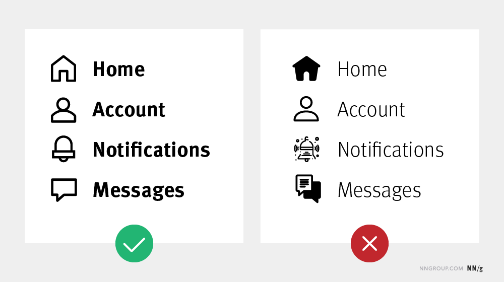
The logo is a paramount symbol of identity. For instance, Medium's meticulous design of its logo, wordmark and symbol showcases how important consistency and recognition in branding are. Each element—carefully constructed for visual harmony—has to remain unaltered to preserve the brand's integrity. Similarly, the way whitespace and margins appear makes sure that the logo breathes freely—and it’s something that helps keep prominence and readability across various platforms.
© Medium, Fair Use
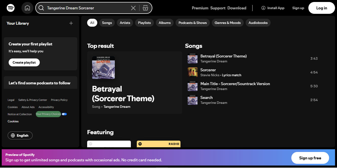
The color palette is a critical aspect of a brand's visual identity. It guides the design of all brand assets. It's not just about aesthetics; the right color combinations can evoke emotions and convey messages, too. For example, TikTok and Spotify have specific color schemes that align well with their brand values and really resonate with their target audiences. TikTok's guide emphasizes the general feel of the app. Meanwhile, Spotify's vibrant duotone colors are popular and appeal to users, which demonstrates how color can enhance user experience.
Spotify’s color use is part of its brand identity—and a vital way for users to know and trust they are, indeed, on Spotify.
© Spotify, Fair Use
Effective typography is essential for designers to make UIs that are readable and engaging. Designers have got to choose the right typefaces and organize them to optimize usability and get the brand's voice across accurately. For instance, the differentiation between serif and sans-serif fonts is something that has an impact on readability and mood—and it influences the user's perception of the brand. A well-defined typographic guideline makes sure that there’s consistency across all digital products. What’s more, it boosts the overall user experience.
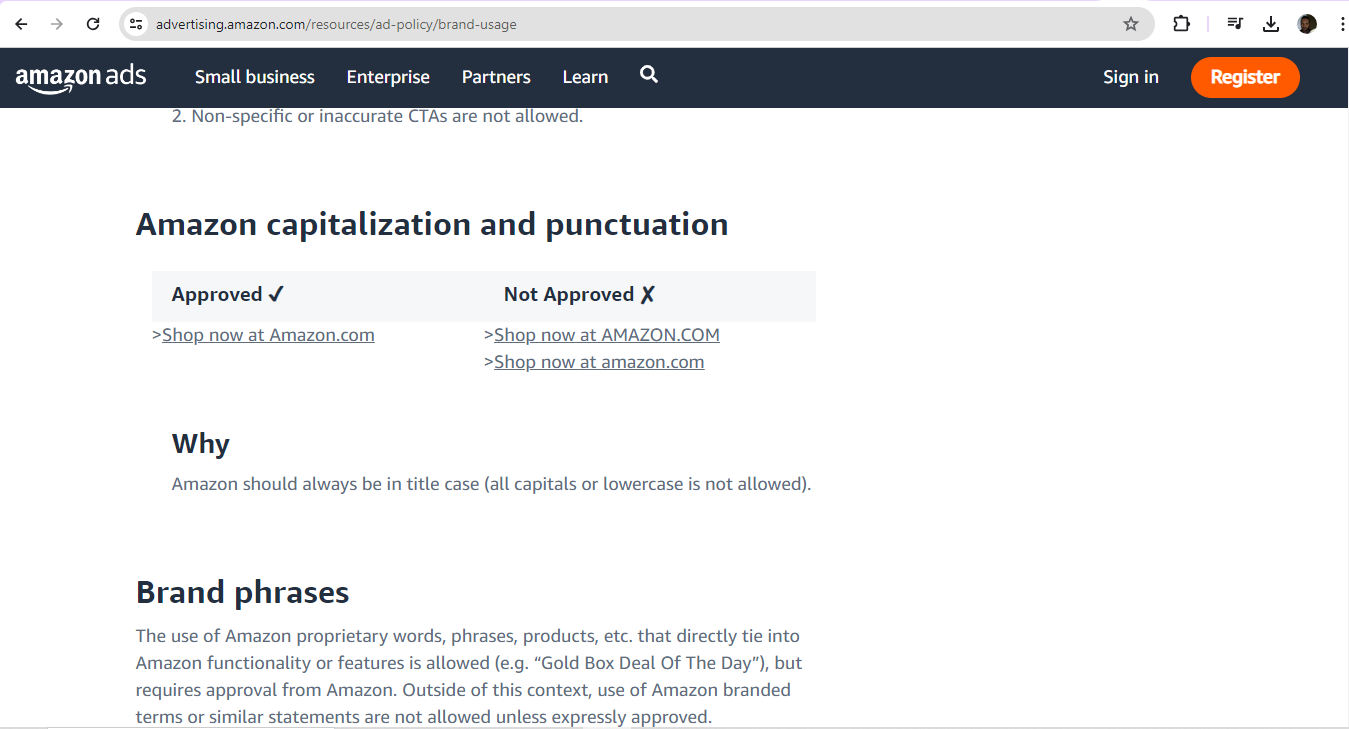
For example, typographical considerations also manifest in brand usage guidelines for third-party digital display ads.
© Amazon, Fair Use
Imagery includes icons, illustrations, photographs and data visualizations—and it plays a massive role in carrying the brand’s identity and personality. It's not just about choosing appealing images, though. It’s about making sure that these are in line with the brand's storytelling and emotional connection with its audience, too. For example, when brands pick consistent characteristics for photographs and illustrations, they can create a really cohesive visual experience—and it’ll be one that reinforces each brand's message.
The tone of voice in UX design extends far beyond the visual elements—and it really embodies how a brand communicates its personality through written and spoken words. Brands have got to find the right balance between being professional and personal, humorous and serious—depending on the context and the user's emotional state. For instance, a brand might take on a warm and reassuring tone to present itself genuinely and speak trust and professionalism to its target audience—like new parents looking for babysitters. This shows how a consistent and appropriate tone of voice can really establish trust and guide users through the product—and make the digital experience that much more engaging and memorable.
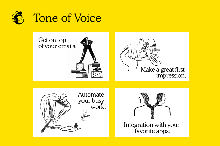
MailChimp’s brand guidelines cover how to bring offbeat humor and a conversational voice together in content.
© Arek Dvornechuck, Fair Use
Designers should stick to their brand’s established guidelines—ones that have proven to work well. Alternatively, they might be involved in a startup or consulted to create a brand’s style guide. Or they might have a voice in a rebranding process. There, they can have some influence on what those guidelines look like. In any case, designers should:
Brand guidelines make sure there’s a uniform appearance across all digital and physical platforms—to reinforce brand recognition and trust. So, designers should help create—or follow—a comprehensive brand style guide that’s accessible to all team members. The guide should have specific rules for verbal, written and visual communication. And regular updates to the guide should keep the team well in line with the brand identity. This will make sure there are smooth transitions between platforms—for a seamless multi-channel experience.
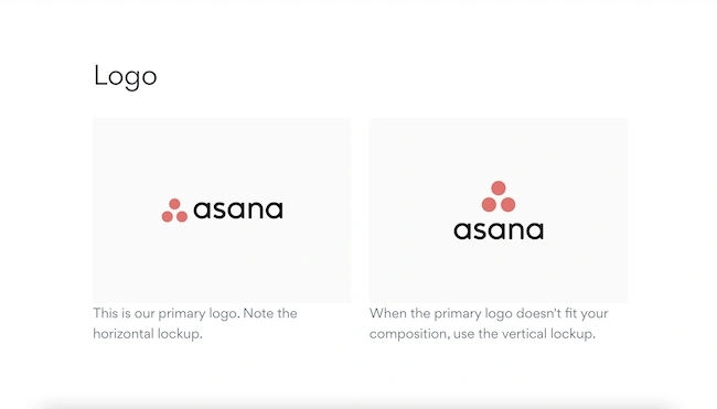
A detailed set of brand guidelines serves as a blueprint to represent the brand to the world—with key elements like logo usage, color palette, typography, imagery and tone of voice. And a brand style guide summarizes these guidelines. Brands should share it with clients and collaborators to keep confusion and inconsistency from happening. It’s got to include clear guidelines on how to adapt brand elements to meet platform-specific requirements and limitations. For example, there could be a section to address responsive design—or a variant for how the brand’s logo might appear:
From Asana’s brand guidelines.
© Asana, Fair Use
It’s especially vital to make sure that the brand guidelines are easy to understand and implement. Clarity and simplicity can help all stakeholders—both internal and external—stick to the guidelines more effectively.
Watch as CEO of Experience Dynamics, Frank Spillers explains responsive design:
Now, just to start off by saying responsive is a default. Responsive is not an option – *do it*. And the reason is because that's where the world is at. Everyone expects things to be mobile-optimized, and responsive just means that if I switch from my laptop to my tablet to my phone, the site's going to fit to that resolution; it's going to kind of follow me.
And we know that users do that; that's the default. So, by doing responsive design, you're supporting device switching, and that's why it's important. You're also potentially making things a little bit more accessible and SEO-friendly, which is a factor for Google's algorithm that prioritizes responsive sites.
Effective brand guidelines are the result of collaboration among all stakeholders who are involved in brand representation—and that includes internal teams, external partners, agencies and freelancers. If designers give everyone the same set of guidelines, they’ll help make sure that all materials that others produce for the company do actually reflect the brand identity—and consistently so. It's important to involve stakeholders in the creation of brand guidelines, as it will make sure that they’re practical and comprehensive. Regular communication and collaboration with stakeholders are essential things to keep the guidelines so relevant and effective.
Author, Speaker and Leadership Coach, Todd Zaki Warfel explains important points about dealing with clients:
This new narrative starts with *identifying your audience and intent*. The way you pitch an idea to a client, peer or executive requires an *adjustment to your language and approach*. Client – they're more of an occasional traveler. They don't know the system; they don't know the ins and outs. They're less likely to share your language. I mean, you're probably speaking design. They speak business and outcomes and results. So, you may need to establish a basic level of understanding.
Clients and executives are also less patient and don't want to waste 20 minutes going through every single detail just to get to the answer. Karen's what you would call an occasional traveler. She expected high-fidelity visual comps and just had a bottom-liner approach. Karen's one of these busy executives. She doesn't have time for – nor does she need to or want to hear – all the details. She just needs to know *why she should care*, *why it matters to her line of business*,
and then she can decide to support your proposal ...or not. Now, the last time the team had presented to Karen, they spent the *entire 60-minute meeting* walking her through *their process* and *justifying their decisions*. If you know anything about executives – a 60-minute meeting; *not* a good idea. Here's the rub. They never addressed the value of the business, and the team didn't come in with a clear ask.
In the own words of the team, it was the most grueling 60 minutes of their entire careers at this company. So, what do we do? Well, this time around, we started with audience and intent. We changed the story and wrote a new narrative and developed a new plan. We started with the *intended outcome* with Karen, shared a few *stories* and then highlighted the *value* that our approach would bring to her business – and quickly gained approval from her. And I'll never forget the moment; it was like eight minutes into my presentation.
I actually looked down at my watch to check, when Karen interrupted me mid-sentence and said, 'Okay, Todd – I get it. You've done your homework; you've clearly shown how the solution solves the problem and how it's better than my original idea. What do we need to do to move forward? What do you need from *me* to deliver this?'
Brand guidelines aren’t static; they’ve got to evolve with the brand. And regular reviews based on market trends, customer feedback and internal insights make sure that the guidelines do remain in line with business goals and brand values. It's important to get relevant stakeholders involved in the review process—and update guidelines as needed to reflect changes in branding strategies, messaging, visual identity and communication channels. This continuous process calls for monitoring, feedback and improvement to keep the brand fresh, relevant—and competitive, too.
It's essential to establish metrics—as well as feedback loops—to monitor just how effective the brand guidelines actually are. When brands and design teams get feedback in from both internal and external sources, they can work to improve the guidelines—and continuously so.
Design Director at Societe Generale CIB, Morgane Peng explains important aspects of how some stakeholders may view design-related topics:
I've been talking to a lot of people in agencies, startups, even from the GAFAs, to Google, to Apple, et cetera. And I realized that we share the same frustrations – from people who don't get design. They may sound familiar. We'll see. The first one is, 'Can you make it *pretty*?'; 'Can you do the 'UX' (whatever it is)?'; and, 'Can you add this *wow* effect?'
And if you're like me – so, this is me – when you hear that, you would cringe. And I've heard them a lot. Because what we really want to hear is... 'Can you make it *usable*?'; 'Can *we* do the UX *together*?'; And the last one: 'Can you *tell me what's broken*?'
It’s important to also be aware of the following points regarding branding and guidelines:
Brand guidelines have got to strike a delicate balance between consistency and adaptability. While strict adherence may make sure there’s a unified brand identity, too much rigidity can stifle creativity—and it can keep a brand back from being able to evolve with market trends. Brands have got to provide clear directives while they give some leeway or flexibility for creative interpretation. It’s best to make sure that guidelines are there as a supportive framework—and not as a restrictive set of rules.
Accessibility is an absolutely critical aspect of brand guidelines—and it’s one that brands mustn’t overlook. They’ve got to make sure that all communications are accessible to people with disabilities, and incorporate standards like WCAG 2.1 to guide how they make websites, mobile apps and other digital content. That includes the points that they’ve got to provide alternative text for images, make sure there’s sufficient color contrast and offer content in multiple formats to accommodate various disabilities.
Watch our video to understand why accessibility is a vital concern for brands and design:
Accessibility ensures that digital products, websites, applications, services and other interactive interfaces are designed and developed to be easy to use and understand by people with disabilities. 1.85 billion folks around the world who live with a disability or might live with more than one and are navigating the world through assistive technology or other augmentations to kind of assist with that with your interactions with the world around you. Meaning folks who live with disability, but also their caretakers,
their loved ones, their friends. All of this relates to the purchasing power of this community. Disability isn't a stagnant thing. We all have our life cycle. As you age, things change, your eyesight adjusts. All of these relate to disability. Designing accessibility is also designing for your future self. People with disabilities want beautiful designs as well. They want a slick interface. They want it to be smooth and an enjoyable experience. And so if you feel like
your design has gotten worse after you've included accessibility, it's time to start actually iterating and think, How do I actually make this an enjoyable interface to interact with while also making sure it's sets expectations and it actually gives people the amount of information they need. And in a way that they can digest it just as everyone else wants to digest that information for screen reader users a lot of it boils down to making sure you're always labeling
your interactive elements, whether it be buttons, links, slider components. Just making sure that you're giving enough information that people know how to interact with your website, with your design, with whatever that interaction looks like. Also, dark mode is something that came out of this community. So if you're someone who leverages that quite frequently. Font is a huge kind of aspect to think about in your design. A thin font that meets color contrast
can still be a really poor readability experience because of that pixelation aspect or because of how your eye actually perceives the text. What are some tangible things you can start doing to help this user group? Create inclusive and user-friendly experiences for all individuals.
To maintain brand consistency and foster creativity at the same time is a challenging—but essential—task. Brand guidelines should define core elements like logos and color schemes. They should, however, allow room for innovation in secondary elements as well. This balance helps brands stay relevant and engaging—without losing their identity. Regular updates and assessments of brand guidelines are crucial things to adapt to changing consumer preferences and market conditions.
Global brands face the challenge of how to adapt their guidelines to fit diverse cultural, legal and linguistic contexts—and not compromise their core identity. This process is known as glocalization—and, to practice it, brands have got to understand local preferences and modify their brand elements accordingly. Plus, they’ve got to simultaneously keep their overall brand consistency. Brands must avoid cultural stereotypes and work closely with local experts to make sure that their messaging is, indeed, appropriate and resonant in each market.
Watch as Author and Human-Computer Interaction Expert, Professor Alan Dix explains the need to design with culture in mind:
As you're designing, it's so easy just to design for the people that you know and for the culture that you know. However, cultures differ. Now, that's true of many aspects of the interface; no[t] least, though, the visual layout of an interface and the the visual elements. Some aspects are quite easy just to realize like language, others much, much more subtle.
You might have come across, there's two... well, actually there's three terms because some of these are almost the same thing, but two terms are particularly distinguished. One is localization and globalization. And you hear them used almost interchangeably and probably also with slight differences because different authors and people will use them slightly differently. So one thing is localization or internationalization. Although the latter probably only used in that sense. So localization is about taking an interface and making it appropriate
for a particular place. So you might change the interface style slightly. You certainly might change the language for it; whereas global – being globalized – is about saying, "Can I make something that works for everybody everywhere?" The latter sounds almost bound to fail and often does. But obviously, if you're trying to create something that's used across the whole global market, you have to try and do that. And typically you're doing a bit of each in each space.
You're both trying to design as many elements as possible so that they are globally relevant. They mean the same everywhere, or at least are understood everywhere. And some elements where you do localization, you will try and change them to make them more specific for the place. There's usually elements of both. But remembering that distinction, you need to think about both of those. The most obvious thing to think about here is just changing language. I mean, that's a fairly obvious thing and there's lots of tools to make that easy.
So if you have... whether it's menu names or labels, you might find this at the design stage or in the implementation technique, there's ways of creating effectively look-up tables that says this menu item instead of being just a name in the implementation, effectively has an idea or a way of representing it. And that can be looked up so that your menus change, your text changes and everything. Now that sounds like, "Yay, that's it!"
So what it is, is that it's not the end of the story, even for text. That's not the end of the story. Visit Finland sometime. If you've never visited Finland, it's a wonderful place to go. The signs are typically in Finnish and in Swedish. Both languages are used. I think almost equal amounts of people using both languages, their first language, and most will know both. But because of this, if you look at those lines, they're in two languages.
The Finnish line is usually about twice as large as the Swedish piece of text. Because Finnish uses a lot of double letters to represent quite subtle differences in sound. Vowels get lengthened by doubling them. Consonants get separated. So I'll probably pronounce this wrong. But R-I-T-T-A, is not "Rita" which would be R-I-T-A . But "Reet-ta". Actually, I overemphasized that, but "Reetta". There's a bit of a stop.
And I said I won't be doing it right. Talk to a Finnish person, they will help put you right on this. But because of this, the text is twice as long. But of course, suddenly the text isn't going to fit in. So it's going to overlap with icons. It's going to scroll when it shouldn't scroll. So even something like the size of the field becomes something that can change. And then, of course, there's things like left-to-right order. Finnish and Swedish both are left-to-right languages. But if you were going to have, switch something say to an Arabic script from a European script,
then you would end up with things going the other way round. So it's more than just changing the names. You have to think much more deeply than that. But again, it's more than the language. There are all sorts of cultural assumptions that we build into things. The majority of interfaces are built... actually the majority are built not even in just one part of the world, but in one country, you know the dominance... I'm not sure what percentage,
but a vast proportion will be built, not just in the USA, but in the West Coast of the USA. Certainly there is a European/US/American centeredness to the way in which things are designed. It's so easy to design things caught in those cultures without realizing that there are other ways of seeing the world. That changes the assumptions, the sort of values that are built into an interaction.
The meanings of symbols, so ticks and crosses, mostly will get understood and I do continue to use them. However, certainly in the UK, but even not universally across Europe. But in the UK, a tick is a positive symbol, means "this is good". A cross is a "blah, that's bad". However, there are lots of parts of the world where both mean the same. They're both a check. And in fact, weirdly, if I vote in the UK,
I put a cross, not against the candidate I don't want but against the candidate I do want. So even in the UK a cross can mean the same as a tick. You know – and colors, I said I do redundantly code often my crosses with red and my ticks with green because red in my culture is negative; I mean, it's not negative; I like red (inaudible) – but it has that sense of being a red mark is a bad mark.
There are many cultures where red is the positive color. And actually it is a positive color in other ways in Western culture. But particularly that idea of the red cross that you get on your schoolwork; this is not the same everywhere. So, you really have to have quite a subtle understanding of these things. Now, the thing is, you probably won't. And so, this is where if you are taking something into a different culture, you almost certainly will need somebody who quite richly understands that culture.
So you design things so that they are possible for somebody to come in and do those adjustments because you probably may well not be in the position to be able to do that yourself.
Copyright holder: Tommi Vainikainen _ Appearance time: 2:56 - 3:03 Copyright license and terms: Public domain, via Wikimedia Commons
Copyright holder: Maik Meid _ Appearance time: 2:56 - 3:03 Copyright license and terms: CC BY 2.0, via Wikimedia Commons _ Link: https://commons.wikimedia.org/wiki/File:Norge_93.jpg
Copyright holder: Paju _ Appearance time: 2:56 - 3:03 Copyright license and terms: CC BY-SA 3.0, via Wikimedia Commons _ Link: https://commons.wikimedia.org/wiki/File:Kaivokselan_kaivokset_kyltti.jpg
Copyright holder: Tiia Monto _ Appearance time: 2:56 - 3:03 Copyright license and terms: CC BY-SA 3.0, via Wikimedia Commons _ Link: https://commons.wikimedia.org/wiki/File:Turku_-_harbour_sign.jpg
As the best brand guideline examples show, UX brand guidelines are vital tools for designers to combine great-looking visual design elements in highly user-friendly interfaces and beyond. They can bring their brand’s personality to life in product designs that follow brand guideline color palettes and toe the line creatively with the brand guideline sheet. An active finger on the pulse of the industry and customer habits will also help to keep their brands relevant and capable of reliable support from marketing campaigns, too.
Overall, both brands, including marketing personnel, and designers, including graphic designers, must be aware that brand guidelines are significant far beyond aesthetic considerations. While the looks and sounds are indeed vital parts for users and customers to recognize, trust and have expectations about the brands they follow, designers need to expand the scope of how they represent their brands so that these companies and organizations appear in the best possible light at every touchpoint and across all channels. In this sense, web design plays a kind of customer service role in bolstering trust, for example. That’s key to forging a strong bond between customer and popular, successful brand.
Urban Outfitters’ brand guidelines help reflect the brand’s minimalist aesthetic, focusing on such areas as typography and calming color palette.
© Georgina Guthrie, Fair Use
Take our Service Design: How to Design Integrated Service Experiences course.
Read our piece, Customer Journey Maps — Walking a Mile in Your Customer’s Shoes.
Consult The Role of UI/UX Design in Branding: How to Create a Consistent Brand Identity by David Ephraim for additional important information.
Read Building Brand Guidelines: Creating Consistency Across Marketing Channels by Hailey Friedman for further insights.
Go to Defining Your Product’s Voice and Tone for the Best UX by Merav Levkowitz for more information.
Read 12 Branding Style Guide Examples For Your Inspiration for more examples and helpful information.
Consult 36 Great Brand Guidelines Examples by Simon Andrys for further insights and examples.
Go to Mastering the art of brand guidelines (with examples) by Georgina Guthrie for more details.
See 21 Brand Style Guide Examples I Love (for Visual Inspiration) by Karla Hesterberg for additional information.
Read 12 Branding Style Guide Examples For Your Inspiration by uBrand for further examples, including Spotify and Starbucks.
Brand guidelines outline specific rules for presenting a brand consistently across various platforms and media. They include details about logos, color schemes, typography, imagery and tone of voice—and they’re a practical tool for designers, marketers, and anyone involved in creating brand materials to ensure uniformity and coherence.
A brand book—though—provides a comprehensive overview of a brand's identity—encompassing its mission, vision, values, personality and positioning. It narrates the brand's story, explaining its purpose and the emotions it seeks to evoke.
So, while brand guidelines focus on the "how" of brand presentation, the brand book focuses on the "why." For example, brand guidelines might specify the exact color codes for a logo and the fonts to use in different contexts. The brand book, however, would explain why those colors and fonts were chosen—and how they reflect the brand's identity and values.
Watch our Master Class Beyond Design: Practical Tips for Freelancing & Creating Your Brand with Nakita M. Pope, Chief Chick and Principal Brand Strategist of Branding Chicks.
Author and Human-Computer Interaction Expert, Alan Dix explains about emotions and usability as core elements in design:
So feelings clearly matter in a user interface. That's why we worry about user experience. But depending on the kind of product, the kind of service, the kind of system you're creating, then feelings matter in different ways. So I'm going to distinguish two major ways this can be. So first of all, where emotion is the primary goal of what you're designing.
So eliciting that emotion is the very purpose of the product. So think about art. Think about games, entertainment applications in general. What you're trying to do is create a *sense of emotion* in the person. That's the primary goal. Other things are secondary. Now, in order to satisfy that primary goal, you often need to get *good functionality* and *good usability*.
So when you’re wanting to choose what movie to watch, you want to be able to find, perhaps, the box set that you know is there and the right episode of it as efficiently as possible. So you still have these fundamental usability requirements, even if the primary goal is emotion. But it's often the things that serve that. So think about again, if you're going to share a picture you just taken a picture of, whether it's a meal you're eating
or your cats or whatever else you're wanting to share, the sharing is about the emotional impact that you're wanting to pass on to other people, to your friends, and to your family. However, when you take that photograph, you want a very efficient, slick and easy process to actually get that shared on your social media channels. So, again, although emotion is the primary purpose of what you're doing, you still need the usability and functionality in order to support that process.
Alternatively, emotion might be a secondary goal. So the primary purpose might be something that's more, shall we say, business like. It might be about your work. So like I'm doing now, producing this video, it might be about office work, might be using a spreadsheet, using a database, might be about getting your money from the ATM and get the money out of the hole in the wall.
It might be about paying using your card in a restaurant. But the thing you're trying to do at that point, the primary goal is to get the thing done efficiently and effectively. However, typically, emotions help. They help in the sense that if you're doing, say, a repetitive job, then being alert is important. You know, this is true whether you're a policeman on the beat and watching out, or a soldier in a battlefield situation.
Whether you're driving your car and needing to sort of have a little bit of peripheral awareness. So emotion helps you do that. It helps you keep alert so that you're ready for things. So if you think about online shopping. Some of online shopping is about getting the job done and getting the thing purchased. But there's also an aspect of shopping, this is particularly true of offline shopping. Of when you go into a clothes shop where
the actual process of doing the shopping is part of the joy of the shopping. It's harder to do that online, incidentally. But there are some brands where that is the thing you’re trying to do. You're trying to create a sense of identity in the brand, a sense of joy in exploring it. So within the same kind of application area, online shopping, depending on the brand and depending on the person's need at that moment,
you might want to emphasize one or the other.
Here are key ones
Logo usage: Defines the correct and incorrect ways to show the logo—includes size, spacing and placement.
Color palette: Specifies the brand's official colors—and includes exact color codes for print and digital use.
Typography: Outlines the fonts to use in various contexts—detailing sizes, weights and styles for headings, body text and other elements.
Imagery: Gives guidelines on the style and type of images that reflect the brand's identity.
Tone of voice: Describes the brand's communication style and personality—including examples of preferred language, tone and messaging.
Application examples: Shows practical examples of how to apply the guidelines across different media—like business cards, websites and advertisements.
Watch our Master Class The Tone Of Typography: A Visual Communication Guide with Mia Cinelli, Associate Professor of Art Studio and Digital Design, University of Kentucky.
Watch as Arielle Eckstut and Joann Eckstut, Leading Color Consultants and Authors, explain six tips for choosing colors:
How do I choose the right colors? I am a firm believer that there are no such things as right colors. There is always more than one way to apply color successfully. But I do believe in asking a series of questions before choosing a palette. Number one. Most importantly, do you need to incorporate existing colors or are you starting from scratch?
Look at what's already there. Are you working with a company company that already has a turquoise logo like Waze, for example? That doesn't mean that a brochure you design has to match the turquoise, but it helps if your palette relates to the logo. If they're going to sit on the same page, you also should consider the context of the overall style of what's already in place.
Is the emphasis, for example, on darker, more conservative colors or bright and festive ones? Number two, what colors does your client love? What colors do you or the person or the company you're working with gravitate to? Does your client at fresh direct love the color green, but you're presenting them with oranges and reds. You're going to get a happier client, personally, if they like the colors.
If they personally, personally, like them. If not, it might not be so good. Getting a feel for their personal palette can be the key to success, and it can be as easy as putting a paint deck in front of someone and asking them to point to colors that they find appealing. Number three, what is the overall effect you're trying to create? Do you want a color scheme that shouts, “Here I am”?
or do you want something that whispers softly? It's not just the hue that you choose that evokes a particular feeling, but it's the chroma, meaning the intensity and the value how light or dark a color is as well. Intense colors emphasize objects that they cover and their flashy, dark, warm colors have a way of drawing things together and are intimate. Light cool colors have a way of opening things up
and making them more expansive, especially if they're in a similar hue and value. In the case of the Washington Post app, the deep blue connotes a seriousness and authority that matches with their mission. Number four, the effect of color on scale. Are you trying to make a room look smaller, bigger, taller or shorter? I use color to adjust any deficiencies
in the scale of a particular space. If I'm painting a room with an uncomfortably low ceiling, a lighter color on the ceiling than on the walls will make the room appear taller. As you can see on the slide on the left, if I'm painting a room with uncomfortably high ceilings, a darker color on the ceiling than on the walls will make that room appear lower. As you can see in the slide on the in the middle,
if you want to make a room feel less long and narrow. I would put an accent color on the end wall as in the slide on the right. The following slides illustrate how changing the paint colors can drastically change the scale and the feeling of a room. We are flipping through these now, just so you can get a quick sense of how this works and last on exterior facades. You can also see how color is used to emphasize either architectural details
like windows and trim or on the building form itself. In the left slide. The first and second houses are done in varying forms of a monochromatic scheme that is sort of maroon and dark blue, whereas the houses further down with the green and tan and the red and tan emphasize architectural details. In the slide on the right, the details like window
trim and doors are emphasized in the gray and yellow houses, while the architectural form of the building is emphasized in the charcoal gray house further down to the right. Number five. Are you looking for colors that are contrasting or harmonious? Once you have chosen your dominant hue, then you need to decide which color scheme you prefer.
Monochromatic schemes where you're using shades of the same color to give the greatest sense of harmony. Complimentary schemes that use highly contro casting colors that hit opposite each other on the color wheel can be anywhere from exciting to jarring. And then there's everything in between the two ends of the bell curve. In this last slide, there is what it's called an analogous color scheme where you can see the similar greens and in the green on the left it's
used with a color yellow, which is next to green on one side of the color wheel. And in the right side it's green with a blue, which is next to it, on the other side in the color wheel. Number six why a neutral in every palette. First, let me give you a definition of neutrals. Neutrals are created by mixing a hue and its complement together in varying proportions.
This muddies or grays down the original hue, neutrals help to bring other color choices together by creating a place for the eye to rest. And they work as excellent backgrounds for more intense accents. In this slide on the left, you can see that the neutral is used as the background color, and on the right, the neutral is used as an accent in the next slide.
You can see how the pale, gray, neutral acts as a background for intense accents.
The brand manager or marketing team usually creates and maintains brand guidelines. They work with designers and other stakeholders to make sure that the guidelines reflect the brand's identity accurately.
It all starts when the brand manager—who oversees the development of the brand guidelines—get input together from various departments, including design, marketing and product teams. Designers play a crucial role—and contribute their expertise in visual elements, such as logos, color schemes and typography. They make detailed specifications for these components to ensure consistency.
Once the brand guidelines get established, the marketing team makes sure of their implementation across all platforms and materials. They regularly review and update the guidelines to keep them current and relevant.
Watch our Master Class Beyond Design: Practical Tips for Freelancing & Creating Your Brand with Nakita M. Pope, Chief Chick and Principal Brand Strategist of Branding Chicks.
Author and Human-Computer Interaction Expert, Professor Alan Dix explains about emotions and usability as core elements in design:
So feelings clearly matter in a user interface. That's why we worry about user experience. But depending on the kind of product, the kind of service, the kind of system you're creating, then feelings matter in different ways. So I'm going to distinguish two major ways this can be. So first of all, where emotion is the primary goal of what you're designing.
So eliciting that emotion is the very purpose of the product. So think about art. Think about games, entertainment applications in general. What you're trying to do is create a *sense of emotion* in the person. That's the primary goal. Other things are secondary. Now, in order to satisfy that primary goal, you often need to get *good functionality* and *good usability*.
So when you’re wanting to choose what movie to watch, you want to be able to find, perhaps, the box set that you know is there and the right episode of it as efficiently as possible. So you still have these fundamental usability requirements, even if the primary goal is emotion. But it's often the things that serve that. So think about again, if you're going to share a picture you just taken a picture of, whether it's a meal you're eating
or your cats or whatever else you're wanting to share, the sharing is about the emotional impact that you're wanting to pass on to other people, to your friends, and to your family. However, when you take that photograph, you want a very efficient, slick and easy process to actually get that shared on your social media channels. So, again, although emotion is the primary purpose of what you're doing, you still need the usability and functionality in order to support that process.
Alternatively, emotion might be a secondary goal. So the primary purpose might be something that's more, shall we say, business like. It might be about your work. So like I'm doing now, producing this video, it might be about office work, might be using a spreadsheet, using a database, might be about getting your money from the ATM and get the money out of the hole in the wall.
It might be about paying using your card in a restaurant. But the thing you're trying to do at that point, the primary goal is to get the thing done efficiently and effectively. However, typically, emotions help. They help in the sense that if you're doing, say, a repetitive job, then being alert is important. You know, this is true whether you're a policeman on the beat and watching out, or a soldier in a battlefield situation.
Whether you're driving your car and needing to sort of have a little bit of peripheral awareness. So emotion helps you do that. It helps you keep alert so that you're ready for things. So if you think about online shopping. Some of online shopping is about getting the job done and getting the thing purchased. But there's also an aspect of shopping, this is particularly true of offline shopping. Of when you go into a clothes shop where
the actual process of doing the shopping is part of the joy of the shopping. It's harder to do that online, incidentally. But there are some brands where that is the thing you’re trying to do. You're trying to create a sense of identity in the brand, a sense of joy in exploring it. So within the same kind of application area, online shopping, depending on the brand and depending on the person's need at that moment,
you might want to emphasize one or the other.
Here are some good ones:
Research and analysis: Study competitors' color choices—to differentiate your brand. Analyze your target audience to understand their color preferences and cultural significance.
Color psychology: Pick colors that are in line with your brand's personality and evoke the desired emotions. For example, blue often represents trust and professionalism, while red can stand for excitement and passion.
Color palette: Create a primary color palette with one or two main colors that represent your brand, and then add a secondary palette with complementary colors.
Consistency across media: Define exact color codes for different media—including CMYK for print, RGB for digital and HEX for web.
Accessibility: Make sure your color choices meet accessibility standards. Use tools to check color contrast ratios—and make sure there’s high readability for all users, including those with color blindness.
Documentation: Include detailed specifications and usage examples in your brand guidelines—and show how to apply the colors in different contexts, such as logos, backgrounds and text.
Watch this video to understand more about why accessibility is such a vital design concern:
Accessibility ensures that digital products, websites, applications, services and other interactive interfaces are designed and developed to be easy to use and understand by people with disabilities. 1.85 billion folks around the world who live with a disability or might live with more than one and are navigating the world through assistive technology or other augmentations to kind of assist with that with your interactions with the world around you. Meaning folks who live with disability, but also their caretakers,
their loved ones, their friends. All of this relates to the purchasing power of this community. Disability isn't a stagnant thing. We all have our life cycle. As you age, things change, your eyesight adjusts. All of these relate to disability. Designing accessibility is also designing for your future self. People with disabilities want beautiful designs as well. They want a slick interface. They want it to be smooth and an enjoyable experience. And so if you feel like
your design has gotten worse after you've included accessibility, it's time to start actually iterating and think, How do I actually make this an enjoyable interface to interact with while also making sure it's sets expectations and it actually gives people the amount of information they need. And in a way that they can digest it just as everyone else wants to digest that information for screen reader users a lot of it boils down to making sure you're always labeling
your interactive elements, whether it be buttons, links, slider components. Just making sure that you're giving enough information that people know how to interact with your website, with your design, with whatever that interaction looks like. Also, dark mode is something that came out of this community. So if you're someone who leverages that quite frequently. Font is a huge kind of aspect to think about in your design. A thin font that meets color contrast
can still be a really poor readability experience because of that pixelation aspect or because of how your eye actually perceives the text. What are some tangible things you can start doing to help this user group? Create inclusive and user-friendly experiences for all individuals.
Watch our Master Class How To Use Color Theory To Enhance Your Designs with Arielle Eckstut and Joann Eckstut, Leading Color Consultants and Authors, who are among the most definitive authorities on color in the United States.
Try these steps:
Choose brand fonts: Pick primary and secondary fonts that reflect your brand's personality—and be sure these fonts complement each other and maintain readability.
Specify font styles: Define the styles for each font—and that includes weights (e.g., bold, regular), sizes and any variations (e.g., italics). Give clear examples of how to use these styles in different contexts—such as headings, subheadings and body text.
Outline usage rules: Establish rules for font usage—including line spacing, letter spacing and alignment. Specify when to use each font and style to keep a good consistency going.
Include hierarchy: Create a visual hierarchy for text elements—and define which fonts and sizes to use for headings, subheadings and body text to guide users in creating organized and readable content.
Give examples: Show examples of correct—and incorrect—typography usage.
Ensure accessibility: Ensure your typography choices meet accessibility standards—with legible fonts and appropriate contrast ratios to make text readable for all users.
Watch our Master Class The Tone Of Typography: A Visual Communication Guide with Mia Cinelli, Associate Professor of Art Studio and Digital Design, University of Kentucky.
Watch this video to understand more about why accessibility is such a vital design concern:
Accessibility ensures that digital products, websites, applications, services and other interactive interfaces are designed and developed to be easy to use and understand by people with disabilities. 1.85 billion folks around the world who live with a disability or might live with more than one and are navigating the world through assistive technology or other augmentations to kind of assist with that with your interactions with the world around you. Meaning folks who live with disability, but also their caretakers,
their loved ones, their friends. All of this relates to the purchasing power of this community. Disability isn't a stagnant thing. We all have our life cycle. As you age, things change, your eyesight adjusts. All of these relate to disability. Designing accessibility is also designing for your future self. People with disabilities want beautiful designs as well. They want a slick interface. They want it to be smooth and an enjoyable experience. And so if you feel like
your design has gotten worse after you've included accessibility, it's time to start actually iterating and think, How do I actually make this an enjoyable interface to interact with while also making sure it's sets expectations and it actually gives people the amount of information they need. And in a way that they can digest it just as everyone else wants to digest that information for screen reader users a lot of it boils down to making sure you're always labeling
your interactive elements, whether it be buttons, links, slider components. Just making sure that you're giving enough information that people know how to interact with your website, with your design, with whatever that interaction looks like. Also, dark mode is something that came out of this community. So if you're someone who leverages that quite frequently. Font is a huge kind of aspect to think about in your design. A thin font that meets color contrast
can still be a really poor readability experience because of that pixelation aspect or because of how your eye actually perceives the text. What are some tangible things you can start doing to help this user group? Create inclusive and user-friendly experiences for all individuals.
Imagery and photography play a crucial role in brand guidelines by visually representing the brand's identity and values. They help convey emotions, tell stories and create a strong visual impact—and here’s how:
Consistency: Imagery and photography guidelines make sure that all images align with the brand's style and message—so they give a cohesive look across all marketing materials, websites and social media.
Emotional connection: Images evoke emotions and help build a connection with the audience. And from using consistent imagery, the brand can evoke specific feelings—and reinforce its identity.
Quality standards: Brand guidelines define the quality and style of photos to use. This includes specifications for lighting, composition, color tones and subject matter.
Brand storytelling: Photography can tell the brand's story by showcasing products, services and experiences.
Diversity and inclusivity: Guidelines can ensure that imagery reflects diversity and inclusivity—representing different demographics and promoting a positive brand image.
Read our Topic Definition of Storytelling to understand more about this important tool in design.
Watch our Master Class How to Design for Neurodiversity: Inclusive Content and UX with Katrin Suetterlin, UX Content Strategist, Architect and Consultant.
There are some negative consequences of ignoring or not sticking to brand guidelines effectively—and these can harm a brand's image and effectiveness, such as:
Inconsistency: If the brand's appearance becomes inconsistent, this inconsistency confuses the audience—and weakens brand recognition.
Diluted identity: The brand can lose its unique personality and voice—making it harder to stand out in a crowded market.
Unprofessional image: Inconsistent use of logos, colors and fonts makes for an unprofessional image—and this lack of cohesion suggests a lack of attention to detail and can reduce trust in the brand.
Weaker emotional connection: Consistent imagery and messaging help build an emotional connection with the audience. Ignoring guidelines disrupts this connection—and makes it harder to engage with and retain customers.
Increased costs: Deviating from established guidelines often leads to more revisions and corrections—an inefficiency that drives up costs and brings delays in production and marketing efforts.
Watch our Master Class The Tone Of Typography: A Visual Communication Guide with Mia Cinelli, Associate Professor of Art Studio and Digital Design, University of Kentucky.
Author and Human-Computer Interaction Expert, Professor Alan Dix explains about emotions and usability as core elements in design:
You can use tools and software—and these include the following:
Adobe InDesign: Adobe InDesign offers powerful layout and design features. You can create detailed and visually appealing brand guideline documents.
Canva: Canva provides an easy-to-use platform with templates for creating brand guidelines. It's ideal for those without advanced design skills.
Figma: Figma allows for collaborative design, making it perfect for teams. You can create and share brand guidelines in real-time.
Sketch: Sketch offers a robust platform for designing and documenting brand guidelines. It’s especially popular for UI/UX design elements.
Microsoft PowerPoint: PowerPoint is a versatile tool for creating brand guidelines. It's easy to use and share with stakeholders.
Google Slides: Google Slides offers a collaborative environment for creating brand guidelines. Multiple team members can edit and review the document simultaneously.
Each of these tools provides unique features that can help you create professional and comprehensive brand guidelines. Choose the one that best fits your needs and skills.
Watch our Master Class The Tone Of Typography: A Visual Communication Guide with Mia Cinelli, Associate Professor of Art Studio and Digital Design, University of Kentucky.
Watch as Arielle Eckstut and Joann Eckstut, Leading Color Consultants and Authors, explain six tips for choosing colors:
Brand guidelines should be detailed enough to ensure consistency and clarity but not overly complicated. Effective brand guidelines typically include the following:
Logo usage: Give clear rules for logo placement, size, spacing and color variations—and give examples of correct and incorrect usage.
Color palette: Specify the exact color codes (CMYK, RGB, HEX) for all brand colors—and show how to use primary and secondary colors together.
Typography: Define the fonts for different uses (headings, body text, etc.)—and include sizes, weights and spacing rules.
Imagery and photography: Outline the style and tone of images that reflect the brand—and give examples and specify quality standards.
Tone of voice: Describe the brand's communication style—and include in that the preferred language and tone, and examples for various contexts, too.
Application examples: Show how to apply the guidelines across different media—like websites, business cards and advertisements.
Watch our Master Class How To Use Color Theory To Enhance Your Designs with Arielle Eckstut and Joann Eckstut, Leading Color Consultants and Authors, who are among the most definitive authorities on color in the United States.
Watch our Master Class The Tone Of Typography: A Visual Communication Guide with Mia Cinelli, Associate Professor of Art Studio and Digital Design, University of Kentucky.
Brand guidelines accommodate different cultural contexts when they incorporate flexibility and sensitivity to cultural nuances.
Color sensitivity: Different cultures perceive colors differently—so it’s important that guidelines specify alternative color palettes that respect cultural preferences and don’t offend any group.
Language and tone: Adjust the tone and language to suit the cultural context.
Imagery and symbols: Use images and symbols that resonate positively with the target culture—and don’t use imagery that may have negative—or unintended—connotations in certain regions.
Local references: Incorporate local elements and references to make the brand feel more relatable and authentic in different cultural contexts.
Examples and case studies: Provide examples of how to adapt the brand for various cultural contexts. And show case studies or successful adaptations to guide users.
Watch as Author and Human-Computer Interaction Expert, Professor Alan Dix explains the need to design with culture in mind:
Copyright holder: Tommi Vainikainen _ Appearance time: 2:56 - 3:03 Copyright license and terms: Public domain, via Wikimedia Commons
Copyright holder: Maik Meid _ Appearance time: 2:56 - 3:03 Copyright license and terms: CC BY 2.0, via Wikimedia Commons _ Link: https://commons.wikimedia.org/wiki/File:Norge_93.jpg
Copyright holder: Paju _ Appearance time: 2:56 - 3:03 Copyright license and terms: CC BY-SA 3.0, via Wikimedia Commons _ Link: https://commons.wikimedia.org/wiki/File:Kaivokselan_kaivokset_kyltti.jpg
Copyright holder: Tiia Monto _ Appearance time: 2:56 - 3:03 Copyright license and terms: CC BY-SA 3.0, via Wikimedia Commons _ Link: https://commons.wikimedia.org/wiki/File:Turku_-_harbour_sign.jpg
Watch our Master Class How To Use Color Theory To Enhance Your Designs with Arielle Eckstut and Joann Eckstut, Leading Color Consultants and Authors, who are among the most definitive authorities on color in the United States.
Brand guidelines play a crucial role in a rebranding process, too, by providing a clear framework for the new brand identity.
Consistency: Brand guidelines make sure that all elements of the new brand—like logos, colors and typography—stay consistent across various platforms and materials.
Clarity: They offer detailed instructions on how to implement the new brand identity—lessening the chances of confusion and making sure that everyone involved understands the changes.
Alignment: From defining the brand’s new vision, values and messaging, guidelines help align all communications with the updated brand strategy.
Efficiency: Clear guidelines streamline the rebranding process—namely, by providing specific directions, which saves time and resources.
Training: They serve as a training tool for employees, and so help them understand and apply the new brand identity correctly.
Monitoring: Guidelines help monitor the implementation of the new brand, and make sure that all changes do adhere to the new standards.
Watch as CEO of Experience Dynamics, Frank Spillers explains three UX techniques to improve customers’ experience and enhance a brand’s ROI:
Read our piece, Customer Journey Maps — Walking a Mile in Your Customer’s Shoes.
Roto, V., Lu, Y., Nieminen, H., & Tutal, E. (2015). Designing for User and Brand Experience via Company-wide Experience Goals. In Proceedings of the 33rd Annual ACM Conference Extended Abstracts on Human Factors in Computing Systems (pp. 2277-2282). ACM.
This paper discusses the importance of aligning user experience (UX) and brand experience across an organization. It argues that delivering a consistent brand experience calls for a company-wide effort, involving collaboration between experience designers and marketing teams. The authors propose defining company-wide experience goals that guide the design of all customer touchpoints—and ensure a cohesive brand and user experience. They present a case study from a company that implemented this approach, showing how it can lead to a stronger, more unified brand perception. The paper highlights the need for UX researchers and practitioners to consider brand experience alongside user experience—as both are crucial for creating a holistic, positive experience for customers and stakeholders.
Hassenzahl, M. (2008). User experience (UX): Towards an experiential perspective on product quality. In Proceedings of the 20th International Conference of the Association Francophone d'Interaction Homme-Machine (pp. 11-15). ACM.
This highly cited paper introduces the concept of user experience (UX) as a holistic approach to understanding and designing for the subjective experiences of users interacting with products or services. It argues that traditional usability measures are insufficient—and it proposes a framework for considering the experiential aspects of product quality, such as hedonic qualities, emotions and the creation of positive memories. This paper’s been influential in shaping the field of UX and emphasizing how important it is to design for meaningful experiences beyond just functionality.
Kapferer, J. N. (2012). The New Strategic Brand Management: Advanced Insights and Strategic Thinking (5th ed.). Kogan Page.
This book—while not directly about UX branding—is a widely recognized and influential work on strategic brand management. It covers topics such as brand identity, brand positioning and brand equity, which could be relevant to understanding how UX design and branding strategies intersect. The book gives a comprehensive framework for managing brands effectively—which are applicable to integrating UX principles into branding efforts.
Rappa, C. (2023). UI/UX & Branding Visuals with AI (The Full Dev Cycle Collection) [Kindle Edition].
This publication explores the integration of artificial intelligence (AI) into the design process—specifically focusing on the use of Midjourney, an AI platform for creating applications, branding elements, and logos. It aims to help designers streamline their workflow by leveraging AI for tasks such as prototyping, UI improvement, and system optimization. The book highlights the creative possibilities that AI can unlock, enabling designers to explore new avenues for branding and visual design.
Do you want to improve your UX / UI Design skills? Join us now
You earned your gift with a perfect score! Let us send it to you.
We've emailed your gift to name@email.com.
Do you want to improve your UX / UI Design skills? Join us now
Here's the entire UX literature on Brand Guidelines by the Interaction Design Foundation, collated in one place:
Take a deep dive into Brand Guidelines with our course Service Design: How to Design Integrated Service Experiences .
Services are everywhere! When you get a new passport, order a pizza or make a reservation on AirBnB, you're engaging with services. How those services are designed is crucial to whether they provide a pleasant experience or an exasperating one. The experience of a service is essential to its success or failure no matter if your goal is to gain and retain customers for your app or to design an efficient waiting system for a doctor’s office.
In a service design process, you use an in-depth understanding of the business and its customers to ensure that all the touchpoints of your service are perfect and, just as importantly, that your organization can deliver a great service experience every time. It’s not just about designing the customer interactions; you also need to design the entire ecosystem surrounding those interactions.
In this course, you’ll learn how to go through a robust service design process and which methods to use at each step along the way. You’ll also learn how to create a service design culture in your organization and set up a service design team. We’ll provide you with lots of case studies to learn from as well as interviews with top designers in the field. For each practical method, you’ll get downloadable templates that guide you on how to use the methods in your own work.
This course contains a series of practical exercises that build on one another to create a complete service design project. The exercises are optional, but you’ll get invaluable hands-on experience with the methods you encounter in this course if you complete them, because they will teach you to take your first steps as a service designer. What’s equally important is that you can use your work as a case study for your portfolio to showcase your abilities to future employers! A portfolio is essential if you want to step into or move ahead in a career in service design.
Your primary instructor in the course is Frank Spillers. Frank is CXO of award-winning design agency Experience Dynamics and a service design expert who has consulted with companies all over the world. Much of the written learning material also comes from John Zimmerman and Jodi Forlizzi, both Professors in Human-Computer Interaction at Carnegie Mellon University and highly influential in establishing design research as we know it today.
You’ll earn a verifiable and industry-trusted Course Certificate once you complete the course. You can highlight it on your resume, CV, LinkedIn profile or on your website.
We believe in Open Access and the democratization of knowledge. Unfortunately, world-class educational materials such as this page are normally hidden behind paywalls or in expensive textbooks.
If you want this to change, , link to us, or join us to help us democratize design knowledge!