Affective Computing

Emotional design is the concept of how to create designs that evoke emotions which result in positive user experiences. Designers aim to reach users on three cognitive levels—visceral, behavioral and reflective—so users develop positive associations (sometimes including negative emotions) with products, brands, etc.
“Everything has a personality: everything sends an emotional signal. Even where this was not the intention of the designer, the people who view the website infer personalities and experience emotions.”
— Don Norman, UX Design Pioneer
In this video, Professor Alan Dix explains why considering emotions is vital when you design experiences.
We are emotional creatures. We're not pure brain. Well, pure logic. But emotion drives so much of our lives. This is very clear in the technology world. You sometimes have images of like silicon wafers that really show the raw technology. Or one of those images of the blue light shining
from the super games computer with multiple video cards. But if you think about... one is the game that's going to be played on that computer with the video cards. Or from a technology point of view, think about social networks and the way you feel as you engage in those. Emotion is a crucial part of the way we engage with technology. It's part of being human and because we're human, it's part of our lives with the technology.
Irrespective of whether that is deliberate, it is always going to be there. This has been true since the very beginning of the use of technology. All technology, but particularly computing technology. Within Human-Computer Interaction, you can see the roots of this in the late eighties. And these three key words came out at this point. *Effectiveness*, which is, does something do the job you want it to do?
Does it satisfy the need? *Efficiency* – does it do it well? So is the user able to execute whatever they need to do using as few actions as possible, as easily as possible, as easy to remember is possible? But then there is a third word, *satisfaction*. Do they actually enjoy doing what they're doing? So these have been around since the late eighties. They found their way into ISO standards, that first emerged in the early nineties and are the existing standards today,
although they've been updated over the years. So very, very early on it was recognized that satisfaction was crucial. However, if you look back for probably the first 20 years of usability, it was often ignored, to the extent that often when people quoted these from the ISO standards, they quoted effectiveness and efficiency but forgot satisfaction.
Now, even if you're taking a very hard-edged business view of computer use, you're going to install something that's going to run in a large office or something like that. For pure business value, if your employees are happy, then they're likely to be productive. If your customers are happy, then they're likely to buy your product. Getting the right emotions is critical for business value
as well as for human value and for actually appreciating our users as whole human beings.
© Interaction Design Foundation, CC BY-SA 4.0
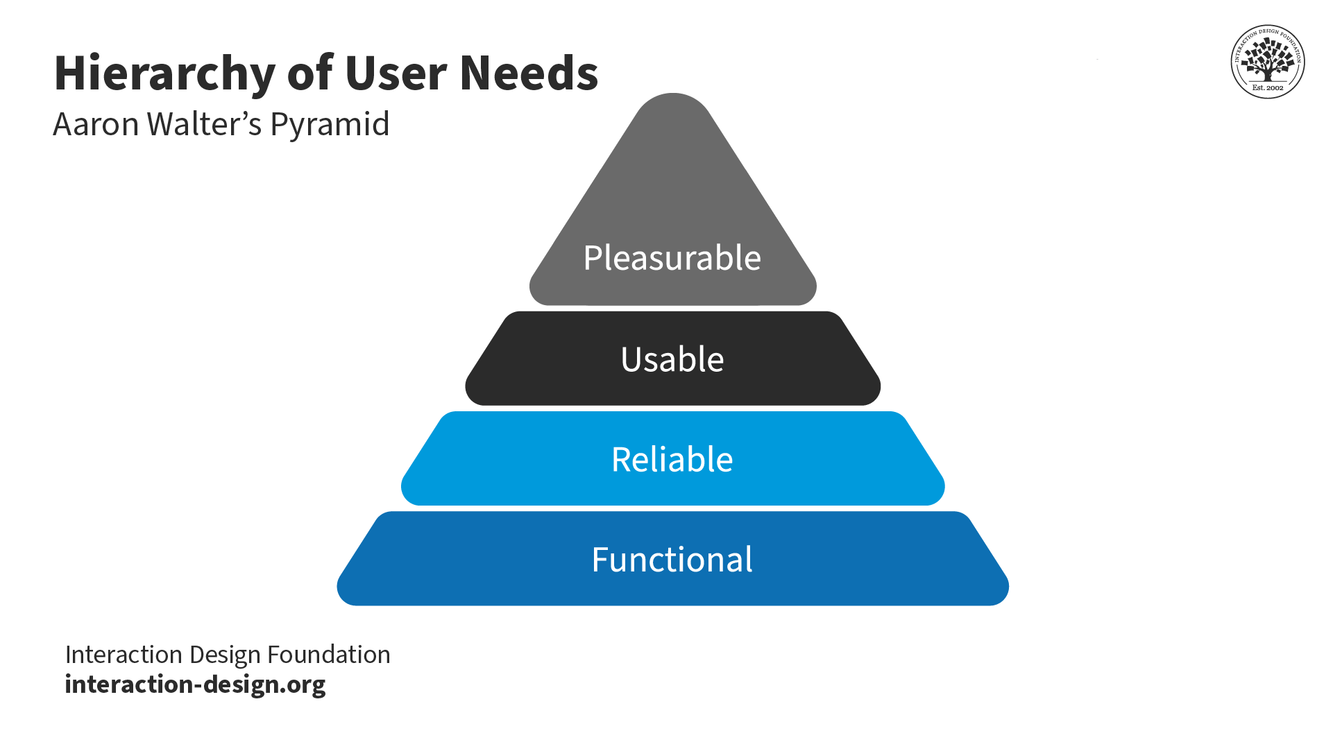
Designers should focus on users’ needs in their interactions with products or services. The functionality of a design should help users achieve their goals as efficiently and effectively as possible. However, a designer must also be keenly aware of their user’s responses—which are naturally emotional. As rational as people may like to think they are, emotions are at the heart of how humans interpret reality. Positive experiences drive curiosity. They help motivate us to grow as individuals. Negative experiences help us prevent repeated mistakes. However, these not-so-positive experiences can sometimes be fun—consider the chilling thrills of horror movies. Likewise, users associate feelings with what they encounter. They also have tempers; some get frustrated faster than others. The fact is that the emotional design of a product or service affects its success—and thus the bottom line. Whether or not they realize it, users have sophisticated thought processes going on most of the time. So, you must address three levels of cognitive responses when you design:
Visceral: Users’ gut reactions to or their first impressions of a design; e.g., an uncluttered user interface suggests ease of use.
Behavioral: Users subconsciously evaluate how a design helps them achieve goals and how easily. They should feel satisfied that they’re in control, with minimum effort required.
Reflective: After they encounter your design, users will consciously judge its performance and benefits, including value for money. If they’re happy, they’ll keep using it, form emotional bonds with it and tell their friends.
Emotional design can significantly impact user experience (UX) in several ways, here’s how:
Create a Connection: Products designed with emotional appeal can create a deeper bond between the user and the product. When users feel an emotional connection, they are more likely to have a positive experience and develop loyalty to the brand or product.
Apple products, such as the iPhone, are a prime example of how brands can create emotional connections with their users. The sleek design, intuitive interface, and the status symbol associated with Apple products create a deep emotional bond. Many Apple users are not just loyal; they are passionate advocates of the brand.
Usability and Satisfaction: A product that evokes positive emotions is often perceived as easier to use. Emotional design can make users more forgiving of minor usability issues and can increase overall satisfaction with the product.
So feelings clearly matter in a user interface. That's why we worry about user experience. But depending on the kind of product, the kind of service, the kind of system you're creating, then feelings matter in different ways. So I'm going to distinguish two major ways this can be. So first of all, where emotion is the primary goal of what you're designing.
So eliciting that emotion is the very purpose of the product. So think about art. Think about games, entertainment applications in general. What you're trying to do is create a *sense of emotion* in the person. That's the primary goal. Other things are secondary. Now, in order to satisfy that primary goal, you often need to get *good functionality* and *good usability*.
So when you’re wanting to choose what movie to watch, you want to be able to find, perhaps, the box set that you know is there and the right episode of it as efficiently as possible. So you still have these fundamental usability requirements, even if the primary goal is emotion. But it's often the things that serve that. So think about again, if you're going to share a picture you just taken a picture of, whether it's a meal you're eating
or your cats or whatever else you're wanting to share, the sharing is about the emotional impact that you're wanting to pass on to other people, to your friends, and to your family. However, when you take that photograph, you want a very efficient, slick and easy process to actually get that shared on your social media channels. So, again, although emotion is the primary purpose of what you're doing, you still need the usability and functionality in order to support that process.
Alternatively, emotion might be a secondary goal. So the primary purpose might be something that's more, shall we say, business like. It might be about your work. So like I'm doing now, producing this video, it might be about office work, might be using a spreadsheet, using a database, might be about getting your money from the ATM and get the money out of the hole in the wall.
It might be about paying using your card in a restaurant. But the thing you're trying to do at that point, the primary goal is to get the thing done efficiently and effectively. However, typically, emotions help. They help in the sense that if you're doing, say, a repetitive job, then being alert is important. You know, this is true whether you're a policeman on the beat and watching out, or a soldier in a battlefield situation.
Whether you're driving your car and needing to sort of have a little bit of peripheral awareness. So emotion helps you do that. It helps you keep alert so that you're ready for things. So if you think about online shopping. Some of online shopping is about getting the job done and getting the thing purchased. But there's also an aspect of shopping, this is particularly true of offline shopping. Of when you go into a clothes shop where
the actual process of doing the shopping is part of the joy of the shopping. It's harder to do that online, incidentally. But there are some brands where that is the thing you’re trying to do. You're trying to create a sense of identity in the brand, a sense of joy in exploring it. So within the same kind of application area, online shopping, depending on the brand and depending on the person's need at that moment,
you might want to emphasize one or the other.
Google's search engine exemplifies this. Its simple and clean interface, coupled with fast and relevant results, creates a positive user experience. Even if users encounter occasional irrelevant results, the overall efficiency and user-friendly design keep satisfaction high.
Memorability: Emotional experiences are more likely to be remembered than neutral ones. If a product can evoke a strong positive emotional response, users are more likely to recall and return to it.
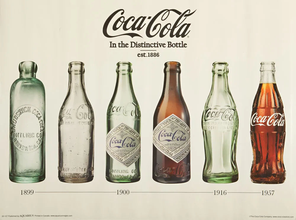
The classic Coca-Cola bottle design has a unique, recognizable shape that evokes nostalgia and makes it memorable. Even in a market flooded with soft drinks, the Coca-Cola bottle stands out and is instantly identifiable, often associated with positive emotions and memories.
The instantly recognizable Coca-Cola bottle has been around since 1957.
© Coca-Cola Company, Fair Use
Differentiation: In a crowded market, emotional design can help a product stand out. By appealing to users’ emotions, designers can differentiate their products from competitors’ offerings.
Dyson vacuum cleaners turn a mundane task into a more satisfying experience. With their innovative design, which showcases the technology inside, and the ease of use, they differentiate themselves with emotional design. They’re not just functionally different but also emotionally appealing.
Motivation and Engagement: Emotional design can motivate users to engage more deeply with a product. For example, a game that evokes excitement and joy can keep players coming back, while a well-designed educational app can make learning more enjoyable and engaging.
Video games like The Legend of Zelda demonstrate how emotional design in games increases engagement. They are designed to evoke excitement and joy with their engaging storylines, immersive worlds, and rewarding gameplay motivate players to continue exploring and returning to the game.
User Well-being: Thoughtful emotional design can contribute to the user's well-being. Products that are designed to be calming, reassuring, or joyful can have a positive impact on the user's mental state.
The Headspace app is designed to promote mental well-being. Its friendly animations, soothing color palette, and easy-to-follow guided meditations create a calming experience. The app's design helps reduce stress and anxiety, which positively impacts users' mental health.
Brand Perception: The emotions evoked by a product can reflect on the brand as a whole. A product that makes users feel valued and happy can improve the overall perception of the brand.
The branding and product design of TOMS Shoes, which includes a promise to help a person in need for every product purchased, creates a powerful emotional response. This strategy makes consumers feel they are contributing to a good cause, which improves their perception of the brand and fosters a sense of community and goodwill.
To apply emotional design, a designer first needs a good functional design to work with. A deep understanding of users ( gained through UX research) is essential. Here are some ways to apply emotional design:
Inject a signature personality: A face/mascot for users to identify with that suits a brand/organization/industry (e.g., MailChimp’s Monkey, Freddie).
Engage users as a character. Include personal touches in all tasks, to reinforce the illusion of a personable helper who knows users like an old friend.
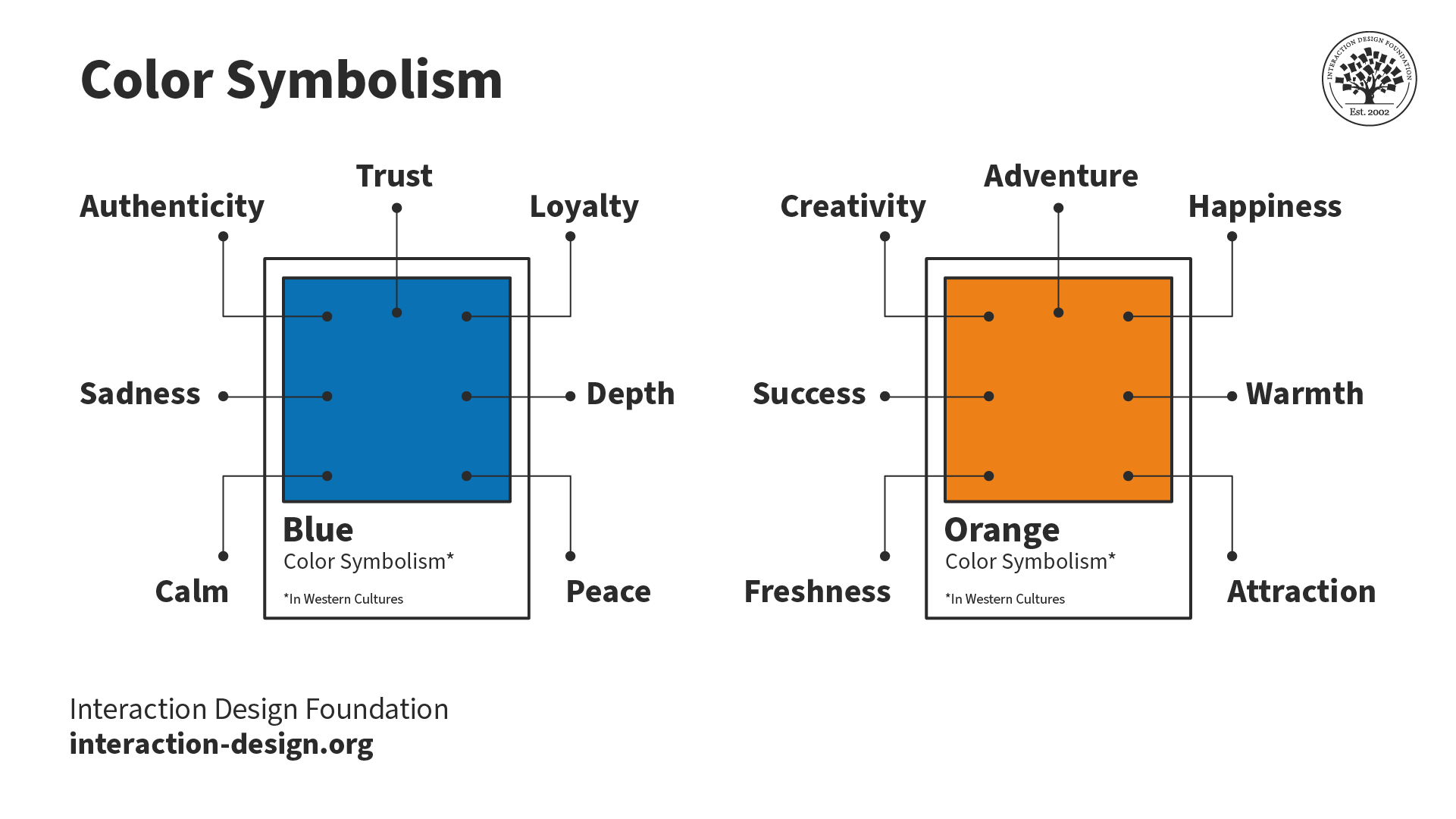
Use color/contrast advantageously (e.g., blue for banking = trustworthiness).
© Interaction Design Foundation, CC BY-SA 4.0
Craft copy with the right tone to inspire or accommodate emotions. Write appropriate terms/phrases (e.g., Slack’s “You’re here! The day just got better.” greeting). Use fonts and styles that suit the desired image.
Customize microcopy (labels, etc.) users can relate to which matches your other copy’s voice/tone.
Apply video/sound to carry messages “in character” (like in the above).
Personalize the experience for different users. (E.g., show users what else they might like, based on their information.)
Offer prizes and surprises (e.g., let users check how many likes they have and find new log-in background images). Consider including Easter eggs.
Use storytelling.
Maintain attention to detail, especially on error messages. Include polite, light-hearted/humorous messages to alleviate users’ frustration whenever problems arise (e.g., downtime). Consider treats to compensate for inconveniences—e.g., chances to win account upgrades.
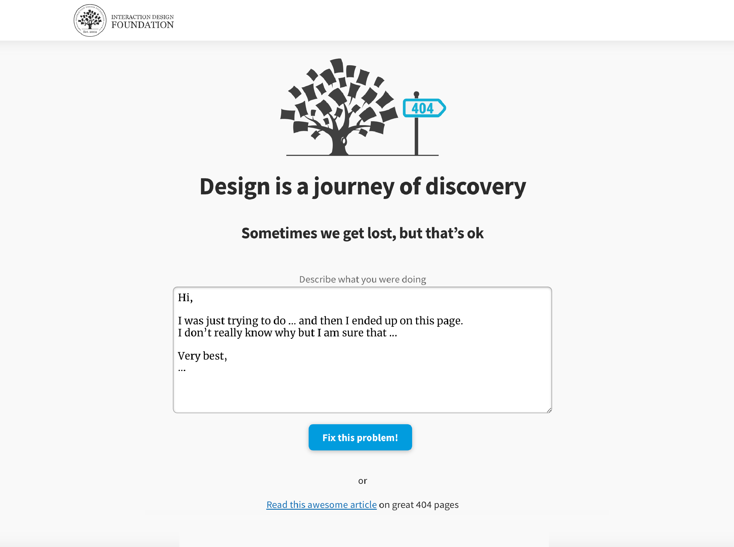
On the Interaction Design Foundation’s 404 error page, we use light-hearted language to try to alleviate frustration—and a small treat in the form of an article on great 404 pages.
Let's go to *emotionally compelling*. It's really important that you bring emotional value to your designs. It's going to be something that people will feel good about, they'll feel loyal, they'll enjoy it, they'll have joy of use – it'll be pleasurable. These are all the goals of emotion design so that users will come back to it – in other words, high adoption – and you remove the stress response from the experience. And so, users feel more bonded to things that make them *feel good*; it's just how we work as humans.
So, here's an example of Mint.com and just very clear – you know – tracking of your credit, of insights that they suggest, and then allowing you to customize your goals; so, really actually really, really important, the customization piece there because a lot of apps don't let you customize data; they sort of assume it for you. I'm thinking of, like, Apple's Digital Health – you know – where they
on the Apple phone it keeps track of what apps you use, but what Apple considers to be entertainment, I consider to be productivity, like YouTube, for example. And so, it's meaningless to me that it keeps track – it's not helpful. So, customization seems to be a really, really important one; we'll get to that later as well. But I want to just talk a little bit about Mint.com for a minute – that a senior designer was interviewed, and the original Mint.com was a disrupter to the industry. So, it was a breakaway like a startup,
and it was immediately successful. And that senior designer was interviewed and they said, 'What did you do?' And he said, 'Well, making it look credible; a lot of it was in the visuals, stripping things away,' and he emphasized the discipline of simplicity and taking away, taking away, taking away. And he called it *emotionally intelligent design*. When we talk about emotional value, we're talking about for example, in the Google Pixel 6 camera was the first time that they introduced
the sensitivity of the camera using algorithms like machine learning and a lot of other things to adjust the skin tone in the phone so that it was inclusive to people of color. And you can see in this example, without the filter – the color tone sensitivity filter – and with. And color tone in particular is a huge issue. For example, I had a Teams meeting once
and I thought, 'Geez! It seems like I look better with Zoom,' because I use Zoom mostly. And so, I opened Zoom and had Teams side by side, and there was a real difference. It was a little bit like this image. I looked terrible on the Teams version. And on the Zoom version I looked much better, like – I don't know – the color of my face or splotches or – you know – just things that probably didn't make me feel good; it seemed like I just looked a little...
washed out, I guess, like this image. And that's an example of emotional value, that if you can deliver just at that level of subtlety, that's a good thing. Now, to Teams' credit, they have the background noise reduction thing, using AI, which is great, so that's an emotional value-add, but they should have kept going. They should keep going and go deeper. Don't just do one emotional value-add, but make it *comprehensive*.
And that's not even to say there's— the whole thing with this topic is Zoom fatigue. Like, so you're constantly on camera with your face, and that's a known issue. It's been a known issue since 2020 – the start of the COVID – when Zoom basically got its big adoption. And none of the manufacturers, at least to date, to now, have developed any solution for that. And I'm thinking – I'll just throw out my solution, is an avatar that kind of – that doesn't show your face but tracks your body movement so you can see that you're present,
but you don't always have to have the physical face on camera, Zoom fatigue.
Above all, to creative positive emotional engagement, you must have a friendly presence in your design—to show users you know them. Reinforce this with happy customer testimonials and pictures of your office/team. Your design should look different from competitors’. It should also feel different, as a reliable, pleasurable part of users’ lives. Attractive designs that accommodate users’needs and feelings give the impression they work better, too. Whatever the emotions your design conjures in users, these feelings will affect the bottom line. Even a minor oversight can trigger the wrong impression overall.
There's a part of the brain where emotions are processed. And if that part of the brain has damage, people can't decide at all. It's the ventro-medial pre-frontal cortex (vmPFC). And sometimes this part of the brain is not working because of perhaps disease or injury. And when that happens, people don't feel emotions; they just don't feel anything emotionally. And interestingly, when that happens, they also can't make any decisions,
like not even deciding what they want for dinner. So, we know that there's a *connection between feelings and decision making*.
Take our Emotional Design course.
Read Smashing Magazine’s in-depth, example-filled piece on Emotional Design.
This blog is loaded with industry insights and examples.
For an insightful view of Emotional Design from the Grand Old Man of User Experience himself, Don Norman, read his book on the subject.
Emotional design in UX involves crafting design elements to evoke specific user emotions. It goes beyond mere functionality, aiming to create a memorable user experience. This video discusses the incorporation of emotional design in UX. It emphasizes four threads of user experience:
The sensual thread (immediate sensory experience)
Deeper emotional level (relationship and feelings)
Compositional level (integration with past experiences)
Spatio-temporal thread (influence of time and place)
As well as theories of emotion itself, raw emotion, there are also theories that come within the human-computer interaction area of the nature of experience. Based on experiences that are outside the digital domain and then used in order to understand the experiences that we design within digital products.
McCarthy and Wright, John McCarthy and Peter Wright, have written one of the more influential books about this. It’s certainly worth reading. And they talk, drawing on a lot of previous literature as well. They talk about four threads of experience. On one hand, the *sensual thread*, the sensual thread, which is that immediate visual, aural, tactile experience of something. The emotional impact of that, the way that changes the way you perceive things.
Then there's a sort of *deeper emotional level*, when you start to, that immediate response becomes something that you see in terms of relationships, in terms of your feelings about the world. Next, there's a point of – not necessarily next in series, but at a different level – is a sense of the way in which these integrate. And they call [them] the *compositional level* .
So that perhaps the thing that you've experienced is in some way sort of tying into past experiences. So you perhaps have smelt some cooking. You think, Oh, you know, this is lovely stuff, but it's going to be part of the meal we're about to have. But the meal we're about to have is because it's perhaps some anniversary or birthday, which ties into the whole sense of the family that goes around that.
So it becomes an integral part of something bigger. But then there’s also, there's a *spatio-temporal thread*. This is happening at a particular time in a particular place, and that also influences the nature of that experience. So the birthday party that's done in two places because you're remote and can't connect might be very different from the birthday party, perhaps held in the home you were brought up in or something like that.
So, where something happens, when it happens, also changes the nature of the experience. I will note too, quickly here, that when McCarthy and Wright talk about "emotional", they're of course, using "emotional" in the day-to-day sense, although they’re using it in their own specific sense. Not that use of "emotion" that psychologists use, which is the pure physical body reaction, which is closer to their sensual levels. So... you do have to realize that when you read literature,
these wordings do differ; be careful to understand what the person who's writing is actually using these words for. They then have a *sequential view* of an experience as well. So you can sort of think of a particular experience, like having that meal, in terms of stages. So there's an anticipation stage, “Oh, you know, we're going to have this meal together.” Perhaps you start to smell food and well, that’s part of the experience, part of anticipation.
You then have the experience itself. And there are these precognitive things like just being together, seeing the person, tasting it. And then the complex things that come with it. The sense of being community, perhaps a nostalgia if you’re perhaps remembering, perhaps somebody who used to be with you and is no longer with you. Then after the meal, you might look back at that and think, “Ah”.
It might have been a terrible meal, you might have had an argument, or you might look back and think, “Oh, that was a great experience.” And it becomes part of the stories you might tell in the future, the part of the way in which you see all those people, the people who were at that meal together. It connects into their past lives, the way you've seen them in the past and your whole experience of them. And then you might tell somebody else about, “Oh, I had this lovely meal.” Or you post onto Facebook and say, “We've had this fantastic meal.
It's nice to have been with X again.” And perhaps you talk about, "We were brought up together, we went to university together.” Something like that. So it suddenly becomes part of something bigger that may then feed into your future experiences.
Emotional design fosters a deeper connection between users and the product. It does so by integrating aesthetics, usability, and storytelling. The goal is to create designs that resonate with the users. It leaves a lasting and positive impact on users’ perceptions and interactions.
Norman’s emotional design theory has three levels: visceral, behavioral, and reflective. The visceral level is about immediate reactions to how something looks and feels. The behavioral level focuses on usability and how well a product does its job. Finally, the reflective level involves thinking about and interpreting the design, affecting emotions. These levels combine aesthetics, functionality, and meaning to shape user experiences.
This article on Norman’s three levels of design explores how these levels contribute to the user experience. It addresses immediate sensory responses and more profound emotional and cognitive aspects throughout the design process.
By incorporating emotional design principles, designers can create products that function well and resonate emotionally, providing users with a better experience.
Aesthetics: Focus on how the design looks and feels. It aims to create an immediate positive reaction.
Usability: Ensure the design is practical and easy to use, enhancing the user’s experience in performing tasks.
Storytelling: Convey a narrative through the design, allowing users to engage and connect with the product.
Meaningful Interaction: Design for meaningful user interactions, fostering a positive and memorable experience.
Reflection: Encourage users to contemplate and interpret the design, building a deeper emotional connection.
This chapter, “User Experience and Experience Design,” delves into the significance of emotional design principles in crafting a positive and impactful digital experience.
Emotional design enhances user experiences by creating a meaningful and memorable connection. It goes beyond functionality, influencing how users feel about and interact with a design. Users are likelier to remember and engage with products that evoke positive emotions. It results in a lasting impact on brand perception and success. In essence, the value of emotional design lies in its ability to forge deeper, more meaningful connections with users.
This article on how to put emotions in your design emphasizes the importance of tapping into users’ emotions to enhance the overall user experience.
Good design often incorporates elements of emotional design. However, these two concepts are not synonymous. A good design is a functional, user-friendly, aesthetically pleasing solution and meets its intended purpose. Conversely, an emotional design goes beyond mere functionality and aesthetics to consider the emotional impact on users. It aims to bring positive emotions, create a memorable experience, and establish a meaningful connection.
A design that blends design principles with emotional elements is functional and creates a lasting positive impression, boosting user satisfaction and loyalty. Watch this video on design principles for insights into crafting a robust and user-friendly experience.
Let's look at the mobile UX design checklist. This is a checklist that you want to internalize and keep in your head as you're designing. First of all is – are you making sure that your controls are *consistent*, to the operating system and to the application that you're developing? The second one is *proximity* – that closeness of items mean that those items are in relationship. So, the grouping, for example, like that means that these items are the same and the pattern there
is the 'OK / Cancel', for example. The third one is *visual hierarchy*. So, visual hierarchy is a concept from graphic design that says put the most important thing at the top and bring it down to the bottom. Generally, visual hierarchy is a reminder to put the important tasks up front on your screens,
and so the user doesn't have to navigate, doesn't have to play and look for them. And the fourth thing on the mobile UX design checklist is *contrast*. Contrast and emphasis – that's a graphic design issue. If you're using very light colors, if you're using light gray. I mean, go outside and test your design in the sun. Go out, go into a dark place and test your design – see what it looks like. Turn your brightness down. I've interviewed users who actually use their mobile phones with the brightness turned to the minimum – I could barely see the phone.
And I said to this user, "Can you turn your brightness up?" because I was actually videotaping and trying to get the phone in. He said, "No, I normally keep it down there just to save battery." So, what does your design look like on a low lighting, you know, where the user has deliberately turned the lighting down? That's another thing to test and make sure that it works for the eye but works for the lighting situation. And then, the fifth one on the checklist is *intuitive icons*. To me, if icons are not intuitive, then there's a problem with them – they're not usable.
So, when we say 'intuitive', it means no understanding – a user should look at an icon and know what it does. Otherwise, the icon maybe shouldn't be there; it shouldn't be used. That's my general rule of icon usability. And that applies to desktop as well. And then, finally, on our checklist – not to be missed – is *making the main task apparent*. That is huge and crucial – that's our task-oriented design approach. If you take one thing away from this checklist, it's that sixth element there
as one of your most important ones. So, let's go through some examples of these, then – *the consistency of controls*. So, you see here in this example, you have all the options side by side there. The in-call screen is a good one in the sense that you have this action, it's occurring – you know – it's a live call,
so how do you present and display the information? And these guys have decided to go with consistency – all the controls and the icons are the same size and the same positioning. That does make it easier to see. But it's not necessarily the right answer from a layout perspective. You could exaggerate one of those items, for example. Conference calls doesn't have the same priority as mute does for me.
To me, I'm muting more than I'm conferencing, for example. So, we can see some 'at a glance' data and call to actions as well in this example. So, the second one on the checklist is *proximity of controls*. You'll see proximity being used here. This is an iPad app – it's an EMR system, Electronic Medical Record. And the proximity we're seeing here is that
the grouping of that clinical information as buttons is all together, the vitals at the top and the patient history down at the bottom. You also have use of the left channel. Notice the left channel. Those buttons are huge because they're used when the patient is being interviewed, so the physician or the nurse needs to tap those very quickly and enter that data as part of the intake so they can get on with the exam.
Here are some different examples of visual hierarchy at use. You have the Yelp app on the left. And notice the the reviews, really important, at the top, right, so you can see the name of the – I think it's a pub, and the reviews, and then more information further down the page. The second app is from Open Table. Again, content first, so the name of the location and then the call to action is actually further down the page,
from the perspective of being able to easily tap those in that tappable area. And, of course, on the third example we've got the task up front and the main important things – prices and performance being one of the key tasks. It's like right there. Some other features further down is they've decided to go with a strict visual hierarchy: the important stuff at the top and then further down. So, our fourth item on the checklist is *using colors for emphasis*.
So, remember we talked about making navigation *pop*. So, you see some examples here of – the Fandango app is where you can see you're looking at the 'in theaters', and the other one here, the other app, you can see that you're on 'what's popular'. Even though the contrast is a little light there, the color is still highlighted nicely in the icon at the bottom on all three of these apps, so that at a glance you can tell where you are, what you're looking at,
and be able to pivot from there. So, our fifth one is *intuitive icons*. Some examples here: GasBuddy is one of my favorite ones because it's task-oriented and the icon is actually used as the starting point. So, 'find gas stations near me', which is almost what you would say to Siri on an iPhone as well. So, that's a nice clever interlink between the app and the command, the way you think about it linguistically, but notice it's like very clear: the icons are not overdone.
All these examples have really nice clean icons. The second screen is when you go into GasBuddy – that's a list of results. And then the gas stations that appear again with a nice visual intuitive icon there. And then, finally, *make the task apparent*. And so, making the task apparent is – the challenge there is that you don't want navigation, so you want to keep the user focused
on the *content*, you want to keep them focused on the *flow* of their experience. And this is a case where a pie menu can be very helpful or those contextual menus to know what the task is. A pie menu, by the way, is a left-click item, so it's not a right-click – it's a left, a left tap, if you will. And it brings up your options, your task options on a wheel and allows the user to navigate.
The concept of emotional types in design is not standardized. However, a common framework includes four emotional dimensions:
Happy: Designs that evoke joy, satisfaction, and positivity.
Sad: Engaging designs that may elicit feelings of empathy or reflection.
Angry: Designs that provoke a sense of urgency, passion, or intensity.
Scared: Elements that instill a sense of caution, excitement, or anticipation.
These emotional dimensions explain how different design elements can impact users. It allows designers to tailor their creations to evoke specific emotional responses.
Read Plutchik’s Psycho-evolutionary Theory of Emotion to learn more about the different types of emotions.
The golden rule of design in Human-Computer Interaction (HCI) focuses on creating user-friendly interfaces. The video below introduces HCI and outlines two sides of HCI:
An academic discipline studying how people interact with technology, particularly computers
An applied design discipline focused on creating interventions that impact people.
I'm guessing the reason you're watching this video now at this moment is because you've got an interest in human-computer interaction. However, that doesn't perhaps mean you know exactly what it is. Maybe you just guessed. Or you just think it sounds like a good idea. So what is human-computer interaction? Well, it's got two sides to it. On one side, there's an academic discipline which is about studying the way people interact with technology, and in particular the computer technology.
Nowadays, computers are in virtually everything. It's quite hard sometimes to tell the difference. But then there's another side to it, which is the design discipline and I think probably quite a lot of you watching this video will be from a design side – you're interested in user experience design and interaction design. One side of Human-Computer Interaction is the academic discipline and the other is the applied design discipline, which is about how you create interventions with
technology that make a difference to people. So, one side is studying that computer technology and how it has an impact on people – so the way in which it works. The other is more about saying that, how do we practically change that academic study, that interesting information we have about the way people work, into action? The two of course interact, so on one hand the professional experience
informs the academic discipline. And you'll probably notice that I use lots of examples, some from my own experience, some from stories I know about from elsewhere. I use those from all sorts of times in order to inform my general understanding. Because it works the other way around. The academic understanding, that more generic understanding, feeds back into the design discipline too. So, if I understand how people interact with individual
computers, how people interact together in a group when they're using technology, how environments change the way people are – if those environments have technology in. Then I'll be in a better position to be able to design things effectively for them. So, these two are intermingled. So, if you want to understand Human-Computer Interaction, if you want to be part of this, what kind of things would I like you to know about? What would I hope you would learn from studying HCI?
Well, first of all is bare facts. Facts about the nature of computers. There's facts about the nature of human psychology, physiology – a whole range of things – social interactions. There are facts that you can read in a book, and I've got my own textbook that I produced on this. And there are many, many others. Also on the web there are vast amounts of material. So, in some sense the
facts are easy to get and then you will get some of those. Now hopefully when I talk about HCI you get some of those facts. However, perhaps there are other things which are more important. The second thing I hope you learn from HCI is about analysis. It's about looking at a situation and trying to make sense of it: what's going on there. Because if you understand a situation then you can apply the facts to the situation.
So, it's about analysis, about picking some things apart. Picking the problems that you're having or picking the opportunities apart. And then of course, once you've done that analysis, together with the facts and knowledge from that, you can then do a design job. So you can bring these things together in order to synthesize them, in order to create something that will be a solution to somebody's problem. But perhaps more important almost than all that: obviously you need
the knowledge side and you need the skills to do it. But perhaps the most important thing within HCI, particularly if you think of it in terms of moving on into design, is an attitude of mind. An attitude that focuses on people that sees real users, real situations as center place. That is seeking to understand people however different they are from you. And to do things which are good for them and makes sense in their lives. So, that's sort of what
our purpose is in a way, particularly as we move from just studying people to actually saying, "How do we design something for them?" So, what kinds of things might you want to know about these? And the sort of things I'll often talk about in this context? One set of things is about the basics of design, you know. So, this goes from sort of the processes that people use when they're doing design and you may be using yourself, to methods of evaluation to understand the nature
of human experience. However, undergirding that is fundamental, undeniable, underlying knowledge and theories. Some of those, particularly about the human, about human perception, cognition, emotion – that also leaks into how to understand the way computers work as well, to the extent that it's important from the point of view of their interactions with people. And then from a sort of practical point of view,
you also need to think about and be aware of the issues that happen when systems are implemented. Again, that's partly about the way they're implemented in the computer, but also the way in which they get deployed into the world. This will vary from place to place, but some of the general principles of how you make sure that this wonderful system that you designed actually gets used by people in the real world and makes a real difference to people.
HCI requires a balance between technical knowledge, analytical skills, and a people-centric attitude. This balance helps in creating meaningful solutions for users.
A “sponge personality” is an individual who is highly receptive to emotions and experiences. Like a sponge absorbs liquid, a sponge personality tends to absorb emotions from their surroundings.
This concept underscores the idea that design elements, like colors, shapes, and user interactions, can impact individuals with varying personalities. Understanding the sponge personality helps designers create emotionally resonant experiences. These designs can cater to users with heightened sensitivity to the emotional aspects of design.
An empath is an individual who has a heightened ability to understand and share the feelings of others. Empathy is a personality trait of emotional intelligence. It is an absolute ideal in design and is one of the traits that differentiates good design from bad design.
Do you know this feeling? You have a plane to catch. You arrive at the airport. Well in advance. But you still get stressed. Why is that? Designed with empathy. Bad design versus good design. Let's look into an example of bad design. We can learn from one small screen.
Yes, it's easy to get an overview of one screen, but look close. The screen only shows one out of three schools. That means that the passengers have to wait for up to 4 minutes to find out where to check in. The airport has many small screenings, but they all show the same small bits of information. This is all because of a lack of empathy. Now, let's empathize with all users airport passengers,
their overall need to reach their destination. Their goal? Catch their plane in time. Do they have lots of time when they have a plane to catch? Can they get a quick overview of their flights? Do they feel calm and relaxed while waiting for the information which is relevant to them? And by the way, do they all speak Italian? You guessed it, No. Okay. This may sound hilarious to you, but some designers
actually designed it. Galileo Galilei, because it is the main airport in Tuscany, Italy. They designed an airport where it's difficult to achieve the goal to catch your planes. And it's a stressful experience, isn't it? By default. Stressful to board a plane? No. As a designer, you can empathize with your users needs and the context they're in.
Empathize to understand which goals they want to achieve. Help them achieve them in the best way by using the insights you've gained through empathy. That means that you can help your users airport passengers fulfill their need to travel to their desired destination, obtain their goal to catch their plane on time. They have a lot of steps to go through in order to catch that plane. Design the experience so each step is as quick and smooth as possible
so the passengers stay all become calm and relaxed. The well, the designers did their job in Dubai International Airport, despite being the world's busiest airport. The passenger experience here is miles better than in Galileo Galilei. One big screen gives the passengers instant access to the information they need. Passengers can continue to check in right away. This process is fast and creates a calm experience,
well-organized queues help passengers stay calm and once. Let's see how poorly they designed queues. It's. Dubai airport is efficient and stress free. But can you, as a designer, make it fun and relaxing as well? Yes.
In cheerful airport in Amsterdam, the designers turned parts of the airport into a relaxing living room with sofas and big piano chairs. The designers help passengers attain a calm and happy feeling by adding elements from nature. They give kids the opportunity to play. Adults can get some revitalizing massage. You can go outside to enjoy a bit of real nature.
You can help create green energy while you walk out the door. Charge your mobile, buy your own human power while getting some exercise. Use empathy in your design process to see the world through other people's eyes. To see what they see, feel what they feel and experience things as they do. This is not only about airport design. You can use these insights when you design
apps, websites, services, household machines, or whatever you're designing. Interaction Design Foundation.
Some key characteristics of an empathic personality include:
High affinity towards the emotions of others and may feel those emotions as if they were their own.
They feel compassion and want to help and support others.
They have strong intuition and can sense and understand others’ needs and emotions.
Empaths listen well and support others to express their feelings.
Emotional design is a strategic approach. It goes beyond functionality. The goal is to create a profound connection between users and a product or interface. Designers use aesthetics, usability, and storytelling to create specific emotions. This enhances user satisfaction and engagement.
To learn more about emotional design, dive into our course and learn how to create emotionally resonant product designs. The course will also help you understand the factors influencing human reactions to a design with real-life examples.
Do you want to improve your UX / UI Design skills? Join us now
You earned your gift with a perfect score! Let us send it to you.
We’ve emailed your gift to name@email.com.
Do you want to improve your UX / UI Design skills? Join us now
Here’s the entire UX literature on Emotional Design (ED) by the Interaction Design Foundation, collated in one place:
Take a deep dive into Emotional Design (ED) with our course Emotional Design — How to Make Products People Will Love .
We believe in Open Access and the democratization of knowledge. Unfortunately, world-class educational materials such as this page are normally hidden behind paywalls or in expensive textbooks.
If you want this to change, , link to us, or join us to help us democratize design knowledge!