Your constantly-updated definition of Empathy Mapping and
collection of videos and articles. Be a conversation starter: Share this page and inspire others!
439shares
What is Empathy Mapping?
Empathy mapping is the visual representation of users’ thoughts, feelings and actions. User Experience (UX) designers use empathy maps to organize user research data to gain a deeper, shared understanding of users’ needs and make decisions.
“Nobody cares how much you know, until they know how much you care.”—Theodore Roosevelt
Designers who choose an empathetic approach build stronger connections with their users. This gives their product a competitive advantage.
Empathy helps designers learn the underlying emotions and motivations that drive their users’ behavior. Designers can develop innovative solutions that meet users’ expectations when they understand what it is users truly want and need.
Let's look at some examples of good design and poor design in airports to understand why empathy is considered to be one of the most powerful tools in a designer’s toolbox.
ShowHide
video transcript
00:00:00 --> 00:00:31
Do you know this feeling? You have a plane to catch. You arrive at the airport. Well in advance. But you still get stressed. Why is that? Designed with empathy. Bad design versus good design. Let's look into an example of bad design. We can learn from one small screen.
00:00:31 --> 00:01:00
Yes, it's easy to get an overview of one screen, but look close. The screen only shows one out of three schools. That means that the passengers have to wait for up to 4 minutes to find out where to check in. The airport has many small screenings, but they all show the same small bits of information. This is all because of a lack of empathy. Now, let's empathize with all users airport passengers,
00:01:00 --> 00:01:32
their overall need to reach their destination. Their goal? Catch their plane in time. Do they have lots of time when they have a plane to catch? Can they get a quick overview of their flights? Do they feel calm and relaxed while waiting for the information which is relevant to them? And by the way, do they all speak Italian? You guessed it, No. Okay. This may sound hilarious to you, but some designers
00:01:32 --> 00:02:01
actually designed it. Galileo Galilei, because it is the main airport in Tuscany, Italy. They designed an airport where it's difficult to achieve the goal to catch your planes. And it's a stressful experience, isn't it? By default. Stressful to board a plane? No. As a designer, you can empathize with your users needs and the context they're in.
00:02:01 --> 00:02:33
Empathize to understand which goals they want to achieve. Help them achieve them in the best way by using the insights you've gained through empathy. That means that you can help your users airport passengers fulfill their need to travel to their desired destination, obtain their goal to catch their plane on time. They have a lot of steps to go through in order to catch that plane. Design the experience so each step is as quick and smooth as possible
00:02:33 --> 00:03:03
so the passengers stay all become calm and relaxed. The well, the designers did their job in Dubai International Airport, despite being the world's busiest airport. The passenger experience here is miles better than in Galileo Galilei. One big screen gives the passengers instant access to the information they need. Passengers can continue to check in right away. This process is fast and creates a calm experience,
00:03:03 --> 00:03:31
well-organized queues help passengers stay calm and once. Let's see how poorly they designed queues. It's. Dubai airport is efficient and stress free. But can you, as a designer, make it fun and relaxing as well? Yes.
00:03:31 --> 00:04:02
In cheerful airport in Amsterdam, the designers turned parts of the airport into a relaxing living room with sofas and big piano chairs. The designers help passengers attain a calm and happy feeling by adding elements from nature. They give kids the opportunity to play. Adults can get some revitalizing massage. You can go outside to enjoy a bit of real nature.
00:04:02 --> 00:04:30
You can help create green energy while you walk out the door. Charge your mobile, buy your own human power while getting some exercise. Use empathy in your design process to see the world through other people's eyes. To see what they see, feel what they feel and experience things as they do. This is not only about airport design. You can use these insights when you design
Teams create empathy maps at the beginning of a project and use them throughout the design process. These maps shed light on hidden insights and keep the user front and center.
For example, a mobile productivity app team conducts user interviews and then creates empathy maps for different user segments, such as students, remote workers, and busy parents. Each empathy map includes details like user thoughts, feelings, needs and pain points related to task management.
As the team assembles the map, they notice students crave recognition and a sense of accomplishment. The team then works this need into their design ideation, testing ideas like leaderboards and productivity streaks.
Empathy mapping is an essential skill for designers:
Empathy is a powerful catalyst for ideation and creative problem-solving in Design Thinking. The deep understanding of the user gained through the empathy mapping process sparks ideas that go well beyond surface-level solutions.
Empathy maps reveal gaps in user research. For example, does the research reveal what users truly feel?
Teams develop a shared understanding of who the user is, and their needs and pain points. Empathy maps based on real quotes capture unfiltered perspectives and avoid the distortion of individual biases about the user.
Empathy map canvases offer a quick visual summary of qualitative research data. This means that the team doesn’t have to go through all research data collected to understand their users.
An empathy map is a simple tool that helps keep the design process user-focused. The empathy mapping process allows designers to gain a deep understanding of users’ wants and needs. The team can then further develop these insights to identify potential opportunities in the product.
Get started with Empathy Mapping today. Download and share this template with your team.
Get your free template for “Empathy Map”
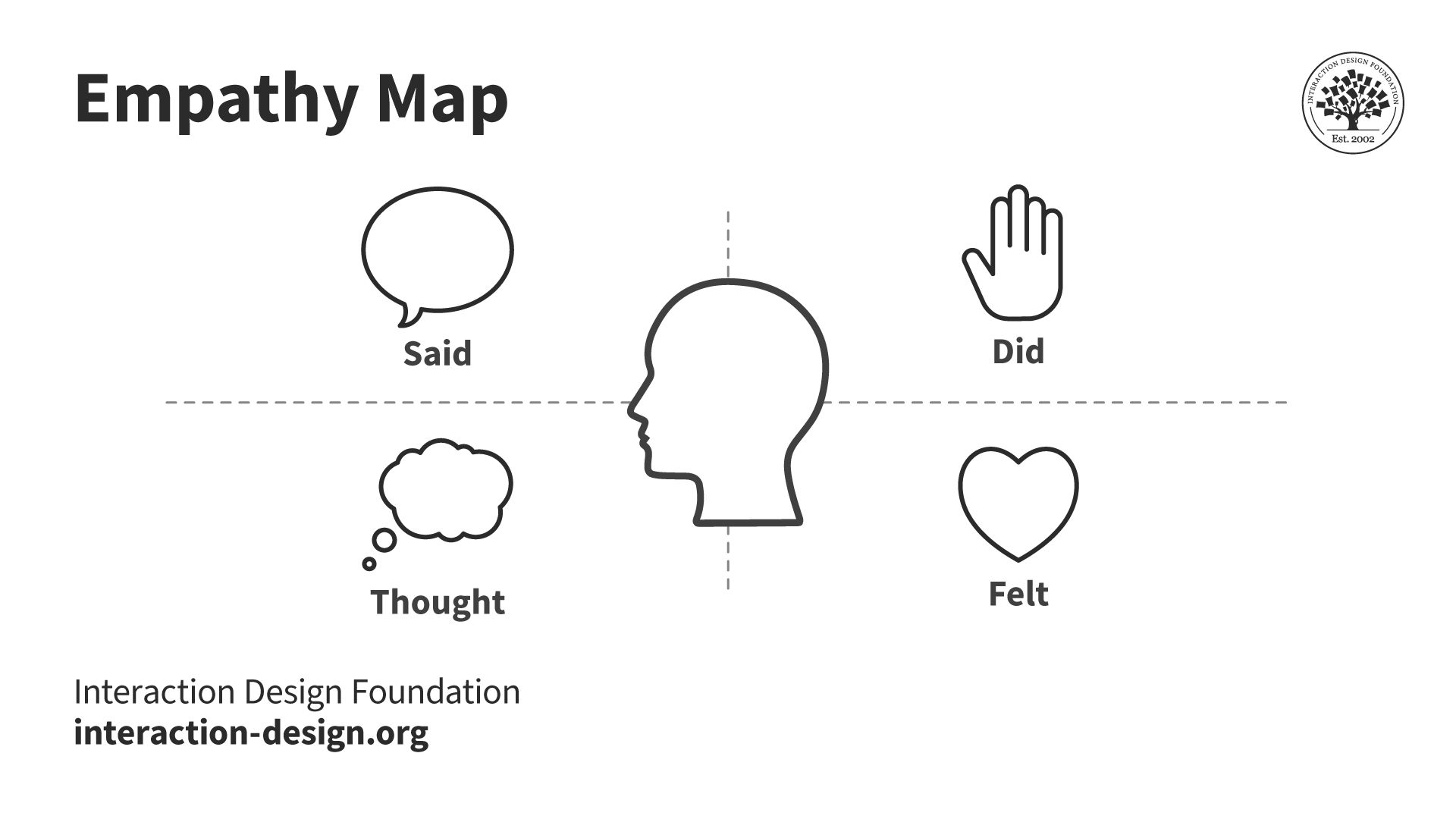
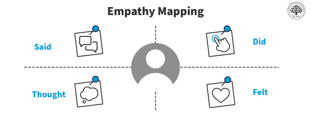
Empathy Map: What the User Said, Did, Thought, Felt
The four quadrants of an empathy map typically organize different aspects of a user's experience.
Most empathy maps help designers look at a user's experience through four lenses: what they say, think, do, and feel.
1. Said/Says: This is usually the easiest section to complete. The “Said/Says” section is for what you hear your users say out loud. You gain valuable insights into their expectations, concerns, needs and preferences by listening to their words. Place direct quotes from users in this section.
For example, this section might include:
“Entering all the tasks’ due dates this way is stressing me out.”
“Is my profile public?”
“This page takes really long to load.”
2. Did/Does: The "Did/Does" section is for your users’ actions and behaviors. This will help you understand how users interact with your product. You can analyze the users’ actions to identify pain points and opportunities for improvement.
For example:
“The user spends the first 10 minutes customizing the app aesthetic.”
“The user screenshots motivational quotes and shares them on their Instagram story.”
“The user lists the different student societies they belong to in their bio.”
3. Thought/Thinks: The "Thought/Thinks" section is for your users’ thoughts, beliefs and assumptions. It looks at the underlying motivations that drive user behavior and this allows you to align your product with your users’ mental models.
For example, the “Thought/Thinks” section might include:
“The signup process is confusing.”
“I have so much on my plate. Will this app actually help me or is it just another thing that will take up precious time?”
“My tuition fees are overdue as it is. I hope this app has a free option. I’m on such a tight budget.”
4. Felt/Feels: This can be the hardest section to complete. The "Felt/Feels" section is for the users’ emotional state. Its purpose is to clearly articulate their fears, frustrations and desires. Watch how people move and listen to the tone of their voice to understand how they feel. You can create engaging experiences that connect with users in an unforgettable way once you master this skill.
For example, this section might include:
“Impatient with the amount of time it takes to complete an action in the app.”
“Overwhelmed by the amount of on-screen text.”
“Excited by the pop-up prompting them to connect with their friends on the app.”
The team will need to interpret all available data to fill out the “thinks” and “feels” sections. They may need to rely on more observational notes as people may not readily share what they think and feel.
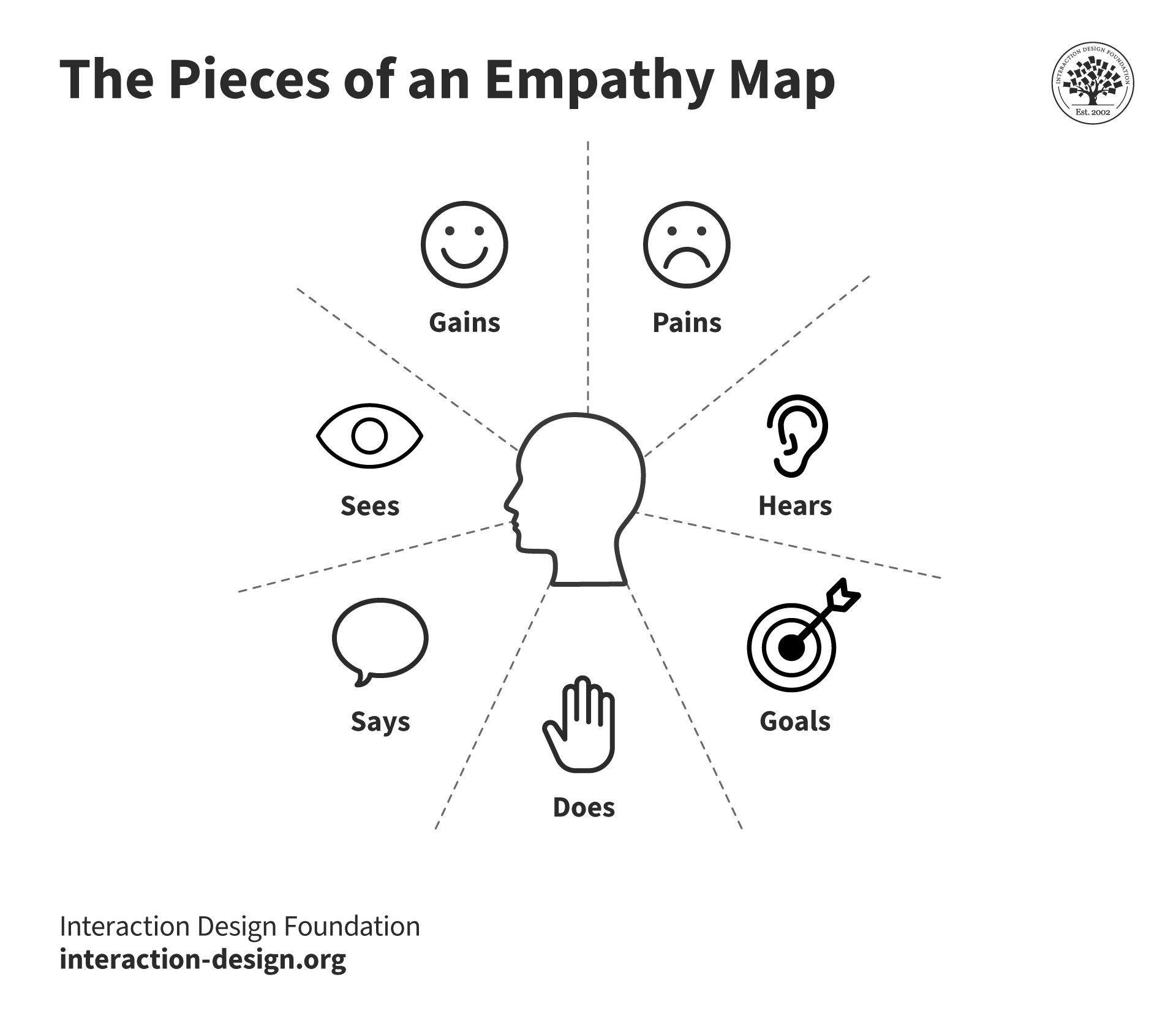
5. Additional sections: The latest variations of the canvas include extra sections for further analysis. These are Goals, Pains, Gains, Sees and Hears.
The “Goals” section details who the team empathizes with and what they need to do. The “Pains” section lists the user’s problems and pain points. The “Gains” section is where you’ll organize the users’ wants, needs and what they dream to achieve. The “Sees” section lists what the user sees in their immediate environment and relevant digital visual stimuli. The “Hears” section does the same for their auditory experience.
Dave Gray's updated empathy map canvas includes additional sections for the user's goals and what they see, hear, desire and struggle with.
Step-by-step breakdown of how to create an effective empathy map:
Step 1: Define Scope and Purpose
Clearly define the scope, purpose and target audience. This could be existing users, potential users or a specific segment of the target market.
Step 2: Gather and/or Conduct Research
Collect as much information as possible about your target audience. This can include customer surveys, interviews, observations and social media data.
Customer surveys are ideal for reaching a large audience quickly to gather general opinions and preferences.
Interviews let you dig deeper. You should choose this route when detailed, personal user experiences and stories are needed to understand specific aspects of user behavior.
Prof. Ann Blandford, Professor of Human-Computer Interaction at University College London, shares what’s the best way to approach the interview situation.
ShowHide
video transcript
00:00:00 --> 00:00:30
As an interviewer, I think it's important to go in with an attitude of *openness*, with an attitude of *wanting to learn*, of *respecting the expertise* of your interviewee, whatever kind of expertise that is, and wanting to learn from them. I sometimes perhaps take that to extremes.
00:00:30 --> 00:01:04
But I think that an important part of interviewing well is to listen to people and not to come with preconceptions about what they're going to say or what they can share. And the other, of course, is about an interviewing style that's open and respectful and *not aggressive* to people so that they do feel relaxed and able to say things and not feel judged for what they're sharing and what they're saying.
00:01:04 --> 00:01:38
So, quite a lot of my research now is around health technologies, particularly. So, that can lead into some fairly sensitive topics. We've done projects looking at how people might use technology to manage their alcohol consumption or their exercise or their diet. And these are all topics that people can feel very defensive about. You know – "How dare you suggest I drink too much or I'm a couch potato or I eat too many carbs!" or whatever.
00:01:38 --> 00:02:01
You know, they're topics where people *can* feel judged. But if people feel judged, then they're not going to give you a real understanding of how you might design technologies that will *really* help them. And so, it's really important to *not* be judgmental – to be open, to respect where they're coming from
00:02:01 --> 00:02:32
and to understand what matters to *them*, as opposed to what you think should matter to them. Well, I certainly work quite hard with students to try to get them to question their own assumptions and not to expose their assumptions when they're interviewing – so that they are actually open to hearing what people are really saying, what people are really trying to express.
00:02:32 --> 00:03:05
Another point is if interviewers are not *intentionally* leading. By coming with too many assumptions about what you're expecting people to care about or expecting people to say, you can unwittingly lead people quite a long way. And leading questions will result in you hearing what you expected to hear, which doesn't necessarily give you the information that you actually need to gain insight from any study.
00:03:05 --> 00:03:39
And surely the point of doing interviews is to get some insight that you didn't already have. If you already knew the answer, there'd be no point in interviewing people about the topic, whatever it is. D.H.: You always have assumptions, right? Otherwise, you wouldn't do a study. A.B.: Yes. D.H.: So, what's the best way to sort of balance or use your assumptions in a constructive way? A.B.: So, I think what you try to do is to have questions more than assumptions.
00:03:39 --> 00:04:04
A *qualitative* study I think is driven by a *question*. *Quantitative* studies are more often driven by a *hypothesis* – i.e. you have a belief and you want to test it – whereas qualitative studies are much more driven by questions. And I've certainly got partway through several studies and suddenly realized that I had a set of assumptions
00:04:04 --> 00:04:11
that aren't necessarily valid. And so, I'm forced to question my own assumptions.
Sometimes, what people do reveals more than what they say. Observations will help you see the things they don't say. If you need to see how users naturally interact with a product in their own environment then this type of user research will be the best fit.
You can tap into live user feedback and trends with social media data. This approach is best when the team looks for real-time reactions and opinions about a product from a diverse user base.
More data will help you and your team to create a more accurate and reliable empathy map.
Step 3: Fill in the Empathy Map Quadrants
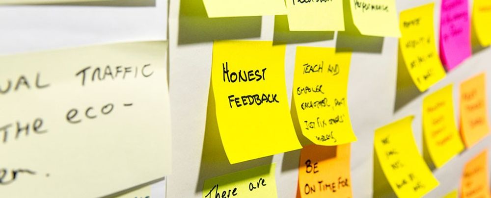
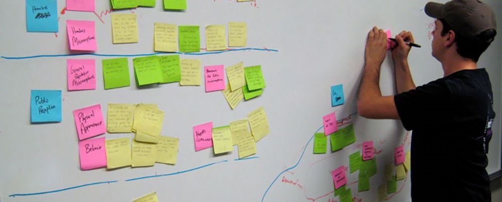
Choose a comfortable and collaborative environment to conduct an in-person empathy mapping session. Provide stakeholders with sticky notes, markers and a whiteboard or a large sheet of paper divided into four quadrants.
Create a Post-It (paper or digital) for each meaningful insight identified in the user research data. Next, add the Post-It to the relevant quadrant.
Start by filling in the "Says" quadrant with direct quotes from your users. These reflect your users’ needs, desires, and concerns. Then, move on to completing the "Does," "Thinks" and "Feels" quadrants. Remember to encourage your team to brainstorm and share their insights.
Stand back and identify any knowledge gaps once you’ve populated all four quadrants. Is there a specific quadrant that needs more user research data?
Step 4: Analyze
Encourage a discussion among your team. Open up the floor to team members to share their observations and identify patterns. The goal of this analysis is to look for opportunities to tackle pain points and help users.
You and your team should:
Identify patterns and trends: Look for commonalities and recurring themes in the empathy maps. These can help you understand your users’ behaviors, needs and desires.
Identify pain points and the opportunities they offer: Hone in on the pain points that have the biggest impact on the users’ experiences.
Identify user segments: Use the insights you and your team have collected during the empathy mapping process to segment your users further. The team will then be able to create more personalized experiences in the future.
Align with business goals: The insights collected from empathy mapping should be in alignment with the business objectives. Empathy maps help inform product development, user experience and marketing initiatives.
Step 5: Identify Your Users’ Needs
To identify your users' needs, go through the empathy map and look for:
verbs—i.e. activities and desires,
user traits,
contradictions and inconsistencies.
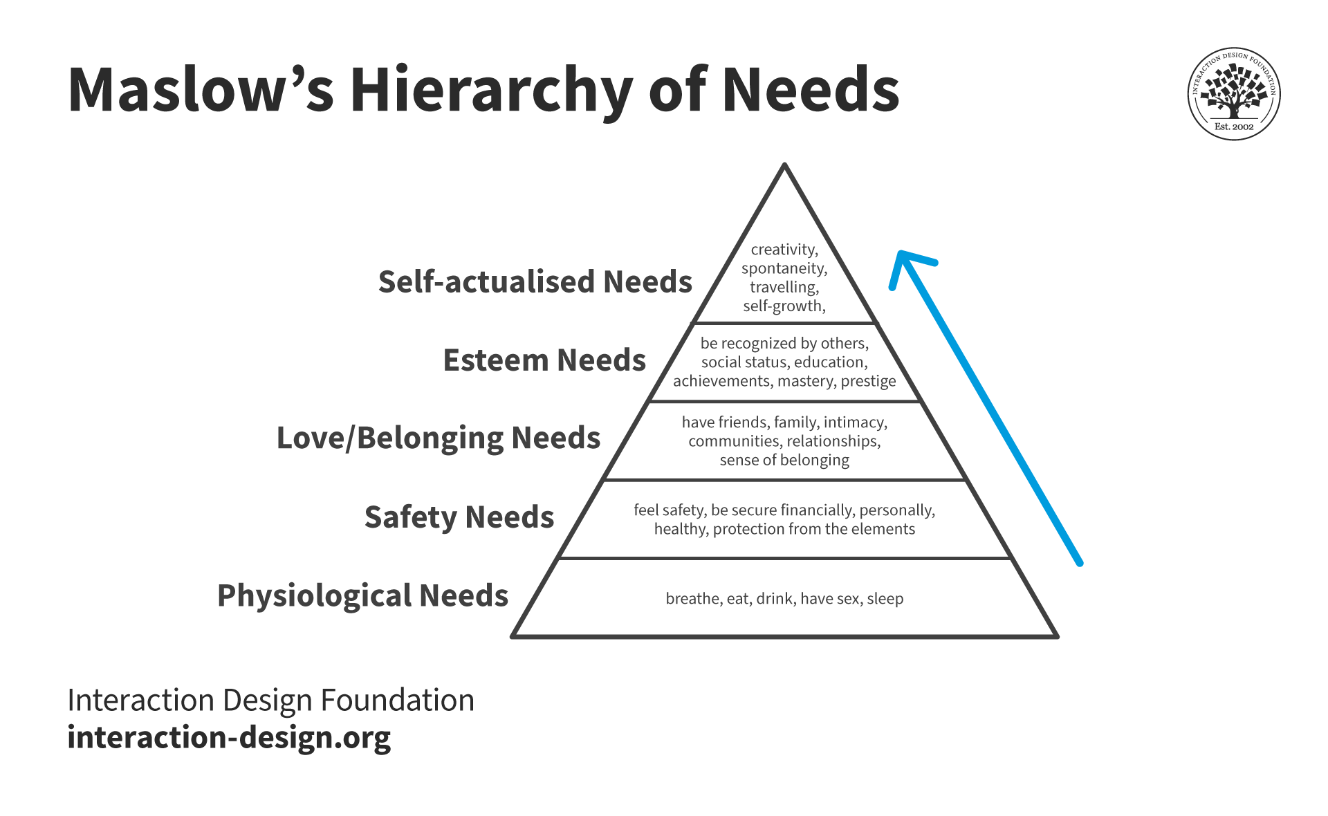
It also helps to refer to all five levels of Maslow's Hierarchy of Needs. This pyramid, developed by psychologist Abraham Maslow in 1943, can help your team pinpoint how your product can meet the needs of the user.
Maslow’s framework helps designers understand the basic, functional needs the product meets (like safety) as well as how it can fulfill higher-level emotional needs.
Designers use Maslow's hierarchy to define and prioritize user motivations and come up with user-centric solutions.
Empathy maps and personas are both valuable tools in user-centric design, but they serve different purposes. A persona is a detailed, semi-fictional character that represents different user types. Personas include demographic information, behaviors, goals, and provide a holistic understanding of the target user. Empathy maps are visualizations that focus on the users’ emotions, thoughts, actions, and words in a specific context.
User Experience (UX) Strategist William Hudson explains how personas help designers develop empathy.
ShowHide
video transcript
00:00:00 --> 00:00:32
Personas are representations of our *users*. They promote empathy by allowing us to focus on individuals rather than groups. It's this whole issue of empathy. We keep talking about "users". And even just talking about the *roles* like "customers" or "clerk" or "salesperson" doesn't make these roles seem real. It doesn't. We're not talking about real people. Real people have limited abilities.
00:00:32 --> 00:01:04
Real people don't necessarily get computers in the same way that the development team does. Real people have needs that have been brought up by their circumstances or by their own personal beliefs. So, we need to know a bit *about* them. And personas are a great way of representing those understandings in the design of a real system. So, there is strong psychological evidence for *personal bias*. Our brains are wired to *empathize with individuals rather than groups*. The general feeling is that when we dehumanize people by referring to them
00:01:04 --> 00:01:32
with these abstract collective nouns – because collective nouns *are* abstract by definition, so we're talking about "users" or we're talking about "customers" – we're taking the "people" away. We need to put the "people" back. Back in 1983, David Sears ran a study with two sets of participants. He gave the participants the same characteristics. And in one set of participants he said that these characteristics were of
00:01:32 --> 00:02:01
*an individual*. And I believe he described the individual. And in the other set participants he said that these characteristics were of *a group of people*. And the participants who were told that they were seeing the characteristics of an individual *always rated the individual more highly* than the participants who rated the characteristics in connection with a group. So, that he called the *person-positivity bias*. And it basically is confirmation that our brains
00:02:01 --> 00:02:33
– us as individuals – *prefer thinking about other individuals*. We're certainly more inclined to think more positively about other individuals than we are about collective nouns like "tourists" or "customers" or "users". The *scope-severity paradox* is a much more recent piece of work – 2010 – and is quite surprising. Two researchers, Nordgren and McDonnell, established that reactions to a fraud were more severe when it was presented with three victims rather than 30. So, it's the same kind of deal: two sets of participants,
00:02:33 --> 00:03:05
both given exactly the same details of a crime, except that in one group they were told it affected three people and the other group were told it affected 30 people. And it was the people who were told that there were only three victims that thought that the crime was more severe. And they, on average, added a year on the prison sentence that the perpetrators of this crime should receive. So, again, that is just confirming this tendency for us to feel more strongly about individuals than we do about groups.
00:03:05 --> 00:03:31
Personas are fabrications *based on research*. We mustn't let go or lose sight of that little parenthetical expression there, because we go out and we find out who these people are – the ones that we're interested in – find out what behaviors they have which drive them to need our solution, what motivations, what their circumstances are, what their contexts of use are,
00:03:31 --> 00:04:01
just so we understand who we're building the solution for and other aspects that we describe in the context of use. These personas are representations of our users, who represent the goals, behaviors and motivations of those real users. They *promote empathy* by allowing us to *focus on individuals rather than groups*. So, instead of talking about "User Community One" or whatever catchy name we'd like to come up with for our user communities, we start talking about "Bob"
00:04:01 --> 00:04:31
or "Jane" or "Elizabeth" – whoever – whatever everybody in the team is happy with. And there have been all kinds of documents and papers and studies written about personas. And you'll find that personas range from quite a limited description of a person. And, in fact, it can be just as little as changing the name "users" to a person's name. So, if you always refer to your customers as "Andrew", then you would actually
00:04:31 --> 00:05:05
be doing yourselves a favor in terms of making that customer seem much more real. But at the other extreme it's not uncommon to hear about user research and persona development taking *weeks* – possibly even months: 2–3 months, which is, in my view and and quite a few others', certainly for an Agile environment well beyond the realms of possibility. So, we're going to be talking about something called a *minimal persona*. So, minimal persona – a name, age and other specific demographic details that a real person
00:05:05 --> 00:05:34
would have. A photo – ideally realistic – showing the person in that setting or doing that thing. And then, basic information about why you're interested in them or why they're interested in us – our solution or product. So, their *primary goals*: *why* those are their primary goals and *what* they're hoping to achieve through our solution or product. And their *behaviors* – what are they doing before and after interaction with our solutions
00:05:34 --> 00:06:02
fit with their daily routine, for example. And some of this comes from the fact that I have for years been astounded by how little the people developing software solutions know about their users. I've been involved in a couple of projects where there was no contact whatever. The development team had never met or seen a user, didn't know what the user was doing immediately prior to entering or receiving data from their system, didn't know what happened to the output data, knew almost nothing.
00:06:02 --> 00:06:33
So, it wasn't surprising that the system when it was first launched was almost impossible to use, because it didn't actually fit. It was like having a random piece of a jigsaw puzzle and a very well-defined hole that it just did not slip into. So, these are the reasons we're trying to actually make sure that we understand at least something about our user communities. And that's what personas are trying to help us with. *Extended personas* – you might add lifestyle interests,
00:06:33 --> 00:07:00
hobbies, as they apply to their motivations. I wouldn't add them just to make the person seem more complete. That isn't absolutely essential. But if some of those issues – lifestyles, interests or hobbies have an impact on your solution, then you should know about them. So, *keep to the details that are relevant* to the problem. Remember that we want to *motivate our team to help* our personas, *not* to drive them crazy with distracting detail, which is one of the complaints you will hear about personas.
00:07:00 --> 00:07:31
Certainly when I've attended conference research papers on the use of personas in teams, often they were not well-received, because there just seemed to be so much of it – the persona specification. *Credibility*: ensure that the personas are *believable* and liked *as much as possible*. Certainly do *not* give personas unpleasant or dubious habits like being a heavy drinker or a heavy smoker or likes to bet on the horses – unless, of course, you're building a gambling app or something! *Change the name, photo and other details* until the whole team is comfortable with them.
00:07:31 --> 00:08:04
It needs to be a collaborative effort between the user experience people and the people who are going to be using them. That would be the development team. So, the names and the photos are almost entirely arbitrary. If you've done research with a handful of participants, then you'd have a handful of photos. If not, then try to find photos from a stock photo site. But try to avoid overtly attractive people because it can be distracting. In user experience, we create often what are referred to as "design research personas",
00:08:04 --> 00:08:30
or "design personas" for short. So, that's what these things are technically called. We go out and we research these user communities. We decide what behaviors and needs are relevant to us: Who are we building the solution for? And those personas are based on this design research. So, that's why we want to call them "design research personas" or "design personas". But there are lots of other things that also get tagged with personas.
00:08:30 --> 00:09:00
And the most common of those I've come across, particularly in large companies, are *market research personas*. And they're not the same thing is the main problem that we have. So, beware that *other kinds of personas exist*, often based on demographics or market segmentation. These can be used for *validating design personas, but should never replace them*. There is little point in trying to reuse personas for different projects, as well, unless the same goals, motivations and behaviors are relevant.
00:09:00 --> 00:09:31
And I've come across this whole approach in one particular vertical market in the U.K. And that is mobile phone service providers – that they have all got marketing personas based on age ranges. And they then attach labels to these age ranges to suggest how these people behave and what they need from our services, which, just to be honest, cannot really be true! You need to actually *forget about the demographics*. There will be some age-related behaviors, no doubt. But they shouldn't be
00:09:31 --> 00:10:02
the motivating factors in the design of an interactive system, which is, after all, what we're trying to achieve. The main thing is that predominantly you have *one* or *two* primary personas. If you've got a project – and I've had people kind of come up to me almost in a boasting tone, saying: "Our project has got 20–30 personas!" And I'd say, "Oh, really? How is that?" They'd say, "Well, it's a hospital system." And the thing is, it's a *very* big system. And what you need to make it agile and to make these things work effectively
00:10:02 --> 00:10:32
is to split the system into parts. So, you may well have some small number of primary personas that apply throughout. But in many cases you're going to have primary personas that are specific to that kind of system or that part of a system. So, let me give you some very simple examples. The one that I like to use is a hotel self-check-in. When I started writing about hotel self-check-ins, there were none in existence. And now I do come across them, funnily enough, in hotels that have got receptionists but all they do then is to
00:10:32 --> 00:11:00
refer you to the self-check-in in front of the reception! I was motivated for this example by checking in at a conference hotel on one occasion. I actually got in pretty easily. I think it was a 20- or 30-minute process. But the next day I was walking through the reception and the queue – the line – of people waiting to check into this hotel went around the block. It was just utterly amazing. There must have been 200 or 300 people waiting to get in.
00:11:00 --> 00:11:32
So, it occurred to me: "Well, why don't we just have some self-check-ins like we do at airports?" And, of course, self-check-in at airports is entirely bog-standard these days – it's what everyone does. So, for example, the primary persona of a hotel self-check-in service must be the customer checking in. It makes no sense for it to be otherwise. A *secondary persona* would be someone who is acting in a *supporting role* inside that system. So, a secondary persona might be a hotel manager or a receptionist or somebody who's
00:11:32 --> 00:12:03
responsible for the upkeep of the hotel, for example. So, these are all *secondary roles*. They're not the people for whom we are building the system. They are people who are *involved in* the system and often in a backroom kind of interaction. These are people that primary personas rarely see or even know about. So, it's a difference between the primary roles in a stage production and just extras or people with non-speaking parts. That is kind of the difference between primary and secondary personas.
00:12:03 --> 00:12:30
A lot of systems may have *only one* persona. This is the person that we're building this particular product for. And you can have all kinds of philosophical arguments about whether you're building a Swiss Army knife solution or whether you're building a carving knife solution. One is very good at one thing. Carving knives are very good at carving. Swiss Army knives are very good, but in a fairly different kind of way, at *all kinds* of things.
00:12:30 --> 00:13:03
But they're not all that easy to use. So, it's up to you. The whole point of personas is to try to *give focus*. So, these are our customers. Other people, who do not fall into the definition or the descriptions of our personas, it's fine if they find our system easy to use. But unless we can actually identify some clear purpose in adapting the system to be more inclusive, then we would deliberately not pay much attention to their particular requirements. Now, things like *accessibility* and the *age ranges* of users – they fall outside the whole persona mechanism.
00:13:03 --> 00:13:30
You must *always make sure that your systems are usable by those with disabilities* whether that's acknowledged specifically in your persona or not. I do have at least one colleague who, if they're dealing with a team who has little experience of accessibility – that is, systems that will be used by disabled people – he deliberately includes a disabled persona. But that really ought not to be necessary. But if that works for you, then that's absolutely fine, too.
00:13:30 --> 00:14:02
Certainly I can see it being important when working with teams that don't have much experience. So, you must make sure that your solutions work for a *broad range of people* in terms of *accessibility* and *age issues*. But otherwise, we want to be very focused on the *specific behaviors* and *needs* of our primary personas. So, we stick to small numbers to maximize empathy. And we consider splitting larger projects, as I was discussing for the hospital example. For example, a hotel check-in system could be split into front desk and housekeeping projects
00:14:02 --> 00:14:35
with separate personas. So, those could be two smaller Agile projects. And there is no magic number. But, like I have been saying, 1 or 2 primary personas is perhaps the most common, with maybe a few secondary personas thrown in, as well. Personas get used in all sorts of places. Obviously, their main focus is in *design*. So, "Who are we building this product for? How should the interactions take place? How much experience can we rely on them having of this kind of solution?" and so forth.
00:14:35 --> 00:15:01
We will have to *recruit* these people. We want to do *research* with them, perhaps continuing research over several life cycles of the system. We want to recruit people for usability testing and user evaluation / usability evaluation in general, not just running them through early beta releases of the software. We might want to be testing with paper prototypes. We might be wanting to show them just wireframes and talking to them about the layout
00:15:01 --> 00:15:32
and their understanding of the different components of the page and those sorts of issues. Sales and marketing will want to know *who* they should be targeting in terms of what the system does and for whom. And remember that you will need to describe the *demographics* and the *filtering questions* for your personas to a recruiter. So, when you're recruiting "Arthurs", what is it about Arthur that makes him your persona? It needs to be something that he wants or needs or you're *hoping* that he wants or needs. He needs a solution to a problem. So, what is that problem?
00:15:32 --> 00:16:03
So, you need to actually talk to your recruiters about filtering questions. You know, what are you going to ask *potential Arthurs* that's going to help you to decide whether this person is really an Arthur? Now, this is quite an interesting area. And it may depend a lot on how enthusiastic your team is about personas. If you've done your job right, if you've *sold* personas, or if your team is already quite familiar and quite enthusiastic about personas,
00:16:03 --> 00:16:33
then you might do some really fun things like getting mugs and coasters printed with maybe the face of the persona on one side and some of their relevant details with respect to your system on the other side. Ditto with mugs, maybe even T-shirts. And one thing that I was quite amused by – and I could actually see this working for some teams – is life-size cardboard cutouts. That's another possibility. So, you could actually have a room with your personas kind of standing around in unused corners.
00:16:33 --> 00:17:04
I do know of organizations – I have heard of organizations – that would actually give the persona a desk, particularly if they were building a system for somebody in-house. And they might actually put all the stuff to do with that persona on the desk, just to make that person seem more real – you know. "Arthur would always be on holiday, but there's his desk" kind of thing. And I should mention – I'll just point out this very last thing – because it's quite important: at the very least, personas should appear in *easy-to-read* form on the project workspace
00:17:04 --> 00:17:35
– whatever – sometimes, you'll hear this phrase – I used to hear it; I don't know that I've heard it very often – called "information radiators". Well, they're what you and I might refer to as "walls" or "partitions". They're the vertical spaces in your workspace. And you would pin important things to that, like all of the backlog for the next cycle and the design maps. So, these are things which everybody who's working on the project would actually be able to refer to quite readily. You might even hand these out in laminated plastic form,
00:17:35 --> 00:17:38
just so everybody has easy access to them, for example.
Video copyright info
Images
Copyright holder: Benoît Prieur. Appearance time: 10:32 - 10:36 Copyright license and terms: CC BY-SA 4.0. Modified: No. Link: https://commons.wikimedia.org/wiki/File:Avenue_Berthelot-_machine_pour_entrer_dans_l%27h%C3%B4tel.jpg
Empathy mapping is exceptionally helpful when it comes to persona development. Empathy maps help shed light on the feelings and thoughts that personas might not fully show. It enriches personas with a deeper understanding of user motivations and pain points. Ultimately, empathy maps make personas more realistic which helps the design team to be more empathetic.
The decision of whether to create an empathy map or persona first depends on the project's goals. If you need quick insights into user experiences, which can then inform persona development, then start with an empathy map.
If the team has already created personas, you can use empathy mapping to add layers of emotional understanding to them.
Personas and empathy maps are symbiotic tools. Both contribute to a deeper understanding of users in the design process.
When to Use Empathy Maps
Design teams often create empathy maps at the beginning of the design process. However, once created, teams should continue to refer to the maps to keep users at the center of the design process.
The design process is not linear, and it’s likely the team will conduct interviews even after a product launch. Designers should always update these maps with new insights.
Empathy maps play several important roles during the design process:
Research Phase: Begin using empathy maps at the outset of a project, during the research and exploration phase.
Use empathy maps to collect and organize data from user interviews, observations, and surveys. This early understanding lays the groundwork for informed design decisions later.
For example, an empathy map created during the research phase may reveal that users feel frustrated with or intimidated by complex apps. This insight tells the design team to focus on simplifying the user experience.
Idea Generation: Use empathy maps during ideation and brainstorming as a springboard for creative thinking. UX designers can use the visual mapping process to identify solutions that hit the mark with users every time.
The idea generation phase is about turning empathetic insights into tangible design ideas that can improve user satisfaction. For example, if an empathy map shows that users are looking for quicker ways to complete tasks, designers might brainstorm features like shortcuts or predictive text.
Iterative Design and Prototyping: Continuously use empathy maps during the iterative design process. As prototypes evolve, empathy maps ensure the user’s emotional journey is consistently considered.
This phase is about bridging the gap between user needs and the product’s functionality. For example, if an updated empathy map indicates that users are annoyed by a lengthy signup process, the design team might prioritize a shorter signup flow in the next iteration of the app.
3 Common Challenges Designers Face when Empathy Mapping and How to Deal with Them
There are a few challenges to overcome when creating an empathy map:
Mistake 1: A Generic User Profile
Often, designers create empathy maps based on generic user profiles. There are many nuances and insights that can only be obtained through real user experiences. If you skip the research and rely on generic user profiles only, then you could end up with a one-size-fits-all design that doesn't really connect with anyone.
To avoid this, designers should create different empathy maps for insights from different groups.
For example, let’s consider an app for public transit users. If the team only looks at the perspective of a 9-to-5 office worker, they’ll miss the needs of night shift workers, students, or parents with school-age children. To remedy this, designers can make a different empathy map for each group to understand what each type of user wants. This will help the team tailor their product to meet specific user needs.
Mistake 2: Disregarding Users’ Emotions
Some designers rely only on what users do and say when they create empathy maps. Emotions drive behavior, and ignoring how users feel can likely lead to a superficial understanding of them.
How can designers avoid this misstep? They should pay close attention to emotional responses during user research.
Designers should ask questions about how users feel during certain tasks or experiences and observe their emotional cues. This is a skill that will take some practice but the more you observe and learn to interpret users’ emotional cues, the easier it will get. This deeper emotional understanding will lead to more intuitive and user-centered designs.
For example, a user of a fitness app might say they use it for exercise tracking. But engage with them a little more, and they might reveal they're also seeking motivation and community because they struggle with accountability. You can transform your product from simply tracking metrics to creating an engaging, supportive user experience when you learn to recognize and design for these emotional needs.
Mistake 3: Treat Empathy Mapping as a One-Off Task
Empathy mapping is not just a box to check at the beginning of a project, never to revisit. User needs and contexts change over time, and so should the designer’s understanding of them.
Designers should revisit and update their empathy maps regularly. As the project progresses, they should keep in touch with users. This ongoing conversation will keep the design relevant and user-focused.
For example, let’s look at a mobile streaming app’s empathy map. Initially, the insights gained might focus on entertainment and a user-friendly user interface (UI). As other streaming apps come to market, competition grows, and user preferences change. Revisiting the empathy mapping process could help the team identify untapped opportunities around unique content and personalized recommendations.
Mistake 4: Look to Prove Assumptions
Teams can make the mistake of only seeing what they expect while looking at data. This is called confirmation bias. They might pick out information that supports their ideas and stereotypes, which defeats the purpose of empathy maps.
Prof. Ann Blandford of University College London explains confirmation bias and other common analysis pitfalls.
ShowHide
video transcript
00:00:00 --> 00:00:32
Ditte Hvas Mortensen: Are there some common pitfalls that you should be aware of when your search for themes? Ann Blandford: *Confirmation bias* is, I think, the biggest one: that you think you've spotted something fairly early on in the data, which, particularly if that's something that supports a pre-existing assumption that you had – you know – before starting the study.
00:00:32 --> 00:01:05
And so, it's so much easier to spot data that supports that position than it is to spot data that contradicts it, particularly if the contradiction is a little bit kind of *tangential*. So, that's why I kind of emphasize that you have to look explicitly for contradictory evidence in the data because that can be harder to spot. So, you have to ask yourself specifically "What would contradictory evidence look like?"
00:01:05 --> 00:01:30
or "What *might* it look like?" You know – "Is there any of that? *Why* might it be there?" So, I think confirmation bias is the biggest. Another trap is there's one participant with slightly outlandish but very engaging and exciting views,
00:01:30 --> 00:02:05
and they express themselves in a wonderful way, and you almost start writing the narrative as if that person is the central figure – as opposed to being a slight outlier in the data set. And so, their perceptions and their attitudes and values are given more *weight* than those of perhaps less articulate or less extreme participants. D.M.: Are there any other sort of common problems that you often experience students have when they do analysis?
00:02:05 --> 00:02:34
And do you have some good advice for how to tackle those problems? A.B.: I think the big one is the one I've already mentioned – about getting overwhelmed by the data and not really knowing where to start or when to stop; having so many themes and not being prepared to let go of any of them;
00:02:34 --> 00:03:01
or having difficulty working out which ones matter and which ones don't. And *data gathering* for some people is more exciting than data analysis. In practice, a good analysis takes longer than data gathering.
00:03:01 --> 00:03:32
It takes longer to analyze 10 hours of interview data than it does to gather 10 hours of interview data, *even* when you take into account the time it took to recruit 10 appropriate participants in the first place, which can be non-trivial. But analysis is much more of a solitary activity, whereas data gathering is inherently social. You know – you're interviewing people; you're learning things; it's fun and engaging.
00:03:32 --> 00:04:00
So, some people can get quite bogged down in analysis, I think. And it feels like a huge task, and you need to break it down into *small steps* of – you know – "I'll deal with three pages of data today." – you know – or, "I'll do *this* step of coding." or, "I'll do this little bit of stuff." You've got to break it down into manageable chunks.
00:04:00 --> 00:04:32
And also, just dive in and *do* some, actually, you know. The longer you leave it – and it's just this pile of transcriptions or whatever – you know, the harder it is to get started and the more overwhelming it can feel. So, I think *feeling overwhelmed* is probably the biggest challenge, and not being prepared to drop themes or not being able to quite see how themes fit together to tell a bigger story.
00:04:32 --> 00:05:01
That's of significance for HCI research or for technology design. And going off on a weird tangent in the analysis, and forgetting why you were doing the study in the first place. So, with those, I think the best way to deal with it is to *talk to people about it* – you know – to get somebody else involved,
00:05:01 --> 00:05:04
even in just talking through ideas with you.
Empathy mapping is more art than science. Only through practice will designers learn how to best manage the delicate balance of research, intuition, and user engagement needed.
If you keep these common mistakes in mind while empathy mapping then you'll be able to create designs that don't just look good on paper but actually hit the mark with the people they're meant for.
Remember, the heart of UX design is learning to understand the human experience—and there's no shortcut to that.
Kouprie and Sleeswijk Visser propose a framework for empathy in design, emphasizing the importance of understanding and addressing users' needs while stepping into and out of their lives.
This book by Tim Brown, CEO of the renowned design firm IDEO, delves into how design thinking, deeply rooted in empathy, can drive organizational change and innovation.
Susan Weinschenk combines insights from psychology and design, providing an extensive list of things designers should know about people, fostering a deeper empathic connection with users.
Donald A. Norman explores the psychology behind good and bad design, emphasizing the need for empathy in understanding how users interact with objects in their everyday lives.
What is empathy vs sympathy in UX design?
Many UX designers sympathize with users when their intention is to empathize.
Empathy is the ability to put yourself in your users’ shoes to gain a deep understanding of their thoughts, feelings, and behaviors. Sympathy is the feeling of compassion for another. You might wish to see them better off but lack the shared emotional experience that comes with empathy.
To empathize with users, you must step into their emotional experiences. This is the only way you’ll learn to understand their underlying motivations, challenges, fears and pain points. Empathy is more actionable than sympathy in UX design because it provides a more nuanced understanding of the user.
Despite their promising title, which might seem a bit surprising given that they are the main method that most traditional software development techniques, including Agile use in order to turn requirements into working systems. Find out how to fix this. What the problem is. There's a whole set of them and we have some simple solutions and we have some difficult solutions.
00:00:30 --> 00:00:40
It's very challenging issue, but I'm going to cover all the main points in my Master Class, so please join me.
What is the difference between an empathy map and an affinity map?
While you can use both empathy and affinity maps to help sort through data, affinity maps have a broader application.
Empathy maps focus on understanding individual user experiences while affinity maps aim to identify patterns across multiple data points. You can use empathy maps to gain insight into users’ experiences and affinity maps to consolidate research findings.
Empathy maps are divided into sections like Says, Does, Thinks, Feels, Goals, Pains, Gains, Sees, and Hears. Affinity maps offer more flexibility. Designers can name and sort data into hierarchies as needed when using affinity mapping.
How does empathy mapping relate to customer journey mapping?
Designers use empathy maps to tap into the user's mindset. This helps them to make informed design decisions more likely to resonate with their users.
Designers use customer journey maps to visualize the entire journey a customer experiences when they interact with a product. They offer a broader perspective.
You can use empathy maps and customer journey maps together for design solutions deeply rooted in the users' emotional and psychological experiences.
If you’d like to learn more about customer journey maps, experience maps and service blueprints, the IxDF Journey Mapping online course is a great place to start.
ShowHide
video transcript
00:00:00 --> 00:00:30
When you design a user interface, skills like visual design, user testing and prototyping are critical. But when you design a complex experience like a buying process, an onboarding sequence, really anything that includes multiple steps over time. Journey mapping is an essential tool. This course will teach you how to use journey mapping in your own work to design holistically and also to identify gaps and opportunities in complex products. It will also help you streamline your team's design efforts.
00:00:30 --> 00:01:01
You'll begin by learning about the power of journey, mapping and design and the different variations that you can use. We'll also cover how to gather data in your journey mapping process and how to make sense of it using a perspective grid. There'll be practical tips on how to create different types of journey maps and how to set up and run a journey mapping workshop by the end of this course. You'll have the knowledge, methods and hands on practice. You'll need to use journey mapping in your own work. The course also includes several downloadable templates
00:01:01 --> 00:01:31
that'll give you a jumpstart in your own journey mapping projects at the end of each lesson. There are multiple choice and open ended questions that are graded personal by industry experts. You'll also have the option to create a practical design project. This will give you invaluable hands on experience that you can add to your portfolio at the end of the course. You'll gain an industry recognized course certificate which is trusted by leading companies around the world, and that will make a great addition to your LinkedIn profile or your design portfolio.
00:01:31 --> 00:01:32
So are you ready?
Can empathy mapping be applied to B2B (Business-to-Business) design projects?
Designers use empathy mapping to explore what Business-to-Business (B2B) clients really need and struggle with. They tap into these insights to create designs that provide real value to businesses.
B2B designers work with stakeholders that include a variety of individuals with different roles and perspectives. They use empathy maps to explore the concerns and motivations of various personas like decision-makers and end-users within the client's company.
Designers can collect data for empathy mapping in the following ways:
1. Existing in-house data such as customer feedback, customer support interactions, and usage analytics.
2. User interviews. If you want deep insights into your users’ thoughts and feelings then ask open-ended questions as much as possible.
3. Usability tests where users interact with the product while sharing their thoughts aloud.
4. User comments and posts on forums and social media.
5. Online user reviews.
You can use the data collected and lead an empathy mapping workshop with the design team and other stakeholders. Remember to include team members from various departments for a holistic understanding of users.
Can empathy mapping be done remotely?
Designers can perform empathy mapping remotely using digital collaboration tools and virtual interviews or surveys. You can adapt traditional in-person workshops with flip charts and sticky notes to suit the virtual workplace.
The process of empathy mapping helps designers distill user knowledge into one place so they can categorize and understand qualitative research, discover gaps in current knowledge, and pinpoint the types of research needed to address them. It's ideal for remote teams who need to stay user-centric.
You can learn more about how to move design and research online in the IxDF online Master Class “Remote UX” with Frank Spillers.
Earn a Gift, Answer a Short Quiz!
Try Again! IxDF Cheers For You!
0 out of 3 questions answered correctly
Remember, the more you learn about design, the more you make yourself valuable.
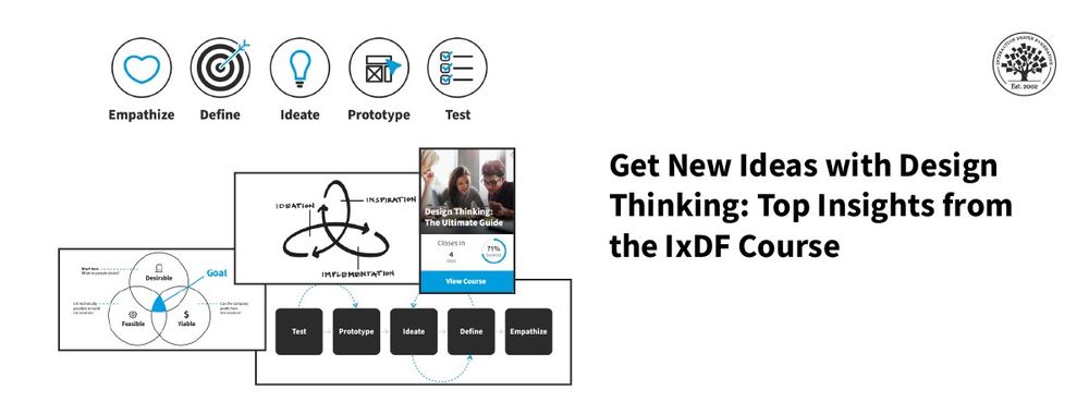
Some of the world’s leading brands, such as Apple, Google, Samsung, and General Electric, have rapidly adopted the design thinking approach, and design thinking is being taught at leading universities around the world, including Stanford d.school, Harvard, and MIT. What is design thinking, and why is it so popular and effective?
Design Thinking is not exclusive to designers—all great innovators in literature, art, music, science, engineering and business have practiced it. So, why call it Design Thinking? Well, that’s because design work processes help us systematically extract, teach, learn and apply human-centered techniques to solve problems in a creative and innovative way—in our designs, businesses, countries and lives. And that’s what makes it so special.
The overall goal of this design thinking course is to help you design better products, services, processes, strategies, spaces, architecture, and experiences. Design thinking helps you and your team develop practical and innovative solutions for your problems. It is a human-focused, prototype-driven, innovative design process. Through this course, you will develop a solid understanding of the fundamental phases and methods in design thinking, and you will learn how to implement your newfound knowledge in your professional work life. We will give you lots of examples; we will go into case studies, videos, and other useful material, all of which will help you dive further into design thinking. In fact, this course also includes exclusive video content that we've produced in partnership with design leaders like Alan Dix, William Hudson and Frank Spillers!
This course contains a series of practical exercises that build on one another to create a complete design thinking project. The exercises are optional, but you’ll get invaluable hands-on experience with the methods you encounter in this course if you complete them, because they will teach you to take your first steps as a design thinking practitioner. What’s equally important is you can use your work as a case study for your portfolio to showcase your abilities to future employers! A portfolio is essential if you want to step into or move ahead in a career in the world of human-centered design.
Design thinking methods and strategies belong at every level of the design process. However, design thinking is not an exclusive property of designers—all great innovators in literature, art, music, science, engineering, and business have practiced it. What’s special about design thinking is that designers and designers’ work processes can help us systematically extract, teach, learn, and apply these human-centered techniques in solving problems in a creative and innovative way—in our designs, in our businesses, in our countries, and in our lives.
That means that design thinking is not only for designers but also for creative employees, freelancers, and business leaders. It’s for anyone who seeks to infuse an approach to innovation that is powerful, effective and broadly accessible, one that can be integrated into every level of an organization, product, or service so as to drive new alternatives for businesses and society.
You earn a verifiable and industry-trusted Course Certificate once you complete the course. You can highlight them on your resume, CV, LinkedIn profile or your website.
Transform Your Creative Process with Design Thinking
Think about a new user experience (UX) design project at work that your team needs fresh ideas for—you want to create a
401 shares
2 mths ago
Open Access—Link to us!
We believe in Open Access and the democratization of knowledge. Unfortunately, world-class educational materials such as this page are normally hidden behind paywalls or in expensive textbooks.