Your constantly-updated definition of the Law of Uniform Connectedness and
collection of videos and articles. Be a conversation starter: Share this page and inspire others!
97shares
What is the Law of Uniform Connectedness?
The law of uniform connectedness is a fundamental Gestalt principle. It states that people see visually connected elements or ones with common characteristics to belong to the same group or unit. Humans perceive elements that share visual cues as being more related than elements without them. Designers use this law to create a sense of cohesion, organization and hierarchy.
In this video, Author, Designer and Educator, Mia Cinelli explains the importance of Gestalt principles in visual design and introduces a few of them.
ShowHide
video transcript
Transcript loading…
How to Connect to the Law of Uniform Connectedness
The Gestalt principles—otherwise known as Gestalt laws—suggest how people perceive visual objects and visual elements. These elements include lines or curves, and focal points. They are vital ingredients for visual designers to cue viewers and users so that they can see items in certain ways.
The Gestalt school of psychology consisted of psychologists Max Wertheimer, Kurt Koffka and Wolfgang Köhler in Germany in the 1920s. The Gestalt approach was to develop visual perception theories, such as the law of prägnanz (or good figure), figure-ground and closed region. The centermost idea in Gestalt psychology is that an image is more than the sum of its parts, and people tend to group individual elements into meaningful patterns.
Uniform connectedness refers to the visual connection that designers make between elements through attributes such as color, lines, frames or other means.This Gestalt principle is all about the tendency that humans have to organize and make sense of visual information by grouping related elements like this.The Gestalt school of thought states that people tend to perceive patterns with five main laws or principles. These five are the principle of proximity, principle of similarity, principle of continuity, principle of closure, and principle of uniform connectedness.
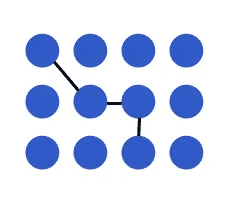
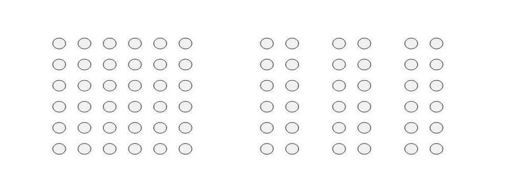
Four of these dots are connected—an instant association the mind makes.
In the principle of uniform connectedness, when elements are visually linked or connected, human brains automatically group them together. The mind does this even if the design elements in view are not physically touching or spatially close. This grouping helps people make sense of complex visuals by organizing information into meaningful units. It’s an innately essential human skill and a powerful design tool.
Since its “discovery,” the principle of uniform connectedness has long been a staple in graphic design. For example, logo design is a prime opportunity to apply uniform connectedness principles to create a unified and memorable brand identity.
What is the Connection between Uniform Connectedness and Digital Design?
Design principles play a crucial role in creating visually appealing and user-friendly interface designs. The law of uniform connectedness—sometimes called unified connectedness is a fundamental design tool in user experience (UX) design and particularly user interface (UI) design. Overall, it plays on the fact that the human brain naturally seeks patterns and connections in the information it receives. Designers of digital products can use it to create visually cohesive and organized interfaces that are intuitive for users to navigate.
Uniform connectedness performs several important functions in UX and UI design. These happen in the various ways designs include the principle, according to:
1. Visual Connections and Grouping
When interactive designers group related elements together and separate unrelated elements, they can establish a clear visual hierarchy. This can guide users' attention and make it easier for them to understand relationships between different elements.
Designers can create visual connections between related elements by utilizing consistent visual cues. These include color, line styles, shapes and patterns. Designers use the principle to maintain consistency in typography, iconography, button styles and other visual elements throughout the design.
Designers apply these visual cues consistently across the design to establish a clear visual language and facilitate the grouping of related elements. For example, in a messaging app, it’s good to use consistent iconography and color schemes for different types of messages (such as text, images or voice notes). This is a factor that helps users quickly distinguish between different types of messages and understand their content.
Another example is in an e-commerce website, designers can connect product listings visually by using a common color scheme or background. This helps users perceive the products as belonging to the same category or group. That makes it easier for them to browse and compare options.
The choice of screws is immense, and organized well here.
When designers create boundaries or enclosures around related elements, they can further reinforce the perception of a group. When they enclose elements within a common frame, box or background, designers can visually connect them and signal their relationship to the users of a product or service.
For instance, in a task management app, designers can group tasks that belong to the same project together—they enclose them within a colored box or use a distinct background color. When they do this, it helps users quickly identify the tasks that are associated with a specific project and understand their overall progress.
This tabbed navigation shows the selected tab connected to its pertinent content. It is distinct from the other tabs, which are closed off.
When designers create the right visual contrast and emphasize specific elements, they can highlight the importance of these and draw users' attention. This is especially important to isolate important interactive elements on a web page, such as calls-to-action. When designers make visually connected elements stand out from the rest, they can reinforce their relationship and how important these are within the design.
For example, in a navigation menu, if a designer uses a different color or style for the currently active page or section, it helps users understand their current location within that website or app. This convenience is something that puts efficiency and ease of use forward as important factors. When elements are visually connected, users can spot the relationships these have—quickly. This reduces cognitive load and enables users to make informed decisions or take desired actions more efficiently.
Leverage size and color in icons to show they’re connected.
The law of uniform connectedness also contributes to the overall aesthetics and visual appeal of a design. As designers work to leverage visual connections between elements, they can create a real sense of harmony and balance. This sense can give a boost to the overall user experience of a product design. It can make the design more engaging and memorable—even if it’s not necessarily the most useful design. This phenomenon is called the aesthetic usability effect.
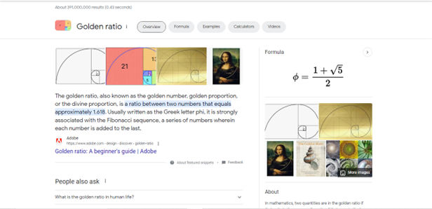
Google’s search results shows the Law of Uniform Connectedness at work. Borders enclose particular items like featured snippets, helping establish a visual connection with the content while also separating it by prioritizing it more.
Examples of the Law of Uniform Connectedness in UX Design
To further illustrate the law of uniform connectedness, here are some other major real-world examples:
1. Google's Material Design
Google's Material Design follows the principle of uniform connectedness. It features consistent visual cues and styling throughout its design system. As it uses common color schemes, typography and iconography, Google creates a cohesive and visually connected user interface across its products. This is something that makes it easier for users to navigate and interact with different apps and services.
Google’s Material Design features a compelling way to communicate with users in design.
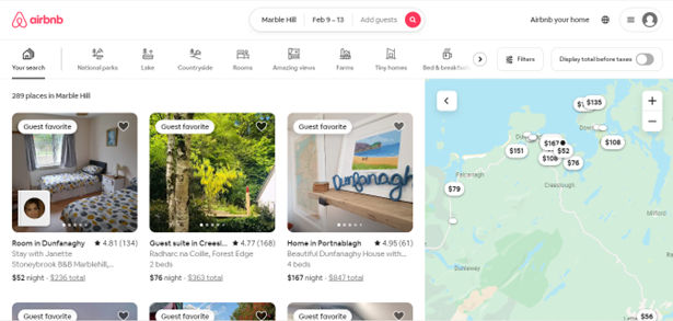
Airbnb's search results page demonstrates the law of uniform connectedness—in its grouping of similar listings together. As it uses consistent visual cues—such as color, typography and layout—Airbnb creates a clear visual hierarchy. It lets users browse and compare listings effectively. Users can easily spot the price, location, as well as other key details of each listing. This is a factor that can make their decision-making process a good deal more efficient.
Airbnb helps users browse and compare listings effectively through consistent use of visual cues.
How to Apply the Law of Uniform Connectedness: Tips and Best Practices
To effectively apply the law of uniform connectedness in UX design, consider the following best practices and tips:
1. Conduct User Research
It’s vital to know the target audience, including their needs, pain points and other aspects that have a bearing on the problem and a potential solution. Designers should get to know a wide range of attributes and use tools such as user personas, user flows and customer journey maps to make the best of the UI and UX design work they’ll produce. Questions to ask include these: What are the user interactions like for each task they must take towards completing their goal? Only through envisioning and accounting for these considerations can designers iterate towards truly user-centered designs.
Watch this video to understand user research’s bearing on how an interface can communicate best with a target audience.
ShowHide
video transcript
Transcript loading…
2. Group Related Elements
Visually connect elements through color, lines or other visual cues to create a sense of unity and coherence within the interface. This helps users perceive related information as a single entity—and then users will find it easier to process and understand.
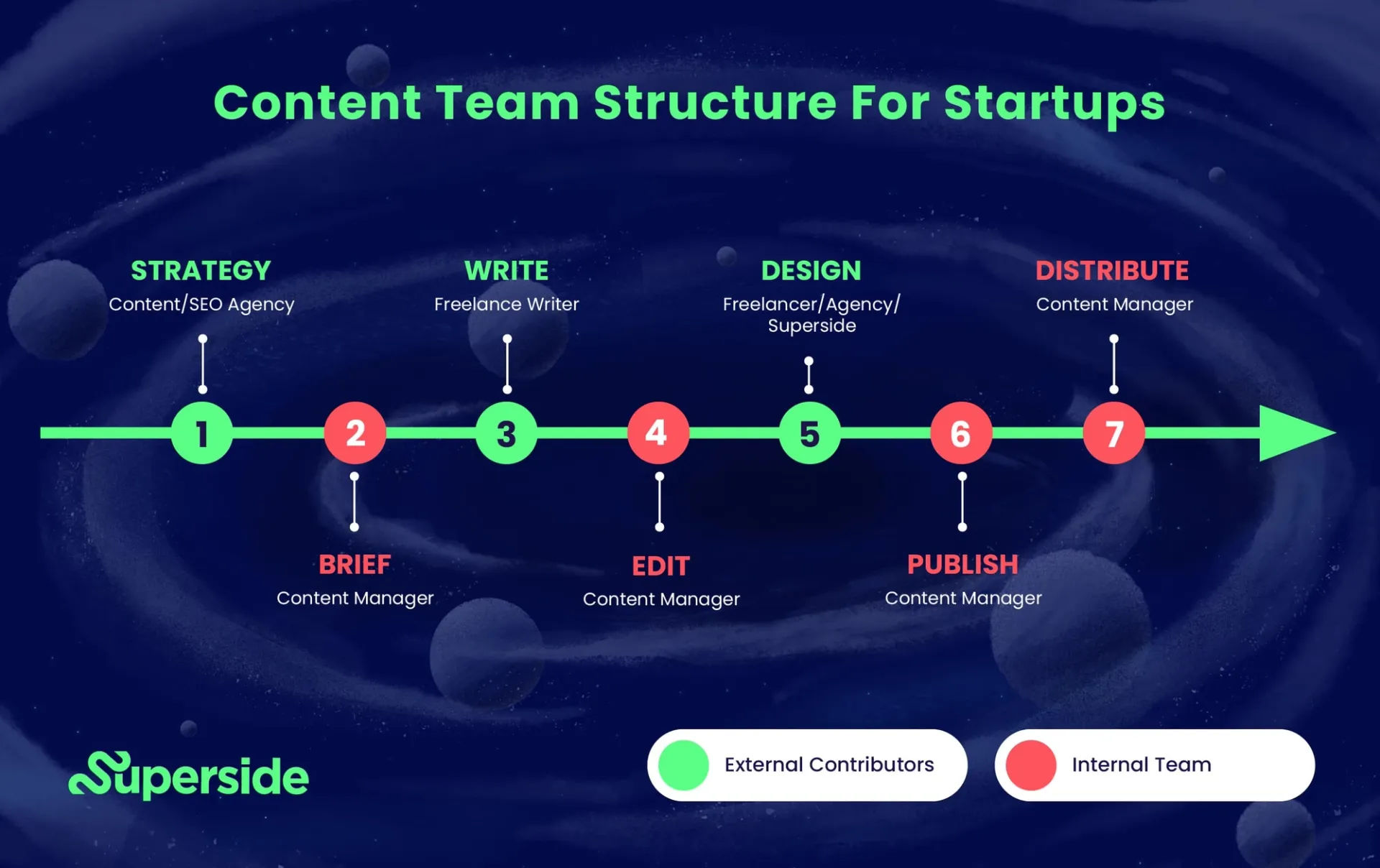
For example, in a task management application, designers can group tasks with similar due dates by using the same color. Or they can place them within a visually connected container. This visually communicates their relationship and helps users quickly identify and manage tasks based on their due dates.
Superside’s application of uniform connectedness clearly shows the process and connects the tasks between two distinct groups.
Use consistent visual cues—like color, typography and iconography—throughout the design to establish a clear visual language and bring about the perception of connectedness. It’s vital to use consistent visual cues throughout the interface—such as color, shape, size, line weight and spacing.
4. Create Strong Visual Hierarchy
When designers apply visual connections to specific elements, they give their users a handy tool—they guide users' attention and emphasize important information.
For instance, in a pricing page, a designer can use uniform connectedness as a way to highlight pricing tiers that are different. As they visually connect the pricing tier name, features and pricing details, they can make a clear hierarchy. This will draw users' attention to the information that’s most relevant.
Amazon employs a clear hierarchy for helping users choose according to pricing order, featured items and more.
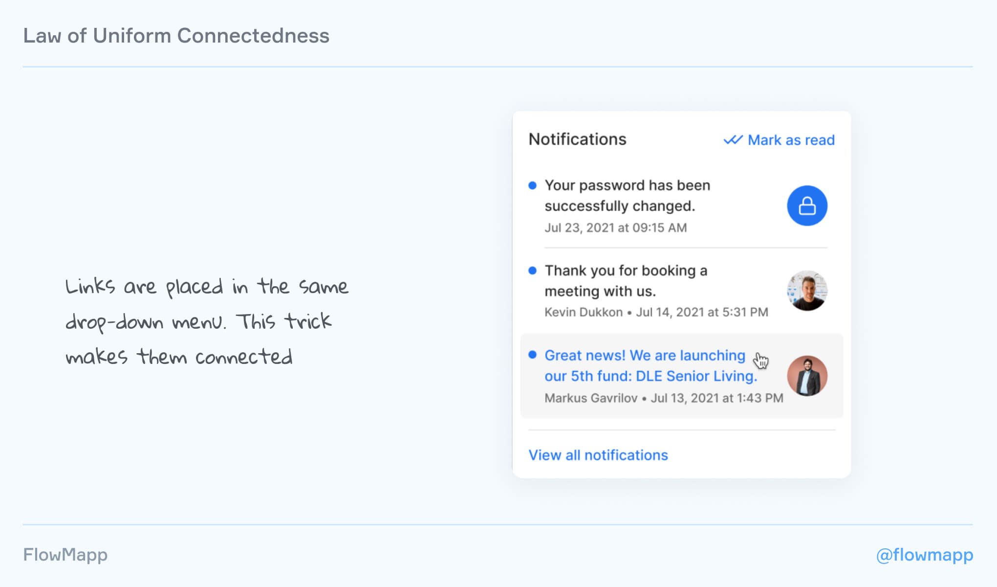
When designers visually connect navigation elements, such as links or buttons, they can create a seamless and intuitive navigation experience.
For example, in a website navigation menu, a designer can use consistent visual cues like color or underline to connect each item’s active and hover states. This helps users understand their current location within the website—plus, easily navigate to different sections.
Use links in, for example, a dropdown to give users their notifications with great convenience.
When designing for different screen sizes and devices, it’s important to think about the effect that changes in scale may have on the visual connections. So, be sure that the connections remain clear and meaningful across various devices and orientations.
7. Remember Accessibility
It’s important to make sure that the visual connections and cues in the design are accessible to all users—that includes those with visual impairments. Use proper color contrast and provide alternative text for visual elements. Accessibility is a great—and in many cases, mandatory—consideration.
8. Collaborate with Developers
Work closely with developers to ensure that the visual connections and cues get implemented consistently across different devices and platforms.
9. Use Other Design Principles
For example, leverage the Gestalt law of proximity and negative space or white space to improve the information architecture and layout in general.
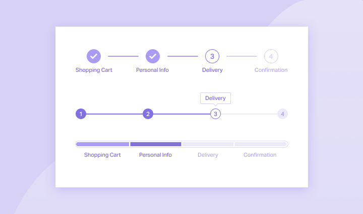
Uniform connectedness works with the white space around it in this progress stepper for an onboarding or checkout flow.
Conduct user testing and gather feedback to evaluate the effectiveness of the visual connections in the design. Iterate and refine the design based on user insights to enhance the user experience. Usability testing is the engine that will power the needed changes with vital user insights as fuel for ideas.
Law of Uniform Connectedness: Risks in Design
While the law of uniform connectedness can greatly enhance the user experience, designers should also be aware of potential risks and considerations, and should not:
Over-rely on Visual Connections: If designers rely too heavily on visual connections, without considering other design principles and user needs, it can result in a visually overwhelming or confusing design. Balance visual connections with other design considerations to create a holistic and user-centered experience.
Disregard Cultural and Contextual Factors: Visual connections may vary across cultures and contexts. Indeed, what users may perceive as being connected in one culture mightn’t be the case for users in another culture. That’s why it’s vital to consider the target audience's cultural background and contextual factors first before using this Gestalt law.
Overall, the law of uniform connectedness is an asset and can enhance the user experience of a digital product or service. As with the other Gestalt laws or principles, it takes careful consideration and application to leverage well and in a way that will cause users to engage more with a design, naturally.
How can the Gestalt Law of Uniform Connectedness contribute to accessibility in design?
The Gestalt law of uniform connectedness plays a crucial role to enhance accessibility in design by guiding users through visual design elements that they perceive as connected and part of the same group. This principle simplifies user interfaces by visually linking related elements, such as buttons or navigation links. That makes it easier for all users, especially those with some visual or cognitive impairments, to navigate and understand content.
Designers use consistent visual cues like color, lines or shapes to group related items and to reduce cognitive load and improve the usability of digital environments. As they focus on visual connectedness, designers ensure that they present information in a way that is intuitive and accessible. That’s key to making digital content more inclusive for a diverse range of users. This approach doesn’t just follow accessibility guidelines; it aligns with inclusive design principles, too—so making technology accessible and usable for everyone.
Understand the wide range of implications for accessible design in this video:
ShowHide
video transcript
Transcript loading…
What are common mistakes when applying the Gestalt law of uniform connectedness in design?
To make designs easier to understand, designers need to avoid some common mistakes with the uniform connectedness principle—and here are five simple guidelines:
Keep it simple: Designers shouldn’t clutter their designs. Using visual design connections like lines or colors can show which elements are related, but it's important not to overdo it.
Be consistent: Designers must use the same visual cues throughout their designs. This consistency helps people easily navigate the design and understand what to expect.
Use other rules too: Incorporate other design principles alongside the law of uniform connectedness to give a design more of a boost. Strategies like grouping similar items or effectively using empty space can make content that much clearer.
Highlight what's most important: Designers should use visual cues to give a real emphasis to the main parts of their design. This approach directs users to the important information or actions first.
Consider user expectations: Designs should match what people are used to seeing. By meeting these expectations, it makes the design more usable and enjoyable.
What are the best practices for using the Gestalt law of uniform connectedness in mobile app design?
Here are some best practices for designers and design teams:
Apply effective visual grouping: Designers should group similar functions together using visual elements—like colors, lines, frames or shapes. This helps users see these elements as being part of a single unit, something that simplifies navigation and interaction within the app.
Create clear connections: It’s good to use tangible references—such as lines or arrows from one element to another—since it can also create a visual connection. This method can guide users through a sequence of actions, or it can draw their attention to related elements.
Go for context and emphasis: Use uniform connectedness to give context or to add emphasis to the relationship between items. For example, it’s good to surround related options with a border, since it can indicate that they share a common function or importance—which makes it easier for users to make decisions.
Separate and prioritize: Similar to Google’s search results—where borders around specific items like videos and featured snippets visually connect content and give it priority—app designers can use borders or backgrounds to highlight important features or content. This visual separation is something that can help users focus on key information or actions.
Remember, the goal is to use visual connections to make the app more navigable and the information more digestible. From grouping elements that function together and clearly indicating their relationships, you can make a more coherent and user-friendly mobile app.
Take our Mobile UI Design course for a fuller understanding of how to design for mobile devices and make good design decisions for smaller screens.
What role does the Gestalt law of uniform connectedness play in typography?
The Gestalt law of uniform connectedness is one of the principles that helps make a coherent feel and boosts the readability of text.
For example, designers can apply this principle when they use consistent styling for headings, subheadings and body text—to make a visual connection between related content. This doesn’t just help in guiding the reader's attention effectively; it’s helpful for making the text more accessible and easier to navigate, too. Designers can also apply uniform connectedness as they work to organize different sections of content—and that includes sidebars or navigation menus. Designers visually distinguish them from the main content area when they use color, lines or shapes in a consistent way.
What’s more, typography involves arranging type in a way that makes text legible, readable and appealing when it shows up for users. The Gestalt principle of uniform connectedness helps with this as it makes sure that the design of text elements follows a cohesive pattern. Plus, it makes the overall appearance of the text harmonious and integrated. This principle can greatly affect how users process and perceive information. It can potentially influence the reader's understanding and interpretation of the content.
Watch author, educator and designer Mia Cinelli explain how a Gestalt principle applies to typography:
ShowHide
video transcript
Transcript loading…
How does the Gestalt law of uniform connectedness interact with the law of continuity in design?
In design, two principles called the Gestalt laws of uniform connectedness and continuation help make things clear and easy to use. Uniform connectedness tells users that when design parts are connected visually, like with lines or shapes, they see them as one group. This helps designers show which parts of a design are related, making it quicker for users to understand how things fit together.
Continuation, however, is about how people's eyes like to follow paths or lines that connect different parts of a design. This makes looking at a design feel smooth and guides people through it in a way that makes sense.
If designers use these rules together, they can make designs that not only look good but are also simple to get around. They might group buttons that do similar things, showing they're connected, which guide users on what to do next. This approach not only makes it clear how things are related but also helps people move through a design easily, making for a better experience.
Are there any tools or software that can help apply the law of uniform connectedness in design projects?
There are tools and software that can make it easier to use the law of uniform connectedness in design projects—here are some of them:
Adobe Photoshop, Illustrator, and Sketch: These let designers play with colors, shapes, and patterns to make design elements look like they're part of the same group.
Adobe XD, Figma, and Axure RP: Perfect for web and app design, these tools help keep designs consistent, making everything from buttons to menus feel connected.
InVision and Marvel App: These are great for showing off designs with interactive prototypes that follow the law of uniform connectedness, making it clear how everything works together.
With these tools, designers can make sure designs feel unified—which makes them easier for users to understand and enjoy.
How should designers consider cultural context when applying the law of uniform connectedness in UI/UX design?
Designers must pay careful attention to cultural context when they apply the law of uniform connectedness in UI design. Here's how to consider cultural context:
Understand cultural symbols and colors: Different cultures interpret symbols and colors in various ways. A color or shape may well suggest connectivity and harmony in one culture, but in another it might have negative connotations. Designers should research and understand these cultural nuances so they can be sure their designs get the intended message across universally or are adapted appropriately for specific cultural contexts.
Consider cultural preferences for layout and design: Cultural context influences how users interact with and perceive information on a screen. For instance, the direction in which users read text—left-to-right, right-to-left, or top-to-bottom—can have a large effect on how elements should be connected visually to maintain a logical flow. Designers should work considerations about cultural preferences into the design process, so they can make sure they achieve connectedness in a way that feels intuitive to the target audience.
Adapt to local user behaviors and expectations: User behaviors and expectations can vary widely across cultures—and they can have an influence on how elements should appear grouped or connected in a UI/UX design. What users consider intuitive or obvious in one culture mightn’t be so in another. So, it’s vital to conduct user research within the target culture. It can give up insights into how to apply the principle of uniform connectedness effectively.
Watch our video on how to design with cultural considerations in mind:
ShowHide
video transcript
Transcript loading…
Video copyright info
Copyright holder: Tommi Vainikainen _ Appearance time: 2:56 - 3:03 Copyright license and terms: Public domain, via Wikimedia Commons
Copyright holder: Maik Meid _ Appearance time: 2:56 - 3:03 Copyright license and terms: CC BY 2.0, via Wikimedia Commons _ Link: https://commons.wikimedia.org/wiki/File:Norge_93.jpg
Copyright holder: Paju _ Appearance time: 2:56 - 3:03 Copyright license and terms: CC BY-SA 3.0, via Wikimedia Commons _ Link: https://commons.wikimedia.org/wiki/File:Kaivokselan_kaivokset_kyltti.jpg
Copyright holder: Tiia Monto _ Appearance time: 2:56 - 3:03 Copyright license and terms: CC BY-SA 3.0, via Wikimedia Commons _ Link: https://commons.wikimedia.org/wiki/File:Turku_-_harbour_sign.jpg
How does the law of uniform connectedness influence the design of mobile navigation patterns?
The law of uniform connectedness has a great impact on the design of mobile navigation patterns—as it guides users through the visual grouping of related items, and makes navigation both intuitive and efficient. Here's how it plays out in mobile UI/UX design:
Visual grouping of navigation elements: Designers use this law to visually group navigation elements—such as buttons or links—namely by placing them close together or by using consistent styling. This visual connection helps users understand that these elements do serve a similar function—and so making it easier to navigate through the app.
Hierarchy and organization: When they apply uniform styles to elements within the same hierarchy level, designers can clarify the structure of their app's navigation. For example, designers might highlight primary navigation options through the use of a distinct color or shape. Meanwhile, they might group secondary options together using a different style. When they do this, it helps users understand the navigation pattern at a glance.
Consistent navigation bars and menus: Uniform connectedness can help design consistent navigation bars and menus across different screens within a mobile app. This consistency helps users quickly learn the navigation pattern. That’s a factor that can reduce cognitive load and give the overall user experience a boost.
Enhanced user flow: From visually connecting related navigation elements, designers can guide their users through a desired action or path. That’s a factor that can enhance the flow of interaction within the app. This approach can lead to increased levels of engagement and a smoother user experience overall.
Watch this video to learn more about UI design patterns:
ShowHide
video transcript
Transcript loading…
What are some highly regarded books about the Gestalt law of common fate?
This book offers a concise exploration of Gestalt principles in UX design. Erin Malone provides a practical guide—and these principles to digital interfaces with a focus on mobile and web examples. The book delves into visual hierarchy, animation, and microinteractions. It aims to help readers improve design skills. It includes downloadable templates for design documentation, too. This makes it a hands-on resource for UX designers.
Designing with the Mind in Mind by Jeff Johnson offers user interface (UI) designers a solid foundation in cognitive psychology—something that’s essential for them to understand the rationale behind UI design guidelines. Initially grounded in cognitive psychology, early HCI principles aimed to optimize problem-solving, memory, and language in interfaces. However, as the field has diversified, practitioners often come from varied backgrounds—not all deeply versed in cognitive psychology. This book empowers designers with the science behind design rules, facilitating educated choices amid project constraints and enhancing the ability to justify design decisions. It includes Gestalt laws. The updated edition expands on topics such as persuasion, cognitive economics, emotional design, trust, habit formation, and speech interfaces, making it a vital resource for contemporary UI design.
Earn a Gift, Answer a Short Quiz!
Question 1
Question 2
Question 3
Get Your Gift
Try Again! IxDF Cheers For You!
0 out of 3 questions answered correctly
Remember, the more you learn about design, the more you make yourself valuable.
Laws of Proximity, Uniform Connectedness, and Continuation – Gestalt Principles (Part 2)
In this, the second part of our examining Gestalt principles, we’ll look at another Law – the Law of Proximity. This one
1.1k shares
5 years ago
Open Access—Link to us!
We believe in Open Access and the democratization of knowledge. Unfortunately, world-class educational materials such as this page are normally hidden behind paywalls or in expensive textbooks.

