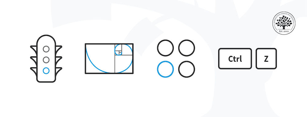
A representation of four of the 10 usability heuristics.

Heuristic Evaluation: How to Conduct a Heuristic Evaluation

by Euphemia Wong | | 32 min read
1,199 shares

Heuristic evaluation is the activity of using a set of guidelines (heuristics) to evaluate if an interface is user-friendly. Let’s look at what heuristics are and how you can conduct a heuristic evaluation to improve the usability of your designs.

Table of contents

What are Heuristics?

“Heuristics” simply means guidelines. In user experience design, it is nearly impossible to define rigid rules. There is no fool-proof way to create experiences that are guaranteed to work. Instead, you can refer to principles to guide you in your design process, to help you evaluate your work before you test it with real users.

Several researchers and leaders have proposed different sets of guidelines for user interface design. Let’s look at one of the most popular guidelines proposed by Jakob Nielsen and Rolf Molich.

Nielsen and Molich's 10 User Interface Design Heuristics

Jakob Nielsen, a usability consultant and partner in the Nielsen Norman Group, and Rolf Molich, usability engineer and founder of DialogDesign, established a list of ten user interface design guidelines in the 1990s. 

In this video, William Hudson explains each of these heuristics, along with illustrative examples.

Show Hide video transcript
  1. 00:00:00 --> 00:00:33

    In this session, I'm going to be talking about something that's referred to either as *expert evaluation* or *heuristic evaluation*. It's an evaluation done by one or more experts  using a set of guidelines, and evaluating whether a solution meets those guidelines, how well it meets the guidelines, where it is deficient. So, expert or heuristic evaluations rely on the experience and the expertise of the evaluator.

  2. 00:00:33 --> 00:01:00

    So, you can't really do these things without  understanding some of the basic concepts of interaction design and usability. I mentioned at the outset that you would be using guidelines, but those guidelines are *not* self-explanatory, so you have to understand what a good solution to a particular problem, what you're trying to achieve, would look like because as you're doing evaluations and as the industry changes on a  regular basis,

  3. 00:01:00 --> 00:01:36

    then you have to appreciate whether or not the solutions you're seeing actually conform to the guidelines in front of you. Heuristics are these rules of thumb based on *good  practice and known problems in design*. And they can be used from the very early design through to finished solutions. And you can even do expert or heuristic evaluations on just sketches if that would be helpful. It probably is more sensible a little bit later in the process, but certainly there's no impediment to looking at maybe the general layout of screens

  4. 00:01:36 --> 00:02:00

    and saying, well, this screen is quite possibly overly complicated for the problem in hand and the customers or users that you're trying to target. It is relatively inexpensive in that hiring in a consultant for one or two days is actually very much cheaper than conducting usability evaluations.

  5. 00:02:00 --> 00:02:37

    But immediately following, you'll notice that I mentioned that it's *not as effective as testing with real users*. And that is certainly the case. However, if you had a lot of novel designs and you wanted to get some idea about whether they were going to be effective, then inviting people in who actually do  usability testing who are experts in the field will get you a lot of feedback without nearly so  much cost as a lot of usability testing, which can get quite expensive just because of having  to recruit, reward, hire facilities, and so on.

  6. 00:02:37 --> 00:03:03

    Jakob Nielsen published his book on User  Interface Engineering back in the early 1990s, and these are his 10 basic UI (user interface)  heuristics. And they haven't really changed, although when we actually go out to do something like benchmarking, we have a very much more detailed set of heuristics.

  7. 00:03:03 --> 00:03:30

    But these are a useful starting point, and they're talking about fairly generic concepts like *visibility of system status* and making sure that people understand where they are in the process. And that, of course, is  a good thing no matter what you're doing. And detailed design does actually flow out of that – for example, letting people know that they've got things in their shopping basket. That is an example of the visibility of system status.

  8. 00:03:30 --> 00:04:00

    *Match between the system and the real world* – and that's something I've already alluded to when I was referring to terminology. The mapping sometimes is also physical. If you're talking about the natural tendency for increasing the quantity of something, it tends to be *up*. So, if you've got a slider, then up or to the right is 'more' and down or to the left is 'less'. And that's just what we call *natural mapping*. *User control and freedom* – being flexible, allowing people to go back and fix things.

  9. 00:04:00 --> 00:04:33

    Bear in mind that when user  interface design was relatively new on sort of the large scale back in the 1990s when Windows 3.1, which was kind of the very first successful version of Windows, and of course the World Wide Web came around about the same time, it was uncommon, it was very unusual to have Undo functions. If you made a mistake and you needed to fix it, then you had to fix it yourself. There was no Control-Z or any kind of undo facility.

  10. 00:04:33 --> 00:05:04

    It was something that you had to do, and we take that for granted now, but it was not the case in the early days. *Consistency and standards* – users should not have to wonder whether different words, situations or actions mean the same thing. And this continues to be a problem in some areas. Certainly on intranets within large organizations, you would find that one department had its own set of visual guidelines with its own visual language which was totally different to the next department.

  11. 00:05:04 --> 00:05:30

    And if you were unlucky enough to have to move between those departments on the intranet, then you were in a bit of trouble. It doesn't happen so much these days with the web – e-commerce, for example; people do try very hard to make sure that users are going to have a fairly painless experience, and so we do tend to see things laid out with very *similar terminology and visual language* between totally different e-commerce sites. And to be honest, there,

  12. 00:05:30 --> 00:06:01

    Amazon, because they are so large and popular, has been something of a yardstick. And most people, when they're asking for advice on how to do something in e-commerce, I would refer them to the Amazon site and usually for very good reason. *Error prevention* is much more successful than dealing with errors. Certainly if you're having to discard data or reject data because users did not understand how you wanted it formatted, you should *not insist that people punctuate things exactly the way you need them*.

  13. 00:06:01 --> 00:06:30

    You can do whatever you like with the punctuation once you've got the basic data from them. If you want the phone numbers without punctuation, then take the punctuation out of the phone number after you've got it. If you don't like the spaces in the credit card numbers, then take the spaces out of the credit card numbers. So, that isn't something that Jakob talks about here, but it is a different form of error prevention, and I wholeheartedly recommended presenting users  with errors and telling them they've done bad

  14. 00:06:30 --> 00:07:00

    and should do it over is *not good user experience*. *Recognition rather than recall* – and this is the basic premise of *all* user interfaces these days. That's the way that we've moved. Back in the 1970s and 1980s, most systems were command line based and you had to remember the syntax and spelling of the next command you wanted to enter. And when Windows and the Mac came along, both having stolen their designs from Xerox PARC,

  15. 00:07:00 --> 00:07:31

    then we got what we used to refer to as *WYSIWYG* – What You See Is What You Get. We don't talk about that much these days, but it was all about *recognition*, which people are very much better at, than recall; so, you can *recognize things much more easily* than you can recall them from scratch. *Flexibility and efficiency of use* – and usually there is a trade-off between what you might call *design for learning*  and *design for efficiency*. That is all tied up with flexibility and efficiency of use.

  16. 00:07:31 --> 00:08:06

    By making things *flexible and efficient*, you're often making them *harder to use*. So, that's where the tension in the design comes in. *Aesthetic and minimalist design* – people like  websites that look attractive and that they trust from a visual design perspective. And it is important that we *do not put too much in front of users at once*. And so, that's what we mean  by minimalist design. *Help users recognize, diagnose and recover from errors* – something that's actually these days largely overlooked,

  17. 00:08:06 --> 00:08:33

    but it's still extremely important on more complex systems; things like Microsoft Office, most of the Adobe apps do have behind them a huge body of *help and documentation* – usually pretty awfully organized and presented, I have to say. It used to be better ten years ago, and we've just for some reason stopped worrying too much about that. So, it used to be that if you were looking at a dialog and you wanted help

  18. 00:08:33 --> 00:08:54

    with that dialog, you could click on a button  and you would get help on that dialog. The best you can hope for these days is that you click on Help and you get taken to a website, and you now have to work out how you're going to find out about this specific issue that you are having with this specific dialog. So, things have gone a little bit backwards in recent years on that front.

These heuristics are applied at the “Surface” element of the user’s experience. However, user experience is created by design decisions taken at the strategy (why and for whom are you building the solution?), scope (what is it that you’re building?) and the structure and skeleton (how does the solution work?) levels. So, it is helpful to keep heuristics in mind throughout the design process. Let’s say you are creating the user flow for a task in a mobile application (the structure). If you map the task flow close to the real-world task that users are already familiar with (heuristic #2: match between system and the real world), your interface (the surface) will be more likely to adhere to this heuristic.
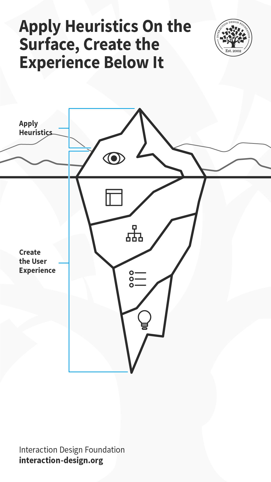
Illustration of an iceberg depicting the elements of user experience.

What the user sees at the surface is only the tip of the metaphorical iceberg, which is influenced by the decisions taken below the “surface of the ocean.”

© Interaction Design Foundation, CC BY-SA 3.0

When you go shopping at the grocery store, sometimes you realize you’ve added extra items that you can do without, and take them out before reaching the checkout counter. Or, perhaps you request the cashier to remove an item even after they have billed it, realizing it is far too expensive. When designing the online version of the checkout process, your architecture should therefore support the back-and-forth movement between the different parts of the checkout process and the interface will need to as well.
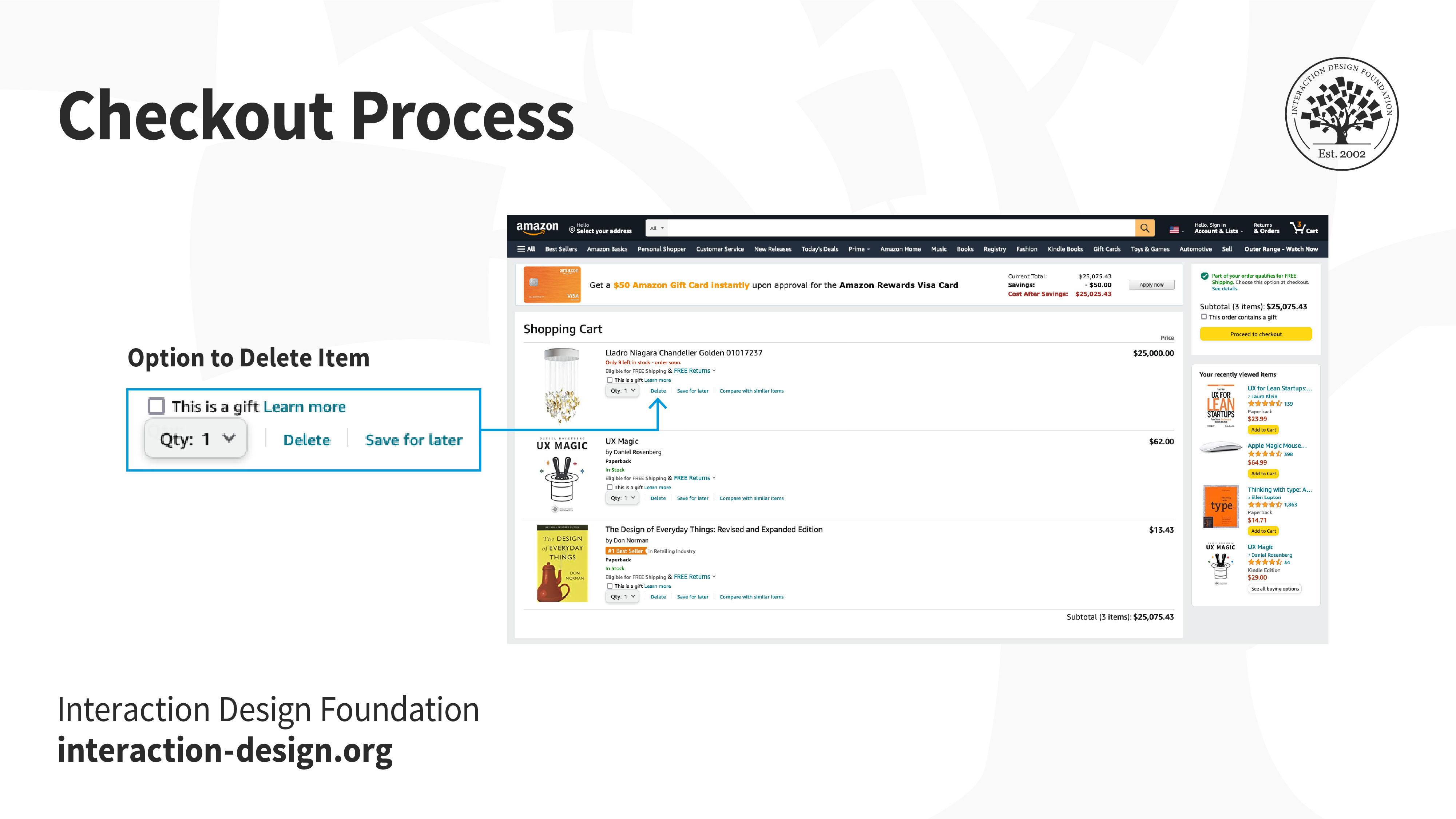
Amazon’s information architecture allows users to remove items at any point before and during the checkout process, even after the user has entered the payment method and shipping information, which is reflected in the interface.

© Amazon, Fair Use

Adapting Heuristics to Your Context

Technology has changed drastically since Nielsen and Molich first wrote the heuristics. For example, mobile devices and voice-based smart devices demand more context-specific heuristics. That said, Nielsen and Molich’s principles have stood the test of time and continue to be relevant. For example, on a voice-based interface, the heuristic “visibility of the system status” continues to be relevant; what changes is how you implement it (perhaps through a flickering light, or a dedicated sound effect). As new technology continues to emerge, you must learn how to adapt these heuristics to the new technologies, and if required, extend or add to the heuristics. For instance, ergonomics and judicious use of screen real estate are heuristics specific to mobile devices. 

How to Conduct a Heuristic Evaluation

Remember to Document Your Work

© Interaction Design Foundation, CC BY-SA 3.0
  • Establish an appropriate list of heuristics. You can choose Nielsen and Molich's 10 heuristics or another set, such as Ben Shneiderman’s 8 golden rules as inspiration and stepping stones. Make sure to combine them with other relevant design guidelines and market research.

  • Select your evaluators. Make sure to carefully choose your evaluators. Your evaluators should not be your end users. They should typically be usability experts and preferably with domain expertise in the industry type that your product is in. For example, an evaluator investigating a Point-of-Sale system for the restaurant industry should have at least a general understanding of restaurant operations.

  • Brief your evaluators so they know exactly what they are meant to do and cover during their evaluation. The briefing session should be standardized to ensure the evaluators receive the same instructions; otherwise, you may bias their evaluation. Within this brief, you may wish to ask the evaluators to focus on a selection of tasks, but sometimes they may state which ones they will cover based on their experience and expertise.

  • First evaluation phase. The first evaluation generally takes around two hours, depending on the nature and complexity of your product. The evaluators will use the product freely to gain a feel for the methods of interaction and the scope. They will then identify specific elements that they want to evaluate.

  • Second evaluation phase. In the second evaluation phase, the evaluators will carry out another run-through, whilst applying the chosen heuristics to the elements identified during the first phase. The evaluators would focus on individual elements and look at how well they fit in the overall design.

  • Record problems. The evaluators must either record problems themselves or you should record them as they carry out their various tasks to track any problems they encounter. Be sure to ask the evaluators to be as detailed and specific as possible when recording problems.

  • Debriefing session. The debriefing session involves collaboration between the different evaluators to collate their findings and establish a complete list of problems. They should then be encouraged to suggest potential solutions for these problems based on the heuristics.

In general, the more evaluators you have, the more usability issues you will unearth, especially when the evaluators have different skill sets. However, Jakob Nielsen suggests that between three and five evaluators is sufficient. With five evaluators, you should be able to identify up to 75% of all issues. While increasing the number of evaluators will help you find more issues, it may not be worth the time and effort.
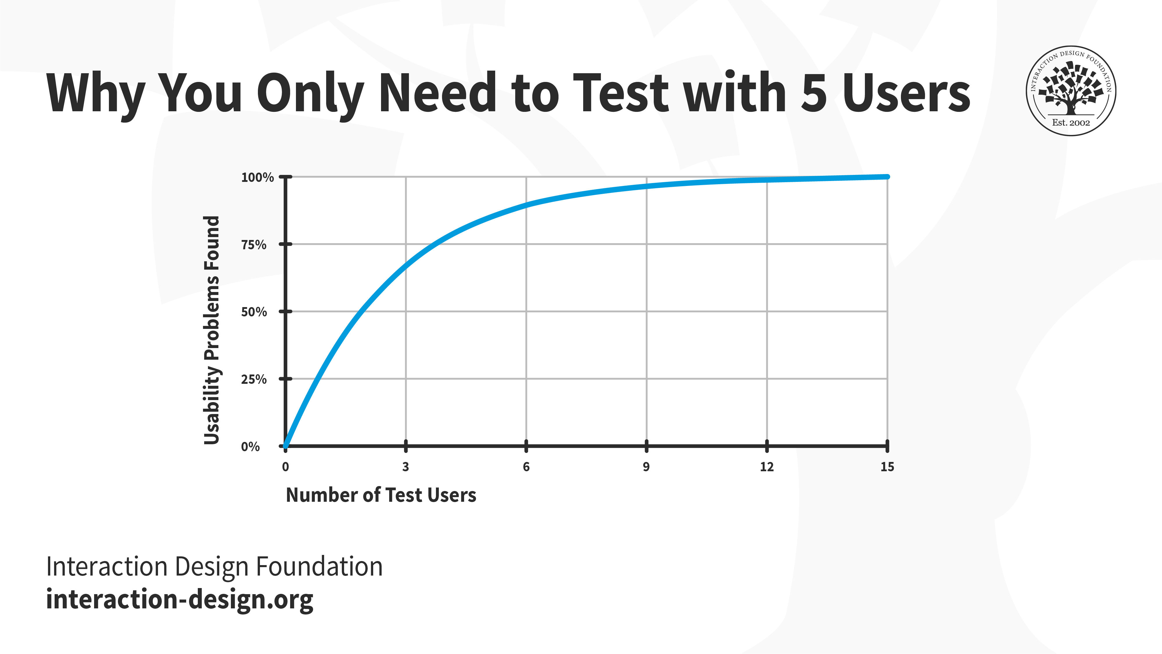
Graph showing the decreasing rate at which newer usability issues are found as the number of evaluators increase.

Jakob Nielsen’s research indicates that five evaluators can help you discover about 75% of the usability issues. Beyond five, with every additional evaluator, the proportion of new usability issues will be much smaller and usually not worth the extra resources.

© Jakob Nielsen and Nielsen Norman Group, Fair Use (Link)

Pros and Cons of Heuristic Evaluation

Like any suggested method in research and design, there are both pros and cons in the usability inspection method of heuristic evaluation. Let’s examine a few of them:

Pros of Heuristic Evaluation

  • Heuristics can help highlight potential usability issues early in the design process. 

  • It is a fast and inexpensive tool compared with other methods involving real users. 

Cons of Heuristic Evaluation

  • Heuristic evaluation depends on the knowledge and expertise of the evaluators. Training the evaluators or hiring external evaluators might increase the time and money required for conducting the evaluation.

  • Heuristic evaluation is based on assumptions about what “good” usability is. As heuristics are based on research, this is often true. However, the evaluations are no substitute for testing with real users. These are, as the name suggests, only guidelines, and not rules that are set in stone. 

  • Heuristic evaluation can end up giving false alarms. In their article, “Usability testing vs. heuristic evaluation: A head-to-head comparison,” Robert Bailey, Robert Allan and P. Raiello found that 43% of 'problems' identified by experimental heuristic evaluations were not actually problems. Furthermore, evaluators could only identify 21% of genuine usability problems in comparison with usability testing.

Start conducting your own heuristic evaluations with the help of this template:
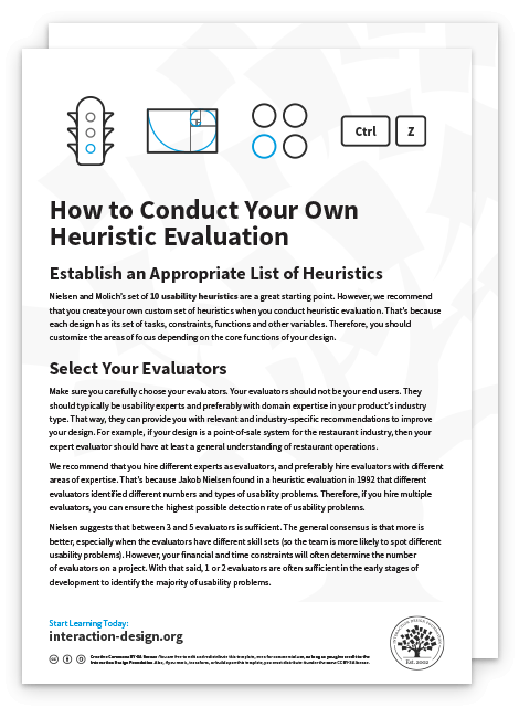
Get your free template for “How to Conduct Your Own Heuristic Evaluation”
How to Conduct Your Own Heuristic Evaluation How to Conduct Your Own Heuristic Evaluation
Secure form
Please provide your name.
We respect your privacy
Please provide a valid email address.
315,603 designers enjoy our newsletter—sure you don't want to receive it?

The Take Away

In user experience design, there are no hard rules that guarantee success. Instead, there are general guidelines, principles, or rules of thumb that you use to inform and evaluate your work. These guidelines are called heuristics, and when you evaluate your (or your competitor’s) work against these heuristics, it is called heuristic evaluation.

One of the most popular sets of heuristics are those created by Jakob Nielsen and Rolf Molich. These are:

  • Visibility of system status: Keep the user informed about what is happening behind the scenes.

  • Match between system and the real world: Ensure the conventions you use match what the user is already familiar with in the real world.

  • User control and freedom: Allow users to step back, undo and redo their actions.

  • Consistency and standards: Ensure interface elements like labels and icons behave consistently throughout the product.

  • Error prevention: Anticipate, and plan for errors. Where possible, eliminate them; and for other cases, ensure users can easily recover from errors.

  • Recognition rather than recall: Do not expect users to remember or recall information. It is always easier to recall information when we have clues to point us towards it. For example, it is easier for us to pick (i.e., recognize) the right answer from a list of options, rather than attempting to answer from memory (recall). Make sure your interface has cues to help users recognize information.

  • Flexibility and efficiency of use: Allow users to customize or tailor the interface to suit their needs so that they can perform frequent actions more easily.

  • Aesthetic and minimalist design: Remove clutter and any superfluous information so that users can focus on achieving their goal, instead of getting confused or overwhelmed.

  • Help users recognize, diagnose and recover from errors: Avoid technical jargon. Write error messages in plain language and ensure nothing gets lost in translation.

  • Help and documentation: Provide easily accessible and searchable documentation.
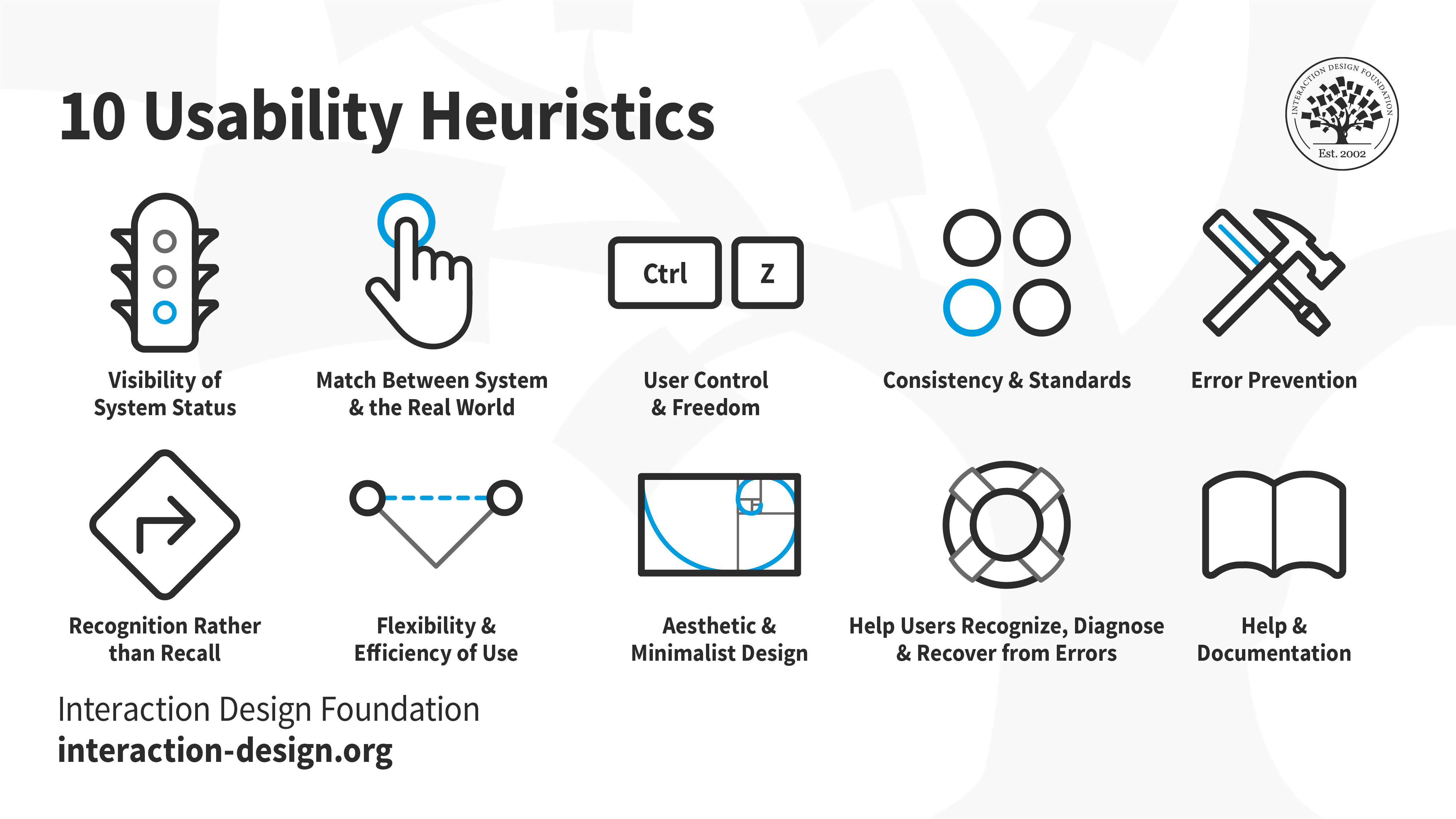
An illustration depicting Jakob Nielsen's 10 Usability Heuristics for User Interface Design. They’re called "heuristics" because they are broad rules of thumb and not specific usability guidelines.

© Interaction Design Foundation, CC BY-SA 3.0

Heuristic evaluation can be a useful inspection method; however, some experts have identified issues with evaluators reporting false alarms, rather than genuine problem elements within designs. To limit the effect misreporting has on the applicability of findings from heuristic evaluation, it helps to use a number of different evaluators, collate their problems and carry out a debriefing session to root out false alarms at various stages in the design process.

Heuristic evaluation is one of the many tools to guide your design process. However, it is not the only one that you should rely on. Make sure you conduct user research and test your designs with real users to continually refine your work.

References and Where To Learn More

Learn more about Jakob Nielsen's 10 Usability Heuristics for User Interface Design here

Ben Shneiderman proposed a set of guidelines, often dubbed “Eight Golden Rules of Interface Design,” four years before Nielsen and Molich published theirs. While they are worded slightly differently, there is a significant overlap between the two sets and you can read more about it here

Nielsen compared eleven sets of guidelines proposed by various authors and curated a synthesized list that tackles the larger question: which heuristics help unearth usability issues? To know more, please see here.

Here are Enrico Bertini, Silvia Gabrielli and Stephen Kimani’s heuristics adapted for mobile devices.

Images

© Interaction Design Foundation, CC BY-SA 3.0

Get Weekly Design Insights

Join 315,603 designers who get useful UX / UI Design tips from our newsletter.
A valid email address is required.

Topics in This Article

1,199 shares

Open Access—Link to us!

We believe in Open Access and the democratization of knowledge. Unfortunately, world-class educational materials such as this page are normally hidden behind paywalls or in expensive textbooks.

If you want this to change, , link to us, or join us to help us democratize design knowledge!

Share Knowledge, Get Respect!

Share on:

or copy link

Cite according to academic standards

Simply copy and paste the text below into your bibliographic reference list, onto your blog, or anywhere else. You can also just hyperlink to this article.

Wong, E. (2024, November 11). Heuristic Evaluation: How to Conduct a Heuristic Evaluation. Interaction Design Foundation - IxDF.

New to UX Design? We're Giving You a Free eBook!

The Basics of User Experience Design

Download our free ebook “The Basics of User Experience Design” to learn about core concepts of UX design.

In 9 chapters, we'll cover: conducting user interviews, design thinking, interaction design, mobile UX design, usability, UX research, and many more!

A valid email address is required.
315,603 designers enjoy our newsletter—sure you don't want to receive it?