Picture this: you’re designing a new app or website and want to know how users feel about it, but you want a good way to get actionable insights from those feelings, fast. Feedback is vital—and the sooner you get it, the better—and that’s why something as direct and visual as a rating scale comes in mighty handy when you want to get responses in and analyze them for fast and useful data, as you’ll find as you keep reading now.
Table of contents
- What is a Rating Scale?
- Why Do UX Researchers Use Rating Scales?
- Types of Rating Scales: Which One to Use?
- What is Bias in Rating Scales, and How to Understand and Mitigate its Impact?
- What are Limitations of Rating Scales?
- How to Use Complementary Research Techniques in UX Research
- How to Plan and Create Rating Scales
- What Are Some Examples of Quantitative Surveys?
- How to Analyze and Interpret Rating Scale Data
- The Take Away
- References and Where to Learn More
What is a Rating Scale?
© Interaction Design Foundation, CC BY-SA 4.0
In UX (user experience) design—and UX research in particular—a rating scale that runs from poor to excellent can help you understand user opinions and preferences in a way that’s faster to access than, for example, more detailed qualitative research feedback with. It’s not that detailed qualitative user data isn’t useful—for it certainly is a vital asset to get hold of! It’s just that rating scales—when a user researcher knows how to tap their potential for precious insights—offer one handy way to decipher user satisfaction, identify pain points, and uncover opportunities for improvement in product design, product development, service design, and more.
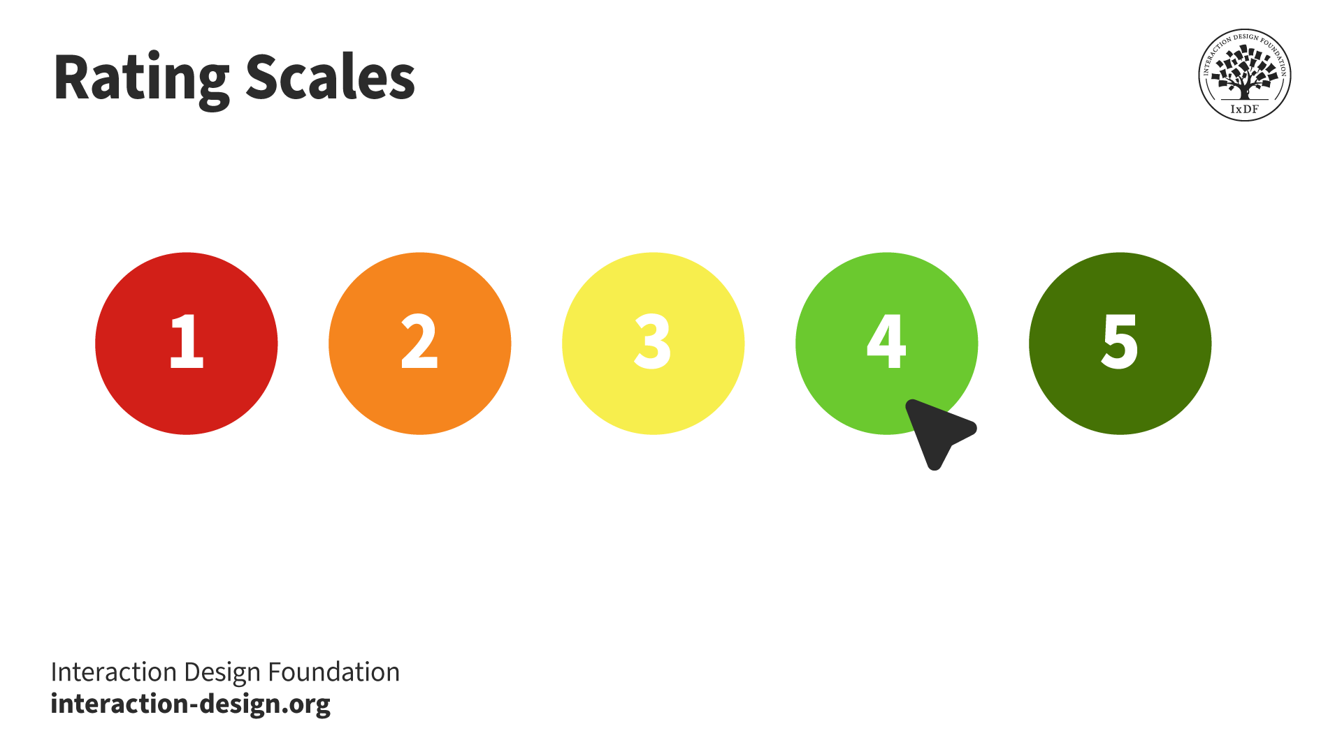
We’re all bound to have run into a rating scale in some way, shape, or form at some point, but we’ll get a “dictionary definition” approach in place right away, not least as we want to get a UX angle on things. A rating scale is, quite simply, a tool that researchers use to measure and assess different qualities, characteristics, or performance ratings. What you do is assign a numerical value—and it’s usual for it to run in the range of 1 to 5—so the rating scale helps people express their opinions, judgments, or preferences about a particular subject or object in a structured way.
You’ve got three main reasons as to why rating scales are useful, and—for one thing—they’re valuable tools to quantify opinions with, as they do play an important role in processes like design thinking since individual respondents can quantify their thoughts, feelings, or experiences about something that researchers are interested in knowing. Some rating scales may just have two “settings” (the binary-response kind), but then others have numbers for more fine-tuned replies—and that’s helpful because instead of using vague terms like “good” or “bad,” people can mark a more precise evaluation with a number on a scale of 1 to whatever.
Watch as UX Strategist and Consultant, William Hudson explains important points about quantitative research in data-driven design.
For another thing, rating scales facilitate comparison—as in, scales of the same type mean you can compare and analyze data; for example, as anyone who’s ever shopped on Amazon can attest to, a higher rating suggests a better product in product reviews, and ratings help consumers make informed choices about their purchases.
Last—but not least—they’re to collect data, and various fields, such as market research, customer feedback, education, and healthcare use rating scales to gather data in, and then data analysis techniques can help to conclude, make improvements, or inform decisions. From the most individual-level rating of how painful a wound or disease is in hospital to the collected results for a manufacturer’s quality assurance department to monitor a new product’s performance, rating scales make sense for a variety of good reasons.
Watch as Professor of Human Computer Interaction, Ann Blandford explains important points about data collection:
Why Do UX Researchers Use Rating Scales?
In user experience (UX) research, rating scales are valuable tools for collecting data and gauging user sentiment, and they can be a handy way to get, for example, a net promoter score, due to several reasons:
1. Simplicity and Ease of Use
Rating scales—especially ones using a 1-5 range—offer simplicity in data collection, and participants can comprehend and respond to questions by selecting a number on the scale that best represents their experience.
2. Quantitative Data Collection
One significant advantage of using rating scales in UX research is researchers can gather quantitative data with them, and since each rating corresponds to a numeric value, researchers can quantify user experiences.
Watch as Author and Expert in Human-Computer Interaction (HCI) Professor Alan Dix explains important points about quantitative research:
3. Versatility in Question Types
Rating scales can adapt to various types of questions, and researchers can use them to assess satisfaction, usability, likelihood to recommend, and more—so they’re a versatile tool that’s useful for addressing a wide array of research questions.
4. Comparative Analysis
Rating scales make it easier to do comparative analysis, and researchers can examine average ratings to compare different user interface aspects, features, or products.
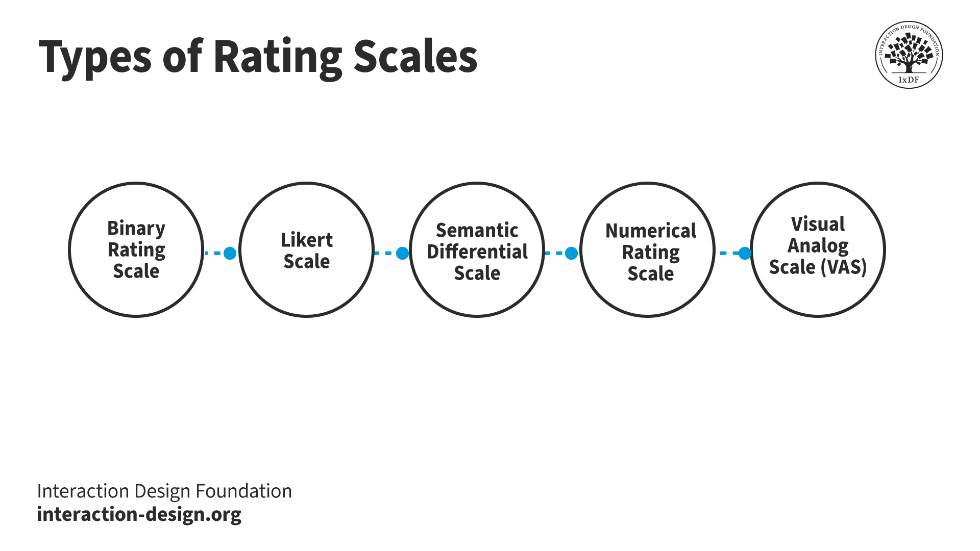
Types of Rating Scales: Which One to Use?
Whenever you’re embarking on user research, it’s important to pick the best performance rating scale—and there is such a thing as the right tool for the specific task at hand, hence why it’s good to understand the nuances of different rating scales and how factors such as your research objectives and the type of data you need will help you work out which one best fits your specific context and research goals.
© Interaction Design Foundation, CC BY-SA 4.0
1. Binary Rating Scale
One of the most straightforward rating scales, what it’s made up of is a simple “yes” or “no” as the response, and binary rating scales are most appropriate whenever you need a concise, “yes/no” answer to straightforward questions—like to verify attendance (at a concert, say), obtain consent, or determine agreement or disagreement with a basic statement.
On the plus side, they’re straightforward for respondents to understand (“yes” and “no” leave no room for ambiguity)—and use; they’re suitable for rapid data collection and analysis (and useful in time-sensitive situations when the pressure is on). On the downside, though, they can lack detailed information and may not capture subtle differences in opinions.
2. Likert Scale
The Likert scale is one you may be familiar with, given it sees a lot of use—and it’s a performance rating scale from 1-5 or 1-7 that gives respondents various options, with it being typical for the responses to range from “strongly disagree” to “strongly agree.”
On Likerts, people pick the option that most matches their level of agreement or disagreement with a specific statement or question, and so they’re ideal for when researchers need to measure the intensity of agreement or disagreement on a particular issue, and so are good to assess respondents’ opinions or attitudes with a high level of detail.
Likert scales have many strong points, like in how they enable respondents to provide nuanced feedback—and so they can capture a range of opinions and attitudes—and they’re versatile tools that turn up in research and surveys across diverse fields. What’s more, the higher level of detail—than, say, binary scales—can provide more fine-tuned valuable insights to help with decision-making in design and beyond. On the downside, however, they’re scales that can be susceptible to response bias, and interpretation may vary among individuals.
3. Semantic Differential Scale
The semantic differential scale is a performance appraisal rating scale that, like the Likert, runs in range from 1-5 or 1-7, but it presents respondents with pairs of opposing adjectives or adjectival phrases (e.g., “good” vs. “bad” or “efficient” vs. “inefficient”). What you do is ask respondents to rate an item—or a concept—by picking a point between two opposing descriptors on a continuum, and so they’re scales that are at their best when you’re after the emotional or qualitative aspect of a concept, product, brand, or service.
To be sure, on the plus side, this scale offers a clear contrast for evaluation by using opposing adjectives, it makes it easier for respondents to mark their sentiments, and it helps in understanding the emotional or qualitative aspect of a concept (handy for brand perception or product evaluation). It doesn’t stop there, though, because the scale provides a structured format for collecting qualitative data in a more standardized way. On the downside, though, these scales are limited to bipolar concepts and mightn’t suit all situations, and they may not capture subtleties in opinions—like, for instance, “(I find the onboarding of this product:) Somewhat exciting” might be of limited use.
4. Numerical Rating Scale
Just like it sounds, a numerical rating scale assigns a numerical value to rate an item—or concept—and respondents rate items on a scale within a specified range like from 1 to 10. It’s best to go for these when you need precise quantitative data for analysis and comparison—like when you’re evaluating attributes or features in a numerical way and want to pinpoint responses with more granularity.
On that note, numerical rating scales provide a finer grain of detail without the limitations of specific labels; they offer flexibility in choosing the scale range and allow some customization, and you can perform calculations or compare data on numerical scales, a nifty plus that makes them practical for research and evaluation purposes.
As with the other scales, there are downsides, and here it’s that interpretation may differ among respondents, and then there’s the point that it may not be as intuitive as other scales for some individuals.
5. Visual Analog Scale (VAS)
The visual analog scale (VAS) calls for respondents to mark a point along a continuous line to indicate what their response to a specific question or statement is, and researchers use this performance appraisal rating scale to measure a particular attribute’s intensity or preference. You might want a visual analog scale when you need to get a high level of precision in capturing the degree of a particular attribute—such as pain levels, satisfaction, or preferences.
On the plus side, the VAS offers a visual representation of intensity or preference—a neat point that makes it easier for respondents to express their feelings—and it provides continuous data and allows for more detailed analysis and interpretation. What’s more, it allows for fine-grained measurement of attributes, a nifty plus that makes it suitable for capturing subtle differences in responses. On the downside, though, a VAS calls for more effort to implement, and interpretation may vary due to the lack of fixed categories (and we’ll see more about interpretation about scales a little later, too).
What is Bias in Rating Scales, and How to Understand and Mitigate its Impact?
Like all research methods, rating scales aren’t immune to biases—not least since we’re dealing with humans in the real world, so it’s vital to recognize and understand these biases to make sure that there’s sound validity and reliability in research findings.
1. Recency Bias
This bias occurs when respondents give more weight to recent events or experiences than earlier ones—like if they see the last item in a series and it “sticks” in their minds more.
Another example might be if a user faced a minor glitch in a software application just before filling out a survey, they might rate the overall experience as negative due to the recent frustration.
To mitigate recency bias, it’s a good idea to hold feedback sessions or conduct them at various points during the user experience to capture a holistic view rather than wait till the very end.
2. Primacy Bias
This one “jumps” to the other end of the timeline from recency bias in that individuals tend to recall—and give more importance to—items that come at the beginning of a list or sequence. So, it can happen that if users have got a list of product features to rate, they might give high ratings to the first ones and not care for the ones that come later.
To mitigate primacy bias, you can rotate the order of questions or features presented to users.
3. Halo/Horns Effect Bias
The Halo effect is where a positive impression in one area influences impressions in other areas, and the Horns effect is the opposite. This can crop up in ratings if a visually stunning website makes users overlook usability issues—the Halo side—while one poor feature could make users rate all the other features negatively (the Horns).
How to mitigate Halo/Horns bias, you can ask for specific feedback on distinct features to prevent generalization.
4. Centrality/Central Tendency Bias
This one means respondents take the “middle of the road”—avoiding using extreme response options and sticking instead to the middle or neutral options. On a scale with an odd number of responses (like five), users tend to pick the middle the most, regardless of how they feel, so they mark “3” on a “5” scale.
To mitigate centrality/central tendency bias, give clear and distinct descriptions for each point on the scale, plus you might want to use an even-numbered scale to force a choice.
5. Leniency Bias
Some raters are overly generous in their ratings—they’re too nice! It happens, for instance, if a tester always gives a maximum score in a product test, even if there are evident flaws.
To mitigate leniency bias, combine quantitative scales with open-ended questions to gather context from the provided ratings; they’ll have to think about backing up their praise with truths, then.
6. Similar-to-me Bias
Just as it sounds, raters favor those who are similar to them or share similar views and experiences—like when a tester prefers a product that someone of the same age group, background, or views designed.
To mitigate similar-to-me bias, make sure you’ve got diversity in research panels and consider blinding evaluators to certain demographic information; you’re after a good swath of feedback from a wide representative group.
7. Confirmation Bias
This one you may have heard of as it crops up in many other areas, and raters seek out and prioritize information that confirms their pre-existing beliefs. It can go either way—positive or negative—because if a user enters into a rating system with a “preset mindset,” they can end up looking for qualities to back up what they already believe, good or bad, about a brand, for instance.
To mitgate confirmation bias, it’s best to frame questions in a neutral way and not use any leading questions—and incorporate diverse methods of data collection to help balance things out, too.
8. Law of Small Numbers Bias
Evaluators can—for a variety of reasons—believe that small sample sizes are just as representative of the population as large ones are, and it can be shaky ground to try and base foundations on when there’s a false sense of security—or insecurity. For instance, if you’ve heard nothing but high praise from a tiny group of respondents, there’s a risk that you may have just made a “lucky” hit on a bunch of positive reviewers (assuming they’re responding in earnest, that is!). Despite the temptation to go with it, you can’t draw a firm conclusion, for example, about a product’s popularity from what one small group of respondents declared about it—far better to reach more respondents to raise the chances of a more “representative” response group.
To mitigate small group bias, educate stakeholders about how important sample size is, including how results from small groups can be inaccurate whether it’s good or bad “news,” and make sure there are adequate sample sizes in research for more accurate results.
What are Limitations of Rating Scales?
1. Lack of Depth
Rating scales provide numeric values but don’t have the depth of qualitative insights, and because they don’t—or can’t—uncover that vital “why” behind a user’s rating, it’s sometimes best to supplement them with other response means to cover the “why”s.
2. Subjectivity
Satisfaction can be a hard thing to “corral” into a cut-and-dried stratification system of numbered responses and the like, and—sure—user rating scales for satisfaction can be subjective matters. People, being human, are different, and—for instance—two users may assign the same rating to an aspect of the UX, but their underlying experiences and expectations may be quite different behind it.
3. Limited Context
Rating scales offer a snapshot of a user’s experience at a specific moment, but they might miss the mark from not capturing the entirety of a user’s journey or the context in which they interact with a product; the holistic experience is valuable to gauge, and the magic of a seamless experience is more than the sum of the parts, anyway.
4. Scale Interpretation
As the pros and cons of the various scales indicated, interpretation is a “biggie” of a matter and can vary a great deal from person to person—like your “4 out of 5” might indicate a positive experience (i.e. a “strong 4” but without you having “strong” to qualify that), while for others, it might mean average (a “weak 4”).
How to Use Complementary Research Techniques in UX Research
1. Usability Testing
You do usability testing by observing users as they interact with a product—and it’s a method that provides real-time insights into how users navigate through an interface.
Watch as UX Strategist and Consultant, William Hudson explains important points about usability testing:
2. User Interviews
User interviews involve one-on-one conversations with participants, and with them you’re able to dig deeper into user experiences, motivations, and preferences—in fact, it’s great to combine this research technique with quantitative questionnaires for comprehensive results that speak more to how users find your product, service, or what have you in earnest terms.
Watch as Ann Blandford explains important points about user interviews:
3. Heatmaps and Click Tracking
Heatmaps and click-tracking tools visualize user interactions with a website or application—and they’re handy tools that visually represent where users click, hover, or spend the most time, which you can run alongside what the users themselves reveal in ratings about their reaction to your, for example, website.
4. A/B Testing
A/B testing is when you compare two versions of a product or interface, to work out which one performs better in the “department” of user engagement, conversions, or other key metrics—as in, one test group tests out design “A” while the other gets design “B” to test.
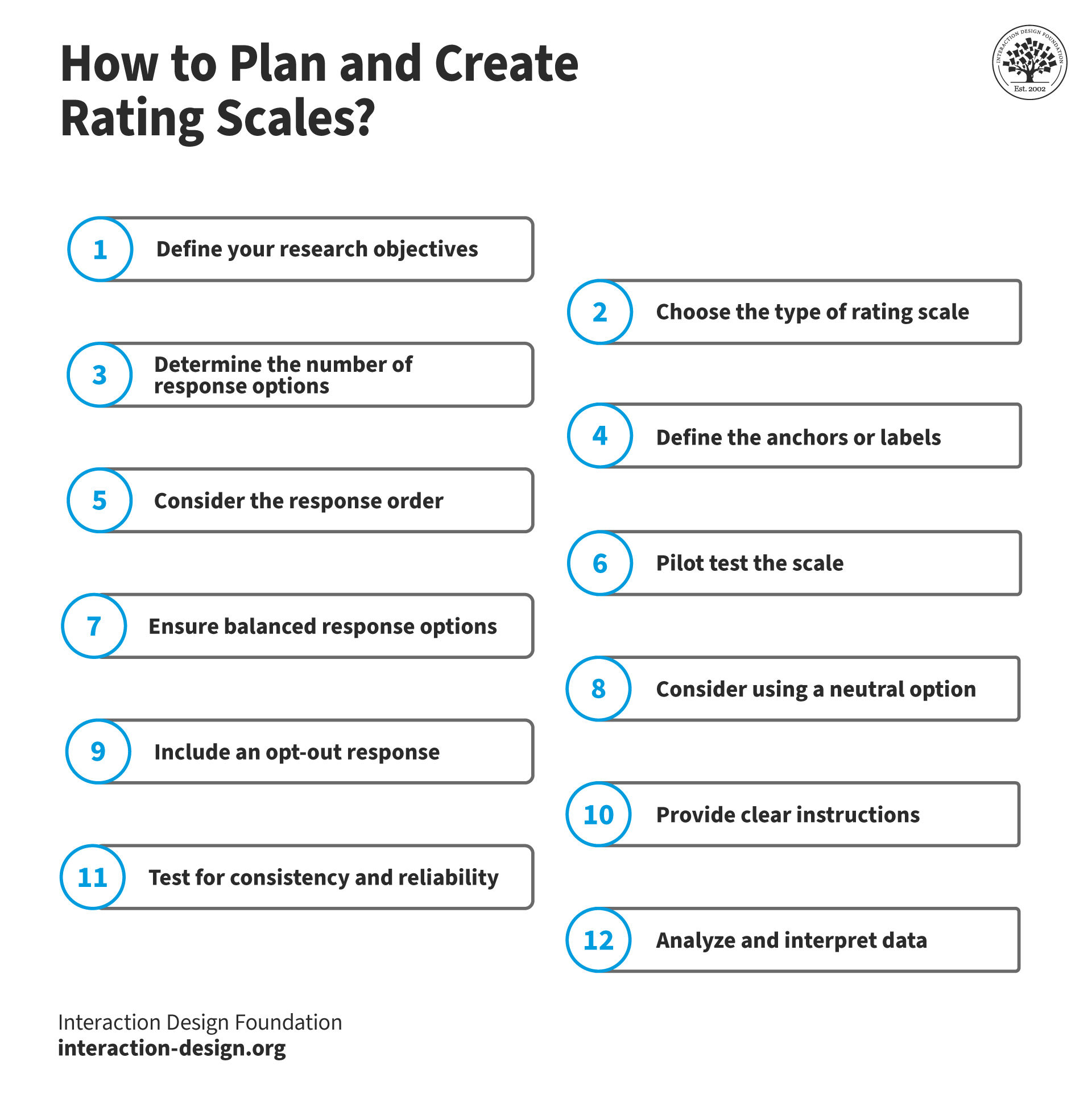
How to Plan and Create Rating Scales
© Interaction Design Foundation, CC BY-SA 4.0
Define your research objectives—and start by outlining your research objectives so you’ve got clear goals to work to, ones that can guide your rating scale’s design and content.
Choose the type of rating scale—and make sure it’s a suitable type—for instance, a Likert, semantic differential, or numeric—based on what your research goals are like.
Determine the number of response options—and decide on the number of answer options—be it, for instance, 3, 5, 7, or 9 points—that align with your data needs.
Define the anchors or labels—and it’s vital to make unambiguous labels that represent the full range of possible responses; ambiguity is a major enemy to watch out for on scales.
Consider the response order—and keep a logical order of answer options—either negative to positive or vice-versa, but always be consistent in either case.
Pilot test the scale—and do it with a small group so you can spot and address issues nice and early on.
Ensure balanced response options—and be sure to include an equal number of positive and negative answer options, as it will help avoid bias because too many positives can “angle” things one way and too many negatives can “spin” matters in the other direction.
Consider using a neutral option—so respondents can have a neutral choice (e.g., “Neither Agree nor Disagree”) when they need to, as they may truly feel “in the middle” on something—which is fine and something to respect.
Include an opt-out response—and use “Not Applicable” for questions that may not apply to everyone, and it’s a little point that will help respondents respect what they’re handling more when they notice you “know” them that bit better.
Provide clear instructions—as in, explain how respondents should use the scale and put things to them in no uncertain terms.
Test for consistency and reliability—so you work out how the scale is in terms of its internal consistency using methods like Cronbach’s alpha.
Analyze and interpret data—is last, but not least here, so you analyze the collected data using appropriate statistical techniques, and you do it well enough that you can draw meaningful conclusions from data that you know is valuable.
What Are Some Examples of Quantitative Surveys?
You present a statement, and respondents choose from five options: strongly agree, agree, neither agree nor disagree, disagree, and strongly disagree—and this Likert scale captures the direction and intensity of feelings for consistent and easy-to-analyze feedback.

© Questionpro, Fair Use
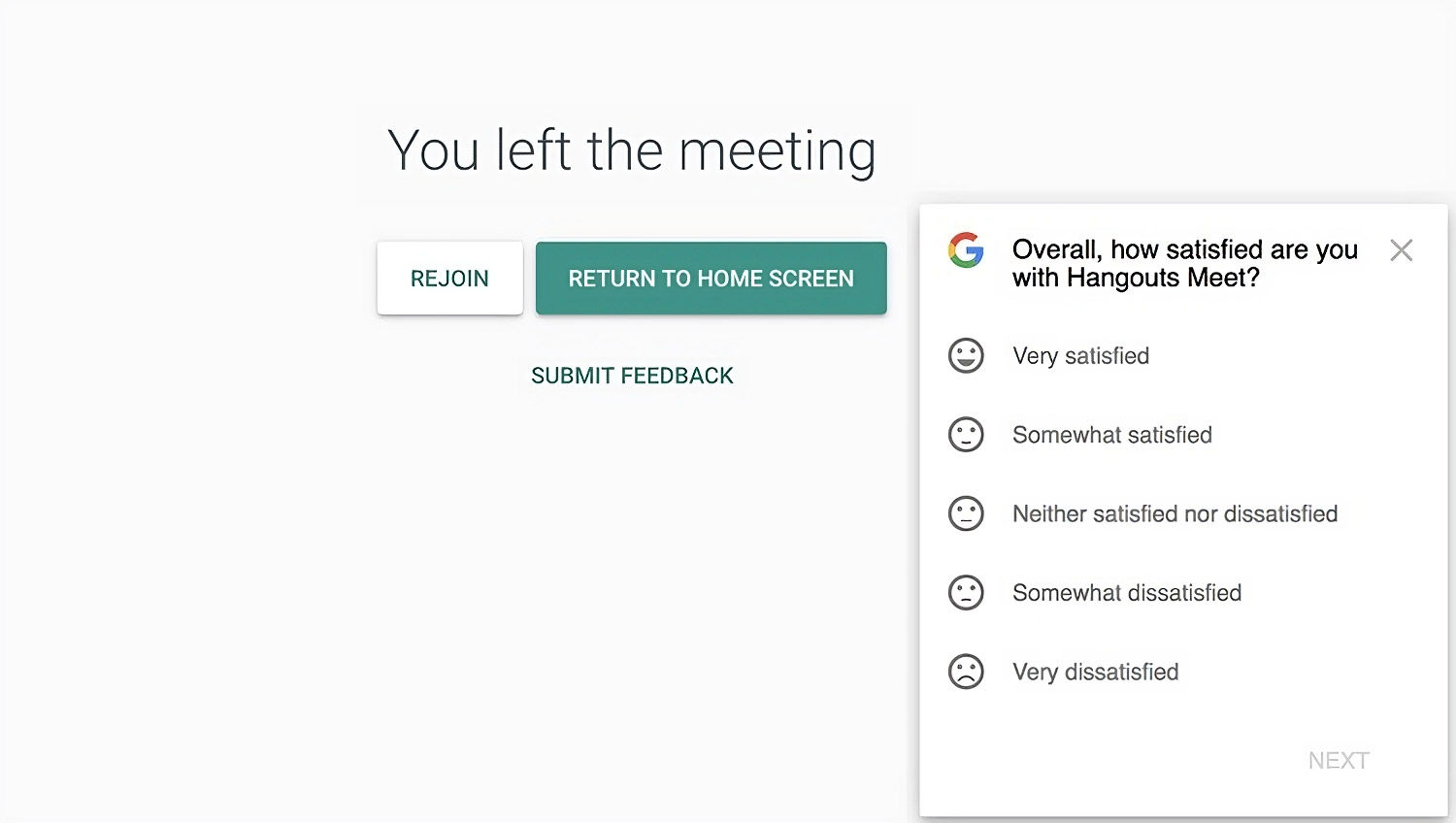
This survey concerns a post-meeting experience on a digital platform, Hangouts Meet, and respondents indicate how satisfied they are using a five-point scale to help give user experience insights that are crucial for platform improvements—and the options range enough that users get to indicate a good deal of depth of their sentiments about the platform’s performance.
![Post-meeting screen with Hangouts Meet satisfaction survey.]()
© Hotjar, Fair Use
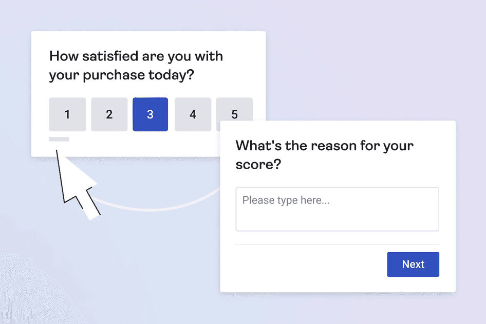
This satisfaction scale survey focuses on post-purchase satisfaction, where respondents use a 1-5 scale to express satisfaction level with a recent purchase—a neat way to give businesses immediate feedback on their purchasing experience, and the subsequent question asks them for qualitative feedback so responders can add context as to why they gave the number they did—with a “3” perhaps being: “It was OK, about what I expected.”
© Hotjar, Fair Use
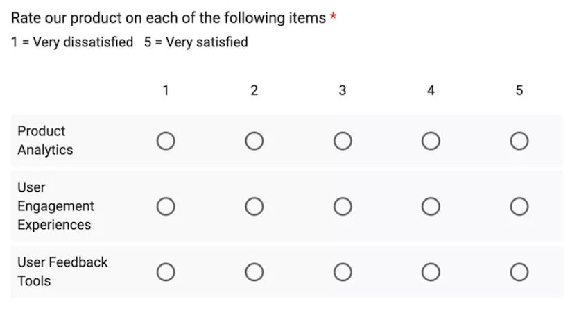
Here’s a matrix-style feedback scale survey where respondents can rate different aspects of a product on a scale from 1 to 5—where they evaluate “Product Analytics,” “User Engagement Experiences,” and “User Feedback Tools,” and the scale ranges from “very dissatisfied” (being a “1”) to “very satisfied” (a “5”). This kind of survey format enables businesses to get granular feedback in on multiple components of their product—or service—in a structured way, although it’s good to note that matrices can be taxing for respondents and may lead to abandonment, on mobile devices in particular.
© Userpilot, Fair Use
How to Analyze and Interpret Rating Scale Data
1. Understand the Basics of the Scale
Whenever you’re analyzing data from a scale, some things that are common to look at are the mean (average), median (middle value), and mode (most frequently occurring value)—and they’re metrics that offer a bird’s-eye view of the data distribution and general sentiment. For instance, a mean value of 4.5 might suggest that consumers have, in the main, a positive attitude towards a product or service.
2. Consider Directionality
Always consider the directionality of the scale. In most cases, 1 signifies disagreement or dissatisfaction, and 5 signifies agreement or satisfaction. It’s crucial to interpret data with this in mind, understanding the nuances of each number. Be sure to check that your survey tool is applying values in the order you expect.
3. Examine Central Tendency and Variability
The central tendency gives a general idea of the dataset’s center, but variability shows how values are spread out—so, that means a high variability indicates diverse opinions, while a low variability suggests there’s a consensus.
4. Identify Response Patterns
Analyze patterns and it’ll help you understand trends and commonalities—for instance, if most participants rate a service with a “4” or a “5,” then it indicates high satisfaction levels (great!), but—on the other hand—if there are a whole tangle of dispersed ratings there, it’s going to suggest mixed feelings.
5. Make Comparative Analyses
Compare data over time or against different datasets and you can draw conclusions on changing attitudes or opinions, and they’re ultra-handy analyses that can help you spot what’s working and what’s not—and so what needs improvement and can then lead on to more user-centered design decisions.
6. Do Filtering and Cross-tabulation
Filtering is helpful as it focuses on specific groups—like responses from a particular age group or gender—and that shines light and provides insights for you into specific segments of the population. Cross-tabulation, meanwhile, compares two or more datasets so you get to understand the relationships between them, and it’s something that can reveal how different groups perceive an issue in relation to others.
7. Have Visual Representations
Visuals—such as bar graphs, pie charts, or histograms—can make data more digestible, and they do offer a quick way for you to understand the essence of the findings right there.
8. Get Beyond Numbers: Insights and Stories
It’s not enough to present numbers at face value, and you’ll find the real value lies in interpreting these numbers, identifying problems, offering solutions, and sharing stories that the data tells. You can see this in that, for example, instead of merely stating that 70% of respondents rated a product as 5, it’s imperative to understand why they loved it and how it stood out to them as a “wow” item.
Rating scales can provide you with valuable quantitative insights, sure enough, but for a holistic understanding, you can complement them with qualitative methods like open-ended questions—and you’ll find that combining numbers, patterns, and stories makes for impactful conclusions that can drive improvements and strategic decisions.
The Take Away
Rating scales in UX research have emerged as a handy and even primary method for gathering quantitative data from users—and that’s because of their simplicity and effectiveness—though depending on their design they can have qualitative aspects. Scales offer a clear distinction between user experiences, and they allow designers and developers to identify areas of strength and weakness in their product or service.
Rating scales are straightforward for participants to understand and use, and well-designed scales increase the accuracy of responses and minimize confusion. What’s more, while compact, scales offer enough gradation to capture varying degrees of satisfaction—and ranged scales provide more nuanced insights than a binary system. Speaking of satisfaction, rating scales establish clear benchmarks for user satisfaction and teams can measure the impact of changes and improvements over time. Last—but not least—you’ll need to collate, visualize, and interpret the data you get in, so you’ve got more solid components on which to help guide more informed decision-making in the design process.
References and Where to Learn More
Learn about the best practices of qualitative user research
Dig into UX design
Grab a notepad and start learning about UX research
Have your thinking cap handy? Read more about Design thinking here