Your constantly-updated definition of A/B Testing and
collection of videos and articles. Be a conversation starter: Share this page and inspire others!
176shares
What is A/B Testing?
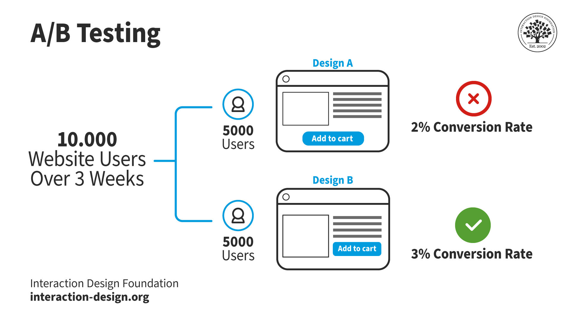
A/B testing, or split testing, is a quantitative user research method. In A/B testing, researchers show different users two versions of the same design to identify which one performs better. The A refers to the original design, while the B refers to the variation of the A design.
A/B testing has applications in many fields, like marketing, social media and retail. However, user researchers and designers primarily use it to test website and application designs.
ShowHide
video transcript
00:00:00 --> 00:00:32
A/B testing is all about changes in behavior. We present people with alternative designs and we look to see how much that alters their subsequent response. So in the simple A/B case, we show them design A, we show them design B, and we measure typically a completion goal, which a lot of subject areas in user experience we refer to as conversions.
00:00:32 --> 00:01:04
So signing up to a newsletter, adding an item to a shopping basket, making a donation to a charity. These are all things that are important to their respective organizations. And typically for the interactive technology that we're working on. So websites and and apps, for example. So these are the things often that we're measuring, but they're not the only things that we can measure. We can measure really straightforward stuff like time spent on page, time spent in the site and also bounce rates.
00:01:04 --> 00:01:33
For example, we'll be looking at some of those a bit later on. Just a reminder that because A/B testing is done very late in the day with live sites and large numbers of users, you really want to make sure that your solution is sound before you get this far. You're not going to be able to test everything that is possibly worrying you or possibly causing problems to users. It's just too long involved and potentially expensive in terms
00:01:33 --> 00:02:00
of user loyalty and also the amount of effort you'd have to put into it. So we are looking at using A/B testing to basically polish the solution rather than to rework it. Bear that in mind and make sure that you've done adequate testing up to this point. Also, bear in mind that A/B testing tends to be focused on individual pages, so it is possible to have multi-page tests, but
00:02:00 --> 00:02:30
it's a more complex area than we're going to be looking at in this lesson. So experiments have research questions that basically the things that you're trying to answer and because A/B testing focuses on changes in behavior, the research questions are going to be centered on defined goals. And as I've mentioned already, typically conversions. So will as an example, moving the add button above the fold improve sales conversions? I would imagine it would actually do something. I always find people
00:02:30 --> 00:03:01
are making the mistake of getting too talkative on the first screen of the page and the actual “buy this” or “add to basket” button gets pushed further and further down until users actually don't even see it. Will a more clearly worded charitable purpose increase donations? If people have a better understanding of what your charity's about or where this money is going, would that improve conversions for those users? So both of these can be A/B tested by using goals that you almost
00:03:01 --> 00:03:30
certainly have already defined in your analytic solution. So these are very good candidates for A/B and multivariate testing. But I'll give you some examples of bad questions too. So obviously I will repeat the words “don't ask this” when I've mentioned them because they're not meant as examples that you should be taking away. Conversely, research questions that are not directly related to improved goal completions tend not to be suitable for AB testing.
00:03:30 --> 00:04:02
And a kind of vague question like “will better product photos reduce questions to customer service?”, don't ask this, is the sort of thing that you simply cannot effectively test in A/B testing. And the reason is that there are all kinds of channels to customer service and only some of them are through the website and only some of them can be effectively measured as goals. So it's just not a suitable scenario for A/B testing. There is a related question you could ask though,
00:04:02 --> 00:04:30
which might be just as good, although not exactly equivalent, and that would be: “Will better product photos improve sales conversions?” Because if it reduces queries to customer service, it's almost certain that people are going to be much more confident about placing orders, adding those things to their basket. So that is a very easily measured outcome in terms of A/B testing, and that is the kind of question that A/B testing is very good at.
00:04:30 --> 00:04:43
So simply rewording or rethinking the question in terms of defined user and business goals is one way of getting to a satisfactory conclusion, even if you have a slightly squiffy question to start with.
Researchers and designers use A/B testing to test individual page elements or minor layout variations. They keep everything else on the page the same except the aspect they want to test. This way, they know that any difference in results comes from the variation alone.
A/B testing is quick, easy, and cheap. Designers and researchers choose this method to test slight differences in their designs.
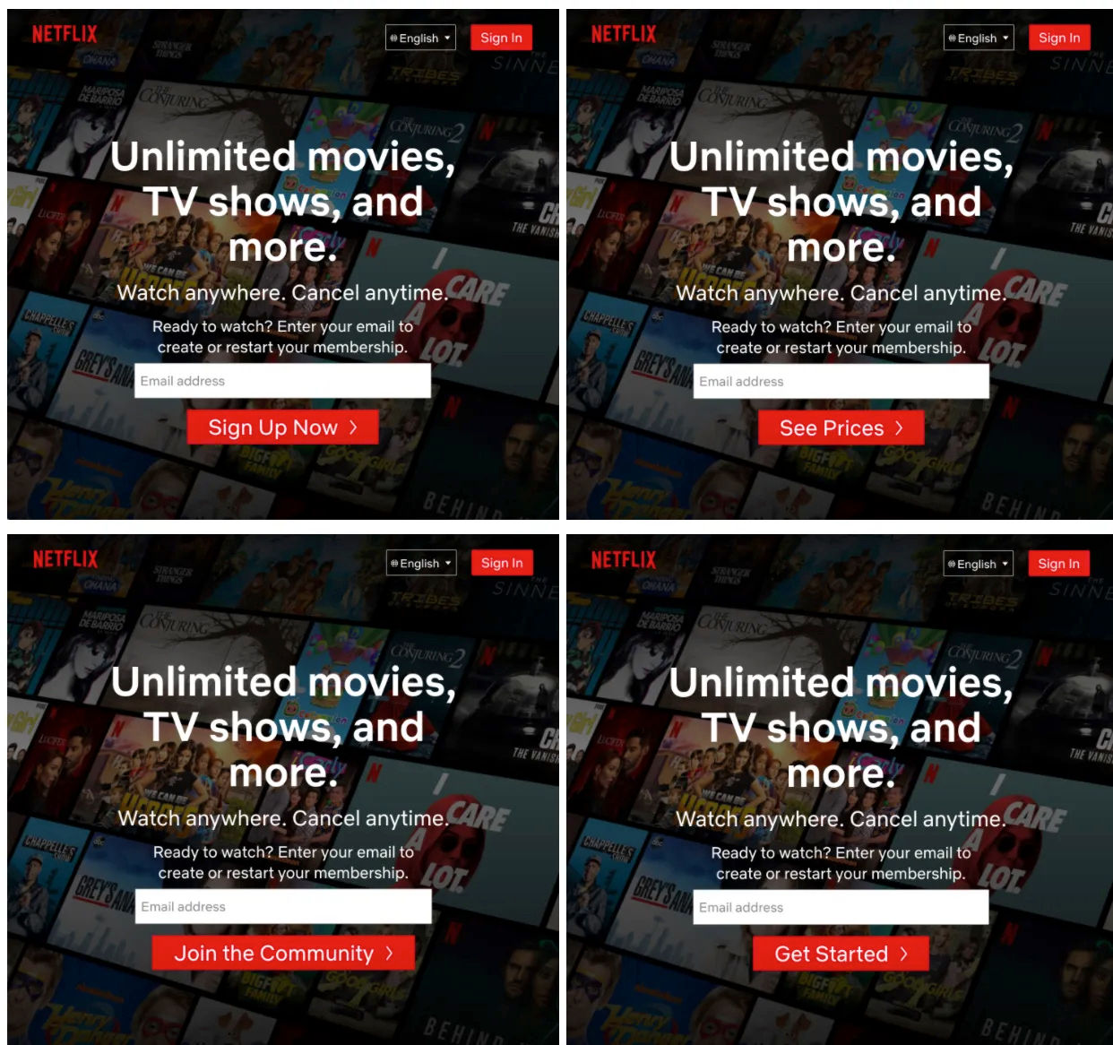
For example, the online streaming platform, Netflix, used A/B/n testing to find which call to action button resulted in more sign-ups. A/B/n testing extends A/B testing by incorporating more than one design variant.
Netflix split site visitors between these four design alternatives. They kept everything the same except the button to ensure their results would be reliable. Once the test was complete, they implemented the phrase “Get Started,” as it resulted in significantly more sign-ups than the other three designs.
A/B testing typically measures the difference in conversion ratebetween two designs. The conversion rate is the percentage of users who complete a desired action. Some example actions include:
Add item to cart.
Donate money to charity.
Sign up for a newsletter.
Click a specific item in a menu.
Other metrics that A/B testing can measure include:
The time a user spends on a page or site.
The percentage of users who leave a site after viewing only one page (the bounce rate).
A/B testing is limited in what it can measure. However, the variables that researchers can A/B test are almost limitless. Researchers change one variable between design variants and compare the metrics. Here are some examples of variables:
Anchor Pricing (display a higher priced item next to the main product)
Sales and discounts
Types of discounts (percentage off vs. buy one get one)
Placement of sale information
Original price crossed out vs. savings amount highlighted
Is A/B Testing Worth It?
“Testing leads to failure, and failure leads to understanding.”
—Burt Rutan
User researchers and designers use testing to make data-driven design decisions and optimize their products' user experience (UX). A/B testing is a highly effective user research method that is:
Cost-effective. Researchers can implement A/B testing with live users following deployment. This approach eliminates the need for expensive pre-launch testing environments. For example, a product manager wants to test two landing pages to see which results in more sign-ups. They split the website's traffic between the two versions. The A/B test gives them valuable data without a significant increase in costs.
Efficient. A/B testing provides rapid results, especially for products with substantial user bases. Sometimes, two weeks of testing is enough to collect actionable data.
Straightforward. Analytics tools provide researchers with clear insights into which design variant performs best. Researchers evaluate outcomes based on predefined metrics, like conversion rates. For instance, a researcher tests two call to action buttons. Analytics reveal the variant that leads to higher conversions. These results provide a clear directive for researchers on which element enhances the user experience.
When Should Designers Use A/B Testing?
In this video, William Hudson explains how to fit quantitative research into the project lifecycle:
ShowHide
video transcript
00:00:00 --> 00:00:32
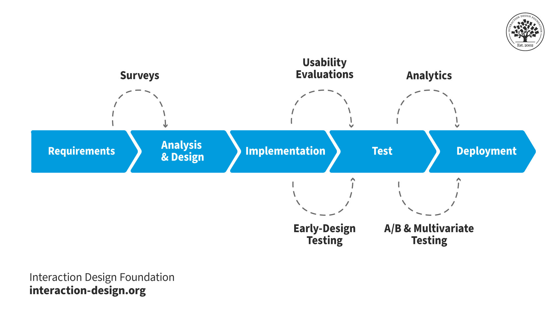
This is a very typical project lifecycle in high-level terms. Generally start off with *requirements* – finding out what's needed, and we go off and talk to stakeholders. And one of the problems we have with *user requirements*, in particular, is that often analysts and requirements researchers in the IT world tend to go off and want to ask *users* what they want.
00:00:32 --> 00:01:02
They don't really understand that users don't quite know what they want, that you actually need to do user research, and that is one of the biggest issues that we face in user experience: is the lack of understanding of user research and the whole field of user experience. From requirements, we might expect to be doing surveys to find out – particularly if we have an existing offering of some kind – we might find out what's good about it, what's not so good about it,
00:01:02 --> 00:01:31
what people would like to do with it. And surveys might be helpful in those particular areas. Now, bear in mind that generally when we're talking about surveys, we already need to have some idea of the questions and the kinds of answers people are going to give us. It is really a very bad plan to launch a large survey without doing some early research on that, doing some qualitative research on how people think about these questions and these topics
00:01:31 --> 00:02:00
and trying to understand it a little bit better before we launch a major initiative in terms of survey research. We can also use surveys in *analysis and design* perhaps to ask people which kinds of things might work better for their particular needs and behaviors. We also can start to employ *early-design testing*, even in the analysis and design phase so that we've got perhaps some wireframes that we're thinking about on the *design* side,
00:02:00 --> 00:02:30
and we can start to *test* them – start to try to find out: "Will people understand this? Will they be able to perform the most important tasks from perspective?" I have been involved in user testing of new product ideas where users had *no idea* what the service being offered was about because it was just presented *so confusingly*; there was no clear message; there was no clear understanding of the concepts behind the message because it wasn't very clear to start with, and so on.
00:02:30 --> 00:03:00
So, early-design testing really has an important role to play there. *Implementation* and *testing* – that's when we can start doing a lot more in terms of evaluating what's going on with our products. There we would employ *usability evaluations*. And the things that I've called "early-design testing", by the way, can be done later on too. It's just they don't really involve the finished product. So, they're perhaps not quite as relevant. But if we've got questions about how the navigation might be changed,
00:03:00 --> 00:03:32
then we might fall back to the tree testing where we're just showing people the navigation hierarchy rather than the whole site and asking them to perform tasks and just tweak the navigation as required to improve that. And one of my big complaints with our whole industry – still, after all these decades! – is that we do tend only to be allowed to do usability evaluations, and we do tend to wait until implementation has taken place
00:03:32 --> 00:04:02
and the product is being tested before we start to try to involve real users, which really is far too late in the whole process. If you want to be able to be confident in the concepts and the terminology that your interactive solution is providing to your users and customers, then that needs to start way back at the beginning of the project cycle. And then, finally, once we've got live solutions available,
00:04:02 --> 00:04:30
we can use *analytics* for websites and apps and we can also use A/B and multivariate testing to make sure that our designs are optimal. If we find problems, we might set up an A/B experiment to see whether this particular alternative would be a better solution or we could go down the multivariate route where we provide permutations of a *number* of different design elements on a particular page and see which of those elements proved to be the most effective.
00:04:30 --> 00:05:00
The fact that if you're doing project development, software development in an iterative environment – like agile, for example – then you might be doing a little bit of this in every single iteration; so, there might be a little bit of work on the requirements at the front and there might be a little bit of design and analysis. Having said that, there is usually some upfront requirements and analysis and design that has to go on so that you know what *shape* your project is
00:05:00 --> 00:05:30
– what *shape and size* I think is perhaps a better or more complete description – because in order for you to be able to even guess at how long this is going to take you, you need to have *scoped* it. And to scope it means to set the boundaries, and to set the boundaries means to understand the requirements and to understand what kind of solutions would be acceptable; so, there will be some of this done always up front. Anybody who sets on a major project *without* doing upfront requirements analysis and design of some sort
00:05:30 --> 00:05:34
is – I'm afraid – probably asking for trouble.
A/B testing is unsuitable for assessing the qualitative aspects of user experience. Qualitative aspects include:
Given this, researchers must know what they want to achieve before testing.
For instance, if a researcher relies solely on A/B testing to enhance user satisfaction, it would not provide the insights needed. A/B testing can show users spend more time on a page but cannot explain why users feel more engaged.
When researchers want to understand the 'why' behind user behaviors, they use other research methods. More suitable methods include user interviews, usability testing and surveys. These methods complement the quantitative data from A/B testing.
What Are the Requirements for A/B Testing?
Before a researcher can conduct an A/B test, their website or app must be fully functional. Test results will be unreliable for unfinished products.
For instance, a designer wants to test a product page for a mobile phone case. The page has:
Product photos that change when the user selects a different color.
An “add to basket” button.
The designer creates two designs with different "add to basket" button placements. However, the drop-down list is not functioning correctly. When the user chooses a case color, the product photos change to the wrong color. If users become frustrated, the button's placement will unlikely affect their decision to add to the basket. Any results from the test will be unreliable.
Designers and researchers use A/B testing in the late stages of the development cycle or after deployment. A/B tests need stable, well-designed environments to function correctly.
Also, the number of users tested must be significant enough to see actionable results. Researchers can conduct longer tests for smaller audiences to reach the required sample size. A/B/n testing requires a larger pool of users than A/B testing. More design alternatives mean more participant groups.
A/B sample size calculators help researchers specify a target sample size based on their website’s existing analytics.
Good vs. Bad Research Questions for A/B Testing
Before user researchers conduct testing, they define the questions they want to answer. An example of a bad question is, “Will better product photos reduce the number of customer service queries?” Researchers cannot effectively A/B test this. Many channels to customer service exist, not just product pages.
In this scenario, a good question is, “Will different product photos improve conversions?” Researchers split their users between two different designs, each with different product photos. If significantly more users purchase the product via design B, researchers can be confident:
Users are ordering more.
They are less likely to go to customer service.
Another bad example is, “Will shortening the sign-up process improve user satisfaction?” Satisfaction is challenging to measure with A/B testing, and many ways exist to shorten a sign-up process. The question must be more specific and design-related. For example, “Which design, A or B, leads to more sign-ups?”
How to Run an A/B Test
Once researchers and designers are confident their product is sound and has enough users, they follow a three-part process for A/B testing.
Pre-requisites
Researchers do not need to complete these steps each time they A/B test. However, for first-time A/B testing, these steps are crucial:
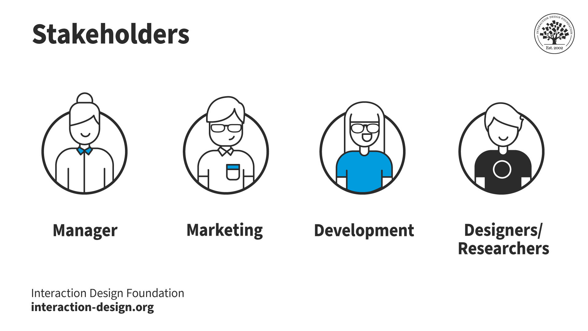
Identify key stakeholders. Discover who needs to agree or give resources for the testing. Requirements include getting:
Funding and permission from managers.
Access to existing A/B testing tools and data.
While A/B testing is inexpensive, managers must still approve its use. Marketing or development teams may hold the keys to existing analytics implementations. Finally, design and research colleagues may need to create alternative designs and run the test.
Convince stakeholders of A/B testing's value. It's crucial everyone involved understands why A/B testing is useful. This understanding is critical in scenarios where stakeholders might not be familiar with UX design. Clear examples, like stories of past successes, show stakeholders how A/B testing has helped other projects or companies.
Set up the necessary tools. Choose and set up the software for web analytics and A/B testing. Find the right tools that fit the project's needs and set them up.
Preparation
Once researchers have the required access, permissions and funding, they prepare for the test:
Define research questions. Decide the questions that need answering. For example, “Will changing the button color of a call to action result in more clicks?”
Design the alternatives. Next, create the designs you will test against each other. Make sure these designs are as perfect as possible. For shorter tests, some flaws are acceptable.
Select your user group(s) (optional). Most A/B testing and analytics software allows you to filter results by user group. For this reason, testing specific groups is not always necessary, as you can specify this later. However, if the software doesn’t allow this, you should define this before testing.
Plan your schedule. Finally, decide on a timeline for your test that includes when you'll start, how long it will run and when you'll check on the results. A clear schedule helps manage the test without wasting time or resources.
Results Follow-Up
Once the testing period has finished, researchers view the results and decide their next steps:
Check if the results are reliable. Look at the analytics to see if the differences are significant enough. Minor differences between the performance of designs A and B may be chance. Researchers use methods like chi-square tests to determine whether the results are significant.
If the results are unclear, change the designs and rerun the test, or run the test longer to get more data. These solutions help make sure the next test gives more apparent answers.
If the results are clear, implement the better version.
Keep improving. Researchers don’t only A/B test once; it's an ongoing process. Findings inform and inspire future tests.
Chi-Square Testing for Statistical Significance
Researchers interpret A/B test results to make informed decisions about design choices. A/B testing results are typically straightforward (e.g., which design resulted in more conversions). However, researchers must determine if the results are statistically significant.
Researchers use the chi-square test, a fundamental statistical tool. Chi-square tests play a pivotal role in A/B testing. They reveal whether observed results are statistically significant or chance findings.
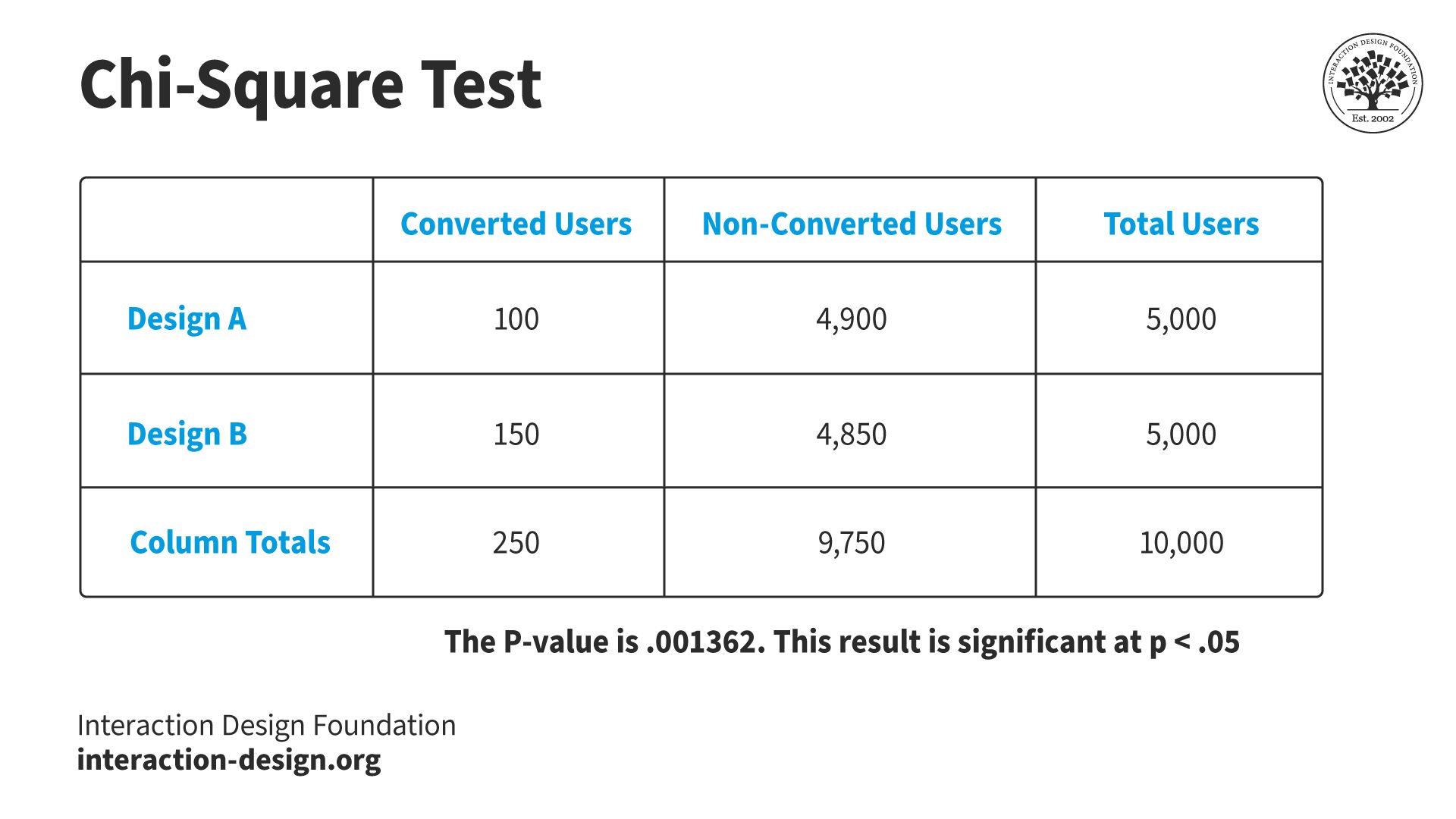
Chi-square test results are easy to interpret. If the test indicates a significant difference, researchers can be confident which design is best. For example, a researcher tests two web page versions to increase conversions:
Version A gets 5000 visitors with 100 sign-ups.
Version B gets 5000 visitors with 150 sign-ups.
The researcher analyzes these results using an online chi-square calculator:
They enter each design's successes (sign-ups) and failures (no sign-ups).
They set the significance level at 0.05 (or 5%—the most typical level).
The chi-square test provides a P-value of 0.001362, which is lower than the significance level. Any P-level value under 0.05 is considered statistically significant, while any value over is considered chance.
In this scenario, the researcher is confident their results are statistically significant. They can make design decisions based on these results.
The chi-square test determines if A/B test results are statistically significant. In this example, the difference between conversions may seem small compared to the total users. However, the P-value (the output of the chi-square test) is much lower than the significance level—it is statistically significant. Chi-square tests give researchers and designers the confidence to make data-driven decisions.
Researchers follow these best practices to run A/B tests:
Understand the platform well. Researchers should be familiar with the product before conducting A/B testing. A lack of knowledge leads to unreliable and unuseful results within the context of the platform.
Know the users. Researchers must understand who their users are and what they need from the product. This knowledge is available from existing user research, data and findings.
Choose what to test wisely. Researchers focus on the parts of their site that affect their users the most. For example, an excellent place to start is with user complaints. Other sources, like heat maps and session recordings, provide researchers with test subjects.
Talk to stakeholders. Management and other departments might see problems or have ideas the design team is unaware of.
Set clear goals. Researchers know what they want to achieve with A/B testing. They set measurable goals to guide testing and ensure relevance and focus.
Small changes, big impact. Design changes should be small. Significant changes and overhauls can confuse and upset users. Researchers focus on minor tweaks that make substantial differences.
Use segmentation. Segmentation is helpful after a completed test to review different user groups. Researchers compare demographics and segments like mobile and desktop website visitors.
Limitations and Challenges
A/B testing is typically straightforward and inexpensive. However, researchers must be aware of its limitations and potential stumbling blocks.
Requires a large user base. A/B testing only provides trustworthy results with a sufficient user pool. Without enough people, it might take longer to get results, or the findings might not be reliable.
Outside factors can influence results. External factors like seasonal changes and new trends can negatively affect results. For example, a retailer runs an A/B test on their website during the holiday season to determine the effectiveness of new product photos. However, the increased traffic and buying intent during the holiday season inflates the success of the images. In a regular season, the photos would likely not perform as well.
Focuses on short-term goals. A/B testing typically focuses on immediate results, like how many people click on a button. Long-term goals like customer happiness and brand loyalty are difficult to assess. For instance, a news website runs an A/B test comparing two headline styles to see which generates more clicks. One style leads to a higher click-through rate but relies on clickbait titles that may erode trust over time.
Ethical Concerns. Some tests significantly change what users experience or how products handle their privacy. In these scenarios, researchers must consider ethical practices. For example, an e-commerce site tests an alternative checkout process that adds a last-minute upsell offer. The offer could frustrate users who want to complete their purchases quickly.
A/B vs. Multivariate Testing
Researchers use multivariate testing to test multiple variables between two or more designs. This method is more complex than A/B testing. Researchers may choose multivariate testing over A/B testing for the following reasons:
Complex interactions. It is suitable for examining how multiple variables interact with one another. Multivariate testing can provide insights into more complex user behaviors.
Comprehensive analysis. It allows for a more detailed analysis of how different elements of a page or product work together. This detail can lead to more nuanced improvements.
Optimizes multiple variables simultaneously. It is ideal for optimizing several aspects of a user experience at once. This optimization can lead to significant improvements in performance.
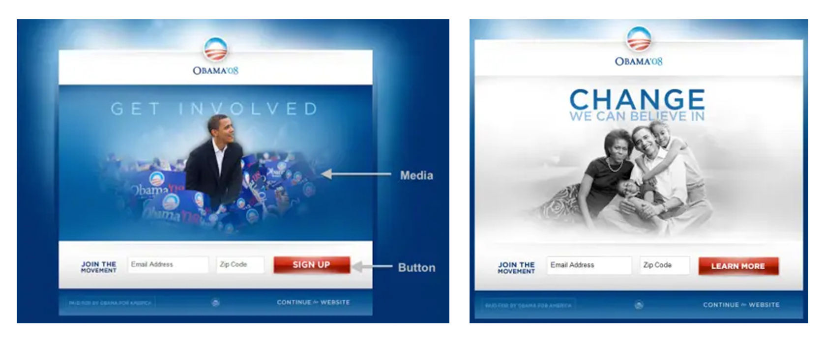
For example, during the 2008 US presidential election, the Obama campaign used multivariate testing to optimize newsletter sign-ups. They tested different combinations of their homepage media (an image or a video) and the call to action button. The team preferred one of the videos. However, testing revealed that an image performed better. This example highlights the importance of user testing and user-centered design.
The Obama campaign tested 4 CTA and six media variations (three images and three videos). They found that design option 11 (right image) had 40.6% more signups than the original page (left image). They implemented the more successful design, translating to approximately 2,880,000 additional signups throughout the campaign. These extra signups resulted in an additional USD 60,000,000 in donations.
Researchers may choose A/B testing over multivariate testing for the following reasons:
Simplicity and focus. It is more straightforward to set up and analyze, comparing two versions of a single variable to see which performs better.
Quick to implement. It allows for rapid testing and implementation of changes. This efficiency is ideal for iterative design improvements.
Requires less traffic. It achieves statistically significant results with less traffic. This benefits sites with smaller user bases.
Clear insights. Offers straightforward insights, making it easier to make informed decisions.
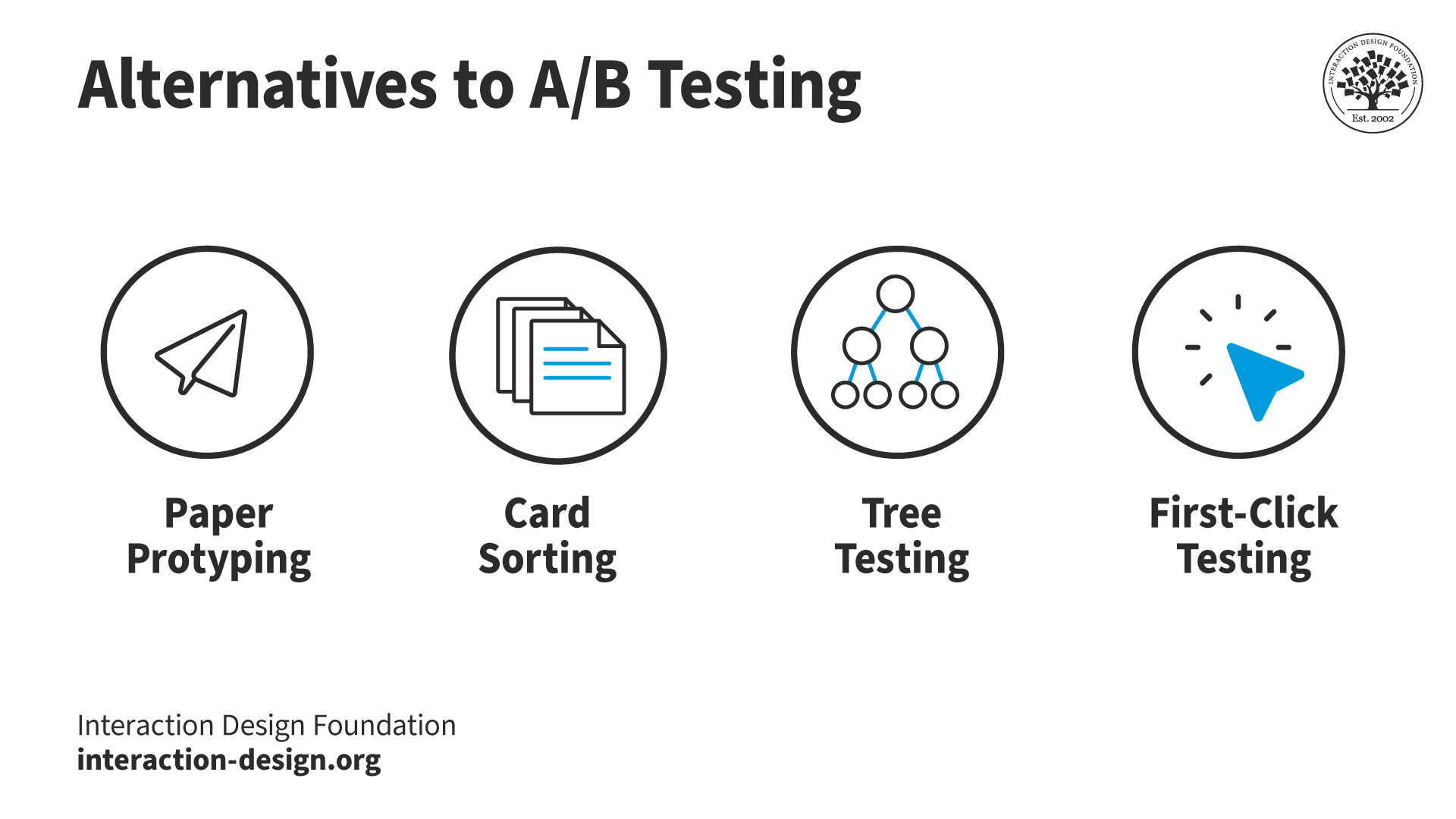
Alternatives to A/B Testing
Researchers employ many types of research methods. A/B testing is a powerful tool, but other methods can be more appropriate depending on the situation.
User researchers understand various user research methods. While A/B testing is helpful in many situations, here are four alternatives and why researchers might choose them instead.
Paper prototyping is an early-stage method researchers use for quick, hands-on idea testing. Unlike A/B testing, paper prototyping is about ideation and immediate reactions. Researchers use this method to generate quick feedback on basic design concepts. Paper prototyping happens before the costly development phase. This approach helps researchers quickly identify user preferences and usability hurdles.
Card sorting dives deep into how users mentally organize information. This method offers insights that are sometimes not revealed in A/B testing. Researchers employ card sorting to structure or restructure a product's information architecture. Users group content into categories and reveal patterns that guide information organization. This method ensures the final structure aligns with user expectations.
Tree testing focuses on evaluating the navigational structure of a site. Designers and researchers use this method to refine an existing navigation. Tree testing can also confirm a new structure's usability. This method strips away the visual design elements and focuses on how easily users can find information. Researchers choose this targeted approach over A/B testing to identify navigational issues.
First-click testing assesses a web page layout's immediate clarity and key actions. Researchers use this method to understand if users can quickly determine where to click to complete their goals. A/B testing does not always reveal this information. First-click testing offers precise feedback on the effectiveness of the initial user interaction.
A large portion of A/B tests do not show a clear improvement. Various factors can contribute to this high failure; for example:
Small sample sizes.
Short testing periods.
Minor changes that don't significantly impact user behavior.
However, these "failures" are invaluable learning opportunities. They provide insights into user preferences and behavior. These insights help researchers refine their hypotheses and approaches for future tests.
To increase the success rate of A/B tests, researchers ensure they have:
A clear hypothesis.
A sufficiently large sample size.
A significant enough variation between the tested versions.
A sufficient test duration to account for variability in user behavior over time.
Don Norman, founding director - Design Lab, University of California, explains how every failure is a learning opportunity:
ShowHide
video transcript
00:00:00 --> 00:00:34
The word "failure" – it's a bad word. There are many cultures where failure is considered *so* bad that basically someone who fails that may change their whole life. If you are in a company and you do something and it fails, you may never recover; or if you do something that fails, you do something bad, you can never recover – and that's *wrong*!
00:00:34 --> 00:01:02
There's the company IDEO, a design company in California. It has this philosophy about fail fast, fail frequently. They're trying to say failure is a good thing because failure is how you learn. But the word "failure" is a negative. I remember I was in Korea and I was talking to some students, and one student who I became friends with was telling me how
00:01:02 --> 00:01:31
he wasn't doing well, et cetera, et cetera, and... But I tried to learn what he had worked on. And it turned out that he had once designed a golf bag – a bag that held golf clubs. And it won a prize. And then a company said, "We really like that." And the company started manufacturing it. And I said, "I don't understand. It sounded to me like that was a great success; why are you so unhappy?"
00:01:31 --> 00:02:00
Well, because the product *didn't sell well*. And so, eventually it was removed from the market; so, he considers it a failure. And I said, "Wait a minute. You succeeded. You did this brilliant thing as a *student*. And this company came and just looked at it and said, 'That's wonderful!' and they manufactured it, and it didn't sell well. That's the company's fault, not your fault." But, no, to him it was a life-defining moment and he really never recovered.
00:02:00 --> 00:02:32
"Failure" – that word; horrible. I have friends who have just the opposite view. If you don't fail at things, you're *not trying hard enough*. How do I know you're trying something that's new and innovative and different that will change the world? Well, it means that because occasionally it didn't make it – it failed – because if you're not failing, you're not trying. You're not trying the extremes; you're not trying outrageous ideas which often are the most positive ones.
00:02:32 --> 00:03:00
So, failure ought to be a great thing; so, I think that IDEO shouldn't say fail fast, fail frequently. I think they should say, "Learn fast, learn frequently." And I like to say that scientists *never* fail. And here's why: because I'm studying this important phenomenon, and so I spend a year or even two years trying to study it and doing this and studying that; in the end, I say, "That's not working.
00:03:00 --> 00:03:33
I think I'm going to try something different." They don't say, "I failed; I'm a failure." They say, "That didn't work." because they learned a lot along the way, they never got to their goal, but they don't count that as a failure. And that's how we should all be. But even when you've had a really unhappy case, even when you really did fail, you should realize that that's OK. *We all fail.* And we should learn from it and go on to the next thing and the next thing. And the more failures we have, actually, the better we're going to be in the future
00:03:33 --> 00:04:02
because we've learned so much. And remember, you only fail when you *push the envelope*. And it's pushing, pushing, pushing – the extreme – that eventually leads to great rewards because if you want to be innovative, you have to be failing, if you will, or maybe learning, *all the time*. In Silicon Valley, there are many startup companies.
00:04:02 --> 00:04:32
And oftentimes people start a company for the first time and don't make it. Ninety percent of the companies that start fail. In fact, it's a higher percentage when you learn that a lot of them don't even get started *enough* that you counted them as a start. So, most of them don't make it. And you know what might people who – the people who support these early startups say? "Yeah, we see these promising people starting something, and we'll get them money to do it,
00:04:32 --> 00:05:03
but we expect they're not going to make it." But when they come back the *second time* and say, 'Oh, we have some new ideas,' we say, 'You failed the first time; good. You've learned a lot, haven't you? You're more likely to succeed now because you've had that experience. You know the sort of things you have to think about.'" You just watch extreme sports. Watch these people on skateboards doing flips, doing this, that and the other. Or watch skiers, and it looks wonderful, right? Any gymnast, any athlete.
00:05:03 --> 00:05:30
But, actually, they have spent thousands of hours refining that and they often fail and sometimes they injure themselves badly along the way. But that's how they get better and better and better and better. We look at the real issues. We focus on people. We think of it as a system. And we do it and we're not afraid to fail,
00:05:30 --> 00:06:03
but we're *careful* – we don't want to do a 10-billion-dollar project and fail. We want to divide that project into small hundred-thousand-dollar projects, that if *those* fail, well, they're not fit— We *learn* from those, but by doing many of those, we build up to the larger one, and more likely to have success. That's the argument I want to make. So, actually in the financial community that supports these startups, having a failure is considered a *positive* sign.
To conduct A/B testing, researchers can use various tools to set up design alternatives and measure outcomes. Popular tools include:
Google Optimize offers seamless integration with Google Analytics (GA). This integration allows researchers to use their existing GA goals as test objectives. Researchers can easily visualize how their experiments impact user behavior.
Optimizely is a powerful tool that allows extensive experimentation. Researchers can use this platform across websites, mobile apps and connected devices. Optimizely makes it easy for researchers to create and modify experiments without writing code.
VWO (Visual Website Optimizer) provides a suite of tools, including A/B testing, multivariate testing, and split URL testing. VWO’s interface is designed for marketers, making it accessible for those with limited technical skills.
Unbounce is best for testing landing pages. Its drag-and-drop editor enables researchers to create and test landing pages without developer resources.
Adobe Target is part of the Adobe Experience Cloud. This tool suits businesses looking for deep integration with other Adobe products.
These tools allow researchers to make data-driven decisions that enhance user experience. However, success in A/B testing comes from more than just tools. Clear objectives, appropriate metrics and iteration based on findings lead to profitable outcomes.
William Hudson, CEO of Syntagm, UX Expert and Author, explains how researchers and designers use analytics in UX design:
ShowHide
video transcript
00:00:00 --> 00:00:34
We're going to be looking at how analytics fits into the user experience profession. It's been around for a long time. Analytics have been around for as long as the web, obviously. And so has usability and user experience. They've been around since before – *long before*, in fact, if we're talking about usability. But the two have really not come very much into contact with each other until fairly recently – I'd say in the last five or seven years,
00:00:34 --> 00:01:02
we're starting to have much more interest in analytics from a user experience perspective. And bear in mind that analytics is really quite a big topic and that there are people who spend their entire lives looking at analytics. We're obviously going to be skimming the surface somewhat, but from a user experience perspective. So, the kinds of things that we're hoping to get out of analytics, whether we're talking about web or mobile app – I'm not going to differentiate
00:01:02 --> 00:01:32
between the two very much. In fact, Google Analytics treats them pretty much as equivalent. But the kinds of things we can get out are largely around the area of behavioral data – which is obviously of great interest to us from a user experience perspective. But we'll also be looking at some of the other kinds of data – typically demographic – which also can be useful for user experience. So, *bounce rates* is a number that is often quoted in analytics circles.
00:01:32 --> 00:02:01
It's how *often people appear* at a page on your website and then *immediately disappear*. So, they've bounced. Obviously, it's very disappointing for web designers to see that they've got high bounce rates on certain pages; and, of course, it can be a variety of issues that leads to that happening, and that's really one of the challenges facing us from a user experience perspective: Is it the content? Is it stuff that directed people to our site without our particularly being aware of it?
00:02:01 --> 00:02:33
Is it faulty information? What kinds of things go on? *Conversion rates* – really the queen of statistics from an analytics perspective: Are people doing what you want them to do? That's what a conversion is. Are people coming to your website and buying stuff? Or subscribing to your newsletter? Or voting for your candidate in whatever kind of organization this might be? Those are all examples of conversions. And, from a UX perspective, we tend to think of those as achievement of goals, and
00:02:33 --> 00:03:01
there is also the question, which we'll be talking a bit about later on, of our organizational goals versus users' individual goals; hopefully, those are aligned, but they may not be; and sometimes the analytics can help us with that. *Repeat usage* – how often people come back; obviously very important for most websites – we don't want people just dropping in and then disappearing forever. We really would like them to engage with our content in most cases.
00:03:01 --> 00:03:33
*User profiles*, *demographics*, *platforms* – these are all the kinds of things that the analytics tools can tell us. And some of this information has been available since year dot in the web arena – information that's passed back to a web server by the browser, for example. But it has become much more elaborate and much more sophisticated of late, especially with platforms like Google Analytics doing a lot of that work for us. *Search behavior* – this has become a little bit complicated in recent years,
00:03:33 --> 00:04:01
mostly because the search information used to be passed in with the request for a page. So, if you went to Google or Bing and you typed in a search string and then clicked on one of the resulting links, the search page would very kindly tell the server what the user was searching for at the time, but for various reasons that isn't happening so much now – some of it for information privacy reasons.
00:04:01 --> 00:04:33
So, search behavior is dealt with slightly differently these days. We're not going to go into great detail on that particular topic, but if you're working with Google Analytics, which is what we're going to be using as an example of an analytics platform, then rest assured that you can get to the search behavior, but it involves integrating Google's search analytics with the web analytics for your interactive solutions. *User journey* is obviously very interesting from a user experience perspective –
00:04:33 --> 00:05:00
Where are people going? What kind of people go where? How long are they spending at various locations? Does visiting one page or another improve or decrease the chances of them actually converting – buying something or signing up, what have you? Analytics is a really huge field, and we're going to be just kind of skimming in and looking at some of the highlights there and trying to understand how it all fits in. So, how this data is collected and reported
00:05:00 --> 00:05:27
– what's good about it? What's bad about it? There are inherent weaknesses in some of the data that we're going to be looking at, and you obviously need to know and understand that. And that is one of the things that I'm planning to do for you – is to point out some of the really important weaknesses and obviously some of the important strengths, too, but a lot of this data can be very helpful when it comes to locating and possibly even fixing user experience problems.
Video copyright info
Author: Stewart Cheifet. Appearance time: 0:22 - 0:24. Copyright license and terms: CC / Fair Use. Modified: Yes. Link: https://archive.org/details/CC1218greatestgames
What does it mean if both versions in an A/B test perform similarly?
If both versions in an A/B test perform similarly, it suggests the changes tested did not significantly impact user behavior. This outcome can have several reasons:
Insensitivity to changes. The tested element might not influence user decisions.
Need for more significant changes. Consider testing more noticeable variations.
Well-optimized existing design. The current design effectively meets user needs.
Inconclusive results. The test duration was too short, or the sample size too small.
If A/B tests remain inconclusive, researchers should use different methods to explore more profound insights. Methods include surveys, interviews and usability testing.
When developing a product or service, it is *essential* to know what problem we are solving for our users. But as designers, we all too easily shift far away from their perspective. Simply put, we forget that *we are not our users*. User research is how we understand what our users *want*, and it helps us design products and services that are *relevant* to people. User research can help you inspire your design,
00:00:33 --> 00:01:00
evaluate your solutions and measure your impact by placing people at the center of your design process. And this is why user research should be a *pillar* of any design strategy. This course will teach you *why* you should conduct user research and *how* it can fit into different work processes. You'll learn to understand your target audience's needs and involve your stakeholders.
00:01:00 --> 00:01:37
We'll look at the most common research techniques, such as semi-structured interviews and contextual inquiry. And we'll learn how to conduct observational studies to *really understand what your target users need*. This course will be helpful for you whether you're just starting out in UX or looking to advance your UX career with additional research techniques. By the end of the course, you'll have an industry-recognized certificate – trusted by leading companies worldwide. More importantly, you'll master *in-demand research skills* that you can start applying to your projects straight away
00:01:37 --> 00:01:44
and confidently present your research to clients and employers alike. Are you ready? Let's get started!
Can A/B testing results be misleading, and how do I mitigate that?
A/B testing results can mislead due to:
Methodological errors. Unclear questions, biased groups and test groups that are too small.
Incorrect data interpretation. Confusion about significance, not seeing random changes and bias towards expected outcomes.
Overlooking factors. Time of year, market changes and technology updates.
Here's how researchers can mitigate these risks:
Test for statistical significance. Confirm if results are statistically significant or chance findings.
Control external factors. Isolate tests from external factors or account for them.
Run tests for adequate duration. Capture user behavior variations with sufficient test periods.
Avoid multiple changes. Test one design change at a time for clear outcomes.
Focus on user experience. Consider long-term user satisfaction and retention impacts.
Peer review. Ask colleagues to review findings for overlooked errors or biases.
Continuous testing. Refine understanding through ongoing testing and iteration.
This risk mitigation allows researchers and designers to make informed design decisions. Take our course, Data-Driven Design: Quantitative Research for UX, to learn how to run successful A/B and multivariate tests.
ShowHide
video transcript
00:00:00 --> 00:00:30
The big question – *why design with data?* There are a number of benefits, though, to quantitative methods. We can get a better understanding of our design issues because it's a different way of looking at the issues. So, different perspectives often lead to better understanding. If you're working in project teams or within organizations who really don't have
00:00:30 --> 00:01:06
a good understanding of *qualitative methods*, being able to supplement those with quantitative research is very important. You might be in a big organization that's very technology-focused. You might just be in a little team that's technology-focused, or you might just be working with a developer who just doesn't get qualitative research. So, in all of these cases, big, small and in between, having different tools in your bag is going to be really, really important. We can get greater confidence in our design decisions.
00:01:06 --> 00:01:13
Overall, that means that we are making much more *persuasive justifications* for design choices.
What is the role of user consent in A/B testing?
User consent is pivotal in A/B testing amidst growing privacy concerns and strict data protection laws like GDPR and CCPA. Here's why user consent matters:
Ethical consideration. Ask for user consent before data collection. This approach honors user privacy and autonomy.
Legal compliance. Explicit consent is often mandatory for data collection and processing. A/B testing data can sometimes personally identify users.
Trust building. Brands that communicate their data practices clearly and respect user choices often gain user trust.
Data quality. Consented participation typically comes from engaged and informed users. This type of user usually provides higher-quality data.
To weave user consent into A/B testing:
Clearly inform users. Clearly explain the A/B test's nature, the data to be collected, its use and the voluntary basis of their participation.
Offer an opt-out. Ensure an accessible opt-out option for users that acknowledges their privacy and choice rights.
Privacy by design. Embed privacy considerations into A/B testing frameworks from the outset. Focus on essential data collection and securing it properly.
Researchers incorporate user consent to align with legal requirements and strengthen user relationships. Learn more about credibility, one of the seven key factors of UX, in this video:
ShowHide
video transcript
00:00:00 --> 00:00:30
User experience, or UX, is critical to a product's success or failure. But what do we mean by *UX*? All too often, we confuse UX with usability, but they aren't the same thing. To understand the difference between UX and usability, let's look at a framework described by UX pioneer Peter Morville.
00:00:30 --> 00:01:01
Morville describes the seven factors of UX as: useful, usable, findable, credible, desirable, accessible, and valuable. The first factor of user experience is *useful*. A product must have a purpose. If a product has no purpose, it's unlikely to compete in a market full of purposeful and useful products. For example, an email app should help people communicate with one another.
00:01:01 --> 00:01:32
An email app that doesn't let you send messages isn't useful. Usefulness is *subjective*. We may call a product 'useful' if it's fun or has aesthetic appeal. So, a game such as Candy Crush may be deemed useful even if it doesn't enable you to accomplish a goal. *Usability* is about enabling your users to effectively and efficiently achieve their objectives. Products that are not usable are not likely to succeed.
00:01:32 --> 00:02:00
Besides giving your product a competitive advantage, a high level of usability can also make a huge difference in the safety and comfort of use. For example, when you purchase an airline ticket, Expedia's website allows you to compare different flights. You may also view the details of a selected flight to make an informed and comfortable decision and – more importantly – you're less likely to accidentally book a flight in the wrong direction!
00:02:00 --> 00:02:30
*Findability* refers to how well a product supports navigation and finding objects. For example, a website that makes it easy to navigate to the right content has high findability. A streaming service with millions of choices such as Netflix is a great example of designing for findability. If Netflix users can't find something to watch on a Friday night, it doesn't matter how great the hidden content is – they'll stop using it.
00:02:30 --> 00:03:03
*Credibility* relates to the user's trust in the product. It's nearly impossible to deliver a good user experience if users think the product is untrustworthy or illegitimate. They'll take their business elsewhere. For example, between 2018 and 2021 a series of scandals hit Meta, formerly Facebook. From privacy abuse to purposefully hiding research that proved Instagram was harmful to a large user base, particularly teenage girls,
00:03:03 --> 00:03:30
each revelation damaged the company's reputation. Even as governments slapped fines and tightened regulations around privacy, Meta's own leaked internal research revealed that the company was rapidly losing users to other platforms. Emotions play a large role in desirability, which is conveyed through design, imagery, brand identity, and emotional design.
00:03:30 --> 00:04:03
The more desirable a product, the more your customers will want to use and recommend it to their friends. Airbnb does a great job of creating a desirable experience. The app turns a stranger's home into a desirable vacation destination that people are willing to explore and recommend. *Accessibility* is about providing an experience that users of a full range of abilities can access. This includes ensuring people who have some form of disability,
00:04:03 --> 00:04:31
audio, visual, motor or cognitive, can interact with your product without difficulty. An accessible interface uses colors that colorblind people can see, legible text, even for people with low vision, and so on. Sadly, accessibility often gets lost when we create user experiences. Some companies may feel that accessibility is a waste of resources because it represents a small portion of their users.
00:04:31 --> 00:05:03
However, when you design for accessibility you create products that are easier for *everyone* to use, not just those with disabilities. It's the ethical thing to do, and in some jurisdictions it's the law. Finally, the product must deliver *value* to the business that creates it and the customer who uses it. Without value, it's likely that your product's success will eventually be undermined. A product can provide value to different users in different ways.
00:05:03 --> 00:05:17
For some users, desirability is more important; for others, accessibility is more important. Essentially, value is the *sum* of all the different user experience factors combined.
How does A/B testing differ for B2B versus B2C products?
A few key differences exist between A/B testing for B2B (business-to-business) and B2C (business-to-consumer) products:
Decision-making process. B2B tests target multiple stakeholders in longer processes. B2C focuses on emotional triggers and immediate value for individual consumer decisions.
Content and messaging. B2B A/B testing emphasizes information clarity and return-on-investment (ROI) demonstration. B2C testing focuses on emotional appeal, usability, and instant gratification.
Conversion goals. B2B tests often aim at lead generation (e.g., form submissions and whitepaper downloads). B2C targets immediate sales or sign-ups.
User volume and data collection. B2C's more extensive user base facilitates richer data for A/B testing. B2B's niche markets may necessitate more extended tests or multivariate testing for significant data.
User behavior. B2B testing focuses on functionality and efficiency for business needs. B2C prioritizes design, ease of use and personal benefits.
Regulatory considerations. B2B faces stricter regulations affecting test content and data handling. B2C has more flexibility but must respect privacy laws.
Researchers must understand these differences to conduct A/B testing in each domain effectively.
What are some unconventional uses of A/B testing in design?
While A/B testing is well known for optimizing website conversion rates and user experience, it is helpful in other areas:
Content strategy. A/B testing can inform what most engages your audience. Refine strategies by testing storytelling methods, article lengths and formats (videos vs. text).
Email design. Test newsletters to enhance open rates and engagement. Experiment with alternative layouts, imagery and interactive features to understand visual preferences.
Voice and tone. Tailor communication to your users effectively. Experiment with voice and tone of content and copy to uncover user preferences.
Error messages and microcopy. Test microcopy variations like error messages to guide users through errors or challenges.
Accessibility. Improve the effectiveness of accessibility features. For example, test the accessibility toolbar placement where users engage with it more.
Torrey Podmajersky, Author, Speaker and UX Writer at Google, explains her process for writing notifications, which includes A/B testing:
ShowHide
video transcript
00:00:00 --> 00:00:30
I'm working at the TAPP Transit System; this is a made-up transit system app. And it says, 'Oh, we need a notification for when someone's payment method has expired.' So, first I do the strategic work and I say, 'What's the *point* here?' What's the point for our user, and what's the point for the business or the organization? And what are our *voice concepts* that we want to make sure that we're landing so that it's in our brand?' So, I take it and then I start including *purpose*.
00:00:30 --> 00:01:03
And it gets longer and longer. And I just *iterate and iterate*, and I keep all these iterations. Thank heavens for tools like Sketch and Figma where I just make artboard after artboard after artboard or frame after frame and keep them all. I choose the best of those, and I work on making it *more concise* – more concise and more concise, and you see it's getting shorter and shorter. It gets so short here at the end, it's not particularly usable. So, I'm going to go with the second to the end and go forward.
00:01:03 --> 00:01:31
I'm going to make it more *conversational*: is this something a person would actually say? And I make more iterations. And I have my favorite among those. And then I look at all of them together, and I say, 'Here's my best ones,' and that's what I'm going to tell my team about. I'm going to say the original message doesn't follow the voice and really doesn't meet the purpose. I'm going to say which one I recommend and why and give them another couple of options.
00:01:31 --> 00:01:42
The secret here is: *I'm happy with all three of these*; I don't care which ones they choose; and, frankly, I'd prefer to A/B test them against each other and learn more about the language.
What are some recommended books that cover A/B testing well?
This book explores the relationship between design practices and data science. King, Churchill and Tan advocate for data-driven A/B testing to refine user experiences. The book details the process for implementing A/B testing in design decisions, from minor tweaks to significant UX changes. It includes real-world examples to illustrate the approach.
This book compiles the expertise of leaders from Google, LinkedIn and Microsoft. It covers the design, execution and interpretation of A/B tests. Kohavi, Tang and Xu offer insights into practical applications and real-world examples. Applications include enhancing product features, efficiency and revenue.
This book focuses on statistical methods for A/B testing. It demystifies complex concepts, making them accessible to professionals with minimal mathematical background. Georgiev covers practical applications in business, risk management and decision-making through online experiments. This book elevates the reader's A/B testing practices in various digital contexts.
Earn a Gift, Answer a Short Quiz!
Try Again! IxDF Cheers For You!
0 out of 3 questions answered correctly
Remember, the more you learn about design, the more you make yourself valuable.
Quantitative research is about understanding user behavior at scale. In most cases the methods we’ll discuss are complementary to the qualitative approaches more commonly employed in user experience. In this course you’ll learn what quantitative methods have to offer and how they can help paint a broader picture of your users’ experience of the solutions you provide—typically websites and apps.
Since quantitative methods are focused on numerical results, we’ll also be covering statistical analysis at a basic level. You don’t need any prior knowledge or experience of statistics, and we won’t be threatening you with mathematical formulas. The approach here is very practical, and we’ll be relying instead on the numerous free tools available for analysis using some of the most common statistical methods.
In the “Build Your Portfolio: Research Data Project”, you’ll find a series of practical exercises that will give you first-hand experience of the methods we’ll cover. If you want to complete these optional exercises, you’ll create a series of case studies for your portfolio which you can show your future employer or freelance customers.
Your instructor is William Hudson. He’s been active in interactive software development for around 50 years and HCI/User Experience for 30. He has been primarily a freelance consultant but also an author, reviewer and instructor in software development and user-centered design.
You earn a verifiable and industry-trusted Course Certificate once you’ve completed the course. You can highlight it on your resume, your LinkedIn profile or your website.
Is the future of user experience design (UX design) going to exist on screens or will it find immersive, three-dimension
461 shares
1 week ago
Open Access—Link to us!
We believe in Open Access and the democratization of knowledge. Unfortunately, world-class educational materials such as this page are normally hidden behind paywalls or in expensive textbooks.