Your constantly-updated definition of Accessibility and
collection of videos and articles. Be a conversation starter: Share this page and inspire others!
1,494shares
What is Accessibility?
Accessibility is the concept of whether a product or service can be used by everyone—however they encounter it. Accessibility laws exist to aid people with disabilities, but designers should try to accommodate all potential users in many contexts of use anyway. To do so has firm benefits—notably better designs for all.
ShowHide
video transcript
00:00:00 --> 00:00:30
Accessibility ensures that digital products, websites, applications, services and other interactive interfaces are designed and developed to be easy to use and understand by people with disabilities. 1.85 billion folks around the world who live with a disability or might live with more than one and are navigating the world through assistive technology or other augmentations to kind of assist with that with your interactions with the world around you. Meaning folks who live with disability, but also their caretakers,
00:00:30 --> 00:01:01
their loved ones, their friends. All of this relates to the purchasing power of this community. Disability isn't a stagnant thing. We all have our life cycle. As you age, things change, your eyesight adjusts. All of these relate to disability. Designing accessibility is also designing for your future self. People with disabilities want beautiful designs as well. They want a slick interface. They want it to be smooth and an enjoyable experience. And so if you feel like
00:01:01 --> 00:01:30
your design has gotten worse after you've included accessibility, it's time to start actually iterating and think, How do I actually make this an enjoyable interface to interact with while also making sure it's sets expectations and it actually gives people the amount of information they need. And in a way that they can digest it just as everyone else wants to digest that information for screen reader users a lot of it boils down to making sure you're always labeling
00:01:30 --> 00:02:02
your interactive elements, whether it be buttons, links, slider components. Just making sure that you're giving enough information that people know how to interact with your website, with your design, with whatever that interaction looks like. Also, dark mode is something that came out of this community. So if you're someone who leverages that quite frequently. Font is a huge kind of aspect to think about in your design. A thin font that meets color contrast
00:02:02 --> 00:02:20
can still be a really poor readability experience because of that pixelation aspect or because of how your eye actually perceives the text. What are some tangible things you can start doing to help this user group? Create inclusive and user-friendly experiences for all individuals.
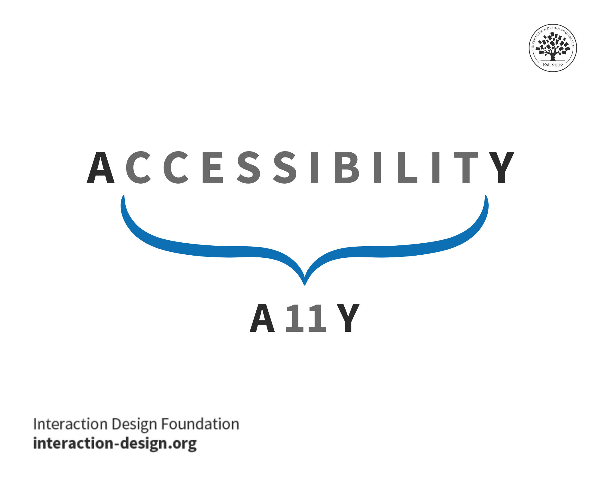
A11Y is the abbreviation—a numeronym, to be exact—for accessibility, where “11” represents the number of letters between the letters A and Y. Often, people in the design field use the shorthand on social media or in blogs when they refer to accessibility-related topics and have a limited word or character count.
We can pronounce A11Y as “A-one-one-Y,” “A-eleven-Y” or even as “ally,” but it’s best just to say “accessibility.” As with most abbreviations, A11Y is a form of jargon, so be sure to clarify its meaning upfront with any audience that might not understand it, whether in writing or verbally.
Remember, when designers create products and services with accessibility in mind, they often design better products for everyone. No matter the name, A11Y is key to inclusive design.
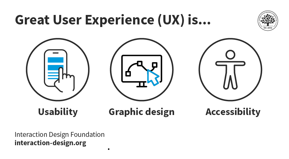
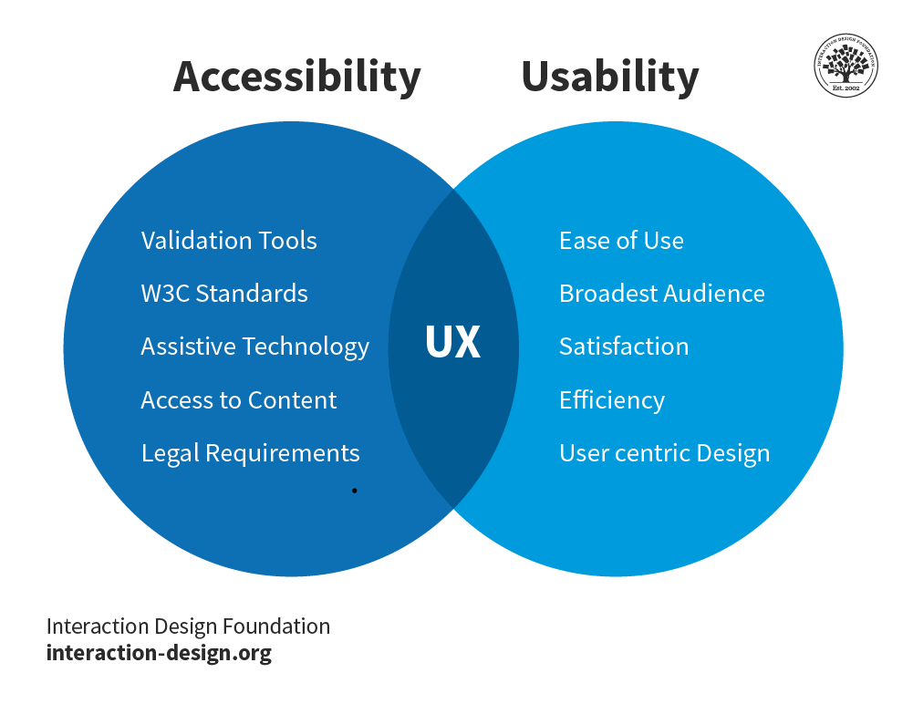
Since they have similarities, accessibility is sometimes confused with usability. Both overlap and are vital parts of user experience (UX) design, but there are also key distinctions between them. Usability is concerned with whether designs are effective, efficient and satisfying to use.
ShowHide
video transcript
00:00:00 --> 00:00:31
There are two main reasons. The first that it's a legal requirement in almost all countries that you make websites that anyone can use, even if they have reduced abilities. This isn't the best reason, but for organizations with legal compliance is a priority. It can be a very powerful one. The second issue is that we find that accessibility is closely connected with general usability and search engine optimization (SEO). When we do things to improve accessibility,
00:00:31 --> 00:01:01
we end up improving both of these other topics. It turns out that search engine optimization and accessibility have more in common than you might think. They both need to deal with technology that's trying to understand the pages. In the case of accessibility, assistive technology needs to present it to users with reduced abilities who perhaps cannot see it or hear it. So assistive technologies will attempt to present web pages in an appropriate form for those users. For search engines,
00:01:01 --> 00:01:33
the Web crawlers need to understand the contents of the pages so they can be indexed correctly. So the structure of the content needs to make sense in both cases, cascading style sheets can work wonders in making a messy HTML page look brilliant. But style sheets are complex to interpret. Assistive technology and search crawlers may simply ignore them. That means if you're relying on style sheets to present your content in a meaningful order, those adjustments go away. Here are some general guidelines for implementing accessibility in web design.
00:01:33 --> 00:02:04
One of the keys to accessibility is to design for assistive technologies or to at least be aware of assistive technologies. When you're designing, if you're looking at visual impairment then the screen readers are the main assistive technology there. Screen readers take the contents of the screen and read it out to you. They are now built into most platforms by default, including smartphones. But if you want to ensure your website works well, the screen is you should try it out. An accessibility specialist may be helpful in that respect.
00:02:04 --> 00:02:31
Screen readers deal with written content, but an important issue is that we need to provide non text content in alternative media. This is the dreaded ALTtext that you are frequently prompted for when creating images. This is because screen readers are great for reading out text in HTML, but if it happens to be text embedded in an image, it has little hope. And for meaning pictorial images Despite the rise of AI, users are likely to get a description
00:02:31 --> 00:03:01
of what an image shows rather than what it was intended to mean. And just as a quick side note, ALT text with decorative images should always be empty and empty ALT-tag tells assistive technology that is not important and can be ignored. If you've got video clips or audio recordings on your site, you need to provide text alternatives for that. Closed captions and transcripts are best and are now provided automatically by many tools. Of course, one of the real usability advantages of text
00:03:01 --> 00:03:24
alternatives is that you can search them. So if you were looking on your internet or on a website for something that somebody said, then you could find that in the transcript and have the entire text available to you there. But most changes for accessibility do benefit all users, especially when you start to think about how can we simplify this layout? How can we make the whole thing easier to use?
Theoretically, this means that usability includes accessibility, since a product that is inaccessible is also unusable to someone with a disability; practically, however, usability tends not to specifically focus on the user experience of people with disabilities. Accessibility, on the other hand, is concerned with whether all users are able to access an equivalent user experience, however they encounter a product or service (e.g., using assistive devices). Unlike usability, accessibility focuses on people with disabilities.
Accessibility is not only the right thing to do, but often also brings benefits to all users. That’s because accessibility features that help people with disabilities often help other people, too. For instance, video captions that help people with hearing difficulties also help a person who is watching the video on mute (e.g., in a social media feed). Legible, high-contrast text that helps people with vision difficulties also helps people with perfect eyesight who are using the app outdoors in bright sunlight. Many users—whatever their abilities—will face challenges due to demanding contexts. When you design for all ability levels, you can create products and services anyone can use and enjoy—or at least find helpful or calming.
Although accessibility is a critical factor that impacts design, many brands overlook it. Based on a 2011 World Health Organization report concerning disability, however, you’ll exclude about 15% of Earth’s population if you don’t make your design accessible. Furthermore, many jurisdictions—including the E.U.—have penalties for failure to create accessible designs. However, designing for accessibility makes sense on more than a legal level; it brings benefits, including these:
Improved SEO from semantic HTML
Opportunities to reach more users on more devices, in more settings/environments
Enhanced public image for your brand
Types of Accessibility Issues
You should consider the number and types of potential accessibility issues users will have. These are common barriers:
The World Wide Web Consortium (W3C) stipulates standards for accessible design in its latest Web Content Accessibility Guidelines (WCAG). You can follow these essential points to accommodate users with diverse abilities:
Use a content management system (CMS) supporting accessibility standards (e.g., WordPress). Whenever you amend any pre-used template, ensure themes were designed for accessibility.
Have a link strategy (i.e., describe the link before inserting it – e.g., “Read more about the Interaction Design Foundation, at their website.” Offer visual cues (e.g., PDF icons), underline links and highlight menu links on mouseover.
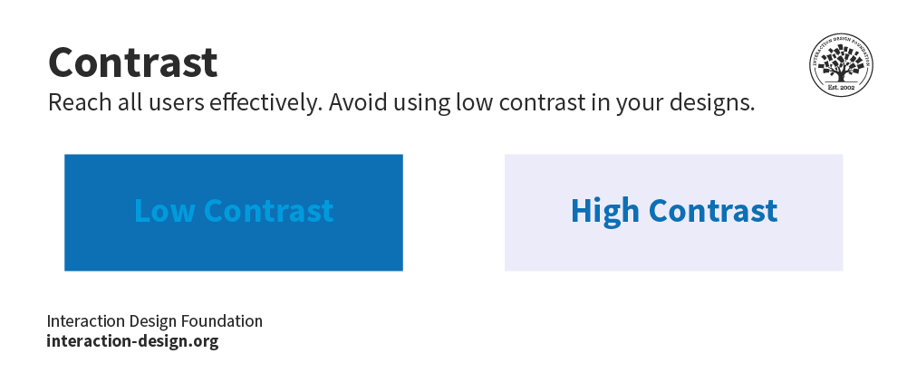
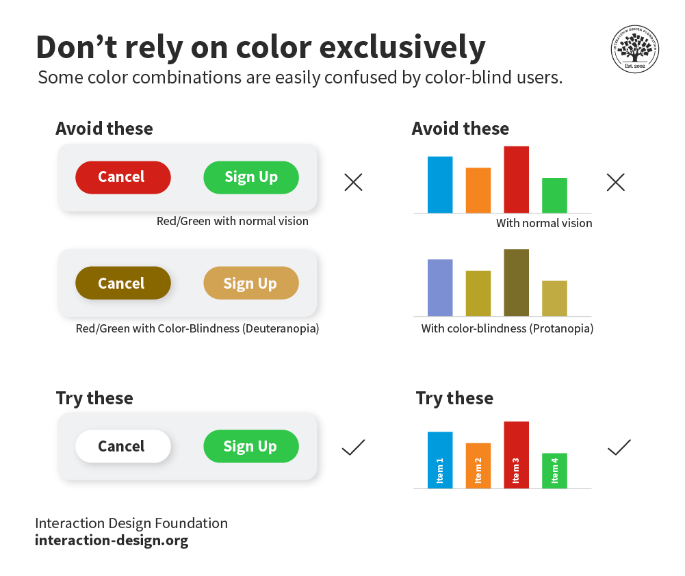
Improve visibility with careful color selection and high contrast.
Reference shapes to help guide users (e.g., “Click the square button”).
Consider how screen readers handle forms. Label fields and give descriptions to screen readers via tags. Make the tab order visually ordered. Assign an ARIA required or not required role to each field (know how to use ARIA). Avoid the asterisk convention.
Use proper HTML elements in lists. Don’t put them on the same line as text.
Present dynamic content carefully, including slideshows. Consult ARIA standards for overlays, etc.
Validate markup using the W3 standards site to ensure all browsers can read your code.
Offer transcriptions for audio resources, captions/subtitles for video.
Make content easily understandable – simpler language reaches more users, as do effective information hierarchy, progressive disclosure and prompting.
Try using your design without a mouse. It can be hard to scroll.
Use tools such as WAVE and Color Oracle to test your design’s accessibility.
So part of the business case that we made was that accessibility impacts usability and SEO. Don Norman has a great quote about that disability is about making it easier for everyone. I like to say that accessibility is a cousin of usability. They're their sister, and it's because you're optimizing your code,
00:00:31 --> 00:01:00
simplifying your layouts, you know, maybe a little strategically for screen readers, right? Knowing that things like maps are going to get in the way or that a layout is going to impact the way that a screen reader accesses it. And it's the same for SEO, you've done any SEO or played around with the way Googlebot thinks and parses a page, it's very structured, it's very strategic. And once you realize how it does that, you can think that way when you're designing as well. So plain English, consideration for the end user,
00:01:00 --> 00:01:34
browser and device compatibility. You know, this is where usability and accessibility are combined with that goal of useful, usable, searchable. And the key is quick and efficiently and painless. That's critical for accessibility even more than usability. So accessibility impacts SEO, Right? And the reason is because the better the experience and time on site is the main factor, right? For the Nielsen/NetRatings maybe ten years ago set the standard from unique visits to time on site,
00:01:34 --> 00:02:01
which is why Facebook and other sites try and keep you locked in right to view their content because their advertisers incentivize them with time on site. Well, the more you do that, the more Google's algorithm likes your site. Making graphical information searchable like all graphical information. Google likes that. So that's a ranking indicator. Screen reader testing can also help you figure out what's missing from your SEO keywords, right? So if you look at your Alt text, you can be like
00:02:01 --> 00:02:23
- Oh, wait a minute, we haven’t optimize this. Now, if you optimize your usability, it doesn't necessarily impact accessibility. And if you optimize SEO, it doesn't necessarily impact accessibility. So it's really the other way around. And modify, optimize accessibility can improve SEO, can improve usability. It's not mutually bi directional.
Naturally, you should test for accessibility on users themselves. Note that while it’s impossible to cover all use cases, your efforts to reach all users can yield many rewards—sometimes in unexpected areas.
Accessibility settings in websites and apps allow users with different abilities and preferences to access and interact with the content and functionality of the website or app. Accessibility settings can include things like changing the font size, color contrast, text spacing, keyboard navigation, screen reader support, captions, transcripts, and alternative text for images. Accessibility settings can help users who have visual, auditory, cognitive, motor, or other impairments to use the website or app more easily and effectively. Accessibility settings can also benefit users with temporary or situational difficulties, such as using a device in bright sunlight or with one hand.
What is web accessibility?
Web Accessibility, as explained by Frank Spillers, is fundamentally about optimizing the user experience for everyone, ensuring that content is accessible, inclusive, and user-friendly, regardless of ability. It aligns closely with usability, focusing on simplifying layouts, optimizing code, and making content more understandable and navigable, especially for screen-reader users. Accessibility goes beyond usability, emphasizing the need for content to be usable and accessible to all, promoting equality and inclusion on the web. Further insights on web accessibility can be gleaned from this video by Frank Spillers.
ShowHide
video transcript
00:00:00 --> 00:00:30
Don Norman has a great quote about that accessability is about making it easier for everyone. I like to say that accessibility is the cousin of usability: they're
00:00:30 --> 00:01:01
sisters, and it's because you're optimizing your code, simplifying your layouts, you know – maybe a little strategically for screen readers; knowing that things like maps are going to get in the way or that a layout is going to impact the way that a screen reader accesses it, and it's the same for – if you've done any SEO or played around with the way Googlebot thinks and parses a page, it's very structured; it's very strategic, and once you realize how it does that, you can think that way when you're designing as well – so,
00:01:01 --> 00:01:34
plain English; consideration for the end user; browser and device compatibility; you know, this is where usability and accessibility are combined with that goal of useful, usable, searchable, you know, and the key is quick and efficiently and painless – really, that's critical: like I said, for accessibility, even more than usability. So, accessibility impacts SEO, and the reason is because the better the experience and time on site is the main
00:01:34 --> 00:02:01
factor for – the Nielsen Net ratings, maybe ten years ago, set the standard from, you know, number of unique visits to time on site, which is why Facebook and other sites try to keep you locked in to view their content, because their advertisers incentivize them with time on site. Well, the more you do that, the more Google's algorithm likes your site. Making graphical information
00:02:01 --> 00:02:32
searchable – all graphical information: Google likes that, so that's a ranking indicator. Screen reader testing can also help you figure out what's missing from your SEO keywords. So, if you look at your Alt text, you can be, like, "Oh, wait a minute; we haven't optimized this." Now, the thing I should say is that if you optimize your usability, it doesn't necessarily impact accessability, and if you optimize SEO, it doesn't
00:02:32 --> 00:03:04
necessarily impact accessibility. So, it's really the other way around: modify, optimize accessibility can improve SEO, can improve usability, right. It's not mutually exclusive. It's not mutually bi-directional – so, look to optimize areas of SEO and accessibility overlap. What are those? So, video transcription, for example, image captioning, Alt attributes, title tags, headers (H1, H2), link anchor
00:03:04 --> 00:03:34
text, on-site sitemaps, table of contents or breadcrumbs, content ordering, size and color contrast of text, semantic HTML. So, this is an example from SEO Moz that, you know – it's like if you went to this page and you're trying to, you know, submit your taxes for tax season, which of these would – which of these – if you didn't see the page, calculate your tax return or online
00:03:34 --> 00:04:05
tax return, tax return estimate, tax return refund / rebate, you know; it's that the screen reader's literally reading all that out, so you're starting to think about, hopefully, the experience – the optimization opportunity as audible, you know, something you hear. So, what does it sound like? What does it sound like? Does it have meaningful descriptive text that's just not going to be a bunch of garbage? A lot of people when they're listening to screen readers,
00:04:05 --> 00:04:32
they get overwhelmed – it's totally overwhelming. It's because it's like "blah-blah-blah-blah-blah": most blind users listen to their voices in a much, much faster pace like that. So, it's like, you know: two, three times as fast – like, it's going like this, and it's like all this information. But the reason why it's overwhelming for, you know, someone who's not familiar with it is because – it's all the garbage that's in
00:04:32 --> 00:05:05
there, all the tags and all that – all this just raw web architecture is revealed through voice, and it's totally nonsensical, and the reality is that screen-reader users have to listen to all that, so they have to listen to, you know, 60 to 80% junk to find the one or two things that're meaningful and valuable to them. Right, so you can help by the way that you order your titles, the way that
00:05:05 --> 00:05:22
you, you know, define your headers, define your title tags, your your Alt tags, your image captions, and so forth and so on.
What is accessibility testing?
Accessibility testing is done to make your web and mobile apps usable to people with special needs such as vision, hearing, and other cognitive impairments. It is an important part of the development process, as it helps to ensure that all users can access and use a website or application, regardless of their abilities. Accessibility testing also helps to comply with legal and ethical standards, such as the Web Content Accessibility Guidelines (WCAG) 2.x, which provide a set of criteria for making web content accessible to people with disabilities.
Accessibility testing can be done using both automated and manual methods. Automated tools can help to identify some common accessibility issues, such as missing alt text for images, insufficient colour contrast, or keyboard accessibility. However, automated tools cannot detect all accessibility problems, such as how well the content is structured, how clear the instructions are, or how the website or app works with assistive technologies. Therefore, manual testing is also necessary to check the usability and functionality of the website or app from the perspective of different users with different needs and preferences. Manual testing can involve using accessibility checklists, testing with assistive technologies, such as screen readers or speech recognition software, and testing with real users who have disabilities or impairments.
ShowHide
video transcript
00:00:00 --> 00:00:30
So, let's look at the 10 principles of accessibility for both web and mobile design. The first principle is that blindness gets you 80% of accessibility issues. Now, there are four major types of disabilities: *blindness*, and that includes low vision and color blindness,
00:00:30 --> 00:01:01
*hearing*, *cognitive* and *motor impairments*. Now, blindness is actually across a spectrum; they're like 22 different types of blindness, but we basically differentiate between blind – and there are different levels; like I said, you can be on the *edge* of blindness – you can still be legally blind but you can still have some sight; and then you may require screen magnification, which would be low vision;
00:01:01 --> 00:01:35
so, basically your vision is impaired to whatever percent: 60, 70, 80, 90, 95%, 97% – you know – but then there's a little bit of magnification that can help. So, you'll have low vision users using screen magnifiers to, like, 300% or 400% magnification, and a lot of those tools, those magnifiers have a screen reader in them
00:01:35 --> 00:02:02
as well, so blind users will use just the screen reader. And just like we saw in that last example, the screen reader is, for example, VoiceOver on the iOS operating system, which talks – essentially reads to you; that's a screen reader. So, why blindness of all these different disabilities? You might think, "Oh! Accessibility – it's too difficult! There's so many different disabilities;
00:02:02 --> 00:02:35
how do you tackle the different ones?" Blindness helps you get almost the whole way there because of keyboard and the screen reader. So, blind users will use a keyboard so you can test keyboard access, which is what motor/mobility users. Hearing – so, deafness and hard of hearing is essentially a captioning thing. So, that's pretty straightforward. And then cognitive issues – they're a little bit more complex.
00:02:35 --> 00:03:00
They're a little bit more complex to test for. And there's such a difference – you know – so we're talking about dyslexia, ADD, Asperger's, things like that. And so, yeah, so blindness is, in terms of core accessibility, the way to get there, in terms of testing.
00:03:00 --> 00:03:30
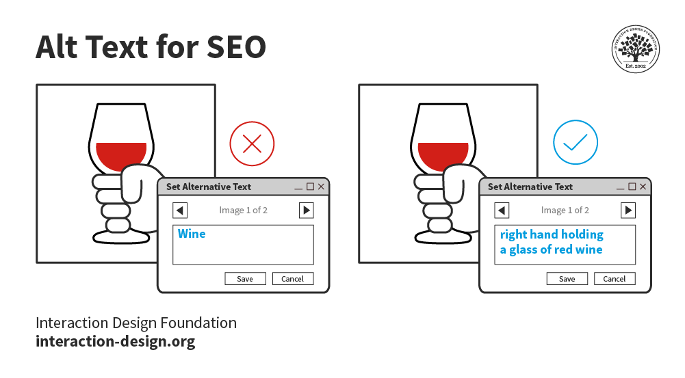
So, for example, if you're testing with users, you can recruit – you know – 80% of your users can be blind and you'll be getting a really good understanding of accessibility. So, *alt-text* is classic on images – classic accessibility can be summarized with alt-text. Now, here's a little quick quiz for you: what alt-text would you give this image?
00:03:30 --> 00:04:00
Let's take a minute and play here. So, "ALT..." So, "Man looking at wall with complex graphics or infographics." What did you give it?
00:04:00 --> 00:04:35
So, the classic issues with alt-text: you want to describe, not the picture, but you want to describe the *information in the picture*. So, what's the man doing? Like the fact that he's wearing a suit or his age or the type of brick wall it is – it's not really important, the color of the wall. You know – "Man staring at wall." It might be a little non-descriptive; it really depends on what the *function* of the image is. If this is an image that's required for the user
00:04:35 --> 00:05:01
to understand the content on the page, then it's going to have to be a little bit more descriptive. So, my alt-text: "Man looking at wall with complex graphics or infographics." I think should cover it. If it's too short, like "Man looking at wall." – we talked about that, that might be a little – you know...
00:05:01 --> 00:05:30
If you add something like "Picture of man looking at wall." – you don't need that; you don't need the "picture". So, or "photo" or "image" – you don't need to say "image" – "Image of man looking at wall." You don't need to say that, either. So, yeah, *alt-text*. It's classic to accessibility because a lot of people forget it.
00:05:30 --> 00:06:01
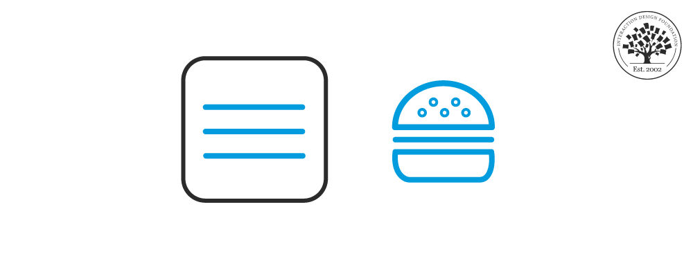
They miss it; it's just classically overlooked. And alt-text is actually critical to SEO. So, it's really, really important that alt-text is addressed. Let's look at the third one, then, so classic on mobile is the *hamburger menu*, the hamburger menu being the three lines in the top left of the screen. The easy fix is to just properly tag it; so, typically those menus, the user,
00:06:01 --> 00:06:35
their screen reader just skips over them; users don't see them. They can't actually access them. So, the classic one for mobile there is tagging those mobile elements when they become responsive. And the fourth one here is *Content that gets placed "out of the way" might not be found on the screen." And so, what does "out of the way" mean? Well, think of this, the screen reader reading this screen – this is a map. So, you're looking for the location of this restaurant. This is from an actual usability or accessibility test,
00:06:35 --> 00:07:06
and I've included the kind of findings here; so, the screen reader doesn't see the location list. That's the important content. The map is not really important; it's a visual paradigm. Blind users are not going to see the map. This Google map's not going to be accessible. It's like a million images that are not tagged; it's just like a big soup. So, the important thing is the *list of locations that are on the screen* so that you know, "Oh yes, there's a restaurant near me."
00:07:06 --> 00:07:30
And the location list is after the map, and it should be *before the map* in the code. So, the way that the screen reader is – the screen reader is parsing, reading the code, and so this is what we mean by "out of the way content" – content that's hard to find.
00:07:30 --> 00:08:05
The fifth principle is that accessibility testing with users – so *actually testing with users* – can reveal huge gaps. Now, this is a huge revelation for accessibility, by the way, because a lot of people think they can handle it with checkers or with code reviews; I used to think that I could do that too. And I need to tell you after 17 years of practice of this in business with my company Experience Dynamics, we've come to the overwhelming *mandatory* recommendation, conclusion,
00:08:05 --> 00:08:31
revelation that *you have to accessibility test* – you have to test with actual users. It shouldn't be a surprise. In usability, you test with users. You don't just try and guess or follow a guideline. It's the same with accessibility testing; it's *even more important* I think because *accessibility is twice as risky as usability*. Here, you see a usability test on the left;
00:08:31 --> 00:09:00
and on the right, you see an accessibility test with blind users completing the same task. So, you see task 3 here and we have just – you know – it's almost three times as easy for users who are sighted than users who are blind to complete this task. The sixth principle is that *disabling zoom on mobile makes it inaccessible*.
00:09:00 --> 00:09:30
So, low vision users using screen magnifiers won't be able to actually do the zooming if you disable it. So, a lot of people will disable that on mobile, and it locks users out. This is an image of a 400 times magnification by a user with low vision, and that's literally how the screen is being digested.
00:09:30 --> 00:10:06
The seventh principle is that *accessibility is easily learned*. Remember that close to 20% of the US population and 10% of men are colorblind, by the way. So, clean coding can be learned with a little practice. Accessibility is actually cheaper if you do it upfront compared to if you try and do it later. So, it should be part of your coding, but also it should be part of your UX design strategy too. So, the next principle is *accessibility doesn't mean ugly*.
00:10:06 --> 00:10:31
It may require you to rethink kind of the layout – again, this is where UX design can be very helpful. But one of the things I've realized is that *visual bias is your worst enemy*; that because you're so familiar with seeing things and the layout of a screen – you know – the more creative you are, the more of a designer you are; the more creative designer, visual designer,
00:10:31 --> 00:11:05
the more biased you're going to be because you can *handle*, just like you can handle gray on gray and – you know – clean UIs that people that need very high contrast, very definite articulation of UI elements are requiring, and for you, it's fine if they're not there. The ninth one here is to *check mobile accessibility separately* – we've talked about a few mobile accessibility issues here. This is the same accessibility test where the link is underneath the map;
00:11:05 --> 00:11:33
for some reason, the responsive view pushes the search UI to a link underneath the map into a collapse, and then you're supposed to click on that link and open it up. Now, it's even hard to see for sighted users. Even when I was observing it, I barely noticed this link. What was happening with our blind users was it was skipping right past it; so, it was reading the screen – you know –
00:11:33 --> 00:12:05
so, it was like *search results, a map, edit search*, and then... and then it was continuing on. And it was just the fact that it said "edit search", here you're seeing the user was turning down her speaking rate because she thought – she went over it like five times and didn't catch it. It actually was there. I thought it wasn't there; I thought it wasn't being picked up, but it was there. When she turned down her speaking rate, you could hear it being said, but it was sort of mashed in.
00:12:05 --> 00:12:32
And the question was – this is like definitely a usability question and a responsive design decision is: *Why would you need to collapse it?* Why not just have the UI – you know – *above the map would be better*, so you have it where it was before? Even below – if it was there – the actual just UI as opposed to collapsing it and making it a link that said "edit search".
00:12:32 --> 00:13:01
So, you can see here really where usability in UX plays into accessibility when you're thinking about it. It actually requires you – in the same way that SEO responsive web design, accessibility requires you to be thinking about things the way a screen reader, the way a user accessing this website with a screen reader would think about it. And it's really tricky to think that way – I need to tell you this.
00:13:01 --> 00:13:30
It's super tricky to think that way, because you're *not used to it*. You know – you're used to your visual bias; you're like, "Well, I can see the link... what's the problem?" And so, this is where accessibility testing can help you get to that last mile of insight. So, the tenth principle here is *embrace the access attitude*. It's *People First* – design for differences.
00:13:30 --> 00:14:01
*Clear Purpose* – so, well-defined goals, and that means understanding your audience. So, we'll be talking about personas later on in this course. *Solid Structure* – so building to standards; there are great standards. Accessibility is based on good clean coding. So, just like alt-text, every image needs an alt tag – *every single image*. That's just part of clean coding, and it'll make things accessible and Googlebot will be happy as well.
00:14:01 --> 00:14:35
*Easy Interactions* – everything works across devices. Interoperability baked right in. *Helpful Wayfinding* – so, it's navigation: clear navigation. One of the things with accessibility is a lot of sites and web apps make it hard for users to navigate. So, just like we saw with that comparison of the usability test versus the accessibility test, it's like twice as hard / three times as hard to navigate a site if you're using a screen reader, for example.
00:14:35 --> 00:15:00
*Clean Presentation* – supporting meaning; that's a huge one: supporting meaning. *Plain Language* – plain language is really important, especially for the cognitive disabilities such as dyslexia or ADD or ADHD. And then, finally, *Accessible Media* – so, supporting all the senses. So, offering captioning for deaf and hard of hearing users,
00:15:00 --> 00:15:14
offering alternative formats – for example, if the media or if the image is too complex or the table is too complex, you'll need to offer a different way for users to get to it.
What are the four areas of accessibility?
The four areas of accessibility stated in the Web Content Accessibility Guidelines (WCAG) are:
- Perceivable: Users must be able to perceive the content and functionality of the website or app using one or more of their senses. This means providing alternatives for non-text content, such as images, audio, and video, using captions, transcripts, and alt text. It also means ensuring that the content is presented in a way that is compatible with different devices and assistive technologies, such as screen readers, magnifiers, or braille displays.
- Operable: Users must be able to operate the website or app using different input methods, such as keyboard, mouse, touch, voice, or gesture. This means ensuring that the website or app is responsive, navigable, and compatible with different browsers and platforms. It also means providing mechanisms to help users find and access the content they need, such as menus, headings, links, search functions, and skip links.
- Understandable: Users must be able to understand the content and functionality of the website or app. This means ensuring that the content is clear, concise, and consistent, using plain language, appropriate grammar, and punctuation. It also means providing feedback, guidance, and error messages to help users complete tasks and avoid mistakes.
- Robust: Users must be able to access the website or app using current and future technologies. This means ensuring that the website or app is built using valid and standard code that follows web development best practices. It also means testing the website or app with different browsers, devices, and assistive technologies to identify and fix any compatibility issues.
These four areas are based on four design principles that describe what web content must be to be considered accessible. Each area has a number of guidelines and success criteria that specify how to meet the principles in practice. You can find more information about the WCAG on the W3C website.
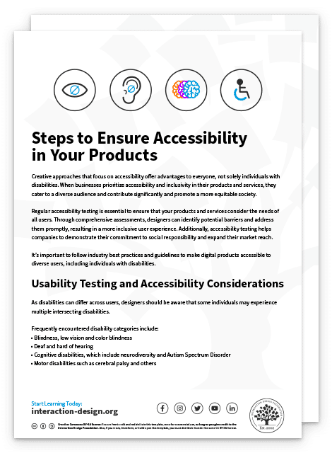
Use our step-by-step guide to ensure accessibility in your products.
Get your free template for “Steps to Ensure Accessibility in Your Products”
What Is Good Accessibility?
Good accessibility is the practice of designing and developing websites, apps, and other digital products and services that are usable by everyone, regardless of their abilities or disabilities. Good accessibility means that people can access and use the content and functionality of a website or app in a similar amount of time and effort as someone who does not have a disability. It also means that people are empowered, independent, and not frustrated by something that is poorly designed or implemented
To acheive good accessibility youYou should aim for user-friendly designs with clear, purpose-driven content that meets the needs of all users, including those with cognitive impairments or who may not have extensive experience with the language used. Understanding the various disability types, such as those illustrated in our video with Frank Spillers, CEO of Experience Dynamics, can help address around 80% of accessibility issues by focusing on core accessibility needs like screen reader compatibility and keyboard access.
ShowHide
video transcript
00:00:00 --> 00:00:30
So, let's look at the 10 principles of accessibility for both web and mobile design. The first principle is that blindness gets you 80% of accessibility issues. Now, there are four major types of disabilities: *blindness*, and that includes low vision and color blindness,
00:00:30 --> 00:01:01
*hearing*, *cognitive* and *motor impairments*. Now, blindness is actually across a spectrum; they're like 22 different types of blindness, but we basically differentiate between blind – and there are different levels; like I said, you can be on the *edge* of blindness – you can still be legally blind but you can still have some sight; and then you may require screen magnification, which would be low vision;
00:01:01 --> 00:01:35
so, basically your vision is impaired to whatever percent: 60, 70, 80, 90, 95%, 97% – you know – but then there's a little bit of magnification that can help. So, you'll have low vision users using screen magnifiers to, like, 300% or 400% magnification, and a lot of those tools, those magnifiers have a screen reader in them
00:01:35 --> 00:02:02
as well, so blind users will use just the screen reader. And just like we saw in that last example, the screen reader is, for example, VoiceOver on the iOS operating system, which talks – essentially reads to you; that's a screen reader. So, why blindness of all these different disabilities? You might think, "Oh! Accessibility – it's too difficult! There's so many different disabilities;
00:02:02 --> 00:02:35
how do you tackle the different ones?" Blindness helps you get almost the whole way there because of keyboard and the screen reader. So, blind users will use a keyboard so you can test keyboard access, which is what motor/mobility users. Hearing – so, deafness and hard of hearing is essentially a captioning thing. So, that's pretty straightforward. And then cognitive issues – they're a little bit more complex.
00:02:35 --> 00:03:00
They're a little bit more complex to test for. And there's such a difference – you know – so we're talking about dyslexia, ADD, Asperger's, things like that. And so, yeah, so blindness is, in terms of core accessibility, the way to get there, in terms of testing.
00:03:00 --> 00:03:30
So, for example, if you're testing with users, you can recruit – you know – 80% of your users can be blind and you'll be getting a really good understanding of accessibility. So, *alt-text* is classic on images – classic accessibility can be summarized with alt-text. Now, here's a little quick quiz for you: what alt-text would you give this image?
00:03:30 --> 00:04:00
Let's take a minute and play here. So, "ALT..." So, "Man looking at wall with complex graphics or infographics." What did you give it?
00:04:00 --> 00:04:35
So, the classic issues with alt-text: you want to describe, not the picture, but you want to describe the *information in the picture*. So, what's the man doing? Like the fact that he's wearing a suit or his age or the type of brick wall it is – it's not really important, the color of the wall. You know – "Man staring at wall." It might be a little non-descriptive; it really depends on what the *function* of the image is. If this is an image that's required for the user
00:04:35 --> 00:05:01
to understand the content on the page, then it's going to have to be a little bit more descriptive. So, my alt-text: "Man looking at wall with complex graphics or infographics." I think should cover it. If it's too short, like "Man looking at wall." – we talked about that, that might be a little – you know...
00:05:01 --> 00:05:30
If you add something like "Picture of man looking at wall." – you don't need that; you don't need the "picture". So, or "photo" or "image" – you don't need to say "image" – "Image of man looking at wall." You don't need to say that, either. So, yeah, *alt-text*. It's classic to accessibility because a lot of people forget it.
00:05:30 --> 00:06:01
They miss it; it's just classically overlooked. And alt-text is actually critical to SEO. So, it's really, really important that alt-text is addressed. Let's look at the third one, then, so classic on mobile is the *hamburger menu*, the hamburger menu being the three lines in the top left of the screen. The easy fix is to just properly tag it; so, typically those menus, the user,
00:06:01 --> 00:06:35
their screen reader just skips over them; users don't see them. They can't actually access them. So, the classic one for mobile there is tagging those mobile elements when they become responsive. And the fourth one here is *Content that gets placed "out of the way" might not be found on the screen." And so, what does "out of the way" mean? Well, think of this, the screen reader reading this screen – this is a map. So, you're looking for the location of this restaurant. This is from an actual usability or accessibility test,
00:06:35 --> 00:07:06
and I've included the kind of findings here; so, the screen reader doesn't see the location list. That's the important content. The map is not really important; it's a visual paradigm. Blind users are not going to see the map. This Google map's not going to be accessible. It's like a million images that are not tagged; it's just like a big soup. So, the important thing is the *list of locations that are on the screen* so that you know, "Oh yes, there's a restaurant near me."
00:07:06 --> 00:07:30
And the location list is after the map, and it should be *before the map* in the code. So, the way that the screen reader is – the screen reader is parsing, reading the code, and so this is what we mean by "out of the way content" – content that's hard to find.
00:07:30 --> 00:08:05
The fifth principle is that accessibility testing with users – so *actually testing with users* – can reveal huge gaps. Now, this is a huge revelation for accessibility, by the way, because a lot of people think they can handle it with checkers or with code reviews; I used to think that I could do that too. And I need to tell you after 17 years of practice of this in business with my company Experience Dynamics, we've come to the overwhelming *mandatory* recommendation, conclusion,
00:08:05 --> 00:08:31
revelation that *you have to accessibility test* – you have to test with actual users. It shouldn't be a surprise. In usability, you test with users. You don't just try and guess or follow a guideline. It's the same with accessibility testing; it's *even more important* I think because *accessibility is twice as risky as usability*. Here, you see a usability test on the left;
00:08:31 --> 00:09:00
and on the right, you see an accessibility test with blind users completing the same task. So, you see task 3 here and we have just – you know – it's almost three times as easy for users who are sighted than users who are blind to complete this task. The sixth principle is that *disabling zoom on mobile makes it inaccessible*.
00:09:00 --> 00:09:30
So, low vision users using screen magnifiers won't be able to actually do the zooming if you disable it. So, a lot of people will disable that on mobile, and it locks users out. This is an image of a 400 times magnification by a user with low vision, and that's literally how the screen is being digested.
00:09:30 --> 00:10:06
The seventh principle is that *accessibility is easily learned*. Remember that close to 20% of the US population and 10% of men are colorblind, by the way. So, clean coding can be learned with a little practice. Accessibility is actually cheaper if you do it upfront compared to if you try and do it later. So, it should be part of your coding, but also it should be part of your UX design strategy too. So, the next principle is *accessibility doesn't mean ugly*.
00:10:06 --> 00:10:31
It may require you to rethink kind of the layout – again, this is where UX design can be very helpful. But one of the things I've realized is that *visual bias is your worst enemy*; that because you're so familiar with seeing things and the layout of a screen – you know – the more creative you are, the more of a designer you are; the more creative designer, visual designer,
00:10:31 --> 00:11:05
the more biased you're going to be because you can *handle*, just like you can handle gray on gray and – you know – clean UIs that people that need very high contrast, very definite articulation of UI elements are requiring, and for you, it's fine if they're not there. The ninth one here is to *check mobile accessibility separately* – we've talked about a few mobile accessibility issues here. This is the same accessibility test where the link is underneath the map;
00:11:05 --> 00:11:33
for some reason, the responsive view pushes the search UI to a link underneath the map into a collapse, and then you're supposed to click on that link and open it up. Now, it's even hard to see for sighted users. Even when I was observing it, I barely noticed this link. What was happening with our blind users was it was skipping right past it; so, it was reading the screen – you know –
00:11:33 --> 00:12:05
so, it was like *search results, a map, edit search*, and then... and then it was continuing on. And it was just the fact that it said "edit search", here you're seeing the user was turning down her speaking rate because she thought – she went over it like five times and didn't catch it. It actually was there. I thought it wasn't there; I thought it wasn't being picked up, but it was there. When she turned down her speaking rate, you could hear it being said, but it was sort of mashed in.
00:12:05 --> 00:12:32
And the question was – this is like definitely a usability question and a responsive design decision is: *Why would you need to collapse it?* Why not just have the UI – you know – *above the map would be better*, so you have it where it was before? Even below – if it was there – the actual just UI as opposed to collapsing it and making it a link that said "edit search".
00:12:32 --> 00:13:01
So, you can see here really where usability in UX plays into accessibility when you're thinking about it. It actually requires you – in the same way that SEO responsive web design, accessibility requires you to be thinking about things the way a screen reader, the way a user accessing this website with a screen reader would think about it. And it's really tricky to think that way – I need to tell you this.
00:13:01 --> 00:13:30
It's super tricky to think that way, because you're *not used to it*. You know – you're used to your visual bias; you're like, "Well, I can see the link... what's the problem?" And so, this is where accessibility testing can help you get to that last mile of insight. So, the tenth principle here is *embrace the access attitude*. It's *People First* – design for differences.
00:13:30 --> 00:14:01
*Clear Purpose* – so, well-defined goals, and that means understanding your audience. So, we'll be talking about personas later on in this course. *Solid Structure* – so building to standards; there are great standards. Accessibility is based on good clean coding. So, just like alt-text, every image needs an alt tag – *every single image*. That's just part of clean coding, and it'll make things accessible and Googlebot will be happy as well.
00:14:01 --> 00:14:35
*Easy Interactions* – everything works across devices. Interoperability baked right in. *Helpful Wayfinding* – so, it's navigation: clear navigation. One of the things with accessibility is a lot of sites and web apps make it hard for users to navigate. So, just like we saw with that comparison of the usability test versus the accessibility test, it's like twice as hard / three times as hard to navigate a site if you're using a screen reader, for example.
00:14:35 --> 00:15:00
*Clean Presentation* – supporting meaning; that's a huge one: supporting meaning. *Plain Language* – plain language is really important, especially for the cognitive disabilities such as dyslexia or ADD or ADHD. And then, finally, *Accessible Media* – so, supporting all the senses. So, offering captioning for deaf and hard of hearing users,
00:15:00 --> 00:15:14
offering alternative formats – for example, if the media or if the image is too complex or the table is too complex, you'll need to offer a different way for users to get to it.
What Is an Example of Poor Accessibility?
An example of poor accessibility is a website lacking alt text for images that are meant to convey meaning. This causes issues for visually impaired users relying on screen readers. Poor accessibility is a crucial aspect of design failures and bad user experience, as illustrated in our articles on Bad UX Examples and Design Failures. Explore more on the impact of inadequate accessibility at interaction-design.org.
What Is the Difference Between Accessibility and Inclusion?
Accessibility is focused on making products and content usable for everyone, regardless of disabilities, by removing barriers and optimizing user experiences. It emphasizes adaptations and adjustments to accommodate individual needs. On the other hand, inclusion refers to the proactive design of products, services, and environments that are welcoming and usable for a diverse range of people from the start. It’s about designing universally, considering all users' varied needs and preferences. For deeper insights and understanding of inclusion, refer to this article on Inclusive Design.
Where to Learn About Accessibility?
To learn about accessibility, consider enrolling in the Accessibility: How to Design for All course offered by Interaction Design Foundation. This course provides extensive insights into designing universally to ensure content and products are accessible to everyone, including people with disabilities. You will learn about the principles and guidelines of accessibility, allowing you to create inclusive user experiences. The course suits designers, developers, and anyone interested in making the digital world more inclusive.
ShowHide
video transcript
00:00:00 --> 00:00:34
The thing with access and accessibility is it's moving more towards being seen as a *human right* internationally and as part of the basic foundation of good coding and good UX design. Accessibility actually encourages us to do clean coding and to think about the usability of our sites because you're thinking about the *user*. Anytime you're thinking about the user, you're doing *user advocacy*. User advocacy gets you to *walk in their shoes*. Walking in their shoes generates *empathy*.
00:00:34 --> 00:00:49
Empathy helps you think about the website from the person who's going to use it, not your perspective. Accessibility needs to be the pillar in our optimization strategies. That is part of the launch strategy of any product.
Good accessibility is crucial to making your website or app a success. Not only is designing for accessibility required by law in many countries—if you fail to consider accessibility, you are excluding millions of people from using your product. The UN estimates that more than 1 billion people around the world live with some form of disability and as populations age over the coming years, that number is expected to rise rapidly. Add to that the 10 percent of people who suffer from color blindness, and you start to get an idea of why accessibility is so important—not just for moral and legal reasons, but also so that your products can reach their full potential. You need to design for accessibility!
So… what is a proven and pain-free way to well-executed accessibility?If you’ve ever tried to optimize your site or app for accessibility, you’ll know it can be a complex and intimidating task… and it can therefore be very tempting to leave it until last or, worse still, avoid it altogether.By understanding that accessibility is about morethan just optimizing your code, you’ll find you can build it into your design process. This will ensure you are taking a disability advocacy approach, and keeping the focus on your users throughout the development process.
This course will help you achieve exactly that—from handling images to getting the most out of ARIA markup, you’ll learn how to approach accessibility from all angles. You’ll gain practical, hands-on skills that’ll enable you to assess and optimize for common accessibility issues, as well as show you how to place an emphasis on the quality of the user experience by avoiding classic mistakes. What’s more, you’ll also come away with the knowledge to conduct effective accessibility testing through working with users with disabilities.
The course includes interviews with an accessibility specialist and blind user, as well as multiple real-world examples of websites and apps where you can demonstrate your skills through analysis and accessibility tests. Not only will this give you a more practical view of accessibility, but you’ll also be able to optimize your websites and mobile apps in an expert manner—avoiding key mistakes that are commonly made when designing for accessibility.
You will be taught by Frank Spillers, CEO of the award-winning UX firm Experience Dynamics, and will be able to leverage his experience from two decades of working with accessibility. Given that, you will be able to learn from, and avoid, the mistakes he’s come across, and apply the best practices he’s developed over time in order to truly make your accessibility efforts shine. Upon completing the course, you will have the skills required to adhere to accessibility guidelines while growing your awareness of accessibility, and ensuring your organization’s maturity grows alongside your own.
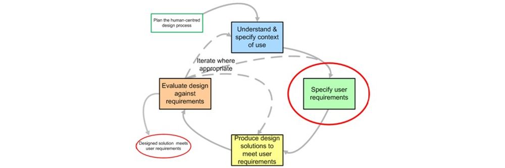
40.1 What is Design for All?Contemporary interactive technologies and environments are used by a multitude of users with
Book chapter
Open Access—Link to us!
We believe in Open Access and the democratization of knowledge. Unfortunately, world-class educational materials such as this page are normally hidden behind paywalls or in expensive textbooks.