Your constantly-updated definition of Assumptions in UX/UI Design and
collection of videos and articles. Be a conversation starter: Share this page and inspire others!
87shares
What are Assumptions in UX/UI Design?
Assumptions are beliefs or views that designers hold about their users, the context of use or the user goals. They usually come from past experiences, industry knowledge or personal intuition. Assumptions serve as a starting point for design decisions but can sometimes be misleading if designers do not validate or challenge them, hence why testing is vital.
Don Norman, the Grandfather of UX Design, explains the 5 Whys method, a powerful tool to dig deep and investigate causes—and assumptions.
ShowHide
video transcript
00:00:00 --> 00:00:30
I've talked about the need to find the root cause of a problem and not just to solve the symptoms. It's important, by the way, to solve the symptom – you don't want that to stay around. But we also need to get rid of the *underlying cause*. Or else it'll come back again; the symptoms will repeat. So, how do you do that? Well, the Japanese developed a technique on, actually, the Toyota assembly lines.
00:00:30 --> 00:01:03
They call it the *5 whys*. Now, the 5 whys sounds good, and you can do that yourself – you can always say "Why?"; when somebody tells you something, you say, "Well, why is that?" And they'll tell you why that is, and you know you've sort of reached the root cause when they say, "I don't know." because actually you can *never* really get at the *very, very bottom*. So, what we need to do is get at the *lowest level* that we can actually *do* something about. In the United States – and probably in every country –
00:01:03 --> 00:01:32
when there's a major airplane crash, when they issue their report, which is often a year or two after the event, they don't say, "This was caused by pilot error." or, "This was caused by a faulty altimeter." or, "This was caused by a bump." What they usually do is they say, "There were *many* things happening, and here's a list of things. And if any one of these had not happened, there would not have been an accident."
00:01:32 --> 00:01:55
So, if there are – say – eight things that led to the accident, any one of which could have prevented the accident, how do you know which is the *root cause*? *All eight* are the root cause. So, you have to therefore look at the *whole system* and find out what the *entire underlying set of possible root causes* is and work on them.
The most important aspect of assumptions in user experience design (UX design) is how designers can hold them to be true without concrete evidence or validation. Designers often base assumptions on past experiences, personal biases or limited information. Assumptions are often too close to designers’ minds for them to recognize them as such. One of the greatest risks in design is that designers can take them for granted as facts. Designers make assumptions about users, their needs, behaviors and the context in which these users will interact with a product or service.
Assumptions can influence the entire design process—from how designers define the problem to how they create solutions. They can shape the direction of a project, guide design decisions and impact the overall user experience. However, it's essential to recognize that assumptions are not facts. While they can hold benefits, they can also lead to design solutions that do not meet user needs or expectations. This is why designers need to be aware of them—and challenge them as needed.
Assumptions arise in any design process—hence why design teams need to identify, check and test them.
What are The Benefits of Assumptions in UX Design?
Here are reasons that assumptions can be useful:
Efficiency: Assumptions allow designers to move forward in their process and not become stuck in analysis paralysis. They provide a foundation for designers to make progress and test ideas. They permit designers to make initial decisions and proceed in their work, and can be useful when there’s limited time or resources available. In fast-paced environments, designers may need to rely on assumptions to make progress quickly. Also, assumptions can act as temporary placeholders until more information becomes available.
Creativity: Assumptions can spark creativity as they encourage designers to think outside the box and consider alternative solutions to problems. When designers assume things, they can help to generate ideas, set goals and create prototypes for testing.
Author and Human-Computer Interaction Expert, Professor Alan Dix explains the value of out-of-the-box thinking:
ShowHide
video transcript
00:00:00 --> 00:00:34
You've probably all heard that phrase 'thinking out of the box'. Everyone tells you, 'Think out of the box.' And it sounds so easy, and yet it's so difficult. If we're talking about theory and creativity, then we've got to think about *de Bono and lateral thinking*. So, if you're thinking out of the box, then lateral thinking is almost, not quite but almost, the same thing in different words.
00:00:34 --> 00:01:04
And this idea of doing things that are breaking the mold, that are not following a line obviously covers a lot of creativity techniques, but particularly lateral thinking, de Bono's lateral thinking. The idea there is you've got, wherever you are, you've got your problem; you've got your start point. *Linear thinking*, in de Bono's terms, is very much about trying to follow the standard path, going along. So, if you're doing mathematics, you might pull the standard techniques off the shelf.
00:01:04 --> 00:01:31
If you're writing a poem, you might be thinking line by line and thinking how each line fits and rhymes with the one before – if you're doing rhyming poetry, that is. So, it's all about following the same path of reasoning going on and on. *Lateral thinking is about trying to expand.* So, instead of following the same path of reasoning, are there *different places to start*? You know – are there different ways of thinking from the way where you are?
00:01:31 --> 00:02:02
So, it's about trying to expand your idea of where you are outwards. So, that might be thinking of different solution strategies, so it might be thinking of different ways to start. Crucially, though, if you want to see out of the box or get out of the box, you actually often need to *see the box*. If you're literally in a cardboard box, you know you're in it. But mental boxes – you don't actually know you're in them. It's not that there's a cardboard wall and you don't go beyond it.
00:02:02 --> 00:02:31
It's more like a hall of mirrors, so you never realize there's anything outside at all. Sometimes, *unusual examples* can help you see that. And that's, again, part of the reason for the bad ideas method, like *random metaphors* – things that, as soon as you've got something that *isn't in the box*, even if it's not a very good thing, it helps you to realize because you say, 'Well, *why* isn't this a good solution? Why doesn't it *work* as a solution?'
00:02:31 --> 00:03:00
And as you answer that question about why, what you're doing is you're *naming that cardboard wall*. And once you've named the cardboard wall and you know it's there, you can start to think of what might be outside of that box but perhaps is a better solution. If you think about some of the analytic method— combining those, those are about building a map of the territory, which is very much about naming the box, naming the walls, naming the boundaries, and by naming them, by seeing from a distance what is there,
00:03:00 --> 00:03:29
being able to then think of alternative solutions that are completely different. So, both alternative solutions help you to see the territory, help you to see the box. Of course, by seeing the box, that gives you the potential to have alternative solutions and actually you can iterate back and forth between those and hopefully build a better understanding of what is there and what is constraining you. If you understand what's constraining you, then you can start to break those constraints.
Hypothesis generation: Designers’ assumptions can lead to the formulation of hypotheses that designers can test and validate through user research and feedback.
Risk management: While unchecked assumptions can be risky, when designers acknowledge and test assumptions, they can help identify potential pitfalls early in the design process and confirm valid assumptions about important matters.
Iterative process: Assumptions can serve as a starting point for iteration and refinement based on user feedback and real-world data. Assumptions also play a role in collaboration and communication within design teams. They serve as a basis for discussions and help align team members' understanding of the design problem and potential solutions. However, it's crucial for designers—and other stakeholders involved in a design project—to remember to state assumptions explicitly and leave them open to examination and validation.
CEO of Experience Dynamics, Frank Spillers explains a solid strategy before designers begin on a project, so they can take an outside-in approach rather than design based on assumptions about users:
ShowHide
video transcript
00:00:00 --> 00:00:31
When you have a question or you're making a design decision, a question about your users: Will our users do this? Will our users need this feature? Will our users like this? Is this something that our users want? When you have those kind of questions, the first thing you should do is GOOB or what we call GOOB: Get Out Of the Building.
00:00:31 --> 00:01:07
And you can get out of the building in your mind to begin with by impersonating – you know – doing a little improv, doing a little role-playing with your device – you know – one hand, one eyeball, kind of simulating the interaction, maybe holding the baby and holding the device and trying to do the thing with one hand; turning the lights off in your office, getting it dark or going outside in the bright sunlight – you know; kind of simulate like that, just to get yourself out a little bit. But GOOB is really about having a culture of decision making that's outside-in facing.
00:01:07 --> 00:01:30
So, you want outside in as opposed to internal assumptions projected outward onto the users. So, make sure that your first point of call is to GOOB and if your stakeholders who are not watching this, who are not here don't understand that, try and encourage that need to align with *user behavior*
00:01:30 --> 00:01:44
– actual user behavior and actual user context since that's critical to UX; it's not just about the visuals – it's about the behavior, and the behavior lives out there, not in here.
What are The Risks When Designers Rely on Assumptions?
While assumptions can be helpful in the design process, designers who rely solely on them without proper validation can cause significant risks to design projects. Some hazards associated with assumptions are if designers:
Design for the wrong user: If designers assume who their target users are and what they need in digital products, they might design for a user persona that doesn't align with the actual users of the final product. This can result in a poor user experience and low adoption rates. It's important for UX designers to rely on user research and data-driven insights rather than assumptions. That way, they can identify the exact target audience and create effective and user-centric designs for them.
Professor Alan Dix explains the significance of personas in design:
ShowHide
video transcript
00:00:00 --> 00:00:34
Personas are one of these things that gets used in very, very many ways during design. A persona is a rich description or description of a user. It's similar in some sense, to an example user, somebody that you're going to talk about. But it usually is not a particular person. And that's for sometimes reasons of confidentiality.
00:00:34 --> 00:01:02
Sometimes it's you want to capture about something slightly more generic than the actual user you talked to, that in some ways represents the group, but is still particular enough that you can think about it. Typically, not one persona, you usually have several personas. We'll come back to that. You use this persona description, it's a description of the example user, in many ways during design. You can ask questions like "What would Betty think?"
00:01:02 --> 00:01:35
You've got a persona called / about Betty, "what would Betty think" or "how would Betty feel about using this aspect of the system? Would Betty understand this? Would Betty be able to do this?" So we can ask questions by letting those personas seed our understanding, seed our imagination. Crucially, the details matter here. You want to make the persona real. So what we want to do is take this persona, an image of this example user, and to be able to ask those questions: will this user..., what will this user feel about
00:01:35 --> 00:02:01
this feature? How will this user use this system in order to be able to answer those questions? It needs to seed your imagination well enough. It has to feel realistic enough to be able to do that. Just like when you read that book and you think, no, that person would never do that. You've understood them well enough that certain things they do feel out of character. You need to understand the character of your persona.
00:02:01 --> 00:02:30
For different purposes actually, different levels of detail are useful. So I'm going to sort of start off with the least and go to the ones which I think are actually seeding that rich understanding. So at one level, you can just look at your demographics. You're going to design for warehouse managers, maybe. For a new system that goes into warehouses. So you look at the demographics, you might have looked at their age. It might be that on the whole that they're older. Because they're managers, the older end. So there's only a small number under 35. The majority
00:02:30 --> 00:03:01
are over 35, about 50:50 between those who are in the sort of slightly more in the older group. So that's about 40 percent of them in the 35 to 50 age group, and about half of them are older than 50. So on the whole list, sort of towards the older end group. About two thirds are male, a third are female. Education wise, the vast majority have not got any sort of further education beyond school. About 57 percent we've got here are school.
00:03:01 --> 00:03:34
We've got a certain number that have done basic college level education and a small percentage of warehouse managers have had a university education. That's some sense of things. These are invented, by the way, I should say, not real demographics. Did have children at home. The people, you might have got this from some big survey or from existing knowledge of the world, or by asking the employer that you're dealing with to give you the statistics. So perhaps about a third of them have got children at home, but two thirds of them haven't.
00:03:34 --> 00:04:05
And what about disability? About three quarters of them have no disability whatsoever. About one quarter do. Actually, in society it's surprising. You might... if you think of disability in terms of major disability, perhaps having a missing limb or being completely blind or completely deaf. Then you start relatively small numbers. But if you include a wider range of disabilities, typically it gets bigger. And in fact can become
00:04:05 --> 00:04:32
very, very large. If you include, for instance, using corrective vision with glasses, then actually these numbers will start to look quite small. Within this, in whatever definition they've used, they've got up to about 17 percent with the minor disability and about eight percent with a major disability. So far, so good. So now, can you design for a warehouse manager given this? Well,
00:04:32 --> 00:05:01
you might start to fill in examples for yourself. So you might sort of almost like start to create the next stage. But it's hard. So let's look at a particular user profile. Again, this could be a real user, but let's imagine this as a typical user in a way. So here's Betty Wilcox. So she's here as a typical user. And in fact, actually, if you look at her, she's on the younger end. She's not necessarily the only one, you usually have several of these. And she's female as well. Notice only up to a third of our warehouse ones are female. So
00:05:01 --> 00:05:31
she's not necessarily the center one. We'll come back to this in a moment, but she is an example user. One example user. This might have been based on somebody you've talked to, and then you're sort of abstracting in a way. So, Betty Wilcox. Thirty-seven, female, college education. She's got children at home, one's seven, one's 15. And she does have a minor disability, which is in her left hand. And it's there's slight problem in her left hand.
00:05:31 --> 00:06:00
Can you design, can you ask, what would Betty think? You're probably doing a bit better at this now. You start to picture her a bit. And you've probably got almost like an image in your head as we talk about Betty. So it's getting better. So now let's go to a different one. You know, this is now Betty. Betty is 37 years old. She's been a warehouse manager for five years and worked for Simpkins Brothers Engineering for 12 years. She didn't go to university, but has studied in her evenings for a business diploma.
00:06:00 --> 00:06:31
That was her college education. She has two children aged 15 and seven and does not like to work late. Presumably because we put it here, because of the children. But she did part of an introductory in-house computer course some years ago. But it was interrupted when she was promoted, and she can no longer afford to take the time. Her vision is perfect, but a left hand movement, remember from the description a moment ago, is slightly restricted because of an industrial accident three years ago.
00:06:31 --> 00:07:04
She's enthusiastic about her work and is happy to delegate responsibility and to take suggestions from the staff. Actually, we're seeing somebody who is confident in her overall abilities, otherwise she wouldn't be somebody happy to take suggestions. If you're not competent, you don't. We sort of see that, we start to see a picture of her. However, she does feel threatened – simply, she is confident in general – but she does feel threatened by the introduction of yet another computer system. The third since she's been working at Simpkins Brothers. So now, when we think about that, do you have a better vision of Betty?
00:07:04 --> 00:07:32
Do you feel you might be in a position to start talking about..."Yeah, if I design this sort of feature, is this something that's going to work with Betty? Or not"? By having a rich description, she becomes a person. Not just a set of demographics. But then you can start to think about the person, design for the person and use that rich human understanding you have in order to create a better design.
00:07:32 --> 00:08:06
So it's an example of a user, as I said not necessarily a real one. You're going to use this as a surrogate and these details really, really matter. You want Betty to be real to you as a designer, real to your clients as you talk to them. Real to your fellow designers as you talk to them. To the developers around you, to different people. Crucially, though, I've already said this, there's not just one. You usually want several different personas because the users you deal with are all different.
00:08:06 --> 00:08:30
You know, we're all different. And the user group – it's warehouse managers – it's quite a relatively narrow and constrained set of users, will all be different. Now, you can't have one persona for every user, but you can try and spread. You can look at the range of users. So now that demographics picture I gave, we actually said, what's their level of education? That's one way to look at that range. You can think of it as a broad range of users.
00:08:30 --> 00:09:02
The obvious thing to do is to have the absolute average user. So you almost look for them: "What's the typical thing? Yes, okay." In my original demographics the majority have no college education, they were school educated only. We said that was your education one, two thirds of them male – I'd have gone for somebody else who was male. Go down the list, bang in the centre. Now it's useful to have that center one, but if that's the only person you deal with, you're not thinking about the range. But certainly you want people who in some sense
00:09:02 --> 00:09:24
cover the range, that give you a sense of the different kinds of people. And hopefully also by having several, reminds you constantly that they are a range and have a different set of characteristics, that there are different people, not just a generic user.
Create irrelevant or unusable features: To assume that certain features are essential and not validate them can lead to the creation of unnecessary or confusing features. These features may not solve users' actual problems or may add complexity to the user interface.
Waste time and resources: To design on the basis of assumptions without proper validation all-too often results in waste. Designers and their design teams might spend a great deal on developing features or solutions that don't meet user needs or expectations. This can delay the product's release or require costly revisions until the product focuses on the user.
Miss out on valuable insights: If designers rely on assumptions, they may not discover valuable insights about user behavior, preferences and needs. If they don’t conduct adequate user research or testing, they will likely miss opportunities to improve the user experience and create more successful products. This also applies to service design.
Kendra Shimmell, Service Design Expert and Senior Director of User Research at Twitch explains the importance of research in service design:
ShowHide
video transcript
00:00:00 --> 00:00:30
I think it's really important to bring both user research with sort of industry research together, so you're looking at things that are likely to shift with technology with business models, with all of that and you're bringing it together with what does the person think they need today and how might that shift given the circumstances around them shifting.
00:00:30 --> 00:01:01
There's a lot of interplay between these things. So, to summarize it's qualitative and user research to understand core human behaviors and the things that maybe aren't going to change. What are their rituals? What are their habits? How are they currently? What are the jobs that they need done? Then, it's industry and market research that is really looking for technology shifts, business model shifts, flag – little signals out in the world
00:01:01 --> 00:01:32
of what is likely to change in 5 / 10 / X number of years. And you're going to bring those two things together: that's where innovation happens. And I think then that's also on the business partnership level, like who else is part of this ecosystem? And what do they know that we don't know? And how can we exchange information? What can we do? And then it's also "Have you instrumented your systems that your customers and your partners are using?" so that just the act of using it can tell you things
00:01:32 --> 00:01:35
about what people need.
Experience difficulty in iteration: When designers or design teams prove assumptions to be wrong, it can be challenging to iterate and improve the design without starting from scratch. This can lead to delays and increased costs.
Cause a negative impact on brand perception: If assumptions lead to a subpar user experience, it can negatively impact how users perceive the brand or product. Be it a website, mobile app, service or other item, once the brand loses credibility, it can be extremely hard to restore in the marketplace and popular psyche.
To minimize these risks, it's crucial for designers to challenge their assumptions in their early design phases. For instance, a designer might assume that users prefer a simple and minimalistic interface based on the trend in the industry. However, this might not hold for all users. Some might find such an interface confusing and challenging to navigate, leading to a negative user experience. Unless the right type of user research catches it early, the UX designer’s work and efforts—along with the efforts of any project managers, developers and other stakeholders—will be wasted.
Watch as UX Strategist and Consultant, William Hudson explains the importance of user research:
ShowHide
video transcript
00:00:00 --> 00:00:30
User research is a crucial part of the design process. It helps to bridge the gap between what we think users need and what users actually need. User research is a systematic process of gathering and analyzing information about the target audience or users of a product, service or system. Researchers use a variety of methods to understand users, including surveys, interviews, observational studies, usability testing, contextual inquiry, card sorting and tree testing, eye tracking
00:00:30 --> 00:01:02
studies, A-B testing, ethnographic research and diary studies. By doing user research from the start, we get a much better product, a product that is useful and sells better. In the product development cycle, at each stage, you’ll different answers from user research. Let's go through the main points. What should we build? Before you even begin to design you need to validate your product idea. Will my users need this? Will they want to use it? If not this, what else should we build?
00:01:02 --> 00:01:31
To answer these basic questions, you need to understand your users everyday lives, their motivations, habits, and environment. That way your design a product relevant to them. The best methods for this stage are qualitative interviews and observations. Your visit users at their homes at work, wherever you plan for them to use your product. Sometimes this stage reveals opportunities no one in the design team would ever have imagined. How should we build this further in the design process?
00:01:31 --> 00:02:00
You will test the usability of your design. Is it easy to use and what can you do to improve it? Is it intuitive or do people struggle to achieve basic tasks? At this stage you'll get to observe people using your product, even if it is still a crude prototype. Start doing this early so your users don't get distracted by the esthetics. Focus on functionality and usability. Did we succeed? Finally, after the product is released, you can evaluate the impact of the design.
00:02:00 --> 00:02:15
How much does it improve the efficiency of your users work? How well does the product sell? Do people like to use it? As you can see, user research is something that design teams must do all the time to create useful, usable and delightful products.
Examples of Assumptions in UX Design
Some common examples include those about:
User needs: Assumptions about user needs can significantly influence the design of a product. For example, a designer might assume that users need a feature that automatically sorts their emails. However, this might not be a need for all users, and some might even find it annoying.
User goals: Similarly, assumptions about user goals can also impact the design. For example, a designer might assume that users want to complete a task as quickly as possible. However, some users might prioritize accuracy over speed.
User behavior: Designers may assume how users will interact with a product based on their own experiences or biases. Or they might assume users will act in the same way. For instance, a designer might assume that users will follow a specific sequence of actions without considering alternative behaviors. This will disregard diverse user behaviors and preferences. A lack of personalization and relevance can result.
Context of use: Similarly, a designer might assume that users will use the product in a quiet and distraction-free environment—and design for that. However, this might not be the case for all users.
Professor Alan Dix explains why designers need to consider relevant contexts of use:
ShowHide
video transcript
00:00:00 --> 00:00:30
One of the things that can be quite hard to remember during design is to keep in mind that you're in a bigger context. It's easy to get focused on the device you're designing for or a particular screen. This isn't helped by the tools you use. Typically, when somebody presents a design, what you see nowadays for a digital design,
00:00:30 --> 00:01:03
whether it's for a phone-based application or web-based application, is a wireframe. And there are so many tools that help you generate these. But of course, what that does is it focuses you on the screen, on the page, not on the wider context in which it's based. So, how can you try and focus on this? There's a lot more things in this context than the screen. There's the things that happened before. So, if you recall the scenario of Betty in the warehouse,
00:01:03 --> 00:01:30
the consignment arrived late; she'd had a bad night. These all contribute to the context the person's in; so, all the things that have happened in the past. And there's other people around. There's Betty's children, particularly the child who woke in the night. There's Tony, who works in the warehouse as well, who noticed there was a problem. Emma, who's on the night shift, who prepared the crib sheets. So, a lot of other people around
00:01:30 --> 00:02:02
– some of those are about interactions that are happening at the moment; some of those connected past events. Some of those might influence it. For instance, the boss or the client, perhaps Betty has to engage with other people; if there's a problem with a consignment, perhaps the delivery folks who provided it. So, there's lots and lots of people involved as well. The body – we are physically-embodied people; we're not sort of eyes and fingers to use a computer system; we're a whole person.
00:02:02 --> 00:02:33
So, again, recall that Betty is supporting this gear thing on a balance between her hip and a slightly weak hand. That does suggest, even without going... you can probably picture this, somehow or other there's a computer screen, but without anywhere to put things out. So, perhaps there are other... understanding a body might suggest ways you redesign the space. But clearly, there's issues about the body of the person involved, which influences things.
00:02:33 --> 00:03:03
Does somebody have to stretch a long way? That can make you think about things. There's the physical environment as well. So, it was interesting. Betty had to take the gear thing and bring it to the computer. There were distances involved, and a warehouse is a big place. If you're designing an office system, then you might not have to think about great distances. But in a warehouse or an outside task there might be big distances involved. Does somebody have to carry things like the way that Betty did? Would it be better then, once you start thinking about that,
00:03:03 --> 00:03:33
to have some sort of system where she might have something handheld to take to the part? Not necessarily all of the system, but they might be doing just something enabling them to scan what the part was and then go back and have a look at things, rather than have to carry it over. Is it noisy or quiet? Is it hot or cold? I mean, I'm guessing a warehouse might be on the chilly side, but then there's lots of people and lots of activities, so maybe not. Maybe – thinking of the body, maybe it gets hot. And certainly it could be quite a noisy environment with forklift trucks around.
00:03:33 --> 00:03:55
So, again, you might think "Oh, we'll have a hands-free system and make it voice-operated." But that's not going to work if there's a forklift truck driving behind the back of you in the middle of trying to do the interaction. So, you have to keep this in mind, the whole context. Otherwise, the system you design that might look great in a wireframe doesn't actually contribute and fit into the bigger picture.
User preferences: Designers may assume what users will find visually appealing or intuitive based on their personal preferences. This can lead to design decisions that don't align with the actual preferences of the target users.
User familiarity: Designers may assume that users are familiar with certain industry-specific terms, symbols or processes. This may not be the case. An unfamiliar or too-complex user interface (UI) can therefore lead to confusion or frustration.
Culture: Designers might assume that design elements, colors or symbols have the same meaning or significance across all cultures. This can lead to misunderstandings or even offense in different cultural contexts.
Professor Alan Dix explains why designers need to consider their users’ culture:
ShowHide
video transcript
00:00:00 --> 00:00:32
As you're designing, it's so easy just to design for the people that you know and for the culture that you know. However, cultures differ. Now, that's true of many aspects of the interface; no[t] least, though, the visual layout of an interface and the the visual elements. Some aspects are quite easy just to realize like language, others much, much more subtle.
00:00:32 --> 00:01:04
You might have come across, there's two... well, actually there's three terms because some of these are almost the same thing, but two terms are particularly distinguished. One is localization and globalization. And you hear them used almost interchangeably and probably also with slight differences because different authors and people will use them slightly differently. So one thing is localization or internationalization. Although the latter probably only used in that sense. So localization is about taking an interface and making it appropriate
00:01:04 --> 00:01:31
for a particular place. So you might change the interface style slightly. You certainly might change the language for it; whereas global – being globalized – is about saying, "Can I make something that works for everybody everywhere?" The latter sounds almost bound to fail and often does. But obviously, if you're trying to create something that's used across the whole global market, you have to try and do that. And typically you're doing a bit of each in each space.
00:01:31 --> 00:02:02
You're both trying to design as many elements as possible so that they are globally relevant. They mean the same everywhere, or at least are understood everywhere. And some elements where you do localization, you will try and change them to make them more specific for the place. There's usually elements of both. But remembering that distinction, you need to think about both of those. The most obvious thing to think about here is just changing language. I mean, that's a fairly obvious thing and there's lots of tools to make that easy.
00:02:02 --> 00:02:31
So if you have... whether it's menu names or labels, you might find this at the design stage or in the implementation technique, there's ways of creating effectively look-up tables that says this menu item instead of being just a name in the implementation, effectively has an idea or a way of representing it. And that can be looked up so that your menus change, your text changes and everything. Now that sounds like, "Yay, that's it!"
00:02:31 --> 00:03:00
So what it is, is that it's not the end of the story, even for text. That's not the end of the story. Visit Finland sometime. If you've never visited Finland, it's a wonderful place to go. The signs are typically in Finnish and in Swedish. Both languages are used. I think almost equal amounts of people using both languages, their first language, and most will know both. But because of this, if you look at those lines, they're in two languages.
00:03:00 --> 00:03:31
The Finnish line is usually about twice as large as the Swedish piece of text. Because Finnish uses a lot of double letters to represent quite subtle differences in sound. Vowels get lengthened by doubling them. Consonants get separated. So I'll probably pronounce this wrong. But R-I-T-T-A, is not "Rita" which would be R-I-T-A . But "Reet-ta". Actually, I overemphasized that, but "Reetta". There's a bit of a stop.
00:03:31 --> 00:04:02
And I said I won't be doing it right. Talk to a Finnish person, they will help put you right on this. But because of this, the text is twice as long. But of course, suddenly the text isn't going to fit in. So it's going to overlap with icons. It's going to scroll when it shouldn't scroll. So even something like the size of the field becomes something that can change. And then, of course, there's things like left-to-right order. Finnish and Swedish both are left-to-right languages. But if you were going to have, switch something say to an Arabic script from a European script,
00:04:02 --> 00:04:31
then you would end up with things going the other way round. So it's more than just changing the names. You have to think much more deeply than that. But again, it's more than the language. There are all sorts of cultural assumptions that we build into things. The majority of interfaces are built... actually the majority are built not even in just one part of the world, but in one country, you know the dominance... I'm not sure what percentage,
00:04:31 --> 00:05:02
but a vast proportion will be built, not just in the USA, but in the West Coast of the USA. Certainly there is a European/US/American centeredness to the way in which things are designed. It's so easy to design things caught in those cultures without realizing that there are other ways of seeing the world. That changes the assumptions, the sort of values that are built into an interaction.
00:05:02 --> 00:05:35
The meanings of symbols, so ticks and crosses, mostly will get understood and I do continue to use them. However, certainly in the UK, but even not universally across Europe. But in the UK, a tick is a positive symbol, means "this is good". A cross is a "blah, that's bad". However, there are lots of parts of the world where both mean the same. They're both a check. And in fact, weirdly, if I vote in the UK,
00:05:35 --> 00:06:02
I put a cross, not against the candidate I don't want but against the candidate I do want. So even in the UK a cross can mean the same as a tick. You know – and colors, I said I do redundantly code often my crosses with red and my ticks with green because red in my culture is negative; I mean, it's not negative; I like red (inaudible) – but it has that sense of being a red mark is a bad mark.
00:06:02 --> 00:06:33
There are many cultures where red is the positive color. And actually it is a positive color in other ways in Western culture. But particularly that idea of the red cross that you get on your schoolwork; this is not the same everywhere. So, you really have to have quite a subtle understanding of these things. Now, the thing is, you probably won't. And so, this is where if you are taking something into a different culture, you almost certainly will need somebody who quite richly understands that culture.
00:06:33 --> 00:06:43
So you design things so that they are possible for somebody to come in and do those adjustments because you probably may well not be in the position to be able to do that yourself.
Video copyright info
Copyright holder: Tommi Vainikainen _ Appearance time: 2:56 - 3:03 Copyright license and terms: Public domain, via Wikimedia Commons
Copyright holder: Maik Meid _ Appearance time: 2:56 - 3:03 Copyright license and terms: CC BY 2.0, via Wikimedia Commons _ Link: https://commons.wikimedia.org/wiki/File:Norge_93.jpg
Copyright holder: Paju _ Appearance time: 2:56 - 3:03 Copyright license and terms: CC BY-SA 3.0, via Wikimedia Commons _ Link: https://commons.wikimedia.org/wiki/File:Kaivokselan_kaivokset_kyltti.jpg
Copyright holder: Tiia Monto _ Appearance time: 2:56 - 3:03 Copyright license and terms: CC BY-SA 3.0, via Wikimedia Commons _ Link: https://commons.wikimedia.org/wiki/File:Turku_-_harbour_sign.jpg
Technological constraints: Designers may assume the limitations of the technology they are working with. This can impact the feasibility and usability of the design. For example, designers might assume that users will have a stable internet connection or access to specific devices.
Feedback: Designers may assume that users will provide feedback voluntarily. This can lead to a lack of proactive measures to gather user insights and improve the user experience.
Accessibility: Designers might assume that all users have the same physical or cognitive abilities. This is a potentially costly error to make. It can result in excluding individuals with disabilities from accessing and using the product or service—and may bring legal woes to the brand.
See why accessibility is such an essential component and concern in design:
ShowHide
video transcript
00:00:00 --> 00:00:30
Accessibility ensures that digital products, websites, applications, services and other interactive interfaces are designed and developed to be easy to use and understand by people with disabilities. 1.85 billion folks around the world who live with a disability or might live with more than one and are navigating the world through assistive technology or other augmentations to kind of assist with that with your interactions with the world around you. Meaning folks who live with disability, but also their caretakers,
00:00:30 --> 00:01:01
their loved ones, their friends. All of this relates to the purchasing power of this community. Disability isn't a stagnant thing. We all have our life cycle. As you age, things change, your eyesight adjusts. All of these relate to disability. Designing accessibility is also designing for your future self. People with disabilities want beautiful designs as well. They want a slick interface. They want it to be smooth and an enjoyable experience. And so if you feel like
00:01:01 --> 00:01:30
your design has gotten worse after you've included accessibility, it's time to start actually iterating and think, How do I actually make this an enjoyable interface to interact with while also making sure it's sets expectations and it actually gives people the amount of information they need. And in a way that they can digest it just as everyone else wants to digest that information for screen reader users a lot of it boils down to making sure you're always labeling
00:01:30 --> 00:02:02
your interactive elements, whether it be buttons, links, slider components. Just making sure that you're giving enough information that people know how to interact with your website, with your design, with whatever that interaction looks like. Also, dark mode is something that came out of this community. So if you're someone who leverages that quite frequently. Font is a huge kind of aspect to think about in your design. A thin font that meets color contrast
00:02:02 --> 00:02:20
can still be a really poor readability experience because of that pixelation aspect or because of how your eye actually perceives the text. What are some tangible things you can start doing to help this user group? Create inclusive and user-friendly experiences for all individuals.
These are fundamental examples of assumptions that designers may encounter. It's important to be aware of and challenge them through user research and user testing. Through various quantitative and qualitative research measures, such as focus groups, designers can ensure they base their design decisions on real user needs and behaviors.
Why do Designers Need to Test Assumptions?
This kind of testing is crucial in UX design and for several reasons:
User-centered design: When designers test assumptions, they help ensure that their designs are user-centered. So, they can ensure that their design work bridges any gaps between any “assumed” needs of the potential users and the needs and goals of those people who will actually encounter, use and judge the product or service.
Reduced risk of design failures: Such testing reduces the risk of design failures. When designers check and validate assumptions, they can avoid costly mistakes and rework.
Improved design decisions: Assumption testing can lead to more informed design decisions. When designers understand the users and their needs and goals, they can make better design decisions to guide new design projects or revisit and improve existing products.
Increased user satisfaction: Testing can lead to increased user satisfaction. When designers are sure they have backed up any assumptions during the design process with solid evidence and act on it, they will be more likely to delight many types of users. The product or service will meet the users' needs and goals, and be truly about them.
This is the spot that designers should strive to aim for.
Best Practices to Minimize Assumptions in UX Design
To minimize the chance of designing based on assumptions, UX designers can follow these best practices:
Conduct User Research
User research is a crucial part of the design process that helps uncover user needs, behaviors, and preferences. When designers conduct interviews, surveys and usability testing, for example, they can gather data to validate or challenge their assumptions.
Use Empathy and User-Centered Design
Designers should adopt an empathetic mindset and embrace user-centered design principles. To do so is a vital aid for designers to understand users' perspectives and design with their needs and pain points in mind. This approach means to involve users throughout the design process, solicit their feedback and iterate based on their input.
See why empathy is such a vital ingredient in design from the outset:
ShowHide
video transcript
00:00:00 --> 00:00:31
Do you know this feeling? You have a plane to catch. You arrive at the airport. Well in advance. But you still get stressed. Why is that? Designed with empathy. Bad design versus good design. Let's look into an example of bad design. We can learn from one small screen.
00:00:31 --> 00:01:00
Yes, it's easy to get an overview of one screen, but look close. The screen only shows one out of three schools. That means that the passengers have to wait for up to 4 minutes to find out where to check in. The airport has many small screenings, but they all show the same small bits of information. This is all because of a lack of empathy. Now, let's empathize with all users airport passengers,
00:01:00 --> 00:01:32
their overall need to reach their destination. Their goal? Catch their plane in time. Do they have lots of time when they have a plane to catch? Can they get a quick overview of their flights? Do they feel calm and relaxed while waiting for the information which is relevant to them? And by the way, do they all speak Italian? You guessed it, No. Okay. This may sound hilarious to you, but some designers
00:01:32 --> 00:02:01
actually designed it. Galileo Galilei, because it is the main airport in Tuscany, Italy. They designed an airport where it's difficult to achieve the goal to catch your planes. And it's a stressful experience, isn't it? By default. Stressful to board a plane? No. As a designer, you can empathize with your users needs and the context they're in.
00:02:01 --> 00:02:33
Empathize to understand which goals they want to achieve. Help them achieve them in the best way by using the insights you've gained through empathy. That means that you can help your users airport passengers fulfill their need to travel to their desired destination, obtain their goal to catch their plane on time. They have a lot of steps to go through in order to catch that plane. Design the experience so each step is as quick and smooth as possible
00:02:33 --> 00:03:03
so the passengers stay all become calm and relaxed. The well, the designers did their job in Dubai International Airport, despite being the world's busiest airport. The passenger experience here is miles better than in Galileo Galilei. One big screen gives the passengers instant access to the information they need. Passengers can continue to check in right away. This process is fast and creates a calm experience,
00:03:03 --> 00:03:31
well-organized queues help passengers stay calm and once. Let's see how poorly they designed queues. It's. Dubai airport is efficient and stress free. But can you, as a designer, make it fun and relaxing as well? Yes.
00:03:31 --> 00:04:02
In cheerful airport in Amsterdam, the designers turned parts of the airport into a relaxing living room with sofas and big piano chairs. The designers help passengers attain a calm and happy feeling by adding elements from nature. They give kids the opportunity to play. Adults can get some revitalizing massage. You can go outside to enjoy a bit of real nature.
00:04:02 --> 00:04:30
You can help create green energy while you walk out the door. Charge your mobile, buy your own human power while getting some exercise. Use empathy in your design process to see the world through other people's eyes. To see what they see, feel what they feel and experience things as they do. This is not only about airport design. You can use these insights when you design
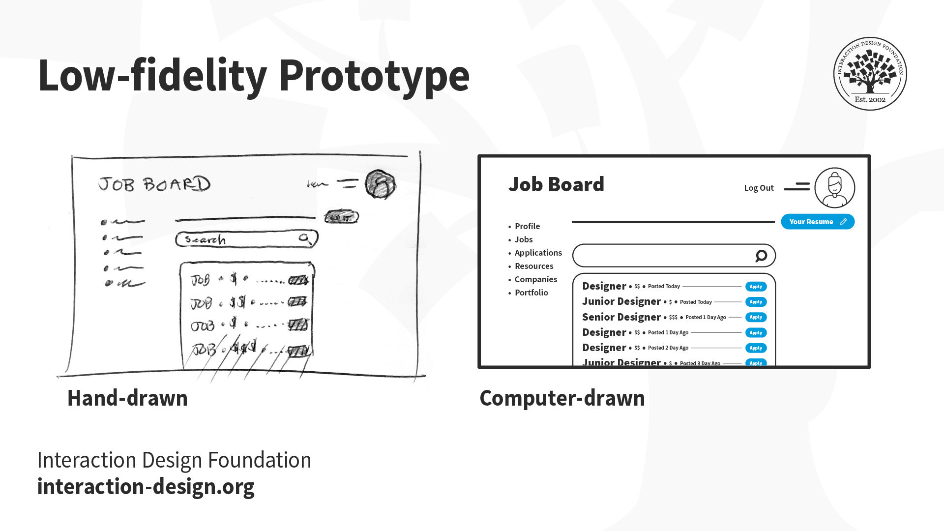
When designers prototype and test early in the design process, they can validate assumptions and gather user feedback before they invest significant resources in development. To conduct rapid prototyping and iterative testing allows designers to iterate based on real user insights. They can then minimize the impact of assumptions on the final design. For example, low-fidelity paper prototypes can help in early testing and gathering feedback without investing too much time and resources.
It’s important to engage with cross-functional teams, such as developers, marketers and business analysts. This activity helps challenge assumptions and gain different perspectives. Collaborative discussions and knowledge sharing between product teams, development teams and others can uncover blind spots and lead to more informed design decisions.
UX Designer and Author of Build Better Products and UX for Lean Startups, Laura Klein explains the value of cross-functional teams.
ShowHide
video transcript
00:00:00 --> 00:00:30
Cross-functional teams, unlike silos, have all the people necessary to build a specific thing together. Let's look at an example. Imagine you're on a team that is supposed to build the onboarding flow for a new app that helps connect job applicants with jobs. You can't build the whole thing with just designers. Or with just engineers, for that matter. I mean, you probably could do it with just engineers, but it's a terrible idea.
00:00:30 --> 00:01:00
A cross-functional team for this onboarding work might include a few engineers, perhaps some for the front end and some for the back end. Might include a designer, a researcher, a product owner or manager, maybe a content writer or a marketing person. In an ideal world, all of these folks would only work on this particular team. In the real world, where we actually live, sometimes folks are on a couple of different teams and some specialists may be brought in to consult. For example, if the team needed help from the legal department to explain some of the ramifications of a specific decision,
00:01:00 --> 00:01:32
a cross-functional team would have a dedicated legal expert they could go to. But that legal expert might also work with lots of other teams. In agile environments, the cross-functional team generally sits together or if remote, has some sort of shared workspace. They all go to the required team meetings. They understand the goal of the team and the users. They're experts, or they soon become experts, on that onboarding flow. Contrast this to how it might be done in a siloed environment. In that case, you might have different people assigned to the team depending on need, which can seem really flexible.
00:01:32 --> 00:02:00
Until you realize that you end up with five different designers working on the project all at different times and they all have to be brought up to speed and they don't really understand why the other designers made the decisions that they did. Same with the engineers. And do not get me started on legal. Silo teams tend to rely more on documentation that gets handed between groups. And this can lead to a waterfall project where project managers or product managers work on something for a while to create requirements, which they then hand off to designers who work on designs for a while
00:02:00 --> 00:02:29
and then they pass the deliverables on to engineering, who immediately insists that none of this will work and demands to know why they weren't brought in earlier for consultation. You get it. By working in cross-functional teams instead, the people embedded on the project get comfortable with each other. They know how the team works and can make improvements to it. They come to deeply understand their particular users and their metrics. They actually bring engineering and even design and research into the decision making process early to avoid the scenario I described above.
Seek Continuous User Feedback
Designers should conduct usability tests and prioritize ongoing user feedback throughout the design process. When designers regularly seek feedback, they can learn about their assumptions, uncover new insights and from there make informed design decisions regarding many aspects of the visual design and functionality.
Aim for Inclusive Design
It’s important to ensure that the design is accessible to users with disabilities. An inclusive approach can help designers understand diverse user needs and reduce assumptions about their abilities and limitations.
UX Content Strategist, Architect and Consultant Katrin Suetterlin explains the value of inclusive design and how it differs from design for universal use:
ShowHide
video transcript
00:00:00 --> 00:00:31
Universal design is a design practice that is generally considered to be a design that has gone through all the design processes while hoping to take everyone into consideration. You just would have to design it in a way that everyone can use it. The *problem* with the approach of universal design is, though, that *you cannot really design for everyone*.
00:00:31 --> 00:01:02
To design with 8 billion people in mind is strictly impossible: a design that is utopian or more academic or more a discourse subject rather than something that we can really and truly design. But you can do *inclusive design* as a part of design practices that strive for inclusion. The difference is that inclusive design is the umbrella above,
00:01:02 --> 00:01:31
for example, accessible design because accessibility is an accommodation. It is checking boxes whether your design is truly accessible. And if it serves the purpose for your audiences. Inclusive design is the same umbrella. Universal design is more of a juxtaposition, but it's more battling against inclusive design because if you think of everyone, you think of no one.
00:01:31 --> 00:02:01
And in this inclusive way, we can look towards architecture, we can look towards city planning and also how buildings are built in the past decades because they have taken aboard the inclusive approach. They do all the accommodations they can think of – for example, no stairs, ride towards those who have to take a wheelchair. Or it could be beneficial to people with a trolley or with something heavy that they have to carry.
00:02:01 --> 00:02:30
So, thinking of this benefits everyone. And now imagine the internet being a public space, and how we can learn from city planning and architecture and interior design, that we are *accommodating those who need accommodation*. And that's what the inclusive approach is about. So, to sum this up, your research cannot be universal, because you cannot serve that, but it can be personalized and it can be also tailored to the needs of the audience you are serving.
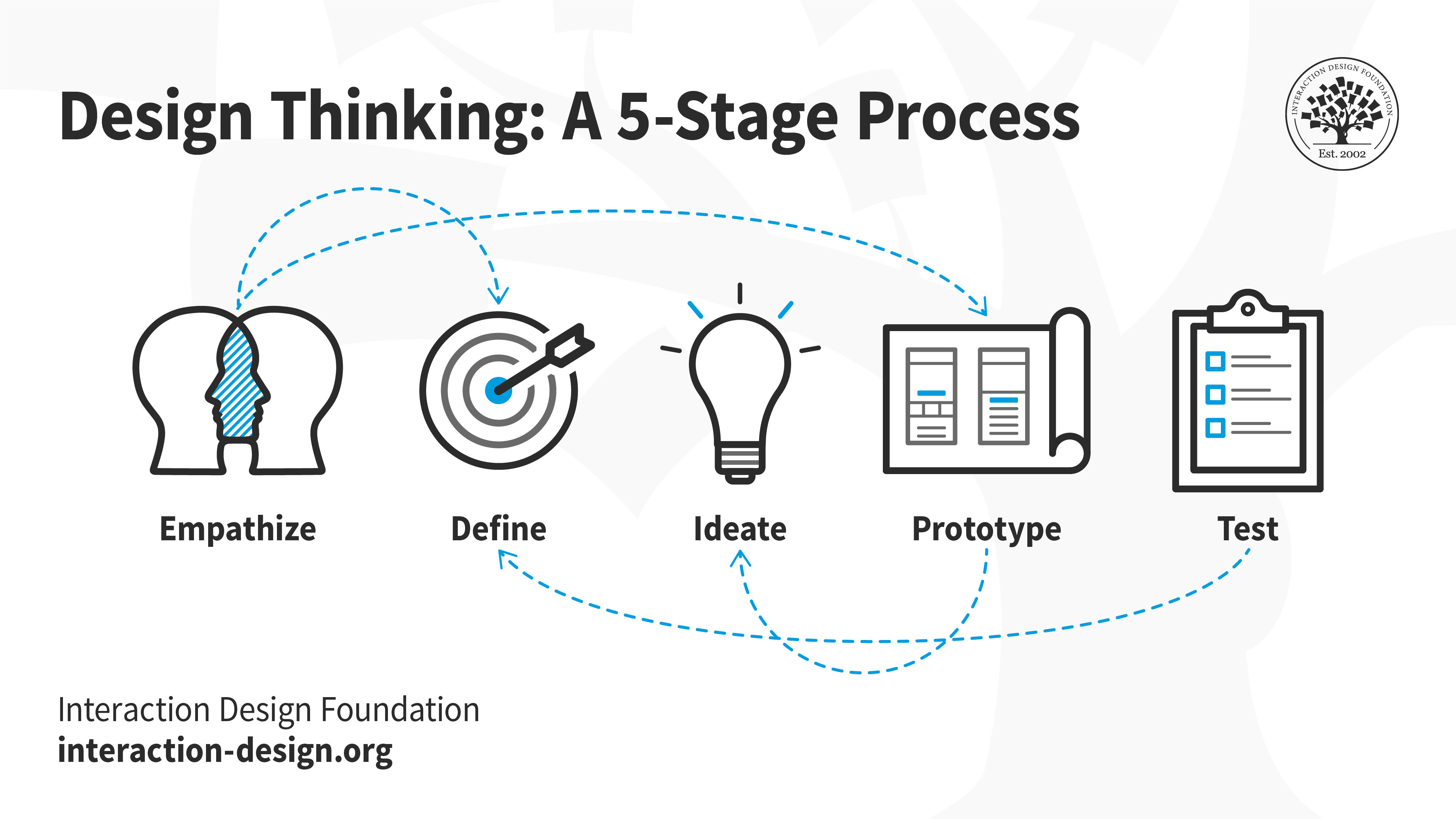
Design Thinking and Assumption Testing
In the design thinking design process, assumptions play a crucial role in the ideation and prototyping stages. They provide a starting point for designers to generate ideas and design prototypes. However, they don’t take these assumptions at face value. Instead, designers challenge and test them through user research, or UX research and feedback.
Design thinking offers superb opportunities to test assumptions.
Design thinking encourages designers to empathize with users, challenge assumptions and iterate on their designs. This approach ensures that they make the final design solution user-centered and that it meets the users' needs and goals. Assumption testing in design thinking involves several steps:
1. Recognizeassumptions: Identify the assumptions that emerged during the design process. These could be about user behavior, user needs, the use context or any other aspect of the design.
2. Prioritize assumptions: Once the team has identified assumptions, they need to prioritize these. Give priority to those that have a high impact on the design. Do the same for those that the design team is least certain of.
3. Formulatehypotheses: For each prioritized assumption, formulate a hypothesis. A hypothesis is a tentative explanation that designers or researchers can test.
4. Testhypotheses: Test these hypotheses through user interviews, usability testing, surveys, etc.
5. Learnand iterate: Based on the outcomes of the hypothesis testing, work to refine and improve assumptions. This is an iterative process that continues until a satisfactory design solution comes about.
Design thinking is a highly iterative process. Design teams can leverage it well to check assumptions and work creatively. From there, they can find how to serve users best. Discover its value in this video:
ShowHide
video transcript
00:00:00 --> 00:00:32
Design thinking improves the world around us every day because of its ability to generate groundbreaking solutions. You can contribute to the future developments in a similar way if you adopt the design thinking mindset into your own work procedures. But first, you need to know what the five phases of design thinking are. And that's what this video will teach you. Design thinking is a *non-linear, iterative process* that can have anywhere from three to seven phases, depending on who you talk to.
00:00:32 --> 00:01:01
The model we chose to focus on here at IxDF has five. As we mentioned, the design thinking process is *non-linear* and *iterative*. This means you don't have to follow the five phases in any particular order. You can carry out the stages in parallel or repeat them and circle back to a previous stage at any point in the process. Basically, don't ever think these pieces are set in stone. The whole point of design thinking is that it allows you to work in a *dynamic way* to *develop and launch innovative ideas*.
00:01:01 --> 00:01:32
There's no need to use design thinking as a step-by-step process, unless the situation calls for it. Now, you may wonder why we chose to focus on *this* particular variation of the design thinking process. We picked the *5-phase model* because it's the one proposed by the Hasso Plattner Institute of Design at Stanford. Actually, you may have heard it called its more common name: the d-school. They are world-renowned for the way they teach and apply design thinking. So, who better to take inspiration and learn from? And there's no need to worry; you won't miss out!
00:01:32 --> 00:01:56
Regardless of which design thinking model you personally choose to focus on, all variants embody the same principles which were first described in 1969 by Nobel Prize laureate Herbert Simon when he wrote *The Sciences of the Artificial*. We hope this short video has given you a good introduction to the five phases of design thinking. We can't wait for you to learn more about this revolutionary process!
Video copyright info
Hasso-Platner Institute Panorama
Ludwig Wilhelm Wall, CC BY-SA 3.0 , via Wikimedia Commons
Examples of Brands that Did Assumption Testing Well
Amazon and Google are just a few of the companies that have leveraged assumption testing to create successful products. For example, Amazon used customer feedback to refine its product offerings and make them more user-friendly. Meanwhile, Google has used hypothesis testing to improve its search engine algorithms and make them more accurate.
When designers test assumptions and fine-tune the promising results, they can meet their users' needs, desires and more in winning design solutions.
Remember, assumption testing is a crucial part of the UX design process. It welcomes effective user research methods and empowers designers. With it, designers can spot everything from minor flaws in the information architecture to deeper-rooted difficulties. Testing helps ensure user-centered designs and reduces the risk of design failures.
Also, it leads to more informed design decisions and prototypes that account better for user flow and optimal interactive design, and more. The outcome is increased user satisfaction, better-designed products, and, indeed, improved business outcomes.
In UI/UX design, people often assume that users will interact with their products in a specific, intended way. However, this isn't always the case. Designers might think users will intuitively navigate their interface or appreciate complex features, but users might find these aspects confusing or unnecessary.
Another common assumption is that aesthetics are more important than functionality. While an appealing design can attract users, it's the usability and value of the product that retain them. Designers sometimes also presume that all users have the same level of technical expertise or physical abilities, and overlook the need for accessible and inclusive design. To avoid these pitfalls, designers should conduct thorough user research, prioritize clear and functional design, and ensure accessibility for all users.
How can designers distinguish helpful assumptions from harmful ones in design?
To distinguish helpful assumptions from harmful ones in design, focus on the evidence behind the assumptions and their impact on the user experience. Helpful assumptions often come from reliable user research and data. They align with user needs, behaviors and expectations. Therefore, they enhance usability and satisfaction. For instance, if a designer assumes that users prefer intuitive navigation, it can lead to simpler and more effective designs if user testing backs it up.
On the other hand, harmful assumptions lack evidence and can lead to misunderstandings about user needs, and create barriers to usability. For example, for a designer to assume all users have the same level of technical proficiency without considering diversity can alienate or frustrate many users.
The key is to validate assumptions through continuous user feedback, testing and iteration. This approach helps identify and eliminate harmful assumptions early in the design process, and ensure the product meets actual user needs and preferences. Always question any assumptions, seek evidence and be ready to adjust the design based on what real users confirm about it.
How should you prioritize assumptions for testing in a design project?
In a design project, prioritize assumptions for testing based on their impact on the user experience and the project's success. Start with assumptions that, if incorrect, could significantly affect the functionality, usability or appeal of the design. These often relate to user needs, behaviors and the core value proposition of your product. For instance, if a designer assumes that users prefer a certain navigation style, they should test this early because it influences the overall design and user satisfaction.
Next, focus on assumptions that are risky or uncertain. These might include new features or innovative design elements that a designer hasn't tested with the target audience. The more uncertain an assumption, the higher it should be on the testing list to reduce project risks.
Lastly, consider the feasibility of testing each assumption. Some might require extensive resources or time to test properly. Designers should prioritize those they can test effectively with the resources available, and ensure they make the most of their testing efforts.
Designers who systematically evaluate the impact, risk and feasibility of testing each assumption can prioritize effectively. They can make sure to validate critical user experience elements early in the design process, and so reduce risk and guide the project towards success.
How do assumptions function in Agile or Lean UX design processes?
In Agile or Lean UX design processes, assumptions play a critical role to drive quick, iterative development. These processes start by acknowledging that the team does not know everything is known at the outset of a project. Rather than spend extensive time upfront to try to gather all possible information, designers and teams make informed assumptions about user needs, behaviors and preferences. These assumptions then guide initial design and development efforts.
The key function of assumptions in Agile or Lean UX is to serve as hypotheses that need validation through rapid experimentation and user feedback. Teams quickly prototype their ideas based on these assumptions and then test them with real users. This testing generates valuable insights and data, which either validate the assumptions or highlight the need for adjustments.
This approach allows teams to learn fast and iterate their designs based on actual user feedback, rather than spend too much time on theoretical analysis. Teams continually update, refine or discard assumptions based on what they learn. This iterative cycle of making assumptions, testing, learning and adjusting helps Agile and Lean UX teams to remain flexible, responsive to user needs and focused on delivering value efficiently.
UX Designer and Author of Build Better Products and UX for Lean Startups, Laura Klein explains how Agile teams iterate:
ShowHide
video transcript
00:00:00 --> 00:00:31
Great agile teams commit to iterating on features. Now, it's interesting. When we did a bunch of research on agile teams back in 2019 and 2020, we found one of the biggest complaints people had was that their teams never went back and improved things that they'd already built. They would ship something, move it to the Done column and then never look at it again. Sometimes, they didn't even look at metrics to see if anybody was even *using* the feature.
00:00:31 --> 00:01:00
The really unfortunate thing was that teams often shipped small or stripped-down versions of features just to get them out the door and then they *still* never went back and approved them. Obviously, this led to absolute nightmare products full of half-finished things that were inconsistent and didn't really make sense as a whole product. The thing is, that's one of the least agile things you can do. The whole point of lightweight methodologies is that we're constantly getting things in front of users, getting feedback and improving them.
00:01:00 --> 00:01:32
Do we sometimes ship things to people that aren't quite perfect? Yeah – all the time. But we do it with the understanding that we're shipping it in order to learn something, and once we learn something, we're going to go back and improve the product based on what we learned, and then we'll do it again... and then we'll do it again. That is iteration, and it's pretty much the core of agile. Great teams learn from their users and keep improving their product by iterating on features. They don't just keep churning out new half-baked features like they're some kind of widget factory.
00:01:32 --> 00:01:41
So, teams that are truly committed to agile methodologies should be iterating and improving their user experience and their codebase *constantly*.
How do cultural assumptions influence design decisions and user perception?
Cultural assumptions greatly influence design decisions and how users perceive products. These assumptions stem from a designer's own cultural background and can affect everything from color choices to content presentation. For example, a color that signifies prosperity in one culture might represent mourning in another. This can lead to misunderstandings or negative reactions from users of different cultural backgrounds if designers don’t consider the subject carefully.
Designers might also assume that navigation patterns that are familiar to them will be things that users understand universally, ignoring the fact that user interface conventions can vary significantly across cultures. Such assumptions can hinder usability for international users. Furthermore, cultural assumptions about symbols, gestures and even language can impact user engagement and the overall user experience.
To address these challenges, designers should conduct thorough research on their target audience's cultural norms and preferences. When designers engage with users from diverse backgrounds during the design process, it helps uncover cultural nuances and inform more inclusive design decisions. This approach not only enhances the user experience for a broader audience but also avoids potential cultural insensitivities. Therefore, it ensures that products are accessible and appealing to users worldwide.
Author and Human-Computer Interaction Expert, Professor Alan Dix explains why designers need to consider their users’ culture:
ShowHide
video transcript
00:00:00 --> 00:00:32
As you're designing, it's so easy just to design for the people that you know and for the culture that you know. However, cultures differ. Now, that's true of many aspects of the interface; no[t] least, though, the visual layout of an interface and the the visual elements. Some aspects are quite easy just to realize like language, others much, much more subtle.
00:00:32 --> 00:01:04
You might have come across, there's two... well, actually there's three terms because some of these are almost the same thing, but two terms are particularly distinguished. One is localization and globalization. And you hear them used almost interchangeably and probably also with slight differences because different authors and people will use them slightly differently. So one thing is localization or internationalization. Although the latter probably only used in that sense. So localization is about taking an interface and making it appropriate
00:01:04 --> 00:01:31
for a particular place. So you might change the interface style slightly. You certainly might change the language for it; whereas global – being globalized – is about saying, "Can I make something that works for everybody everywhere?" The latter sounds almost bound to fail and often does. But obviously, if you're trying to create something that's used across the whole global market, you have to try and do that. And typically you're doing a bit of each in each space.
00:01:31 --> 00:02:02
You're both trying to design as many elements as possible so that they are globally relevant. They mean the same everywhere, or at least are understood everywhere. And some elements where you do localization, you will try and change them to make them more specific for the place. There's usually elements of both. But remembering that distinction, you need to think about both of those. The most obvious thing to think about here is just changing language. I mean, that's a fairly obvious thing and there's lots of tools to make that easy.
00:02:02 --> 00:02:31
So if you have... whether it's menu names or labels, you might find this at the design stage or in the implementation technique, there's ways of creating effectively look-up tables that says this menu item instead of being just a name in the implementation, effectively has an idea or a way of representing it. And that can be looked up so that your menus change, your text changes and everything. Now that sounds like, "Yay, that's it!"
00:02:31 --> 00:03:00
So what it is, is that it's not the end of the story, even for text. That's not the end of the story. Visit Finland sometime. If you've never visited Finland, it's a wonderful place to go. The signs are typically in Finnish and in Swedish. Both languages are used. I think almost equal amounts of people using both languages, their first language, and most will know both. But because of this, if you look at those lines, they're in two languages.
00:03:00 --> 00:03:31
The Finnish line is usually about twice as large as the Swedish piece of text. Because Finnish uses a lot of double letters to represent quite subtle differences in sound. Vowels get lengthened by doubling them. Consonants get separated. So I'll probably pronounce this wrong. But R-I-T-T-A, is not "Rita" which would be R-I-T-A . But "Reet-ta". Actually, I overemphasized that, but "Reetta". There's a bit of a stop.
00:03:31 --> 00:04:02
And I said I won't be doing it right. Talk to a Finnish person, they will help put you right on this. But because of this, the text is twice as long. But of course, suddenly the text isn't going to fit in. So it's going to overlap with icons. It's going to scroll when it shouldn't scroll. So even something like the size of the field becomes something that can change. And then, of course, there's things like left-to-right order. Finnish and Swedish both are left-to-right languages. But if you were going to have, switch something say to an Arabic script from a European script,
00:04:02 --> 00:04:31
then you would end up with things going the other way round. So it's more than just changing the names. You have to think much more deeply than that. But again, it's more than the language. There are all sorts of cultural assumptions that we build into things. The majority of interfaces are built... actually the majority are built not even in just one part of the world, but in one country, you know the dominance... I'm not sure what percentage,
00:04:31 --> 00:05:02
but a vast proportion will be built, not just in the USA, but in the West Coast of the USA. Certainly there is a European/US/American centeredness to the way in which things are designed. It's so easy to design things caught in those cultures without realizing that there are other ways of seeing the world. That changes the assumptions, the sort of values that are built into an interaction.
00:05:02 --> 00:05:35
The meanings of symbols, so ticks and crosses, mostly will get understood and I do continue to use them. However, certainly in the UK, but even not universally across Europe. But in the UK, a tick is a positive symbol, means "this is good". A cross is a "blah, that's bad". However, there are lots of parts of the world where both mean the same. They're both a check. And in fact, weirdly, if I vote in the UK,
00:05:35 --> 00:06:02
I put a cross, not against the candidate I don't want but against the candidate I do want. So even in the UK a cross can mean the same as a tick. You know – and colors, I said I do redundantly code often my crosses with red and my ticks with green because red in my culture is negative; I mean, it's not negative; I like red (inaudible) – but it has that sense of being a red mark is a bad mark.
00:06:02 --> 00:06:33
There are many cultures where red is the positive color. And actually it is a positive color in other ways in Western culture. But particularly that idea of the red cross that you get on your schoolwork; this is not the same everywhere. So, you really have to have quite a subtle understanding of these things. Now, the thing is, you probably won't. And so, this is where if you are taking something into a different culture, you almost certainly will need somebody who quite richly understands that culture.
00:06:33 --> 00:06:43
So you design things so that they are possible for somebody to come in and do those adjustments because you probably may well not be in the position to be able to do that yourself.
Video copyright info
Copyright holder: Tommi Vainikainen _ Appearance time: 2:56 - 3:03 Copyright license and terms: Public domain, via Wikimedia Commons
Copyright holder: Maik Meid _ Appearance time: 2:56 - 3:03 Copyright license and terms: CC BY 2.0, via Wikimedia Commons _ Link: https://commons.wikimedia.org/wiki/File:Norge_93.jpg
Copyright holder: Paju _ Appearance time: 2:56 - 3:03 Copyright license and terms: CC BY-SA 3.0, via Wikimedia Commons _ Link: https://commons.wikimedia.org/wiki/File:Kaivokselan_kaivokset_kyltti.jpg
Copyright holder: Tiia Monto _ Appearance time: 2:56 - 3:03 Copyright license and terms: CC BY-SA 3.0, via Wikimedia Commons _ Link: https://commons.wikimedia.org/wiki/File:Turku_-_harbour_sign.jpg
How can designers avoid bias in their assumptions?
Designers can avoid bias in their assumptions if they actively seek diverse perspectives and ground their decisions in user research. When designers engage with a wide range of users from different backgrounds, it helps uncover varied needs and preferences, which challenges personal biases and assumptions. Designers should implement a mix of qualitative and quantitative research methods, such as interviews, surveys and usability testing. This will allow designers to gather data that represent the experiences and opinions of a broader audience.
It’s also crucial to encourage a culture of feedback within the design team. Designers who collaborate with colleagues from different disciplines and life experiences can introduce new viewpoints and challenge biased assumptions. When designers regularly revisit and question initial assumptions throughout the design process, it ensures that designers can keep their decisions focused on user needs rather than personal biases.
Lastly, continuous learning about cognitive biases and their impact on decision-making helps designers recognize and mitigate their own biases. If designers adopt these strategies, they can create more inclusive, user-centered designs that cater to a wider range of user needs and preferences.
What ethical considerations should designers make about user behavior assumptions?
Designers should consider several ethical aspects when they make assumptions about user behavior. First, respect for user privacy is paramount. Assumptions should not lead to invasive design decisions that compromise user data or personal space. Designers must ensure that their work aligns with ethical data usage and privacy standards. They must only collect and use data with clear consent and for legitimate purposes.
Second, inclusivity and accessibility must guide assumptions. Design decisions should not exclude users based on abilities, age, cultural background or socioeconomic status. Assumptions about user behavior should include a broad spectrum of user experiences and needs, to ensure products are accessible and useful to as many people as possible.
Third, designers must not perpetuate stereotypes or biases in their assumptions. This means to challenge personal biases and consider the diverse ways users might interact with a product. Designers should seek out diverse perspectives and involve users from different backgrounds in the design process to ensure assumptions do not inadvertently marginalize any group.
Lastly, transparency about assumptions and their impact on design decisions is crucial. Users should have a clear understanding of how their data and behavior might influence the product experience. This transparency builds trust and allows users to make informed decisions about their interaction with the product.
UX Content Strategist, Architect and Consultant Katrin Suetterlin explains the nature of inclusive design:
ShowHide
video transcript
00:00:00 --> 00:00:31
Universal design is a design practice that is generally considered to be a design that has gone through all the design processes while hoping to take everyone into consideration. You just would have to design it in a way that everyone can use it. The *problem* with the approach of universal design is, though, that *you cannot really design for everyone*.
00:00:31 --> 00:01:02
To design with 8 billion people in mind is strictly impossible: a design that is utopian or more academic or more a discourse subject rather than something that we can really and truly design. But you can do *inclusive design* as a part of design practices that strive for inclusion. The difference is that inclusive design is the umbrella above,
00:01:02 --> 00:01:31
for example, accessible design because accessibility is an accommodation. It is checking boxes whether your design is truly accessible. And if it serves the purpose for your audiences. Inclusive design is the same umbrella. Universal design is more of a juxtaposition, but it's more battling against inclusive design because if you think of everyone, you think of no one.
00:01:31 --> 00:02:01
And in this inclusive way, we can look towards architecture, we can look towards city planning and also how buildings are built in the past decades because they have taken aboard the inclusive approach. They do all the accommodations they can think of – for example, no stairs, ride towards those who have to take a wheelchair. Or it could be beneficial to people with a trolley or with something heavy that they have to carry.
00:02:01 --> 00:02:30
So, thinking of this benefits everyone. And now imagine the internet being a public space, and how we can learn from city planning and architecture and interior design, that we are *accommodating those who need accommodation*. And that's what the inclusive approach is about. So, to sum this up, your research cannot be universal, because you cannot serve that, but it can be personalized and it can be also tailored to the needs of the audience you are serving.
What strategies minimize the risk of incorrect assumptions?
To minimize the risk of incorrect assumptions, employ several strategies. First, engage in thorough user research. Designers should gather insights directly from the target audience. It provides a solid foundation for assumptions, and ensures they have a grounding in reality. Utilize surveys, interviews and user testing to understand user needs, behaviors and pain points.
Second, involve diverse perspectives in the design process. Collaboration with team members from different backgrounds and disciplines can challenge and refine assumptions, preventing biases from influencing design decisions.
Third, adopt an iterative design approach. Prototype early and test often, allowing real user feedback to validate or refute the assumptions. This process of continuous validation helps identify and correct erroneous assumptions before they become costly mistakes.
Lastly, maintain a flexible mindset. Be willing to adapt assumptions and design decisions according to new information and feedback. To stay open to change ensures that a design evolves in alignment with actual user needs and preferences.
CEO of Experience Dynamics, Frank Spillers explains the need to conduct proper user research in this video for the accompanying course:
ShowHide
video transcript
00:00:00 --> 00:00:33
When developing a product or service, it is *essential* to know what problem we are solving for our users. But as designers, we all too easily shift far away from their perspective. Simply put, we forget that *we are not our users*. User research is how we understand what our users *want*, and it helps us design products and services that are *relevant* to people. User research can help you inspire your design,
00:00:33 --> 00:01:00
evaluate your solutions and measure your impact by placing people at the center of your design process. And this is why user research should be a *pillar* of any design strategy. This course will teach you *why* you should conduct user research and *how* it can fit into different work processes. You'll learn to understand your target audience's needs and involve your stakeholders.
00:01:00 --> 00:01:37
We'll look at the most common research techniques, such as semi-structured interviews and contextual inquiry. And we'll learn how to conduct observational studies to *really understand what your target users need*. This course will be helpful for you whether you're just starting out in UX or looking to advance your UX career with additional research techniques. By the end of the course, you'll have an industry-recognized certificate – trusted by leading companies worldwide. More importantly, you'll master *in-demand research skills* that you can start applying to your projects straight away
00:01:37 --> 00:01:44
and confidently present your research to clients and employers alike. Are you ready? Let's get started!
How can designers use A/B testing to test assumptions?
Designers use A/B testing to test assumptions by comparing two versions of a design element to see which one performs better. First, identify an assumption to test, such as which call-to-action (CTA) button color leads to more clicks. Create two versions of the design: version A (the control) with the current CTA color and version B (the variant) with a different color.
Next, split the audience randomly so that one group sees version A and the other sees version B. Both groups should be similar in all respects except for the design variation they are exposed to. Then, collect and analyze the data on how each version performs based on the specific goals, such as click-through rates for the CTA button.
If version B significantly outperforms version A, a designer can assume that the new CTA color is more effective and they can implement it in the design. A/B testing allows designers to make data-driven decisions, reducing the risk of relying on incorrect assumptions and ensuring design choices are optimized for user engagement and conversion.
What role do assumptions play in predictive models and user personas?
In predictive models and user personas, assumptions form the basis for designers to create representations of user behaviors and characteristics. For predictive models, assumptions help to define the rules and conditions under which the model predicts future user actions. These assumptions might include user engagement patterns or how certain features affect user behavior. When designers and data scientists set these initial parameters, they can develop models that forecast user actions under specific circumstances, which aids in decision-making and strategy development.
User personas, on the other hand, are what designers build on assumptions about the target audience's demographics, behaviors, motivations and goals. These assumptions often come from user research and data analysis. When designers create a semi-fictional character that represents a user segment, they make assumptions to fill in the gaps where data might be incomplete. This ensures the persona accurately reflects the user base.
Both tools rely on assumptions to simplify complex user data into actionable insights. However, it's crucial to validate these assumptions through continuous research and testing. This ensures that predictive models and user personas remain relevant and accurately reflect real user behaviors and preferences. Ultimately, that leads to more effective and user-centered design solutions.
Can you explain "assumption mapping" and its benefits in UX design?
Assumption mapping is a technique in UX design that helps teams identify, categorize and prioritize assumptions they make about a product, its users and the market. In this process, the design team lists all assumptions, then evaluates them based on their impact and certainty. They map assumptions onto a quadrant chart. One axis represents the level of evidence that supports the assumption (from high to low). The other axis represents the impact on the project (from high to low).
The benefits of assumption mapping in UX design are significant. First, it brings clarity and transparency to the design process as it makes explicit what the team believes to be true. This shared understanding helps to align team members and stakeholders. Second, it prioritizes research and testing efforts. When teams identify which assumptions are riskiest—those with high impact but low certainty—they can focus their resources on validating these first. This approach reduces project risk and helps in making informed decisions.
Third, assumption mapping fosters a culture of questioning and learning. It encourages teams to continuously seek evidence and validate their thinking, which can lead to more innovative and user-centered design solutions. If UX design teams apply assumption mapping, they can navigate uncertainties more effectively. They can ensure that they ground their design decisions in user needs and behaviors. Ultimately, this can lead to more successful and satisfying user experiences.
Remember the value of Design Thinking, which UX Strategist and Consultant William Hudson explains:
ShowHide
video transcript
00:00:00 --> 00:00:33
Design thinking is a non-linear, iterative process that teams use to understand users, challenge assumptions, redefine problems, and create innovative solutions to prototype and test. It is most useful to tackle problems that are ill defined or unknown. In a rapidly changing world, organizations must be able to adapt and innovate quickly to survive. Design thinking is a powerful tool that can help organizations to do just that. By focusing on the user and their needs, he can help teams to develop creative solutions
00:00:33 --> 00:01:00
that meet the real needs of the people they serve. The end goal of a design thinking process is to create a solution that is desirable, feasible and viable. This means that your product should satisfy the needs of a user, be feasible to implement and have a financial model as well. During the bulk of your design thinking process, you'll focus on desirability as you are concerned with testing your ideas and validating your hypothesis about your users.
00:01:00 --> 00:01:08
Towards the end of your project, however, you should bring the focus to feasibility and viability so that your solution can be sustainable.
What are some highly cited scientific articles on the subject of assumptions in UX design?
Ferreira, Sharp and Robinson's conference paper delves into the intersection of Agile development and User Experience (UX) design, focusing on how the values and assumptions of decision-makers influence the practice in this area. The publication addresses the gap in academic understanding regarding the integration of UX design and Agile development processes, emphasizing the impact of external stakeholders' values on shaping the collaboration between Agile developers and UX designers. By conducting field studies, the authors highlight the importance of contextual values in improving practice beyond just processes and techniques, advocating for a deeper understanding of how external influences shape UX/Agile practices for enhanced outcomes in product development.
Lucy Kimbell's article "Rethinking Design Thinking: Part I" has been influential for its critical examination of the concept of design thinking beyond traditional design realms. The publication delves into the evolution of design thinking from its origins in designer research to its adoption by management educators and consultancies in a global economy. Kimbell identifies three main perspectives on design thinking: as a cognitive style, a general theory of design, and a resource for organizations. The article challenges the assumptions underlying design thinking, highlighting issues such as dualism between thinking and acting, oversimplified views of design practices, and the emphasis on designers as central agents in the process. Kimbell suggests a shift towards understanding the contextual, embodied practices of designers to reconceptualize design thinking effectively.
What are some highly regarded books about assumptions?
Jon Yablonski's Laws of UX: Using Psychology to Design Better Products & Services has been influential due to its comprehensive exploration of applying psychology principles in UX design. The publication emphasizes the critical role of understanding user behavior and interactions with digital interfaces, highlighting how design success hinges on aligning with human perception and cognitive processes. By deconstructing familiar apps and experiences, Yablonski provides practical examples for UX designers to create more intuitive and human-centered interfaces. The book covers topics such as aesthetics, key psychology principles for designers, UX heuristics, predictive models like Fitts's law and ethical considerations, offering a valuable framework for integrating psychology into the design process for enhanced user experiences.
Earn a Gift, Answer a Short Quiz!
Try Again! IxDF Cheers For You!
0 out of 3 questions answered correctly
Remember, the more you learn about design, the more you make yourself valuable.
Some of the world’s leading brands, such as Apple, Google, Samsung, and General Electric, have rapidly adopted the design thinking approach, and design thinking is being taught at leading universities around the world, including Stanford d.school, Harvard, and MIT. What is design thinking, and why is it so popular and effective?
Design Thinking is not exclusive to designers—all great innovators in literature, art, music, science, engineering and business have practiced it. So, why call it Design Thinking? Well, that’s because design work processes help us systematically extract, teach, learn and apply human-centered techniques to solve problems in a creative and innovative way—in our designs, businesses, countries and lives. And that’s what makes it so special.
The overall goal of this design thinking course is to help you design better products, services, processes, strategies, spaces, architecture, and experiences. Design thinking helps you and your team develop practical and innovative solutions for your problems. It is a human-focused, prototype-driven, innovative design process. Through this course, you will develop a solid understanding of the fundamental phases and methods in design thinking, and you will learn how to implement your newfound knowledge in your professional work life. We will give you lots of examples; we will go into case studies, videos, and other useful material, all of which will help you dive further into design thinking. In fact, this course also includes exclusive video content that we've produced in partnership with design leaders like Alan Dix, William Hudson and Frank Spillers!
This course contains a series of practical exercises that build on one another to create a complete design thinking project. The exercises are optional, but you’ll get invaluable hands-on experience with the methods you encounter in this course if you complete them, because they will teach you to take your first steps as a design thinking practitioner. What’s equally important is you can use your work as a case study for your portfolio to showcase your abilities to future employers! A portfolio is essential if you want to step into or move ahead in a career in the world of human-centered design.
Design thinking methods and strategies belong at every level of the design process. However, design thinking is not an exclusive property of designers—all great innovators in literature, art, music, science, engineering, and business have practiced it. What’s special about design thinking is that designers and designers’ work processes can help us systematically extract, teach, learn, and apply these human-centered techniques in solving problems in a creative and innovative way—in our designs, in our businesses, in our countries, and in our lives.
That means that design thinking is not only for designers but also for creative employees, freelancers, and business leaders. It’s for anyone who seeks to infuse an approach to innovation that is powerful, effective and broadly accessible, one that can be integrated into every level of an organization, product, or service so as to drive new alternatives for businesses and society.
You earn a verifiable and industry-trusted Course Certificate once you complete the course. You can highlight them on your resume, CV, LinkedIn profile or your website.
All open-source articles on Assumptions in UX/UI Design
There are many ways we get stuck into patterns of thinking and doing, making innovation difficult. Not so very long ago,
824 shares
2 years ago
Open Access—Link to us!
We believe in Open Access and the democratization of knowledge. Unfortunately, world-class educational materials such as this page are normally hidden behind paywalls or in expensive textbooks.