Your constantly-updated definition of Bad Design and
collection of videos and articles. Be a conversation starter: Share this page and inspire others!
439shares
What is Bad Design?
Bad design refers to design that fails to meet user needs effectively, lacks functionality, or creates unnecessary complexity, which leads to frustration, inefficiency and a poor user experience. It often results from overlooking essential principles of good design, such as usability, accessibility, aesthetics, and user-friendliness.
In this video, learn about the phenomenon of Norman Doors and how it relates to good and bad design:
ShowHide
video transcript
00:00:00 --> 00:00:32
Even though you're a lot smarter and you have ten fine tuned fingers. Have you ever struggled to open a simple door? The chances are 100%. Unless you grew up and live here where there are no doors. Norman Doors. What is the difference between good and bad design? How can such a simple thing as a door be confusing?
00:00:32 --> 00:01:00
Those of us who live active lives in large cities experience poorly designed doors every single day. We have trouble opening doors. We push doors that were meant to be pulled. We pull doors that are meant to be pushed. We walk right into doors that we can never pull nor push, but that slide. These doors are named Norman Doors. They signal that you should do the opposite
00:01:00 --> 00:01:32
of what you're actually supposed to do, and they need a sign to correct it. Norman Doors are named after Don Norman, who coined the term user experience. Don Norman wrote the legendary book The Design of Everyday Things. He's a professor of psychology, cognitive science and computer science and worked as a vice president of Advanced Technology at Apple and as a design executive at HP.
00:01:32 --> 00:02:01
Yet he still struggles to walk through a simple door, just like the rest of us. Don Norman helps us understand, but it's not usually us who are the problem, but poorly designed doors or poorly designed apps or poorly designed microwaves or poorly designed nuclear power plants, which are the problem. The fundamental design problem is that discoverability and understanding fail.
00:02:01 --> 00:02:32
Discoverability is essential in all designs. You must design the relevant components so they are visible and communicate the right message to people who use your products and services. So how can you design for discoverability and understanding? The Golden rule is to always consider what actions are possible. Ask yourself, Is it possible to figure out where and how they should be performed?
00:02:32 --> 00:03:00
Make sure that it's easy to discover and understand what to do. How is the product's supposed to be used? What do the different controls and settings mean with those that people push? You must provide signals and signifiers that intuit heavily indicate to push and where to push. Put a vertical plate on the side with doors that people pull. You must put a door handle that naturally indicates to pull.
00:03:00 --> 00:03:32
These are natural signals. Humans can naturally interpret and understand them. Make it obvious what to do. Humans, and perhaps even cats naturally know what to do. No labels needed. With complex devices, discoverability and understanding can require guidance from manuals, instructions, or even courses. That's okay, but only if it's necessary. But with simple things, this is not good enough.
00:03:32 --> 00:04:00
It's a mistake made by lazy or ignorant design teams. And we trust that's not you and your team. So let's rid the world of frustrating doors, frustrating interfaces, and overcomplicated designs. Let's rid the world of unnecessary manuals. Let's create products that are easy to understand and make our lives smoother and easier. Whenever possible. It's not about magic.
00:04:00 --> 00:04:27
It's about us designers and learning and implementing essential design skills. You can use these insights when you design apps, websites, services, household machines, or whatever your design. Sign up for our courses. Learn from top design specialists. Get your certificate. It's industry recognized. Interaction Design Foundation.
Bad design becomes "bad" primarily because it fails to effectively communicate or fulfill its intended function, which results in confusion, exasperation, or dissatisfaction among users. The characteristics that typically contribute to a design being considered flawed include:
1. Lack of Clarity and Usability
Designs that confuse users, make navigation difficult, or obscure important information hinder usability. For instance, a website with a cluttered layout, confusing menus, or hidden call-to-action buttons can leave users feeling lost and frustrated.
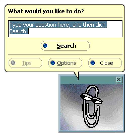
Clippy, the Microsoft Office Assistant, was intended to make Office applications more user-friendly but became notorious for its intrusive and often unhelpful interruptions, especially for regular users. They found Clippy annoying rather than helpful, leading Microsoft to disable the feature by default in Office XP and eventually remove it altogether in future versions.
Chris Pratley, a former Microsoft employee, said that Clippy was “optimized for first use.” In his post-mortem report on Clippy, he said:
What has happened is that the usability test showed that people who have never seen a feature before have trouble with it in the first hour of using it. So the designer makes the feature hold your hand through the process. That improves the results in the test, but ruins the feature for people who know what they are doing.
Design that does not consider all users, including those with disabilities, is a hallmark of bad design. This could be a website that fails to provide alternative text for images (crucial for screen readers), uses color combinations with low contrast, or lacks keyboard navigation, making it inaccessible to users with visual impairments or other disabilities.
CAPTCHAs are designed to distinguish human users from bots and often present significant accessibility challenges, particularly for users with visual impairments. Traditional CAPTCHAs that require users to identify and type distorted text can be nearly impossible for screen reader software to interpret. Even audio CAPTCHAs or image-based CAPTCHAs can pose problems for users with hearing impairments or cognitive disabilities. This highlights the need for more accessible alternatives, such as checkbox CAPTCHAs ("I am not a robot") or more innovative solutions like behavioral analysis that doesn't require user interaction.
3. Ignores User Needs and Feedback
Designs created without understanding or considering the target audience's needs, preferences, and behaviors are likely to miss the mark. An example is a mobile app with a beautiful interface that fails to perform its core function efficiently or an app that overlooks user feedback regarding critical bugs or desired features.
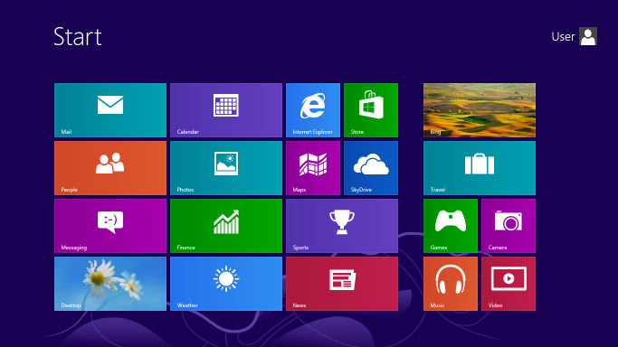
The release of Windows 8 by Microsoft in 2012 is a notable example of a product criticized for ignoring user needs and feedback, primarily due to its drastic redesign that removed the familiar Start menu in favor of a new tile-based, touch-centric interface. This shift not only confused many users but also alienated those on non-touch devices, despite significant feedback during beta testing advocating for the retention of traditional elements. The backlash led Microsoft to reintroduce the Start button in Windows 8.1 and eventually restore the Start menu in Windows 10, acknowledging the misalignment with user preferences and the importance of listening to user feedback to maintain trust and satisfaction.
The new tile menu that was introduced in Microsoft Windows 8.
While aesthetics are important, designs that prioritize appearance over functionality can lead to a subpar user experience. An example would be a visually stunning website that loads slowly due to heavy use of high-resolution images and complex animations, thereby sacrificing performance and usability.
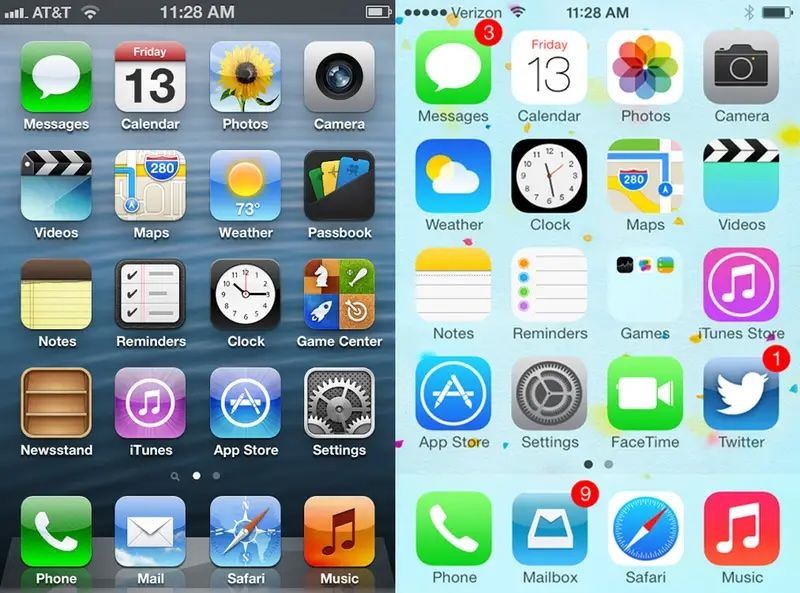
The launch of Apple's iOS 7 in 2013 exemplifies the tension between aesthetics and functionality. The operating system transitioned from skeuomorphism to a flat design that prioritized minimalism over clarity. This aesthetic overhaul led to usability issues, such as indistinct actionable elements, reduced contrast, and confusing navigation, due to the removal of visual affordances and the use of light colors and thin fonts. User feedback prompted Apple to iterate on iOS 7's design in subsequent updates, with the reintroduction of subtle visual cues to improve discoverability and readability. This situation highlights the critical importance of balancing visual appeal with functional usability in design, ensuring that aesthetic innovations do not compromise the user experience.
Apple’s previous operating systems, including iOS 6, had a skeuomorphic design. In 2013, however, Apple changed to a flat design with the release of the iOS 7. This caused widespread backlash, resulting in different iterations in updated versions of the system.
A lack of consistency in design elements such as typography, color schemes, and layout across a product can confuse users and degrade the user experience. Inconsistent application designs or branding materials can erode trust and professionalism.
In 2018, Snapchat's significant redesign merged content from friends, media, and celebrities into a single feed, which caused confusion and backlash among users. This overhaul disrupted the app's consistency in its navigation and how it presented content—a move away from the familiar user interface that users had come to know. The resulting petition, with over 1.2 million signatures calling for a rollback, emphasized the crucial need to maintain a coherent and user-friendly design to ensure user satisfaction and engagement.
6. Little or No Adaption to Changing Needs and Technologies
Designs that fail to evolve with user needs, technological advancements, or trends can quickly become outdated. For example, a website that is not optimized for mobile devices ignores the significant portion of users accessing the internet via smartphones.
BlackBerry was a leader in the smartphone industry but struggled to adapt to the shift towards touchscreens and expansive app ecosystems. It continued to prioritize physical keyboards and its own less versatile operating system. This Business Insider video discusses the Blackberry’s rise and fall:
How Bad UX and UI Design Impacts User Experience
Bad User Interface (UI) and User Experience (UX) Design can significantly detract from the overall user experience. A well-designed interface aims to facilitate ease of use, efficiency, and satisfaction in the interaction between the user and the product. Conversely, a poorly designed interface can lead to complete disengagement with a product. Here are several ways in which bad UI/UX design can negatively impact user experience:
Increased confusion and frustration: Poorly designed interfaces can leave users bewildered, struggling to complete basic tasks due to confusing, unclear, or counterintuitive layouts, as seen in the initial launch of Apple's Apple Music. The service faced criticism for its convoluted user interface, which mixed users' music libraries with streaming options in a way that was not intuitive to navigate.
Reduced efficiency and productivity: An interface that fails to optimize for ease of use can significantly slow down users, as exemplified by the complex and layered menus found in the early versions of Adobe's Creative Cloud apps. Users often had to navigate through multiple menus to find common tools and features which hindering workflow efficiency.
Higher learning curve: A steep learning curve can deter users, such as those new to Amazon's Alexa. Initially, users found it challenging to discover and remember the specific voice commands required to interact with the device effectively—this demonstrates the need for more intuitive interaction cues.
Decreased user satisfaction and loyalty: Negative interactions with an interface can lead to a drop in overall satisfaction. The redesign of LinkedIn's interface in 2017 received backlash for its over-simplified design that removed or hid many used features, frustrating long-time users and impacting their loyalty to the platform.
Loss of trust: Inconsistent design and unreliable products can erode trust. This is exemplified by the Volkswagen emissions scandal. Although not a direct UX example, the deliberate design choice to cheat emissions tests betrayed user trust on a massive scale and emphasized the broader implications of design ethics.
Accessibility issues: Failing to consider all users leads to exclusion, such as websites without mobile optimization, epitomized by older government websites that are difficult to navigate on smartphones. This means a significant portion of the population seeking information or services are excluded.
Increased error rates: Non-intuitive interfaces can lead to user errors. This was the case with early electronic voting machines that led to confusion over how to select candidates, resulting in misvotes or spoiled ballots. A clear, error-proof design is essential.
Designers should aim to reduce the instances of errors but some occasional errors are unavoidable. It helps to make these instances memorable or unique to enhance the user experience.
Negative impact on brand image: Users often associate their experience with a product's interface with the brand as a whole. The release of Google Buzz, which automatically shared users' email contacts publicly without clear consent, resulted in a privacy uproar that tarnished Google's image regarding user privacy.
Financial consequences: Design flaws can lead to direct and indirect financial losses, as seen with the costly recall of Samsung's Galaxy Note 7 due to design flaws in its battery—there were many instances of overheating and fires. In addition to financial losses, Samsung experienced long-term damage to its reputation.
A user-centered design approach that prioritizes clear, intuitive, and accessible design is vital to avoid these pitfalls. This approach ensures usability, enhances user satisfaction, and fosters trust, ultimately contributing to a product's success and a brand's reputation.
How Can Designers Avoid Bad Design?
Designers can steer clear of bad design and create positive, user-friendly experiences by adopting a series of best practices focused on user-centered design principles. Here are strategies to help avoid common pitfalls and ensure the creation of effective and engaging designs:
Understand Users
Designers should conduct user research to gain insights into users' needs, preferences, behaviors, and challenges. Create personas and user journey maps to guide design decisions from the perspective of the end-user.
This video explains what user research is and why it’s so important:
ShowHide
video transcript
00:00:00 --> 00:00:30
User research is a crucial part of the design process. It helps to bridge the gap between what we think users need and what users actually need. User research is a systematic process of gathering and analyzing information about the target audience or users of a product, service or system. Researchers use a variety of methods to understand users, including surveys, interviews, observational studies, usability testing, contextual inquiry, card sorting and tree testing, eye tracking
00:00:30 --> 00:01:02
studies, A-B testing, ethnographic research and diary studies. By doing user research from the start, we get a much better product, a product that is useful and sells better. In the product development cycle, at each stage, you’ll different answers from user research. Let's go through the main points. What should we build? Before you even begin to design you need to validate your product idea. Will my users need this? Will they want to use it? If not this, what else should we build?
00:01:02 --> 00:01:31
To answer these basic questions, you need to understand your users everyday lives, their motivations, habits, and environment. That way your design a product relevant to them. The best methods for this stage are qualitative interviews and observations. Your visit users at their homes at work, wherever you plan for them to use your product. Sometimes this stage reveals opportunities no one in the design team would ever have imagined. How should we build this further in the design process?
00:01:31 --> 00:02:00
You will test the usability of your design. Is it easy to use and what can you do to improve it? Is it intuitive or do people struggle to achieve basic tasks? At this stage you'll get to observe people using your product, even if it is still a crude prototype. Start doing this early so your users don't get distracted by the esthetics. Focus on functionality and usability. Did we succeed? Finally, after the product is released, you can evaluate the impact of the design.
00:02:00 --> 00:02:15
How much does it improve the efficiency of your users work? How well does the product sell? Do people like to use it? As you can see, user research is something that design teams must do all the time to create useful, usable and delightful products.
Prioritize Usability
Interfaces should be intuitive and easy-to-use interfaces. Designers must ensure that navigation is logical, content is easily accessible, and actions are straightforward to perform.
Implement Consistent Design
Maintain consistency in layout, color schemes, typography, and terminology across your product. Consistency helps users learn the interface faster and reduces confusion.
Iterate Based on User Feedback and Testing
Regularly test your designs with real users to identify usability issues and areas for improvement. Use feedback to iteratively refine and enhance the user experience.
Design for Accessibility
Ensure your designs are accessible to people with disabilities by following accessibility guidelines (such as WCAG). Consider color contrast, keyboard navigation, alternative text for images, and other accessibility best practices.
Beyond accessibility is inclusive design, learn the differences between them and universal design and their importance in UX design.
ShowHide
video transcript
00:00:00 --> 00:00:31
Universal design is a design practice that is generally considered to be a design that has gone through all the design processes while hoping to take everyone into consideration. You just would have to design it in a way that everyone can use it. The *problem* with the approach of universal design is, though, that *you cannot really design for everyone*.
00:00:31 --> 00:01:02
To design with 8 billion people in mind is strictly impossible: a design that is utopian or more academic or more a discourse subject rather than something that we can really and truly design. But you can do *inclusive design* as a part of design practices that strive for inclusion. The difference is that inclusive design is the umbrella above,
00:01:02 --> 00:01:31
for example, accessible design because accessibility is an accommodation. It is checking boxes whether your design is truly accessible. And if it serves the purpose for your audiences. Inclusive design is the same umbrella. Universal design is more of a juxtaposition, but it's more battling against inclusive design because if you think of everyone, you think of no one.
00:01:31 --> 00:02:01
And in this inclusive way, we can look towards architecture, we can look towards city planning and also how buildings are built in the past decades because they have taken aboard the inclusive approach. They do all the accommodations they can think of – for example, no stairs, ride towards those who have to take a wheelchair. Or it could be beneficial to people with a trolley or with something heavy that they have to carry.
00:02:01 --> 00:02:30
So, thinking of this benefits everyone. And now imagine the internet being a public space, and how we can learn from city planning and architecture and interior design, that we are *accommodating those who need accommodation*. And that's what the inclusive approach is about. So, to sum this up, your research cannot be universal, because you cannot serve that, but it can be personalized and it can be also tailored to the needs of the audience you are serving.
Optimize Performance
Balance aesthetic elements with performance considerations. Optimize images, leverage efficient coding practices, and minimize load times to ensure a smooth and responsive experience.
Embrace Minimalism
Avoid overwhelming users with unnecessary elements or information. Use white space effectively and keep interfaces clean and focused on the most important content or actions.
Adapt for Different Devices and Screen Sizes
Design responsively to ensure your product provides a seamless experience across various devices, from desktops to smartphones. Test on multiple devices to guarantee compatibility and usability.
This video explores adaptive design and how it enhances user experience:
ShowHide
video transcript
00:00:00 --> 00:00:33
So, adaptive design technically is about kind of making sure that things fit nicely, for example, on an iPad and on a phone – for example, the latest phone, a large phone versus maybe an older, smaller phone, and works nicely in that viewport or that buttons are in the place they should be instead of just being pushed by
00:00:33 --> 00:01:04
the fluid layout of responsive design. But let me just say that probably in reality there's like a hybrid really because if you work with your developers and you tell them 'Hey, those icons that are big on the desktop, I want them to stack,' for example, is common responsive. So, you've got like a bunch of icons and then on mobile you want them to stack. But maybe they aren't showing up right; maybe they're too small, so you need to tell your developers, 'Hey can you make them larger and fill the space, and then make them stack?'
00:01:04 --> 00:01:30
So, that's the role of a UX designer or a UX person is to help with – you know – it's kind of getting things right, so there is a little touch of adaptiveness there. But what adaptive design does is a little different. And adaptive design is illustrated by the following story. I remember getting off a plane, going to the bag check to get my bag,
00:01:30 --> 00:02:02
and the first thing I wanted to do is get on Wi-Fi. I think I was working on a document and I had to upload it immediately, like right there; somebody was waiting for it. So, I flipped open my laptop, kind of set it on one of my bags, waiting for the other bag, whatever, and tried to go on the Wi-Fi. What was funny was that when I first tried on my phone, the link was, the thing that said connect – you know – it's like 'Do you agree that this is free Wi-Fi?' and then 'connect' – it was a tiny little link on the mobile phone.
00:02:02 --> 00:02:32
And on the desktop it was a huge button. So, desktop – huge button that said, 'I agree. Connect.' On the mobile phone – a tiny little link. And what that really should have been is the opposite. It should have been a huge button on the mobile phone, and it could have been – I don't know – just a reasonable size button on the desktop. But it sort of always reminds me of the adaptive approach, which is to, say, if you know I'm on mobile and you know that there's this text,
00:02:32 --> 00:03:04
instead of making me read all the text, you might say 'shorten the text on mobile' and put like an 'open, view more', especially because we UX people – well, I guess everybody knows that people don't read terms and conditions and a bunch of blah-blah text; they go straight to the call to action. Adaptive design is going to say, 'I know you're probably not going to read this. You're on mobile. So, I'm just going to make it really short and put a "read more" and then have a big old button the first thing that you see; so, a little bit of text and a big old button for the call to action.'
00:03:04 --> 00:03:09
So, adaptive design to me is the right thing to do.
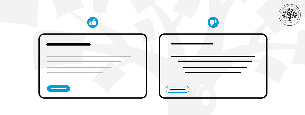
Incorporate Visual Hierarchy
Use size, color, and placement to establish a clear visual hierarchy that guides users to the most important elements and actions on the page.
This video explains the concept of visual hierarchy and how to use it:
ShowHide
video transcript
00:00:00 --> 00:00:31
Visual hierarchy refers to the arrangement or organization of elements within a design in a way that guides the viewer's eye through the content in a specific order of importance. It's about creating a clear and logical structure that helps users navigate and understand the information presented. You can use size and scale, color and contrast typography, white space
00:00:31 --> 00:01:00
alignment, repetition, proximity, visual elements such as icons, images, textures and graphics and reading patterns. By using these principles effectively, Designers can guide the viewer's focus, ensuring that the most important elements are noticed first and create a more intuitive and engaging experience.
Collaborate
Designers must work closely with developers, content creators, and other stakeholders to ensure that design decisions are feasible and aligned with overall project goals. Collaboration can also bring new insights and ideas to the design process.
How does bad design affect a product's usability and accessibility?
Bad design significantly impacts usability and accessibility, which leads to a poor user experience. It introduces a steep learning curve, reduces efficiency, increases error rates, and lowers user satisfaction. This design flaw frustrates users and may deter them from using the product further. Additionally, neglecting accessibility standards excludes a significant segment of users with disabilities, limiting the product's reach and potentially leading to legal and ethical issues. Inadequate compatibility with assistive technologies further alienates users with specific needs, reducing the product's potential user base and success.
To address these challenges, designers must adopt a user-centered design approach that prioritizes understanding and meeting the diverse needs of all users, including those with disabilities. Following principles of good design and guidelines like the Web Content Accessibility Guidelines (WCAG) improves both usability and accessibility. Involving users with diverse abilities in the design and testing phases can uncover valuable insights, aiding in the creation of products that are functional and inclusive. By employing these practices, designers can overcome the drawbacks of bad design, creating experiences that are accessible and enjoyable for a wide and diverse audience.
Learn more about usability in this video:
[[1702]]
What role does user feedback play in identifying and correcting bad design?
User feedback plays a crucial role in identifying and correcting bad design by providing direct insights into how real users interact with and perceive a product. It highlights usability issues, confusing elements, and unmet needs that may not be evident to designers and developers. This feedback, whether gathered through usability testing, surveys, or user interviews, helps pinpoint specific areas where the design fails to meet user expectations or deviates from user-friendly principles. Armed with this information, design teams can make targeted adjustments to improve usability, enhance user satisfaction, and ensure the product aligns more closely with user requirements. Essentially, user feedback acts as a guiding light for refining and evolving the design to eliminate flaws and create a more intuitive and effective user experience
Learn more about how to get user feedback and why it's important in this video:
ShowHide
video transcript
00:00:00 --> 00:00:32
To create great user experiences. UX design teams use a five phase process: Empathize, define, ideate, prototype and test. In the empathize phase, teams explore the problem they're trying to solve with the product. User researchers conduct interviews with people affected by the problem and review existing knowledge of the issue. The stage is about knowing what needs to be solved and why.
00:00:32 --> 00:01:02
At the defined stage, user researchers turn their knowledge into a research plan and conduct more targeted tests. They'll learn more about their users and what they're currently doing to solve the problem. Then they'll put their findings into deliverables. Tools for the UX designers to reference when they start designing solutions. These include: user Journey Maps, to show how users try and solve the problem and present. Personas, which are details of typical users.
00:01:02 --> 00:01:32
Affinity Diagrams of what those users think, feel, see and do. And "How might we" statements that list the problem teams are trying to solve with the product. In the ideate phase, teams ensure everyone has a shared understanding of the problem. Someone will then lead a brainstorming session where the team will consider solutions for the first time. The team will come up with as many ideas as possible, even if they're silly sounding or impractical. Afterwards, they will evaluate the options and choose the most viable
00:01:32 --> 00:02:00
and effective solutions from those ideas. In the prototyping phase, the UX designers turn those design ideas into testable prototypes. These prototypes could be low fidelity, digital prototypes or even paper prototypes. The UX designers will do their best to make sure the product is intuitive to use and make multiple versions of those design ideas. In the test phase, researchers get participants to test the prototype and get feedback.
00:02:00 --> 00:02:31
From that they deliver usability test reports to the designers. Who then make new prototypes based on that feedback. products will get increasingly polished and refined with cycles of testing until a final design is settled on. Then the design will be developed and shipped. You think it's all over here, but not quite. Product development is cyclical and non-linear. The product can still be revamped based on real user feedback, and in that revamp you may repeat some or all of the design phases.
00:02:31 --> 00:02:36
New information could even set development right back to the planning stage once again.
What impact does bad design have on a brand's image and customer loyalty?
Bad design negatively affects a brand's image and customer loyalty through user frustration, confusion, and dissatisfaction, which can erode trust and suggest a lack of attention to user experience. This not only damages the brand's reputation through negative word-of-mouth but also impacts repeat business as customers are driven to seek alternatives with more intuitive and satisfying experiences. In a competitive market, the importance of good design extends beyond aesthetics, playing a critical role in fostering positive user interactions, trust, satisfaction, and ultimately, loyalty towards the brand, underscoring its significance for long-term success.
What are some well-regarded books on the topic of bad design?
Some well-regarded books are:
Shariat, J., & Savard Saucier, C. (2017). Tragic Design: The Impact of Bad Product Design and How to Fix It (1st ed.). O'Reilly Media.
Norman, D. (2013). The Design of Everyday Things (Illustrated ed.). Basic Books.
How can designers learn from bad design examples?
Designers learn from bad design examples by analyzing their ineffectiveness and user frustration causes. They identify specific design elements that hinder usability, such as unclear navigation, inconsistent layouts, or the absence of accessibility features. Through this analysis, designers appreciate user-centered design principles more and understand the impact of their decisions on the user experience. Examining bad designs also develops their critical thinking and problem-solving skills, prompting them to propose better alternatives. This process reinforces best practices knowledge and helps them avoid similar mistakes. Ultimately, bad design examples serve as valuable educational tools, guiding designers to create intuitive, effective, and user-friendly products.
What is the role of testing to prevent bad design?
Testing prevents bad design with a systematic approach to evaluation. Testing evaluates usability, functionality, and user satisfaction before a product is finalized. Through various testing methods, designers and developers can identify and address issues that could lead to poor user experiences. Usability testing, for example, allows teams to observe real users interacting with the product, uncovering problems with navigation, comprehension, or task completion. Performance testing ensures the product functions smoothly under different conditions, while accessibility testing verifies that it serves a broad audience, including users with disabilities. By incorporating user feedback and data from these tests, teams can make informed revisions, enhancing the product's overall quality and avoiding design decisions that detract from the user experience. Testing, therefore, serves as a critical feedback loop in the design process, ensuring that the final product meets user needs and expectations effectively.
How can the collaboration between designers and developers prevent bad design?
The collaboration between designers and developers can prevent bad design by ensuring that both the visual and functional aspects of a product are well-integrated and user-centered from the start. Through effective communication, designers can convey their vision and user experience goals clearly, while developers can provide insights into technical feasibility and constraints. Regular collaboration sessions allow for the exchange of ideas, enabling both parties to find innovative solutions that balance aesthetics with functionality. This teamwork facilitates early identification and resolution of potential design and usability issues, reducing the risk of rework and ensuring a smoother development process. By working closely together, designers and developers can create products that not only look good but also perform seamlessly, enhancing the overall user experience and preventing bad design outcomes.
What measures can organizations take to foster a culture that prevents bad design?
Organizations can foster a culture that prevents bad design by implementing several measures:
Promote user-centered design: Encourage the adoption of user-centered design principles across all projects, emphasizing the importance of understanding and addressing user needs.
Encourage collaboration: Facilitate regular collaboration between designers, developers, and other stakeholders to ensure a holistic approach to product development.
Invest in continuous learning: Provide resources and opportunities for continuous learning, including workshops, conferences, and access to industry literature, to keep teams updated on best practices and emerging trends.
Implement regular testing: Integrate usability testing and user feedback into the design process, using insights gained to inform design decisions and improvements.
Celebrate good design: Recognize and celebrate examples of good design within the organization, reinforcing the value of design excellence.
Foster an open feedback culture: Create an environment where constructive feedback is encouraged and valued, enabling teams to learn from successes and mistakes.
If you’ve heard the term user experience design and been overwhelmed by all the jargon, then you’re not alone. In fact, most practicing UX designers struggle to explain what they do!
“[User experience] is used by people to say, ‘I’m a user experience designer, I design websites,’ or ‘I design apps.’ […] and they think the experience is that simple device, the website, or the app, or who knows what. No! It’s everything — it’s the way you experience the world, it’s the way you experience your life, it’s the way you experience the service. Or, yeah, an app or a computer system. But it’s a system that’s everything.”
— Don Norman, pioneer and inventor of the term “user experience,” in an interview with NNGroup
As indicated by Don Norman, User Experience is an umbrella term that covers several areas. When you work with user experience, it’s crucial to understand what those areas are so that you know how best to apply the tools available to you.
In this course, you will gain an introduction to the breadth of UX design and understand why it matters. You’ll also learn the roles and responsibilities of a UX designer, how to confidently talk about UX and practical methods that you can apply to your work immediately.
You will learn to identify the overlaps and differences between different fields and adapt your existing skills to UX design. Once you understand the lay of the land, you’ll be able to chart your journey into a career in UX design. You’ll hear from practicing UX designers from within the IxDF community — people who come from diverse backgrounds, have taught themselves design, learned on the job, and are enjoying successful careers.
If you are new to the Interaction Design Foundation, this course is a great place to start because it brings together materials from many of our other courses. This provides you with both an excellent introduction to user experience and a preview of the courses we have to offer to help you develop your future career. After each lesson, we will introduce you to the courses you can take if a specific topic has caught your attention. That way, you’ll find it easy to continue your learning journey.
In the first lesson, you’ll learn what user experience design is and what a UX designer does. You’ll also learn about the importance of portfolios and what hiring managers look for in them.
In the second lesson, you’ll learn how to think like a UX designer. This lesson also introduces you to the very first exercise for you to dip your toes into the cool waters of user experience.
In the third and the fourth lessons, you’ll learn about the most common UX design tools and methods. You’ll also practice each of the methods through tailor-made exercises that walk you through the different stages of the design process.
In the final lesson, you’ll step outside the classroom and into the real world. You’ll understand the role of a UX designer within an organization and what it takes to overcome common challenges at the workplace. You’ll also learn how to leverage your existing skills to successfully transition to and thrive in a new career in UX.
You’ll be taught by some of the world’s leading experts. The experts we’ve handpicked for you are:
Alan Dix, Director of the Computational Foundry at Swansea University, author of Statistics for HCI: Making Sense of Quantitative Data
Ann Blandford, Professor of Human-Computer Interaction at University College London
Frank Spillers, Service Designer, Founder and CEO of Experience Dynamics
Laura Klein, Product Management Expert, Principal at Users Know, Author of Build Better Products and UX for Lean Startups
Michal Malewicz, Designer and Creative Director / CEO of Hype4 Mobile
Mike Rohde, Experience and Interface Designer, Author of The Sketchnote Handbook: The Illustrated Guide to Visual Note Taking
Szymon Adamiak, Software Engineer and Co-founder of Hype4 Mobile
William Hudson, User Experience Strategist and Founder of Syntagm
Throughout the course, we’ll supply you with lots of templates and step-by-step guides so you can start applying what you learn in your everyday practice.
You’ll find a series of exercises that will help you get hands-on experience with the methods you learn. Whether you’re a newcomer to design considering a career switch, an experienced practitioner looking to brush up on the basics, or work closely with designers and are curious to know what your colleagues are up to, you will benefit from the learning materials and practical exercises in this course.
You can also learn with your fellow course-takers and use the discussion forums to get feedback and inspire other people who are learning alongside you. You and your fellow course-takers have a huge knowledge and experience base between you, so we think you should take advantage of it whenever possible.
You earn a verifiable and industry-trusted Course Certificate once you’ve completed the course. You can highlight it on your resume, LinkedIn profile or website.
Design plays a role that’s utterly crucial in our daily lives—it bridges functionality with aesthetics to meet user need
477 shares
10 mths ago
Open Access—Link to us!
We believe in Open Access and the democratization of knowledge. Unfortunately, world-class educational materials such as this page are normally hidden behind paywalls or in expensive textbooks.