Your constantly-updated definition of Design Guidelines and
collection of videos and articles. Be a conversation starter: Share this page and inspire others!
885shares
What are Design Guidelines?
Design guidelines are sets of recommendations on how to apply design principles to provide a positive user experience. Designers use such guidelines to judge how to adopt principles such as intuitiveness, learnability, efficiency and consistency so they can create compelling designs and meet and exceed user needs.
ShowHide
video transcript
00:00:00 --> 00:00:34
Hello and welcome to this UX Daily video in which we'll be discovering a design pattern that is very useful when you're creating the page structure for your project – the *visual framework*. My name is Priscilla Esser, and I will be discussing the tricks of the trade from WordPress template developers and other seasoned interface designers. And I will show you how they create consistency in page layouts. One of the essential elements of creating the best results for visual frameworks is something called *visual hierarchy*.
00:00:34 --> 00:01:01
In this video, I will help you understand what visual hierarchy is and how to use that to create a proper visual framework. The visual framework is all about creating visual consistency throughout the user experience. To illustrate the importance of this consistency, just think about the simple task of finding your way back to the homepage of a website. We're all used to having the company logo in the top navigation bar to be the homepage link. Just have a look at this example from the Interaction Design Foundation website.
00:01:01 --> 00:01:32
But what if you designed a website with multiple pages that all have this link at another location? How would it impact your experience if the logo was placed in the *footer* of the website, for example? Probably not that positive, right? You would have to scan each page separately for visual cues that indicate this functionality, adding to your mental burden. The solution is creating a consistent visual framework for all pages of your website or application. It's a framework of visual elements, colors and typography that forms a basic layout.
00:01:32 --> 00:02:03
This layout gives you sufficient structure to create consistent pages. But it also offers enough flexibility to handle different content types. In this example, you can see how the two pages of the garden supply website are consistent in the placement of the logo, headers, menu items, and search boxes. At the same time, the pages differ in the type of content they provide. The page on the left is clearly intended to inspire people with a large image and top categories, whereas the page on the right is giving an overview of available products in the online store.
00:02:03 --> 00:02:34
Notice how the consistent elements of the visual framework seem to be more in the *background* but the content itself appears to be more in the *foreground*. This is what a good visual framework can do for your design. It can help let your content stand out and shine. A great example of a visual framework in practice is a WordPress theme. These themes allow you to add any content you desire to create your own website based on the chosen visual framework. As most people aren't designers, this is a great way of making sure a website has good consistency
00:02:34 --> 00:03:04
and visual appeal. But since you are a designer, we'll use this example to see how it's done. So, let's have a look at the WordPress theme we see in this example. The visual elements that have been predetermined by the theme developers are the header size, placement of menu items and search box. Also, the structure of the blog post has given us a three-column layout with white blocks on a grayish background. The typography is set, as is color use, the way images are shown, etc.
00:03:04 --> 00:03:32
Naturally, everyone wants to personalize their website, so most elements are customizable. However, the theme developers do present a good visual framework that you can take as a starting point. Now, if we have a further look at this example, we see that the theme developers have also provided alternative ways to present different types of content while keeping the visual framework intact. The screenshot here shows how a side menu bar can be combined with a wider content block for blog posts. The user does not get confused by this change
00:03:32 --> 00:04:01
as the visual framework ensures that the major elements can be found at the same place and the overall look and feel is consistent. To create a visual framework, these are the steps that you should take. First, determine what types of content you need to place on different pages of your interface and what tasks a user will most likely want to perform often. Then, based on type of content and task, determine what user interface design patterns will be present across all pages
00:04:01 --> 00:04:33
– for example, a top-left navigation bar, a search box, a list or a dropdown menu of categories. Next, you should organize all returning visual elements on the page and indicate where content should go. Think about what element should go into the header area – most important – what, if anything, could be made accessible in sidebar, and what is more suitable for a footer area. Also, depending on the types of content, determine if you want to use multiple columns or not. Ensure that content has sufficient space to attract attention. When all elements have found a place on your page, you can decide on a more detailed level what colors and
00:04:33 --> 00:05:04
fonts you want to use. This is where the framework becomes personalized to the brand or company you're designing for. You can have some fun here, but you can also use color and fonts to guide people in the right direction, as we will see in a few minutes when we dive into the topic of visual hierarchy. But let's first finish the topic of implementation of the visual framework. While you're taking the first couple of steps in creating this framework, it's very useful to make wireframes to position the various elements in a consistent layout.
00:05:04 --> 00:05:31
Without emphasizing the visual appeal of color and images at first, it's much easier to shuffle design elements such as blocks of content and other design patterns around to create a good overview and focus on usability. In wireframes, you simply create placeholders for pieces of content and visual elements. It's a great way to do some early user testing by creating a paper prototype or creating a clickable prototype with wireframing software such as Balsamiq.
00:05:31 --> 00:06:03
The example you see here is actually created in Balsamiq, but many other wireframing applications are available. Of course, you might just prefer the old-fashioned paper-and-pencil way to get the creative juices flowing, which is perfectly OK. After creating the wireframes in the first couple of steps of implementing a visual framework and focusing on more graphic design elements such as color and typography, you may want to consider creating a style guide to report the design decisions you made here. Style guides give all the visual elements and rules for implementing them. It increases the uniformity and consistency you're looking for with a visual framework,
00:06:03 --> 00:06:36
but enables future extensions of your framework by others. This way, you ensure that when a client will not hire you five years from now to add to the website you designed for them, your efforts will not have been in vain and the new additions will remain consistent with your original intentions. As you can see here, major companies like Yelp provide their style guide as a resource for designers, product managers and developers. It serves as a common language to create brand consistency and a good user experience.
00:06:36 --> 00:07:03
Now, the main problem with visual frameworks is that when the initial design isn't very good, it will continue to bite you in the behind throughout all of the pages. So, how do you get the initial framework just right? Let's start by deciding what we consider a good page layout. Here's what I think: First of all, a page should invite and enable the user to accomplish the task they want in a way that doesn't take too much effort. Secondly, it should allow the page owner to effectively communicate what they want
00:07:03 --> 00:07:31
whether it is who they are or what the latest addition to the collection is. So, there's two sides of the coin, but they both revolve around seeing what you need to see to achieve a goal. Let's take a look at an example of a page that *doesn't* use visual hierarchy to achieve these results. It's actually a newspaper page from many years ago. Notice how all visual elements seem to be *equally important*. This was very common back in the day. But now, we're used to having things displayed in a much more *supportive* way.
00:07:31 --> 00:08:01
Now, take this example. Here, some blocks of content instantly stand out to you and some seem to be more in the background. I imagine that if you're looking for a specific piece of information, this newspaper will help you do that much faster than the previous one. The designers of this page have played with visual elements to make some bits stand out more than others. Can you identify what design decisions they've made to achieve this? First, they've played with *size*.
00:08:01 --> 00:08:33
Take a moment to see all of the different sizes they used to create hierarchy in the content. They also used *color* to make some text stand out more than others. Do you see how they did that? Let's have a closer look at how this works in the next slide. Visual hierarchy is all about *setting priorities*. What do you want people to see first, while they're merely glancing over your design? And then, when they *like* what they see, people will start *skimming*. This will make another level of the hierarchy stand out to them. This is often a bit smaller with less energizing colors or less contrast in the background
00:08:33 --> 00:09:01
like the second line of gray text you see in this image. Only when people *consciously* take the time to start reading the text will text that is thinner, smaller and less contrasted be noticed. Now, where it becomes fun for you as a designer is when you start playing with these visual elements to attract attention to the right places. Using an *anomaly* to the standard visual hierarchy of a page layout, like the bullet text in this example, will give you control over the users' path of attention. It really draws the eye of the user to this text.
00:09:01 --> 00:09:36
In this case, we say that the bold text has more *visual weight* than the regular text. Generally speaking, more visual weight attracts more attention when combined with less heavy elements. Let's have a look at some examples of visual frameworks to see if we can recognize how the designers have used visual hierarchy. Here, we're looking at a screenshot from the Dropbox website. Some visual hierarchy is achieved by making the heading bigger or bolder than the remaining text and by using blue as a contrast color. But all in all, I think this is rather a flat design without big differences in visual weight.
00:09:36 --> 00:10:00
When we turn to this example, which is comparable in that it shows a pricing scheme for cloud-based storage subscriptions, we see that a stronger visual hierarchy is used. The most popular pricing option stands out more, not just because it's labeled "most popular", but also because the most popular option seems to burst out of the visual structure that the others abide by. To achieve this, the designs have used brighter colors and they allow the best option to take up more space in the layout of the page.
00:10:00 --> 00:10:30
And as you can see, they do this *consistently* as it's not just the boxed area at the top of the page but also the features description which seems to grow heavier for each step it takes. The previous examples were both based on visual frameworks that depend heavily on a white background and fairly minimalist text options. Here, we take a different turn and show you an example that uses many more images and colors to present the content. A visual framework is implemented with a top navigation bar, a large area to showcase highlighted talks
00:10:30 --> 00:11:02
and a row system with room for six talks per category. The visual hierarchy that is used to support this framework uses *size* – so, the biggest talk is perceived as the most important, especially since the title of this talk has the biggest font size – and *contrast*. The two other talks in the talk area really stand out from the background, making it look quite important as well. Since most users will visit this website to browse for interesting talks to watch and to get inspired, it's perfectly fine to have size and contrast *competing* with each other.
00:11:02 --> 00:11:33
When users would visit a website with a *single purpose*, you might want to combine size and contrast to give a certain element *all* of the visual weight. Now, let's analyze this example together. Which element is the highest in the visual hierarchy and what stands out to you first? In this case, it's a combination of contrast and color. The block of content on the top-left side has the most visual weight. So, what is then the element *lowest* in the hierarchy in the screenshot and what has the lowest visual weight is in that respect the absolute opposite of the heavy black-and-yellow box
00:11:33 --> 00:12:01
in my opinion is the category bar that says "Entertainment, Products, People, Fashion, Music" and so on. It has a small font size and is grey on a white background. It attracts the least attention. In this video, we had a look at a very powerful way to create consistency in your designs: the visual framework. We've seen that consistency helps users to find their way on a website or application and increases the usability. To create a good visual framework, you need to determine all of the elements that you need to place on the page and find the right location for them.
00:12:01 --> 00:12:32
You can start out by drawing wireframes that focus on the placement before continuing with the style guide, which also describes the colors and fonts that need to be used consistently. When a visual framework is well documented, it helps future designers to continue the look and feel in new pages or products. A good visual framework also takes into account the visual hierarchy of a page. By using colors and sizes, you can give certain elements on a page more visual weight than others – which makes them attract more attention and appear more important.
00:12:32 --> 00:12:45
The visual framework and visual hierarchy give you as a designer great input to play around and have some fun with visual elements while ensuring that you create high-quality designs.
Find out how design guidelines help us craft successful designs, and how to adapt them to suit the content in creative ways.
Design Guidelines – An Essential Bridge between Principle and Judgment
Over many years, cognitive psychologists provided the foundations of many design guidelines through findings from their studies. Still other design guidelines exist thanks simply to common sense. For example, users can tell when a webpage looks too busy the moment they see it. So, designers should also be able to tell, and understand why. Design guidelines fall into several groups, including these:
Design guidelines are rules of thumb for you to create work which never frustrates users. Likewise, you should also cater to users who have a wide range of disabilities. How you apply design guidelines also depends on the contexts of use, your design’s platform and the type of interaction users will have with it (e.g., voice-controlled).
Industry pioneers such as Don Norman and Jakob Nielsen identified areas which designers and developers should consider to design products that offer the best user experience. Here’s an example of how a designer might realize one of Jakob Nielsen’s ten design principles.
Design principle: Provide plain-language error messages to pinpoint problems and likely solutions.
Design Guideline: Write large-lettered, jargon-free text in web-safe font. Use short sentences and draw users’ attention to causes and remedies.
Design rule: Use 20-pt, black Georgia on lavender background (#e6e6fa Hex). Put instructions in bold.
Note the differences. The principles represent general points of direction. The guidelines reveal how to approach these. The rules are direct instructions. So, the designer approaches the design principles and then uses design guidelines to determine the design rules. Designers often apply design guidelines subjectively when they design products. One designer might interpret a guideline differently from another.
At the Interaction Design Foundation, we follow the design principle that we use recognition rather than recall. So, we have a design guideline to always show you where you are inside a course -so you don’t have to remember.
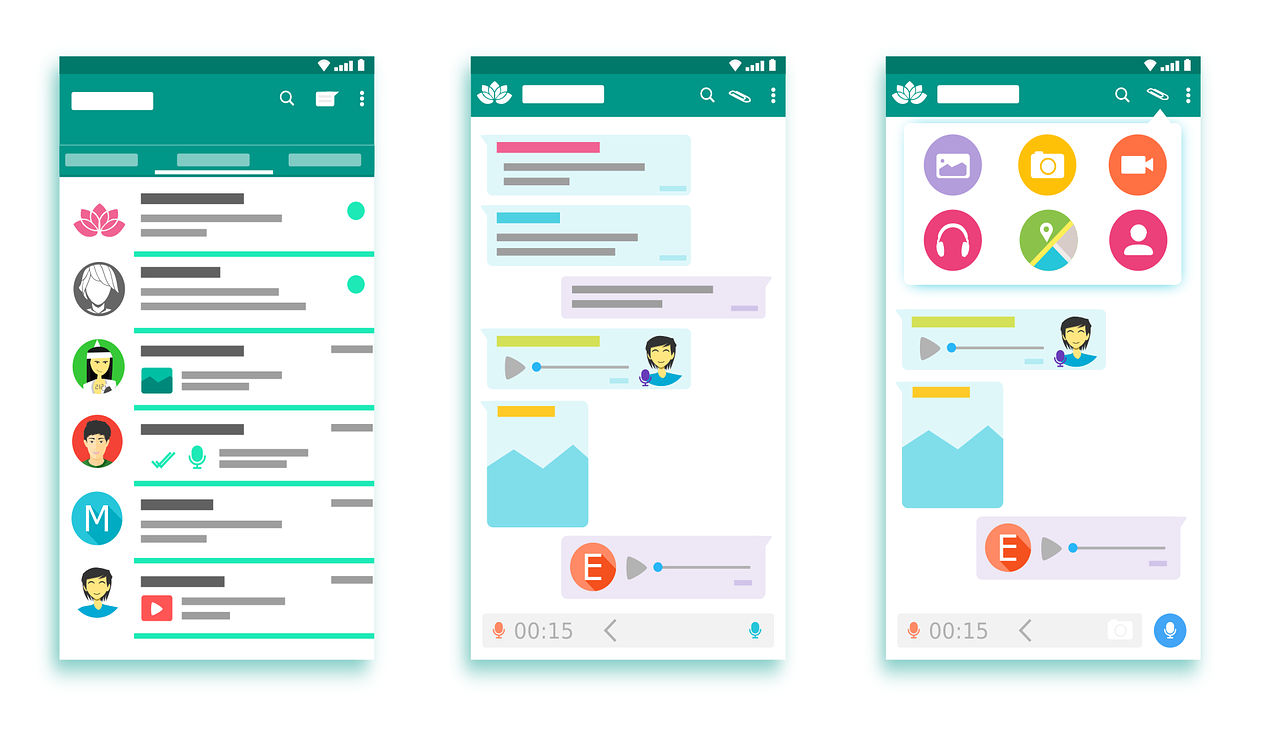
It’s vital to give users what’s most fit for purpose. Brands have various guidelines for designers to tailor dashboards to minimize cognitive load and maximize readability. Microsoft, Apple and Google are examples of companies that have exemplary standards (e.g., Google’s Material Design) for use in customization. Designers also have to accommodate users’ cultural considerations (e.g., color use and text direction). Moreover, when you design for mobile devices, you have to balance between brand consistency and maximal use of limited screen space. That’s why designers often use pictures or icons to represent information on mobile designs.
Author/Copyright holder: 200 Degrees. Copyright terms and licence: CCO.
Google’s Material Design is a good example of company specific design guidelines that relates both to branding and user experience.
In all cases, it’s best to apply design guidelines with care, where you balance user data and insights with brand directives to create designs that users find intuitive and pleasurable.
“Learn the rules like a pro, so you can break them like an artist.”
The rule of layout is a set of principles that guide the arrangement of visual elements in a design. These principles help designers create works that are visually appealing and easy to understand. There are several rules of layout, but some of the most common ones include:
The grid: Grids give order to graphic design. They speed up the design process by helping designers decide where content should be placed rather than where it could be placed.
Emphasis and scale: The eye generally needs a place to rest or something of interest to hold it. Otherwise, people will look at your design and quickly move on. You want to use scale and emphasis to communicate to the viewer.
Balance: Balance refers to the distribution of visual weight in a design. A well-balanced design feels stable and harmonious.
Rule of thirds: The rule of thirds divides an image into thirds both horizontally and vertically and then places the most critical elements of the image along those lines or at their intersections.
Rule of odds: The rule of odds suggests that an odd number of elements in a design is more visually appealing than an even number of elements.
These rules are not hard and fast, but they can be helpful starting points for designers looking to create effective layouts.
ShowHide
video transcript
00:00:00 --> 00:00:31
If you have spacings between elements, as you can see here, it's really good to have *the same space between similar types of elements*. So, if you're looking at it, if you remove the little red squares, you're going to instantly see that this all makes sense. But it's really easy to destroy this whole concept by just having random distances. And just those distances alone are something that makes or breaks a layout, because this is just looking a lot better.
00:00:31 --> 00:01:00
And this comes from something called the *red square method*, and you can look it up online on your own as well. This is something that I use quite a lot to talk about grids and layouts because I think that this is one of the easier ways for people to actually get a grasp on the layout part. But consistency in space is also important between similar elements. So, if you have two columns of text and a photo, it's really good to have them have the same spacing all the time.
00:01:00 --> 00:01:33
So, if it doesn't really jump all over the place, our brains are just going to be a lot happier about it. And what you can do to learn this better is to try and recreate some other designs by first *block-framing* them. And block-framing means adding just shapes on top of things. So, a font is a rectangle; a photo is like just a circle; a different photo or a title is another rectangle. And then try to *align just those rectangles* – not the fonts, not the photos, not the little icons – just the rectangles because
00:01:33 --> 00:02:00
that's going to give you the understanding of what you're really dealing with. And, as you can see, we're coming back to the whole thing that design is just about moving rectangles around. Once you learn that everything is a rectangle – well, or a circle, but generally is a simple shape and you have to position them well in space that they have the proper spacing from each other, proper distance, proper hierarchy, then it's going to be a lot easier to just switch it over to the actual images.
00:02:00 --> 00:02:18
This is something that is really important for the *hierarchy* and the *layout*. And if they are perfect, then people are going to forgive you for a lot. So, they're like the drum beat, basically, of your design if it was a song. If the drum beat is off, then everything just kind of falls apart.
Watch this video to learn more about the layout methods in detail.
What is the difference between design principles and guidelines?
Design principles provide general direction, while guidelines offer specific recommendations for implementing those principles. For instance, a principle may focus on legibility and readability. However, a guideline would specify using large, jargon-free text with short sentences and drawing attention to causes and solutions for effective communication. Combining these elements ensures that design decisions align with overall principles while offering actionable steps for implementation, fostering a cohesive and practical design approach. Principles serve as the guiding philosophy, outlining broad objectives, while guidelines provide a practical roadmap for achieving those objectives. The relationship between these elements is pivotal for every designer to understand and implement them.
ShowHide
video transcript
00:00:00 --> 00:00:39
Let's look at the mobile UX design checklist. This is a checklist that you want to internalize and keep in your head as you're designing. First of all is – are you making sure that your controls are *consistent*, to the operating system and to the application that you're developing? The second one is *proximity* – that closeness of items mean that those items are in relationship. So, the grouping, for example, like that means that these items are the same and the pattern there
00:00:39 --> 00:01:00
is the 'OK / Cancel', for example. The third one is *visual hierarchy*. So, visual hierarchy is a concept from graphic design that says put the most important thing at the top and bring it down to the bottom. Generally, visual hierarchy is a reminder to put the important tasks up front on your screens,
00:01:00 --> 00:01:33
and so the user doesn't have to navigate, doesn't have to play and look for them. And the fourth thing on the mobile UX design checklist is *contrast*. Contrast and emphasis – that's a graphic design issue. If you're using very light colors, if you're using light gray. I mean, go outside and test your design in the sun. Go out, go into a dark place and test your design – see what it looks like. Turn your brightness down. I've interviewed users who actually use their mobile phones with the brightness turned to the minimum – I could barely see the phone.
00:01:33 --> 00:02:02
And I said to this user, "Can you turn your brightness up?" because I was actually videotaping and trying to get the phone in. He said, "No, I normally keep it down there just to save battery." So, what does your design look like on a low lighting, you know, where the user has deliberately turned the lighting down? That's another thing to test and make sure that it works for the eye but works for the lighting situation. And then, the fifth one on the checklist is *intuitive icons*. To me, if icons are not intuitive, then there's a problem with them – they're not usable.
00:02:02 --> 00:02:33
So, when we say 'intuitive', it means no understanding – a user should look at an icon and know what it does. Otherwise, the icon maybe shouldn't be there; it shouldn't be used. That's my general rule of icon usability. And that applies to desktop as well. And then, finally, on our checklist – not to be missed – is *making the main task apparent*. That is huge and crucial – that's our task-oriented design approach. If you take one thing away from this checklist, it's that sixth element there
00:02:33 --> 00:03:03
as one of your most important ones. So, let's go through some examples of these, then – *the consistency of controls*. So, you see here in this example, you have all the options side by side there. The in-call screen is a good one in the sense that you have this action, it's occurring – you know – it's a live call,
00:03:03 --> 00:03:31
so how do you present and display the information? And these guys have decided to go with consistency – all the controls and the icons are the same size and the same positioning. That does make it easier to see. But it's not necessarily the right answer from a layout perspective. You could exaggerate one of those items, for example. Conference calls doesn't have the same priority as mute does for me.
00:03:31 --> 00:04:02
To me, I'm muting more than I'm conferencing, for example. So, we can see some 'at a glance' data and call to actions as well in this example. So, the second one on the checklist is *proximity of controls*. You'll see proximity being used here. This is an iPad app – it's an EMR system, Electronic Medical Record. And the proximity we're seeing here is that
00:04:02 --> 00:04:32
the grouping of that clinical information as buttons is all together, the vitals at the top and the patient history down at the bottom. You also have use of the left channel. Notice the left channel. Those buttons are huge because they're used when the patient is being interviewed, so the physician or the nurse needs to tap those very quickly and enter that data as part of the intake so they can get on with the exam.
00:04:32 --> 00:05:02
Here are some different examples of visual hierarchy at use. You have the Yelp app on the left. And notice the the reviews, really important, at the top, right, so you can see the name of the – I think it's a pub, and the reviews, and then more information further down the page. The second app is from Open Table. Again, content first, so the name of the location and then the call to action is actually further down the page,
00:05:02 --> 00:05:31
from the perspective of being able to easily tap those in that tappable area. And, of course, on the third example we've got the task up front and the main important things – prices and performance being one of the key tasks. It's like right there. Some other features further down is they've decided to go with a strict visual hierarchy: the important stuff at the top and then further down. So, our fourth item on the checklist is *using colors for emphasis*.
00:05:31 --> 00:06:00
So, remember we talked about making navigation *pop*. So, you see some examples here of – the Fandango app is where you can see you're looking at the 'in theaters', and the other one here, the other app, you can see that you're on 'what's popular'. Even though the contrast is a little light there, the color is still highlighted nicely in the icon at the bottom on all three of these apps, so that at a glance you can tell where you are, what you're looking at,
00:06:00 --> 00:06:34
and be able to pivot from there. So, our fifth one is *intuitive icons*. Some examples here: GasBuddy is one of my favorite ones because it's task-oriented and the icon is actually used as the starting point. So, 'find gas stations near me', which is almost what you would say to Siri on an iPhone as well. So, that's a nice clever interlink between the app and the command, the way you think about it linguistically, but notice it's like very clear: the icons are not overdone.
00:06:34 --> 00:07:00
All these examples have really nice clean icons. The second screen is when you go into GasBuddy – that's a list of results. And then the gas stations that appear again with a nice visual intuitive icon there. And then, finally, *make the task apparent*. And so, making the task apparent is – the challenge there is that you don't want navigation, so you want to keep the user focused
00:07:00 --> 00:07:25
on the *content*, you want to keep them focused on the *flow* of their experience. And this is a case where a pie menu can be very helpful or those contextual menus to know what the task is. A pie menu, by the way, is a left-click item, so it's not a right-click – it's a left, a left tap, if you will. And it brings up your options, your task options on a wheel and allows the user to navigate.
Refer to this video to understand more about design principles.
Where to learn more about good design?
In online education, there are many ways to educate yourself about design. You can explore courses like IxDFs' visual design course to learn more about good design. Witness the designs in action and delve into code-level examples. Additionally, broaden your knowledge by reading firsthand accounts from seasoned designers. This will help gain insights into how they apply and leverage good design principles in their projects. Engage with design communities and forums, where discussions and shared experiences contribute to a rich learning environment. Staying updated on industry trends through design blogs and podcasts and attending design conferences further fuels your understanding of good design. This will foster a continuous learning journey in the dynamic and evolving field of UX design.
Where to learn more about design guidelines?
You can enhance your understanding of design guidelines with courses from the Interaction Design Foundation. Explore design guidelines from industry experts like Don Norman and more on multiple topics. Discover various brand guidelines to deepen your knowledge and apply these principles effectively in your designs. Continuous interaction with online design communities, participating in design challenges, and seeking mentorship from experienced designers further enrich your understanding of design guidelines. This will also provide practical insights and networking opportunities. A culmination of the above will contribute to your growth as a skilled and informed designer. One of the popular courses offered by IxDF is UI Design Patterns for Successful Software. Besides these courses, you can also check Amazon's guidelines on UX design and a big repository of user interface platform guidelines.
What are the 7 rules of UX design?
1. Visibility: The design should make it easy to see possible actions and how to perform them.
2. Feedback: The design should provide feedback to the user about what actions have been performed, what results have been accomplished, and what state the system is in.
3. Constraints: The design should use constraints to prevent users from taking actions that are not allowed or that would lead to errors.
4. Mapping: The design should use natural mappings between the controls and their actions, the system state, and the user's expectations.
5. Consistency: The design should be consistent with user expectations and other products in the same category.
6. Affordance: The design should clarify possible actions and how to perform them.
7. Simplicity: The design should be simple and easy to understand, with unnecessary complexity removed.
(From Don Norman's Design of Everyday Things)
ShowHide
video transcript
00:00:00 --> 00:00:32
Design is arguably *the* defining human endeavor that separates us from all other species. Take a look around you right now and you'll notice that *everything* has been designed – from how you sleep to how you eat and to how you communicate; everything around you has been designed by someone. In other words, user experience design, or UX design, is *everywhere* – from how you interact with your smartphone to how your home is designed. Of course, not all experiences are *well designed*. And that's why UX design is such an incredibly exciting and rewarding field to be in.
00:00:32 --> 00:01:00
We can trace UX design all the way back to the ancient Romans. They developed theories of aesthetics to construct amazing buildings that have stood the test of time. Vitruvius, a renowned Roman architect who wrote the first-ever book on architecture, asserted that good design must have the qualities of *durability*, *usefulness* and *aesthetics*. These qualities are *as* important to UX design today as they were millennia ago.
00:01:00 --> 00:01:31
From the early 1970s to '80s, UX design was known as "human-computer interaction", or *HCI*. HCI rose to prominence just as personal computers became mainstream, and that was not a coincidence. You see, before the 1970s computers were just large machines that were operated by punching lines of code. So, for most people, computers were really, really hard to use. But in the 1970s, Xerox PARC introduced the first personal computer. And it was not only small, but it utilized the first *graphical user interface*.
00:01:31 --> 00:02:03
Instead of lines of code, you used Windows icons and a mouse. And it started a revolution! Soon, companies like Apple and Microsoft were heavily borrowing from the Alto to create their own personal computers. This explosion of personal computing in the 1970s and 1980s led people to ask questions like "How should people interact with computers?" and "How can we make that interaction as intuitive as when we interact with other humans?". As people started finding the answers to these questions, the field of human-computer interaction, or HCI, started to grow.
00:02:03 --> 00:02:34
Originally, HCI practitioners were mostly from fields such as cognitive psychology and computer science, and they were mostly focused on the concept of *usability*: how to make computers as intuitive as possible. As the field of HCI grew, designers quickly realized that designing intuitive computers required a greater understanding of other fields such as *motion graphics*, *storytelling* and *linguistics*. UX design today is really just a continuation of what was called *HCI* in the 1980s
00:02:34 --> 00:03:01
and *interaction design* in the 1990s. Today, we're dealing with a whole new set of products and services, the smartphone, virtual and augmented reality and artificial intelligence. But the questions we are asking as UX designers are *exactly the same*. It's still about "How can we make the experience of interacting with a computer, a smartphone, a product, a service as *intuitive*, *smooth* and *pleasant* as possible?".
00:03:01 --> 00:03:30
Don Norman, the prominent designer who coined the term "user experience", once said that *design is everything*. What he meant was that UX designers are not only concerned with the product *when* it is being used but also *before* the product has been purchased and *after* it has been used. Let's think about the smartphone, for example. As UX designers, we care not only about making the software easy to use;
00:03:30 --> 00:04:01
we also care about *designing the right marketing campaign*, about *creating a great unboxing experience*, as well as *making troubleshooting as painless as possible*. Of course, on top of that, we need to make sure that the product or service that you're offering actually addresses the need of the user in the first place. If not, you'll just be designing in a vacuum and no one will care how smooth or pleasant the experience is.
00:04:01 --> 00:04:31
This is why UX design has become such a huge umbrella term which encompasses many fields, including *visual design*, *usability*, *psychology*, *sociology* and *aesthetics*. If you're interested in the *questions* that UX designers ask and if you're excited about finding the *answers*, then we have some very good news for you! The first piece of good news is that because UX design is such a multidisciplinary field, the barriers of entry are very low. It doesn't matter where you come from or what you majored in;
00:04:31 --> 00:05:00
you'll always have something relevant to bring to the field of UX design. All you need is a constant drive for absorbing new knowledge and constantly improving yourself. The second piece of good news is that it's extremely challenging and rewarding to be a UX designer. There's an endless depth to the job, and you'll always be coming up with new possibilities and new solutions. And, finally, the great news is that you can start *right now*! You can start learning UX design *today*. At the Interaction Design Foundation, because we're a non-profit
00:05:00 --> 00:05:19
we're able to deliver online UX courses at an extremely high quality and at a surprisingly low price. You can also pick up a few books at your library, or you can read some articles online. The point is you can take action right now. You can start learning UX design, and then you can make the world into a better design place than when you found it.
Watch this video to learn more about UX design.
What is the format of a design statement?
A design statement is a comprehensive guide for crafting consistent, user-focused, visually appealing designs. It typically outlines design principles, associated guidelines, and rules for implementation. This structure of design rationale provides a framework for designers to curate products that align with user needs and aesthetic considerations. In UX, you need to understand the UX problem statement before working on the design statement. Incorporating case studies and user feedback into design statements enhances their effectiveness. The design statement also provides a robust framework for designers to articulate the intent and impact of their designs. Incorporating the design statement will include mapping out the users' pain points, highlighting the design's core issues, and suggesting probable solutions. This gives designers a basis to work and formulate their UX design.
How do you document design guidelines?
Design guidelines are documented by outlining principles, providing specific guidelines for their application, and detailing rules for implementation. This comprehensive documentation ensures that designers share a common understanding. This process also promotes consistency in design decisions, fostering team communication and collaboration. In addition to documentation, collaborative tools and real-world examples can also be used. This further enriches the understanding of design guidelines, providing practical insights for designers. These insights can then be effectively applied to their projects to deliver excellent, coherent, human-centric designs. Every budding designer is encouraged to adapt to the process of documenting design guidelines. This ensures a structure in their design process and will help highlight anomalies.
What are the key usability principles?
1. Simplicity: The design should be simple and intuitive.
2. Efficiency: After learning the design, users should be able to perform tasks quickly.
3. Satisfaction: The design should be pleasant, satisfying to use and meet users' expectations
4. Learnability: It should be easy for new users to navigate and use the interface.
5. Memorability: The design should be easy to remember, helping users to perform tasks with ease when they return.
6. Error Prevention: The design should prevent errors, and when they occur, provide clear ways to correct them.
7. Flexibility: The design needs to accommodate different user skills and preferences.
8. Visibility: The design should ensure all relevant options and functionality are easily accessible.
ShowHide
video transcript
00:00:00 --> 00:00:32
One of the early standards that mentioned usability was ISO 9241. And it talked about three crucial issues for user interfaces. One of them was *effectiveness* – does it do the right thing? Does it get things done that are important? The second was *efficiency* – does it do that with the minimum effort? The minimum mental effort?
00:00:32 --> 00:01:03
The minimum physical effort? Or is it taking extraneous effort that's unnecessary? And very often, people only quote those two because there was a third one as well, which is *satisfaction*: Does it make you feel good? Do you feel happy having used this system or used this piece of software? And so, that last one is often missed entirely. And that's all about the *emotion*, the way you feel.
00:01:03 --> 00:01:32
And it was often ignored, often missed in the past. What's now happened is that's become perhaps in some ways more important than the other two. Emotion is important because it's good to feel emotion. But also, *emotion affects the bottom line in business*. If your employees are happy, they tend to be more productive. So, if you're designing a production line or an office or wherever the environment,
00:01:32 --> 00:02:09
if you can have software and systems that make people feel good, they'll tend to work better. And certainly you want your customers to feel happy because they're the people who are usually going to buy your goods. So, if you've not made your customers happy, they don't buy anything. So, emotion is important to us as humans, but it's also important from a business point of view.
To understand the three crucial issues of usability, review this video.
What are examples of design criteria?
The key criteria or principles in interaction design include:
1. Goal-driven Design: Designing interfaces that help users achieve their goals efficiently and effectively.
2. Usability: The interface should be easy to use, understand, and learn.
3. Affordances & Signifiers: Affordances are the potential actions the user can take, and signifiers indicate where those actions should occur.
4. Learnability: Users should be able to quickly and intuitively learn how to use the interface.
5. Feedback & Response Time: The design should provide feedback so users know if an action was successful, and response time should be quick.
6. Consistency: Components and operations should be consistent to help users understand and learn the interface.
7. Errors: The design should anticipate potential errors, prevent them, and provide helpful guidance when mistakes occur.
8. Accessibility: The design should be usable by people of all abilities in different contexts.
Remember, good interaction design isn't just about creating a usable interface; it's about creating a user experience that is pleasant, efficient, and satisfying.
Earn a Gift, Answer a Short Quiz!
Question 1
Question 2
Question 3
Get Your Gift
Try Again! IxDF Cheers For You!
0 out of 3 questions answered correctly
Remember, the more you learn about design, the more you make yourself valuable.
If you’ve heard the term user experience design and been overwhelmed by all the jargon, then you’re not alone. In fact, most practicing UX designers struggle to explain what they do!
“[User experience] is used by people to say, ‘I’m a user experience designer, I design websites,’ or ‘I design apps.’ […] and they think the experience is that simple device, the website, or the app, or who knows what. No! It’s everything — it’s the way you experience the world, it’s the way you experience your life, it’s the way you experience the service. Or, yeah, an app or a computer system. But it’s a system that’s everything.”
— Don Norman, pioneer and inventor of the term “user experience,” in an interview with NNGroup
As indicated by Don Norman, User Experience is an umbrella term that covers several areas. When you work with user experience, it’s crucial to understand what those areas are so that you know how best to apply the tools available to you.
In this course, you will gain an introduction to the breadth of UX design and understand why it matters. You’ll also learn the roles and responsibilities of a UX designer, how to confidently talk about UX and practical methods that you can apply to your work immediately.
You will learn to identify the overlaps and differences between different fields and adapt your existing skills to UX design. Once you understand the lay of the land, you’ll be able to chart your journey into a career in UX design. You’ll hear from practicing UX designers from within the IxDF community — people who come from diverse backgrounds, have taught themselves design, learned on the job, and are enjoying successful careers.
If you are new to the Interaction Design Foundation, this course is a great place to start because it brings together materials from many of our other courses. This provides you with both an excellent introduction to user experience and a preview of the courses we have to offer to help you develop your future career. After each lesson, we will introduce you to the courses you can take if a specific topic has caught your attention. That way, you’ll find it easy to continue your learning journey.
In the first lesson, you’ll learn what user experience design is and what a UX designer does. You’ll also learn about the importance of portfolios and what hiring managers look for in them.
In the second lesson, you’ll learn how to think like a UX designer. This lesson also introduces you to the very first exercise for you to dip your toes into the cool waters of user experience.
In the third and the fourth lessons, you’ll learn about the most common UX design tools and methods. You’ll also practice each of the methods through tailor-made exercises that walk you through the different stages of the design process.
In the final lesson, you’ll step outside the classroom and into the real world. You’ll understand the role of a UX designer within an organization and what it takes to overcome common challenges at the workplace. You’ll also learn how to leverage your existing skills to successfully transition to and thrive in a new career in UX.
You’ll be taught by some of the world’s leading experts. The experts we’ve handpicked for you are:
Alan Dix, Director of the Computational Foundry at Swansea University, author of Statistics for HCI: Making Sense of Quantitative Data
Ann Blandford, Professor of Human-Computer Interaction at University College London
Frank Spillers, Service Designer, Founder and CEO of Experience Dynamics
Laura Klein, Product Management Expert, Principal at Users Know, Author of Build Better Products and UX for Lean Startups
Michal Malewicz, Designer and Creative Director / CEO of Hype4 Mobile
Mike Rohde, Experience and Interface Designer, Author of The Sketchnote Handbook: The Illustrated Guide to Visual Note Taking
Szymon Adamiak, Software Engineer and Co-founder of Hype4 Mobile
William Hudson, User Experience Strategist and Founder of Syntagm
Throughout the course, we’ll supply you with lots of templates and step-by-step guides so you can start applying what you learn in your everyday practice.
You’ll find a series of exercises that will help you get hands-on experience with the methods you learn. Whether you’re a newcomer to design considering a career switch, an experienced practitioner looking to brush up on the basics, or work closely with designers and are curious to know what your colleagues are up to, you will benefit from the learning materials and practical exercises in this course.
You can also learn with your fellow course-takers and use the discussion forums to get feedback and inspire other people who are learning alongside you. You and your fellow course-takers have a huge knowledge and experience base between you, so we think you should take advantage of it whenever possible.
You earn a verifiable and industry-trusted Course Certificate once you’ve completed the course. You can highlight it on your resume, LinkedIn profile or website.
The persona method has developed from being a method for IT system development to being used in many other contexts, inc
Book chapter
Open Access—Link to us!
We believe in Open Access and the democratization of knowledge. Unfortunately, world-class educational materials such as this page are normally hidden behind paywalls or in expensive textbooks.


