The 5 Stages in the Design Thinking Process
- 2k shares
- 1 mth ago
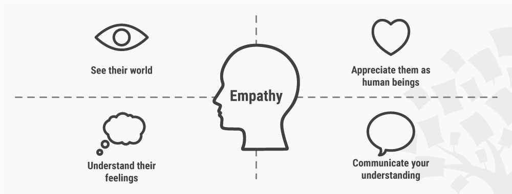
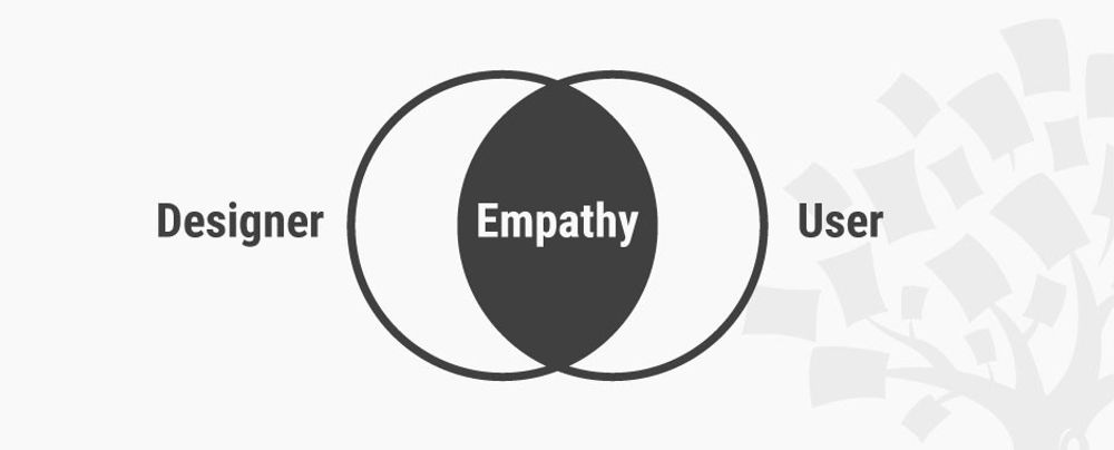
Empathy is the ability designers gain from research to understand users’ problems, needs and desires fully so that they can design the best solutions for users. Designers strive for empathy by deeply probing users’ worlds, to define their precise problems and then to ideate towards solutions that improve users’ lives.
“What makes us human is what is delightful.”
— Genevieve Bell, Anthropologist noted for cultural-practice-and-technological-development work
See why empathy is absolutely vital in design.
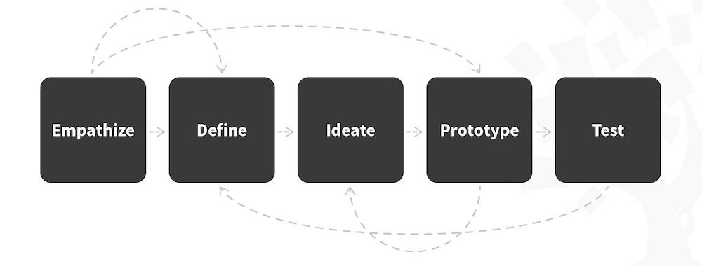
To understand your users/customers fully, you must see and feel their worlds from their perspective. And to access these core vantage points, you’ll first need the right research methods. You want to gather reliable information from which you can distill your users’ essences, as personas, to take forward in your design process. In user-centered design, user experience (UX) design and elsewhere, you need empathy. It even has a themed stage in the design thinking process: Empathize.
Your biggest challenge is to dig deep into your users’/customers’ subconscious; they can’t fully explain their precise needs. Designing for the human world is tricky, especially when users/customers access brands across many touchpoints and channels (e.g., online). In service design, ethnography is key to understanding their habits, motivations, pain points, values and whatever else influences what they think, feel, say and do on their user journeys. In ethnographic field studies, you observe what these users/customers do. Four methods are:
Shadowing – following users/customers around to get a day-in-the-life-of feel of what they experience.
Unstructured/Semi-structured Interviews – exploring hard-to-reach areas of their behavior in a naturalistic atmosphere, not systematically questioning them. This “hanging out” with them yields more honest, accurate insights. It’s usually better to conduct semi-structured interviews, strung loosely around an “areas-to-cover” framework in a discussion guide.
Diary Studies – letting users self-report. As with surveys, you rely on users to record things for you. Unlike surveys, diary studies help to capture “after-effects” over (typically) a 1-to-2-week period. Note: diary studies alone can’t reveal pain points effectively; they’re best combined with interviews.
Video Ethnography – video-recording enough material of participants in their environment as users/customers to gather insights about them.
It’s best to remain informal and open-minded.
Here’s what to consider for an ethnographic study where you directly observe users interacting with a service (e.g., booking short-stay accommodation):
Introduction – Thank them and briefly explain your research’s purpose.
Context – Look around and note your users’ surroundings.
Note/observe/ask – Encourage them to continue their activities as though you weren’t there, letting you observe and ask as few questions as possible. When you do ask questions, ensure they’re open-ended and encourage more observations (e.g., “How?”).
Touchpoints & Channels – Pay attention to the touchpoints and service channels your users interact with (e.g., paying for room/property bookings by phone).
Tools – Note which tools these customers use throughout their journey.
Familiarity with Domain/Task – Note how comfortable they are with the various tools and tasks they use/perform.
Service Artifacts – Pay attention to the artifacts that are important throughout the service experience between the customers’ various touchpoints:
Physical items
Cognitive constructs (e.g., the customer’s changing understanding of the steps involved)
Social or emotional elements (e.g., hunting for a lockbox in an unfamiliar street)
Disconnects – Notice these, which happen anytime customers experience a problem with the service (e.g., they can’t access the accommodation/property).
Needed ecosystem support – Watch for the points in the service where support from the backstage of the service is needed (e.g., the service-providing organization/agency must contact the landlord if the customer can’t).
Wrap-up – Thank them at the end of the session and answer any relevant questions they have.
For Semi-structured interviews, order and ask your questions properly, stringing them loosely in a discussion guide featuring the following types of questions:
Introductory – e.g., “What was it like the last time you…?”
Follow-up – on what they’ve just said.
Probing – ask them to give an example/explain something.
Specifying – if their descriptions are too general.
Direct – to introduce topics, etc.
Indirect – if you sense a direct question might lead the user, etc.
Structuring – to get back on-topic, etc.
Interpreting – to confirm you’ve understood the previous answer correctly.
Also, let silence help the user/customer give you honest, unpressured answers.
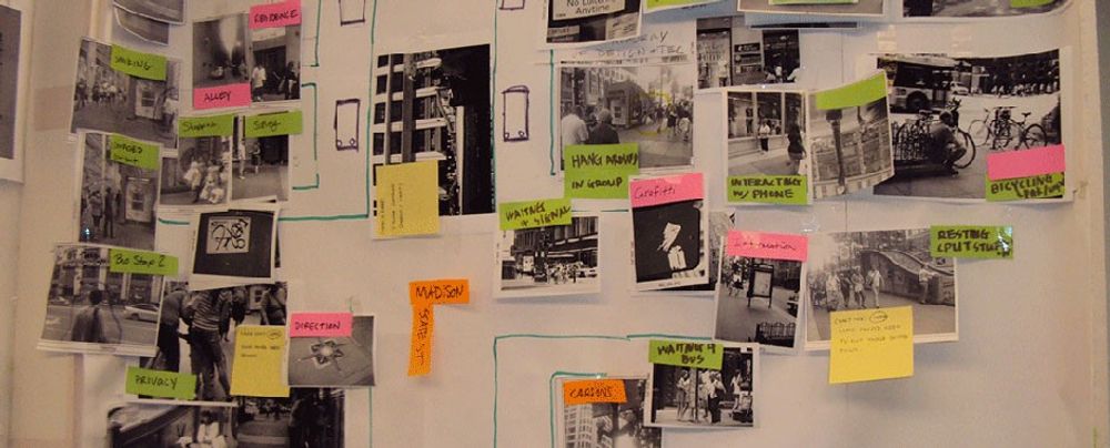
From your findings, you can now create personas, empathy maps and user journey maps (image below) / customer journey maps.
Tips
Service safaris are a great way to go into the field to see what users experience.
Brainstorming with your team can help reveal the right, open-ended questions to ask users.
Engage with extreme users – If you can find and interview users who face greater challenges, you’ll find the full scope of problems which all users can encounter.
Find effective analogies to draw parallels between users’ problems and problems in other fields, to find further insights.
Bodystorming – Wearing equipment gives you first-hand experience of what your users encounter in their environment (e.g., goggles to simulate vision problems).
Overall, remember: what users/customers do and what they say they do are two different things.
© Yu Siang and Interaction Design Foundation, CC BY-SA 3.0
Take our Service Design course.
Find invaluable insights into empathy here.
Here’s a deep-dive view of empathy.
UX designers apply empathy throughout the design process by stepping into the users' shoes at every stage—from research to testing. They start by actively listening to users during interviews and observing behavior during field studies. These early steps help designers understand users’ goals, pain points, and emotions.
Next, they create personas and empathy maps that capture the user’s mindset. This keeps the user’s voice front and center during ideation and wireframing. During prototyping, designers walk through user journeys to spot emotional friction points and smooth them out. Lastly, they test with real users, listen deeply to feedback, and revise designs based on lived experiences—not assumptions.
A great example is how IDEO’s human-centered design process begins with empathy, allowing them to redesign everything from hospital experiences to toothpaste packaging with emotional impact in mind.
Watch as Author and Human-Computer Interaction Expert, Professor Alan Dix explains important points about personas:
Personas are one of these things that gets used in very, very many ways during design. A persona is a rich description or description of a user. It's similar in some sense, to an example user, somebody that you're going to talk about. But it usually is not a particular person. And that's for sometimes reasons of confidentiality.
Sometimes it's you want to capture about something slightly more generic than the actual user you talked to, that in some ways represents the group, but is still particular enough that you can think about it. Typically, not one persona, you usually have several personas. We'll come back to that. You use this persona description, it's a description of the example user, in many ways during design. You can ask questions like "What would Betty think?"
You've got a persona called / about Betty, "what would Betty think" or "how would Betty feel about using this aspect of the system? Would Betty understand this? Would Betty be able to do this?" So we can ask questions by letting those personas seed our understanding, seed our imagination. Crucially, the details matter here. You want to make the persona real. So what we want to do is take this persona, an image of this example user, and to be able to ask those questions: will this user..., what will this user feel about
this feature? How will this user use this system in order to be able to answer those questions? It needs to seed your imagination well enough. It has to feel realistic enough to be able to do that. Just like when you read that book and you think, no, that person would never do that. You've understood them well enough that certain things they do feel out of character. You need to understand the character of your persona.
For different purposes actually, different levels of detail are useful. So I'm going to sort of start off with the least and go to the ones which I think are actually seeding that rich understanding. So at one level, you can just look at your demographics. You're going to design for warehouse managers, maybe. For a new system that goes into warehouses. So you look at the demographics, you might have looked at their age. It might be that on the whole that they're older. Because they're managers, the older end. So there's only a small number under 35. The majority
are over 35, about 50:50 between those who are in the sort of slightly more in the older group. So that's about 40 percent of them in the 35 to 50 age group, and about half of them are older than 50. So on the whole list, sort of towards the older end group. About two thirds are male, a third are female. Education wise, the vast majority have not got any sort of further education beyond school. About 57 percent we've got here are school.
We've got a certain number that have done basic college level education and a small percentage of warehouse managers have had a university education. That's some sense of things. These are invented, by the way, I should say, not real demographics. Did have children at home. The people, you might have got this from some big survey or from existing knowledge of the world, or by asking the employer that you're dealing with to give you the statistics. So perhaps about a third of them have got children at home, but two thirds of them haven't.
And what about disability? About three quarters of them have no disability whatsoever. About one quarter do. Actually, in society it's surprising. You might... if you think of disability in terms of major disability, perhaps having a missing limb or being completely blind or completely deaf. Then you start relatively small numbers. But if you include a wider range of disabilities, typically it gets bigger. And in fact can become
very, very large. If you include, for instance, using corrective vision with glasses, then actually these numbers will start to look quite small. Within this, in whatever definition they've used, they've got up to about 17 percent with the minor disability and about eight percent with a major disability. So far, so good. So now, can you design for a warehouse manager given this? Well,
you might start to fill in examples for yourself. So you might sort of almost like start to create the next stage. But it's hard. So let's look at a particular user profile. Again, this could be a real user, but let's imagine this as a typical user in a way. So here's Betty Wilcox. So she's here as a typical user. And in fact, actually, if you look at her, she's on the younger end. She's not necessarily the only one, you usually have several of these. And she's female as well. Notice only up to a third of our warehouse ones are female. So
she's not necessarily the center one. We'll come back to this in a moment, but she is an example user. One example user. This might have been based on somebody you've talked to, and then you're sort of abstracting in a way. So, Betty Wilcox. Thirty-seven, female, college education. She's got children at home, one's seven, one's 15. And she does have a minor disability, which is in her left hand. And it's there's slight problem in her left hand.
Can you design, can you ask, what would Betty think? You're probably doing a bit better at this now. You start to picture her a bit. And you've probably got almost like an image in your head as we talk about Betty. So it's getting better. So now let's go to a different one. You know, this is now Betty. Betty is 37 years old. She's been a warehouse manager for five years and worked for Simpkins Brothers Engineering for 12 years. She didn't go to university, but has studied in her evenings for a business diploma.
That was her college education. She has two children aged 15 and seven and does not like to work late. Presumably because we put it here, because of the children. But she did part of an introductory in-house computer course some years ago. But it was interrupted when she was promoted, and she can no longer afford to take the time. Her vision is perfect, but a left hand movement, remember from the description a moment ago, is slightly restricted because of an industrial accident three years ago.
She's enthusiastic about her work and is happy to delegate responsibility and to take suggestions from the staff. Actually, we're seeing somebody who is confident in her overall abilities, otherwise she wouldn't be somebody happy to take suggestions. If you're not competent, you don't. We sort of see that, we start to see a picture of her. However, she does feel threatened – simply, she is confident in general – but she does feel threatened by the introduction of yet another computer system. The third since she's been working at Simpkins Brothers. So now, when we think about that, do you have a better vision of Betty?
Do you feel you might be in a position to start talking about..."Yeah, if I design this sort of feature, is this something that's going to work with Betty? Or not"? By having a rich description, she becomes a person. Not just a set of demographics. But then you can start to think about the person, design for the person and use that rich human understanding you have in order to create a better design.
So it's an example of a user, as I said not necessarily a real one. You're going to use this as a surrogate and these details really, really matter. You want Betty to be real to you as a designer, real to your clients as you talk to them. Real to your fellow designers as you talk to them. To the developers around you, to different people. Crucially, though, I've already said this, there's not just one. You usually want several different personas because the users you deal with are all different.
You know, we're all different. And the user group – it's warehouse managers – it's quite a relatively narrow and constrained set of users, will all be different. Now, you can't have one persona for every user, but you can try and spread. You can look at the range of users. So now that demographics picture I gave, we actually said, what's their level of education? That's one way to look at that range. You can think of it as a broad range of users.
The obvious thing to do is to have the absolute average user. So you almost look for them: "What's the typical thing? Yes, okay." In my original demographics the majority have no college education, they were school educated only. We said that was your education one, two thirds of them male – I'd have gone for somebody else who was male. Go down the list, bang in the centre. Now it's useful to have that center one, but if that's the only person you deal with, you're not thinking about the range. But certainly you want people who in some sense
cover the range, that give you a sense of the different kinds of people. And hopefully also by having several, reminds you constantly that they are a range and have a different set of characteristics, that there are different people, not just a generic user.
Take our course Design Thinking: The Ultimate Guide.
In UX design, empathy and sympathy might seem similar, but they serve very different purposes. Empathy means feeling with the user—you understand their emotions because you mentally walk in their shoes. Sympathy, on the other hand, means feeling for someone—more like observing their struggle from a distance and feeling sorry for them.
Empathy drives better design because it helps designers connect with users on a deeper level. Instead of designing out of pity, designers solve real problems by seeing the world through the user’s lens. For instance, when designing for users with disabilities, empathy leads to inclusive features. Sympathy might just result in a sad acknowledgment with no real impact, and empathy is far better to bring on board to design for users of all ability levels.
The key takeaway is that sympathy can tend to create distance while empathy builds bridges. We can also look at compassionate empathy—or empathic concern—which is about truly understanding and sharing someone’s emotional experience and then being motivated to help or take supportive action with that understanding as the basis. That differs from sympathy as the latter generally refers to feeling pity or sorrow for what someone else is going through without fully sharing in their emotional state or not having the same drive to fix things so they’re not distressed.
Watch our video about empathy in design:
Do you know this feeling? You have a plane to catch. You arrive at the airport. Well in advance. But you still get stressed. Why is that? Designed with empathy. Bad design versus good design. Let's look into an example of bad design. We can learn from one small screen.
Yes, it's easy to get an overview of one screen, but look close. The screen only shows one out of three schools. That means that the passengers have to wait for up to 4 minutes to find out where to check in. The airport has many small screenings, but they all show the same small bits of information. This is all because of a lack of empathy. Now, let's empathize with all users airport passengers,
their overall need to reach their destination. Their goal? Catch their plane in time. Do they have lots of time when they have a plane to catch? Can they get a quick overview of their flights? Do they feel calm and relaxed while waiting for the information which is relevant to them? And by the way, do they all speak Italian? You guessed it, No. Okay. This may sound hilarious to you, but some designers
actually designed it. Galileo Galilei, because it is the main airport in Tuscany, Italy. They designed an airport where it's difficult to achieve the goal to catch your planes. And it's a stressful experience, isn't it? By default. Stressful to board a plane? No. As a designer, you can empathize with your users needs and the context they're in.
Empathize to understand which goals they want to achieve. Help them achieve them in the best way by using the insights you've gained through empathy. That means that you can help your users airport passengers fulfill their need to travel to their desired destination, obtain their goal to catch their plane on time. They have a lot of steps to go through in order to catch that plane. Design the experience so each step is as quick and smooth as possible
so the passengers stay all become calm and relaxed. The well, the designers did their job in Dubai International Airport, despite being the world's busiest airport. The passenger experience here is miles better than in Galileo Galilei. One big screen gives the passengers instant access to the information they need. Passengers can continue to check in right away. This process is fast and creates a calm experience,
well-organized queues help passengers stay calm and once. Let's see how poorly they designed queues. It's. Dubai airport is efficient and stress free. But can you, as a designer, make it fun and relaxing as well? Yes.
In cheerful airport in Amsterdam, the designers turned parts of the airport into a relaxing living room with sofas and big piano chairs. The designers help passengers attain a calm and happy feeling by adding elements from nature. They give kids the opportunity to play. Adults can get some revitalizing massage. You can go outside to enjoy a bit of real nature.
You can help create green energy while you walk out the door. Charge your mobile, buy your own human power while getting some exercise. Use empathy in your design process to see the world through other people's eyes. To see what they see, feel what they feel and experience things as they do. This is not only about airport design. You can use these insights when you design
apps, websites, services, household machines, or whatever you're designing. Interaction Design Foundation.
Enjoy our Master Class User Journey Mapping for Better UX with Kelly Jura, Vice-President, Brand & User Experience at ScreenPal.
Use an empathy map early in a UX project—ideally right after initial user research. This is when you’ve gathered interviews, observations, or surveys and need to make sense of the emotional and behavioral patterns behind user actions. Mapping what users think, feel, say, and do turns raw data into a shared understanding that teams can act on.
Empathy maps work best during the ideation phase. They help generate ideas rooted in real user needs and align stakeholders around those needs. They’re also useful before prototyping to validate that concepts address the emotional and cognitive realities of your users.
It’s wise to revisit empathy maps during usability testing to check if the design still resonates with the user perspective you uncovered early on.
Read our piece Empathy Map – Why and How to Use It for further insights.
To avoid bias while practicing empathy in UX research, start by becoming and staying aware of your own assumptions. Designers often project personal experiences onto users without realizing it. Combat this by asking open-ended questions and actively listening, not leading.
Use diverse user samples to avoid “sample bias”—designers who only interview users like themselves risk designing for a narrow audience. Furthermore, practice reflexivity: after each research session, reflect on how your own background might influence your interpretations.
Record and transcribe sessions to ensure team members hear users’ actual voices, not filtered impressions. And use tools like affinity diagrams to let patterns emerge from data, not preconceptions.
Watch as CEO of Experience Dynamics, Frank Spillers explains important points about designer bias:
For you, one of your biggest biases and issues as a designer if you're a visual designer or if you're working on a website or app that – you know – you're a stakeholder on the team, it's going to be the fact that you can actually see what's on a screen, assuming that you're not blind, that you're actually reviewing visual designs.
And the things that I found that are the biggest challenges for visual design are the *semantics*. So, words make sense when you look at them or descriptions are aided with a visual cue; you know – confirmation messages visually colored or it flashes up and there's something that gives you a visual cue there, error messages the same thing. So, these kind of semantics of – you know –
that you understood an error message or you understood something are one of the things we just get used to. And then we forget what it might be like if you don't have the visual crutch. So, this example here is a quiz, and this is where we saw this, when we were optimizing this quiz, that when we were looking at the accessibility of it, the problem with it – so we went through and we made it accessible, so you could
keyboard and tab through the the different choices – and then we tested it with a user. And we were like, oh – we totally didn't realize this. What was happening is that the correct answer was appearing to the left of the answer choice. And the problem was that when it announced the correct choice, even though it was accessible, it didn't say which one it was.
So, say Choice B was circled and then the correct answer was displayed over there, but it just didn't have this semantic of saying, "The correct answer is Choice B (blah blah blah blah blah)." So, very simple, but a good reminder of like, oh yeah – you know – reinforcing the fact that your visual bias adds context; that might not be there when it's read aloud or when it's navigated through an audible experience like a screen reader.
The second bucket for visual bias is the interaction; it's the little animations or little micro-interactions that are occurring on a screen are another source of – you know – it's like, "Well, I saw that, but a screen reader didn't." You know. So, being aware of that, as well as the third one, which is *place*. So, like the location on a screen or movement that occurs – some meaning from a state change.
Like a hover is a classic one – you hover on and off and it kind of tells you that it's a clickable element or it tells you that nothing's happening. Sometimes you click on stuff, play buttons or you click on elements on a screen that are loading like a button or something like that – nothing happens. And then you can kind of tell nothing's happening because if you have a little technical proficiency as a user, you can look down and see if the page is loading on your browser in the lower-left corner
or you can see that nothing happened – you push the button and nothing happens. Well, if you don't have that visual cue or if something is placed in an area of a screen that you have to kind of navigate back up to the top if you're using assistive technology, that's going to be a blocker. Right? So, visual bias I think is our worst enemy because we're so familiar with it, we're so used to it that we've forgotten that we are, so we have that crutch.
There's more than one bias, though. There's *mouse-heavy bias*. So, we've gotten used to the fact that we use mice all the time and as designers we require point and click a lot. So, it took me a while to realize how important this was. Many years ago when I was doing lots of usability – you know – kind of user studies and going out and talking to users, then when you're doing B2B studies (business-to-business studies), you usually run across
that one user who is the keyboard user, and it's like "I don't use the mouse." Like, this woman is using this very important software for the company and sometimes she's the only user. And she's going through and just because of the speed that she needs to input, it's keyboard-driven. Now, we found this with many types of applications like that, so designing for keyboard accessibility for the heavy input user is just something that you end up supporting.
It's one of these universal type of design approaches. And so, with accessibility, we're blocking users if we make things too mouse-dominant because then they're not able to use the keyboard. And without the keyboard, there's usually not a focus state related to that. So, we'll talk more about focus states just like we've been talking about since they're so important. Now, the other bias is the *color bias* – so we've talked about color blindness.
And for example, putting error messages only in red text. And if you recall the guideline there is to add a supporting element like another visual element to reinforce the color. Don't just use color alone basically. So, watch out for those three biases: *visual bias, color bias and mouse bias* because as a sighted designer or business person or developer you're probably
going to be biased by those things. Now, in the design phase, some of the very basic accessibility things you should be nipping in the bud, in other words, stopping them before the train goes down the track are things like *typography*, so the size of your font; designing and defining that up front or making sure that that's documented in a style guide is really important. If it's not, then that's where a developer needs to be familiar with accessibility so they can stop it
at their stage of coding or a front-end web developer who's putting together a style sheet that will call those styles. So, *color contrast* is the other big classic, and I think if there's one skill that any good designer – and I'm talking visual designer – needs to learn, it's *high contrast* because that seems to be the big one from the dozens of designers that I've worked with over the years. It seems like they give me designs all the time that are low contrast. It's the gray on gray, as I like to joke.
Then *link visibility and target size* is the other one. This is all up front. So, before you even get to thinking about accessibility, you should be thinking about that. And then *labeling or label proximity* – so how close the label is to the element that you're trying to get the call to action on. Once you have those basics, then you can add *predictability and consistent navigation*;
things like the focus, focusability, and then the blocks of content being separated and distinct from each other.
Enjoy our Master Class User Stories Don't Help Users: Introducing Persona Stories with William Hudson, User Experience Strategist and Founder of Syntagm Ltd.
To spot user pain points through empathy, start by deeply listening to users. Don’t just focus on what they say—watch what they do, how they react, and where they hesitate. Emotional cues like frustration, confusion, or hesitation often point to underlying pain points.
Use open-ended interviews to let users tell their stories. Ask questions like: “What’s the hardest part of using this product?” or “When was the last time you felt stuck?” Then, analyze responses with empathy maps or journey maps to pinpoint where emotions dip. Observation matters, too. During usability tests, note moments of struggle or workarounds—those signal design gaps. Look beyond surface feedback to understand the “why” behind user behavior.
Watch as Professor of Human-Computer Interaction (HCI) at University College London (UCL), Ann Blandford explains important points about user interviews:
So, semi-structured interviews – well, any interview, semi-structured or not, gets at people's perceptions, their values, their experiences as they see it, their explanations about why they do the things that they do, why they hold the attitudes that they do. And so, they're really good at getting at the *why* of what people do,
but not the *what* of what people do. That's much better addressed with *observations* or *combined methods* such as contextual inquiry where you both observe people working and also interview them, perhaps in an interleaved way about why they're doing the things that they're doing or getting them to explain more about how things work and what they're trying to achieve.
So, what are they *not* good for? Well, they're not good for the kinds of questions where people have difficulty recalling or where people might have some strong motivation for saying something that perhaps isn't accurate. I think of those two concerns, the first is probably the bigger in HCI
– that... where things are unremarkable, people are often *not aware* of what they do; they have a lot of *tacit knowledge*. If you ask somebody how long something took, what you'll get is their *subjective impression* of that, which probably bears very little relation to the actual time something took, for example. I certainly remember doing a set of interviews some years ago
where we were asking people about how they performed a task. And they told us that it was like a three- or four-step task. And then, when we got them to show us how they did it, it actually had about 20, 25 steps to it. And the rest of the steps they just completely took for granted; you know – they were: 'Of course we do that! Of course we—' – you know – 'Of course that's the way it works! Of course we have to turn it on!' And they just took that so much for granted that *it would never have come out in an interview*.
I mean, I literally can't imagine the interview that would really have got that full task sequence. And there are lots of things that people do or things that they assume that the interviewer knows about, that they just won't say and won't express at all. So, interviews are not good for those things; you really need to *observe* people to get that kind of data. So, it's good to be aware of what interviews are good for and also what they're less well-suited for. That's another good example of a kind of question that people are really bad at answering,
not because they're intentionally deceiving usually, but because we're *not* very good at *anticipating what we might do in the future*, or indeed our *attitudes to future products*, unless you can give somebody a very faithful kind of mock-up
and help them to really imagine the scenario in which they might use it. And then you might get slightly more reliable information. But that's not information I would ever really rely on, which is why *anticipating future product design is such a challenge* and interviewing isn't the best way of getting that information.
Enjoy our Master Class User Stories Don't Help Users: Introducing Persona Stories with William Hudson, User Experience Strategist and Founder of Syntagm Ltd.
To foster empathy in cross-functional design teams, create direct connections between team members and users. Bring engineers, product managers, and marketers into user interviews or usability tests—seeing user struggles firsthand creates a shared emotional anchor that unites the team around real needs.
Use tools like empathy maps or journey maps in workshops to translate user research into emotional insights that everyone can relate to. Encourage storytelling: have team members reflect on what resonated with them most from a user session.
Lead by example—when design leaders prioritize empathy, it becomes a cultural value. And celebrate moments where empathetic decisions led to better outcomes.
Companies like Atlassian and IDEO routinely integrate empathy into cross-functional collaboration, resulting in stronger alignment and more user-centered solutions.
Watch as UX Designer and Author of Build Better Products and UX for Lean Startups, Laura Klein explains important points about cross-functional collaboration:
Cross-functional teams, unlike silos, have all the people necessary to build a specific thing together. Let's look at an example. Imagine you're on a team that is supposed to build the onboarding flow for a new app that helps connect job applicants with jobs. You can't build the whole thing with just designers. Or with just engineers, for that matter. I mean, you probably could do it with just engineers, but it's a terrible idea.
A cross-functional team for this onboarding work might include a few engineers, perhaps some for the front end and some for the back end. Might include a designer, a researcher, a product owner or manager, maybe a content writer or a marketing person. In an ideal world, all of these folks would only work on this particular team. In the real world, where we actually live, sometimes folks are on a couple of different teams and some specialists may be brought in to consult. For example, if the team needed help from the legal department to explain some of the ramifications of a specific decision,
a cross-functional team would have a dedicated legal expert they could go to. But that legal expert might also work with lots of other teams. In agile environments, the cross-functional team generally sits together or if remote, has some sort of shared workspace. They all go to the required team meetings. They understand the goal of the team and the users. They're experts, or they soon become experts, on that onboarding flow. Contrast this to how it might be done in a siloed environment. In that case, you might have different people assigned to the team depending on need, which can seem really flexible.
Until you realize that you end up with five different designers working on the project all at different times and they all have to be brought up to speed and they don't really understand why the other designers made the decisions that they did. Same with the engineers. And do not get me started on legal. Silo teams tend to rely more on documentation that gets handed between groups. And this can lead to a waterfall project where project managers or product managers work on something for a while to create requirements, which they then hand off to designers who work on designs for a while
and then they pass the deliverables on to engineering, who immediately insists that none of this will work and demands to know why they weren't brought in earlier for consultation. You get it. By working in cross-functional teams instead, the people embedded on the project get comfortable with each other. They know how the team works and can make improvements to it. They come to deeply understand their particular users and their metrics. They actually bring engineering and even design and research into the decision making process early to avoid the scenario I described above.
Enjoy our Master Class User Journey Mapping for Better UX with Kelly Jura, Vice-President, Brand & User Experience at ScreenPal.
Kolko, J. (2014). Well-designed: How to Use Empathy to Create Products People Love. Harvard Business Review Press.
Jon Kolko’s Well-Designed presents a compelling case for embedding empathy into the heart of the product design process. Drawing on real-world examples and case studies, Kolko outlines how emotionally intelligent design fosters innovation and builds stronger connections between users and products. The book stresses that empathy is not just a soft skill, but a critical tool for identifying real user problems and designing meaningful solutions. Its blend of actionable frameworks and philosophical insights has made it a foundational read in UX and product design. The book’s influence is especially strong among design leaders and product teams aiming to humanize digital experiences.
Norman, D. A. (2004). Emotional design: Why We Love (or Hate) Everyday Things. Basic Books.
In Emotional Design, UX pioneer Don Norman reveals how emotions influence our interactions with everyday products. He presents a framework of three design levels—visceral, behavioral, and reflective—that shape user experience beyond mere usability. The book integrates cognitive science with product design, exploring why aesthetically pleasing or emotionally resonant products succeed. Norman uses real-life examples to show how emotion-rich design enhances satisfaction and loyalty. This influential work shifted the design world’s focus from function alone to the emotional resonance of objects. It remains foundational for UX designers, product developers, and innovators seeking to understand the psychological depth of user-product relationships.
Mattelmäki, T., & Battarbee, K. (2002). Empathy probes. Proceedings of the Participatory Design Conference 2002, 266–271.
In this influential paper, Mattelmäki and Battarbee introduce "empathy probes" as a method for designers to gain deep insights into users’ personal experiences and contexts. By providing participants with specially designed material packages—such as diaries, cameras, and postcards—users document aspects of their daily lives, emotions, and interactions. This approach enables designers to move beyond rational and practical considerations, fostering a more profound understanding of users’ subjective experiences. The study exemplifies how empathy probes can bridge the gap between designers and users, leading to more human-centered and contextually relevant design solutions. This method has since become a cornerstone in user-centered design practices, emphasizing the importance of empathy in the design process.
Leonard, D., & Rayport, J. F. (1997). Spark innovation through empathic design. Harvard Business Review, 75(6), 102–113.
In this seminal article, Leonard and Rayport introduce the concept of empathic design, emphasizing the importance of observing customers in their natural environments to uncover unarticulated needs and inspire innovation. They outline a five-step process—observation, capturing data, reflection and analysis, brainstorming for solutions, and developing prototypes—that enables companies to identify latent customer needs and redirect existing technological capabilities toward new business opportunities. This approach has been influential in shifting product development strategies from traditional market research to more immersive, user-centered methods, fostering a deeper understanding of customer experiences and driving innovative solutions.
Empathy plays a central role in UX design—it lets designers relate to the problems and experiences their users have. When designers empathize, they don’t just guess user needs; they understand them deeply. That understanding helps them create experiences that feel intuitive, useful, and human-centered.
Empathy drives designers to ground design decisions in real user behavior, not assumptions. For example, it helped Airbnb’s founders identify why hosts were struggling—poor photos—and led to a redesign of the listing process. It wasn’t a tech issue. It was a human one.
Designers can cultivate empathy by conducting user interviews, observing real-world behavior, and mapping emotional user journeys. Always design with the user—as in, seeing things from their perspective—not just for them as a target audience to sell something to.
Watch our video about empathy in design:
Do you know this feeling? You have a plane to catch. You arrive at the airport. Well in advance. But you still get stressed. Why is that? Designed with empathy. Bad design versus good design. Let's look into an example of bad design. We can learn from one small screen.
Yes, it's easy to get an overview of one screen, but look close. The screen only shows one out of three schools. That means that the passengers have to wait for up to 4 minutes to find out where to check in. The airport has many small screenings, but they all show the same small bits of information. This is all because of a lack of empathy. Now, let's empathize with all users airport passengers,
their overall need to reach their destination. Their goal? Catch their plane in time. Do they have lots of time when they have a plane to catch? Can they get a quick overview of their flights? Do they feel calm and relaxed while waiting for the information which is relevant to them? And by the way, do they all speak Italian? You guessed it, No. Okay. This may sound hilarious to you, but some designers
actually designed it. Galileo Galilei, because it is the main airport in Tuscany, Italy. They designed an airport where it's difficult to achieve the goal to catch your planes. And it's a stressful experience, isn't it? By default. Stressful to board a plane? No. As a designer, you can empathize with your users needs and the context they're in.
Empathize to understand which goals they want to achieve. Help them achieve them in the best way by using the insights you've gained through empathy. That means that you can help your users airport passengers fulfill their need to travel to their desired destination, obtain their goal to catch their plane on time. They have a lot of steps to go through in order to catch that plane. Design the experience so each step is as quick and smooth as possible
so the passengers stay all become calm and relaxed. The well, the designers did their job in Dubai International Airport, despite being the world's busiest airport. The passenger experience here is miles better than in Galileo Galilei. One big screen gives the passengers instant access to the information they need. Passengers can continue to check in right away. This process is fast and creates a calm experience,
well-organized queues help passengers stay calm and once. Let's see how poorly they designed queues. It's. Dubai airport is efficient and stress free. But can you, as a designer, make it fun and relaxing as well? Yes.
In cheerful airport in Amsterdam, the designers turned parts of the airport into a relaxing living room with sofas and big piano chairs. The designers help passengers attain a calm and happy feeling by adding elements from nature. They give kids the opportunity to play. Adults can get some revitalizing massage. You can go outside to enjoy a bit of real nature.
You can help create green energy while you walk out the door. Charge your mobile, buy your own human power while getting some exercise. Use empathy in your design process to see the world through other people's eyes. To see what they see, feel what they feel and experience things as they do. This is not only about airport design. You can use these insights when you design
apps, websites, services, household machines, or whatever you're designing. Interaction Design Foundation.
Enjoy our Master Class User Journey Mapping for Better UX with Kelly Jura, Vice-President, Brand & User Experience at ScreenPal.
UX designers use specific techniques to build empathy and truly understand user needs. One of the most powerful is user interviews—open-ended conversations that reveal goals, frustrations, and emotional triggers. Field studies and contextual inquiries go a step further by placing designers in users’ real environments to observe behavior firsthand.
Another effective technique is empathy mapping, where teams document what users think, feel, say, and do. This keeps user emotions at the center of the design process. Personas—fictitious representations of users based on real data—also help maintain a constant connection to user stories. And during journey mapping, designers visualize the user’s path and identify emotional highs and lows.
Watch as Professor of Human-Computer Interaction (HCI) at University College London (UCL), Ann Blandford explains important points about user interviews:
So, semi-structured interviews – well, any interview, semi-structured or not, gets at people's perceptions, their values, their experiences as they see it, their explanations about why they do the things that they do, why they hold the attitudes that they do. And so, they're really good at getting at the *why* of what people do,
but not the *what* of what people do. That's much better addressed with *observations* or *combined methods* such as contextual inquiry where you both observe people working and also interview them, perhaps in an interleaved way about why they're doing the things that they're doing or getting them to explain more about how things work and what they're trying to achieve.
So, what are they *not* good for? Well, they're not good for the kinds of questions where people have difficulty recalling or where people might have some strong motivation for saying something that perhaps isn't accurate. I think of those two concerns, the first is probably the bigger in HCI
– that... where things are unremarkable, people are often *not aware* of what they do; they have a lot of *tacit knowledge*. If you ask somebody how long something took, what you'll get is their *subjective impression* of that, which probably bears very little relation to the actual time something took, for example. I certainly remember doing a set of interviews some years ago
where we were asking people about how they performed a task. And they told us that it was like a three- or four-step task. And then, when we got them to show us how they did it, it actually had about 20, 25 steps to it. And the rest of the steps they just completely took for granted; you know – they were: 'Of course we do that! Of course we—' – you know – 'Of course that's the way it works! Of course we have to turn it on!' And they just took that so much for granted that *it would never have come out in an interview*.
I mean, I literally can't imagine the interview that would really have got that full task sequence. And there are lots of things that people do or things that they assume that the interviewer knows about, that they just won't say and won't express at all. So, interviews are not good for those things; you really need to *observe* people to get that kind of data. So, it's good to be aware of what interviews are good for and also what they're less well-suited for. That's another good example of a kind of question that people are really bad at answering,
not because they're intentionally deceiving usually, but because we're *not* very good at *anticipating what we might do in the future*, or indeed our *attitudes to future products*, unless you can give somebody a very faithful kind of mock-up
and help them to really imagine the scenario in which they might use it. And then you might get slightly more reliable information. But that's not information I would ever really rely on, which is why *anticipating future product design is such a challenge* and interviewing isn't the best way of getting that information.
Enjoy our Master Class User Stories Don't Help Users: Introducing Persona Stories with William Hudson, User Experience Strategist and Founder of Syntagm Ltd.
Remember, the more you learn about design, the more you make yourself valuable.
Improve your UX / UI Design skills and grow your career! Join IxDF now!
You earned your gift with a perfect score! Let us send it to you.
We've emailed your gift to name@email.com.
Improve your UX / UI Design skills and grow your career! Join IxDF now!
Here's the entire UX literature on Empathy in UX/UI Design by the Interaction Design Foundation, collated in one place:
Take a deep dive into Empathy with our course Service Design: How to Design Integrated Service Experiences .
Services are everywhere! When you get a new passport, order a pizza or make a reservation on AirBnB, you're engaging with services. How those services are designed is crucial to whether they provide a pleasant experience or an exasperating one. The experience of a service is essential to its success or failure no matter if your goal is to gain and retain customers for your app or to design an efficient waiting system for a doctor’s office.
In a service design process, you use an in-depth understanding of the business and its customers to ensure that all the touchpoints of your service are perfect and, just as importantly, that your organization can deliver a great service experience every time. It’s not just about designing the customer interactions; you also need to design the entire ecosystem surrounding those interactions.
In this course, you’ll learn how to go through a robust service design process and which methods to use at each step along the way. You’ll also learn how to create a service design culture in your organization and set up a service design team. We’ll provide you with lots of case studies to learn from as well as interviews with top designers in the field. For each practical method, you’ll get downloadable templates that guide you on how to use the methods in your own work.
This course contains a series of practical exercises that build on one another to create a complete service design project. The exercises are optional, but you’ll get invaluable hands-on experience with the methods you encounter in this course if you complete them, because they will teach you to take your first steps as a service designer. What’s equally important is that you can use your work as a case study for your portfolio to showcase your abilities to future employers! A portfolio is essential if you want to step into or move ahead in a career in service design.
Your primary instructor in the course is Frank Spillers. Frank is CXO of award-winning design agency Experience Dynamics and a service design expert who has consulted with companies all over the world. Much of the written learning material also comes from John Zimmerman and Jodi Forlizzi, both Professors in Human-Computer Interaction at Carnegie Mellon University and highly influential in establishing design research as we know it today.
You’ll earn a verifiable and industry-trusted Course Certificate once you complete the course. You can highlight it on your resume, CV, LinkedIn profile or on your website.





We believe in Open Access and the democratization of knowledge. Unfortunately, world-class educational materials such as this page are normally hidden behind paywalls or in expensive textbooks.
If you want this to change, , link to us, or join us to help us democratize design knowledge!
