Your constantly-updated definition of Logo Design and
collection of videos and articles. Be a conversation starter: Share this page and inspire others!
97shares
What is Logo Design?
Logo design is the art of creating a visual symbol that captures a brand’s identity and differentiates it. Designers create successful logos when they carefully mix typography, color theory and graphic elements to communicate each brand’s essence, values and personality to the marketplace and establish a strong visual presence that customers trust.
The Interaction Design Foundation’s logo—a tree with pages as leaves—embodies the brand’s mission that knowledge wants to be free.
It might be more appropriate to reverse the order of the terms in the question above to examine why user experience (UX) design is an important factor in a brand’s logo design. Like graphic design, logo design existed long before UX design. Logo creators have included design elements in graphic representations of what a business or artisan does or makes for centuries. The history of custom logo design extends back through graphic design and the industrialization of marketing in the 1800s to—arguably—primitive designs that represented the makers of products or services in the ancient world.
Amazon’s logo evolved to become the iconic arrow-like smile the world associates with quality, convenience and much more.
UX and user interface (UI) designers concern themselves with the creation and optimization of digital products such as websites and apps. A company logo may be a single or one-time creation—in comparison to a series of web pages, for example. However, it still calls for designers to approach it as a product to delight users with. As its purpose is to represent the brand across the many channels where users and potential customers will find it, it’s especially vital for designers to get the logo just right. The global market and popular psyche tend to embrace those brands with logos that are the most meaningful and relevant to the users and consumers who love them.
Logos are often combinations of a wordmark—such as the company’s name—with a graphic symbol or mark. So, a logo is a kind of trademark. Some company logo designs also bear symbols such as the trademark—™—or registered trademark, ®. A brand’s graphic logo design will typically feature their distinguishing mark, such as Apple’s apple with the bite mark. The other features to consider in the logo design of a company are typography and color choices. How the letters of the company name appear and the associated colors are essential ingredients to convey a brand’s message. To make logo design further relevant is to establish a context with the target audience. When designers gear their logo design ideas around a context or theme, they can access users and potential customers in a way that links the product to the setting. For example, a tree or leaf design in an app for gardening can deliver real-life authenticity to the users who will engage with it.
When they work for brands, designers apply design principles to create good logos. Design principles are fundamental pieces of advice that come from researchers and practitioners in design and related fields. When a design shows these principles at work within it, the proof is in its accessibility, usability and more.
CEO of Experience Dynamics, Frank Spillers explains design principles, in this case as they apply to mobile UX design:
ShowHide
video transcript
Transcript loading…
Since a logo is far more than an image, it’s a fundamental tool in branding. For instance, in the space of so many pixels on a smartphone screen, the best logo designs offer a vital point of perception for their target audiences. Casual users and more avid, loyal customers can instantly identify and draw associations with the brand.
The logo also stays in their memories as a key identifier of the brand. That’s why designers need to add visual elements that are appropriately captivating. Users will make snap judgments and decide within seconds if a brand can serve their needs best. So, logos need to speak to users and establish an emotional connection at lightning speed.
Author and Human-Computer Interaction Expert, Professor Alan Dix explains why emotion is a vital part of design:
ShowHide
video transcript
Transcript loading…
What are the Benefits of Good Logo Design?
As with good branding in UX design, an effective logo can bring numerous positive benefits to the organization it represents because it:
1. Boosts Brand Recognition
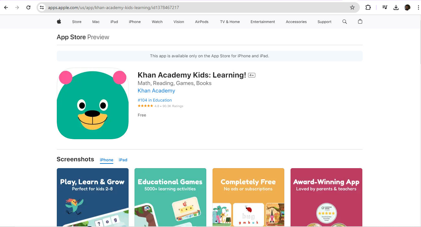
A well-designed logo is a visual cornerstone. Like a flag for a nation or organization, it carries symbolism that a brand wants the global marketplace to acknowledge, recognize, respect—and love. As a good logo is visually “catchy,” it will instantly tell users what they can expect from the brand, and how. For example, a learning app for children is likely to feature vibrant colors and elements as an appropriate way to distinguish its brand in the market.
Khan Academy Kids: Learning! App features a highly appropriate and recognizable icon.
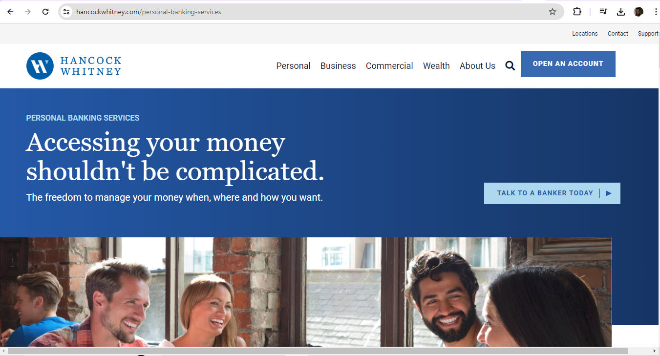
Logos are far more than symbols. They’re also vital ways to validate how professional a brand is. A consistent and professional logo gives consumers reassurance about the quality and reliability of the brand. That’s crucial for long-term business relationships. For example, a bank’s logo will need to instill a sense of security in users—that they can entrust their money to that brand. The challenge to create the perfect logo therefore demands design skills and logo ideas that thoroughly understand the expectations, needs, desires and concerns of users. When they design a logo, UX designers must show they have a firm grasp of these points—plus an eye for standard industry practices.
Hancock Whitney bank’s logo (top left) features blue and white, a color scheme that casts consistently across its website and fosters trust.
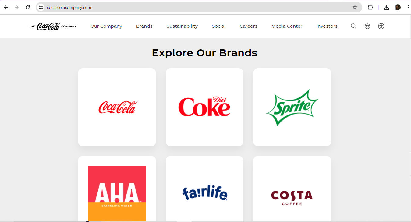
A memorable logo can bring out good feelings and trigger positive memories between users or customers and the brand. This emotional connection goes a long way to keeping customers on board with a brand. They’ll keep coming back to a brand that they find represented consistently across all platforms. For example, Coca-Cola—one of the world’s most visible brands—shows up across the globe with its iconic logo. For instance, a unique font overlying a distinct background in an instantly recognizable interplay of red and white signifies good times with the beverage for many, and good memories associated with it. When customers see this logo—appearing exactly as the brand intended—it’s a touchstone of their experience with the company.
Coca-Cola’s brands feature iconic looks, including typography and colors.
In UI and UX design, a logo is more than an aesthetic feature; it's a tool that aligns with the user's needs and improves how they interact with the brand. A well-crafted logo reflects the brand’s personality and makes it relevant and appealing. Users recognize the logo as a signifier of a good user experience. For example, brands that promote, measure and gamify health and fitness in their hardware—such as fitness trackers—and apps tend to echo the elements of well-being, motion and personal improvement in their logos.
Amazfit captures the essence of “Up your game” and promoting fitness in both of its logos.
What are Best Practices and Tips to Design Logos Well?
Anytime designers approach design work that involves a brand’s logo, they should:
1. Follow the Brief
If the client is an established brand and wants to revamp their logo, they’ll typically include all the necessary details in a document. In the industry, this is a brief. The brief should contain relevant features of their brand guidelines, including company colors. Some fresh startups may also have a clear idea of the symbolism they want to convey in a logo and will include this information in their web design and logo files. Design briefs tend to carry all—or nearly most—of the information designers will need to design a logo.
2. Conduct Thorough Research
In any case, before designers dive in, they must fully understand the brand's values, target audience and industry. This is foundational. The whole course of the logo’s design needs to lift from the best-laid “runway”—if the logo is to both resonate with the intended audience and reflect the company's identity precisely. So, a solid grasp of a brand’s message, vision, values, along with its customers’ and users’ needs, is a vital place to begin.
UX Strategist and Consultant, William Hudson explains the importance of user research:
ShowHide
video transcript
Transcript loading…
3. Keep It Simple and Memorable
Simplicity is vital. Users need to understand what a brand encapsulates in its logo right away—and recognize it for that and remember it as well. They should have a visceral reaction to it. So, when designers sketch and then color a prospective logo, every line, curve, dot and shade must add up to something meaningful that users and customers would expect. As a bonus, simpler designs are easier to reproduce across various mediums, too—an important advantage when it comes to the many channels which brands access their target users through.
Frank Spillers explains the importance of channels—particularly omnichannel—in this video related to service design:
ShowHide
video transcript
Transcript loading…
4. Make It Versatile and Scalable
It’s best to design logos that are highly versatile and scalable. These tend to keep their impact and clarity across different sizes and media. This adaptability is valuable as it prevents visual distortion. It also makes sure a brand appears consistently across digital platforms—including social media posts—as well as physical advertising and merchandise.
5. Pay Attention to Typography and Colors
Designers must select typography and colors that optimize readability and capture the brand's essence and personality. Consistency is a watchword here also. Designers must follow their brand guidelines and use a specific color palette and legible typography for all branding materials. A crucial point is that the colors and typography must appear consistently everywhere. A cohesive brand identity depends on exact reproduction. For example, the shade of blue that appears in the logo on the website must match the logo color on paper. This demands particular care and attention since colors on-screen and in ink have a different make-up and process.
6. Test on Different Platforms and Sizes
It’s vital to regularly test the logo across various platforms and sizes. Designers must check that their design work stays effective and visually appealing, whatever the device users may access their product with. So, designers should assess how the logo performs on different screens and contexts. For example, does the logo on the brand’s website translate well to social media contexts, when users scroll through their news feed on a smartphone?
Google’s iconic logo has seen some changes through the years but remains true in its expression of brand values.
What are Potential Risks and Concerns with Logo Design?
Designers can make mistakes especially when they design for startups that lack or have not had time to build up strong brand guidelines. Here are some of the main hazards that designers should understand, especially if they lack an extensive design brief from the client:
Trends: Designers should aim for a timeless look rather than keep up with fashions. For example, bevels and corporate swooshes can date a logo and lock it in the past—making it stale for users who demand freshness and relevance.
Color psychology: Colors echo feelings and can work against the brand’s message. For example, blue is a common one for banking as users connote trust with blue. Red is less common in banking, as it can signify excitement or even danger. Even so, some successful banks do have red in their logo. What’s more, designers must consider the target audience’s culture—for instance, red in Eastern cultures can symbolize good fortune.
Professor Alan Dix explains the importance of cultural considerations in design:
ShowHide
video transcript
Transcript loading…
Video copyright info
Copyright holder: Tommi Vainikainen _ Appearance time: 2:56 - 3:03 Copyright license and terms: Public domain, via Wikimedia Commons
Copyright holder: Maik Meid _ Appearance time: 2:56 - 3:03 Copyright license and terms: CC BY 2.0, via Wikimedia Commons _ Link: https://commons.wikimedia.org/wiki/File:Norge_93.jpg
Copyright holder: Paju _ Appearance time: 2:56 - 3:03 Copyright license and terms: CC BY-SA 3.0, via Wikimedia Commons _ Link: https://commons.wikimedia.org/wiki/File:Kaivokselan_kaivokset_kyltti.jpg
Copyright holder: Tiia Monto _ Appearance time: 2:56 - 3:03 Copyright license and terms: CC BY-SA 3.0, via Wikimedia Commons _ Link: https://commons.wikimedia.org/wiki/File:Turku_-_harbour_sign.jpg
Typography: It’s best to pick a font that reflects the brand essence and is visually appealing and legible. Clean fonts that translate across multiple mediums are solid choices. Some large, successful brands have been able to encapsulate themselves in a single letter, as a kind of progression from their wordmark logo.
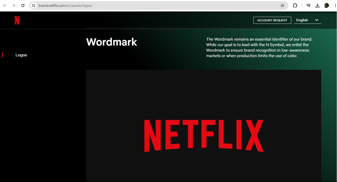
The Netflix wordmark logo—featuring the name of the brand in its signature red—conveys the popular and exciting nature of the brand.
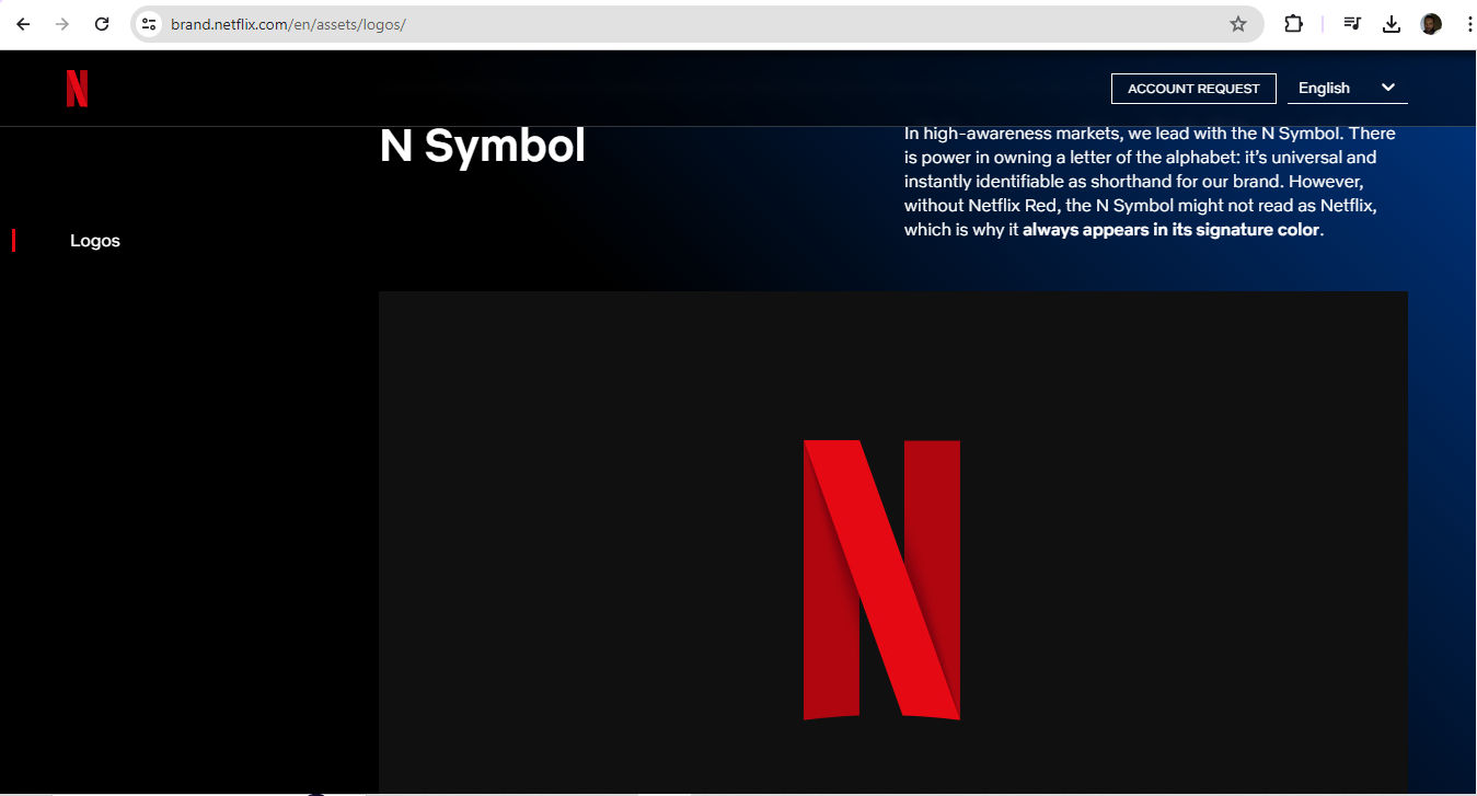
Netflix’s N Symbol—in red with curves as shown, as the brand stipulates—is an instantly identifiable brand shorthand, and leads in high-awareness markets.
Overcomplicated designs: Logos that are too highly detailed can confuse users and give them a negative experience.
Raster images: Vector images are better because raster ones may cause pixelation at larger sizes.
Stock images: Designers can get into trouble over copyright if the stock images they rely on for a logo are another brand’s design work.
Accessibility: Accessibility is a watchword in UX design overall, and logo design isn’t exempt. It’s vital to consider color contrast choices—for example, red-and-green combinations can cause problems for users.
Watch our video to understand why accessibility is vitally important in design:
ShowHide
video transcript
Transcript loading…
User testing: Apart from the point that the brand must see how its users and customers like the logo, it’s essential to test the logo regularly across multiple platforms and sizes.
William Hudson explains important points about user testing:
ShowHide
video transcript
Transcript loading…
Overall, logo design is an easy-to-misunderstand part of UX design. Because logos should carry the brand’s vision, essence and more, it can take a sharp eye and creative mindset to create one that will succeed and endure in the marketplace. Brands need to carefully consider the angles and options available to them. This includes when it comes to writing a brief, choosing from designers’ portfolios or considering AI logo design, logo design apps, logo templates and more.
Remember, logo design transcends mere aesthetics—it's about forging a connection with the audience. The global marketplace is a large arena for users and customers to have first-impressions and draw mental associations. That’s an extra reason for designers to get their clients’ brand logos right the first time. If they prove popular, many of these logos can evolve as the brand enjoys continuing success long into the future.
“We ended up with the primary colors, but instead of having the pattern go in order, we put a secondary color on the L, which brought back the idea that Google doesn’t follow the rules.”
To choose the right colors for your logo, do the following:
Understand your brand's message and the emotions to evoke: Colors convey different feelings and meanings. So, select colors that line up with your brand identity. Red can represent excitement, passion or urgency. Blue often symbolizes trust, calmness and professionalism. Green suggests nature, growth and health. Yellow conveys optimism and energy. Meanwhile, black signifies sophistication and elegance.
Consider the target audience: Different demographics may respond differently to colors. For example, younger audiences might prefer vibrant, bold colors, while older audiences might appreciate more subdued tones.
Analyze your competitors' logos: Choose colors that help your logo stand out while making sure that it remains relevant to your industry. Don’t copy competitors. A unique brand identity has to stand out.
Test color combinations: Use tools like Adobe Color or Coolors to experiment with different palettes. Ensure your logo looks good in both color and black-and-white versions.
Remember color psychology: Colors can influence perceptions and behavior. For example, fast-food brands often use red and yellow because these colors can stimulate appetite and energy.
Keep your design simple: A cluttered logo with too many colors can confuse viewers. Stick to two or three main colors to create a clean, memorable design.
Watch as Author and Human-Computer Interaction Expert, Professor Alan Dix explains the importance of cultural considerations in design:
ShowHide
video transcript
Transcript loading…
Video copyright info
Copyright holder: Tommi Vainikainen _ Appearance time: 2:56 - 3:03 Copyright license and terms: Public domain, via Wikimedia Commons
Copyright holder: Maik Meid _ Appearance time: 2:56 - 3:03 Copyright license and terms: CC BY 2.0, via Wikimedia Commons _ Link: https://commons.wikimedia.org/wiki/File:Norge_93.jpg
Copyright holder: Paju _ Appearance time: 2:56 - 3:03 Copyright license and terms: CC BY-SA 3.0, via Wikimedia Commons _ Link: https://commons.wikimedia.org/wiki/File:Kaivokselan_kaivokset_kyltti.jpg
Copyright holder: Tiia Monto _ Appearance time: 2:56 - 3:03 Copyright license and terms: CC BY-SA 3.0, via Wikimedia Commons _ Link: https://commons.wikimedia.org/wiki/File:Turku_-_harbour_sign.jpg
What tools and software do logo designers commonly use?
Designers typically use several tools and software for logo design. Adobe Illustrator stands out as a popular choice. That’s because it offers advanced vector graphics capabilities. Designers can create scalable logos without losing quality. Illustrator provides a wide range of tools for precision, color management and typography, which makes it well-suited to professional logo design.
Sketch is another tool that designers favor, especially for digital and web-based logos. It offers a user-friendly interface and a focus on vector design, similar to Illustrator. Sketch also integrates well with other design tools and plugins—enhancing its functionality.
Affinity Designer supports vector and raster designs, and gives much flexibility for creating detailed logos. Affinity Designer also provides a smooth user experience and robust tools comparable to those of more expensive software.
For beginners or those who want simpler tools, Canva and Adobe Spark provide accessible platforms with pre-made templates and easy-to-use interfaces. These tools allow for quick logo creation without extensive design knowledge.
Inkscape, an open-source vector graphics editor, serves as a free alternative to Adobe Illustrator. It offers comprehensive tools for creating professional-quality logos. That makes it a great option for those on a budget.
First, think about your brand's goals and audience. Text-only logos, or wordmarks, work well for brands with unique names. Examples include Google and Coca-Cola. These logos emphasize the brand name; they also make sure users and customers immediately recognize them.
Symbols, or icons, work best for brands with strong, established identities. Companies like Apple and Nike use symbols to create memorable and easily recognizable logos. Symbols can communicate a brand's essence quickly and effectively.
You can have the advantages of both text and symbols if you combine them. This approach can help new or lesser-known brands establish their name while associating it with a memorable symbol.
Consider your industry's standards. Some industries lean towards certain types of logos. For instance, tech companies often use symbols, but fashion brands tend to use wordmarks.
Test your logo in various contexts. See that it stays effective when you scale it down or use it in black and white. Note, though, that many brands will insist on color representation. In any case, a good logo should be versatile and easy to recognize in different settings.
What are some common mistakes to avoid in logo design?
Avoid these common mistakes in brand logo design:
Complexity: Overly complex logos with intricate details can lose clarity at smaller sizes. Plus, they can be too much in the context of users being able to digest and recognize them. So, keep your design simple and clean.
Poor font choices: Trendy or inappropriate fonts can make your logo look unprofessional and work against your company’s message. Select a timeless, legible font that matches your brand's personality. You can capture a fresh, fun brand personality in your logo design and have a font that suits it—in an appropriate and enduring way.
Overused symbols: Don’t rely on clichés. Globes or light bulbs, for instance, can make your logo forgettable. Aim for unique symbols that distinguish your brand and suit the context they’ll access it in.
Color overload: Too many colors can overwhelm users and utterly confuse them. Stick to two or three main colors that carry your brand's message to them clearly and accessibly (remember some users will have color blindness).
Poor versatility: Make sure your logo works in different sizes and formats— that includes black and white. A versatile logo adapts to various contexts and loses none of its impact.
Trend following: While trends can influence design, you can date your logo quickly if you rely too heavily on them. A timeless design is one that will remain relevant.
Copying competitors: It’s not a good idea to mimic competitors' logos. It can confuse consumers and weaken your brand identity. Another hazard is that it might also trespass on their legal trademark. So, create a distinctive logo that really sets your brand apart.
Watch our Master Class How To Use Color Theory To Enhance Your Designs with Arielle Eckstut and Joann Eckstut, leading color consultants and authors, who are among the most definitive authorities on color in the United States.
How can I use negative space effectively in my logo?
Negative space, or white space, can be extremely helpful. This space is the empty areas around and within your logo elements. It can create a secondary image or enhance the primary design.
Identify key shapes or elements: Find the main shapes and symbols that represent your brand. Look for ways to outline these elements using negative space.
Create dual images: Design your logo so that the negative space forms a secondary image or message. For example, the FedEx logo uses the space between the "E" and "x" to create an arrow—which symbolizes speed and precision.
Enhance readability: Use negative space to make your logo more readable and visually appealing. Be sure that the design remains clear at different sizes.
Keep it simple: Don’t clutter your design. Negative space should make your logo clean and easy to understand.
Test different versions: Experiment with different layouts and perspectives until you’ve found the one where negative space works best.
Focus on balance: Keep a balance between positive and negative space. Your logo will look more harmonious and professional if you get things right with the positive-negative space interplay.
Read our Topic Definition of Negative Space to understand more about it.
Typography is crucial in logo design. It’s like a conduit for your brand's personality and message. The right typeface boosts the logo’s readability, and it creates a visual identity. It goes a long way to deciding how people perceive your brand. So, make sure it:
Captures brand personality: Typography sets the tone for your brand. A modern sans-serif font can suggest innovation and simplicity. A classic serif font can carry a sense of tradition and reliability. Choose a typeface that aligns with your brand values and remember users’ perceptions and industry expectations.
Enhances readability: Clear, legible typography helps your logo come across well. Beware of overly decorative or complex fonts. They might make your logo hard to read—especially at smaller sizes.
Creates visual identity: The typeface you choose becomes a key element of your brand identity. It’s a big part of who the brand is. So, use the typography consistently across all branding materials. That will help build recognition and trust. For instance, a banking app that looks too “hip” might put users on their guard.
Establishes hierarchy: Typography helps establish a visual hierarchy in your logo. If you vary font sizes, weights and styles, you can highlight different aspects of your brand name or tagline.
Differentiates your brand: Unique typography sets your logo apart from competitors. Custom or modified typefaces can make your logo distinctive and memorable—but be careful that “distinctive” doesn’t turn up as an inappropriate typeface.
How can I design a timeless logo that doesn't look outdated?
To future-proof a brand logo, focus on simplicity, versatility and classic design principles. Here's how to do it:
Keep it simple: Avoid overly complex designs. Simple logos stay clear and effective across different sizes and media. Would it look good on a smartphone ad, the side of a coffee cup and the side of a professional vehicle, for instance?
Choose classic fonts: Pick fonts that have stood the test of time. Helvetica and Garamond are good examples. Steer clear of trendy fonts that might age quickly.
Limit your colors: Use a few core colors to represent your brand in the best way. Timeless logos often use black, white, and one or two accent colors. Stay away from overly bright or trendy colors.
Avoid trends: Tempting as it may be to follow design trends, they can make your logo look outdated—fast. Why not focus on creating a unique, enduring design instead?
Make sure it’s versatile: Design your logo to work in different contexts—like on digital screens, printed materials and merchandise. Like point 1 (Keep it simple), a versatile logo looks good in various sizes and color schemes.
What is the golden ratio, and how can I use it in logo design?
The golden ratio is a mathematical ratio, approximately 1.618:1. It often shows up in nature and art. Designers frequently use this ratio to make visually pleasing and balanced compositions.
In logo design, you can divide elements into sections that follow this ratio. Here are some ways to do this:
Proportions: Use the golden ratio to determine the proportions of your logo's elements. For example, if your logo includes a rectangle, divide its width by 1.618 to get the height; that will help create a balanced shape.
Layout: Arrange elements within your logo according to the golden ratio. This ensures a harmonious relationship between the parts. It’ll make the logo more aesthetically pleasing.
Typography: Apply the golden ratio to font sizes. Set your primary text size, then multiply it by 1.618. That will give you a complementary size for secondary text.
Shapes and spacing: Use the golden ratio to create and position shapes within your logo. This can help bring about a good sense of order and coherence.
Watch as UX Strategist and Consultant, William Hudson explains the golden ratio:
ShowHide
video transcript
Transcript loading…
How do I ensure my logo looks good in different sizes and formats?
To ensure your logo looks good in different sizes and formats, follow these steps:
Simplify the design: Use a simple design with clear shapes and minimal details. Complex logos can lose clarity when you scale them down.
Test at other sizes: Create versions of your logo at different sizes. Check how it looks on business cards, websites and billboards; is it clear and recognizable on all of them?
Use vector graphics: Design your logo in a vector format—such as Adobe Illustrator. Vectors let your logo scale, so you won’t lose quality.
Check legibility: Make sure any text in your logo stays readable when the logo appears at smaller sizes. Overly intricate fonts can blur or distort when they shrink.
Create multiple versions: Develop different versions of your logo—that includes a full-color version, a black-and-white version and a simplified version. From those, you’ll be able to check your logo’s versatility across various backgrounds and media.
Consider different formats: Save your logo in multiple file formats—PNG, SVG and EPS are good examples. Each format serves different purposes. These range from web use to high-quality printing.
This influential conference paper investigates how different categories of figurative logo designs influence consumer responses across cultures. The authors conducted two studies involving participants from Portugal, Spain and the Netherlands to examine the psychological properties of logo figurativeness. The key findings suggest that figurativeness is an essential design element that significantly impacts affective responses to logos. Specifically, natural designs (depicting objects from nature) were consistently preferred over cultural designs (depicting human-made objects) and abstract logos across all three countries in the study. The results indicate that the appeal of figurative logo designs—particularly natural designs—seems to be universal across cultures. This research provides valuable insights for logo design strategies, and highlights how important it is to consider figurativeness and naturalness when designers create logos that evoke positive affective responses from consumers globally.
What are some highly regarded books about logo design?
Logo Design Love is a highly influential book that guides readers through the entire logo design process—from initial sketches to final execution. It offers practical tips, best practices and a step-by-step approach to creating successful, professional logos that effectively represent a brand. The book is widely regarded as a must-read for both aspiring and experienced logo designers.
Earn a Gift, Answer a Short Quiz!
Question 1
Question 2
Question 3
Get Your Gift
Try Again! IxDF Cheers For You!
0 out of 3 questions answered correctly
Remember, the more you learn about design, the more you make yourself valuable.
It's Easy to Fast-Track Your Career with the World's Best Experts
Master complex skills effortlessly with proven best practices and toolkits directly from the world's top design experts. Meet your experts for this course:
Mia Cinelli: Associate Professor of Art Studio and Digital Design at the University of Kentucky.
Joann Eckstut: Color Consultant, Founder of The Roomworks, and one of the 12 designers chosen by the Color Association of the USA to create the yearly forecast used by industries to keep up with color trends.
Arielle Eckstut: Author, Agent-at-large at the Levine Greenberg Rostan Literary Agency, and Co-Founder of The Book Doctors and LittleMissMatched.
Customer Journey Maps — Walking a Mile in Your Customer’s Shoes
Perhaps the biggest buzzword in customer relationship management is “engagement.” Engagement is a funny thing, in that i
1.1k shares
5 mths ago
Open Access—Link to us!
We believe in Open Access and the democratization of knowledge. Unfortunately, world-class educational materials such as this page are normally hidden behind paywalls or in expensive textbooks.