Your constantly-updated definition of the Law of Continuity and
collection of videos and articles. Be a conversation starter: Share this page and inspire others!
88shares
What is the Law of Continuity?
The Gestalt law of continuity—or continuation—refers to how the human mind naturally organizes visual elements into continuous and uninterrupted lines or patterns. It is a fundamental concept in visual perception and design. Designers apply it to create interfaces that guide users' attention and create a smooth flow of information.
In this video, author, designer and educator Mia Cinelli explains the importance of Gestalt principles in visual design and introduces a few of them, including continuity.
ShowHide
video transcript
00:00:00 --> 00:00:32
Gestalt principles are principles of human perception that describe how we group similar elements, recognize patterns and simplify complex images when we perceive objects. - So, Gestalt principles — sometimes called Gestalt laws — are simply a way of thinking through Gestalt psychology — 'Gestalt' just meaning 'form', is how we're making sense of a visual field. These are ways of parsing out what things mean within a visual space. Gestalt relies first and foremost on the understanding of a visual field and the ability to create
00:00:32 --> 00:01:00
what are called *figure/ground relationships. So, figure/ground relationships are sometimes called 'positive space' and 'negative space'. So, I'm going to talk about them as figure/ground, because when we look at something like this visual field of rectangles, it all looks the same — that is right now our ground. But the first rule of figure/ground relationships is that discontinuity creates figure. So, by changing one thing here, by creating that discontinuity, that draws our attention,
00:01:00 --> 00:01:30
that becomes the thing in which we are focusing on, and that is really essential, because this can manifest through the Law of Similarity, by which visual similarities are read as being more related. And we can do this through color; we can do this through shape; we can do this through size. So, we read these things as being more of a group. Proximity works in a similar way wherein the actual visual or physical proximity of things relative to each other tells us that these are also read as a group.
00:01:30 --> 00:02:02
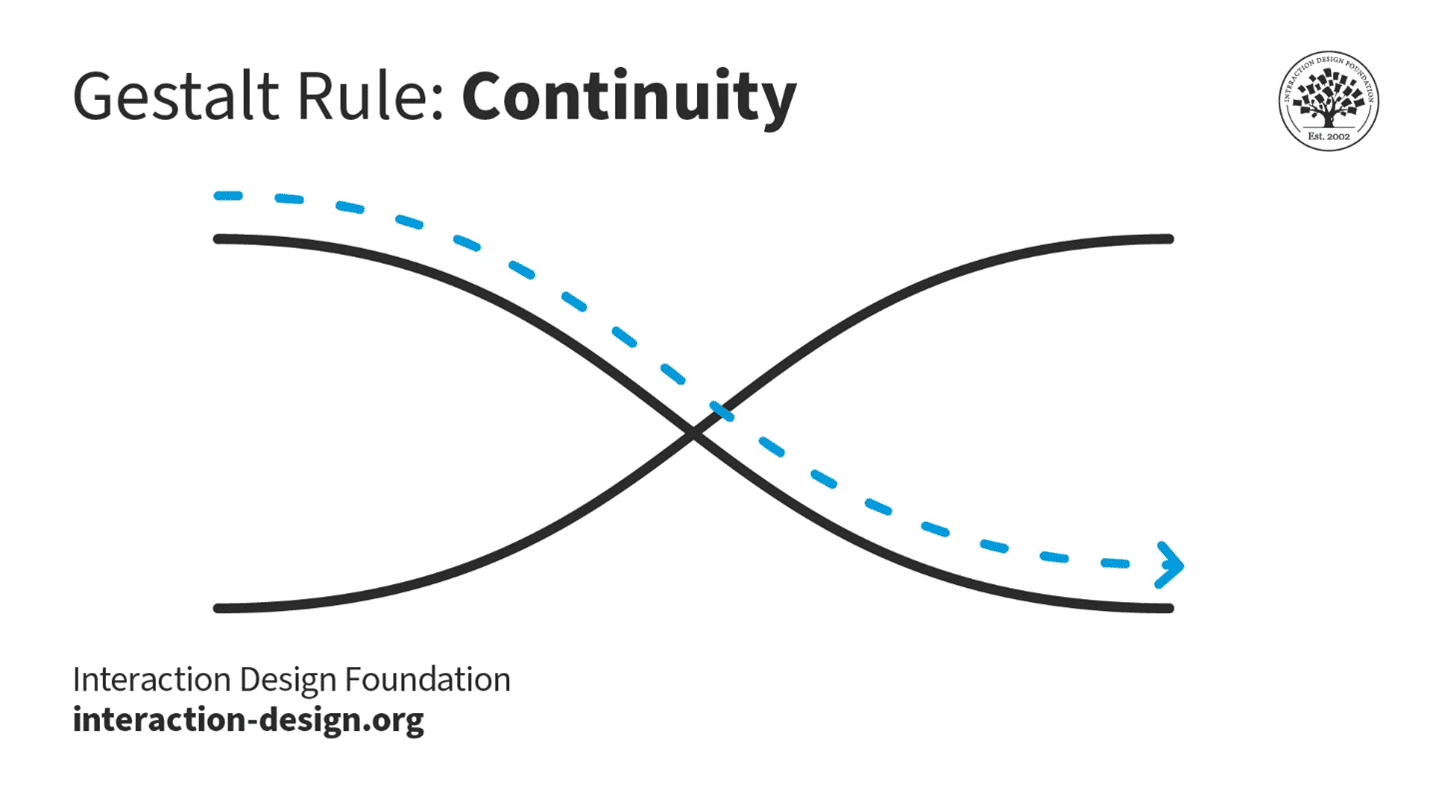
There's the Law of Continuation, by which our eye wants to follow a particular line. And so, when we read this visual, we don't read it as two lines which have met in the middle and made a hard turn. We read this as two lines flowing over each other, and that's because of continuation. And all of these things — Gestalt principles — influence hierarchy, informational grouping and readability, and they become essential for understanding both concept and content.
The Gestalt principle of continuity—also, the law of continuity, principle of continuation and law of continuation—comes from the idea that the human mind perceives and organizes visual stimuli in such a way to create a sense of continuity and flow. The theory behind the law of continuity is that people usually perceive objects so that a series of visual elements belong together—and form a continuous line or pattern. This is true even if some parts are missing or obscured, and this principle is closely related to the concept—or Gestalt law—of closure. In closure, the mind fills in missing information to make a complete and unified perception out of a figure.
The law of continuity has roots in the Gestalt psychology movement, which emerged in the early 20th century. “Gestalt” is a German word that describes the concept that an organized whole is more than the sum of its parts. For example, according to the principle of closure, figure-ground and the law of prägnanz, complex images become simplified because of the mind’s need to make sense of the object on show. To Gestalt psychologists, individual elements therefore take on a higher meaning than mere components.
German psychologists Max Wertheimer, Wolfgang Köhler and Kurt Koffka developed the Gestalt principles to understand how humans perceive the world around them. The law of continuity is observable in the real world in that the human eye follows the smoothest path when viewing lines. That’s true regardless of how the artist has actually drawn the lines.
When humans face a sequence of visual elements, they tend to see them as a continuous line or pattern. The human brain prefers to see a continuous flow of visual elements—as opposed to seeing separated objects. This natural inclination towards continuity is a key aspect of how humans make sense of their visual environment—an urge to extract meaning quickly from what was once a far, far more hazardous world. Because of its value, this law has seen a lot of use in a wide range of fields—including graphic design, advertising and product design.
Why Continuity Continues to be Vital in UX/UI Design
The Gestalt law of continuity can play an important part in user experience (UX) design and user interface (UI) design. When designers apply this law in their design work, it helps them create interfaces that are intuitive and easy to navigate. Reasons why this principle is important in UX/UI design include that it:
1. Simplifies Navigation
The continuity principle can guide users' eyes in a certain direction—a point that makes it easier for them to navigate the interface. It helps create a visual flow that guides users from one element to another—and so helps user interactions with a digital product or service.
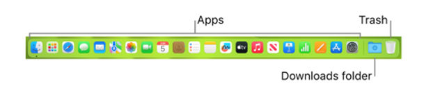
Apple's macOS Dock is a strip of icons located at the bottom of the screen. When a user hovers over an icon, it magnifies and smoothly animates to indicate selection—giving a sense of continuity and connection between the user's action and the system's response.
The law of continuity improves readability as it groups information in a continuous flow. It helps users easily understand—and process—the information they find on a website or app. For example, with primary and secondary navigation, designers can get continuity to work so it guides users without confusing them.
Readability is a huge factor when designers have to show text information in volume. Continuity is a factor in flowing conveniently from primary to secondary navigation.
The continuity principle can give a sense of cohesion and unity to design elements. This makes the interface appear well-organized and aesthetically pleasing. At the very least, it can help calm users’ pain points if they are distracted or in busy or potentially stressful environments.
Alamy makes use of continuity to direct users in a smooth flow.
A user interface design that follows the law of continuity is likely to be more engaging as it runs in line with the natural visual perception of humans. This element of visual design is important as—typically—users will respond better to information architecture and other parts of a design in a way that they expect to find. That is, they find what they see conforms naturally to expected principles such as continuity.
Credit Karma features the law of continuity to draw attention to their services.
Examples of the Gestalt Law of Continuity in UX Design
Here are some chief examples of how designers use the Gestalt law of continuity in interfaces:
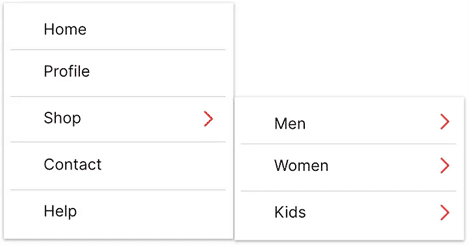
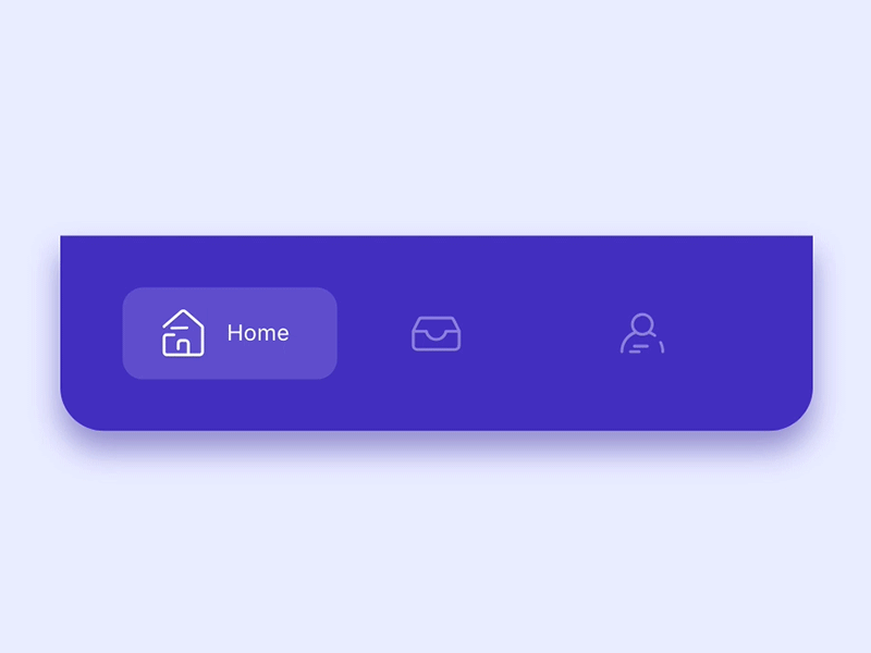
● Menus and Navigation Bars
In websites and applications, menus and navigation bars often follow a linear layout. This is something that lets users perceive them as a continuous group of elements.
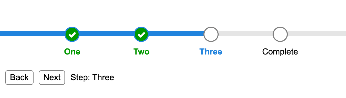
● Progress Bars
Progress bars are another example where the continuity principle often turns up. The continuous line in progress bars gives users a visual cue about how much progress they’ve made and how much is left.
Progress bars help keep users on board and can represent a highly encouraging aspect of continuity in flow.
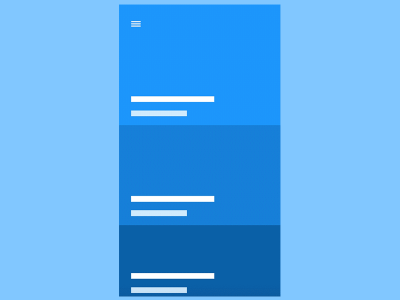
The way designers arrange and present text also adheres to the law of continuity. In Western cultures, for example, users naturally read text in a continuous flow from left to right, top to bottom.
See typography expert, author, designer and educator Mia Cinelli explain the virtues of the law of continuation in typography:
ShowHide
video transcript
00:00:00 --> 00:00:30
How do Gestalt Principles apply to typography? This is really important to note, that continuation is essential for typography because I see this all the time where designers want to be clever. And here on the left-hand side, we have some right-aligned and left-aligned type which are living back to back, and we know from the hue structure that we're intended to read this as 'Back To School Sale', but this is not how we're going to read it. Because of continuation, we are following a baseline, as this example in Latin text.
00:00:30 --> 00:01:00
So, we don't read 'Back To School Sale'; we read 'Back School To Sale', which completely disrupts the message. So, instead of doing something like this, think through continuation. The example on the right-hand side makes way more sense and will not disrupt our legibility or readability because we're following continuation, thinking about that baseline. And continuation can also create a beautiful implied motion. So, here we can use this in a really expressive way, following this line. 'They gracefully descend the stairs to arrive at the party.'
00:01:00 --> 00:01:02
That adds just a little bit more social meaning for us.
Best Practices to Apply the Law of Continuity in UX Design
Some key ways that UX designers apply the Gestalt law of continuity in their designs are that they use it to:
1. Maintain a Logical Flow
Designers should ensure that design elements follow a logical and predictable flow. This could be from left to right, top to bottom or along a specific path that guides the user towards the desired action.
Sprig applies continuity to direct users conveniently to the steps to use their app.
Use the principle of continuity to put related elements together—something that helps users perceive them as being a single entity. This improves the overall structure of an interface, and the readability of it.
3. Use Lines and Paths
Use lines, paths and similar visual cues to guide users' eyes in the direction that’s desired. This can be particularly useful in guiding users towards call-to-action buttons or important information.
Nike applies continuity to direct users’ eyes horizontally through the rows.
Consistency is key when it comes to making a continuous flow. So, be sure that elements like fonts, colors and button styles show up in a consistent way across the interface. Users find they can trust consistently crafted interfaces. A UI that improves the user experience will be one that matches their expectations while it distinguishes the brand message.
5. Design with Intention
For interface design, have a clear vision of the user flow and how to arrange elements to create continuity. Continuity comes best when designers arrange elements to lead the user’s gaze from one section to another. This creates a seamless experience—something that’s vital to keep users on board.
Good continuity keeps the users in flow—via smooth navigation, for example.
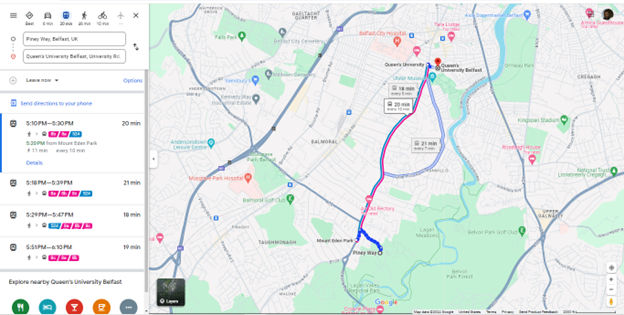
Directional cues like arrows or curved lines can help make a clear path that users can follow. They also create continuity within the design. This can be especially helpful when designers want to guide users through complex processes or interactions.
Google Maps keeps a good continuous flow to mirror the users’ needs.
Smooth transitions and animations create a sense of connection between different states of an interface. They also provide continuity between different pages or sections. This helps make an uninterrupted experience for the user while they navigate different areas of the design.
8. Use Grid Systems & Layouts
Grid systems and layouts are vital for putting order in designs and a sense of continuity throughout interfaces. Consistent spacing, alignment and hierarchy will help ensure that all elements fit together harmoniously. They’ll also guide the user’s eye from one area to another without disruption.
A good, solid hierarchy goes a long way to aiding the users in flow.
Flowcharts are great tools for mapping out how users move through an application or website. They help designers spot potential disruptions or gaps in the flow—problems that could impact overall continuity within their designs. They’re also vital tools in terms of how they can communicate design ideas among team members.
10. Design Gestural Interfaces with Care
Gestures like swiping or pinching should always give a smooth and continuous experience for touchscreen users. So, designers need to beware of letting jarring disruptions happen at all costs. That way, they can help achieve true continuity within their designs.
Risks and Considerations
The law of continuity is a great benefit in UX/UI design—but it's important to be mindful of potential risks and considerations, and here are some:
Overuse of continuity: The overuse of the principle of continuity can make for an interface that’s cluttered and confusing. So, don’t overwhelm users with too many elements in a continuous flow. Strike a balance between continuity and simplicity—to make sure a pleasant user experience becomes a reality. For example, think about using ample negative space or white space; it’ll give valuable breathing room to a design.
Disruption of user expectations: If a design's continuity doesn't align with common UX patterns or user expectations, it can end up confusing users and even frustrating them. Always bear in mind the established conventions and user expectations in the design field—for example, include design patterns that work well.
Neglect of other design principles: Remember, the law of continuity is just one of many Gestalt principles. It's important, indeed—still, don't neglect other principles such as proximity, similarity and closure. Those are equally crucial when it comes to making a cohesive and user-friendly design.
The law of continuity—which plays a vital role in a seamless and enjoyable user experience—is a way to guide users' attention, establish logical flows and more. Ultimately, user testing will show fine points about how well the law of continuity actually works in a digital product or service. Overall, though, it’s an essential item in a designer’s tool kit—one that can help greatly in a site or app’s UX to keep a sure footing on the journey from user to customer.
Amazon's website uses the principle of continuity in their product listings, displaying in a continuous flow. This makes it easy for users to browse through items.
What are the limitations of the Gestalt law of continuity in complex interfaces?
In complex interfaces where there are many elements and dense information, overuse of this principle can end up confusing users. They might find it hard to distinguish between related and unrelated elements because everything seems interconnected.
To navigate these limitations, it’s important for designers to complement the Gestalt law of continuity with other principles—such as proximity and similarity. For example, if they group related elements together—proximity—or use similar visual styles for related items—similarity—they can help reinforce relationships between elements. Particularly, if designers set out a clear visual hierarchy through varying sizes, colors and typography, they can guide the user's attention to the most important information. This will help in the processing of complex interfaces.
Watch Hype4’s Creative Director and CEO, Michal Malewicz explain how the law of proximity helps establish a good hierarchy:
ShowHide
video transcript
00:00:00 --> 00:00:30
To create a proper hierarchy. We're going to use one of the gestalt rules called proximity. And of course, if you know the Gestalt rules, you should try to follow all of them. But I believe proximity is the most important one, because in many cases we're using very simple shapes. So the distance between those shapes is what actually makes the entire layout. And this rule says that objects placed close to each other are automatically understood as a group.
00:00:30 --> 00:01:01
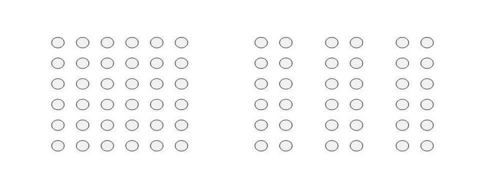
So in our case, how many groups do we have here? So we have the group of 12 bluish green circles. Then we have a group of three in green circles and then another group of three green circles. But then we also have a group of all the circles combined. And this is how this grouping and proximity works. You need to be aware that there are groups within groups and there can be groups within groups. So let's take one of our examples from before.
00:01:01 --> 00:01:30
And if we add grouping on top of it, you'll see that we can just by proximity, establish a couple of groups here. The emoji is one group, then the text and the other text is the second group. And then the pattern with the other clickable element is the third group. And of course, you can also consider the emoji being one group and all of the content is being another group. It's not just how you approach it and how you're actually going to work it in.
00:01:30 --> 00:02:02
Additional examples of this design, because it's not just going to be just this one version, but the thing is that we should be able to consistently replicate those groups in other versions of that screen. So if we created those groups and those distances between the groups, they need to be consistent. And this is what you should use basically to create that consistency. So if you have a distance between the two groups, which are just the whole windows, the distance should always be bigger than the distance
00:02:02 --> 00:02:30
between individual elements within the groups, within a group. So the further down we go in a group, the smaller the distance can be. That allows our brain to process it naturally and really quickly. And we'll see that. Okay, we have two separate big groups of things and then they are divided into smaller groups. And then you can use that rule to organize it further. So you can use another smaller square to
00:02:30 --> 00:03:00
place between elements within those groups. Or you can even use the same one because you can see you could use the Red Square here between the large title and the text as well and the bottom and the smaller text underneath. And that would still fit so that or a smaller one would work here. And this is really important because that's the whole rule of clarity and layout that is really important to follow. So those distances cannot be random. They need to be based on something and they need to be based on
00:03:00 --> 00:03:30
the natural hierarchy. So we quickly understand that, okay, this is a group and this is a group within a group, and these things are together as well because that's going to make it a lot easier. Grouping is also important with the distances. For example, this is one of the largest, like more common problems that I've seen in many forms designed by junior designers is not having enough space between the label and the previous field. And that creates an effect where if there is a longer
00:03:30 --> 00:04:01
a forum where coming it through with our eyes and we don't really know which field that label belongs to, so just increase the distance by two or three times between the fields and then four or six times between the title and the form. And by having that consistency with all the other elements on the site, so like if smaller distances extend, the larger one is to extend keep the X and to X across all of the other things to keep that consistent grading of all of those elements.
Do cultural differences affect the perception or application of the Gestalt law of continuity in design?
Cultural differences can have a bearing on how people perceive and apply the Gestalt law of continuity in design. Cultures vary when it comes to their visual languages, symbols and patterns—and this fact can affect how different cultures interpret design principles. For instance, Western cultures might emphasize linear, analytical processing—and be in favor of clear, continuous lines—while Eastern cultures may focus on holistic processing, valuing the overall balance and flow. Designers must think about these cultural nuances if they’re to make sure their designs communicate effectively across users’ different cultural contexts. So, an understanding of the audience's cultural background helps designers work the Gestalt principles into their interfaces in a way that resonates more effectively with that audience's perception and interpretation.
Watch as author and human-computer interaction (HCI) expert Alan Dix explains about how to design for cultural considerations:
ShowHide
video transcript
00:00:00 --> 00:00:32
As you're designing, it's so easy just to design for the people that you know and for the culture that you know. However, cultures differ. Now, that's true of many aspects of the interface; no[t] least, though, the visual layout of an interface and the the visual elements. Some aspects are quite easy just to realize like language, others much, much more subtle.
00:00:32 --> 00:01:04
You might have come across, there's two... well, actually there's three terms because some of these are almost the same thing, but two terms are particularly distinguished. One is localization and globalization. And you hear them used almost interchangeably and probably also with slight differences because different authors and people will use them slightly differently. So one thing is localization or internationalization. Although the latter probably only used in that sense. So localization is about taking an interface and making it appropriate
00:01:04 --> 00:01:31
for a particular place. So you might change the interface style slightly. You certainly might change the language for it; whereas global – being globalized – is about saying, "Can I make something that works for everybody everywhere?" The latter sounds almost bound to fail and often does. But obviously, if you're trying to create something that's used across the whole global market, you have to try and do that. And typically you're doing a bit of each in each space.
00:01:31 --> 00:02:02
You're both trying to design as many elements as possible so that they are globally relevant. They mean the same everywhere, or at least are understood everywhere. And some elements where you do localization, you will try and change them to make them more specific for the place. There's usually elements of both. But remembering that distinction, you need to think about both of those. The most obvious thing to think about here is just changing language. I mean, that's a fairly obvious thing and there's lots of tools to make that easy.
00:02:02 --> 00:02:31
So if you have... whether it's menu names or labels, you might find this at the design stage or in the implementation technique, there's ways of creating effectively look-up tables that says this menu item instead of being just a name in the implementation, effectively has an idea or a way of representing it. And that can be looked up so that your menus change, your text changes and everything. Now that sounds like, "Yay, that's it!"
00:02:31 --> 00:03:00
So what it is, is that it's not the end of the story, even for text. That's not the end of the story. Visit Finland sometime. If you've never visited Finland, it's a wonderful place to go. The signs are typically in Finnish and in Swedish. Both languages are used. I think almost equal amounts of people using both languages, their first language, and most will know both. But because of this, if you look at those lines, they're in two languages.
00:03:00 --> 00:03:31
The Finnish line is usually about twice as large as the Swedish piece of text. Because Finnish uses a lot of double letters to represent quite subtle differences in sound. Vowels get lengthened by doubling them. Consonants get separated. So I'll probably pronounce this wrong. But R-I-T-T-A, is not "Rita" which would be R-I-T-A . But "Reet-ta". Actually, I overemphasized that, but "Reetta". There's a bit of a stop.
00:03:31 --> 00:04:02
And I said I won't be doing it right. Talk to a Finnish person, they will help put you right on this. But because of this, the text is twice as long. But of course, suddenly the text isn't going to fit in. So it's going to overlap with icons. It's going to scroll when it shouldn't scroll. So even something like the size of the field becomes something that can change. And then, of course, there's things like left-to-right order. Finnish and Swedish both are left-to-right languages. But if you were going to have, switch something say to an Arabic script from a European script,
00:04:02 --> 00:04:31
then you would end up with things going the other way round. So it's more than just changing the names. You have to think much more deeply than that. But again, it's more than the language. There are all sorts of cultural assumptions that we build into things. The majority of interfaces are built... actually the majority are built not even in just one part of the world, but in one country, you know the dominance... I'm not sure what percentage,
00:04:31 --> 00:05:02
but a vast proportion will be built, not just in the USA, but in the West Coast of the USA. Certainly there is a European/US/American centeredness to the way in which things are designed. It's so easy to design things caught in those cultures without realizing that there are other ways of seeing the world. That changes the assumptions, the sort of values that are built into an interaction.
00:05:02 --> 00:05:35
The meanings of symbols, so ticks and crosses, mostly will get understood and I do continue to use them. However, certainly in the UK, but even not universally across Europe. But in the UK, a tick is a positive symbol, means "this is good". A cross is a "blah, that's bad". However, there are lots of parts of the world where both mean the same. They're both a check. And in fact, weirdly, if I vote in the UK,
00:05:35 --> 00:06:02
I put a cross, not against the candidate I don't want but against the candidate I do want. So even in the UK a cross can mean the same as a tick. You know – and colors, I said I do redundantly code often my crosses with red and my ticks with green because red in my culture is negative; I mean, it's not negative; I like red (inaudible) – but it has that sense of being a red mark is a bad mark.
00:06:02 --> 00:06:33
There are many cultures where red is the positive color. And actually it is a positive color in other ways in Western culture. But particularly that idea of the red cross that you get on your schoolwork; this is not the same everywhere. So, you really have to have quite a subtle understanding of these things. Now, the thing is, you probably won't. And so, this is where if you are taking something into a different culture, you almost certainly will need somebody who quite richly understands that culture.
00:06:33 --> 00:06:43
So you design things so that they are possible for somebody to come in and do those adjustments because you probably may well not be in the position to be able to do that yourself.
Video copyright info
Copyright holder: Tommi Vainikainen _ Appearance time: 2:56 - 3:03 Copyright license and terms: Public domain, via Wikimedia Commons
Copyright holder: Maik Meid _ Appearance time: 2:56 - 3:03 Copyright license and terms: CC BY 2.0, via Wikimedia Commons _ Link: https://commons.wikimedia.org/wiki/File:Norge_93.jpg
Copyright holder: Paju _ Appearance time: 2:56 - 3:03 Copyright license and terms: CC BY-SA 3.0, via Wikimedia Commons _ Link: https://commons.wikimedia.org/wiki/File:Kaivokselan_kaivokset_kyltti.jpg
Copyright holder: Tiia Monto _ Appearance time: 2:56 - 3:03 Copyright license and terms: CC BY-SA 3.0, via Wikimedia Commons _ Link: https://commons.wikimedia.org/wiki/File:Turku_-_harbour_sign.jpg
How can designers use the Gestalt law of continuity to enhance accessibility in designs?
Designers can increase the level of accessibility in their work when they use the Gestalt law of continuity to organize elements in a way that guides the user's eye smoothly from one component to the next. This principle can help designers make intuitive navigation paths for users—and that includes those with visual impairments—since it has an emphasis on clear, logical sequences of information or actions. From aligning elements along curves or lines, designers can make interfaces easier to understand and interact with. So, it lessens the amount of cognitive strain and makes content more accessible—to everyone.
How can the Gestalt law of continuity assist in the redesign process of an existing product?
The Gestalt law of continuity can help in an existing product’s redesign through how it helps a designer improve that product’s visual and navigational flow. They can leverage this to create a more intuitive user experience—and so organize content and navigation elements in a way that feels natural and logical.
Continuity can help when it comes to clarifying the hierarchy and relationships between different parts of the product. That will make it easier for users to understand and interact with the product—efficiently. From reorganizing components to follow natural sight lines, a designer can make navigation paths that are more intuitive. That will make it easier for users to understand and engage with the product. This approach doesn’t just clarify the product's structure and hierarchy—it gives its aesthetic appeal a boost, too, something that leads to a more cohesive and user-friendly interface.
How can designers apply the Gestalt law of continuity in mobile app design, and what are the benefits?
Designers can integrate the Gestalt law of continuity in mobile app design to make for more streamlined user experiences. This principle suggests that elements that are aligned in a line or curve get perceived as being related—and so can guide users through content with ease. When it’s at work, it improves navigation and coherence across various screen sizes—something that’s vital for responsive design. In a mobile-first approach, when designers prioritize simplicity and continuity, they make sure that content scales seamlessly from smaller to bigger screens. So, tips include to use consistent alignment and directional cues—to lead the eye—and to design with scalability in mind to accommodate different devices. This doesn’t just enhance the usability—it boosts aesthetic appeal, too—so making apps more intuitive and engaging.
In what situations would the Gestalt law of continuity be more beneficial than the law of similarity?
The Gestalt law of continuity is better to use than the law of similarity in situations calling for a viewer's eye to get guided through a sequence or along a specific path. This is especially true in design contexts where the goal is to lead the user naturally from one element to the next—so creating a fluid and intuitive user experience.
For example, in web design, the law of continuity helps create a sense of flow from the landing page down to the call-to-action. That makes sure that users follow the intended navigation path—and don’t get lost or distracted. That’s crucial for websites with complex information structures or multiple sections, as it keeps the user's journey coherent and focused.
In interface design—such as the design of mobile apps or software—continuity excels in terms of organizing elements in a way that feels logical and predictable to the user. When buttons, icons and information follow a clear path, users can navigate more efficiently. That enhances usability and satisfaction.
Overall, while the law of similarity is excellent for grouping and categorizing elements, the law of continuity shines in scenarios where movement, flow and directional guidance are of the essence. That makes it an indispensable source of help for creating engaging, user-friendly designs.
Can designers use the Gestalt law of continuity and the law of closure together? Provide an example in user interface design.
Yes, designers can effectively use the Gestalt laws of continuity and closure together in user interface (UI) design. An excellent example of this is in the design of navigation menus on websites or apps: think about a dropdown menu that—when activated—displays items in a curved or diagonal layout rather than a straight vertical or horizontal line. This use of the law of continuity encourages the user's eye to follow the path of menu items smoothly—something that boosts both the usability and the aesthetic appeal.
Simultaneously, if some menu items are partially hidden or only icons appear without text, the law of closure lets users recognize these items as part of a complete menu. Users mentally fill in the gaps, understanding the full shape or form of the menu—even if all parts aren't fully visible. This combination doesn’t just make a visually engaging interface—it supports intuitive navigation as well. That’s because users can easily predict and follow the menu's flow, which improves their overall experience with the product.
What are some highly cited pieces of scientific research about the Gestalt law of continuity?
Chang, D., Dooley, L., & Tuovinen, J. E. (2002). Gestalt Theory in Visual Screen Design — A New Look at an old subject. In Selected Papers from the 7th World Conference on Computers in Education (WCCE’01), Copenhagen, Computers in Education 2001: Australian Topics, Volume 8 (pp. 5–12). Melbourne: Australian Computer Society.
This publication revisits the application of Gestalt theory in educational visual screen design. It critically examines the common yet narrow application of Gestalt laws in design literature and identifies eleven relevant laws for enhancing visual screen design in educational contexts, including the law of continuity. The study applies these principles to redesign an instructional multimedia application, 'WoundCare', and it presents an evaluation of the new designs based on user feedback. It highlights the positive impact of these principles on learning and design aesthetics.
What are some highly regarded books about the Gestalt law of continuity?
This book offers a concise exploration of Gestalt principles in UX design. Erin Malone provides a practical guide—applying these principles to digital interfaces with a focus on mobile and web examples. The book delves into visual hierarchy, animation and microinteractions—aiming to help readers improve design skills. It also includes downloadable templates for design documentation—which make it a hands-on resource for UX designers.
Earn a Gift, Answer a Short Quiz!
Question 1
Question 2
Question 3
Get Your Gift
Try Again! IxDF Cheers For You!
0 out of 3 questions answered correctly
Remember, the more you learn about design, the more you make yourself valuable.
One of the key ingredients to a successful product is the creation of effective, efficient and visually pleasing displays. In order to produce such high-quality displays, whether they are graphical (e.g., websites) or tangible (e.g., remote controls), an understanding of human vision is required, along with the knowledge of visual perception. By observing, researching, and identifying examples of our perceptual abilities, we can design products according to these unifying qualities. In order to spread such skills within the world of interaction design, we have developed “Gestalt Psychology and Web Design: The Ultimate Guide.”
Gestalt psychology is a theory of mind which has been applied to a number of different aspects of human thought, action, and perception. In particular, Gestalt theorists and researchers attempt to understand visual perception in terms of the way in which underlying processes are organized and how they help us make sense of the world. The organization of these cognitive processes is important to our understanding of how we interpret the constant stream of visual information entering our eyes and how it becomes a cohesive, meaningful and usable representation of the world. Over the last twenty years, the work of Gestalt psychologists has been adopted by interaction designers and other professionals involved in the development of products for human users.
Within this course, we have compiled and consolidated some of the best resources currently available on the subject of Gestalt psychology and visual perception. To help you appreciate how you can apply Gestalt psychology to web design, we have provided many different examples from existing designs. These draw attention to the exact qualities, quirks, and features of visual perception. Moreover, they discuss how these have been accommodated and, on a number of occasions, exploited so as to support either the user's intentions or those of the designer or client.
The application of Gestalt thinking to design provides us with insights and new ways of approaching problems and challenges. By cementing in our own minds the many ways we organize visual information, we can improve our designs for all users.
Laws of Proximity, Uniform Connectedness, and Continuation – Gestalt Principles (Part 2)
In this, the second part of our examining Gestalt principles, we’ll look at another Law – the Law of Proximity. This one
1.1k shares
5 years ago
Open Access—Link to us!
We believe in Open Access and the democratization of knowledge. Unfortunately, world-class educational materials such as this page are normally hidden behind paywalls or in expensive textbooks.