It's probably happened to you. You've found the door to a building you were looking for but are having trouble getting in—you've pulled when you should have pushed (or vice versa). Blame yourself; everyone else does! This is the opening scenario from Don Norman's Design of Everyday Things (DOET), which reached its 35th anniversary in 2023. But the example above was just a simple case, as the clip below demonstrates. In the design world, this is called a Norman Door. Once you understand the simple, timeless concepts behind its faulty design, you’ll have the foundations to create intuitive, user-friendly designs. Read on to discover affordances, signifiers and more, and level up your design expertise. Let’s get started.
Table of contents
Seats Are for Sitting: How Affordances Shape Interactions
It is not really the door users who are to blame. In the early editions of DOET, Norman referred to the affordances that doors offered: flush plates for pushing and protruding handles for pulling. Unfortunately, this isn't how they're always used. Designers and manufacturers are fond of symmetry, so you'll often find protruding handles on both sides of a door, even if they only open in one direction. This is the norm in most homes, which is one of the reasons it can be stressful to visit someone else's house for a brief stay. Embarrassingly, I often try to leave a neighbor's apartment through the closet. I open the door in the right direction, but it’s the wrong door. In my defense, they are almost identical. That isn’t an affordance problem! Domestic signage needs serious improvement.
In the revised edition of DOET (2013), Norman changed his mind about affordances. They were originally a controversial topic in ecology, describing how species (including humans) make sense of their environment. For example, a horizontal surface might afford support or sitting, depending on the species. The term has been appropriated in many different disciplines, but Norman confessed that it was more relevant to interaction with physical objects than today's technology.

For humans, steps usually afford sitting
© Interaction Design Foundation, CC BY-SA 4.0
Take the simple on-screen button shown below. It doesn't offer much in the way of an affordance. In 1990, Microsoft added shadows to the Windows 3.0 user interface's interactive elements so they appeared to be above the surface. The shadows improved the affordance of buttons, but predicting their behavior is still impossible. Command buttons—those that cause an action in the interface—are what used to be called momentary contact in the electro-mechanical world. They stayed down only as long as they were being pushed. Some buttons toggle (stay down until pressed again), and some act in league with others, most notably, radio buttons. Affordances don't work well for this. Users need to learn how each button behaves. Similarly, underlined hyperlinks are just a convention, not an affordance. They attract attention and clicking is about the only option available, so users do learn their purpose.
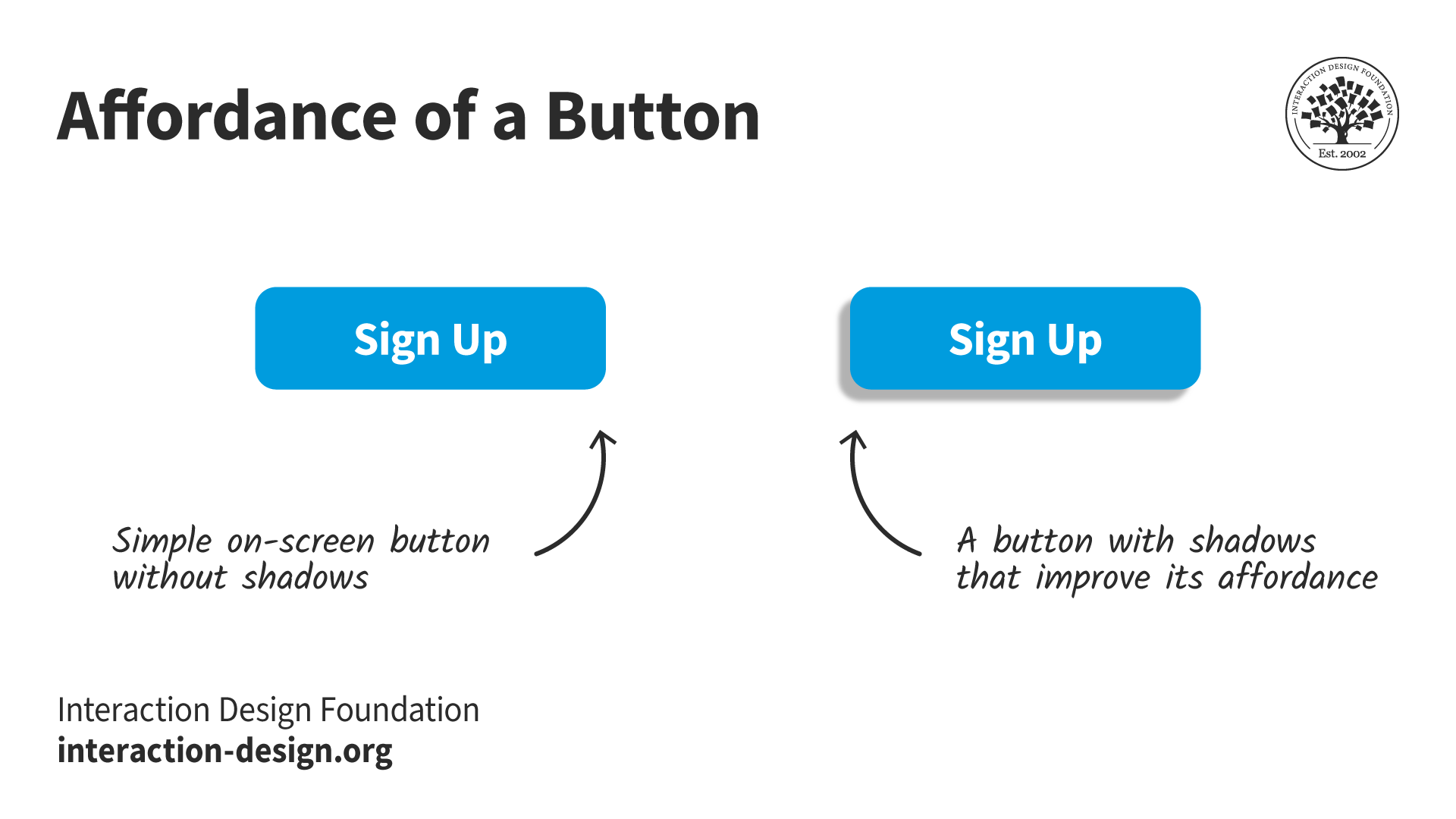
Shadows on buttons improve the affordance of pushing
© Interaction Design Foundation, CC BY-SA 4.0
Signifiers: The Key to Intuitive User Experiences
Norman's replacement for affordances was the term "signifier":
A cue or indicator that communicates to users how an object should be used or what actions are possible. Signifiers can be visual, auditory, or tactile elements that provide users with valuable information about the functionality of an object or system.
A signifier is easy to understand in the context of a door or other relatively simple objects, but how does it apply to the home page of a website or mobile app? DOET is full of the basic principles of interaction design, even though it was written for a general audience. Starting the book with doors was a great idea as it drew readers gently into a complex subject. It's one of the reasons I'm pleased to write about it more than 30 years since I first came across it. Confusingly, the book was called POET at the time: The Psychology of Everyday Things. The publisher later decided it would be a better fit for the design shelves of bookshops (remember those?), so POET became DOET.
Soon after POET was published, I took an undergraduate course in Human-Computer Interaction. The HCI course was interesting but tedious. POET spurred me on to stay in the field. I still use and teach many of its concepts, including Norman’s task-action model.
The Task-Action Model: How Do Your Users Think?
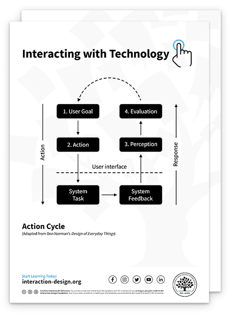
One of the important concepts that POET addresses, which I find more useful than affordances or signifiers, is the task-action model, shown below.
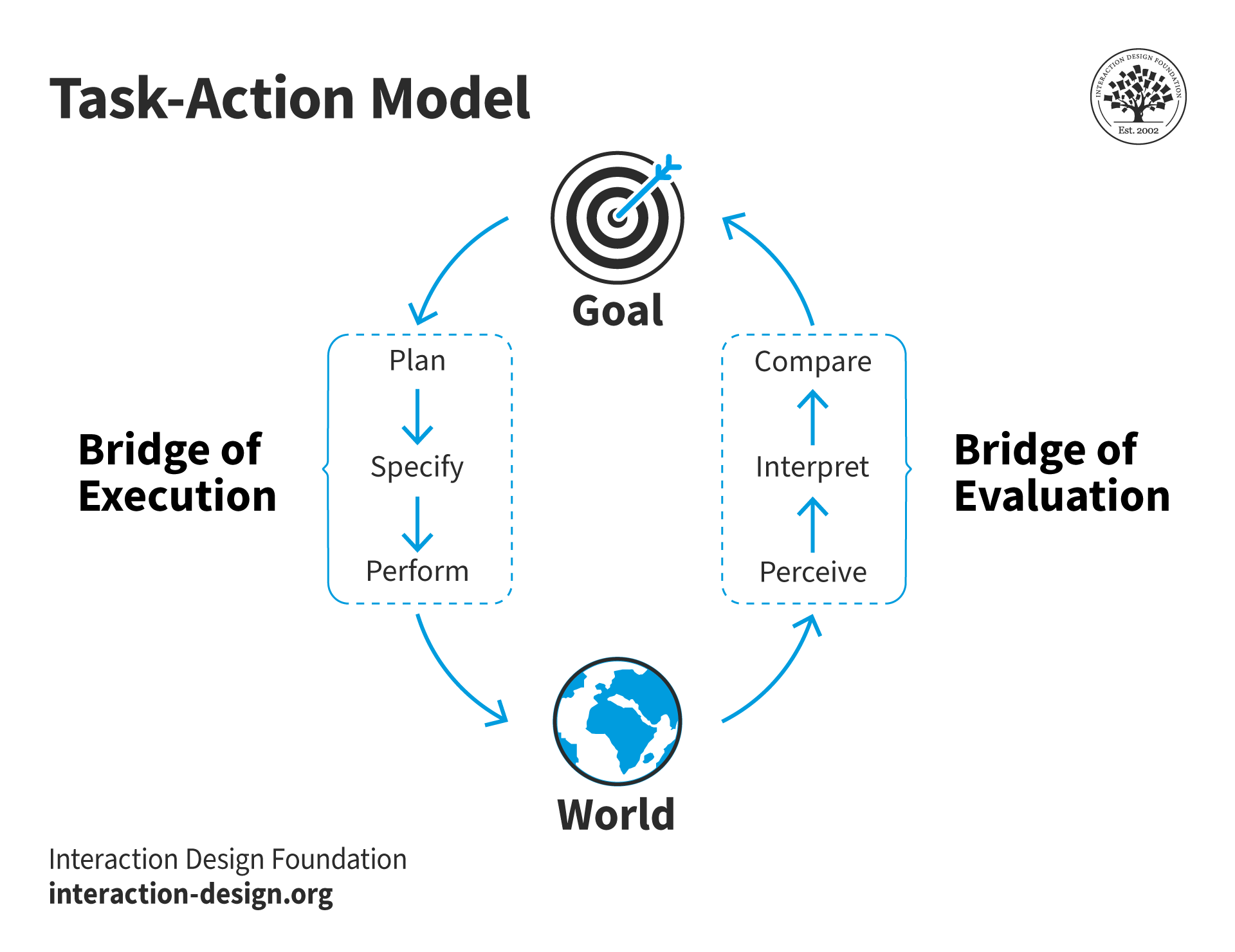
Goals get broken into actions in the world which we perceive and act on
© Interaction Design Foundation, CC BY-SA 4.0
This is the key to how people interact with many things, especially technology. Note that the "bridges" of execution and evaluation were called "gulfs" in earlier editions, which is how I still think of them. But bridges span gulfs, so it's a small change. The point is that these gulfs or bridges need to be as short as possible. People have things they want to do, called goals in the model. They need to break these down into plans and actions in the world. That is the execution side. Usually, we expect our actions to result in a change in the world. We perceive those changes and try to understand their meaning and whether they are relevant to our goal.
So if we want to turn on the lights in a room, we form a plan to locate the light switch, operate it, and hope that the world changes—the lights come on! This sounds like a simple example, but when I used to teach this in conference centers, I would point out that the location of the light switches was not obvious. How they operated could be a complete mystery. In one extreme example, access to the auditorium’s lighting booth was required. The user had to log into a lighting system to effect any changes. The simple case was of no help.
Optimize User Interactions with Goal-Mapping
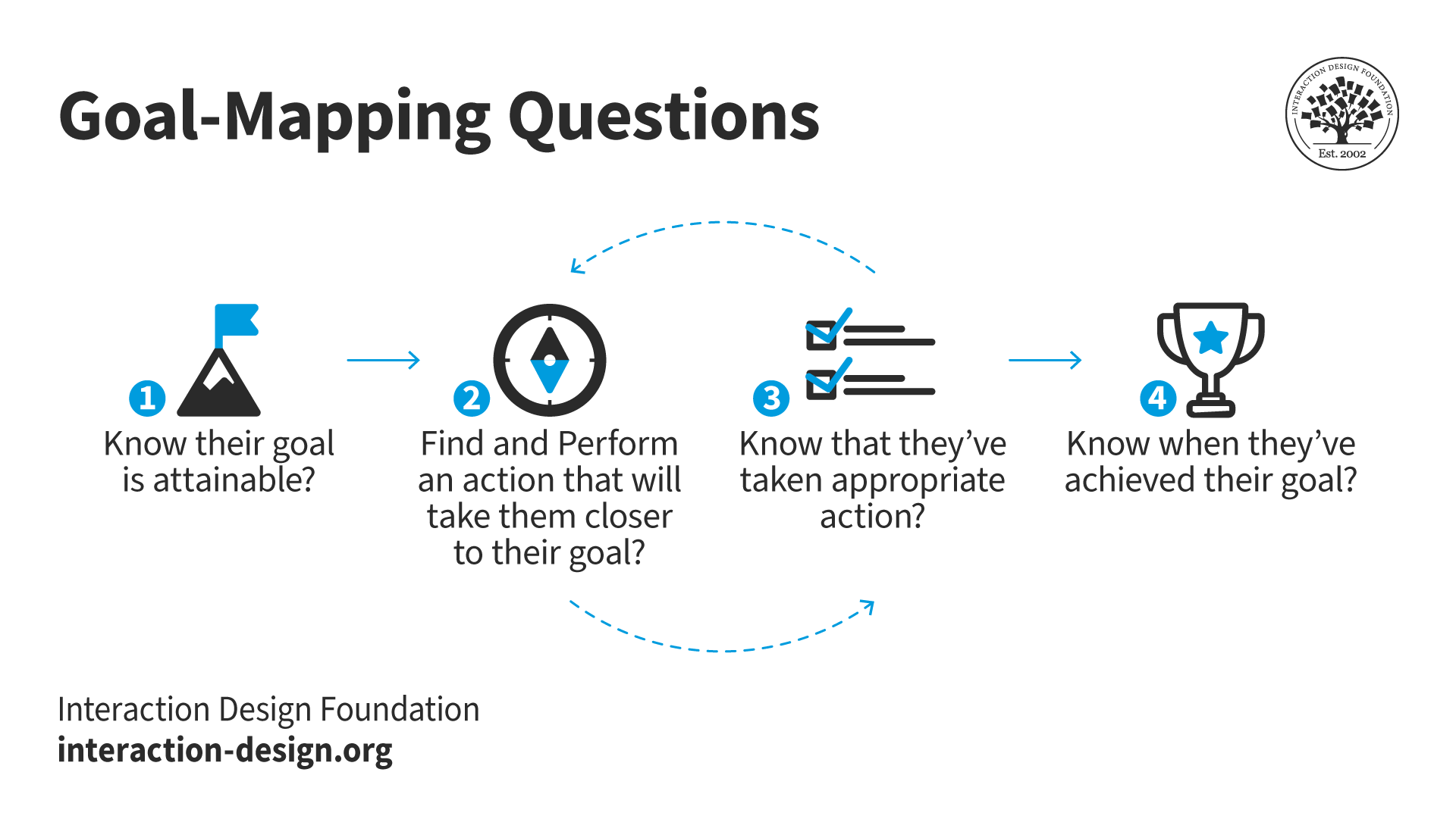
At first glance, the task-action model (above) might seem as abstract as affordances and signifiers. However, it does allow us to ask some fundamental questions.
How do users:
Know their goal is attainable?
Find and perform an action to take them closer to their goal?
Know that they've taken appropriate action?
Know when they've achieved their goal?
These questions relate to evidence in the world. For technological systems, we are referring primarily to evidence in the interface. Questions one and two refer to the execution side of the model, while questions three and four refer to evaluation. Questions two and three are repeated until a user either reaches their goal, decides to try another strategy, or gives up altogether, as illustrated here:
Questions 2 and 3 may be repeated until the goal is reached.
© Interaction Design Foundation, CC BY-SA 4.0
Affordances and signifiers play a role in questions one and two. However, for common problem domains, recognition and consistency are more significant. Recognition requires much less cognitive effort than understanding what an artifact in the interface means or does. Consistency results in fewer complications in questions three and four. For example, the "share" icon is probably recognized by most users through experience, not through understanding its meaning:

The three-node share icon is usually recognized, not understood.
© Interaction Design Foundation, CC BY-SA 4.0
Goal-Mapping Answers
I call these goal-mapping questions because they relate to the path users must take to reach a goal. A useful feature of the questions is that they can be used to evaluate designs.
But first, we need to consider how the answers to our questions might be categorized. I've been using these labels (in order of worst to best):
Implicit expectations: other products/sites/real world
Explicit expectations: previous experience, external
Indirect match: text or images on the screen, but not as users expect
Direct match: text or images on the screen, exactly what users expect
For the "expectation" answers, there isn't any direct evidence in the immediate world. For example, the answer might be implied:
How do I know my goal is attainable?
Because it's an e-commerce site, there must be a way of changing my credit card details.
Explicit expectations are stronger than implicit. Users might receive instructions with their credit card for changing their PIN number. They would arrive at the credit card site with an explicit expectation of this goal.
The two "match" answers are precisely that. Something in the world matches the goal or action the user attempts to perform. An indirect match might be words or an image that is relevant but requires some cognitive processing. For example, you've received an updated credit card and want to change its details on an e-commerce site. You're very unlikely to find mention of credit cards on the home page, but hopefully, you will have learned that these tend to be in the accounts area of the site. A direct match would be a button or link that reads "credit card" or "card details." But hopefully, by this point, you will have been reassured by the answers to question three as you've navigated through the site: "Have I taken appropriate action?" When I try this goal on the Amazon UK site, my journey is
Accounts & Lists > Your Account > Your Payments > Wallet/Cards & accounts
They're indirect matches until the final page (the word “cards”), but there is a subtle feeling that I am getting warmer as I navigate.
The Importance of Cognitive Ease: Are Your Users Confident or Frustrated?
We can assess what’s going on for users by considering a couple of essential factors:
Cognitive ease is the inverse of cognitive effort. It reflects how little thinking users have had to do to match their goal to evidence in the interface.
Confidence is how certain users feel about performing an action, that is, how likely they feel they will reach their goal.
Let’s look at my credit card example above:
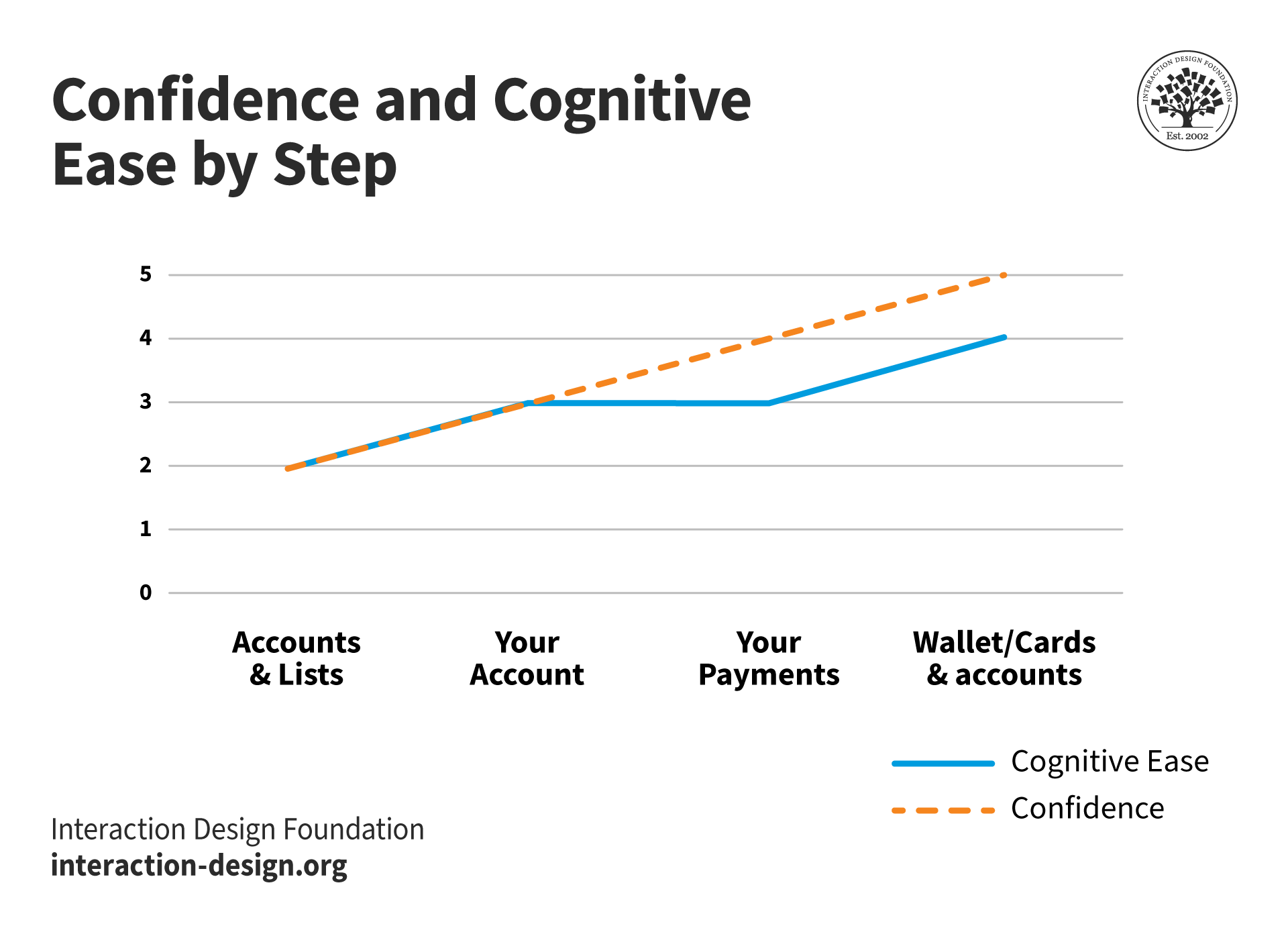
The graph shows confidence constantly rising during navigation while cognitive ease reduces slightly since credit cards are not mentioned until the final page. More cognitive effort has to go into understanding that "Your Account" and "Your Payments" are related to credit cards.
© Interaction Design Foundation, CC BY-SA 4.0
Confidence is usually inversely related to cognitive effort, but there are often surprises. Years ago, I was trying to buy a bedside light on a furniture website organized by rooms. Naturally, I was supremely confident that a bedside light would be found on the bedroom page. But I was mistaken.
Here’s the navigation path and a diagram of the experience:
Shop by Room > Bedroom > ?
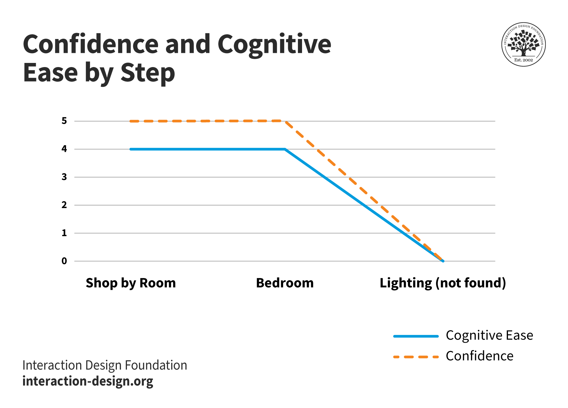
Both cognitive ease and confidence when lighting fails to appear on the bedroom page of the site.
© Interaction Design Foundation, CC BY-SA 4.0
The latest version of the manufacturer’s app is a little better for “buy a bedside light,” but not much. “Lighting” is the last item of a horizontally scrolling list of 15 products!
"Lighting" can be found under bedrooms - if you're patient!
© Interaction Design Foundation, CC BY-SA 4.0
It would be much easier for users if there were only a handful of categories at the bedroom level: Beds & Mattresses, Storage, Tables and Accessories. That solution isn’t ideal either, as it would require users to recognize “bedside light” as an accessory. But user research would tell!
In any event, I wouldn't expect to have to evaluate affordances on an e-commerce or other well-established site. Hopefully, standard user interface components will have been used in a way that most users understand. And all the “evidence” I’ve been discussing are signifiers. Consequently, the interface itself isn't very challenging or exciting, but it works well. It's the kind of experience you would hope to have with a door.
The Take Away
We've discussed Don Norman's concepts of affordances and signifiers, in the context of UX design, particularly focusing on the example of "Norman Doors." Norman's book, "Design of Everyday Things," highlights the challenges users face with poorly designed doors that lead to confusion. Affordances, which represent the perceived functions of objects, are discussed, along with the evolution of the concept towards signifiers. Signifiers act as cues or indicators to guide users on how to interact with objects. However, we've highlighted the importance of recognition and consistency in most cases, since they involve much less cognitive effort.
Finally, we revisited Norman's Action Cycle model and introduced goal-mapping questions that allow us to make use of it as an evaluation tool. Practical examples were provided.
Downloadable Template
We have a free template for evaluating designs with the goal-mapping questions. Try it with your development team. You might have some eureka moments.