Your constantly-updated definition of Signifiers and
collection of videos and articles. Be a conversation starter: Share this page and inspire others!
177shares
What are Signifiers?
Signifiers are perceptible cues that designers include in (e.g.) interfaces so users can easily discover what to do. Signifiers optimize affordances, the possible actions an object allows, by indicating where and how to take action. Designers use marks, sounds and other signals to help people perform appropriate tasks.
“Good design requires, among other things, good communication of the purpose, structure, and operation of the device to the people who use it. That is the role of the signifier.”
If you have ever studied semiotics (i.e., the study of signs and symbols), linguistics or film, you may have come across signifiers before. Generally speaking, a signifier is something that points to or indicates something else. In the 2013 edition of his book The Design of Everyday Things, Don Norman introduced the term to the field of design, and used it to refer to perceivable cues about the affordances — the actions that are possible for a person to take — with a designed object.
Signifiers Should Guide People
Affordances give visual cues about what we can do with objects. For example, a door affords opening; a touchscreen affords touching (something on-screen); a ceiling-to-floor picture window affords viewing (hopefully, picturesque scenery). However, affordances can be problematic when:
A perceived affordance is misleading. E.g., a door is pullable, but its flat horizontal handle hints that people should push it open.
People haveno clue what to do. E.g., a poorly designed touchscreen fails to indicate where to touch and how (e.g., tap or slide) to achieve a goal.
People can’t detect ananti-affordance (something that works against the affordance). E.g., someone accidentally walks into that picture window and gets badly bruised.
That’s why we as designers must direct people who encounter our products to affordances whenever these aren’t clear as well-designed perceived affordances. So, we include signifiers to specify how people discover the possibilities of affordances and communicate where the action should take place. Namely, we design easily findable labels, arrows, icons, sounds and other signals to lead people to take the right actions to use our digital and physical products.
Learn the difference between affordances, perceived affordances and signifiers using the example of an airplane meal.
ShowHide
video transcript
Transcript loading…
The people who use our designs are easily frustrated. They have things to do (e.g., bills to pay), sometimes in stressful circumstances, and even the smallest detail (or lack of it) can make or break a seamless experience. Users shouldn’t have to pause to figure out what to do. And if you accidentally design a perceived affordance that sends the wrong signal, you can delay them (or worse). For example, while on sabbatical at Cambridge University, England, in the 1980s, cognitive science and usability engineering expert Don Norman found he had trouble even using some doors thanks to confusing handles. Norman later introduced the term “signifier” because so many people in the design community were misusing the concept of affordances. Affordances are possible interactions; signifiers are design propertiesthat announce affordances. We need both.
Learn more about “Norman doors” and the difference between good and bad design.
ShowHide
video transcript
Transcript loading…
Norman further describes how affordances and signifiers can exist dependently and independently. Depending on the context, affordances without signifiers and signifiers that mislead can be dangerous: another reason we must craft controls that prove we fully empathize with the people we design for and understand their needs. Don Norman was among the experts consulted following 1979’s Three Mile Island nuclear power plant accident. There, the control room’s design was flawed enough to help fail to prevent a disaster. Although it's an extreme case, a glance at the cost of confusion is enough to highlight the value of signifiers: discoverability and understanding are crucial in human-centered design.
The IxDF landing page features signifiers: e.g., the microcopy “Advance my career now >” clearly signals that blue button’s purpose.
How to Use Signifiers Best
Along with having a good grasp of design principles, ensure that you:
Clearly indicate where and how people should interactwith your website, app or physical product, including the gestures they need to use. For example, should they tap, slide sideways or scroll upwards on your app? If it’s voice-controlled, use a combination of visual (e.g., lights) and auditory signifiers (e.g., vocal cues) to guide them.
Use signifiers consistently. Familiarity is key; don’t make people pause to think. For example:
A large green button to indicate pressing to “Submit”.
Greyed-out text fields to prevent people from entering unnecessary information.
Communicate the purpose with clues as to what to do, what is happening and what alternative actions people can perform. As people will develop their mental model of your product (i.e., the look, feel and operation of it) based on the system image (i.e., what they make of the physical structure they encounter), always design to empathize with them. People make mappings from design parts that appear to be controls, etc., to resulting actions, and the constraints in your design will limit what they can do and help keep them on track.
Remember all the senses, not just seeing and hearing, but also tactile (touch), vestibular (movement) and proprioceptive (body awareness). So, consider where (e.g.) vibrations might act as appropriate signifiers. Furthermore, by designing for accessibility, you can help optimize everyone’s experience.
Overall, you converse with people through your design. When you leverage their knowledge of how the world works and anticipate their needs, you can minimize the risk of uncertainty in good experiences.
Affordances and signifiers work together, but they serve different purposes. Affordances are visual cues about actions you can perform on an object based on its design and the user’s capabilities. For example, a door handle affords pulling if it sticks out, while a flat plate on a dooraffords pushing.
Watch our video to learn more about affordances:
ShowHide
video transcript
Transcript loading…
Meanwhile, signifiers communicate what an action achieves. They provide cues that guide user behavior so users can use the item as intended. A “PULL” sign on a door, an arrow on a touchscreen button, or an icon on a software interface are all signifiers.
Watch our video to learn more about signifiers:
ShowHide
video transcript
Transcript loading…
Users must perceive signifiers if they’re to be useful (i.e. useful signifiers). Good design ensures that signifiers effectively highlight the right affordances. For example, a recessed handle on a sliding door suggests pulling, but without a signifier like an arrow, users might not realize in which direction to pull. A good example of an affordance in a UI is a toggle switch, with visible on and off positions and a slider. It matters a lot whether users notice them since if they don't they will not interact with it. The signifier here is the text or icon that tells users what is being switched on or off. Effective UX design balances both for clarity and usability.
Why are signifiers important in user interface (UI) design?
Signifiers are crucial in UI design because they guide users by clearly showing what actions mean in an interface. Without them, users may struggle to understand how to interact with it—and then get confused, frustrated, and maybe even leave.
Good signifiers help users navigate a design effortlessly. For example, a play button shaped like a triangle immediately signals its function, while a grayed-out button suggests it’s disabled. Buttons that look clickable use affordances. What the buttons do are signifiers.
Signifiers reduce cognitive load by making interactions intuitive. Users shouldn’t have to guess or rely on trial and error—which works against the seamless experience they should enjoy. Instead, the interface should naturally communicate what’s possible.
When signifiers are clear and consistent, users feel more confident and in control, which gives them a better overall experience. Designers who create effective signifiers bridge the gap between user expectations and how their interfaces work.
What are some common examples of signifiers in digital interfaces?
Examples of signifiers—which help users understand what actions they can take on digital interfaces—include buttons with clear labels, icons indicating functionality, and visual cueslike color changes or shadows.
Clickable buttons often use contrasting colors and hover effects to show interactivity. Hyperlinks appear in blue and underline when hovered over, signaling they’re clickable. Icons—such as a magnifying glass for searching or a trash bin for deleting—provide intuitive guidance.
Form fields use placeholder text or floating labels to indicate where users should type. Disabled buttons appear grayed out to show they’re inactive. Loading spinners or progress bars show users that an action is in progress.
When designers create effective UI designs with clear visual cues like this, they improve usability and reduce confusion. This results in intuitive digital experiences that enhance user engagement and satisfaction.
How do color and contrast act as signifiers in UX design?
Color and contrast play a key role in UX design as they act as signifiers that guide user behavior. Bright, high-contrast buttons stand out and signal interactivity, while muted or gray buttons suggest inactivity.
For example, a red button often signals urgency or a destructive action. For example, if you’re about to delete an item, you’d want this button to “jump” out and warn you—which red tends to do. Meanwhile, a green button suggests confirmation or success—and green is a more “positive” color that reassures users. By convention, links are blue and underlined to indicate they’re clickable.
Contrast also improves readability and accessibility—vital considerations in design and often a legal requirement in the case of accessibility. High contrast between text and background ensures legibility, while low contrast can indicate secondary information.
Good UX and UI design involves leveraging color and contrast to create intuitive, visually clear interactions. When effective, these elements reduce confusion, improve usability, and safeguard users from making errors. They also make digital experiences more engaging and accessible for all users, whoever they are and whatever they’re doing.
Take our Master Class How to Use Color Theory to Enhance Your Designs with Arielle Eckstut, Author and Co-Founder of The Book Doctors and LittleMissMatched, and Joann Eckstut, Joann Eckstut, Color Consultant and Founder - The Roomworks.
What role do animations play as signifiers?
Animations act as powerful signifiers in UX design since they provide visual feedback and guide user interactions. They help users understand what’s happening on the screen and what actions they can take.
For example, a button that slightly expands when hovered over signals that it’s clickable. A loading spinner reassures users that the system is processing their request and that they should wait (within reason) for the system response to complete. Slide-in notifications grab attention, while subtle fade effects indicate transitions between states.
Animations also enhance usability by directing focus. For example, a shaking input field signals an error and prompts users to correct their input. Meanwhile, a smooth page transition prevents users from feeling lost when navigating.
When designers use them thoughtfully, animations improve user experience by making interactions more natural and responsive. However, excessive or distracting animations can work against usability and irritate users. The best UX designs use animations to create clarity, reinforce affordances, and make digital experiences feel intuitive and engaging.
Yes, text labels are essential signifiers in UX and UI design, as they provide clear instructions and help users understand an interface. Well-written labels remove ambiguity, help make interactions intuitive and reduce the risk of user errors.
For example, a button labeled “Submit” tells users exactly what will happen when they click it, while a vague label like “OK” can cause confusion. Form field labels—such as “Email Address”—clarify what information users need to enter. Navigation menus with clear text—like “Home,” “Shop,” or “Contact Us”—are tried-and-tested ways to guide users effectively.
Well-designed text labels are concise, specific, and put near interactive elements. However, poorly designed ones—such as jargon-filled or missing ones—force users to guess, leading to frustration or even anger if users feel misled into taking destructive actions like deleting information when they didn’t mean to do so.
Using descriptive, well-placed labels is vital because they improve usability, accessibility, and user confidence. Clear text signifiers create a seamless digital experience and help users navigate and interact effortlessly.
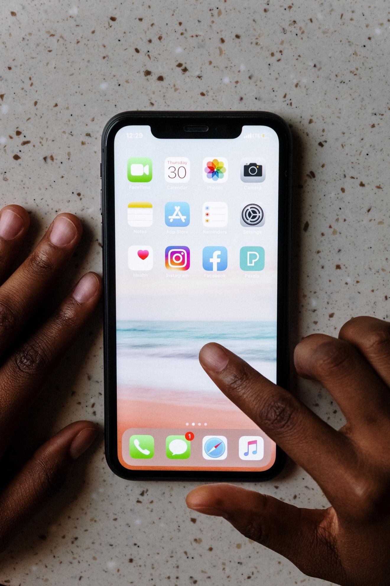
What are the best practices for using signifiers in mobile design?
It’s particularly important to use clear signifiers in mobile design—to improve usability and ensure a smooth user experience—as mobile screens are smaller. Therefore, every visual cue must be intentional and intuitive on that reduced screen real estate, and here are some best practices:
Use familiar icons—a hamburger menu for navigation, a magnifying glass for search, and a trash bin for deleting. These universally recognized symbols help users understand functionality quickly.
Ensure buttons look tapable by using contrasting colors, shadows, or borders. A flat design without clear signifiers can leave users guessing—and frustrate them.
Provide visual feedback—buttons should change color or animate when tapped to confirm interaction. Loading spinners and progress bars reassure users that the app is responding.
Use clear labels when they’re needed, to complement an icon. Not all icons are obvious, so pairing them with text (e.g., “Save” under a floppy disk icon) prevents user confusion.
Keep gestures intuitive—swiping, pinching, and long-pressing should feel natural and have subtle visual cues to support them.
Effective signifiers make mobile navigation effortless and engaging—helping keep the experience seamless between user and brand.
What are the most common mistakes designers make with signifiers?
Designers often make critical mistakes with signifiers that confuse users and hurt usability. One common mistake is using unclear or even missing signifiers. If buttons don’t look tappable or links don’t stand out, users may struggle to navigate—and even abandon the interface and have nothing to do with the brand again.
Another issue is relying too much on icons without labels. Not all icons are universally understood. A floppy disk means "save" to some, but there’s a chance that others may not recognize it. Pairing icons with text improves clarity—and reduces the risk of confusion.
Inconsistent design is another problem. For instance, if one button has a shadow and another doesn’t, users may not know which is clickable. Consistency in colors, shapes, and interactions reinforces usability—and trust in the UI (and the brand behind it).
Some designers overuse animations or flashy effects, too, making interfaces feel cluttered instead of helpful or even irritating—or worse (think of what might happen if users with light-triggered epilepsy see flashing lights). Signifiers should be subtle yet clear.
The best UX designs use intuitive, consistent, and well-placed signifiers to guide users effortlessly around an interface—reducing confusion and improving overall experience for them.
How do cultural differences affect the interpretation of signifiers?
Cultural differences have a significant impact on how users interpret signifiers in UX design. Colors, icons, and gestures can have different meanings across cultures, and so they can affect usability and user experience.
For example, color symbolism varies—red signifies danger or warning in Western cultures but represents luck and prosperity in China. A thumbs-up icon means approval in many countries, but—beware—it is offensive in parts of the Middle East.
Text-based signifiers also differ. Certain words or abbreviations may be unclear or misinterpreted by non-native speakers. Using simple, universally understood language is wise—it improves accessibility.
Gestures and icons can also create confusion and work against a design’s user-friendliness. For example, a mail icon might clearly represent email in Western cultures, but it might be less intuitive elsewhere. Designers should research target audiences and test designs with diverse users to ensure they can “get” the meaning of each signifier and enjoy intuitive and seamless experiences.
Watch as Author and Human-Computer Interaction Expert, Professor Alan Dix explains important points about how to design with culture in mind:
ShowHide
video transcript
Transcript loading…
Video copyright info
Copyright holder: Tommi Vainikainen _ Appearance time: 2:56 - 3:03 Copyright license and terms: Public domain, via Wikimedia Commons
Copyright holder: Maik Meid _ Appearance time: 2:56 - 3:03 Copyright license and terms: CC BY 2.0, via Wikimedia Commons _ Link: https://commons.wikimedia.org/wiki/File:Norge_93.jpg
Copyright holder: Paju _ Appearance time: 2:56 - 3:03 Copyright license and terms: CC BY-SA 3.0, via Wikimedia Commons _ Link: https://commons.wikimedia.org/wiki/File:Kaivokselan_kaivokset_kyltti.jpg
Copyright holder: Tiia Monto _ Appearance time: 2:56 - 3:03 Copyright license and terms: CC BY-SA 3.0, via Wikimedia Commons _ Link: https://commons.wikimedia.org/wiki/File:Turku_-_harbour_sign.jpg
What are some popular and respected books about signifiers?
In this update to his seminal work, UX Pioneer Don Norman introduces the concept of signifiers, referring to perceivable cues that indicate how users can interact with a design. The book emphasizes the importance of intuitive design and has been instrumental in shaping user-centered design principles.
Earn a Gift, Answer a Short Quiz!
Question 1
Question 2
Question 3
Get Your Gift
Try Again! IxDF Cheers For You!
0 out of 3 questions answered correctly
Remember, the more you learn about design, the more you make yourself valuable.
In this course, taught by your instructor, Don Norman, you’ll learn how designers can improve the world, how you can apply human-centered design to solve complex global challenges, and what 21st century skills you’ll need to make a difference in the world. Each lesson will build upon another to expand your knowledge of human-centered design and provide you with practical skills to make a difference in the world.
“The challenge is to use the principles of human-centered design to produce positive results, products that enhance lives and add to our pleasure and enjoyment. The goal is to produce a great product, one that is successful, and that customers love. It can be done.”
42.1 AbstractThe concept of affordances originates from ecological psychology; it was proposed by James Gibson (1977, 19
Book chapter
Open Access—Link to us!
We believe in Open Access and the democratization of knowledge. Unfortunately, world-class educational materials such as this page are normally hidden behind paywalls or in expensive textbooks.

