Your constantly-updated definition of The Rule of Thirds and
collection of videos and articles. Be a conversation starter: Share this page and inspire others!
177shares
What is The Rule of Thirds?
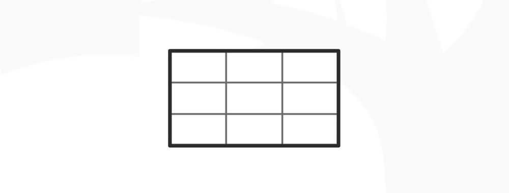
The rule of thirds is a design technique where designers divide a layout into nine equal parts through two equally spaced horizontal lines and two equally spaced vertical lines. This technique makes sures key elements—like images, text or calls to action—appear along these lines or at their intersections, and so boost user engagement and make a balanced, visually appealing interface.
The rule of thirds has deep roots in the theory of proportions. That theory emphasizes the relationship between individual components—micro—and the overall structure—macro—in design. The rule of thirds comes from Painter and Engraver, John Thomas Smith's 1797 insights in Remarks on Rural Scenery, and it’s evolved to become a cornerstone of design alongside the golden ratio and the rule of proportions.
Designers, photographers and others who work in the visual arts have applied the rule of thirds design principle in works that are both captivating and effective—to create a sense of harmony, intrigue and more. These compositions feature strategically placed elements along the grid lines or their intersections—or the “sweet spots”—to whet visual interest and create balance. For example, the rule of thirds in graphic design is a staple technique of visual communication, one that can access viewers in a storytelling manner—or arouse their interest in other compelling ways.
The rule of thirds is a design staple that speaks volumes through the compositions it frames.
Unsurprisingly, the rule of thirds is an essential visual design technique that features greatly in UX (user experience) design. Designers particularly value it as a way to help optimize the user experience in digital products such as web pages. When designers work on user interfaces (UIs), they use the rule of thirds to guide the eyes of their target audience naturally to the most crucial parts of a site or mobile app. They can therefore improve usability and aesthetic appeal as they help users establish a sense of order, intrigue and trust in their design works.
When designers get the rule of thirds working in their designs, they align key interface elements—such as navigation bars, call-to-action buttons and key information—along these strategic points. Here are the main benefits of the rule of thirds in UI design:
1. Visual Hierarchy, Harmony and Balance
Designers use the rule of thirds to establish a clear visual hierarchyin their web design work and elsewhere. This arrangement helps them highlight the most crucial elements there, like call-to-action buttons or key information. It makes them easily accessible and noticeable for users.
The rule of thirds helps make a balanced composition, too. When designers distribute elements evenly across the grid, they can stop themselves from overcrowding a design—and make sure that each component receives adequate space to “breathe.” This technique enhances how clear and readable the interface is overall. What’s more, when designers apply the rule of thirds across websites they design, it can give a really consistent and professional look to their work.
2. Enhanced User Interaction and Conversion
When designers put elements strategically around a screen with the rule of thirds, it doesn’t just capture user attention. It guides users’ interactions across the interface, too. This guidance is something that can greatly improve both the navigation and usability. And it can lead to better user engagement—as well as potentially higher conversion rates. For example, if designers place a primary call-to-action at an intersection point within the grid, it can draw users’ eyes towards it—and naturally so. So, users will be much more likely to interact with the call-to-action.
The rule of thirds can really help improve the user experience whenever users encounter static elements like information architecture on a webpage. Still, it also applies to dynamic elements in interactive designs, where user focus is absolutely critical.
Another great advantage of the rule of thirds lies in its flexibility and effectiveness across different screen sizes and orientations. This adaptability is something that’s crucial in responsive design—where user interfaces have to function seamlessly across a range of devices from desktops to smartphones. With the rule of thirds, designers can create layouts that keep a high level of visual appeal and functionality, whatever the device. This makes sure users can have a consistent user experience—everywhere.
4. Enhanced Visual Interest
The rule of thirds also encourages designers to experiment with asymmetry so they can make layouts that are more dynamic and visually interesting. For instance, designers can place an image near two-thirds of one side rather than center it. That way, they can break the monotony of a symmetrical design. This adds an element of surprise and visual interest, and the technique’s particularly effective to draw the user's eye to specific areas of the screen. It gives a boost to both the design's aesthetic quality and its functional efficiency, too.
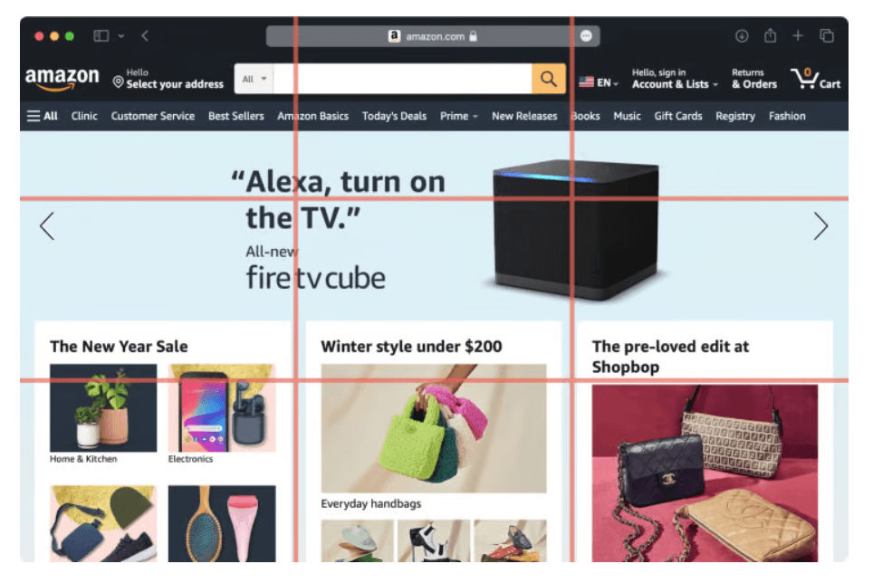
Amazon structures its homepage around a grid that’s divided into nine equal parts—leveraging the rule of thirds to make the best visual flow and user engagement.
How Do Designers Apply the Rule of Thirds in Website Design?
UI designers use the rule of thirds in website design to organize and position elements effectively, and here's how they do it:
1. Layout Composition
Designers put key elements like logos, navigation menus and call-to-action buttons at the intersection points—or along the lines. This makes for a layout that’s more balanced and visually engaging.
2. Content Placement
Designers often place images, text blocks and other content in a way that goes in line with the rule of thirds grid. They draw users’ attention to the important content and make a natural flow for their eyes to go with.
3. Visual Hierarchy
When designers align important content or interactive elements with the intersecting points or lines, they can establish a visual hierarchy that’s clear—and guide the user's focus to specific areas of the website.
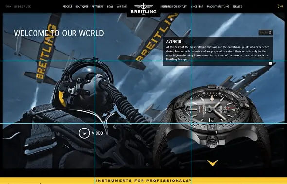
Breitling watch’s design balances many elements well on one screen.
Designers use the rule of thirds to make sure there’s an optimal distribution of negative space or white space. This can boost the readability—and overall user experience—of the design.
5. Responsive Design
When designers create content for different screen sizes, the rule of thirds helps them keep a balanced composition and adapt the layout effectively across various devices.
CEO of Experience Dynamics, Frank Spillers explains responsive design:
ShowHide
video transcript
00:00:00 --> 00:00:30
Now, just to start off by saying responsive is a default. Responsive is not an option – *do it*. And the reason is because that's where the world is at. Everyone expects things to be mobile-optimized, and responsive just means that if I switch from my laptop to my tablet to my phone, the site's going to fit to that resolution; it's going to kind of follow me.
00:00:30 --> 00:00:52
And we know that users do that; that's the default. So, by doing responsive design, you're supporting device switching, and that's why it's important. You're also potentially making things a little bit more accessible and SEO-friendly, which is a factor for Google's algorithm that prioritizes responsive sites.
Advanced Techniques and Examples
For more sophisticated applications, designers might choose to use variations like focusing on just the columns or rows of the grid. This can help them put emphasis on specific aspects of the content more strongly.
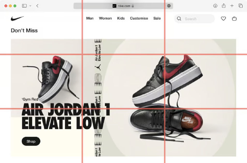
Nike utilizes the rule of thirds by making sure that these focal points really grab the viewer's attention.
Step-by-Step Guide to Implement the Rule of Thirds
To design rule of thirds compositions well, designers can follow these steps:
1. Establish the Grid
Designers should set up a basic grid on their design canvas—one that divides the space into nine equal sections. That grid will serve as the foundation for them to strategically place the design elements. It’s important to make sure that the grid lines are even in spacing both horizontally and vertically so they create a balanced layout.
2. Place Key Elements
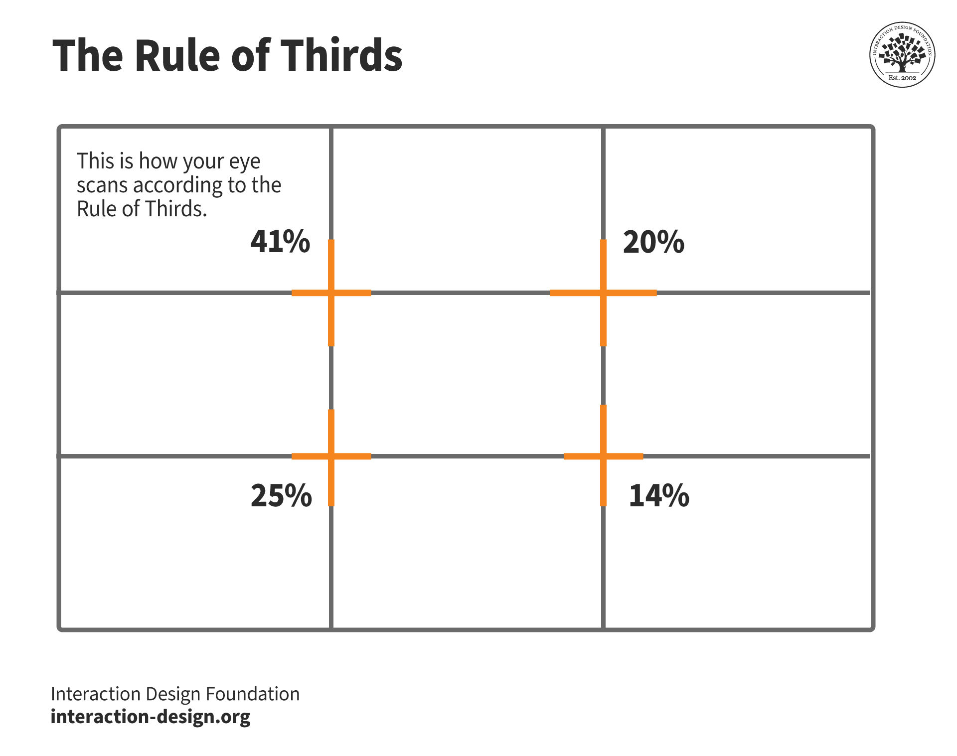
Designers should focus on positioning important elements—like logos, navigation menus, call-to-action buttons and key content—at the intersections of these grid lines. These points typically attract the most viewer attention, and they can give a great boost to the design’s visual impact. The top-left intersection—for example—gets the highest visual attention at over 40%. That makes it an ideal spot for the most important information or interactive elements to go.
3. Use Visual Weight and Balance
Designers should distribute elements across the grid to keep a visual balance. Avoid overcrowding any one part of the grid, especially the intersections. The rule of thirds encourages not just the placement of elements at the intersections but along the lines themselves, too. That can help them achieve a well-proportioned and aesthetically pleasing design.
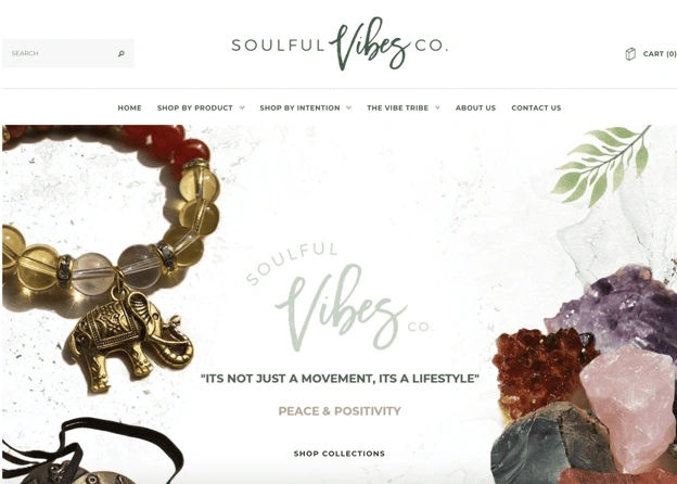
This design’s main focus—on the crystal rocks and the beaded bracelet with an elephant—is on the left and right thirds sections, and that makes sure the visitor focuses on the center text itself: "It's not just a movement, it's a lifestyle."
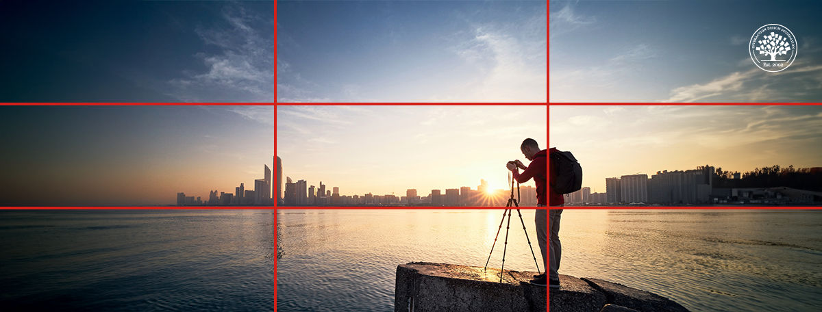
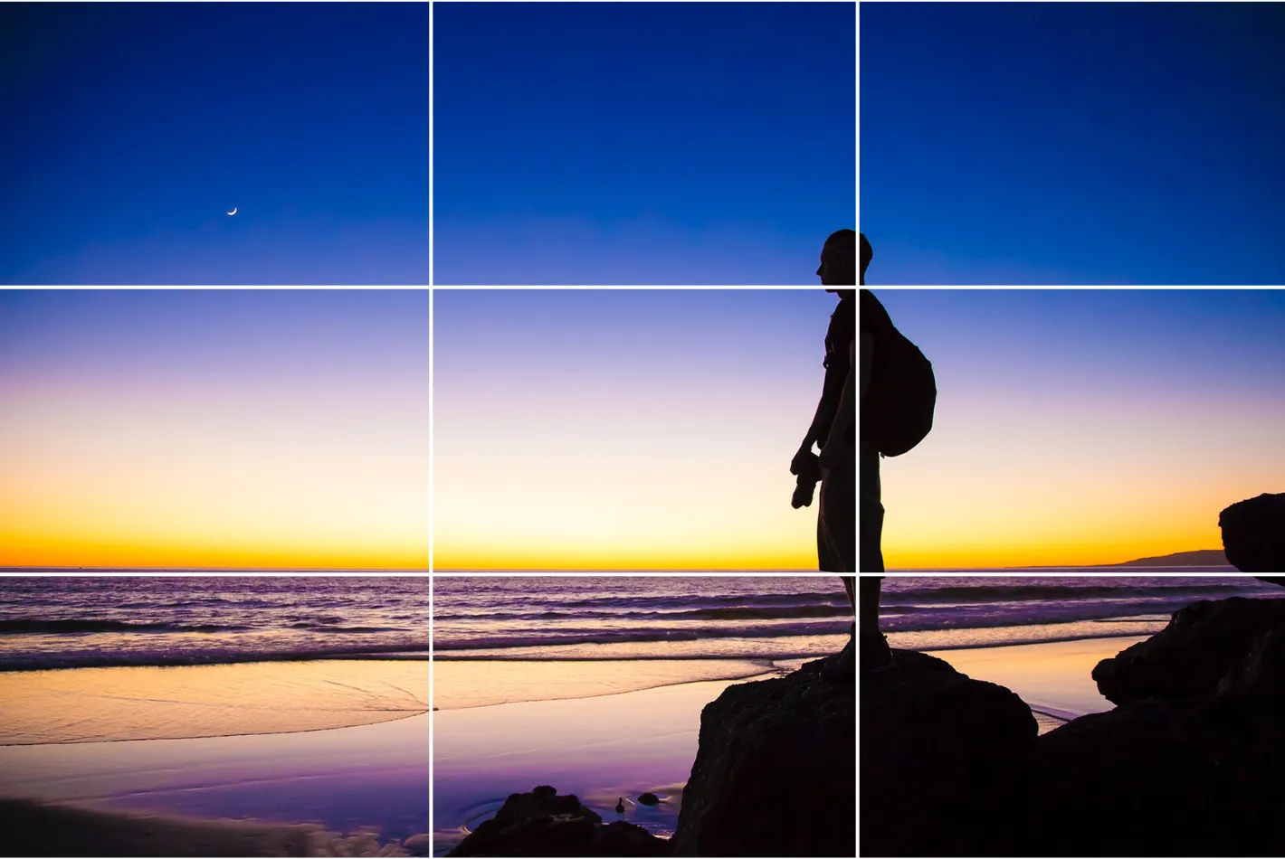
When designers work images or graphical elements into their designs, they should line the subject or focal point up with the grid intersections or along the lines. This technique is crucial not just in UI/UX design but in photography, too, where the rule of thirds is a foundational skill. For example, in a landscape photo, to run the horizon line along the top or bottom horizontal grid line—and not the center—can make for a more captivating composition.
5. Practice Continuously and Make Adjustments
The best way to master the rule of thirds is to keep at it with continuous practice—and experimentation. Designers should apply this rule in different projects and see how it changes their design’s visual appeal as well as user interaction. They should use tools like cropping and re-aligning in post-production so they refine how they put elements according to the rule of thirds. What’s more, this can help them train their designer’s eye to naturally recognize these balance points in future projects.
6. Conduct Usability Testing
Designers can make sure how effective their rule-of-thirds web designs and other visual designs are when they do their user testing well. Regular feedback mechanisms—like A/B testing and heatmaps—can further refine how they apply the rule of thirds. These can help designers understand how users interact with their creations—and where they may need to make adjustments. When designers regularly revisit these principles and adapt them based on specific project needs and user feedback, it can lead to more refined and successful design outcomes.
UX Strategist and Consultant, William Hudson explains A/B testing in this video:
ShowHide
video transcript
00:00:00 --> 00:00:32
A/B testing is all about changes in behavior. We present people with alternative designs and we look to see how much that alters their subsequent response. So in the simple A/B case, we show them design A, we show them design B, and we measure typically a completion goal, which a lot of subject areas in user experience we refer to as conversions.
00:00:32 --> 00:01:04
So signing up to a newsletter, adding an item to a shopping basket, making a donation to a charity. These are all things that are important to their respective organizations. And typically for the interactive technology that we're working on. So websites and and apps, for example. So these are the things often that we're measuring, but they're not the only things that we can measure. We can measure really straightforward stuff like time spent on page, time spent in the site and also bounce rates.
00:01:04 --> 00:01:33
For example, we'll be looking at some of those a bit later on. Just a reminder that because A/B testing is done very late in the day with live sites and large numbers of users, you really want to make sure that your solution is sound before you get this far. You're not going to be able to test everything that is possibly worrying you or possibly causing problems to users. It's just too long involved and potentially expensive in terms
00:01:33 --> 00:02:00
of user loyalty and also the amount of effort you'd have to put into it. So we are looking at using A/B testing to basically polish the solution rather than to rework it. Bear that in mind and make sure that you've done adequate testing up to this point. Also, bear in mind that A/B testing tends to be focused on individual pages, so it is possible to have multi-page tests, but
00:02:00 --> 00:02:30
it's a more complex area than we're going to be looking at in this lesson. So experiments have research questions that basically the things that you're trying to answer and because A/B testing focuses on changes in behavior, the research questions are going to be centered on defined goals. And as I've mentioned already, typically conversions. So will as an example, moving the add button above the fold improve sales conversions? I would imagine it would actually do something. I always find people
00:02:30 --> 00:03:01
are making the mistake of getting too talkative on the first screen of the page and the actual “buy this” or “add to basket” button gets pushed further and further down until users actually don't even see it. Will a more clearly worded charitable purpose increase donations? If people have a better understanding of what your charity's about or where this money is going, would that improve conversions for those users? So both of these can be A/B tested by using goals that you almost
00:03:01 --> 00:03:30
certainly have already defined in your analytic solution. So these are very good candidates for A/B and multivariate testing. But I'll give you some examples of bad questions too. So obviously I will repeat the words “don't ask this” when I've mentioned them because they're not meant as examples that you should be taking away. Conversely, research questions that are not directly related to improved goal completions tend not to be suitable for AB testing.
00:03:30 --> 00:04:02
And a kind of vague question like “will better product photos reduce questions to customer service?”, don't ask this, is the sort of thing that you simply cannot effectively test in A/B testing. And the reason is that there are all kinds of channels to customer service and only some of them are through the website and only some of them can be effectively measured as goals. So it's just not a suitable scenario for A/B testing. There is a related question you could ask though,
00:04:02 --> 00:04:30
which might be just as good, although not exactly equivalent, and that would be: “Will better product photos improve sales conversions?” Because if it reduces queries to customer service, it's almost certain that people are going to be much more confident about placing orders, adding those things to their basket. So that is a very easily measured outcome in terms of A/B testing, and that is the kind of question that A/B testing is very good at.
00:04:30 --> 00:04:43
So simply rewording or rethinking the question in terms of defined user and business goals is one way of getting to a satisfactory conclusion, even if you have a slightly squiffy question to start with.
Software and Tools to Implement the Rule of Thirds
Designers can choose from numerous tools to implement the rule of thirds, including the following:
1. Grid Systems in Design Software
Design software like Adobe Photoshop, Illustrator or Sketch often include grid systems that allow designers to overlay a rule of thirds grid on their designs. This helps designers align and position elements according to the rule.
2. Grid Plugins and Extensions
Many design softwares offer plugins and extensions specifically for grid systems and composition, such as "GuideGuide" for Photoshop and "Grid Guide" for Sketch, which enable designers to create and align designs based on the rule of thirds.
3. Grid Generators
Online grid generators such as "Gridulator" and "Gridpak" let designers generate custom grid systems, including the rule of thirds—and download them to use in their design projects.
4. Grid Paper and Templates
Physical grid paper and printable templates with the rule of thirds grid are ideal for sketching and initial wireframing before designers move on to digital design software.
5. Mobile Apps
There are mobile apps specifically for applying the rule of thirds to photographs that smartphone users take. These apps overlay the grid on the camera viewfinder, helping photographers align their shots according to the rule.
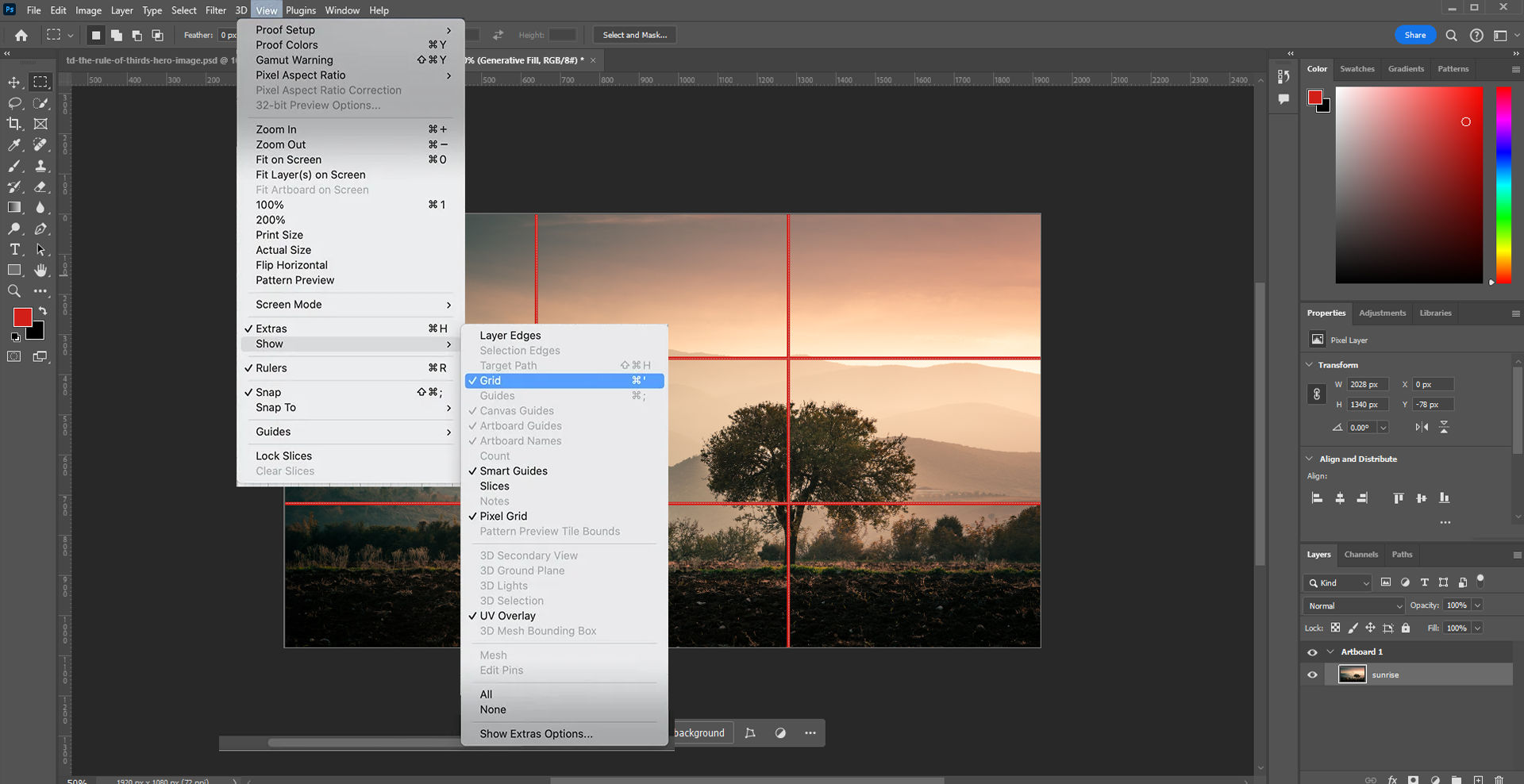
Photoshop features a handy way to apply the rule of thirds: click "View" → "Show" → "Grid".
Considerations and Risks about the Rule of Thirds
The rule of thirds is certainly a fundamental design principle in UX and UI design. Still, it’s crucial to be aware of potential limitations and risks that may affect just how effective a design ends up being. When designers understand these considerations, it can help them make decisions that are more informed—and potentially avoid common pitfalls.
1. Limitations in Creative Freedom
To rely too heavily on the rule of thirds may accidentally get in the way of a designer’s creativity. It might lead to designs that lack a unique feel and a personal touch. This overreliance can end up making interfaces feel standardized, monotonous—and uninspiring. Users will be less likely to take to experiences that don’t have the engaging effects they’re after.
2. Suitability for Various Design Approaches
The rule of thirds mightn’t always be the best choice for every design scenario. For instance, minimalistic interfaces—which thrive on simplicity and ample white space—or data-heavy interfaces—which call for a different approach to information hierarchy and layout—mightn’t benefit from strictly sticking to this rule.
3. Risks of Overcrowding and Clutter
Designers might feel tempted to put too many elements at the intersections of the grid—in the belief that doing so will capture users’ attention better. However, this can lead to a cluttered and overwhelming interface—one where the user finds it difficult to focus or find important information.
4. Balance and Composition Challenges
If designers use the rule of thirds incorrectly, it can result in compositions that are unbalanced and visually confusing. If designers fail to thoughtfully align elements—or if they misuse the grid—the overall aesthetic and functional quality of the design may suffer and harm the user experience.
5. Overemphasis on Aesthetics Over Usability
Indeed, it’s important to create designs that are very visually appealing. Even so, designers who overemphasize aesthetics at the cost of usability can end up making interfaces that are utterly beautiful—yet hard to navigate and understand. This misalignment often results in users who are frustrated and who may not engage deeply with the product.
6. Inflexibility Across Different Devices
The rigidity of the rule of thirds can sometimes work against its application across various screen sizes and resolutions. Designs that look perfect on a desktop might not translate well to smaller mobile screens. This can lead to issues in visual coherence and user interaction.
7. Content-Design Disconnect
If designers stick too strictly to the rule of thirds, they might make designs that don’t adequately consider the content they should display. This can make for a disconnect between what the design emphasizes and the actual information or functionality that needs to come across to users—which can potentially mislead users.
8. Accessibility Concerns
Designs that focus too heavily on aligning elements strictly according to the rule of thirds might overlook important accessibility considerations—like readable text sizes and easily clickable buttons. This oversight can make the interface less accessible to users with disabilities—and that’s a great risk in user-centered design.
This video explains why accessibility is such a vital concern in design:
ShowHide
video transcript
00:00:00 --> 00:00:30
Accessibility ensures that digital products, websites, applications, services and other interactive interfaces are designed and developed to be easy to use and understand by people with disabilities. 1.85 billion folks around the world who live with a disability or might live with more than one and are navigating the world through assistive technology or other augmentations to kind of assist with that with your interactions with the world around you. Meaning folks who live with disability, but also their caretakers,
00:00:30 --> 00:01:01
their loved ones, their friends. All of this relates to the purchasing power of this community. Disability isn't a stagnant thing. We all have our life cycle. As you age, things change, your eyesight adjusts. All of these relate to disability. Designing accessibility is also designing for your future self. People with disabilities want beautiful designs as well. They want a slick interface. They want it to be smooth and an enjoyable experience. And so if you feel like
00:01:01 --> 00:01:30
your design has gotten worse after you've included accessibility, it's time to start actually iterating and think, How do I actually make this an enjoyable interface to interact with while also making sure it's sets expectations and it actually gives people the amount of information they need. And in a way that they can digest it just as everyone else wants to digest that information for screen reader users a lot of it boils down to making sure you're always labeling
00:01:30 --> 00:02:02
your interactive elements, whether it be buttons, links, slider components. Just making sure that you're giving enough information that people know how to interact with your website, with your design, with whatever that interaction looks like. Also, dark mode is something that came out of this community. So if you're someone who leverages that quite frequently. Font is a huge kind of aspect to think about in your design. A thin font that meets color contrast
00:02:02 --> 00:02:20
can still be a really poor readability experience because of that pixelation aspect or because of how your eye actually perceives the text. What are some tangible things you can start doing to help this user group? Create inclusive and user-friendly experiences for all individuals.
Designers should note that to break away from the rule of thirds can work well, too. It might lead to unique and captivating designs. Depending on the project's requirements and creative direction, designers might deviate and arrive at fresh perspectives and innovative solutions—solutions that really stand out in the digital landscape.
Overall, the rule of thirds is a time-tested tool that can help improve user experience—and boost engagement and conversion. It can cast compelling imagery and build trust with a brand, too. As with other design principles, it’s important to apply it mindfully and create good-looking designs that users find useful, helpful and more.
How does the rule of thirds improve visual composition?
The rule of thirds is a fundamental composition principle in design and photography. It improves visual balance and interaction in a layout. When designers divide the image into a grid—of three horizontal and three vertical segments—they put important elements along these lines or at their intersections. This technique encourages a more natural movement of the eye through the artwork. What’s more, it gives its aesthetic appeal a boost and makes the composition more dynamic and balanced.
How does the rule of thirds relate to the golden ratio?
The rule of thirds and the golden ratio both guide the arrangement of elements in a design—but they do it in different ways. The rule of thirds divides the design space into nine equal parts with two horizontal and two vertical lines. To stick key elements at the intersections or along these lines creates balance and directs the viewer's eye.
The golden ratio, though, involves a more complex mathematical relationship of 1:1.618. It suggests a division of space that’s asymmetrical yet naturally pleasing to the eye. When designers use the golden ratio, they often make a focal point that runs in line with this ratio. That leads to a sense of aesthetic harmony, one that feels organic.
Although both principles aim to enhance visual interest and harmony, many professionals see the golden ratio as being more flexible. That’s due to its adaptability to different scales and its prevalence in nature. The rule of thirds is a kind of simplification of the golden ratio. It makes it easier to apply—but sometimes less dynamic.
Designers can choose between these principles based on their specific goals and the project’s context. Both methods help structure content in a way that's visually appealing and easy to navigate.
Watch as UX Strategist and Consultant, William Hudson explains the golden ratio:
ShowHide
video transcript
00:00:00 --> 00:00:33
The golden ratio, also known as The Golden section or Golden mean, is a mathematical ratio that is closely related to the Fibonacci sequence. It is commonly found in nature and when used in design, it fosters organic and natural looking compositions that are esthetically pleasing to the eye. The golden ratio has been employed for over 2000 years and is still fundamental to both designers and users. Because these forms are so prevalent, our eyes identify them quickly and we tend to process these as familiar and pleasing. You can find beautiful examples of the sequence throughout many
00:00:33 --> 00:01:01
natural elements ferns, flowers, seashells, even hurricanes. Although the golden ratio has been a subject of study for centuries, the medieval Italian mathematician Fibonacci popularized the sequence in which every number is simply the sum of the two numbers before it. The ratio between two consecutive Fibonacci numbers is approximately 1.618, also called Phi. Like Pi, it has a long string of numbers after the decimal point.
00:01:01 --> 00:01:31
Fortunately, we can approximate this to 1.6 or 1.61 or 1.618 in designs without surrounding the esthetic appeal of the golden ratio. But how is the ratio used in design? Think of a rectangle with a short side of length. One. To calculate the most esthetically pleasing rectangle, you simply multiply the length of the short side by the golden ratio approximation of 1.618. So the long side in this instance would have a length of 1.618.
00:01:31 --> 00:02:04
Today we use the golden ratio widely in graphics, websites and applications to create more esthetic designs. In particular, it is very easy to incorporate when building wireframes. You can show that the content you need is prioritized properly and that the esthetic demands of the layout will be met without doing too much design work at first. In this example, the ratio between the content area and sidebar is equal to Phi. If you divide the total width of 960 pixels by 1.618, you get 593 pixels.
00:02:04 --> 00:02:25
You then assign this width to the content area. You assign the remaining 367 pixels to the side bar. As this is a ratio, it is flexible. This means that you can easily apply to make many design layouts as there is no need to use fixed numbers. All you need to do is specify that one area is 1.618 times longer than the other.
Are there cultural variations in the use of the rule of thirds?
Yes, cultural variations affect it. This composition principle is widely applicable, indeed, but its implementation can differ based on cultural perceptions—of space, balance and aesthetics. In Western cultures, for instance, designers often use the rule of thirds to create dynamic visual interest in a picture. They position key elements off-center to guide the viewer’s eye in a specific narrative direction.
In many Asian cultures, though, there’s a preference for compositions that are more central and symmetric. This reflects principles of balance and harmony—that are prevalent in artistic traditions like Japanese Zen gardens and Chinese landscape paintings. Here, designers might still use the rule of thirds but do it in a way that emphasizes balance and tranquility rather than dynamic movement.
These cultural preferences can influence everything from graphic design to web layouts. And it’s crucial to understand these differences for designers who work in global contexts. When they recognize and adapt to cultural variations in visual composition, designers can communicate more effectively with diverse audiences.
Watch Author and Human-Computer Interaction Expert, Alan Dix explain why it’s important to design with culture in mind:
ShowHide
video transcript
00:00:00 --> 00:00:32
As you're designing, it's so easy just to design for the people that you know and for the culture that you know. However, cultures differ. Now, that's true of many aspects of the interface; no[t] least, though, the visual layout of an interface and the the visual elements. Some aspects are quite easy just to realize like language, others much, much more subtle.
00:00:32 --> 00:01:04
You might have come across, there's two... well, actually there's three terms because some of these are almost the same thing, but two terms are particularly distinguished. One is localization and globalization. And you hear them used almost interchangeably and probably also with slight differences because different authors and people will use them slightly differently. So one thing is localization or internationalization. Although the latter probably only used in that sense. So localization is about taking an interface and making it appropriate
00:01:04 --> 00:01:31
for a particular place. So you might change the interface style slightly. You certainly might change the language for it; whereas global – being globalized – is about saying, "Can I make something that works for everybody everywhere?" The latter sounds almost bound to fail and often does. But obviously, if you're trying to create something that's used across the whole global market, you have to try and do that. And typically you're doing a bit of each in each space.
00:01:31 --> 00:02:02
You're both trying to design as many elements as possible so that they are globally relevant. They mean the same everywhere, or at least are understood everywhere. And some elements where you do localization, you will try and change them to make them more specific for the place. There's usually elements of both. But remembering that distinction, you need to think about both of those. The most obvious thing to think about here is just changing language. I mean, that's a fairly obvious thing and there's lots of tools to make that easy.
00:02:02 --> 00:02:31
So if you have... whether it's menu names or labels, you might find this at the design stage or in the implementation technique, there's ways of creating effectively look-up tables that says this menu item instead of being just a name in the implementation, effectively has an idea or a way of representing it. And that can be looked up so that your menus change, your text changes and everything. Now that sounds like, "Yay, that's it!"
00:02:31 --> 00:03:00
So what it is, is that it's not the end of the story, even for text. That's not the end of the story. Visit Finland sometime. If you've never visited Finland, it's a wonderful place to go. The signs are typically in Finnish and in Swedish. Both languages are used. I think almost equal amounts of people using both languages, their first language, and most will know both. But because of this, if you look at those lines, they're in two languages.
00:03:00 --> 00:03:31
The Finnish line is usually about twice as large as the Swedish piece of text. Because Finnish uses a lot of double letters to represent quite subtle differences in sound. Vowels get lengthened by doubling them. Consonants get separated. So I'll probably pronounce this wrong. But R-I-T-T-A, is not "Rita" which would be R-I-T-A . But "Reet-ta". Actually, I overemphasized that, but "Reetta". There's a bit of a stop.
00:03:31 --> 00:04:02
And I said I won't be doing it right. Talk to a Finnish person, they will help put you right on this. But because of this, the text is twice as long. But of course, suddenly the text isn't going to fit in. So it's going to overlap with icons. It's going to scroll when it shouldn't scroll. So even something like the size of the field becomes something that can change. And then, of course, there's things like left-to-right order. Finnish and Swedish both are left-to-right languages. But if you were going to have, switch something say to an Arabic script from a European script,
00:04:02 --> 00:04:31
then you would end up with things going the other way round. So it's more than just changing the names. You have to think much more deeply than that. But again, it's more than the language. There are all sorts of cultural assumptions that we build into things. The majority of interfaces are built... actually the majority are built not even in just one part of the world, but in one country, you know the dominance... I'm not sure what percentage,
00:04:31 --> 00:05:02
but a vast proportion will be built, not just in the USA, but in the West Coast of the USA. Certainly there is a European/US/American centeredness to the way in which things are designed. It's so easy to design things caught in those cultures without realizing that there are other ways of seeing the world. That changes the assumptions, the sort of values that are built into an interaction.
00:05:02 --> 00:05:35
The meanings of symbols, so ticks and crosses, mostly will get understood and I do continue to use them. However, certainly in the UK, but even not universally across Europe. But in the UK, a tick is a positive symbol, means "this is good". A cross is a "blah, that's bad". However, there are lots of parts of the world where both mean the same. They're both a check. And in fact, weirdly, if I vote in the UK,
00:05:35 --> 00:06:02
I put a cross, not against the candidate I don't want but against the candidate I do want. So even in the UK a cross can mean the same as a tick. You know – and colors, I said I do redundantly code often my crosses with red and my ticks with green because red in my culture is negative; I mean, it's not negative; I like red (inaudible) – but it has that sense of being a red mark is a bad mark.
00:06:02 --> 00:06:33
There are many cultures where red is the positive color. And actually it is a positive color in other ways in Western culture. But particularly that idea of the red cross that you get on your schoolwork; this is not the same everywhere. So, you really have to have quite a subtle understanding of these things. Now, the thing is, you probably won't. And so, this is where if you are taking something into a different culture, you almost certainly will need somebody who quite richly understands that culture.
00:06:33 --> 00:06:43
So you design things so that they are possible for somebody to come in and do those adjustments because you probably may well not be in the position to be able to do that yourself.
Video copyright info
Copyright holder: Tommi Vainikainen _ Appearance time: 2:56 - 3:03 Copyright license and terms: Public domain, via Wikimedia Commons
Copyright holder: Maik Meid _ Appearance time: 2:56 - 3:03 Copyright license and terms: CC BY 2.0, via Wikimedia Commons _ Link: https://commons.wikimedia.org/wiki/File:Norge_93.jpg
Copyright holder: Paju _ Appearance time: 2:56 - 3:03 Copyright license and terms: CC BY-SA 3.0, via Wikimedia Commons _ Link: https://commons.wikimedia.org/wiki/File:Kaivokselan_kaivokset_kyltti.jpg
Copyright holder: Tiia Monto _ Appearance time: 2:56 - 3:03 Copyright license and terms: CC BY-SA 3.0, via Wikimedia Commons _ Link: https://commons.wikimedia.org/wiki/File:Turku_-_harbour_sign.jpg
Are there tools to help apply the rule of thirds in digital design?
Yes, several tools help with this. These tools often integrate into graphic design software and applications—making it easier to align and put elements in place according to this compositional rule.
One common feature is the grid overlay. Most photo editing and graphic design programs, such as Adobe Photoshop and Illustrator, offer a grid option that you can overlay on your canvas. This grid splits the image into nine equal parts, which matches the rule of thirds layout. Designers can place key elements at the intersections or along the lines to enhance visual interest and balance.
What’s more, many camera apps on smartphones and digital cameras come with an option to show the rule of thirds grid on the screen while capturing photos. This helps photographers frame their shots according to this principle—even before they edit the images.
Some website and UI design tools also incorporate grid systems that adapt the rule of thirds. These tools help designers maintain alignment and proportion across different screen sizes, and ensure that the layout remains effective and aesthetically pleasing.
Take our Master Class Accessible and Inclusive Design Patterns with Vitaly Friedman, Senior UX Consultant, European Parliament, and Creative Lead, Smashing Magazine.
Can you combine the rule of thirds with other design principles?
Yes, you can. For instance, when you use the rule of thirds to position key elements in a design, you can also apply the principle of balance to make sure that these elements distribute visual weight evenly. This keeps the design from feeling too heavy on one side or the other. Alignment comes into play when you use the grid lines of the rule of thirds to line up text and other elements neatly. This can enhance the clarity and cohesiveness of the design.
Contrast can work in tandem with the rule of thirds, too. You place contrasting elements at the grid intersections or along the lines. This doesn’t just capture attention—it makes the composition more dynamic and engaging, too.
Also, the principle of movement—where you arrange elements to lead the viewer's eye across the design—is something that can benefit from the strategic placement through the rule of thirds. This creates a natural flow, and one that guides the viewer through the design in a deliberate way.
Take our Master Class Accessible and Inclusive Design Patterns with Vitaly Friedman, Senior UX Consultant, European Parliament, and Creative Lead, Smashing Magazine.
How do you measure the effectiveness of the rule of thirds in a design?
Focus on several key aspects: viewer engagement, composition balance and the overall aesthetic appeal.
First, assess viewer engagement. Track how users interact with the design. In digital designs, tools like heat maps can show where viewers spend the most time looking. If these areas align with the intersections of the rule of thirds, it suggests that the rule’s guiding viewer attention well.
Next, evaluate the composition’s balance. A well-applied rule of thirds should create a visual balance that feels neither too cluttered on one side nor too empty on the other. This balance contributes to a more pleasant viewing experience—one which you can subjectively assess by collecting feedback from users or other designers.
Last—but not least—think about the overall aesthetic appeal. This involves looking at how well the elements within the design harmonize and contribute to a unified look. You can conduct surveys or A/B testing to see which designs viewers prefer. A design that applies the rule of thirds well is one that will often receive more positive reactions, indicating how aesthetically effective it is.
When you create something, you design something, you need to know if it works for your users. And you need to get that design in front of them. And the only way that you can make sure that it meets their expectations is to have them actually *play with it*. Usability testing is *the number one* technique for determining how usable your product is. We want to see how *successful* our users are, see if they're on the right track and if we're getting the reactions that we *want* from a design.
00:00:31 --> 00:01:04
'Ah... I'm not really sure what the users will think!' *Better test it.* 'Uh... too much fighting with our team internally over what to do!' *Better test it!* Usability testing helps you check in with your user expectations. And it's a way of you making sure that you're not just stuck in your own ideas about a design and actually bringing in an end-user from the outside to get some *more clarity and focus*. And the reason why this class is going to help you is you'll benefit from the 15 years of my
00:01:04 --> 00:01:32
personal experience and *hundreds and hundreds of usability tests* that I've conducted over the years. We're going to start from the very beginning of *how to create a test plan and recruit participants*, and then go into *moderation skills, tips and techniques*. You'll also learn *how to report on tests* so you can take that data and represent it in a way that makes sense, you can communicate to your team and learn how to *change your design based on the data that you get from usability tests*,
00:01:32 --> 00:01:36
most importantly. I hope you can join me on this class. I look forward to working with you!
What are the common mistakes when applying the rule of thirds?
Here are some common ones. One typical error is over-reliance on the grid. While the rule of thirds does give a helpful guide, to rigidly put every element along the grid lines or intersections can make a design feel forced or unnatural. It's important to use the grid as a guideline rather than a strict rule—permitting some flexibility to achieve the best visual outcome.
Another mistake is to ignore the context of the elements within the design. For instance, if a key element like a call-to-action button or a focal image aligns perfectly with a grid intersection but clashes with other important components or text, the overall composition might suffer. Designers must consider the interplay between all elements, and ensure they complement rather than compete with each other.
Finally, some designers forget to consider the viewer's natural reading patterns. Those patterns vary from culture to culture. For example, in Western cultures, people typically scan images and text from left to right. It can boost the readability—as well as engagement—to place the most significant elements in a design accordingly. Not thinking about these patterns can lead to a disconnect with the audience.
Watch Author and Human-Computer Interaction Expert, Alan Dix explain why it’s important to design with culture in mind:
ShowHide
video transcript
Transcript loading…
Video copyright info
Copyright holder: Tommi Vainikainen _ Appearance time: 2:56 - 3:03 Copyright license and terms: Public domain, via Wikimedia Commons
Copyright holder: Maik Meid _ Appearance time: 2:56 - 3:03 Copyright license and terms: CC BY 2.0, via Wikimedia Commons _ Link: https://commons.wikimedia.org/wiki/File:Norge_93.jpg
Copyright holder: Paju _ Appearance time: 2:56 - 3:03 Copyright license and terms: CC BY-SA 3.0, via Wikimedia Commons _ Link: https://commons.wikimedia.org/wiki/File:Kaivokselan_kaivokset_kyltti.jpg
Copyright holder: Tiia Monto _ Appearance time: 2:56 - 3:03 Copyright license and terms: CC BY-SA 3.0, via Wikimedia Commons _ Link: https://commons.wikimedia.org/wiki/File:Turku_-_harbour_sign.jpg
Does the rule of thirds apply to mobile app design?
Yes, the rule of thirds applies to mobile app design. It serves as a powerful tool to create interfaces that are both visually appealing and functional. This rule helps designers put important elements—like buttons, logos and navigation items—in places that are easy to access and notice. When designers divide the screen into nine equal parts with two horizontal and two vertical lines, they can find strategic spots for these key components.
To apply the rule of thirds in mobile app design boosts the user experience by making sure that crucial information and interactive elements get the attention they deserve. For example, to position a call-to-action button at one of the intersections can make it more prominent—and encourage users to click. Similarly, to get text or important content aligned along these lines can improve the readability and make the information more digestible.
What’s more, this compositional rule helps maintain visual balance in the app’s layout—something that's especially important given the limited space on mobile screens. By distributing elements thoughtfully across the grid, the design avoids overcrowding and creates a cleaner, more organized interface.
CEO of Experience Dynamics, Frank Spillers explains UI patterns and how to use them:
ShowHide
video transcript
00:00:00 --> 00:00:30
All right, so now it's time to take a look at some common UI patterns and how to use them. So, we use UI patterns as a way to help users not have to relearn, and there's a really great example here from Down Dog. And in particular, their onboarding, their visual design, their affordances, their contrast, it's all just beautifully executed.
00:00:30 --> 00:01:04
It's actually one of the most popular apps for yoga and other types of fitness training. *Gestures* – of course, this is a gesture-based medium. But gestures are classically difficult to learn. And so, they've kind of become standardized on all mobile operating systems, more or less. There may be some unique gestures, and there are some gesture hints you can give. So, you can say, "Swipe up to begin." So, you can give like a hint like that. But just be familiar with the fact that gestures in the very beginning of mobile
00:01:04 --> 00:01:33
had all these different variances across operating systems and most users just did not learn and did not take the time; they don't care. So, the most basic – you know – tap, swipe. There are some gestures like the Tinder gesture that was made famous, like was it: swipe left, swipe right. The other pattern is *integration*, that if you send them to email to validate and they click on email, it should take them back to the app, hopefully.
00:01:33 --> 00:02:02
So, there's a little bit of technology there in terms of opening the container. Some apps do it really well; other apps don't. They send you to a website. Click on another button; then that launches the container. I think that's okay, too, as long as it makes the connection and the app actually opens. But you should have seamlessness between notifications, the websites or email and the app itself so that if anyone is on any of those touchpoints, they're fluidly able to jump in between.
00:02:02 --> 00:02:33
*Back buttons* are important. It's important that the back buttons act like back buttons and a user can go back to previous content or to a previous section, and that they're *not lost*. And that's actually another point about if you're using accordions and the accordion opens up, the user might get lost inside of the accordion menu. So, you want users to be able to control where they left off, especially if it's a lot of content and to be able to go back and kind of have
00:02:33 --> 00:03:01
more control over that. There's nothing wrong with accordions – they're great – but they can lose their robustness in terms of lost in navigation. Also remember *contrast and affordance* so that – you know – the open / close, whether it's an arrow or plus minus sign, however you illustrate that affordance, that that's visible as well; unless you're deliberately giving the user some kind of focus where they need to be like on that particular page,
00:03:01 --> 00:03:30
it's better if you show navigation and let them quickly bail out because remember you're in that micro interaction, that clipped attention span. *Hamburger menus* can do without actually the three bars is what the research showed, so a menu with a square around it. And putting that little square or that line around it really helps. Be sure to *test*, of course, to make sure your users can get in there. Be sure to *tag* it from an accessibility standpoint, in other words, so that
00:03:30 --> 00:04:09
a screen reader can know that it's a menu that can be opened. *Use search diligently* – in other words, let users search your mobile app or your mobile site, but if you're letting them drill into a search – say that it's for this section, so this is a news search or this is an archive search or this is – you know – so a lot of sites will just use search and just assume that users know, when really it's like a global search. The key to using different UI controls such as presenting information in a carousel
00:04:09 --> 00:04:31
or in a bigger menu like a mega menu for mobile is to give people visibility. Don't make them look at each single item. Let them actually get a glance of it and so that they can go on to the next screen. *Videos*, of course, are popular content, but videos force users to sit and watch them.
00:04:31 --> 00:05:02
So, maybe tell them what the video is about and let them scan it quickly, so you might put *markers* in the videos. Make sure those videos are *captioned* for accessibility, for deaf and hard of hearing users. And the same with *infographics*; if you use infographics, make sure that the infographics have good described by Aria tags. So, Aria is perfect for mobile and can be used on mobile to make it more accessible. So, it's really important, that customization, personalization.
00:05:02 --> 00:05:34
Giving users *control* of their data is a really good idea. Be *careful of random features*. Make sure that your features are based on desirability and from observed user behavior. Remember *touch target size and placement and tappability signifiers* so that users know they can tap certain objects and *watch out for accidental touches*.
00:05:34 --> 00:05:56
You know, you can support undo or you can have good error handling to deal with that. Think about how you can help take a user to their task, give them what they need, build motivation, build momentum and have them, you know, essentially convert or engage if it's not an e-commerce or transactional type of thing.
This publication has been influential because it gives a comprehensive analysis of the rule of thirds. Despite the widespread use of this rule, there’s little research to understand how professionals apply it in practice. This study examines the use of the rule of thirds in photographic composition—and draws on a survey of 181 participants who evaluated 590 window views. The authors used a tree-regression model to predict view satisfaction based on the application of the rule of thirds. The findings suggest that the rule of thirds can be a useful tool to create images that are visually engaging, as it helps to draw the viewer's attention to key elements within the frame. This research contributes to a better understanding of the cognitive and perceptual processes involved in visual composition—and it has implications for fields such as photography, graphic design and visual communication.
What are some highly regarded books about the rule of thirds?
This book’s been influential in the field of graphic design because it gives a comprehensive and accessible guide to understanding and applying the rule of thirds. The updated third edition of this classic text includes a cross-cultural and inclusive re-envisioning of design history related to the grid—as well as expanded discussions of grid use in interactive and UX/UI scenarios. The book is filled with hundreds of large, full-color layout concepts and diagrams that educate and inspire designers. It doesn’t just teach the basics of the grid system—it shows how to effectively break the rules to create unique and visually engaging layouts, too. This book is an essential resource for designers who work in any medium, as it helps them develop a deeper understanding of the cognitive and perceptual processes that are involved in visual composition.
Earn a Gift, Answer a Short Quiz!
Question 1
Question 2
Question 3
Get Your Gift
Try Again! IxDF Cheers For You!
0 out of 3 questions answered correctly
Remember, the more you learn about design, the more you make yourself valuable.
In this course, you will gain a holistic understanding of visual design and increase your knowledge of visual principles, color theory, typography, grid systems and history. You’ll also learn why visual design is so important, how history influences the present, and practical applications to improve your own work. These insights will help you to achieve the best possible user experience.
In the first lesson, you’ll learn the difference between visual design elements and visual design principles. You’ll also learn how to effectively use visual design elements and principles by deconstructing several well-known designs.
In the second lesson, you’ll learn about the science and importance of color. You’ll gain a better understanding of color modes, color schemes and color systems. You’ll also learn how to confidently use color by understanding its cultural symbolism and context of use.
In the third lesson, you’ll learn best practices for designing with type and how to effectively use type for communication. We’ll provide you with a basic understanding of the anatomy of type, type classifications, type styles and typographic terms. You’ll also learn practical tips for selecting a typeface, when to mix typefaces and how to talk type with fellow designers.
In the final lesson, you’ll learn about grid systems and their importance in providing structure within design. You’ll also learn about the types of grid systems and how to effectively use grids to improve your work.
You’ll be taught by some of the world’s leading experts. The experts we’ve handpicked for you are the Vignelli Distinguished Professor of Design Emeritus at RIT R. Roger Remington, author of “American Modernism: Graphic Design, 1920 to 1960”; Co-founder of The Book Doctors Arielle Eckstut and leading color consultant Joann Eckstut, co-authors of “What Is Color?” and “The Secret Language of Color”; Award-winning designer and educator Mia Cinelli, TEDx speaker of “The Power of Typography”; Betty Cooke and William O. Steinmetz Design Chair at MICA Ellen Lupton, author of “Thinking with Type”; Chair of the Graphic + Interactive communication department at the Ringling School of Art and Design Kimberly Elam, author of "Grid Systems: Principles of Organizing Type.”
Throughout the course, we’ll supply you with lots of templates and step-by-step guides so you can go right out and use what you learn in your everyday practice.
In the “Build Your Portfolio Project: Redesign,” you’ll find a series of fun exercises that build upon one another and cover the visual design topics discussed. If you want to complete these optional exercises, you will get hands-on experience with the methods you learn and in the process you’ll create a case study for your portfolio which you can show your future employer or freelance customers.
You can also learn with your fellow course-takers and use the discussion forums to get feedback and inspire other people who are learning alongside you. You and your fellow course-takers have a huge knowledge and experience base between you, so we think you should take advantage of it whenever possible.
You earn a verifiable and industry-trusted Course Certificate once you’ve completed the course. You can highlight it on your resume, your LinkedIn profile or your website.
Learn the Role of Perception and Memory in HCI and UX
Have you ever wondered how your brain makes sense of the world? It's a fascinating process! If you want to design helpfu
538 shares
3 mths ago
Open Access—Link to us!
We believe in Open Access and the democratization of knowledge. Unfortunately, world-class educational materials such as this page are normally hidden behind paywalls or in expensive textbooks.
