We’re now going to take a look at some more Gestalt principles, building on what we’ve learned in the first two articles. This third piece is particularly useful because having a good grasp of Figure/Ground, Prägnanz, Closure, and Common Fate will enhance your ability to design with more thoughtfulness, confident that you’re making the best use of some basic human tendencies to access your design and its impact.
![]()
“The eye tends to build a relationship between elements, it fills in the gaps, and identifies hidden motion in the design.” Figure/Ground, Prägnanz, Closure, and Common Fate are Gestalt Principles that help the eye build these relationships:
The Figure/Ground law examines how the eye can separate shapes in a design from the background of that design.
The Prägnanz law shows how our eyes can simplify complex shapes into simple shapes.
The law of Closure refers to our tendency to complete an incomplete shape in order to rationalize the whole.
The law of Common Fate observes that when objects point in the same direction, we see them as a related group.
This article is the third in the Gestalt series. Please refer to the previous two to learn about the Laws of Similarity, Proximity, Uniform Connectedness, and Continuation.
So, for example, text on a page makes use of this law. The figure is the text itself and the ground the paper on which the text sits. The law of Figure/Ground states that we can distinguish an object (the figure of the rule) from background (the ground). This rule shows that when we look at a design, we perceive the figure from the ground distinctly.
There are two main factors that affect the way we perceive the figure and the ground in any given design:
The size of the figure when compared to the background. For example, header text is normally published in a larger font than body text. In this instance, the header is the figure and the body the ground. The header stands out more to the eye than the main body of text.
The contrast between the figure and the ground. This is why most printed pages will use black ink on a white background. The figure (the text) is at maximum contrast with the ground (the page). Contrast provides a distinct barrier between the two. This is why the readability of content can be impaired when there is little contrast between the text and the page – it becomes more difficult for us to distinguish the figure from the ground. Have you ever wondered why you never find red text on a blue or gray screen? Contrast is the reason.
![]()
Author/Copyright holder: Klaus-Dieter Keller. Copyright terms and licence: Public Domain.
The relationships between figure and ground can be classified into three categories:
Stable – In the case of a stable figure, the figure will be clearly identifiable from the background, and one element clearly dominates the overall layout.
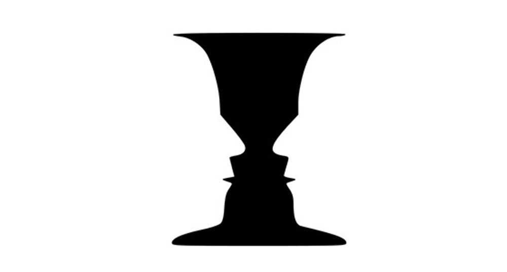
Reversible –In this case, the figure and background have near-equal density. This enables the eye to flip the figure with the background (hence “reversible”). This can be used to create visual illusions in both web design and art. However, at any point in time, a reversible design will have a clear figure and a clear ground.
A classic illustration of this is the image of a Rubin vase (have a look at the image above). This tends to be a black vase that is set centrally over a square white background. The symmetrical vase has a large, trumpet-funnel top that takes up nearly the full width of the background’s top and tapers down into a narrow middle. Down the middle, it has five contours and four projections before it flares out again to cover most of the width of the bottom.
You’ve probably seen such a vase and know what’s coming next. Yes, that’s right! The vase has “made” two white faces facing each other, not through it but set against what our eyes now perceive as being black space behind them. It’s a neat trick!
Ambiguous – In an ambiguous design, there is little distinction between the ground and the figure. At any point, a single element might be both figure and ground at the same time. You can make your design ambiguous by blurring the boundaries between your ground and figure.
It sounds difficult, but it’s a fascinating realm to explore, and there are many famous examples of ambiguous design. M.C. Escher – a Dutch graphic artist - was a master at this. His designs tapped ambiguity to the maximum and, thanks to that, we have wonderful pictures of people climbing steps in buildings: some are going up; some are going down, but at impossible angles. Escher used ambiguity to make waterfalls flow around more buildings in an impossible way – the water initially flows downward, falling in places, follows a seemingly logical course, and then, mysteriously, flows up again. Ambiguous designs are yours for the taking of your inspiration, whether you want to insert hidden writing, faces in profile that are also a single, different face, or faces made of fruity parts.
Designing with the Figure/Ground in Mind
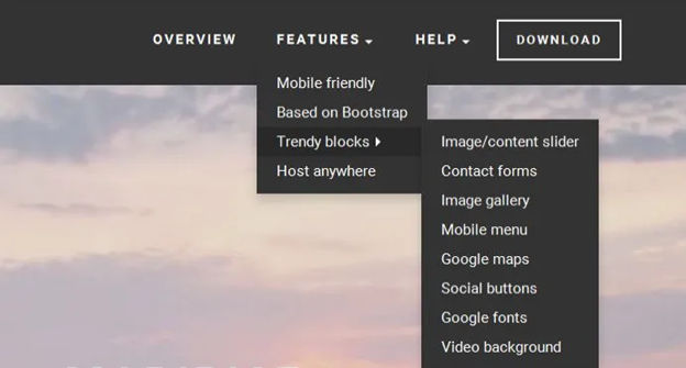
In the image at the start of this article, the Digital Camera World website menu uses the Figure/Ground principle to differentiate between two menus (see the top sections of the image). The use of drop shadow and color creates the illusion of the (lower) blue menu being on a top layer, while the white menu remains part of the background.
You can also see figure/ground at work on the 500px.com website’s homepage (as shown above). The background is a large and dominant image – people in the hot air balloon rides enjoying the majestic sunset sky - but the content is clearly identifiable, thanks to the use of both space and contrast with the background. This stops the background from overwhelming the content and distracting or confusing a visitor, who is probably joining in with the people to take in the sunset view. Cleverly “bulls-eyed” in the sky and tapering up next to the hot air balloons is the text – the all-important message.
The Law of Prägnanz (or Simplicity)
Prägnanz is a German word that means “good figure” or “pithiness” (literally defined as, “brief, forceful and meaningful in expression”). The human eye likes to find simplicity and order in complex shapes – it prevents us from being overwhelmed by information overload.
![]()
Author/Copyright holder: Clint. Copyright terms and licence: CC BY 2.0
When we see convoluted shapes in a design, the eye simplifies these by transforming them into a single, unified shape (by removing extraneous detail from these shapes).
Designing with the Law of Prägnanz in Mind – We can use the law of Prägnanz to help when wireframing a website. Our eyes assemble the content blocks into a single page.
This law goes by the other name of “The Law of Good Gestalt”, and for good reason. We humans like to make quick sense of things that would otherwise be upsettingly disordered. We dislike flux and need to find meaning quickly. Luckily, we don’t even have to think about doing this – our eyes have already got there!
When redesigning a site, you can apply Prägnanz law to wireframe the new concept and place it alongside the current version of a page. The eye can swiftly pick out any variances, and the user can quickly provide feedback on changes made – without the need for content. That’s all there is to it.
The Law of Closure
The Gestalt principle or law of Closure explains how we perceive incomplete shapes (Palmer & Rock, 1994). When there is missing information in an image, the eye ignores the missing information and fills in the gaps with lines, color or patterns from the surrounding area to complete the image. In reality, there are no borders or lines between this area (the background) outside the image we’re completing and the bits of background that we have determined are now part of the image. The eye tells us otherwise.
![]()
Author/Copyright holder: Tangient LL. Copyright terms and licence: CC BY-SA 3.0
Designing with the Law of Closure in Mind – We can use the Law of Closure to achieve visual effects such as the use in the World Wildlife Fund logo (pictured at the top of this article). The panda is incomplete (there are no lines around the white areas), but our eyes perceive a whole panda despite this. It takes some effort to overcome and notice the otherwise random black shapes and spots that appear on every piece of white background we can eventually make ourselves see.
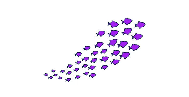
The Law of Common Fate
The law of Common Fate says that we perceive shapes as lines moving along the smoothest path. For example, we look at grouped elements and see them as moving in a similar direction.
![]()
Author/Copyright holder: Alastair Rae. Copyright terms and licence: CC BY-SA 2.0
Let’s see this in action. If you’ve got a piece of paper handy, draw seven or eight circles in a line beside each other. Above two of them, put a little arrowhead. Now, notice that these two circles are different from the others, but in the same way. The others are staying put, but the “arrowheaded” circles are going somewhere (the same direction); they share a common fate.
Note: The elements do not have to be moving (though they can be), but they must suggest motion for this law to work in your designs.
Designing with the Law of Common Fate in Mind - The law of Common Fate plays an important role in design, for example, with nested menus and content. Take the example of LinkedIn (as shown in the image up there at the start). LinkedIn have used the law of common fate to build a relationship between sub-menus. When you move over a menu item, the sub-menu item moves in the same direction as the last. This creates a link between sub-menus in the minds of the users.
The Take Away
The principles of perceptual organization defined by Gestalt Psychology provide us with valuable knowledge so we can design effective, efficient, and visually pleasing displays. Throughout three articles, we have reviewed the most relevant for you as a designer:
And, in this article, you have learned about the laws of Figure/Ground, Prägnanz, Closure, and Common Fate. As we have seen, we have many exciting ways to reach our users with designs. Are you ready to apply them?
Where to Learn More
We can’t help but to invite you, once again, to enroll in our Gestalt Psychology Course! Check its description here.
Besides learning about the Gestalt principles and how they relate to design, you will also take away some of the best resources currently available and a consolidated list of recommended reading materials, videos, and useful links to relieve you of the task of trawling the internet, searching for that vital piece of information.
In addition to this, we have a course on Visual Perception and Design
which is particularly relevant to this law.


