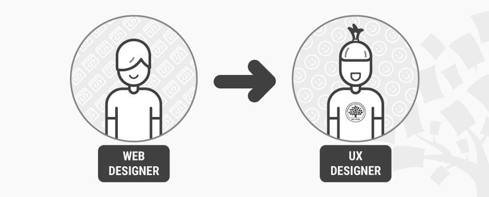
Changing careers isn’t as hard as it’s often made out to be, especially if you’ve got the right resources to help you make the change. For many web designers, now is the perfect time to make the switch into UX design. To start with, there’s the monetary boost that comes with the change in career. According to PayScale, web designers in the US earn an average of $46,000 annually(1), while UX designers on the other hand earn a sizeable $74,000(2). Secondly, job opportunities for UX designers are booming: CNN reports that a total of 3,426,000 UX design jobs will be created in the US alone within the next 10 years(3). Furthermore, UX design is a meaningful job, not only because you get to work on a product from the inside out, but also because—as DMI has shown—UX design makes a significant impact on businesses, with UX design-driven businesses outperforming the S&P index by 228%(4). So, where do you find the right resources to help you make your career change? Why, you’re reading one right now.
What is User Experience and User Experience Design?
To start with, let’s have a brief introduction to what we mean by “User Experience”. Products have users, and the user experience (UX) is simply the experience a user has from using that particular product. So far, so good?
UX design is the art of designing products so that they provide the optimum possible user experience. If this description sounds broad, it’s because the nature of UX design is pretty broad. Building the optimum UX encompasses an understanding of psychology, interaction design, user research, and many other disciplines, but on top of it all is an iterative problem solving process (but more on that later).
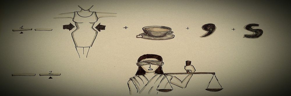
Broadly speaking, user experience can be broken down into 3 components: the look, feel, and usability.
![]()
The look of a product is about using visuals to create a sense of harmony with the user’s values, and that creates credibility and trust with the user. It’s about creating a product that not only looks nice, but looks right too.
The feel, then, involves making the experience of using a product as pleasant and enjoyable as possible. It’s built by crafting the interactions between the user and the product, as well as the reactions they have when (and after) using the product.
Lastly, usability underpins the user experience. Quite simply, if a product isn’t usable, no amount of good looks can salvage it, and the only feeling users are going to have is anger and frustration. Ideally, products should be personalized to user’s needs, and deliver functionality in a predictable way.
If you’re still not sure whether UX design appeals to you, we’ve got some articles that help introduce some of the important parts of UX as a career:
An Introduction to Usability
Usability vs Desirability
What is Interaction Design?
What Do Web Design and UX Design Have in Common?
The job title “Web Designer” has many definitions, and indeed, what a web designer does is largely dependent on what the client or project requires. Some web designers simply create visual designs and/or high fidelity interactive prototypes of the website, and leave the coding of the website to front-end and back-end developers. The majority of web designers, however, do get involved with both the designing and (front-end) development of the website. Some web designers even regularly do user research and testing as part of their jobs (and if you’re one of them, you’re already almost ready for a job in UX design).
But no matter what your job as a web designer entails, here are some aspects of web design that can also be found in UX design.
Problem solving
Web designers look to solve problems for their clients; UX designers look to solve problems for their users. Web designers work with a problem solving process: first, they find out the problems their clients have, then design a web solution for them, and then proceed to develop and test the website before releasing it. And after a website is launched, web designers often are involved with further testing the site, collecting feedback from users, and then reiterating on the design.
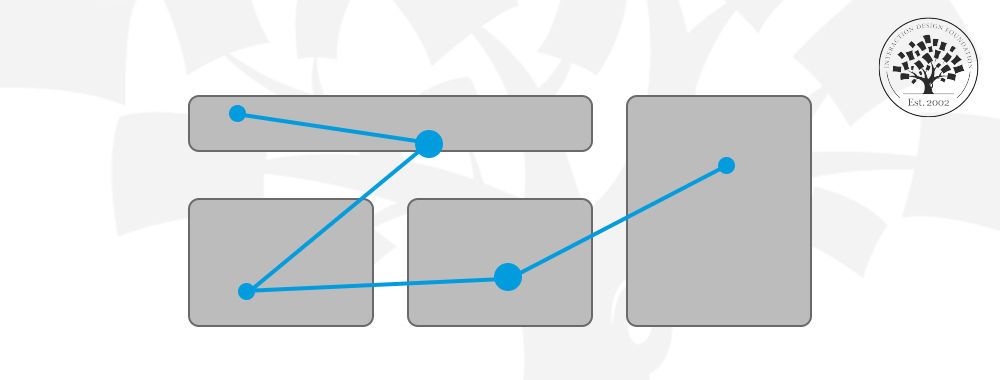
This iterative problem solving process is similar to the UX design process (shown in the image below). UX designers begin with user research; it’s essential to get to know the potential users of a product and find out what their problems are, how to solve them and how to make users want and/or need that solution. User research is often done via user interviews, observations, demographic studies, drafting user stories and personas, etc. Thereafter, UX designers would create a design solution that solves the user’s key needs, and often bring the prototype back to users to test its validity or usability. After the product is launched, UX designers collect more user feedback, which feeds into a new round of user research, thereby starting the process again.
If you’ve done user research before as part of your web designer job, you will find it a great advantage when making the switch to UX design. If not, don’t worry—you’ll have many opportunities to learn the best ways to conduct user research (read on to find out more).
Emotional design
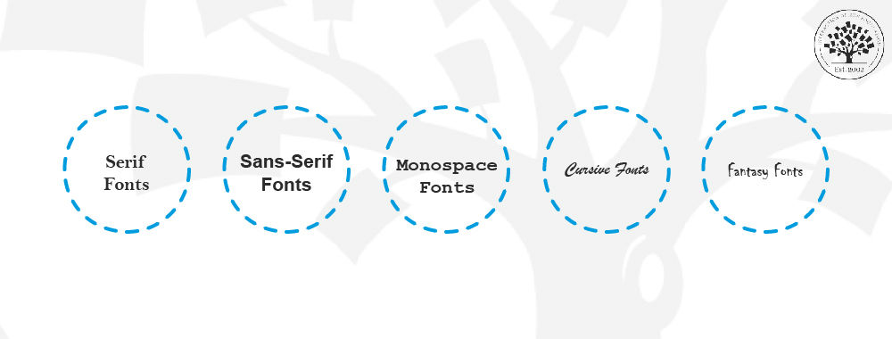
When designing websites, web designers often make use of typography, color and layout to shape the emotions of users. A sense of credibility could be established, for instance, by using darker colors and serif fonts; similarly, a sense of fun could be created using colorful imagery and playful typography. Web designers are familiar with emotional design; that is, creating designs that elicit emotions from users. UX designers are also concerned with emotional design, but on a larger scale—they are concerned with eliciting emotions from users throughout their entire experience of using a product.
To do that, UX designers work with not only typography and color, but also psychology, motion design, content curation and information architecture. Web designers making the change would innately understand what emotional design in UX entails; they simply need to pick up new knowledge in other areas to augment their ability to do so on a bigger picture.
Multi-disciplinary
Web design is a multi-disciplinary job, where you’d need not only knowledge in design (typography, color theory) but also skills in developing a website (HTML, CSS, JavaScript). Some web designers are also involved in interaction design when they code for animations and interactions using CSS and/or JavaScript. UX design is also a multi-disciplinary field, but perhaps supercharged in that sense. UX designers need to make use of knowledge from the areas of psychology, user research, visual design, and even business to create the best UX for their products.
The Differences between Web Design and UX Design
User-focused vs technology-focused
A large part of your job as a web designer is spent on catching up on the latest developments in HTML, CSS and other coding languages—all of which change and improve at a dizzying pace. Which browsers support what versions of CSS? Would CSS animations work in Safari on a Mac? Don’t even get me started on Internet Explorer! These might be a few questions (and frustrations) that are constantly on your mind as a web designer.But UX design isn’t concerned with technology. Instead, its focus is centered squarely on users—technology is only a means for users to get what they need. Only by focusing on users can UX designers create solutions that cater to the specific needs they have, and ultimately, that users will be willing to pay for. UX designers do extensive user research to find out the most they can about their users, most of which the majority of web designers wouldn’t have had the chance to perform.
UX is more than the web
UX design is platform independent. Its principles and processes are applied to many diverse areas outside of web browsers: on mobile apps, desktop software, and even hardware products and retail spaces. On the other hand, the domain of web design is strictly tied to web browsers. This means that UX designers are able to find job opportunities not only in up-and-rising fields like tech startups, but also in mature and stable industries like car manufacturers. As long as there’s a product, there’s a need for UX—and this really opens up your world of opportunities.
The Big Benefit of Web Design Experience when Moving to UX Design
Relevance of web design background
The biggest benefit of moving from web design to UX design is the amount of overlap between the two fields of design. While it’s true that UX design covers more platforms than the web browser, a sizeable portion of UX design work is still done on products that are at least partially web-based (think of social media websites like Facebook and Twitter, web apps like Dropbox, and services like Google). The overlap between web design and UX design is greater if you’ve done some form of user research or iterative process of continually improving a website with user data.
Being fluent in design and website coding terminologies will also give you a boost that cannot be ignored; after all, UX design is a collaborative process where communication is crucial. Being able to use industry terms while talking to your colleagues will definitely put you in a better place than someone who came from a non-design background.
Aesthetics
Your ability to create beautiful aesthetics as a web designer will also come in handy when making the switch to UX design. Firstly, aesthetics is a great tool to augment your communications with internal stakeholders. As a UX designer, you have to constantly present your findings and recommendations to internal stakeholders (such as the CEO or product manager), and your ability to create visually pleasing reports and presentations will maximize the absorption of your key points.
Secondly, aesthetics plays a vital role in UX design. A common myth of UX design is that great usability trumps aesthetics—but that is far from true. In fact, a study of more than 2,500 participants by the Stanford Credibility Project showed that nearly half of them assessed the credibility of websites based on their visual appeal(5). This goes to show how aesthetics works hand in hand with other factors like usability to bring about the optimum user experience of using a product.![]()
How to Enhance Your Skills to Make the Jump from Web Design to UX Design
Moving from web design to UX design can sometimes be quite straightforward, especially if you’ve done some aspects of user research in your job as a web designer. For other web designers, however, there is no cause for concern. You’ll be able to make the leap if you’ve spent some time studying UX, practicing some UX skills during your web design work, and constructing a CV which shows your understanding of UX design. If you’re wondering where to learn, there are plenty of options available to you, and we’ve highlighted some of the best below.
Online Courses
Online courses are the key to the enterprise of obtaining a solid design education, which goes a long way to sharpening the skills and mindset you’ll need as a successful designer.
Interaction Design Foundation
Don Norman, the cognitive scientist who coined the term “User Experience”, called the Interaction Design Foundation (yes, that’s us) a “goldmine of information on interaction design.” Forbes Magazine says that we offer “Ivy League level education in UX, Product Design or Human-Computer Interaction.” Fortunately, that education isn’t at an Ivy League level of pricing. We charge a low annual fee and you get access not just to all of our online learning, but also to the largest specialist design community in the world. We also offer a free library of academic texts from the design industry’s top researchers.
We have three courses (among our current offering of 32) that are specifically designed to help people enter the world of UX design. You’ll learn all areas of UX work and basic skills to practice UX work in Become a UX Designer from Scratch. In Get Your First Job as a UX (or Interaction) Designer, you’ll be able to learn what kinds of experience in UX do employers seek the most, as well as craft a winning cover letter, CV and portfolio that will help you get an interview for a UX design job. Finally, in User Research – Methods and Best Practices, learn the industry best practices of how to conduct proper user research and turn the results of your research into useful action on your product.
You can find all of our other UX courses here.
Coursera
You might also want to check out Coursera which is a great source of online learning. Their courses, like ours, are developed by leading experts in their field. Unlike us, however, they don’t specialize in UX and their courses aren’t always available, but when they are, they can either be accessed usually for a fee (on a per course basis).
Udemy
Udemy offers a huge selection of courses in nearly every subject area you can imagine. Udemy isn’t really a training provider, but rather a broker of training created by people from around the world. As such, there’s not much in the way of quality control applied to their courses—while some are absolutely brilliant, many are not.
Classroom Courses
Nielsen Norman Group
If you want to examine classroom courses; we recommend sticking with the “big names” of the industry who provide reliable and high-quality learning experiences. One of those big names is the Nielsen Norman Group who are also one of the best known UX consultancies; they offer a range of classroom based training at various locations around the world. They’re not inexpensive, but if you prefer not to have online training, they’re a good alternative.
You can find the Nielsen Norman Group’s training here.
General Assembly
General Assembly is another option for bootcamp-styled campus learning. They have relatively short and intense courses that repeat regularly. However, they are at a high price point and are available only at select locations.
You can find out more about General Assembly here.
University Courses
If you’ve got plenty of money and time, you could go ahead and get a Bachelor’s degree or a Master’s degree at a university. There isn’t, as of yet, a “UX-only” degree course, and the majority of related degrees tend to focus on Human Computer Interaction.
Two examples of this kind of program are:
Carnegie Mellon – HCI Programs
York University – MSc in HCI Technologies
University is not a low cost option, both in the sense of your time and money you’ll be spending on it. You’ll want to weigh up the pros and cons of a university course very carefully before you decide to go this route.
For instance, here’s how we break down the total costs of a 4-year university degree:
HSBC, as reported by Top Universities, found that the average US-based university education costs $36,564 a year(6). That includes tuition fees as well as living expenses. For a 4-year degree, this adds up to $146,256—and that’s not counting the costs (such as interest) of getting a loan for your studies.
Then there’s the opportunity cost of quitting work and spending four years at university. That is, the income you’ll forgo when studying full-time at a university. According to the United States Census, a non-graduate earns an average of $27,351 per year(7). Over 4 years, that amounts to $109,404 that could have been earned if you had been working.
Summing up the actual cost and opportunity cost gives you the total cost: a whopping $255,660!
![]()
If you think that all the options are confusing, you might want start by examining the return on investment from each type of learning. We’ve got an article here that examines the return on investment from each of the learning types mentioned above.
Networking
The best way to find work in any field is to use a little inside knowledge and get some help from those people already doing what you want to do. This used to be hard work, but today you can simply get online and get networking.
We’d recommend LinkedIn to anyone looking to do some professional networking; join UX groups and join the conversation. Don’t just jump in and ask for work—demonstrate your value first and help people, and look for work only after you’ve built relationships.
The Interaction Design Foundation also offers networking opportunities to both members and non-members. Our members are able to carry out highly specific networking through pre-designed forums that allow for collaboration between large groups of designers. Both members and non-members can also attend our local groups’ community events, which are completely free to attend. You can find out more about the local groups here.
You could also think about getting involved with the design community’s leadership by interacting with them on social media. We’ve provided a list of twenty great designers here that you can interact with online; you can expand that list as much as you like with a little Google work.
Mentoring and Feedback
We’ve found that you can make a career change more easily if you can find someone to mentor you and provide feedback on your efforts. You can, of course, source a mentor from your existing professional network if you know someone who is happy to take the role on. If you think that’s not going to work for you, members of the Interaction Design Foundation’s Design League have access our network of UX design experts and see a mentor from that network.
The Take Away
It isn’t difficult to move from web design to UX design. You can build on your existing skills through a process of education and choose the kind of education that suits you best. Thereafter, you can put that learning into practice as a web designer. The good news is you already speak the language of design so once you have a little practice in UX, you’re going to be ready to transition your career into UX design and join the fastest growing part of the design profession in the world today.
References & Where to Learn More
Course: Web Design for Usability
Payscale’s research on Web Design salaries
Payscale’s research on UX Design salaries
CNN reports 3.4 million UX designer job growth in the next 10 years
DMI’s analysis of design investment
UX Myths: Aesthetics are not important if you have good usability
How much does it cost to study in the US?
Earnings by education: US Bureau Of Labor Statistics


