Your constantly-updated definition of Responsive Design (RD) and
collection of videos and articles. Be a conversation starter: Share this page and inspire others!
576shares
What is Responsive Design (RD)?
Responsive design is an approach to web design in which the interface adapts to the device's layout to facilitate usability, navigation and information seeking. Responsiveness is possible thanks to media queries, allowing the design to adjust automatically to the browser space to ensure content consistency across devices, and design elements being sized in relative units (%).
Responsive design has significant benefits, and it's a default for web design to support device switching.
With responsive design, you may:
Reach a larger audience: Nowadays, more users access the web through mobile devices, so ensure your mobile User Experience design is well-considered.
Save time and development efforts since designers and developers only focus on one design version.
Improve SEO, as search engines reward mobile-friendly websites with better search positions.
Ensure brand and design consistency across devices, as there is no chance to modify guidelines to fit different design boxes.
ShowHide
video transcript
Transcript loading…
Why Responsive Design is so Popular
In the early 2010s, designers had to address a historical phenomenon. More users were starting to access web material on handheld devices than on desktops. There were two main design approaches to deal with designing across devices:
Designers could craft several versions of a design optimized for different devices and make each have fixed dimensions (adaptive design approach).
They could work on a single, flexible design that would stretch or shrink to fit the screen (responsive design approach).
Organizations and designers found the benefits of responsive design hard to ignore. Rather than work with absolute units (e.g., pixels) on separate versions, designers focused on just one design and let it flow like a liquid to fill all "containers."
How to Understand the Language of Responsive Design
Grid systems are aids designers use to build, design, arrange information and make consistent user experiences. In interaction design, multi-column, hierarchical and modular are the most widely-used types of grids.
The principle of a grid is simple: every element occupies the same percentage of space, however large or small the screen becomes, which means that the components can be scaled up and down as the user switches devices.
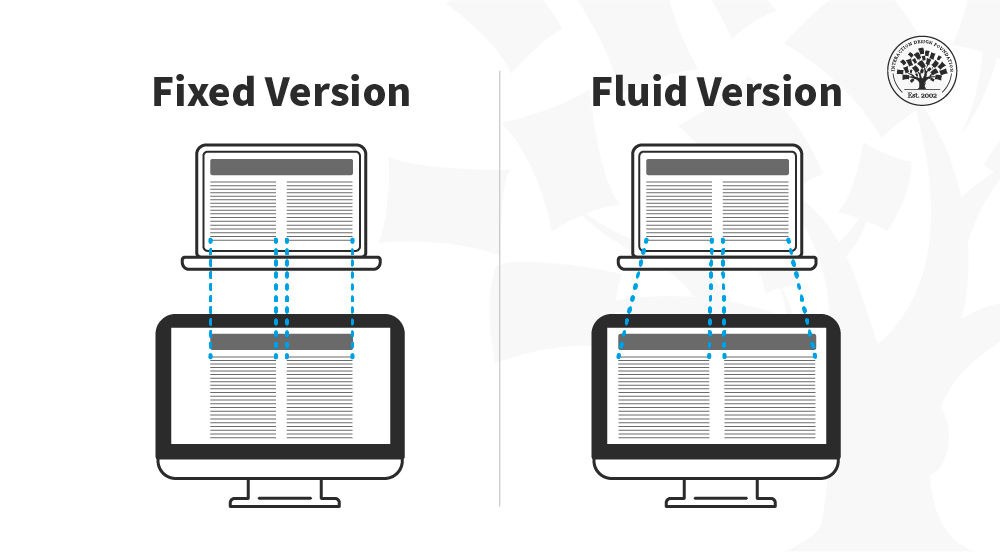
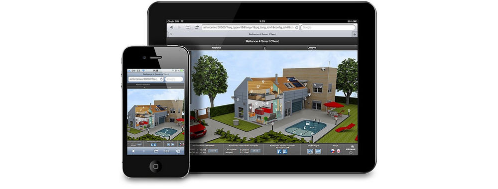
In this image, you can see that the fixed version of the content has the same width regardless of the device whereas in the fluid version the content fills the available space depending on the device size.
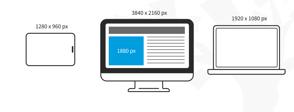
In responsive design, fluid images are images that scale to fit their container, meaning that when the browser reaches a breakpoint, the image will scale up or down to the current window size.
For non-photographic images, such as icons, you can use SVG files—these file formats are lightweight, and you can scale them to any resolution without losing quality.
Media Queries and Breakpoints
Media queries are filters that detect the browsing device's dimensions and make your design appear appropriate regardless of the screen size. To aid media queries, you have breakpoints: these are the values where the content of your website will be rearranged to provide the user with the best possible experience.
Media queries and breakpoints go hand in hand, and both can be defined in your CSS style sheets. For designers, a breakpoint is a boundary where the design will change to accommodate the features to the new size. Commonly, designers use three sizes when designing responsive websites: 1024 & upwards, 1023-768, and 767-320 px.
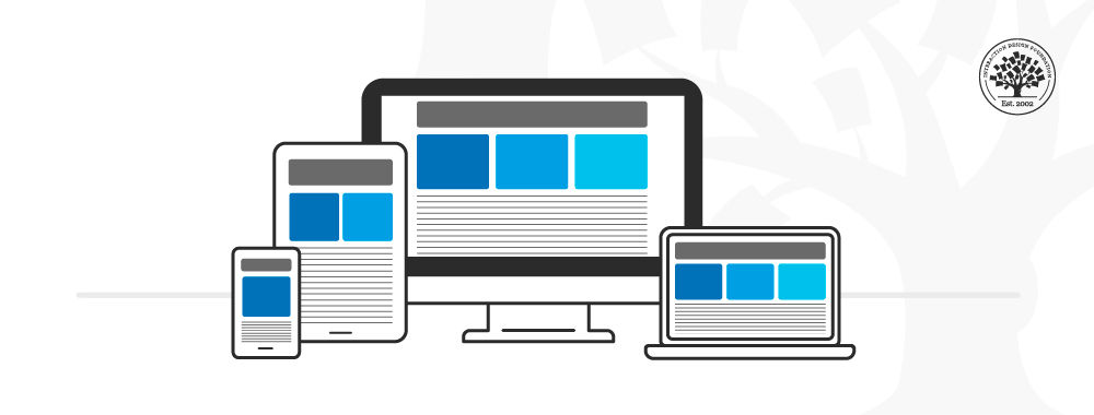
In this image, you can see how the placement of the columns is rearranged depending on the screen real estate available. The content is displayed in one column in the smartphone, two on the tablet and three on the desktop.
Media queries work best with a "mobile first" approach where you define what you want on mobile and then scale up from there. You’ll need to test content to see where breakpoints occur and plan them. Eventually, you may find you can predict breakpoints based on a device's screen resolution.
Best Practices & Considerations for Responsive Design
With responsive design, you design for flexibility in every aspect—images, text and layouts. So, you should:
Assume a "mobile-first" mentality: Whether you start to design from the smallest screen or the desktop version, assuming a mobile-first mentality helps you practice the mobile-first approach, a design principle with simplicity at its core. A mobile-first mentality means prioritizing content, leaving complex graphs and images for the desktop version, and creating fat-finger-friendly tap targets (30px minimum).
Use Scalable Vector Graphics (SVGs). These are an XML-based file format for 2D graphics, which supports interactivity and animations.
Include three or more breakpoints (i.e., design for 3+ devices).
Prioritize and hide content to suit users' contexts of use. Check your visual hierarchy and use progressive disclosure and navigation drawers to give users needed items first. Keep nonessential items (nice-to-haves) secondary.
Aim for minimalism.
Apply design patterns to maximize ease of use for users in their contexts and quicken their familiarity: e.g., the column drop pattern fits content to many screen types.
Aim for accessibility with font sizes/styles. Use contrast and background effectively. Consider learning about typographic scales to harmonize body copy and headlines. As some users rely on screen readers, make all your text "real" instead of text within images.
Responsive design is robust and economical, but its "easy" nature is deceptive. You can still run into difficulties if you use it without caution. For example, it can restrict your control over the design's screen sizes; consequently, if you do not set media queries upfront, the elements could shift independently. Also, it is typical to run into issues with advertisement formats, especially on mobile devices.
Still, responsive design aids great UX since, by default, it requires uniformity, seamlessness, and simplicity in your design efforts. It is SEO-friendly, and the multiple CMS and frameworks, such as WordPress and Bootstrap, make it very cheap to implement.
What is the difference between responsive and adaptive design?
Responsive design and adaptive design are both design “techniques” which designers use to make websites work on different screen sizes, but they do it in different ways.
Responsive design uses a fluid layout that adjusts to any screen size—and the content, images, and elements resize and reposition automatically based on the user’s device. This approach works well because it uses one design that flexes across desktops, tablets, and phones, flowing like a liquid, and most modern websites use this method.
Watch as CEO of Experience Dynamics, Frank Spillers explains important points about responsive design:
ShowHide
video transcript
Transcript loading…
Adaptive design is different in that designers use fixed layouts designed for specific screen sizes. What happens is the website detects the device and loads a predefined layout that best fits the screen. So, instead of one flexible design, it’s got multiple static layouts for different devices, like desktop, tablet, and mobile.
Watch as CEO of Experience Dynamics, Frank Spillers explains important points about adaptive design:
ShowHide
video transcript
Transcript loading…
So, the key difference is that responsive design flows to fit any screen, while adaptive design switches between set layouts. Responsive works best for flexibility—great if you want a future-proof, scalable design. Adaptive, though, gives more control over how a site looks on each device, and it’s better if you need custom layouts for specific devices—especially for mobile phones.
How does responsive design improve user experience?
Responsive design improves UX by making websites easy to use on any device—and, done well, it adjusts layouts, images, and text automatically, so users don’t need to zoom or scroll sideways, and makes for a smooth, frustration-free experience.
Another thing is how a responsive website loads faster because it optimizes content for different screens—and faster load times help reduce bounce rates and keep users engaged.
Navigation also improves with responsive design in that menus, buttons, and forms resize and reposition to stay easy to tap and read on smaller screens. From that, then, users can find information quickly without struggling with tiny text or hard-to-click links.
Yet another benefit is consistency—so, a responsive site looks and works the same across all devices, so users feel comfortable and familiar whether they visit from a phone, tablet, or desktop and can trust the brand more into the bargain.
Watch as CEO of Experience Dynamics, Frank Spillers explains important points about responsive design:
ShowHide
video transcript
Transcript loading…
How does responsive design work?
How responsive design works is by using flexible layouts, images, and CSS media queries to adjust a website’s look based on the screen size. Instead of designers needing to create separate designs for different devices, one design automatically adapts to fit desktops, tablets, and phones, flowing like a liquid to fill each “container” in the best way.
A fluid grid system helps structure the layout, so elements like text, images, and buttons resize and reposition based on screen width, which keeps content readable and accessible without users needing to zoom or scroll sideways.
CSS media queries detect the user’s screen size and apply the right styles—so, for example, a three-column desktop layout may change to one column on a phone for better readability.
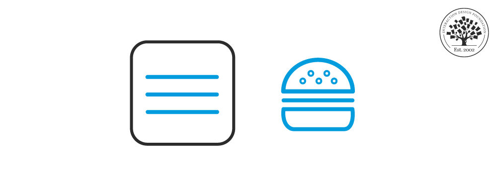
Images and videos also scale proportionally or swap for smaller versions to load faster on mobile. What’s more, navigation adjusts, too, with menus turning into hamburger icons for easier use.
The biggest benefit of responsive design lies in how it automates adjustments, so websites work smoothly on any screen, so improving usability and accessibility. You can see this, for, example on Apple’s website.
Watch as CEO of Experience Dynamics, Frank Spillers explains important points about responsive design:
ShowHide
video transcript
Transcript loading…
What are the main features of responsive design?
Responsive design has several key features that make websites work well on any screen, and they include, first, that a fluid grid system ensures that layouts adjust smoothly. Instead of fixed widths, elements resize proportionally based on screen size, which keeps content nice and structured and readable.
Flexible images and media scale automatically, with large images shrinking on small screens to prevent scrolling issues, while videos adjust to fit different devices.
CSS media queries detect the user’s screen size and apply the right styles. For example, a three-column layout on a desktop might switch to a single-column layout on a phone for better readability.
Adaptive navigation improves usability—so, menus simplify on smaller screens, often turning into a hamburger menu for easy access, and buttons and links resize for touchscreens.
Fast performance matters, too, and responsive sites optimize images and content for mobile, cutting down on load times and improving user experience.
Watch as CEO of Experience Dynamics, Frank Spillers explains important points about responsive design:
ShowHide
video transcript
Transcript loading…
How do I use CSS media queries for responsive design?
CSS media queries help websites adapt to different screen sizes by applying styles based on the device’s width, height, or resolution—and they make sure that layouts, fonts, and images adjust properly on desktops, tablets, and phones.
To use media queries, start with a default style that works on all screens and then add specific styles for different devices. For example:
css
CopyEdit
/* Default styles for all devices */ body { font-size: 16px; background-color: white; }
/* Styles for tablets (screens smaller than 768px) */ @media (max-width: 768px) { body { font-size: 14px; background-color: lightgray; } }
/* Styles for phones (screens smaller than 480px) */ @media (max-width: 480px) { body { font-size: 12px; background-color: lightblue; } }
This code changes font size and background color based on screen width.
Media queries also adjust layouts, images, and navigation, and that keeps websites usable and readable on all devices and ensures that websites look good and work smoothly on any screen.
Take our course featuring Responsive Design and everything you need to know about mobile UX.
What are common mistakes in responsive web design?
Many designers of websites make common mistakes in responsive web design, which hurt usability and performance both—and can wreck an otherwise seamless experience. One mistake is not designing for mobile first—some teams build for desktops first and then try to shrink everything for smaller screens, an approach that leads to cluttered layouts and slow load times on mobile.
Another mistake is ignoring touch-friendly design, in that too-small buttons and links make navigation frustrating on phones. Users should be able to tap easily without zooming or misclicking; a big-enough problem when they’re in a calm environment, but far worse if they’re in a potentially stressful or hazardous environment.
Another big problem is to forget to optimize images. Large, uncompressed images slow down mobile loading times, making users leave before the page even loads.
Yet another design fail is how some sites use fixed widths instead of flexible grids, and this makes layouts break on certain screen sizes, leading to awkward scrolling and unreadable text.
Last—but not least—not testing on real devices causes issues because just resizing a desktop browser window doesn’t show real mobile behavior. So, don’t assume you can “shrink and walk” and that everything will be fine with the users: it’s vital to test on actual phones and tablets to ensure a smooth experience.
In an era where mobile comes first in terms of sheer weight of usage (more users access digital solutions on handheld devices rather than “sit-down” computers), it’s never been more important than to tailor things with a mobile-first approach. So, do keep designs mobile-friendly, flexible, and fast—and users happy.
Watch as CEO of Experience Dynamics, Frank Spillers explains important points about responsive design:
ShowHide
video transcript
Transcript loading…
What is responsive typography?
Responsive typography makes text easy to read on any screen by adjusting size, spacing, and line length based on the device. So, instead of using fixed font sizes, it uses relative units like em, rem, or vw so text scales automatically.
For example, instead of setting a fixed size:
css
CopyEdit
p { font-size: 16px; }
A responsive approach uses:
css
CopyEdit
p { font-size: 2vw; /* 2% of the viewport width */ }
And this makes the text adjust dynamically to different screens.
Responsive typography also improves readability with proper line height, spacing, and contrast—and it’s important for accessible design. Small screens need larger text and more spacing, while desktops can use smaller text with tighter spacing.
CSS media queries help refine typography further:
css
CopyEdit
@media (max-width: 768px) { p { font-size: 14px; } }
What are some highly cited scientific articles about responsive design?
Fernando Almeida's 2018 journal article, The Role of Responsive Design in Web Development, explores the significance of responsive web design (RWD) in modern digital environments. Responsive design enables software developers to create web pages that automatically adjust to different screen sizes, ensuring seamless adaptability across various devices. This approach facilitates fast and efficient web page rendering, enhancing user experience on desktops, tablets, and mobile phones. This study aims to examine the key benefits and challenges associated with responsive web design. A quantitative research method was used, involving a survey completed by 181 industry professionals. The collected data helped identify the primary factors driving developers to adopt responsive design, as well as the obstacles they encounter. The findings highlight improved user experience and enhanced accessibility as the most significant advantages. However, challenges such as incompatibility with older browsers, increased loading times, and difficulties in optimizing the user experience were also noted. Additionally, the study reveals that perceptions of responsive design’s pros and cons differ between highly experienced professionals and freelance developers.
What are some popular and respected books about responsive design?
Ethan Marcotte coined the term “responsive web design” (RWD) and introduced its core principles in this book. He explains how to use fluid grids, flexible images, and media queries to create websites that adapt seamlessly across devices. This book is a must-read for web designers and developers looking to build user-friendly, future-proof websites.
Earn a Gift, Answer a Short Quiz!
Question 1
Question 2
Question 3
Get Your Gift
Try Again! IxDF Cheers For You!
0 out of 3 questions answered correctly
Remember, the more you learn about design, the more you make yourself valuable.
Improve your UX / UI Design skills and grow your career!
Join IxDF now!
Question 1
Question 2
Question 3
Get Your Gift
Congratulations! You Did Amazing
3 out of 3 questions answered correctly
You earned your gift with a perfect score! Let us send it to you.
Check Your Inbox
We've emailed your gift to name@email.com.
Improve your UX / UI Design skills and grow your career!
Join IxDF now!
Literature on Responsive Design (RD)
Here's the entire UX literature on
Responsive Design (RD) by
the Interaction Design Foundation, collated in one place:
Learn more about Responsive Design (RD)
Take a deep dive into Responsive Design (RD) with
our course
Mobile UI Design
.
It's Easy to Fast-Track Your Career with the World's Best Experts
Master complex skills effortlessly with proven best practices and toolkits directly from the world's top design experts. Meet your experts for this course:
Frank Spillers: Service Designer and Founder and CEO of Experience Dynamics.
Mia Cinelli: Associate Professor of Art Studio and Digital Design at the University of Kentucky.
Joann Eckstut: Color Consultant, Founder of The Roomworks, and one of the 12 designers chosen by the Color Association of the USA to create the yearly forecast used by industries to keep up with color trends.
Arielle Eckstut: Author, Agent-at-large at the Levine Greenberg Rostan Literary Agency, and Co-Founder of The Book Doctors and LittleMissMatched.
Ellen Lupton: Award-winning Author, Designer, and Senior Curator of Contemporary Design at Cooper Hewitt, Smithsonian Design Museum, as well as Professor at the Maryland Institute College of Art (MICA).
All open-source articles on Responsive Design (RD)
The hamburger menu—with its three horizontal lines—simplifies website navigation. Not every interface benefits from its
802 shares
8 mths ago
Open Access—Link to us!
We believe in Open Access and the democratization of knowledge. Unfortunately, world-class educational materials such as this page are normally hidden behind paywalls or in expensive textbooks.
